Confusion Matrix PowerPoint Diagram & Google Slides


Confusion Matrix Diagram Overview Template
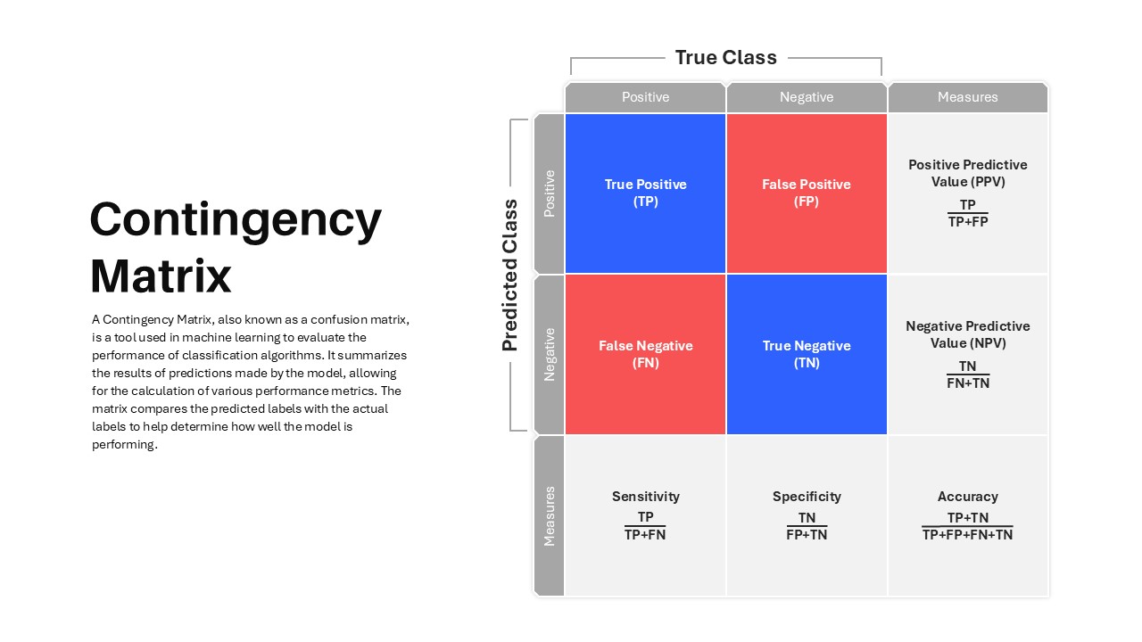
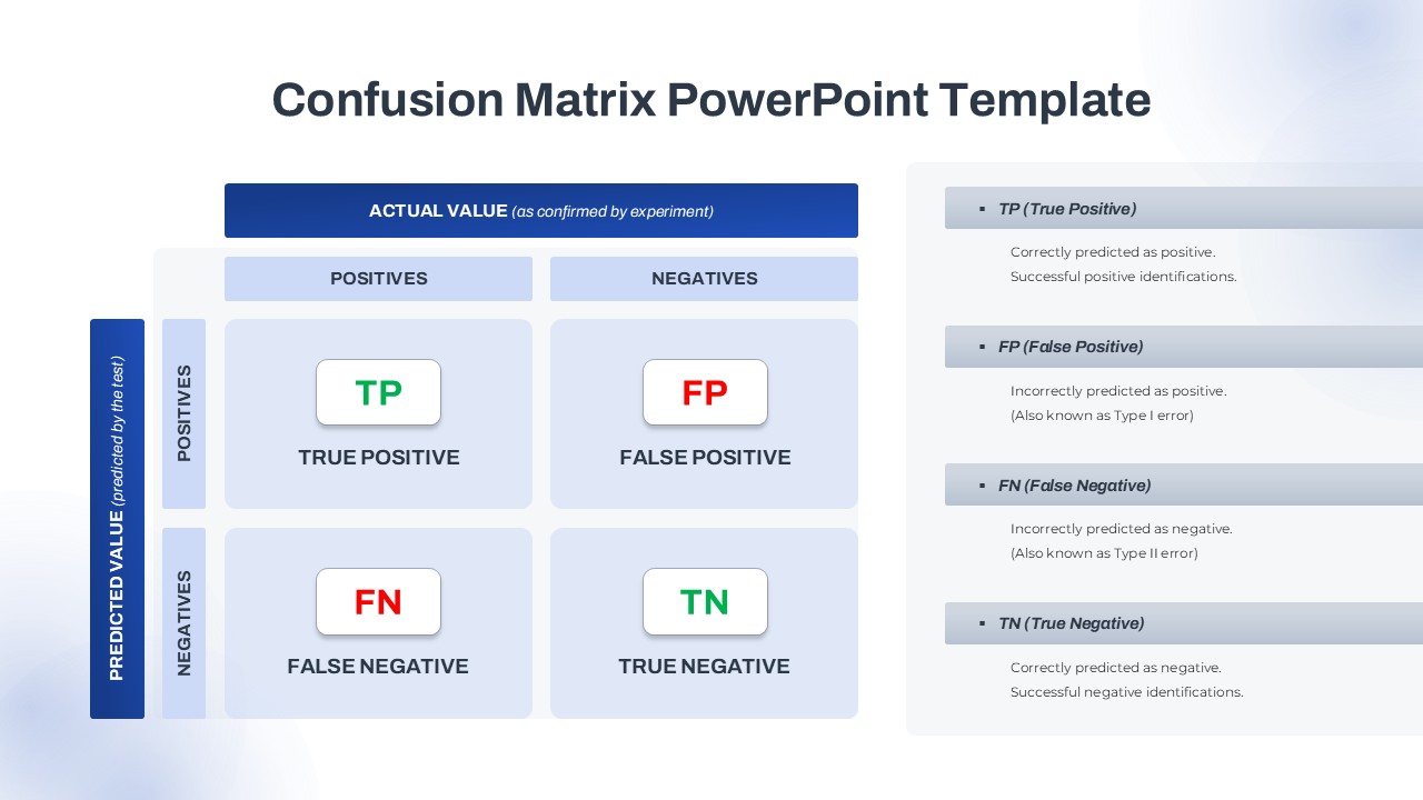
Explain machine learning outcomes with confidence using this professionally designed Confusion Matrix PowerPoint Diagram. Built around a structured 2×2 matrix, the slide presents the four core classification outcomes—True Positive (TP), False Positive (FP), False Negative (FN), and True Negative (TN)—in a clean, easy-to-follow layout. The clear separation between actual and predicted values helps audiences quickly understand model behavior and evaluation results. The confusion matrix remains one of the most widely used tools for assessing classification performance in machine learning and predictive analytics.
The slide combines color-coded quadrants with supporting explanation panels, making complex concepts easier to communicate during technical reviews, stakeholder meetings, academic lectures, and project presentations. Whether you are discussing model accuracy, error analysis, precision, recall, or classification performance, this comparison infographic provides a visual framework that simplifies the conversation.
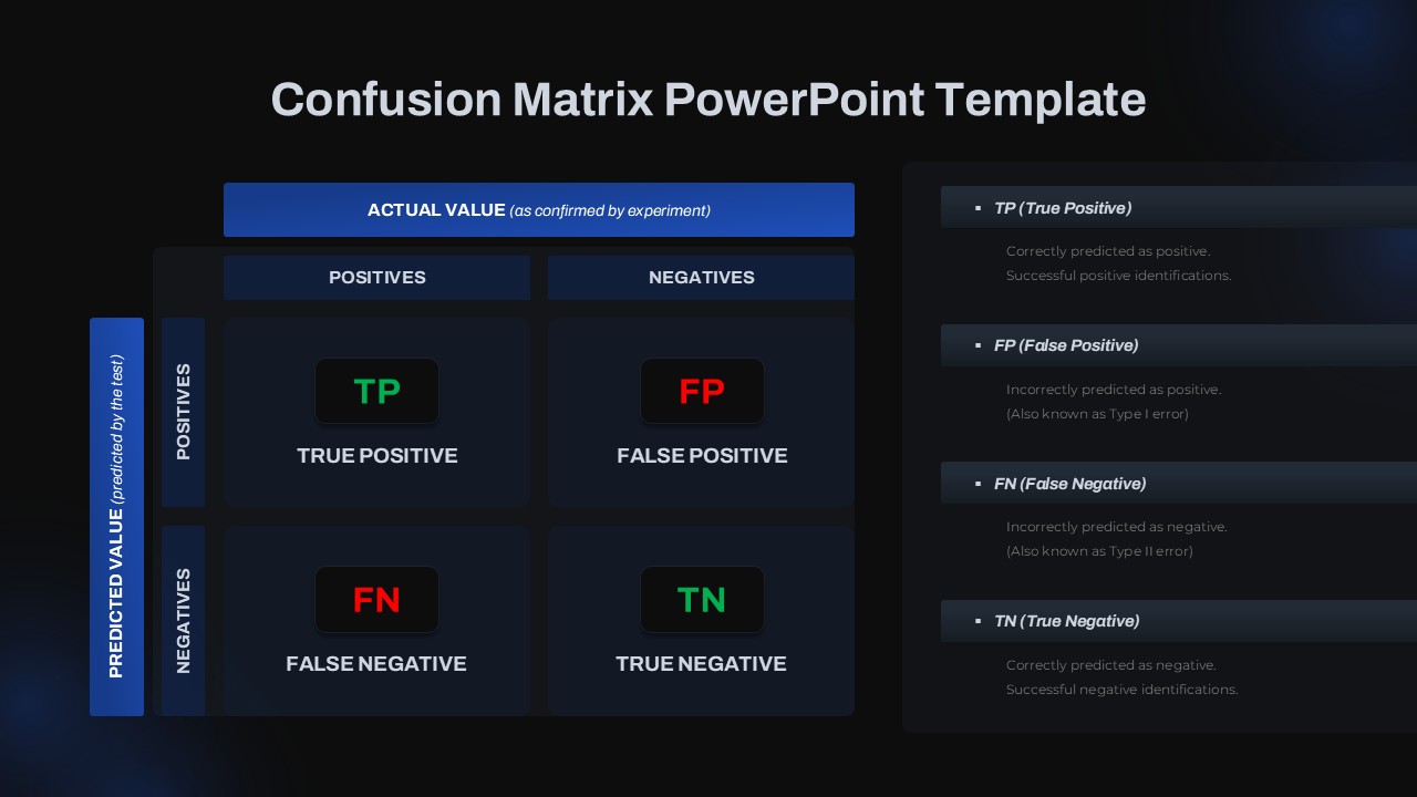
Available in both light and dark theme variations, the template adapts seamlessly to different presentation styles. Every element is fully editable, allowing you to modify colors, labels, fonts, and content to match your branding or reporting requirements. Vector-based objects ensure crisp visuals across all screen sizes without losing quality.
Use Cases and Intended Audience
This Confusion Matrix PowerPoint Diagram is designed for data scientists, machine learning engineers, business analysts, AI researchers, and product teams who need to communicate classification model performance in a clear and visual format. It is particularly useful for presenting concepts such as accuracy, precision, recall, and prediction errors to both technical and non-technical audiences.
Beyond machine learning applications, the diagram can be repurposed for risk assessment frameworks, quality assurance reporting, customer segmentation analysis, survey result categorization, compliance tracking, decision-making models, and performance evaluations. Its flexible 2×2 structure makes it a valuable visualization tool for comparing outcomes, identifying errors, and presenting analytical insights across various business, academic, and operational contexts.
Login to download this file

Item ID
SB05010


Related Templates

Bubble Chart Scatter, Diagram & Matrix Template for PowerPoint & Google Slides
Comparison Chart
Materiality Assessment Matrix Diagram Template for PowerPoint & Google Slides
Risk Management
Product Process Matrix Diagram Template
Business Strategy

Ansoff Matrix Diagram PowerPoint Template
Business Strategy
Content Marketing Matrix Template for PowerPoint & Google Slides
Comparison
Editable Four-Quadrant TOWS Matrix Template for PowerPoint & Google Slides
Opportunities Challenges
9-Box Matrix for Performance & Potential Template for PowerPoint & Google Slides
Employee Performance
MoSCoW Prioritization Matrix Slide Template for PowerPoint & Google Slides
Business Strategy
Prioritization Matrix for PowerPoint & Google Slides
Business Proposal
Speed vs Reversibility Decision Matrix Template for PowerPoint & Google Slides
Comparison
Risk Probability & Impact Matrix Template for PowerPoint
Risk Management
Contingency Matrix Template
Technology
Nursing Staffing Matrix Template
Nursing
Disaster Response Role Matrix RACI Chart Template
Project Status
Heatmap Matrix with Numbers for PowerPoint and Google Slides
Project
Decision Matrix PowerPoint Template
Leadership
Ansoff Growth Matrix Template
Business Strategy
Buyer Utility Map Strategy Matrix Template for PowerPoint & Google Slides
Customer Journey
Action Priority Matrix Template
Business Strategy
Confrontation Matrix Swot PowerPoint Template & Google Slides
SWOT