Comparative Analysis template for PowerPoint & Google Slides

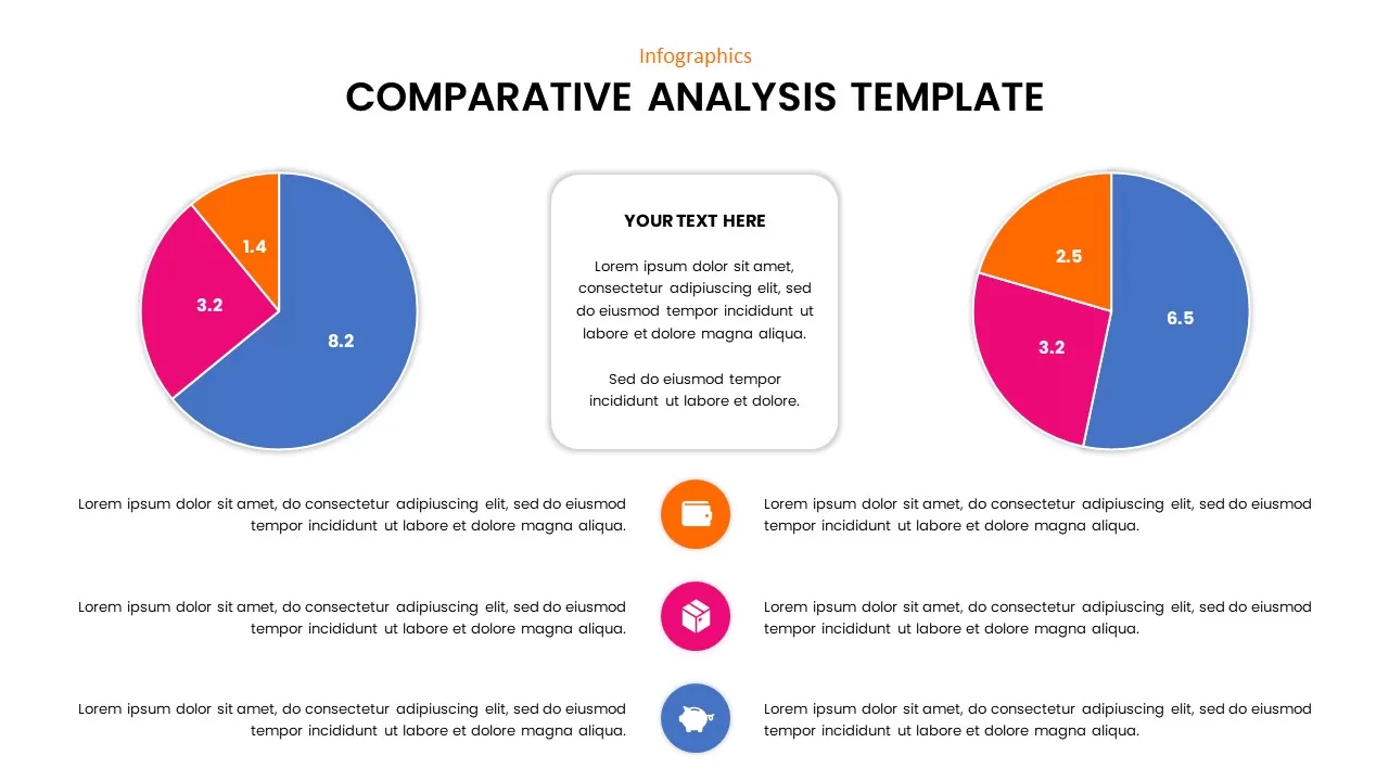
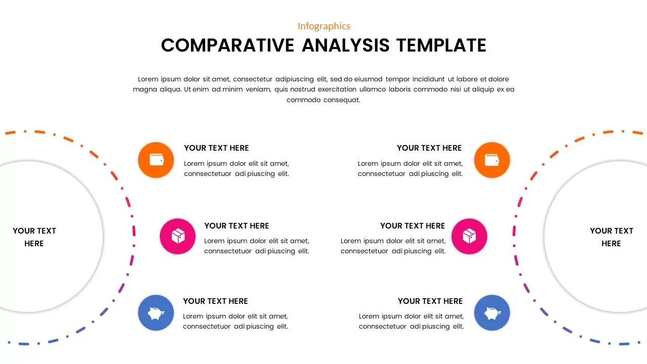
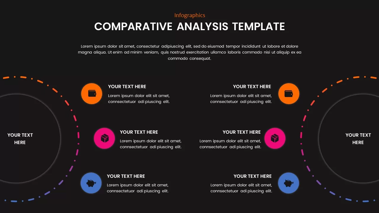
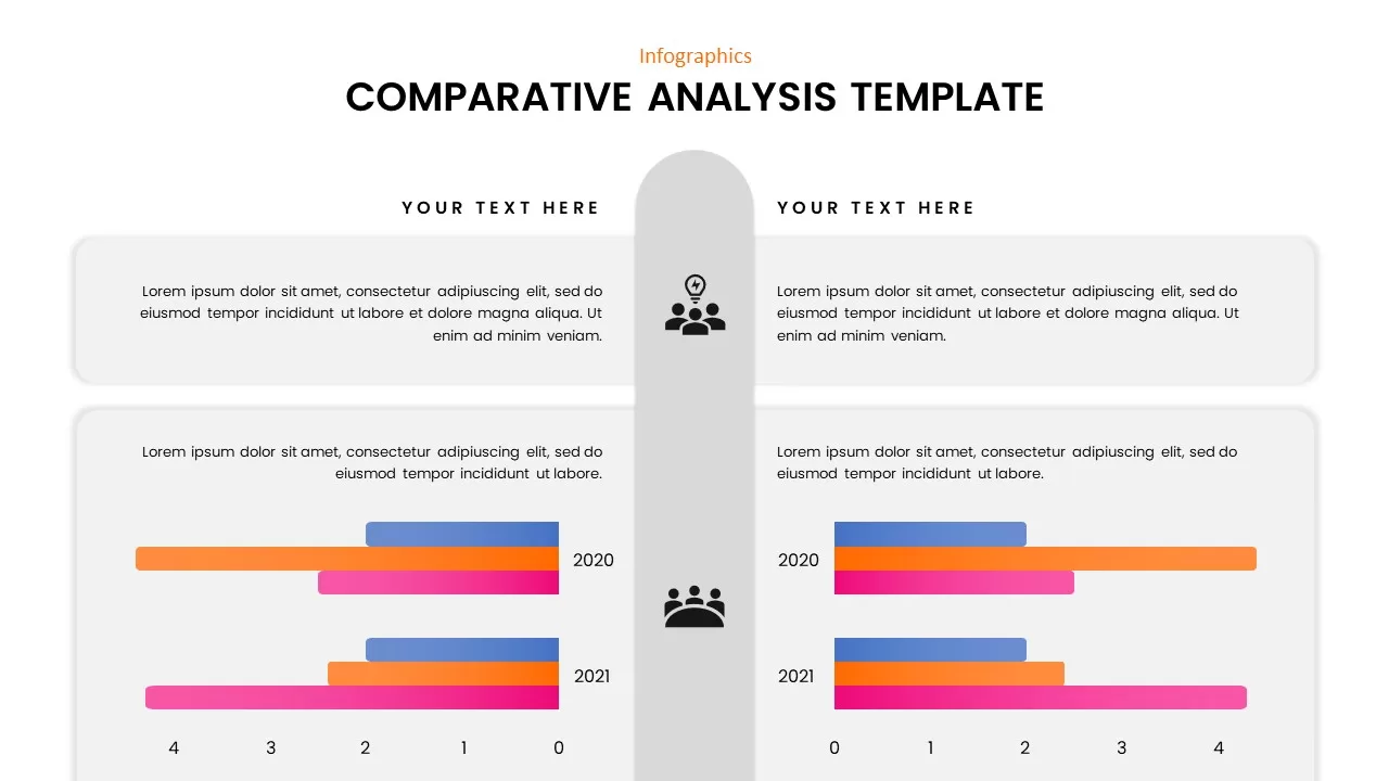
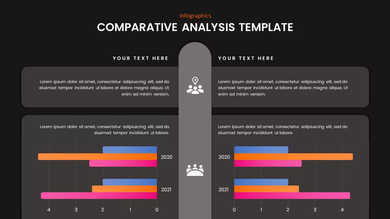
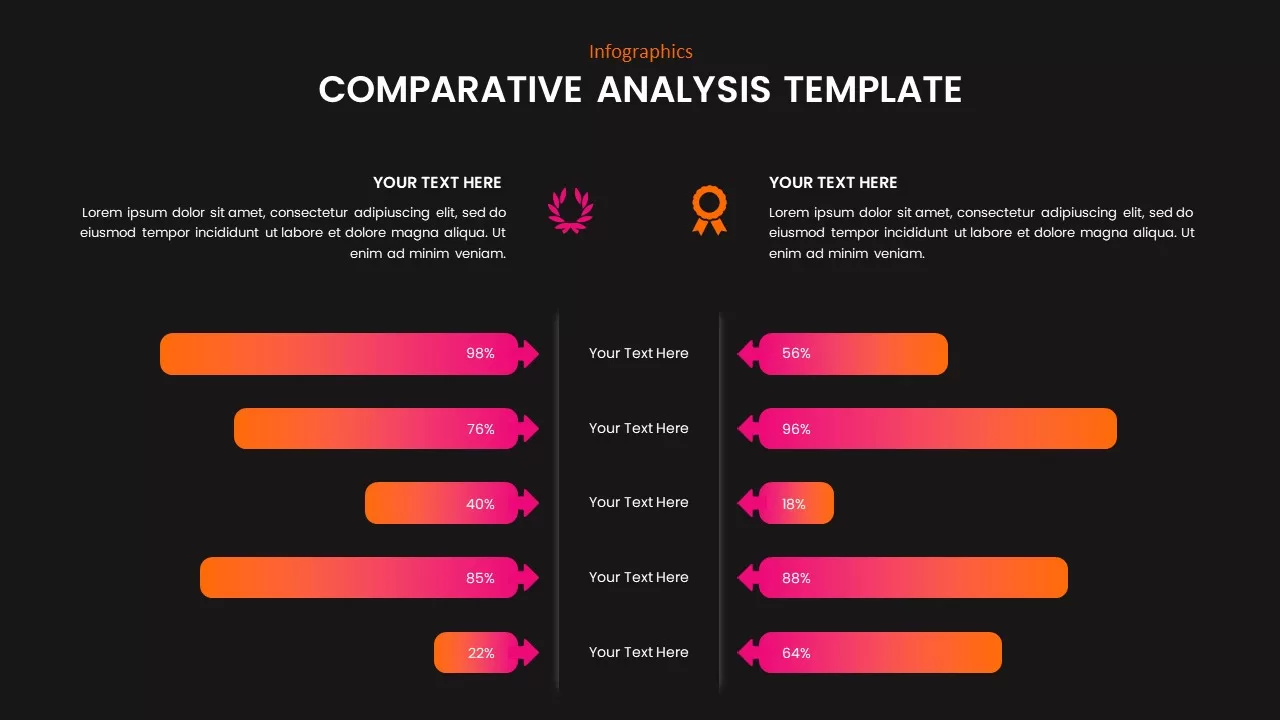
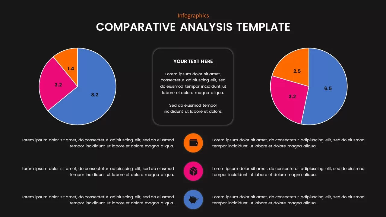
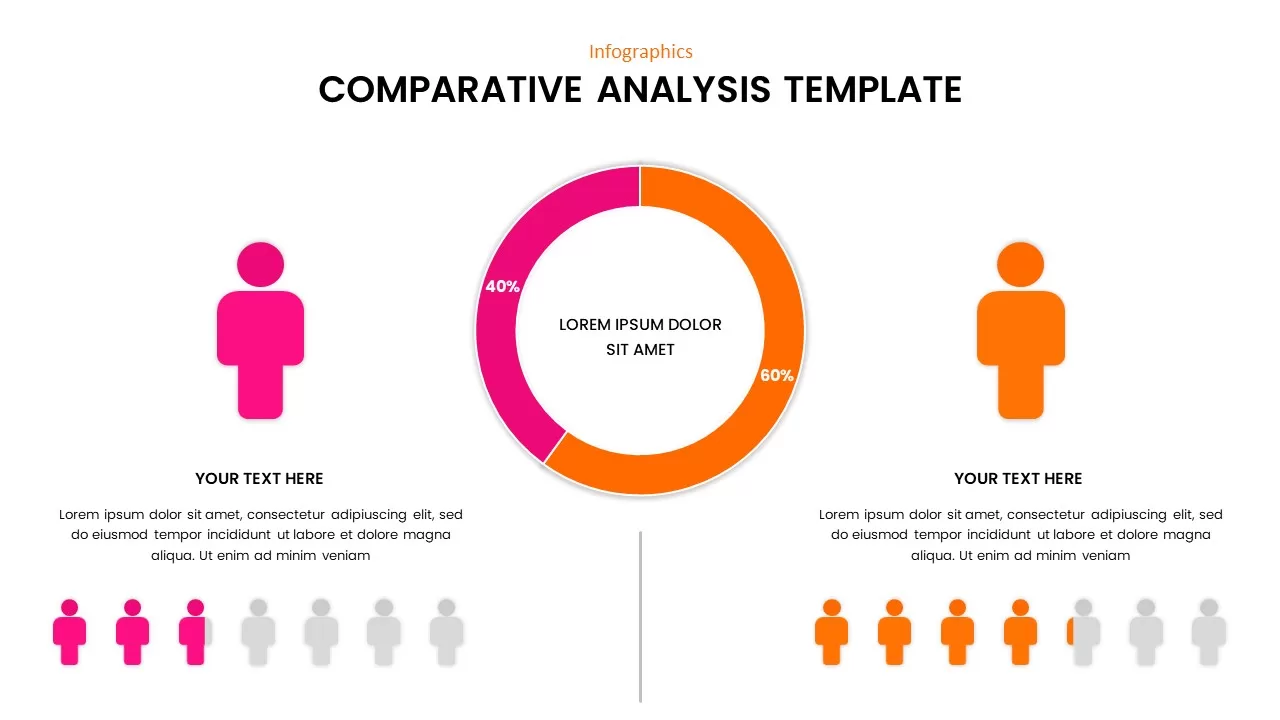
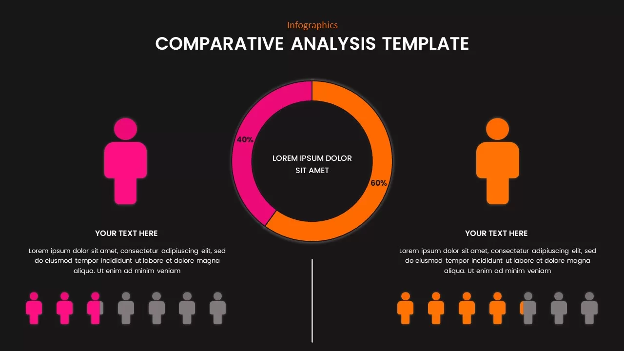
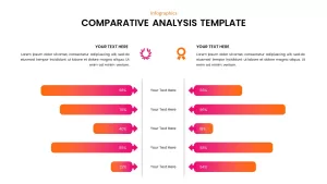
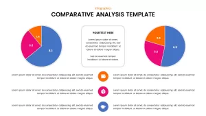
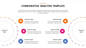
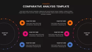
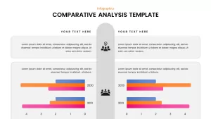
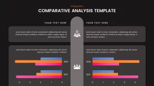
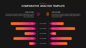

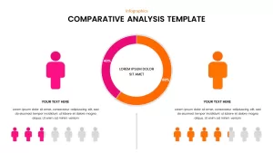
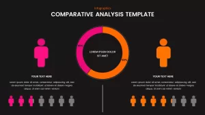
This comparative analysis template is a versatile tool designed to highlight and compare data across different categories, making complex information visually engaging and easy to interpret. With vibrant color gradients ranging from pink and orange to purple, the template features multiple layouts such as bar graphs, pie charts, and segmented infographics. Each section is designed to present key performance indicators (KPIs), percentages, or categorical comparisons effectively.
Whether you’re analyzing market trends, comparing project progress, or evaluating multiple products or strategies, this template provides a clean, organized structure for showcasing critical insights. Its user-friendly design makes it easy to customize with your own data, while the sleek color coding adds clarity and impact. The template’s versatility allows it to fit various use cases, from business reports and presentations to marketing strategies and competitor analysis.
With placeholders for text, graphs, and pie charts, this template ensures that your data is not only informative but also visually striking, ensuring your audience stays engaged throughout the presentation. Ideal for PowerPoint and Google Slides, it ensures seamless use on both platforms.
Who is it for
This template is perfect for business analysts, marketing professionals, project managers, and executives who need to present comparative data in a clear, concise, and engaging manner. It is also ideal for consultants, researchers, and data scientists presenting findings to clients or stakeholders.
Other Uses
In addition to business presentations, this template can be used for academic research, product comparison, performance reviews, or any situation that requires a clear and compelling visual comparison of data. It is also a great fit for annual reports, client presentations, and team meetings.
Login to download this file

Item ID
SB02068
Related Templates

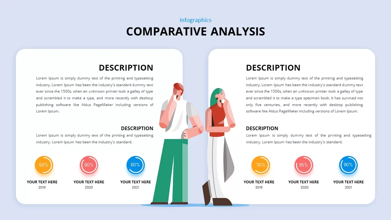
Comparative Analysis Template for PowerPoint & Google Slides
Comparison
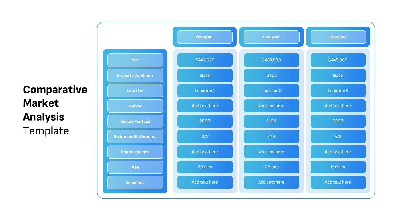
Comparative Market Analysis Template for PowerPoint & Google Slides
Comparison

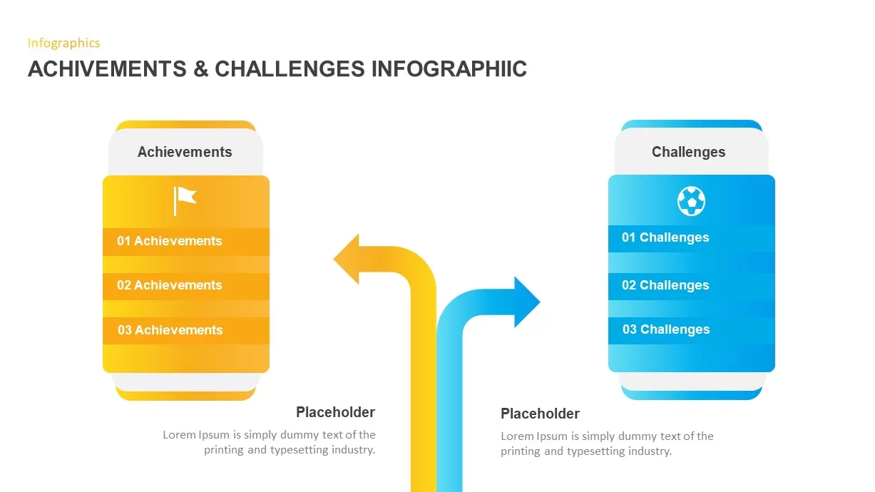
Achievements and Challenges Comparative Infographic Template for PowerPoint & Google Slides
Opportunities Challenges
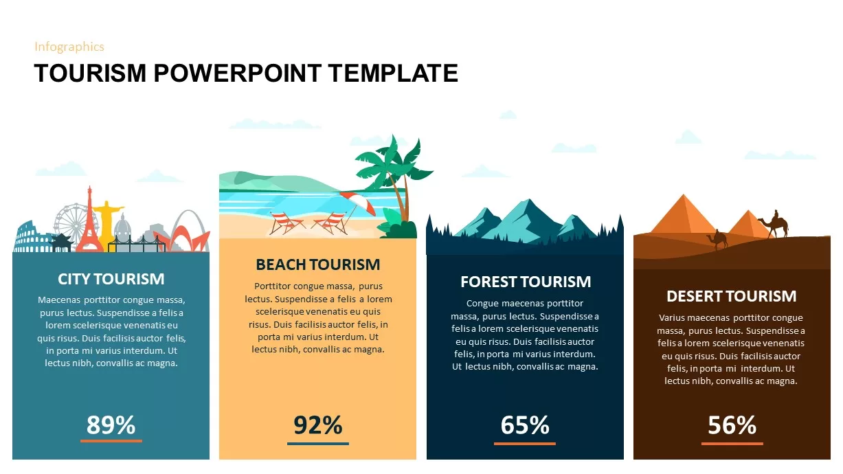
Comparative Tourism Infographics Template for PowerPoint & Google Slides
Comparison
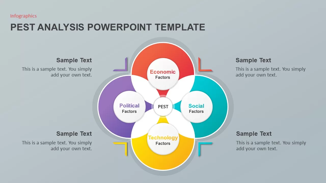
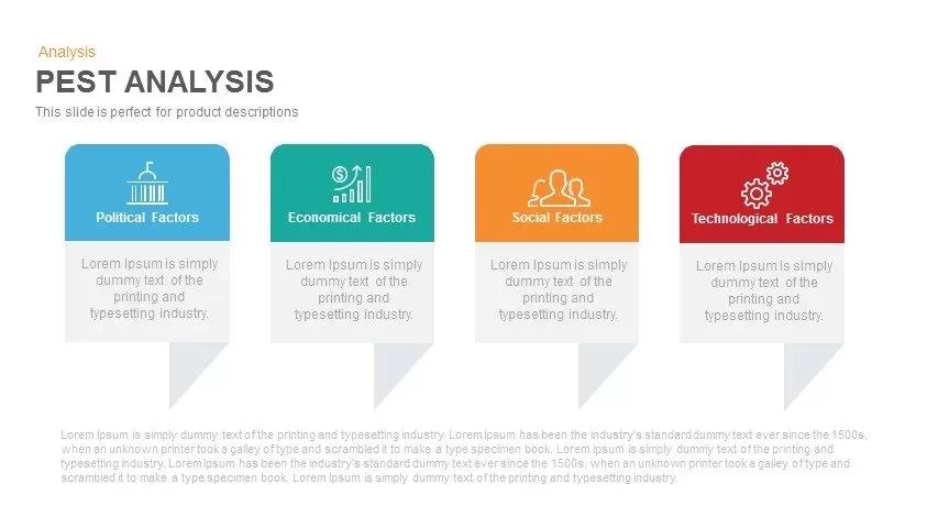
PEST Analysis PowerPoint Template for PowerPoint & Google Slides
Business Strategy
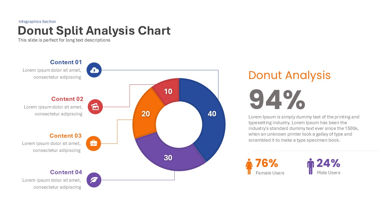
Donut Split Analysis template for PowerPoint & Google Slides
Pie/Donut

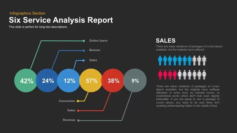
Six Service Analysis Report template for PowerPoint & Google Slides
Infographics
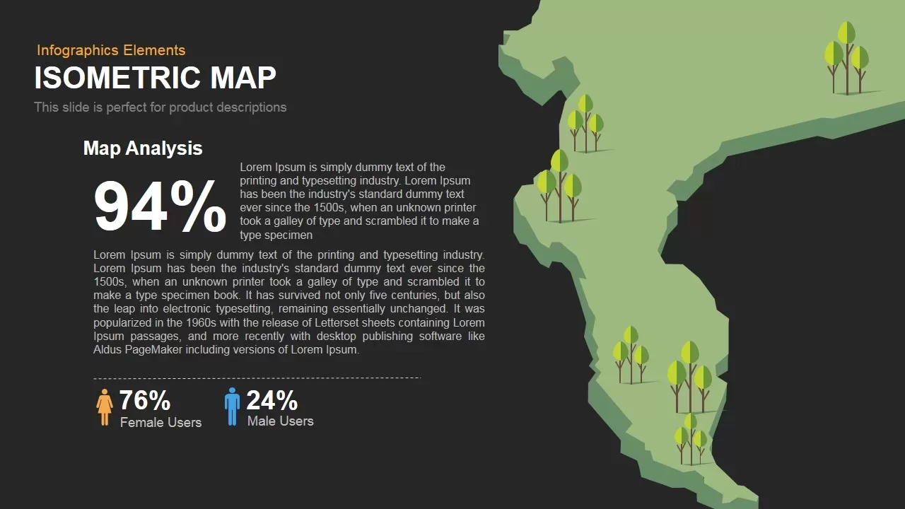
Isometric Map Analysis Slide Template for PowerPoint & Google Slides
World Maps
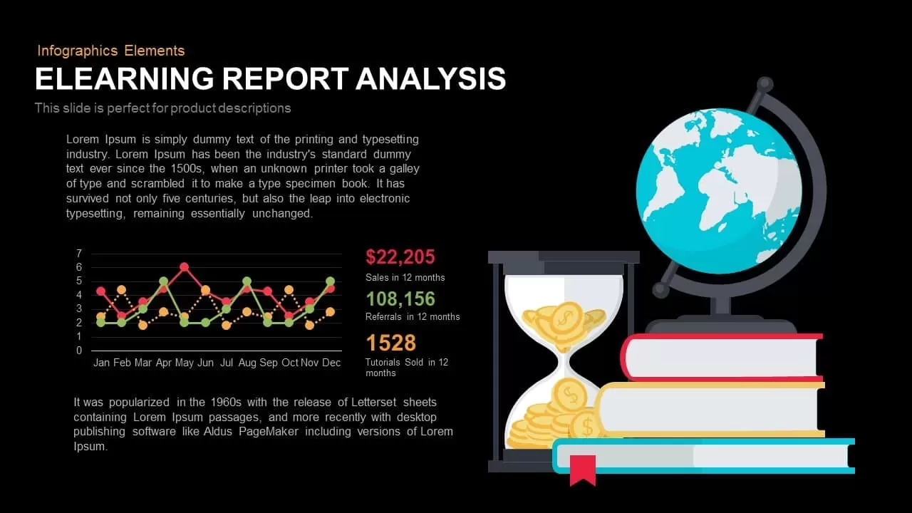
E-Learning Report Analysis Template for PowerPoint & Google Slides
Infographics
Pencil Bar Chart Data Analysis Template for PowerPoint & Google Slides
Bar/Column

PEST Analysis Template for PowerPoint & Google Slides
PEST
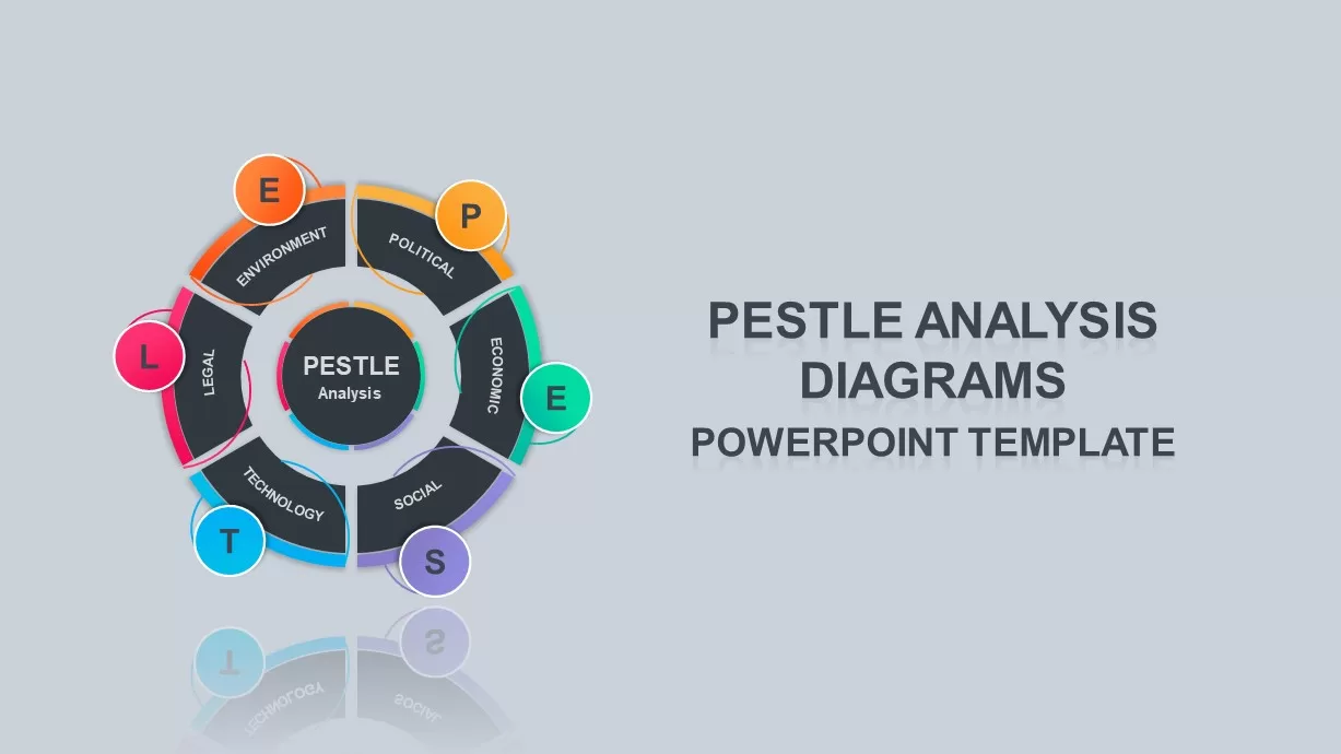
PESTLE Analysis Deck Template for PowerPoint & Google Slides
Decks

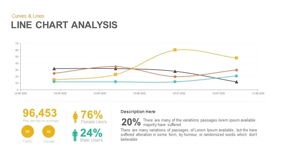
Line Chart Analysis template for PowerPoint & Google Slides
Charts
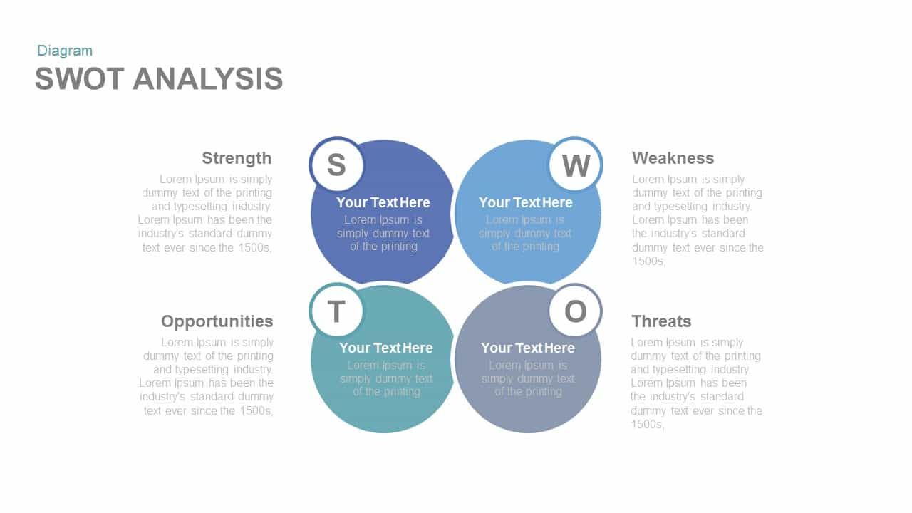
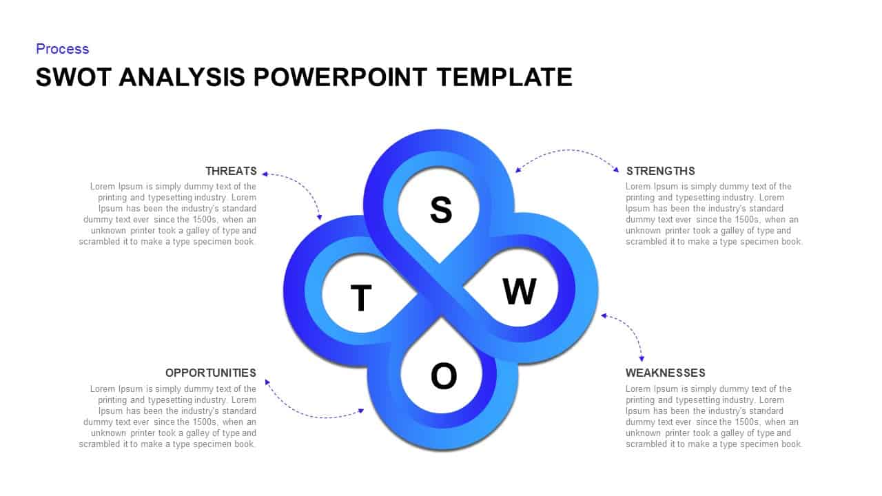
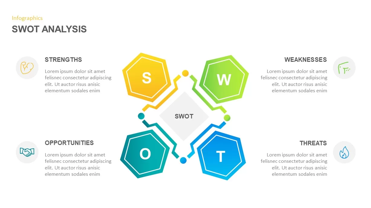
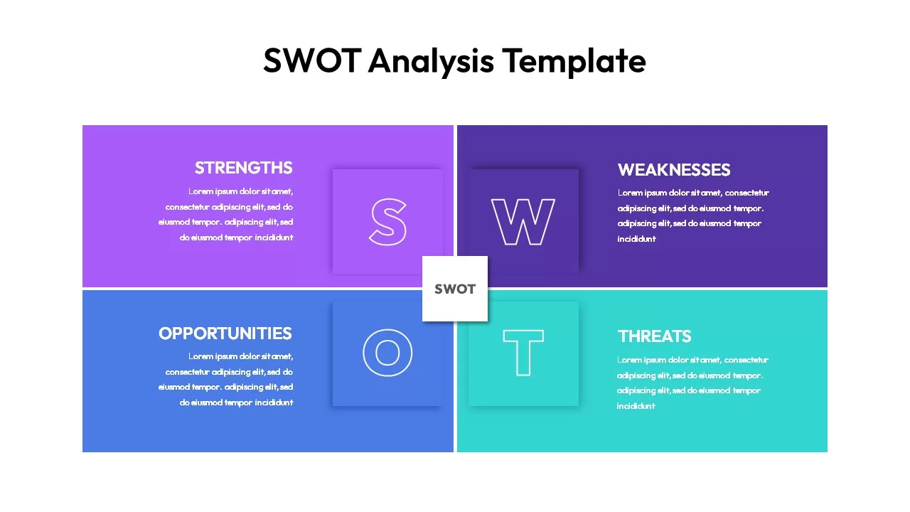
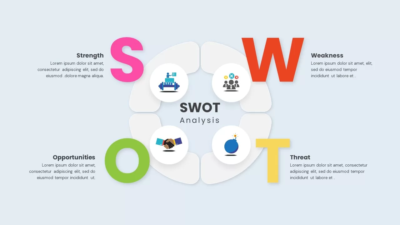
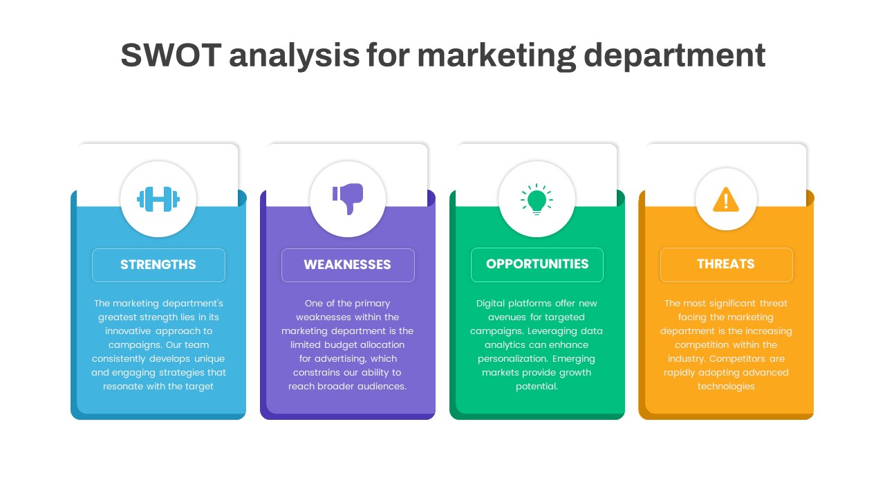
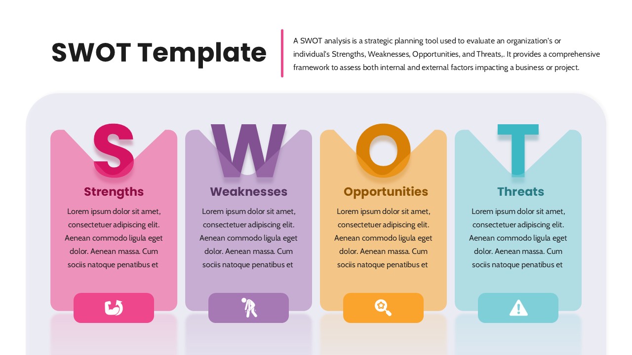
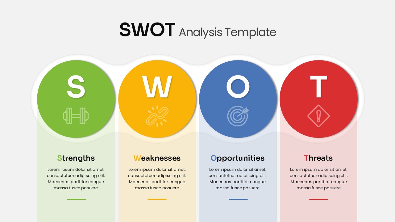
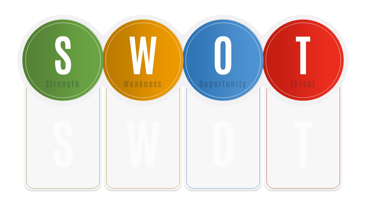
Free SWOT Analysis template for PowerPoint & Google Slides
SWOT
Free
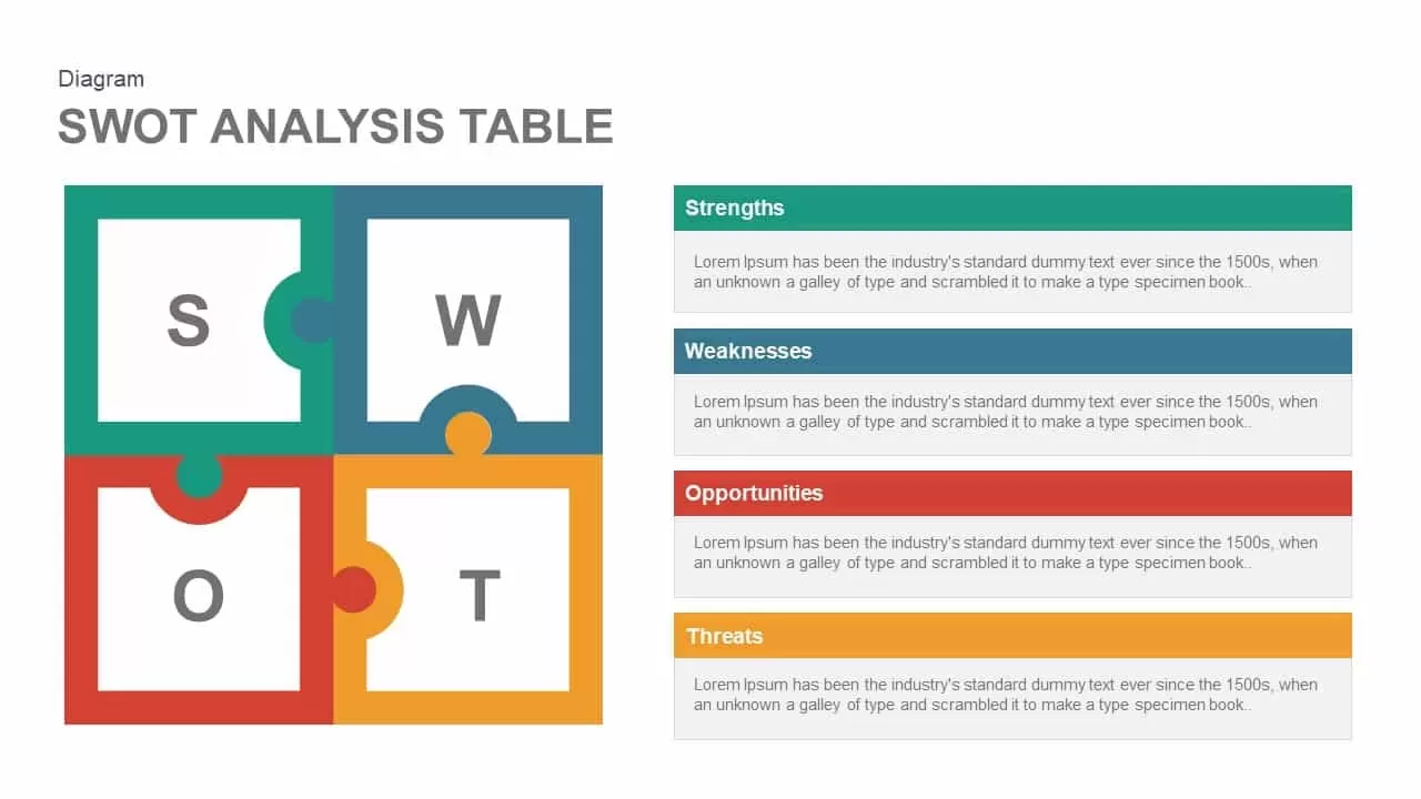
Puzzle-Style SWOT Analysis Table Diagram Template for PowerPoint & Google Slides
SWOT
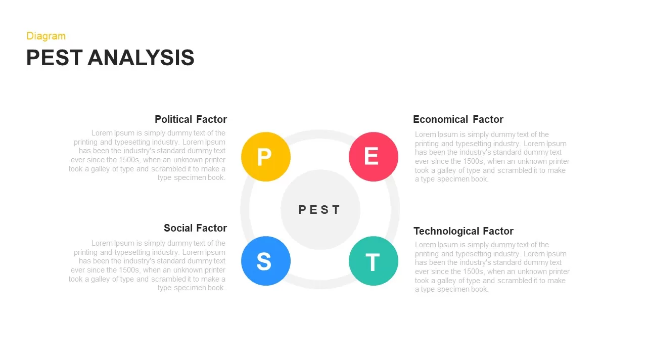
PEST Analysis Circular Diagram Template for PowerPoint & Google Slides
PEST
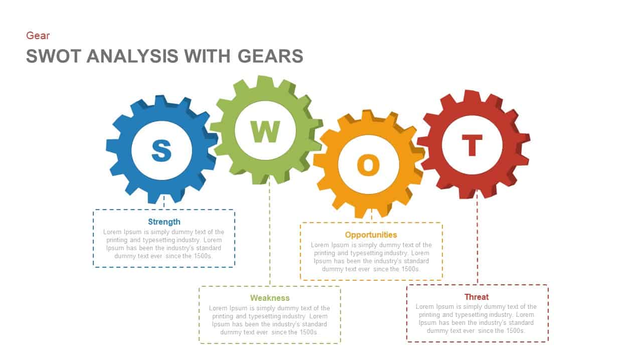
SWOT Analysis Gear Diagram Slide Template for PowerPoint & Google Slides
SWOT

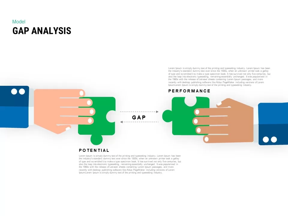
Interactive Gap Analysis Puzzle Diagram Template for PowerPoint & Google Slides
Gap
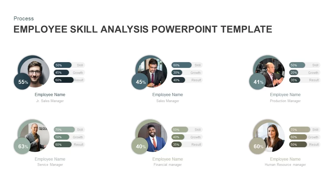
Employee Skill Analysis Dashboard Template for PowerPoint & Google Slides
Employee Performance
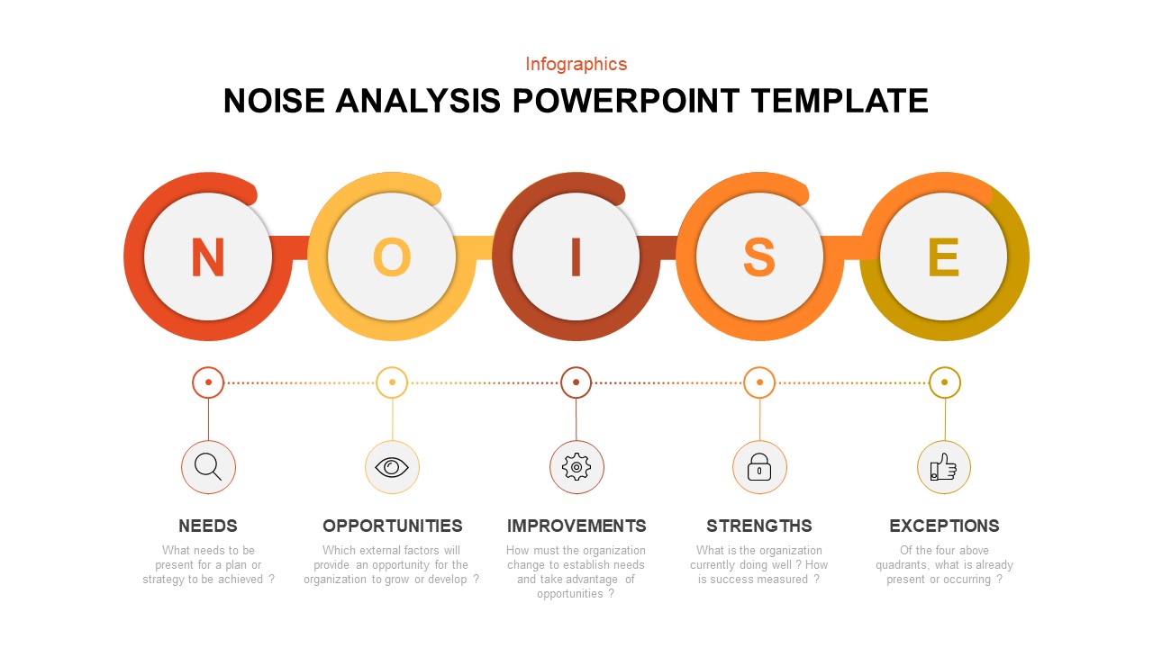
Modern Noise Analysis Infographic Template for PowerPoint & Google Slides
Process
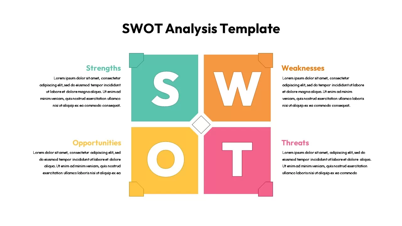
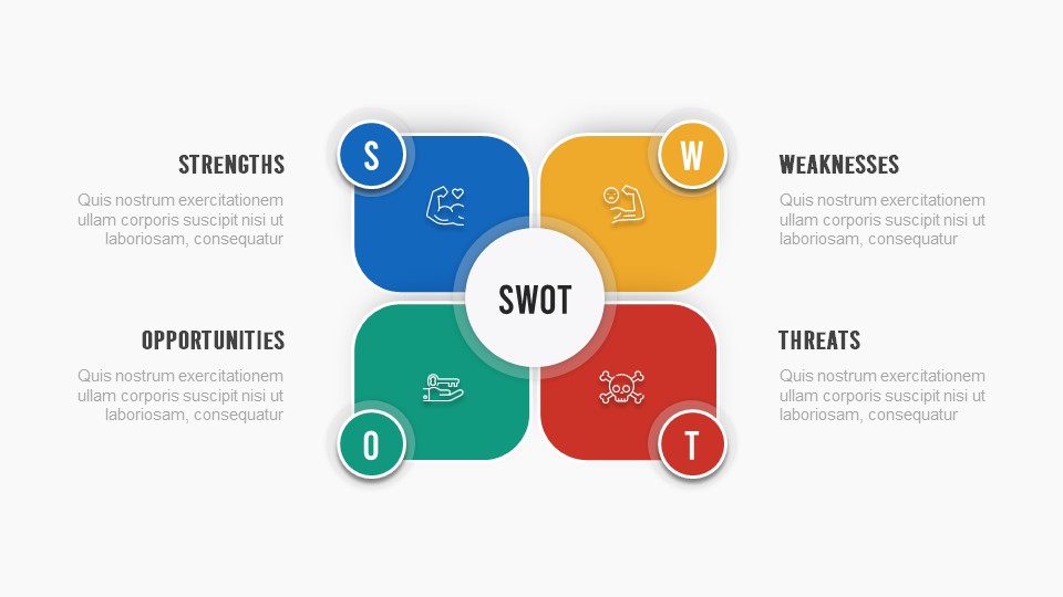
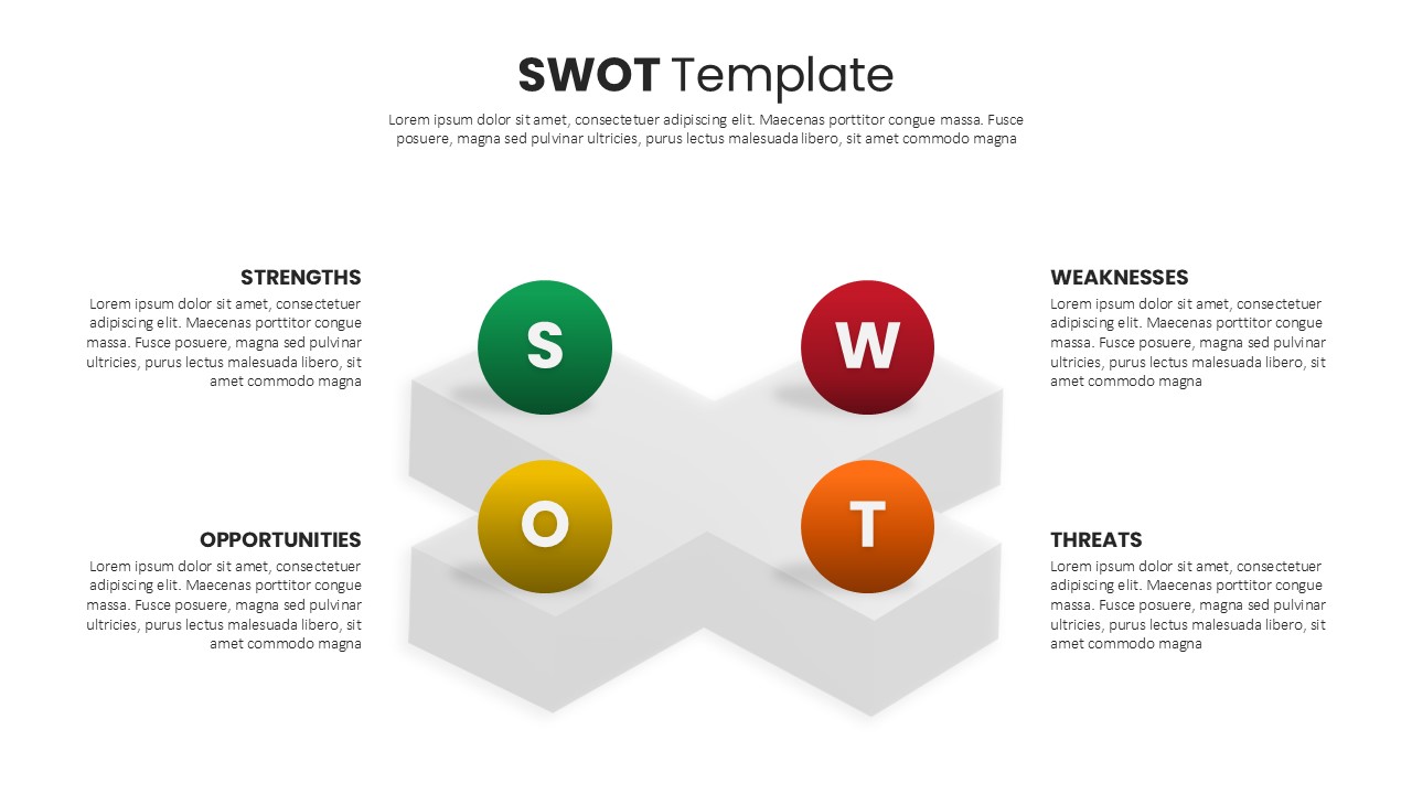
Four-Quadrant SWOT Analysis Diagram Template for PowerPoint & Google Slides
SWOT
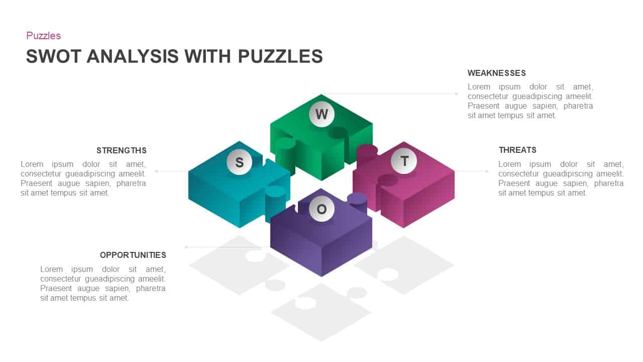
Interactive 3D Puzzle SWOT Analysis Slide Template for PowerPoint & Google Slides
SWOT
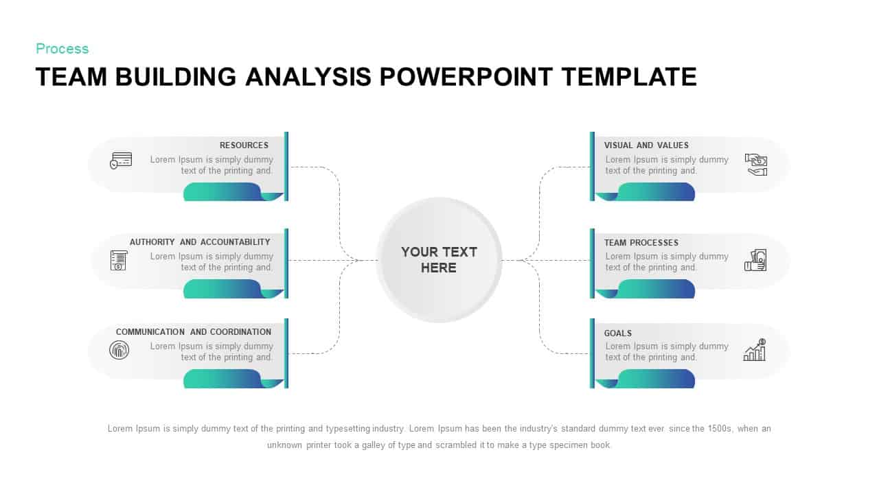
Team Building Hub-and-Spoke Analysis Template for PowerPoint & Google Slides
Process
Four-Part SWOT Analysis Diagram Template for PowerPoint & Google Slides
SWOT
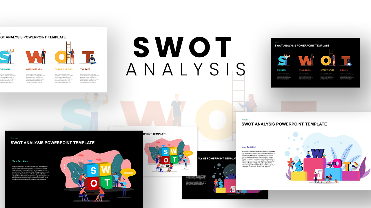
Versatile SWOT Analysis Slide Collection Template for PowerPoint & Google Slides
SWOT
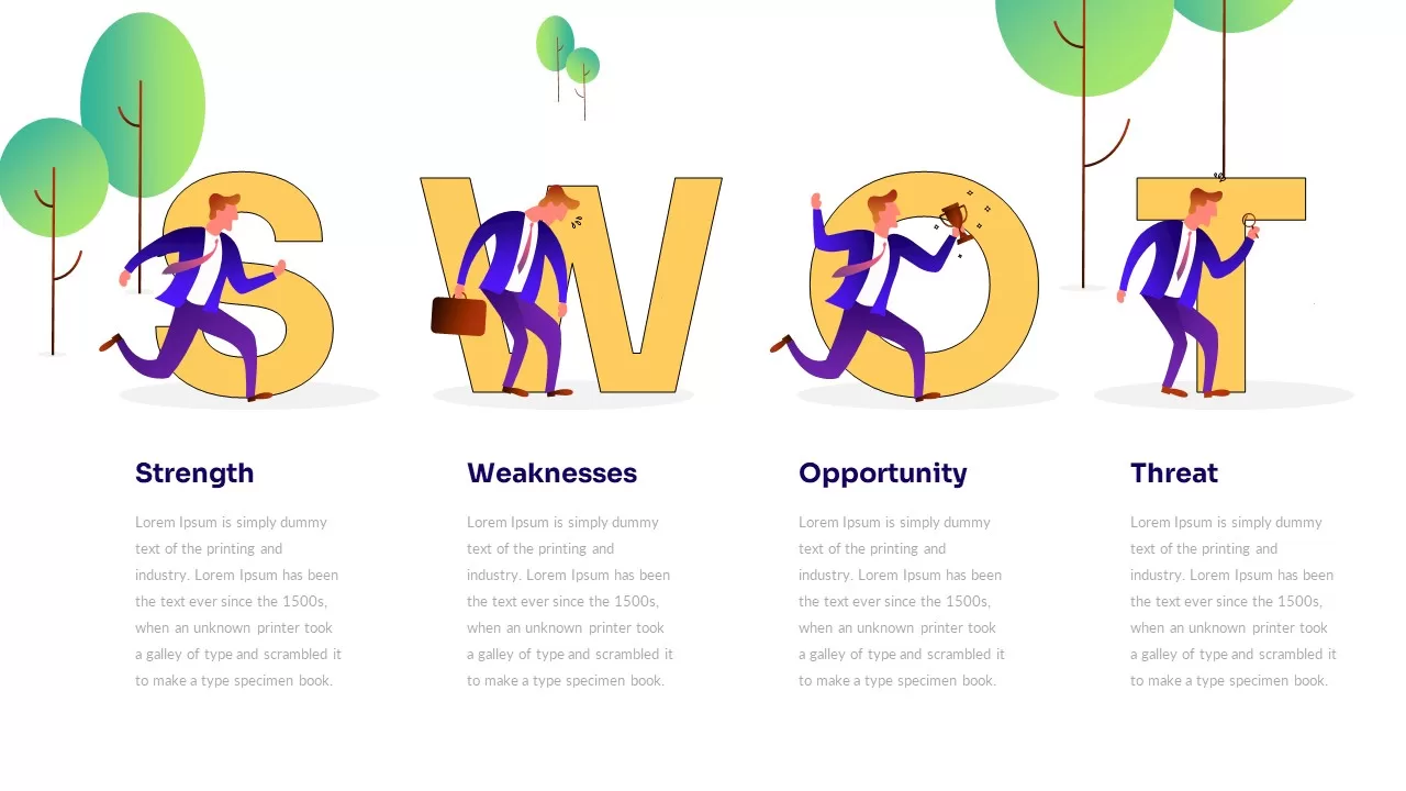
Illustrated Business SWOT Analysis Template for PowerPoint & Google Slides
SWOT
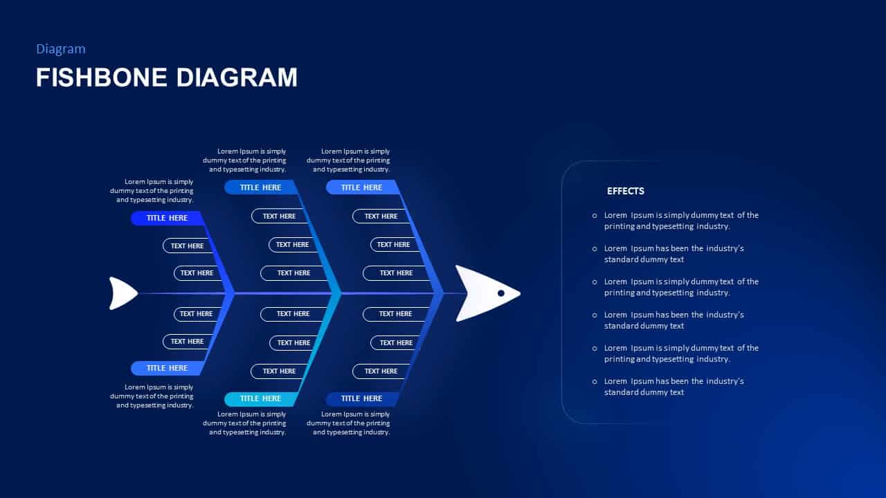
Fishbone Cause Analysis Diagram Template for PowerPoint & Google Slides
Process
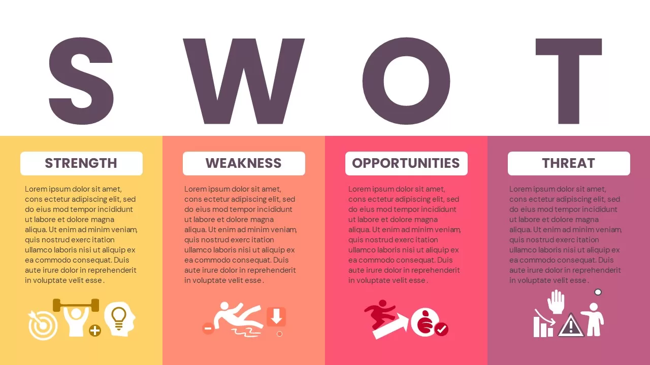
SWOT Analysis Infographic Diagram Template for PowerPoint & Google Slides
SWOT
PESTLE and PEST Strategic Analysis Diagrams Template for PowerPoint & Google Slides
Business Strategy
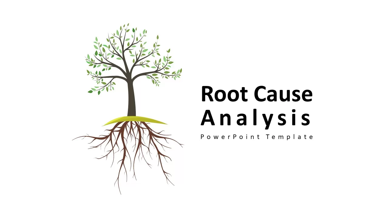
Root Cause Analysis PowerPoint & Google Slides Template for Presentations
Business Strategy
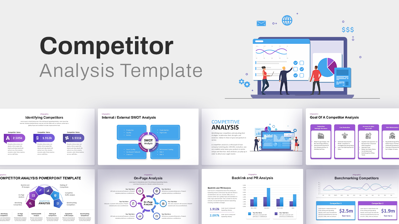
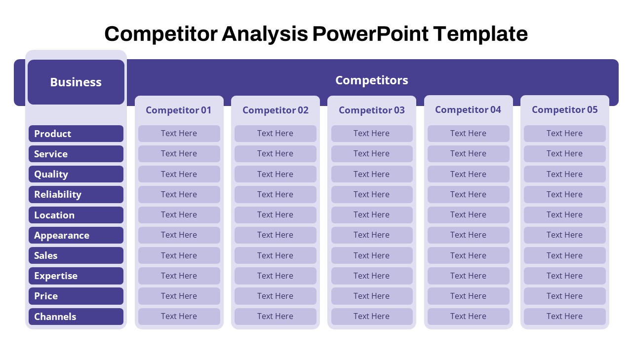
Comprehensive Competitor Analysis Template for PowerPoint & Google Slides
Competitor Analysis
Business Case Deck with Market Analysis Template for PowerPoint & Google Slides
Business Report
Sky and Tree Root Cause Analysis Deck Template for PowerPoint & Google Slides
Opportunities Challenges
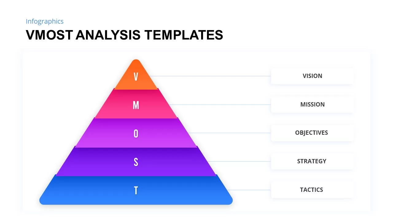
VMOST Analysis Template for PowerPoint & Google Slides
Business Strategy
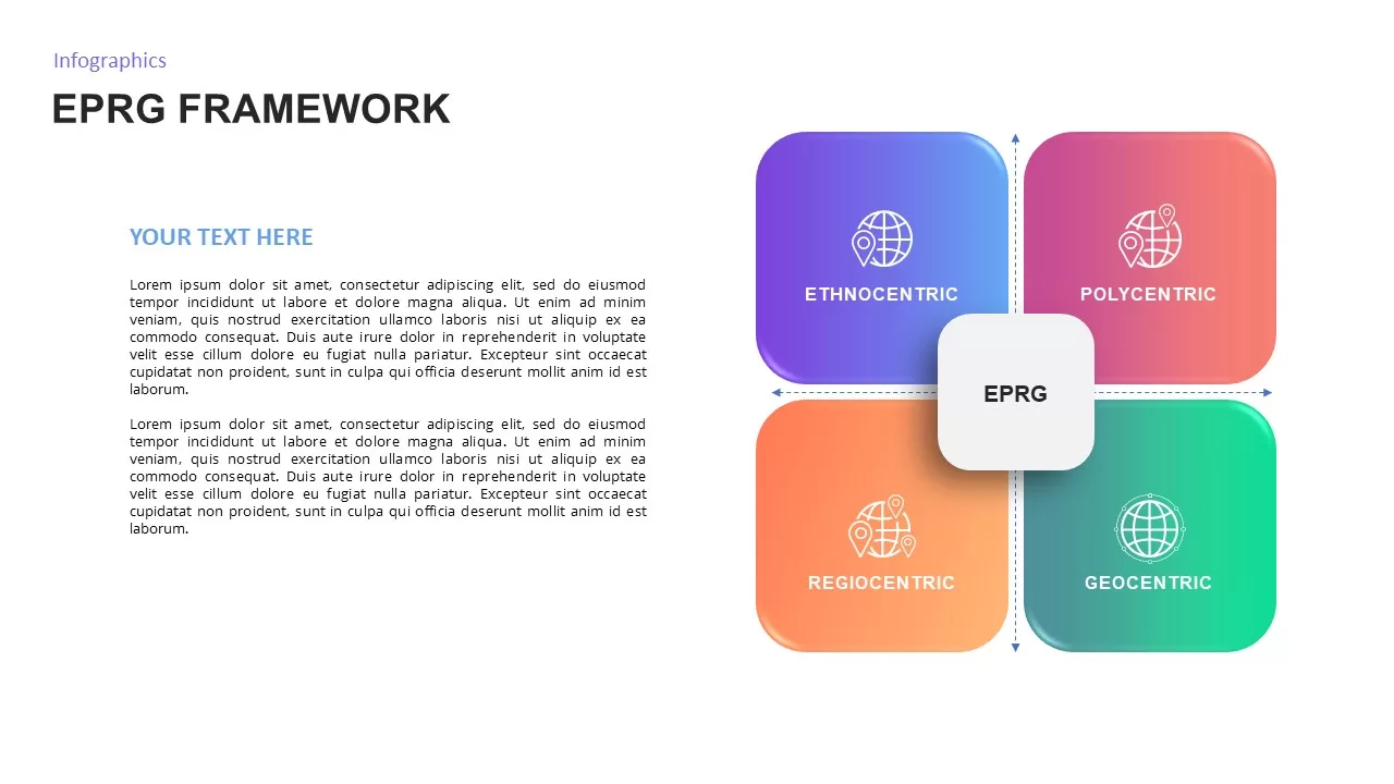
EPRG Framework Analysis template for PowerPoint & Google Slides
Business Strategy
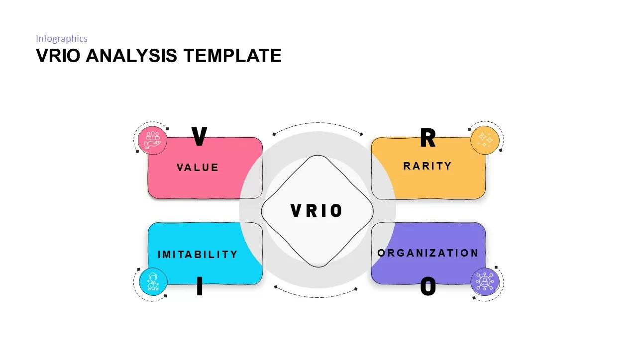
VRIO Analysis Framework template for PowerPoint & Google Slides
Business Strategy
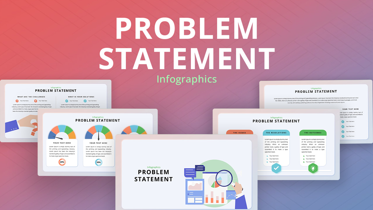
Problem Statement Analysis template for PowerPoint & Google Slides
Business Strategy
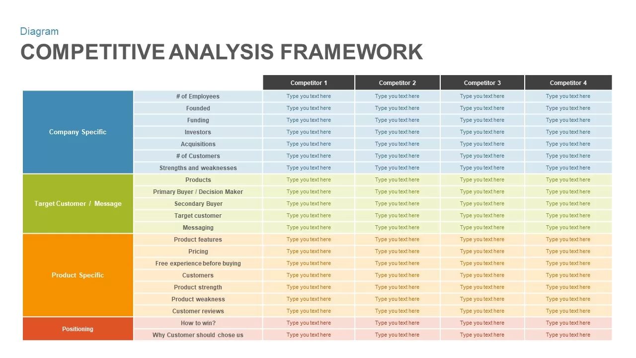
Competitive Analysis Framework template for PowerPoint & Google Slides
Business Report
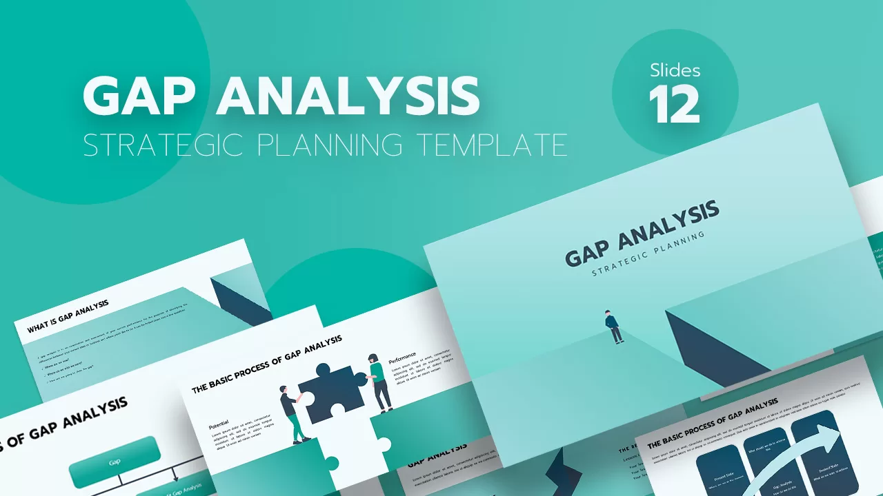
Gap Analysis Strategic Planning Template for PowerPoint & Google Slides
Gap
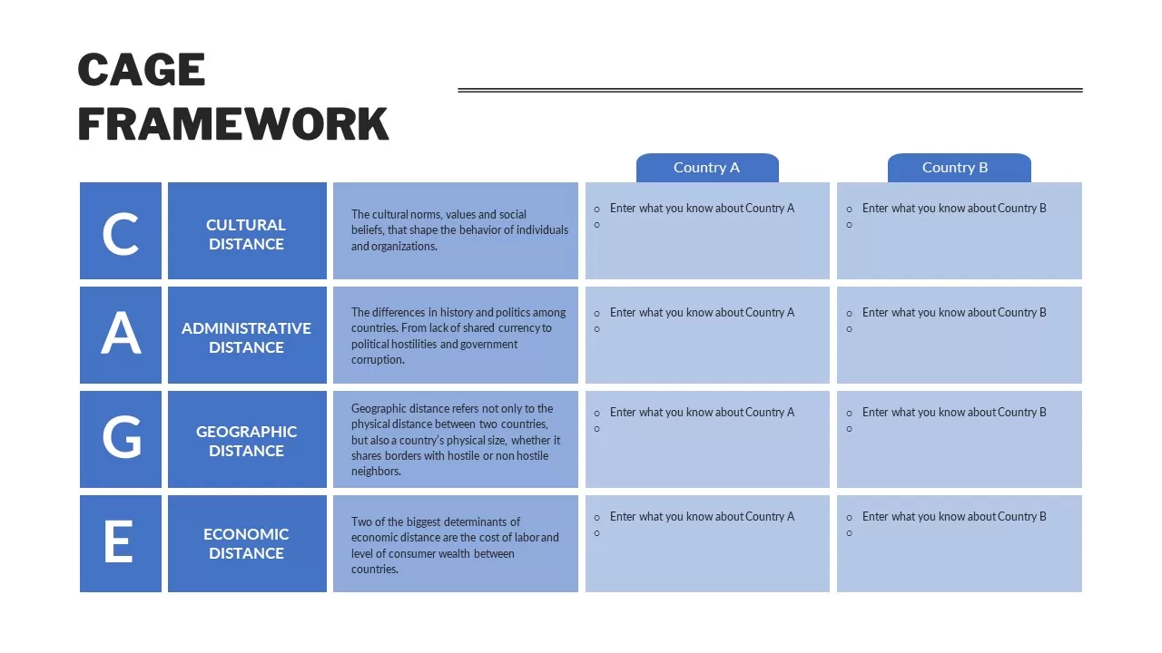
CAGE Distance Analysis Framework Template for PowerPoint & Google Slides
Competitor Analysis
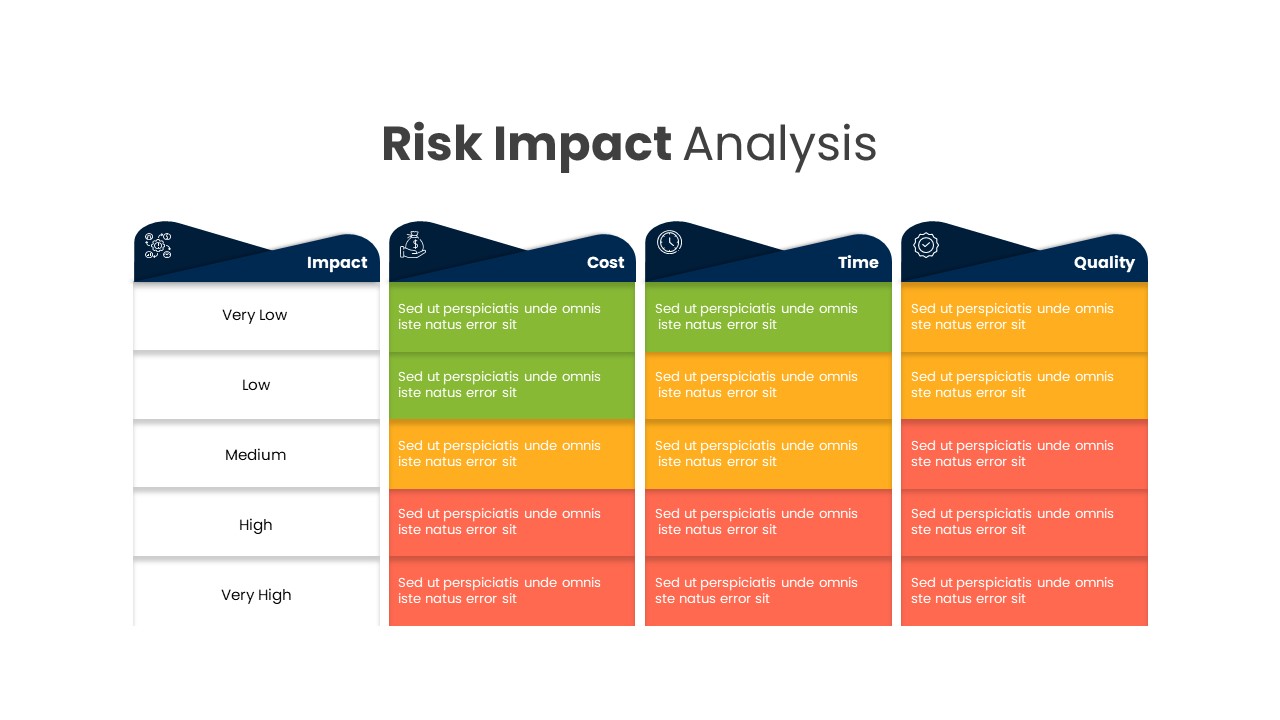
Comprehensive Risk Impact Analysis Template for PowerPoint & Google Slides
Risk Management
Colorful SWOT Analysis Quadrant Template for PowerPoint & Google Slides
SWOT
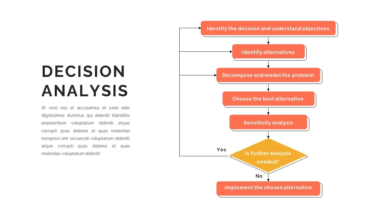
Decision Analysis Process Flowchart Template for PowerPoint & Google Slides
Flow Charts
SWOT Analysis Framework template for PowerPoint & Google Slides
SWOT
SWOT Analysis Visual Overview template for PowerPoint & Google Slides
Business Strategy
SWOT Analysis Quadrant template for PowerPoint & Google Slides
Business Strategy
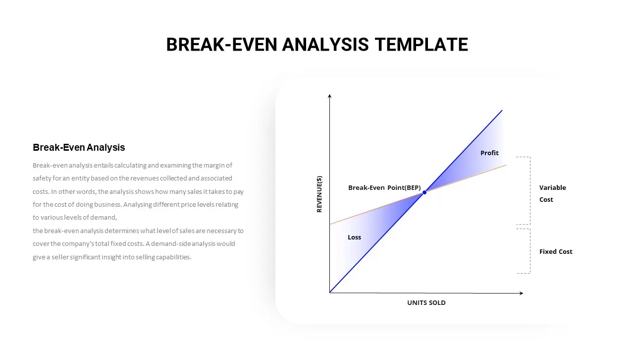
Break-Even Analysis Infographic Template for PowerPoint & Google Slides
Revenue
Free SWOT Analysis Overview template for PowerPoint & Google Slides
SWOT
Free
SWOT Analysis template for PowerPoint & Google Slides
SWOT
SWOT Analysis template for PowerPoint & Google Slides
SWOT
Heat Map Analysis Template for PowerPoint & Google Slides
Risk Management
Checkmate Slide for Competitor Analysis Template for PowerPoint & Google Slides
Competitor Analysis
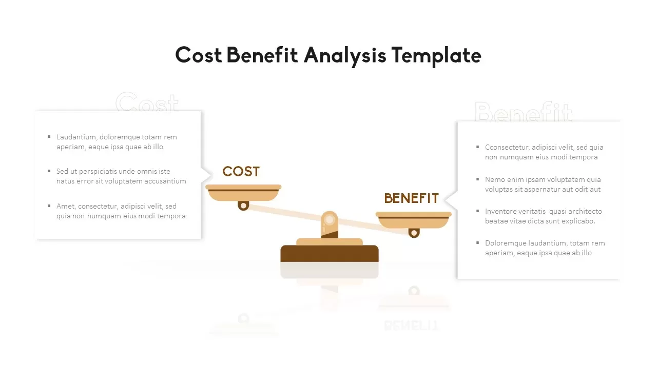
Cost Benefit Analysis Comparison Template for PowerPoint & Google Slides
Comparison
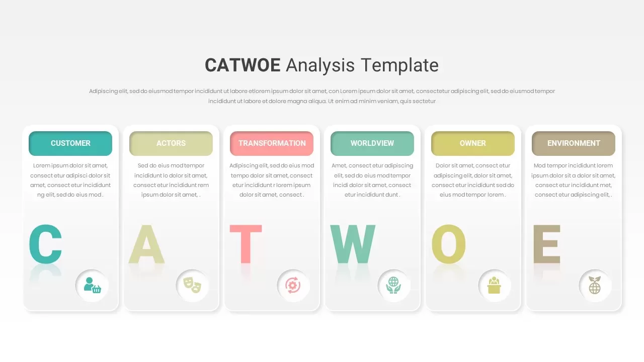
CATWOE Analysis Template for PowerPoint & Google Slides
Process
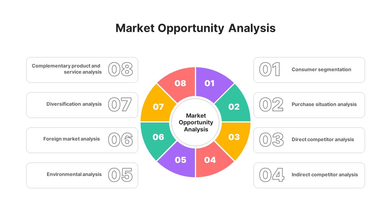
Market Opportunity Analysis Wheel template for PowerPoint & Google Slides
Business Strategy
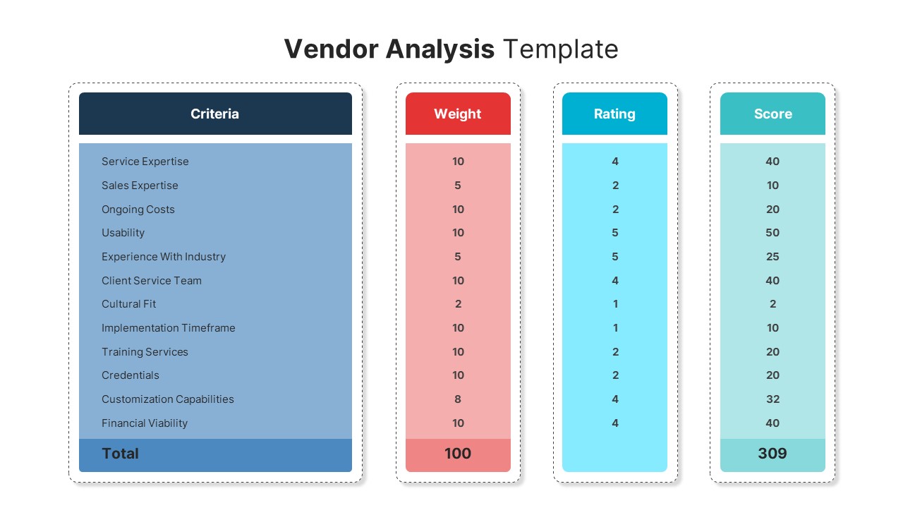
Vendor Analysis Criteria and Scoring template for PowerPoint & Google Slides
Business
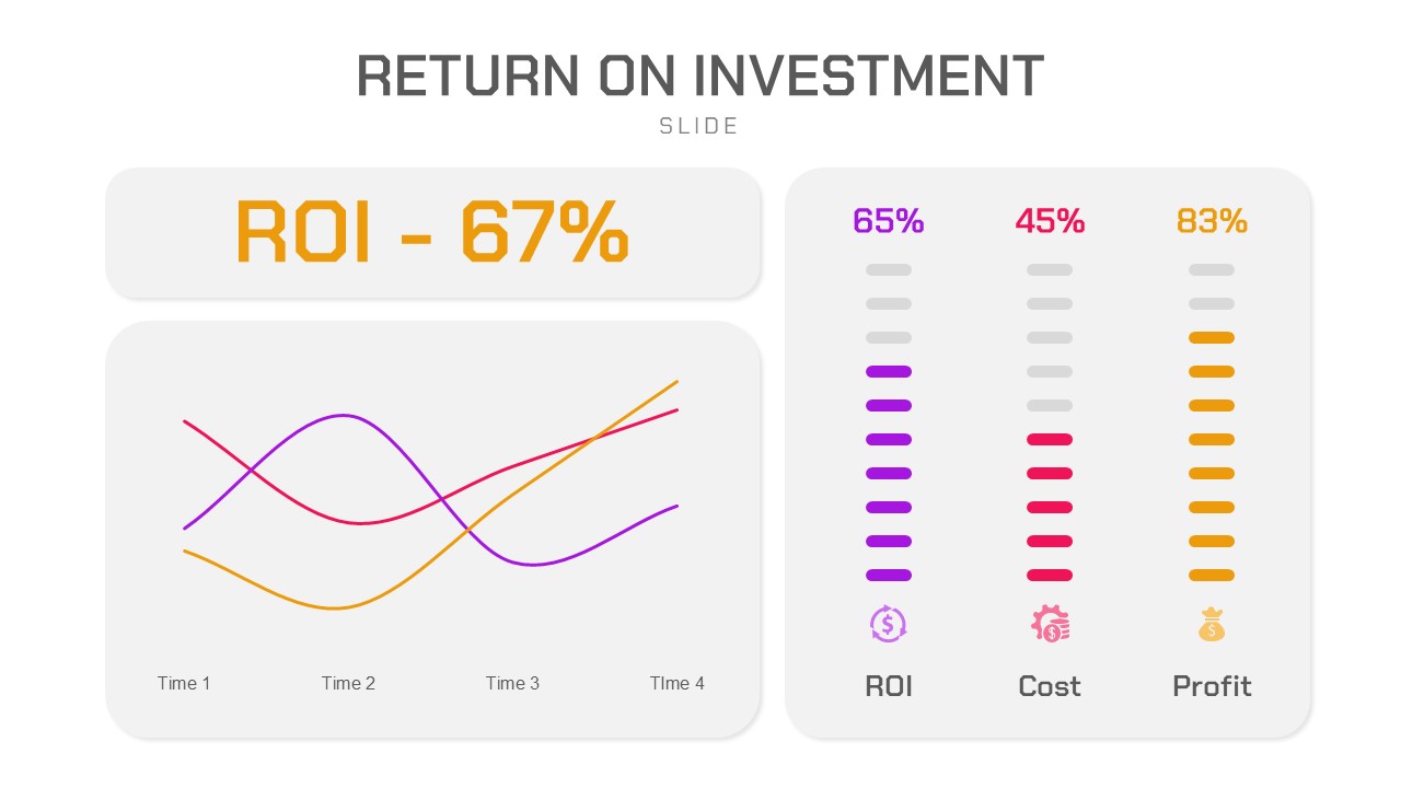
Return on Investment (ROI) Analysis template for PowerPoint & Google Slides
Business Report
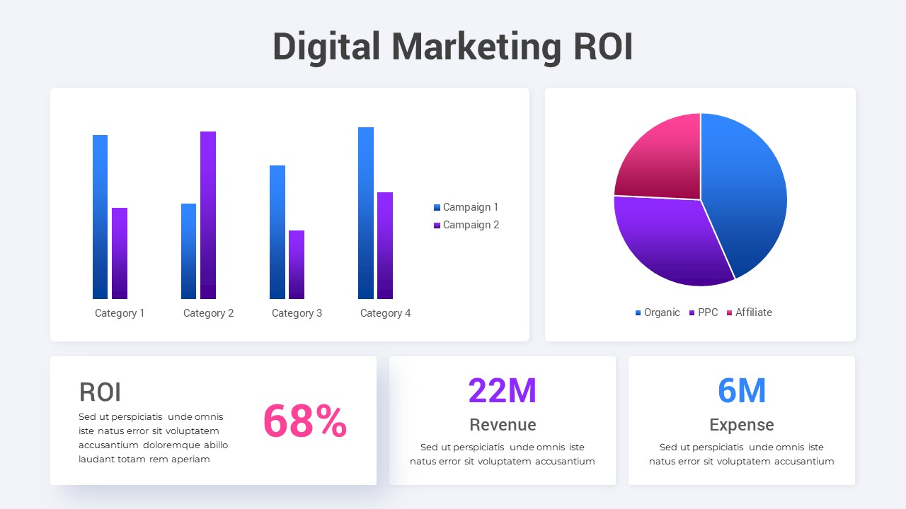
Digital Marketing ROI Analysis template for PowerPoint & Google Slides
Digital Marketing
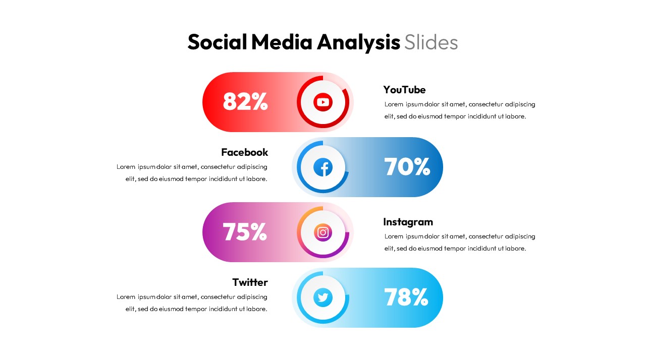
Social Media Analysis Metrics Slide Deck Template for PowerPoint & Google Slides
Digital Marketing
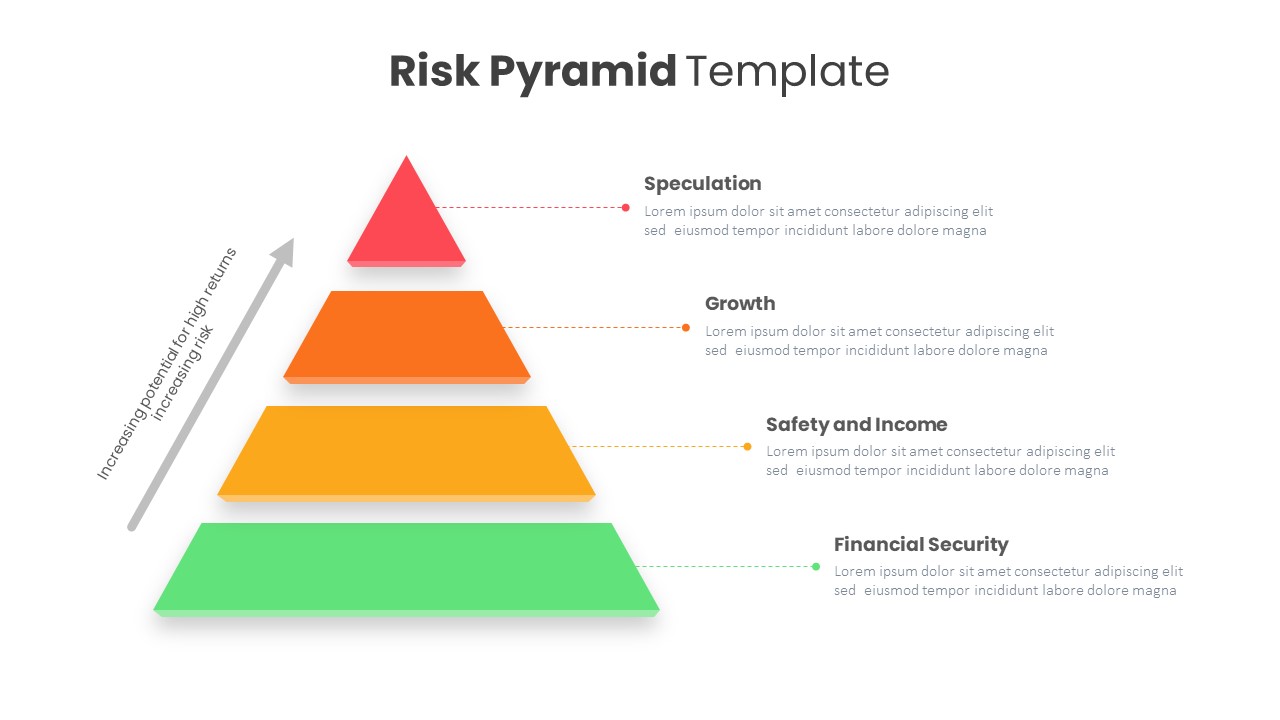
Risk Pyramid Hierarchy Analysis Template for PowerPoint & Google Slides
Pyramid
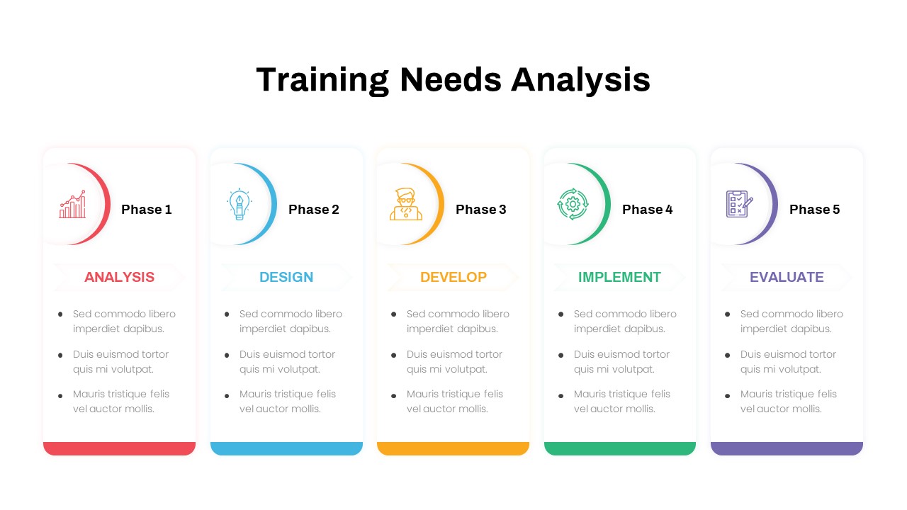
Training Needs Analysis Process Template for PowerPoint & Google Slides
Employee Performance
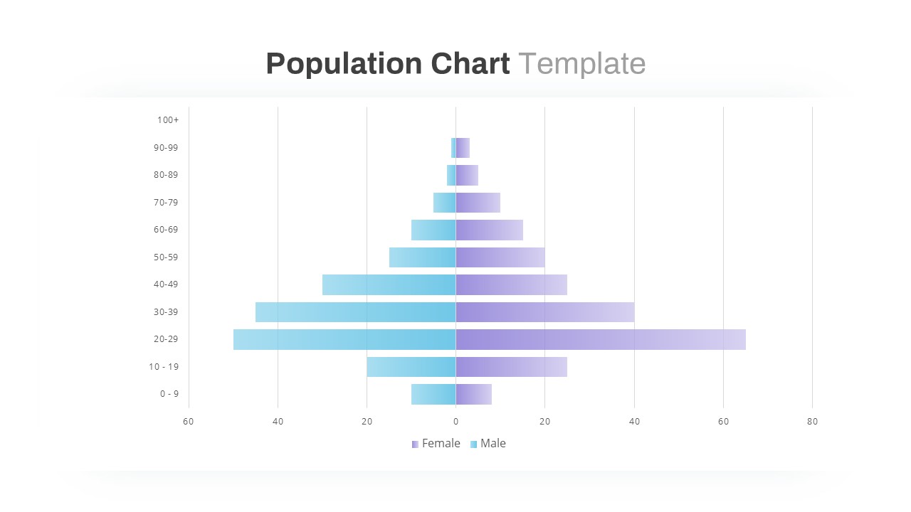
Population Pyramid Chart Analysis Template for PowerPoint & Google Slides
Bar/Column
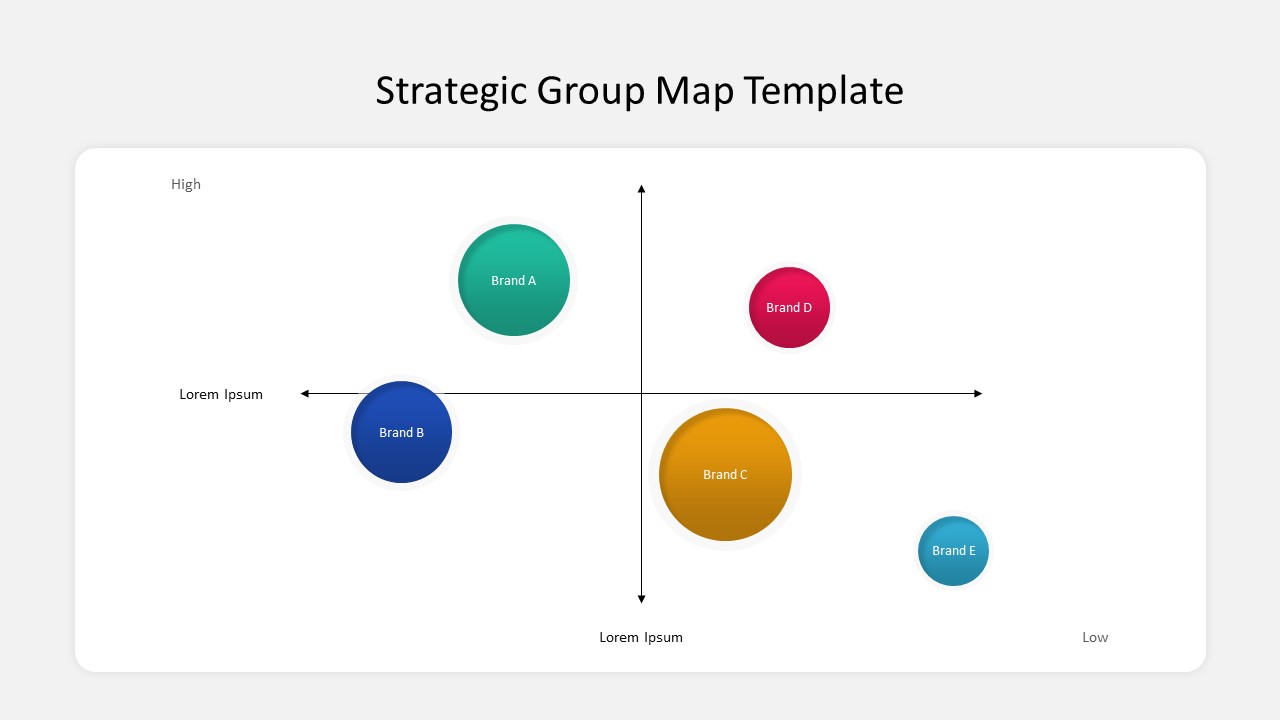
Business Strategic Group Map Analysis Template for PowerPoint & Google Slides
Competitor Analysis
Free
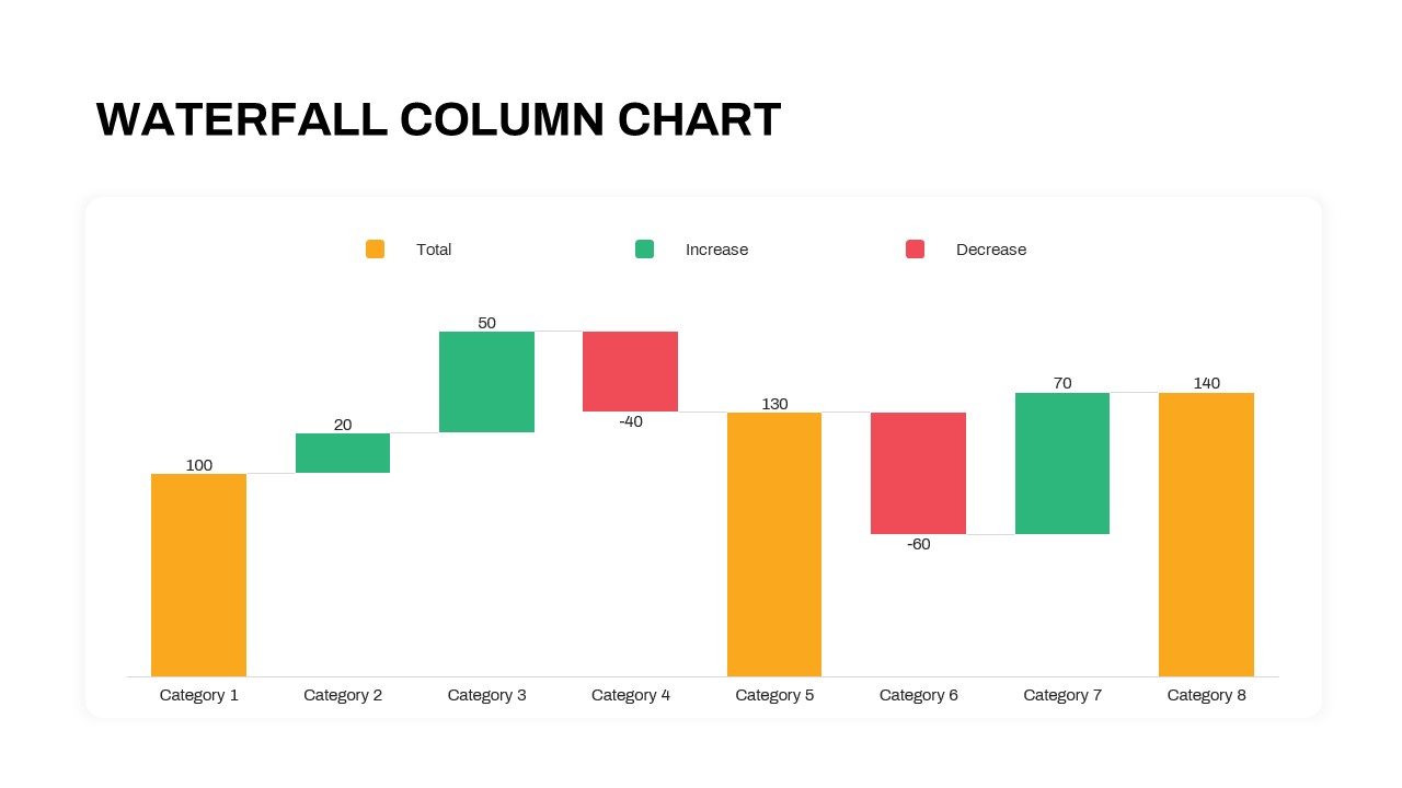
Waterfall Column Chart Analysis Template for PowerPoint & Google Slides
Bar/Column
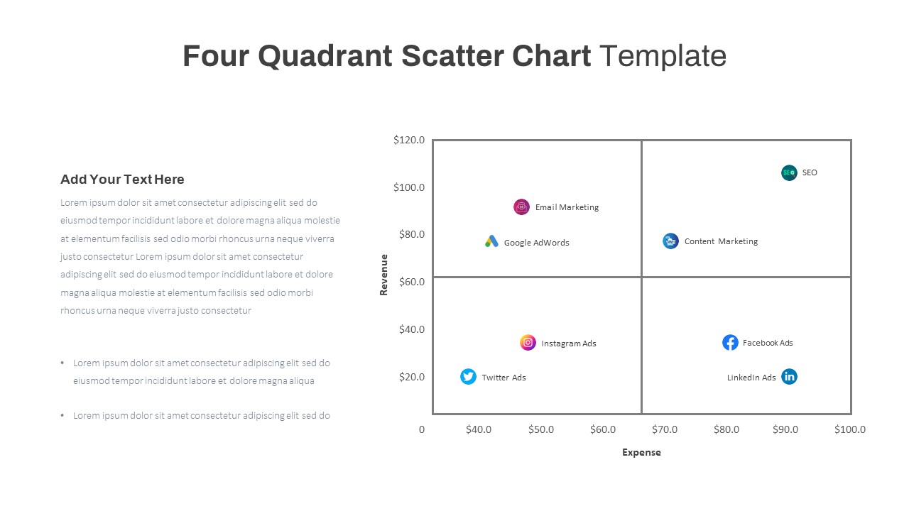
Four Quadrant Scatter Chart Analysis Template for PowerPoint & Google Slides
Comparison Chart
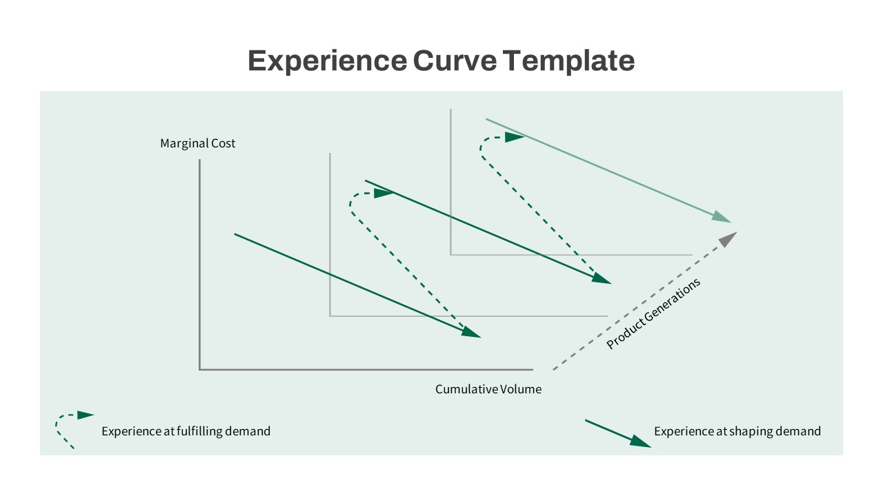
Experience Curve Analysis Diagram Template for PowerPoint & Google Slides
Business Strategy
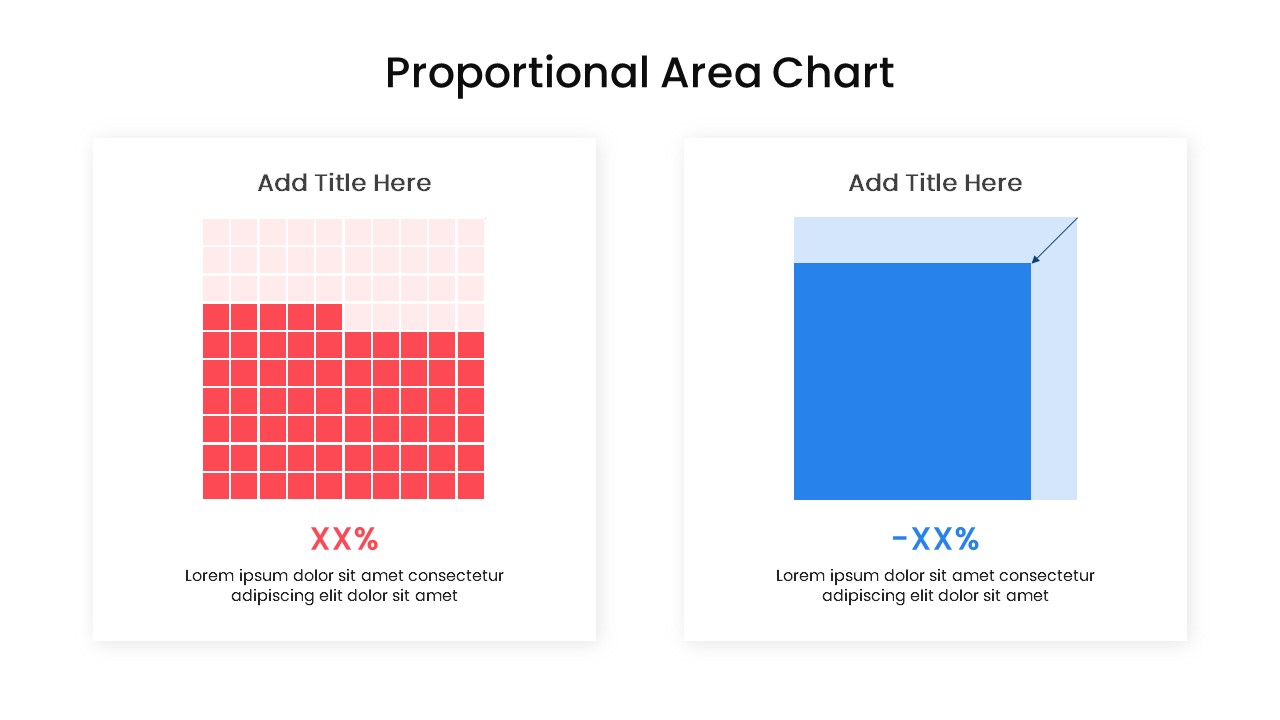
Proportional Area Chart Analysis Template for PowerPoint & Google Slides
Comparison Chart
Free Competitor Analysis Matrix Template for PowerPoint & Google Slides
Competitor Analysis
Free
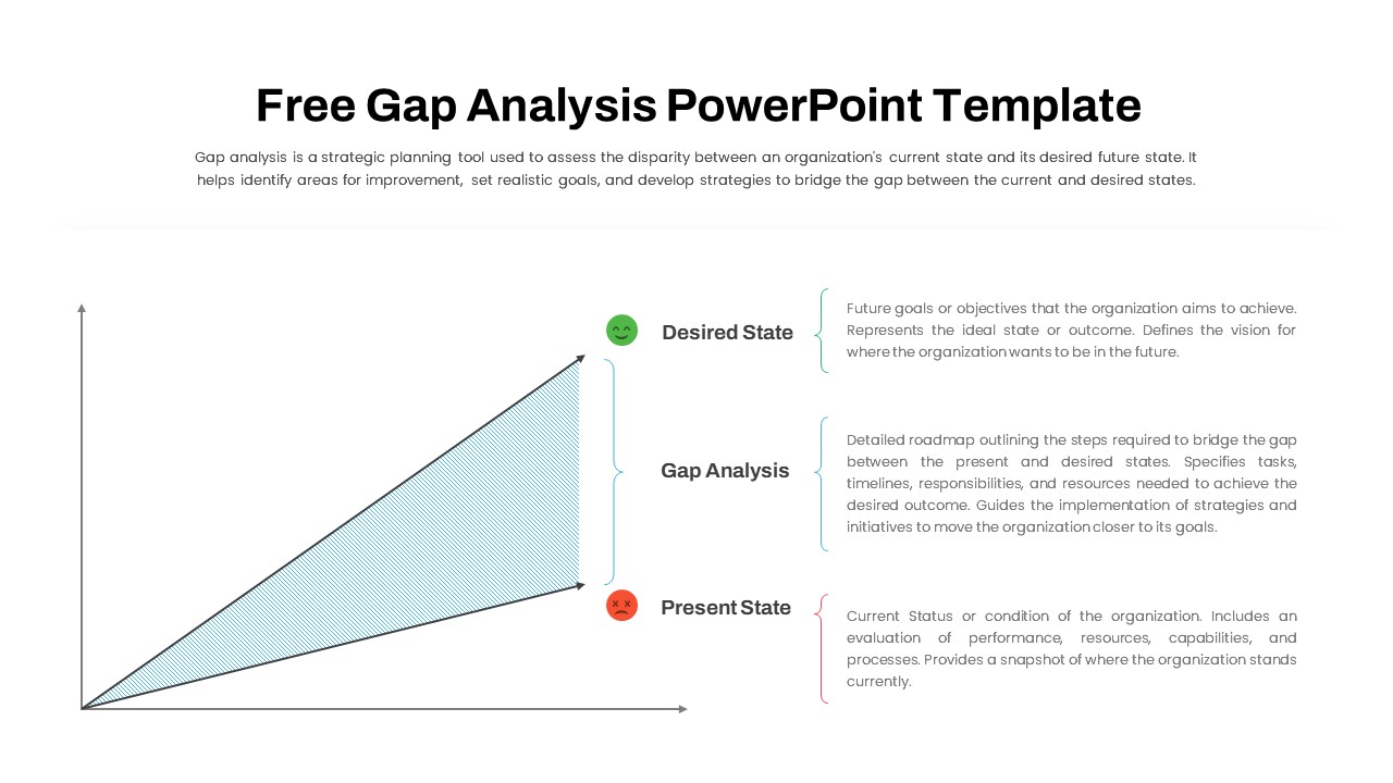
Free Comprehensive Gap Analysis Framework Template for PowerPoint & Google Slides
Opportunities Challenges
Free
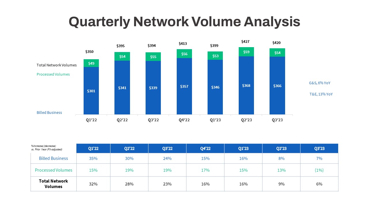
Quarterly Network Volume Analysis Template for PowerPoint & Google Slides
Business Report
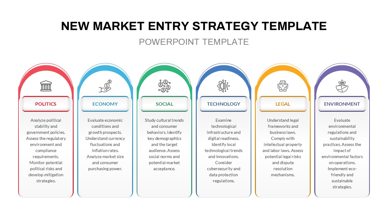
PESTLE Analysis for Market Entry Template for PowerPoint & Google Slides
PEST
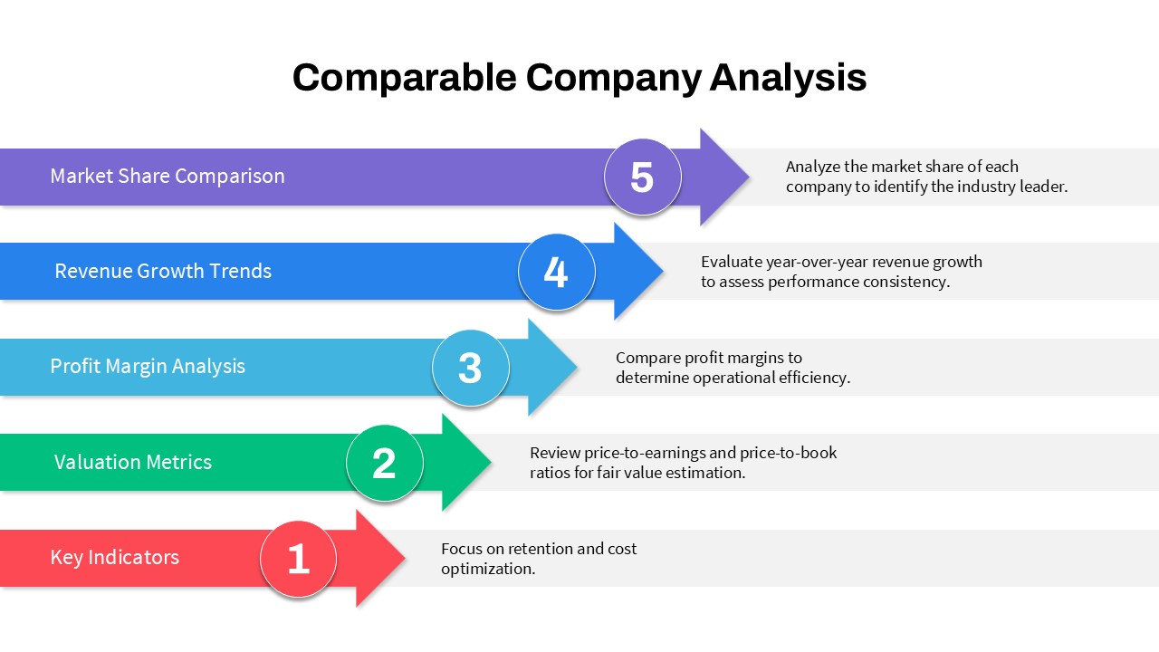
5-Step Comparable Company Analysis Template for PowerPoint & Google Slides
Arrow
Data Analysis Bar Chart with Insights Template for PowerPoint & Google Slides
Bar/Column
Free
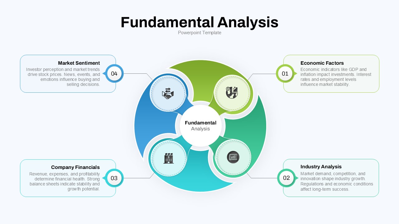
Fundamental Analysis Circular Diagram Template for PowerPoint & Google Slides
Circular
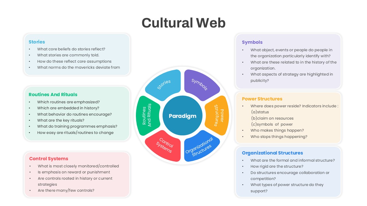
Cultural Web Analysis Circular Diagram Template for PowerPoint & Google Slides
Circular
Marketing SWOT Analysis Slide Template for PowerPoint & Google Slides
SWOT
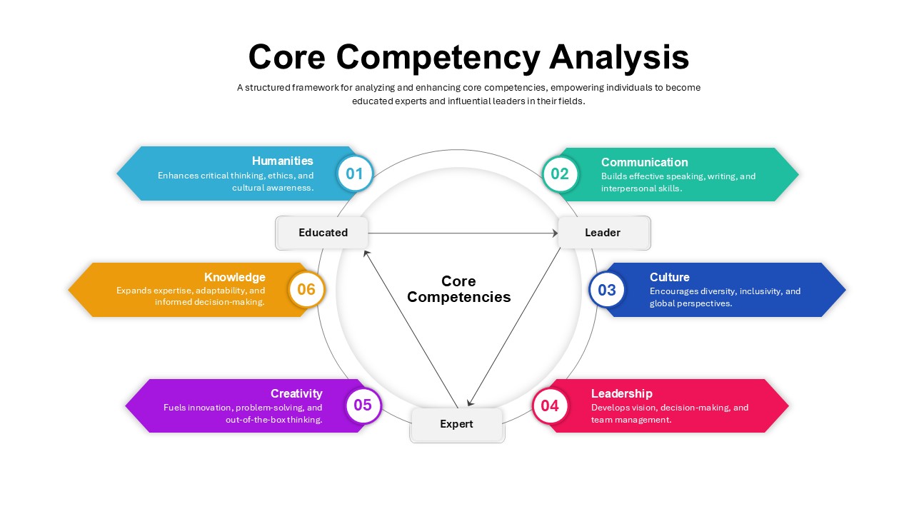
Core Competency Analysis Circular Template for PowerPoint & Google Slides
Circular
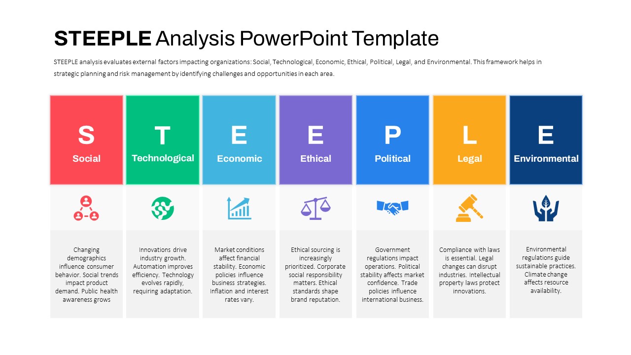
STEEPLE Analysis framework template for PowerPoint & Google Slides
Business Strategy
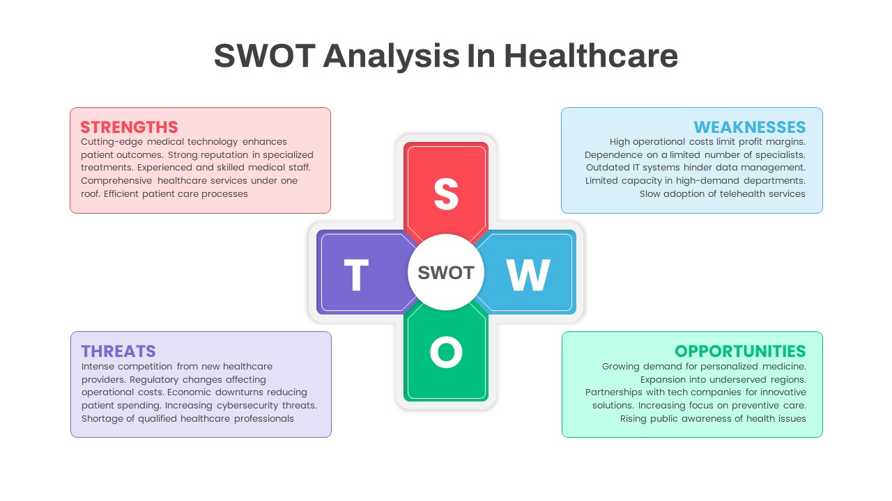
SWOT Analysis in Healthcare template for PowerPoint & Google Slides
SWOT
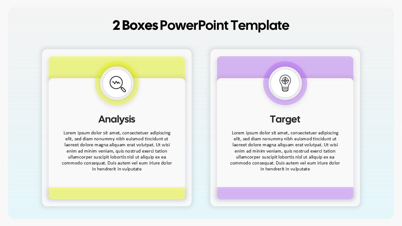
Two-Box Analysis & Target Comparison Template for PowerPoint & Google Slides
Comparison
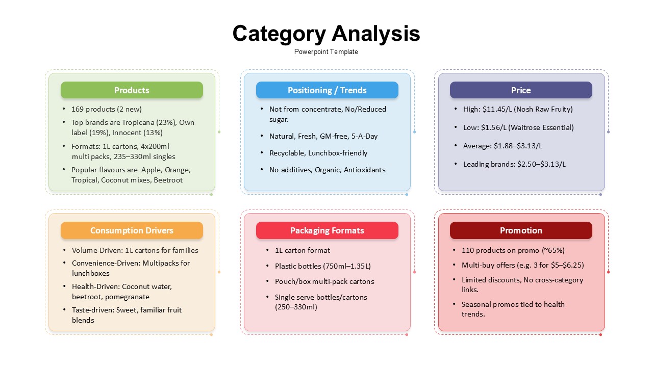
Category Analysis Comparison Infographic Template for PowerPoint & Google Slides
Comparison
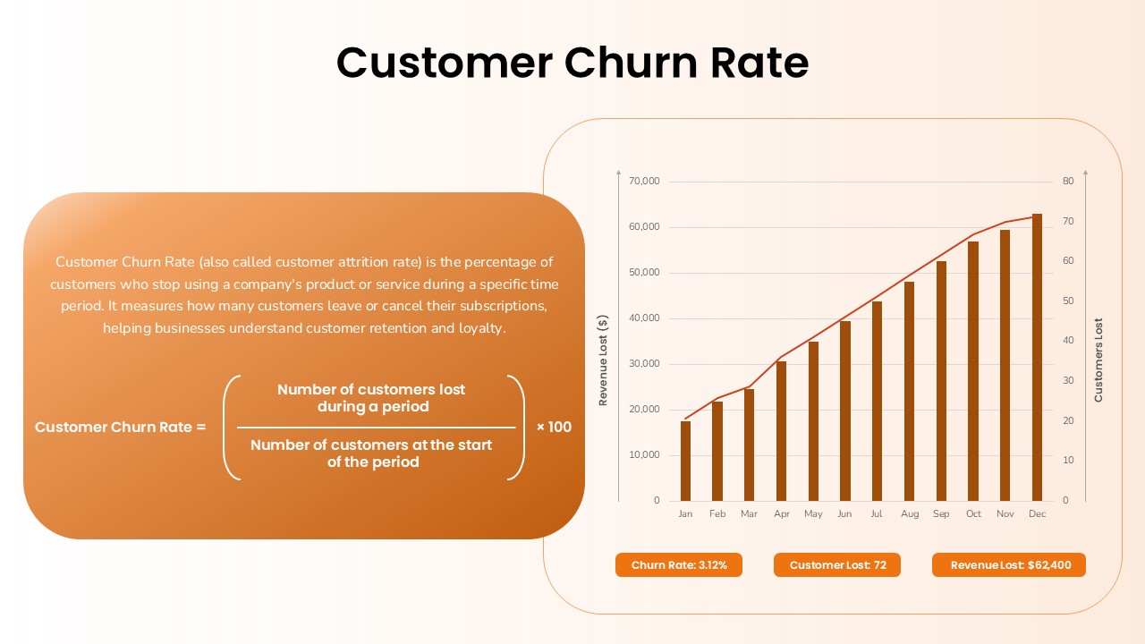
Customer Churn Rate Analysis template for PowerPoint & Google Slides
Business Report
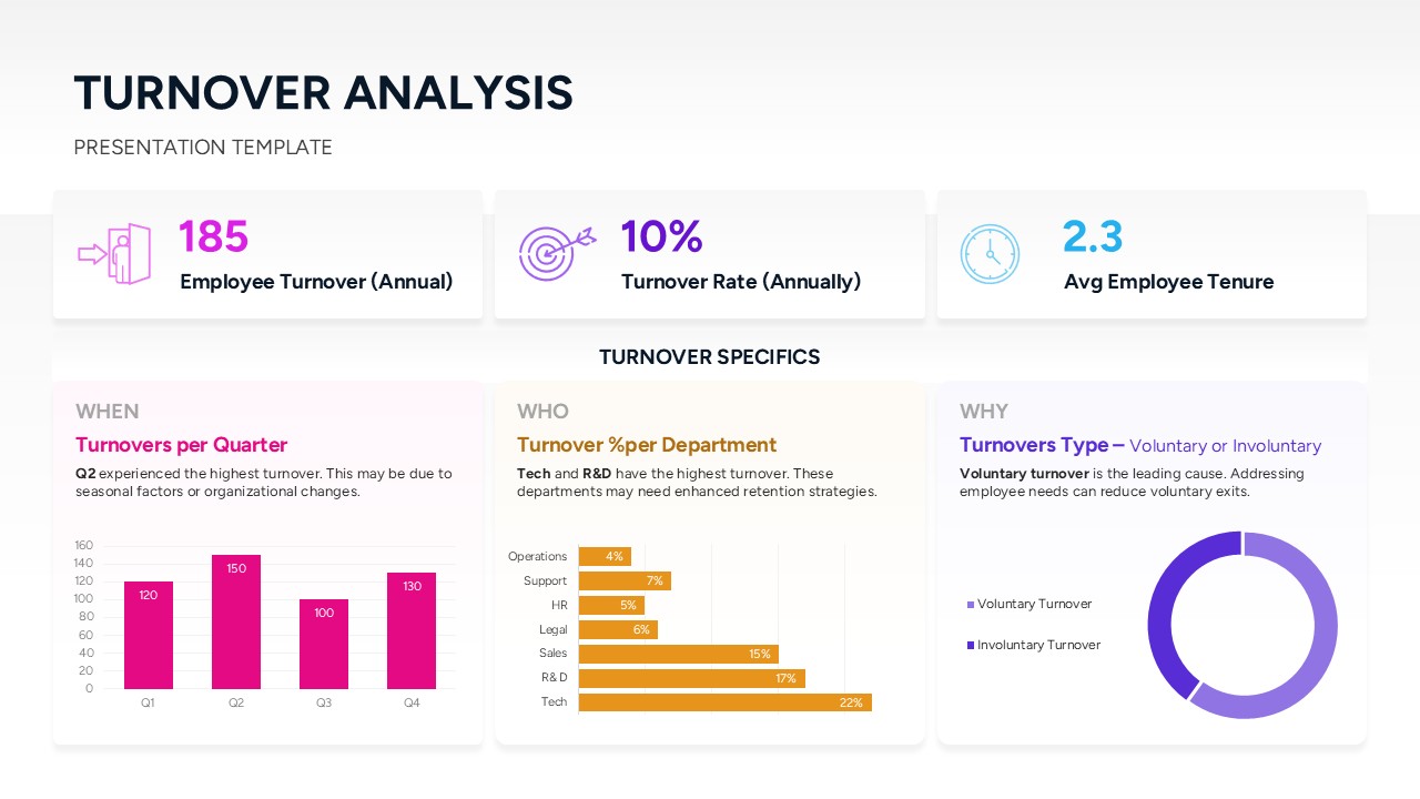
Turnover Analysis Dashboard Template for PowerPoint & Google Slides
Employee Performance
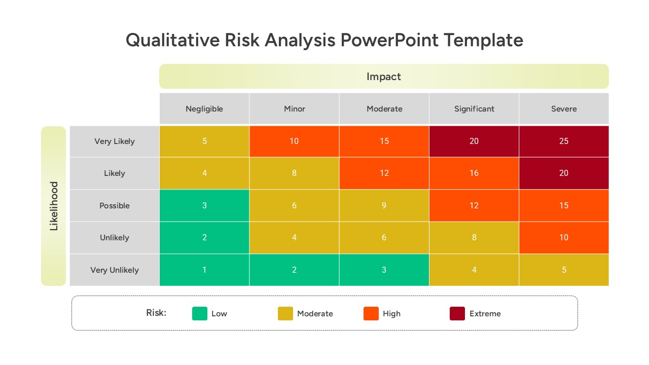
Qualitative Risk Analysis template for PowerPoint & Google Slides
Business
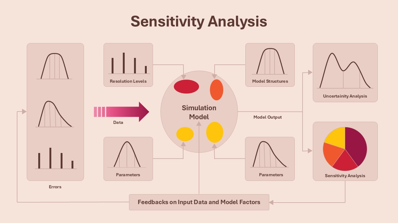
Sensitivity Analysis Framework template for PowerPoint & Google Slides
Business Strategy
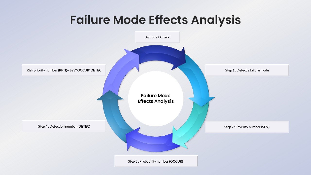
Failure Mode Effects Analysis (FMEA) Slide Template for PowerPoint & Google Slides
Process
Colorful SWOT Analysis Quadrant Template for PowerPoint & Google Slides
SWOT
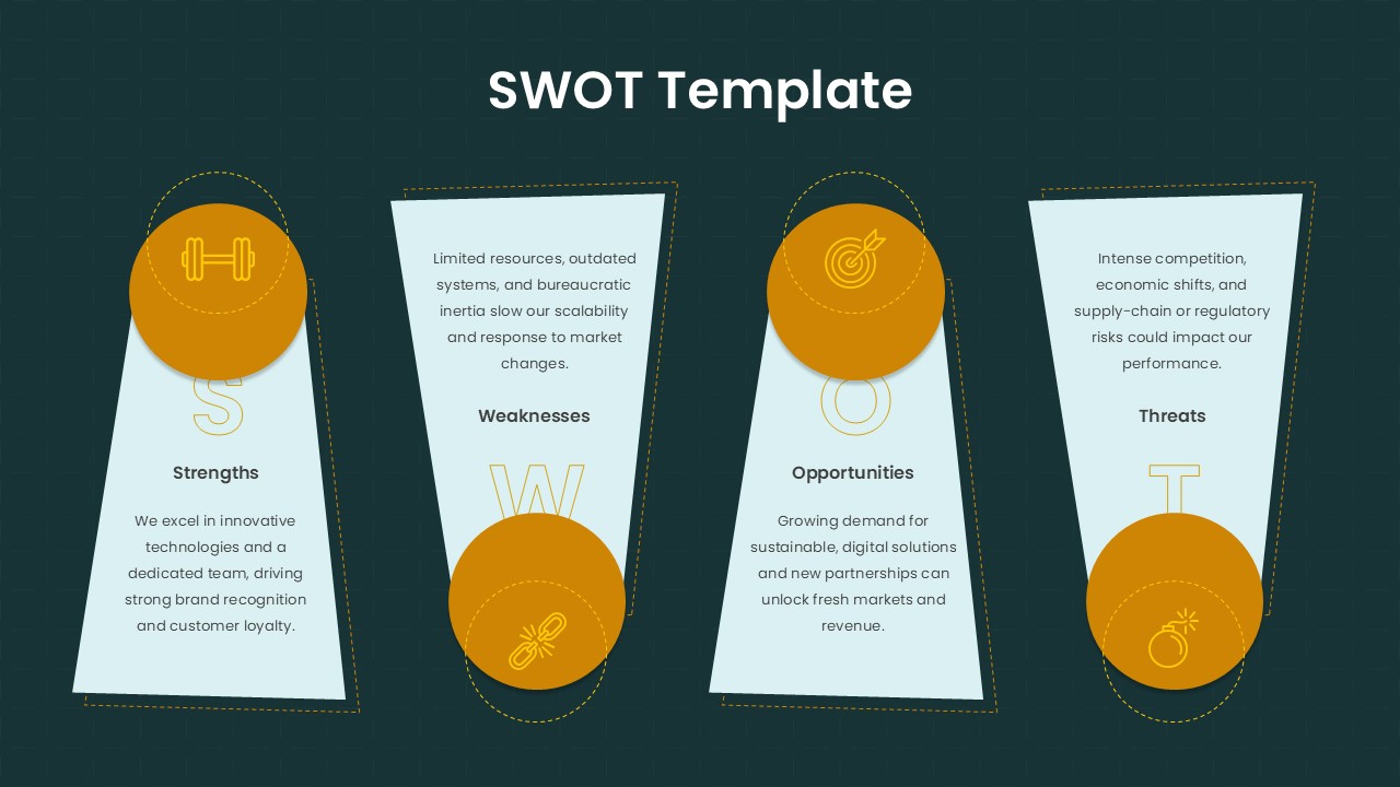
Trapezoid SWOT Analysis Template for PowerPoint & Google Slides
SWOT
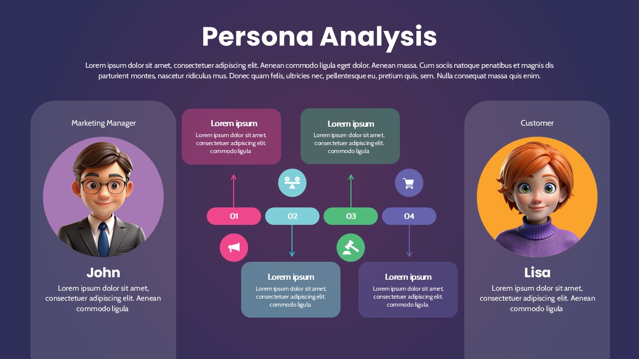
Persona Analysis Template for PowerPoint & Google Slides
Infographics
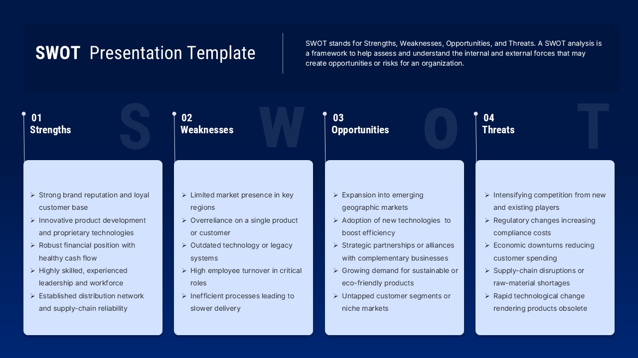
Blue SWOT Analysis Presentation Template for PowerPoint & Google Slides
SWOT
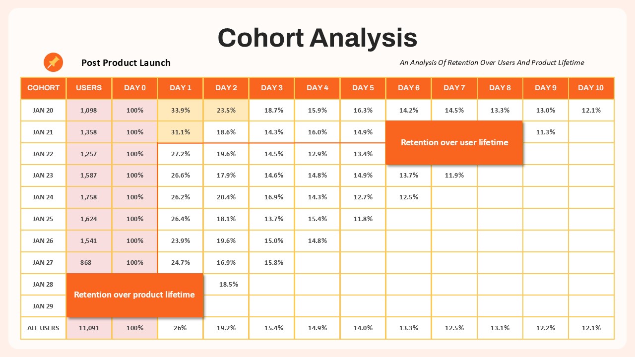
Cohort Analysis Retention Dashboard Template for PowerPoint & Google Slides
Comparison Chart
Multi Color SWOT Analysis Quadrant Template for PowerPoint & Google Slides
SWOT
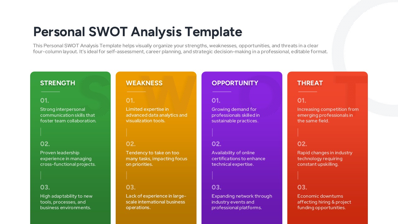
Personal SWOT Analysis Matrix Cards Template for PowerPoint & Google Slides
SWOT
Blank SWOT Analysis Template for PowerPoint & Google Slides
SWOT
3D Quadrant SWOT Analysis Template for PowerPoint & Google Slides
SWOT
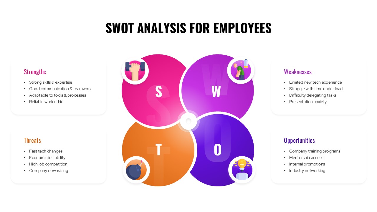
SWOT Analysis For Employees Template for PowerPoint & Google Slides
SWOT
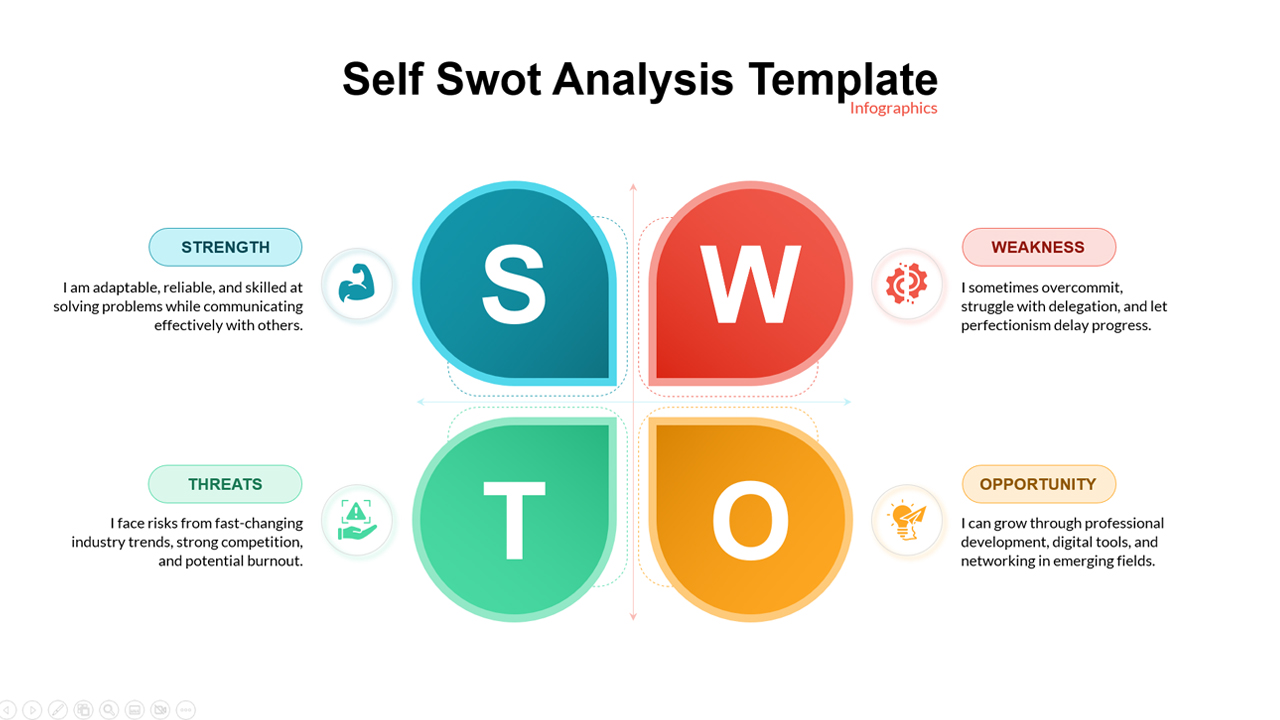
Self SWOT Analysis Template for PowerPoint & Google Slides
SWOT
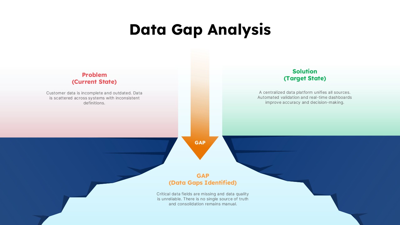
Data Gap Analysis Template for PowerPoint & Google Slides
Business
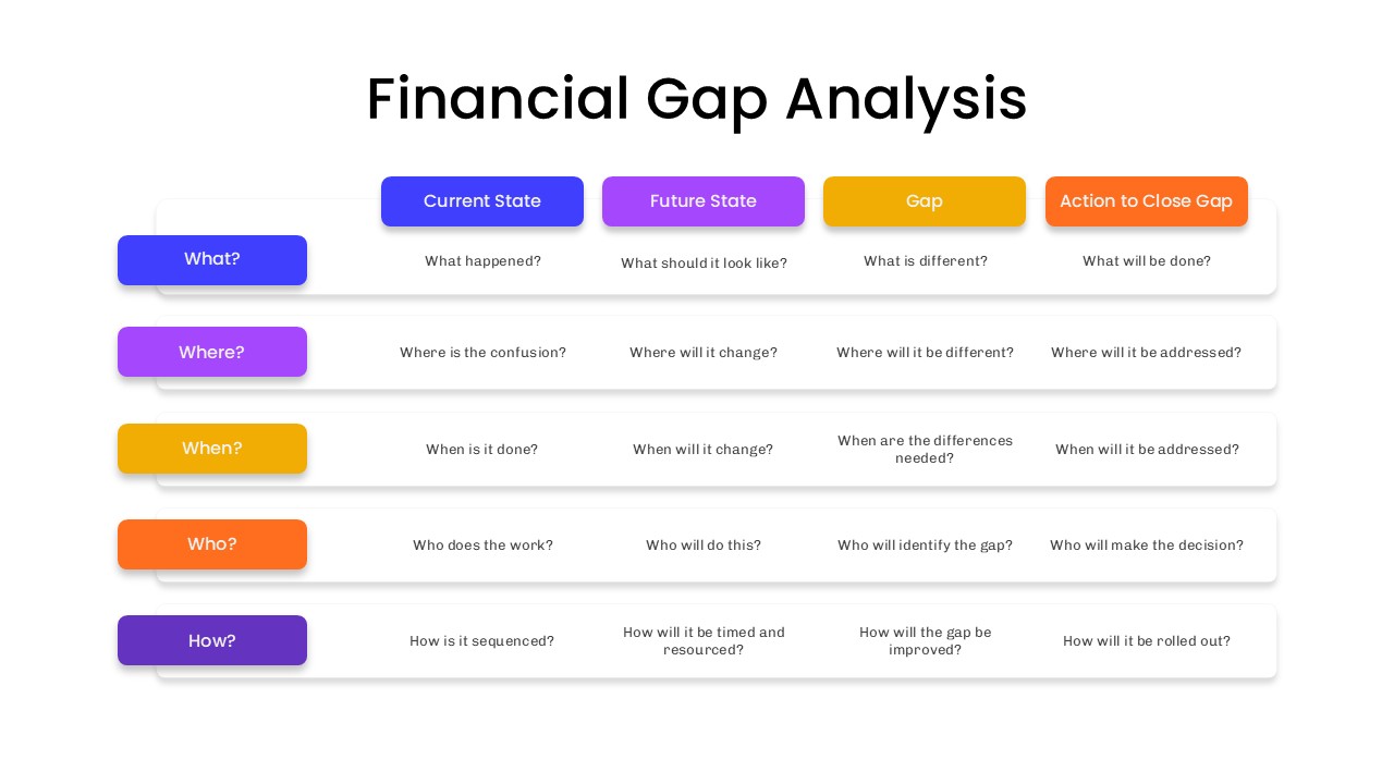
Financial Gap Analysis Framework Template for PowerPoint & Google Slides
Finance
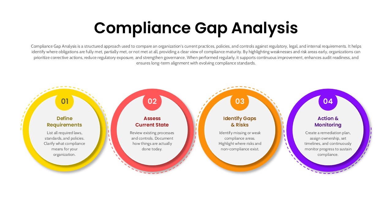
4 Step Compliance Gap Analysis Process Template for PowerPoint & Google Slides
Risk Management