Free Economics PowerPoint Template & Google Slide

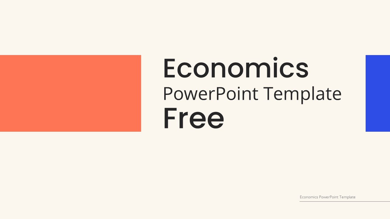


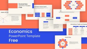


Free Economics PowerPoint Template for Classroom Presentations
The Free Economics Presentation PowerPoint template is designed to impart an understanding of economic principles. Tailored for educational use, it comprises 12 slides featuring topics, charts, images, vector infographics, and diagrams, offering a complete platform for delving into economic and fiscal matters. This resource is crafted to equip your audience with a nuanced comprehension of various facets of economics, consolidating key concepts in an organized and visually engaging format. Whether for classroom instruction or professional development, this template assists as a versatile tool for fostering knowledge and insight into the complexities of economic theory and practice.
What are key economics concepts?
Key economics concepts encompass a broad array of principles that form the foundation of understanding how societies allocate resources and make decisions. These include supply and demand, which dictate pricing and production levels in markets, as well as elasticity, which measures the responsiveness of quantity demanded or supplied to changes in price. Additionally, concepts such as opportunity cost highlight the trade-offs inherent in decision-making, while comparative advantage elucidates the benefits of specialization and trade between individuals and nations. Other fundamental concepts include inflation, unemployment, fiscal and monetary policy, and the role of government intervention in regulating markets and addressing market failures. Understanding these concepts is essential for analyzing economic phenomena and formulating effective policy responses to economic challenges.
Free PowerPoint for economics presentations is designed for educators, students, and professionals in economics research and practices. It can be utilized for academic lectures, research presentations, business reports, economic policy proposals, financial analyses, and more.
The 12 free PowerPoint Slides in the economics template are arranged in the following sequence:
- Cover slide for economics presentation
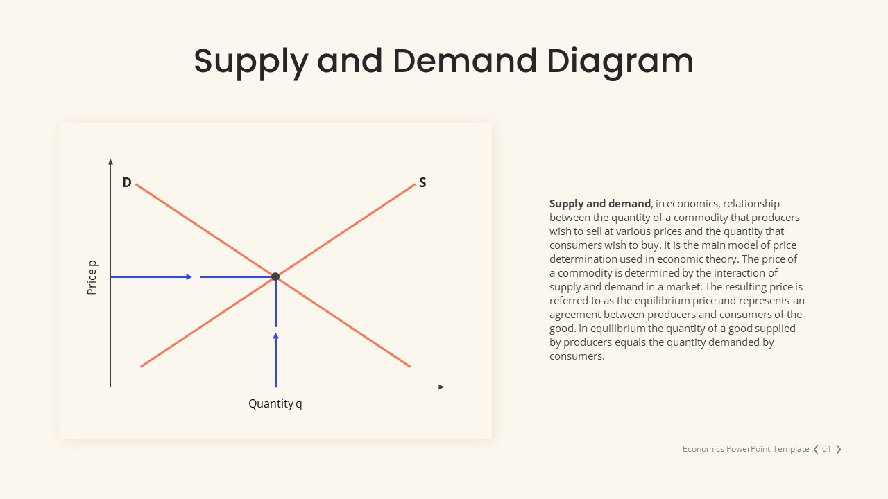
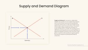
- The supply and demand diagram features a chart slideshow
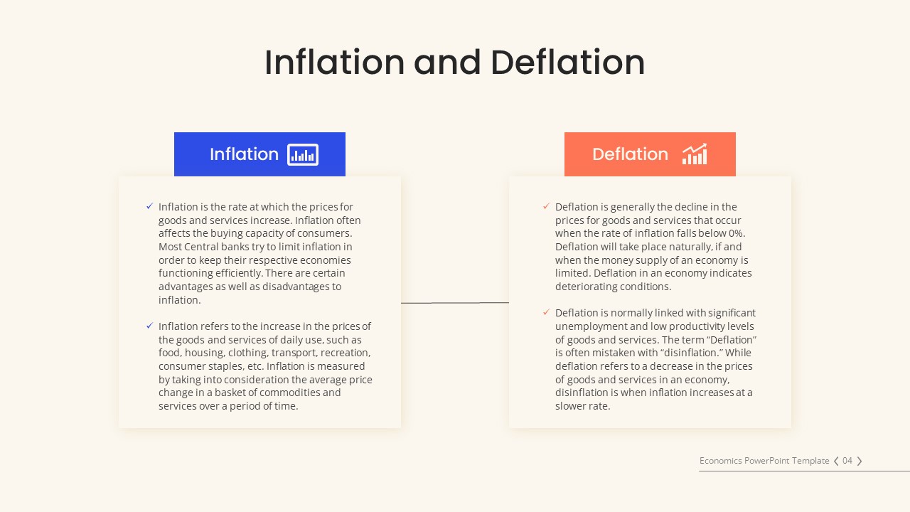
- Inflation and deflation as a company chart with editable text areas
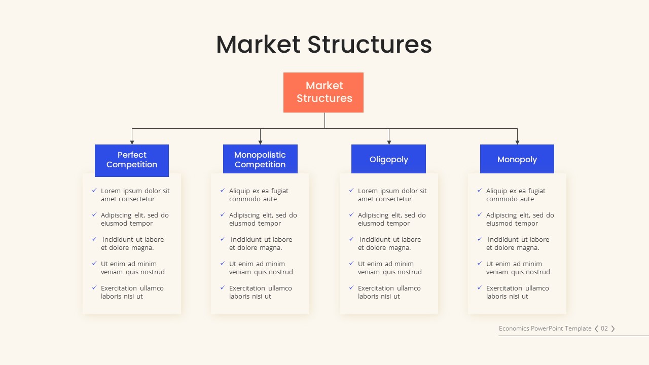
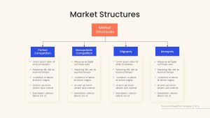
- Market structures feature a flowchart to show four market structures
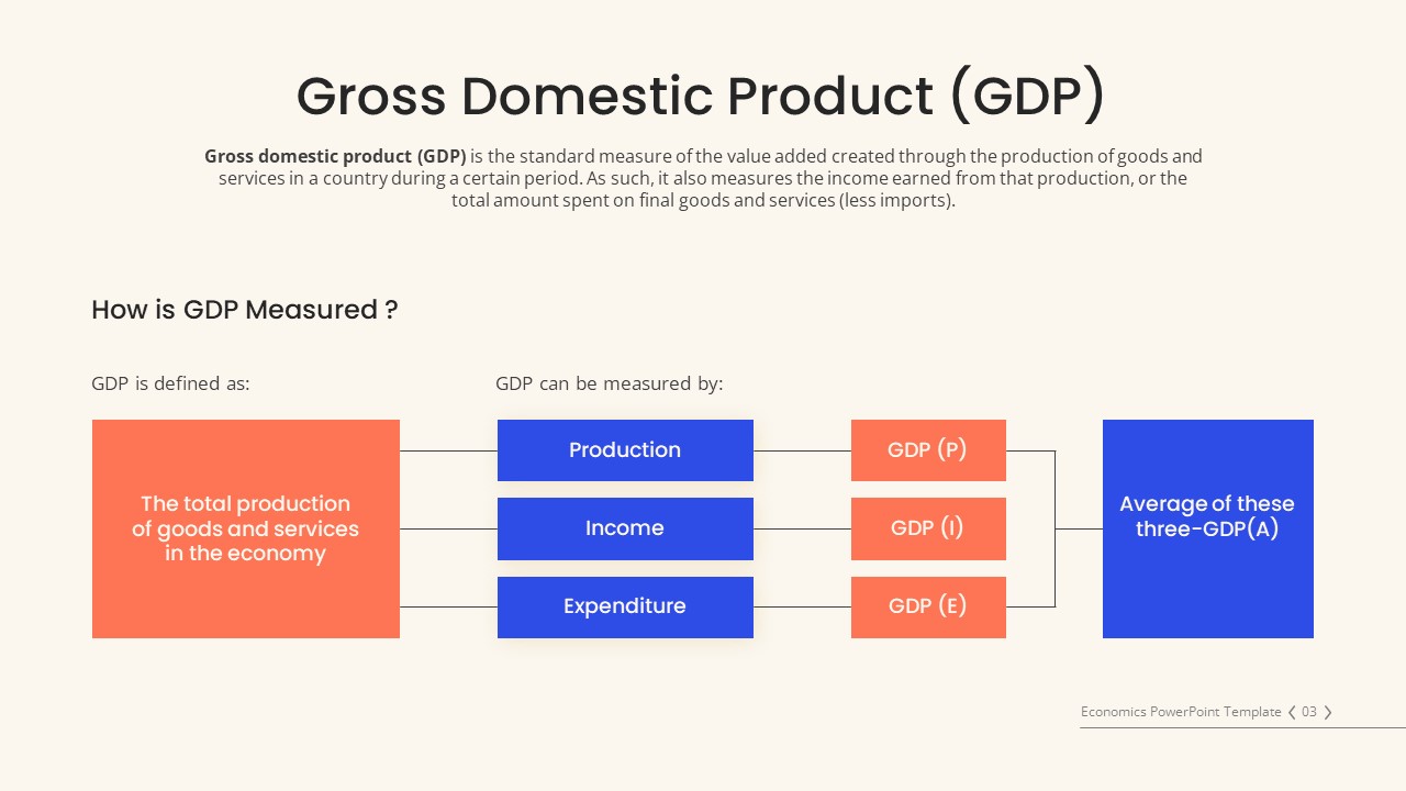
- Chart showing Gross Domestic Product (GDP)
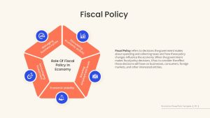
- Fiscal policy features a pentagon diagram with infographic icons
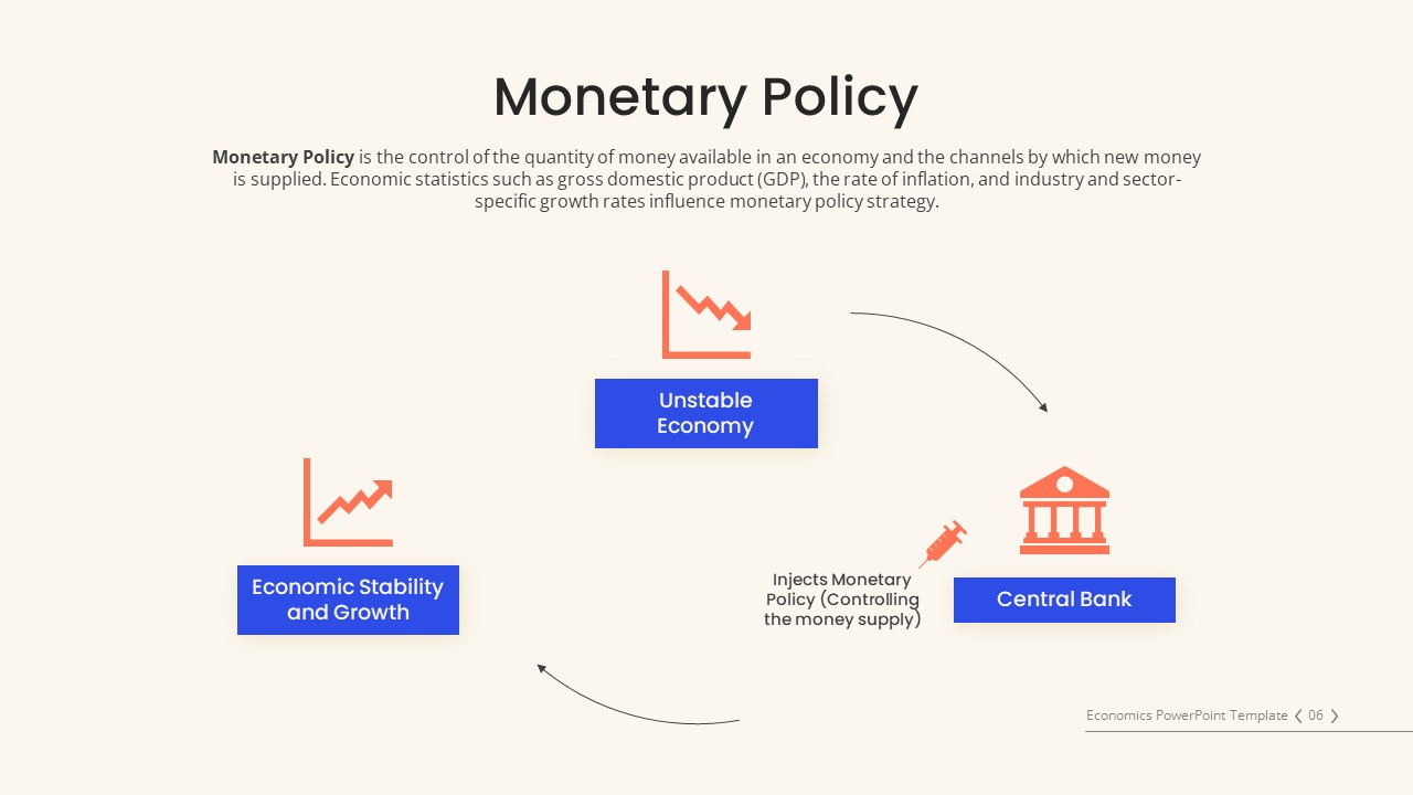
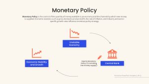
- Monetary policy: a 3-section chart
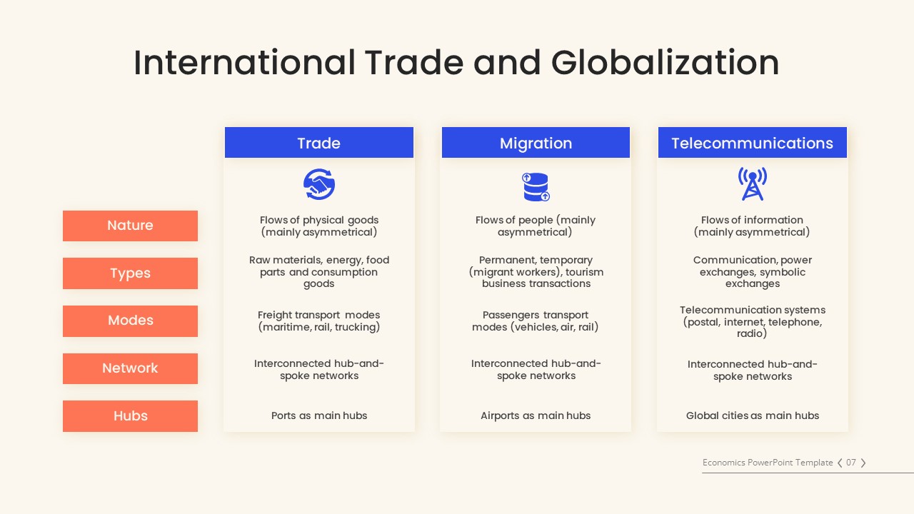
- Internation trade and globalization features a descriptive banner design
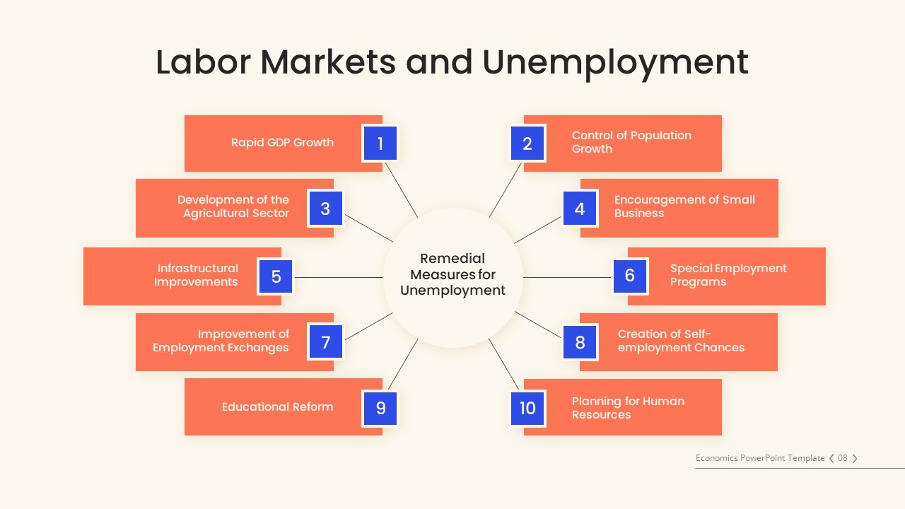
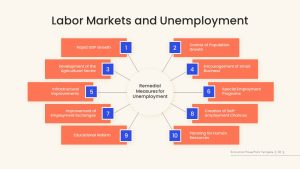
- Labor market and unemployment features a 10-stage infographic
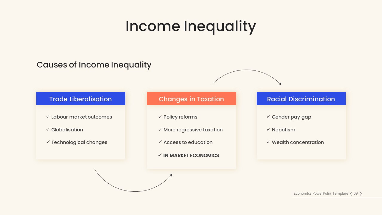
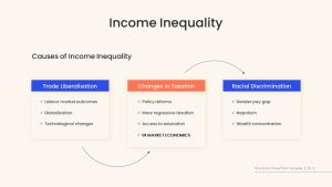
- Income and inequality feature a poster ppt with bullet point text areas
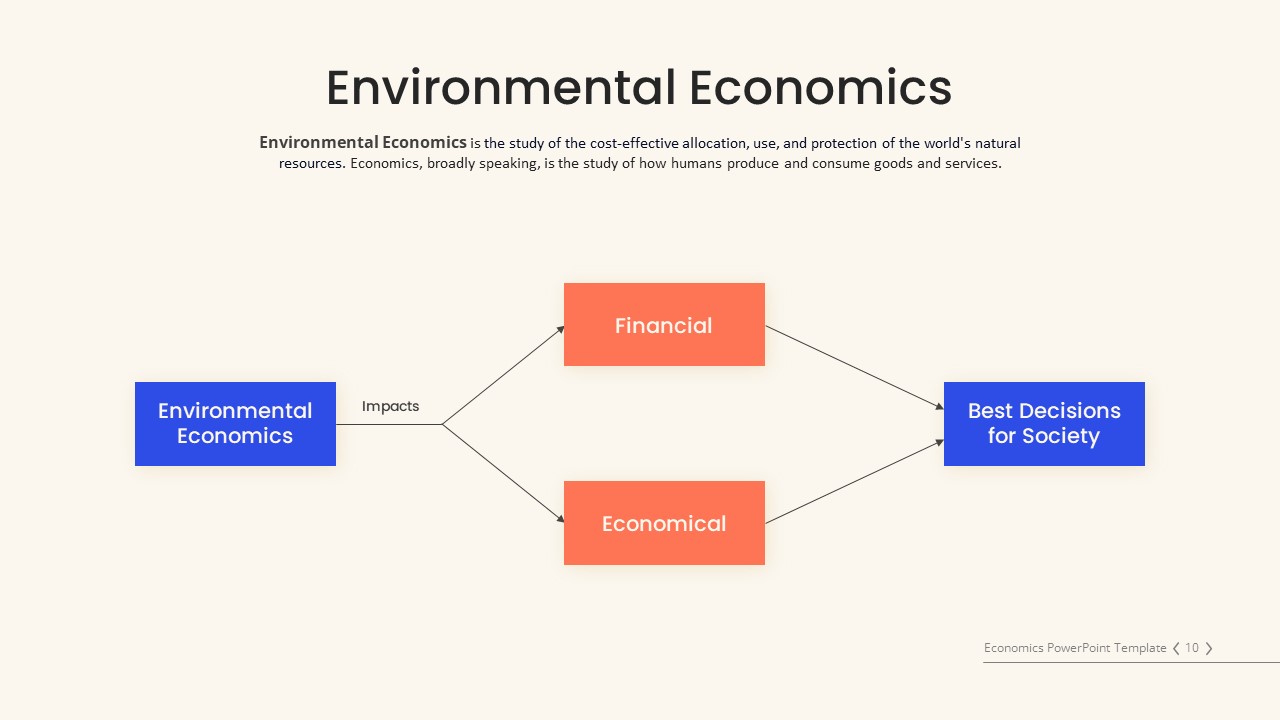
- Environmental Economics
- Thank you for the presentation template
All the slides in the economics PowerPoint template are free to download and are 100% editable. Download it now!
Login to download this file

Item ID
SB04120
Related Templates

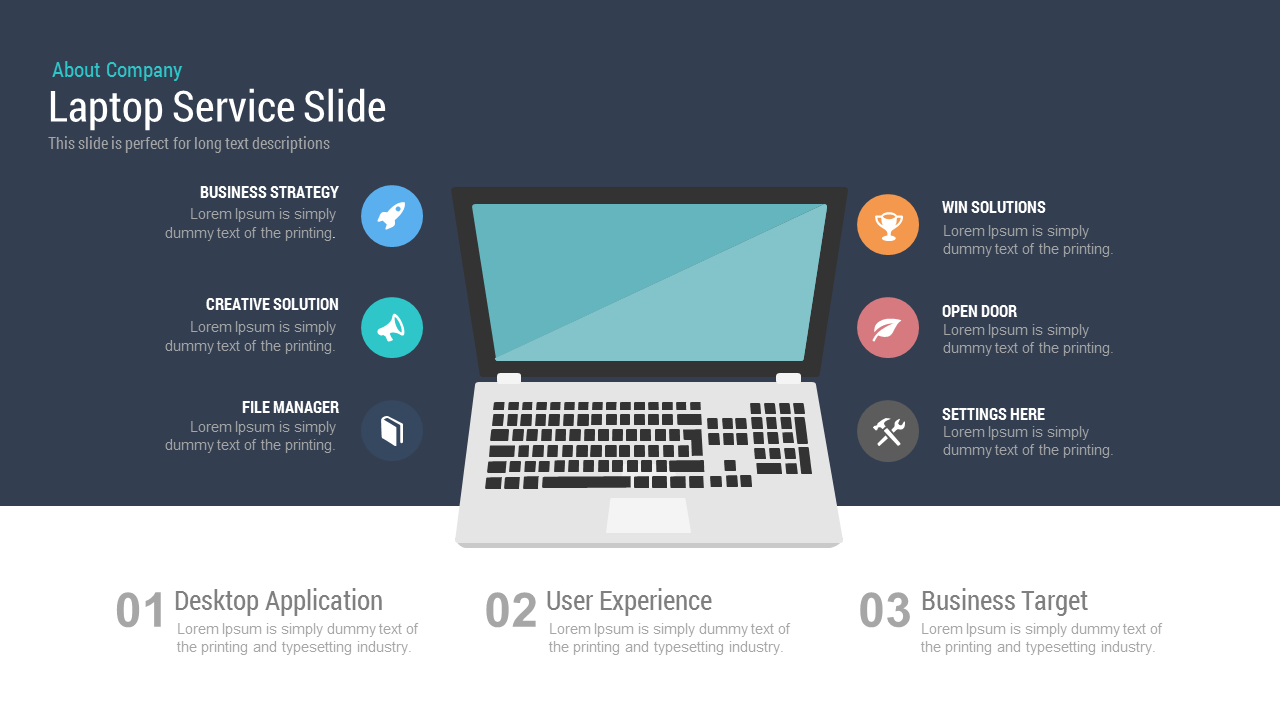
Free Laptop Service Slide Template for PowerPoint & Google Slides Presentations
Business
Free

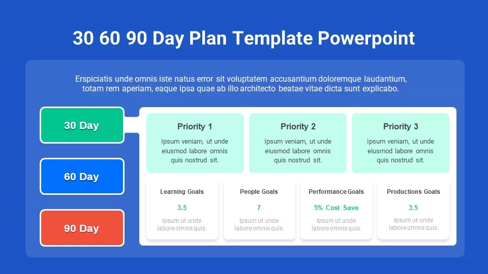
Free 30-60-90 Day Plan Slide Pack Template for PowerPoint & Google Slides
Project Status
Free
Free Veterans Day Patriotic Slide Pack Template for PowerPoint & Google Slides
Graphics
Free
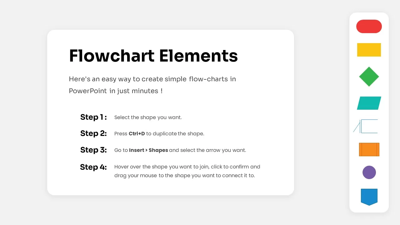
Free Flowchart Elements Tutorial Slide Template for PowerPoint & Google Slides
Flow Charts
Free
Free Elegant Happy New Year Greeting Slide Template for PowerPoint & Google Slides
Graphics
Free
Free Animated Countdown Timer Slide Template for PowerPoint & Google Slides
Free
Free
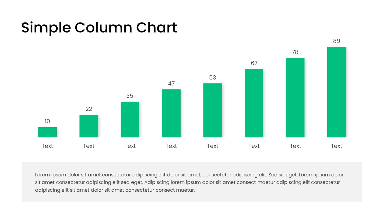
Free Editable Simple Column Chart Slide Template for PowerPoint & Google Slides
Bar/Column
Free
Free World UFO Day Slide Template for PowerPoint & Google Slides
Business
Free
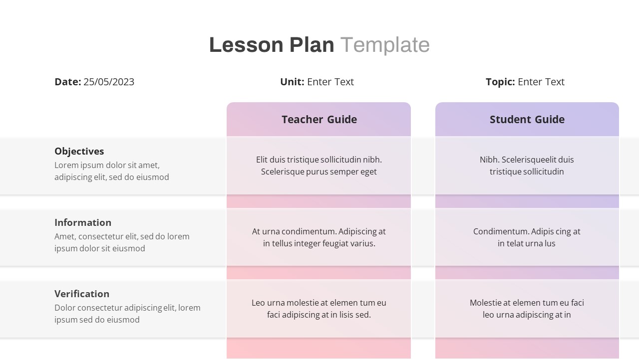
Free Lesson Plan Table Slide Template for PowerPoint & Google Slides
Agenda
Free
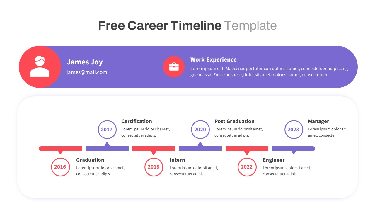
Free Colorful Career Timeline Resume Slide Template for PowerPoint & Google Slides
Timeline
Free
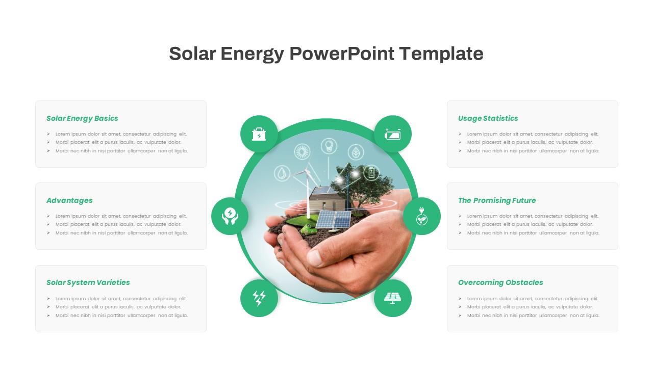
Free Solar Energy Infographic Slide Template for PowerPoint & Google Slides
Circular
Free
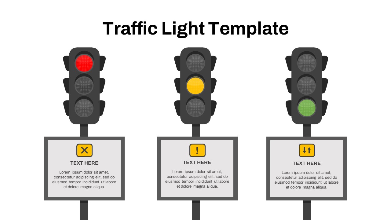
Free Traffic Light Project Status Slide Template for PowerPoint & Google Slides
Project Status
Free
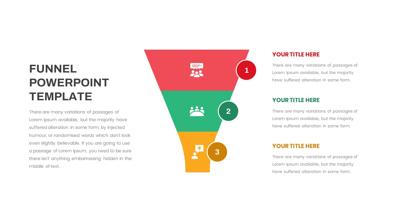
Free Multi-Step Funnel Infographic Slide Pack Template for PowerPoint & Google Slides
Funnel
Free
Free Modern Company Profile About Us Slide Template for PowerPoint & Google Slides
Company Profile
Free
Free Elegant Executive Quote Slide Layout Template for PowerPoint & Google Slides
Our Team
Free
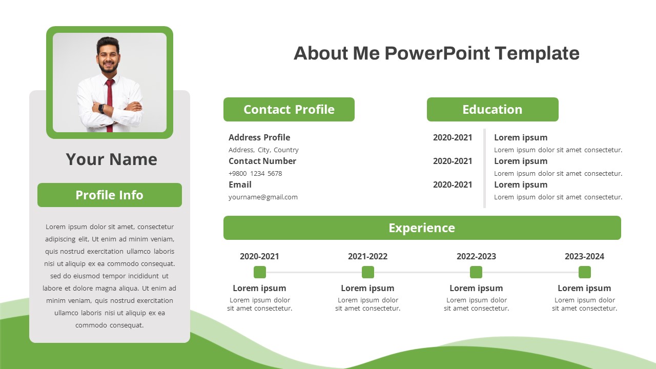
Free Modern About Me Profile Slide Template for PowerPoint & Google Slides
Company Profile
Free

Free Professional Event Planner Slide Deck Template for PowerPoint & Google Slides
Business
Free
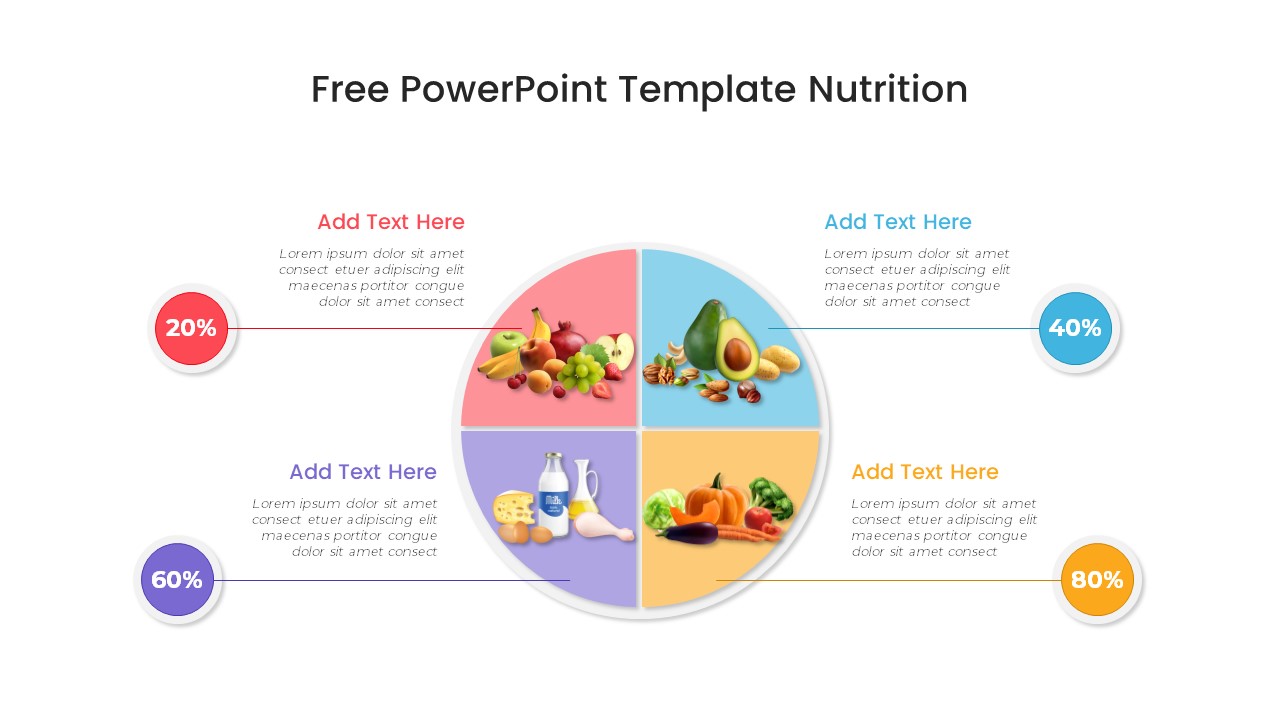
Free Nutrition Infographic Slide Template for PowerPoint & Google Slides
Health
Free
Free Thank You Slide Template for PowerPoint & Google Slides
Graphics
Free
Free Online Shopping 3-Slide Infographic Template for PowerPoint & Google Slides
Digital Marketing
Free