Cost Cutting Savings Dashboard Template for PowerPoint & Google Slides
Cost Cutting Template for PowerPoint and Google Slides
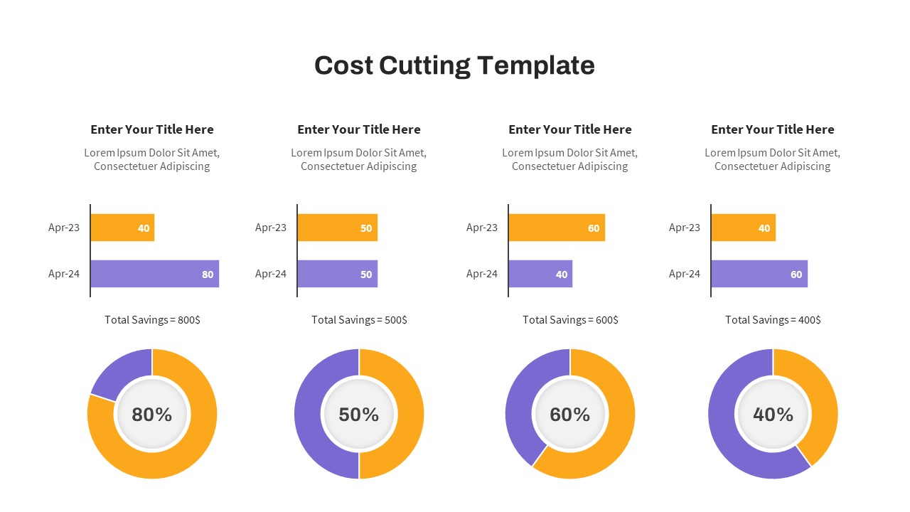
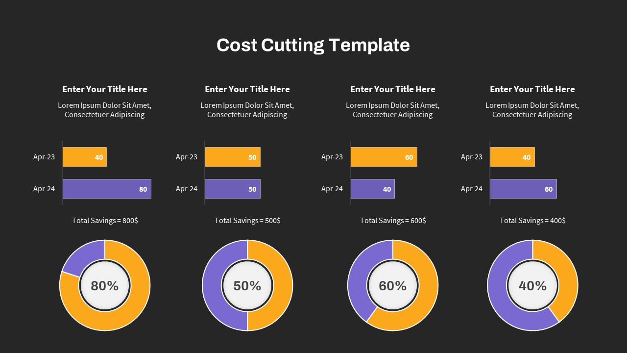
Presenting financial restructuring, expense optimization strategies, budget variance analysis, or department cost reductions requires a structured data-driven dashboard. This cost cutting template provides financial analysts, CFOs, operations directors, and management consultants with a four-column comparative chart layout to present year-over-year cost savings. By pairing horizontal bar charts with proportional doughnut rings, this slide helps speakers illustrate budget trends, financial targets, and net savings across multiple operational units during executive reviews.
Key slide components and visual highlights include:
- Four structured analytical columns enabling side-by-side comparison of distinct cost centers, operational departments, or spending categories.
- Dual horizontal bar charts in each column comparing two timeframe benchmarks (Apr-23 in warm orange vs Apr-24 in soft purple).
- Integrated financial summary indicators showcasing calculated metrics such as Total Savings ($800, $500, $600, and $400) directly under each bar chart.
- Proportional doughnut chart indicators at the bottom displaying percentage savings targets (80%, 50%, 60%, and 40%) using color-coded progress segments.
- Clean, high-contrast white presentation canvas with dark charcoal typography engineered for sharp visibility across executive boardroom displays.
- 100% editable vector charts and text fields that allow presenters to update values, adjust bar lengths, and customize percentage rings directly inside PowerPoint or Google Slides.
Login to download this file

Item ID
SB03981


Related Templates

Procurement Savings Dashboard PowerPoint Template
Dashboard
Cost Benefit Analysis Template PowerPoint and Google Slides
Comparison
Cost Reduction Strategy Donut Chart Template for PowerPoint & Google Slides
Pie/Donut
Total Cost of Ownership Model PowerPoint Template
Business
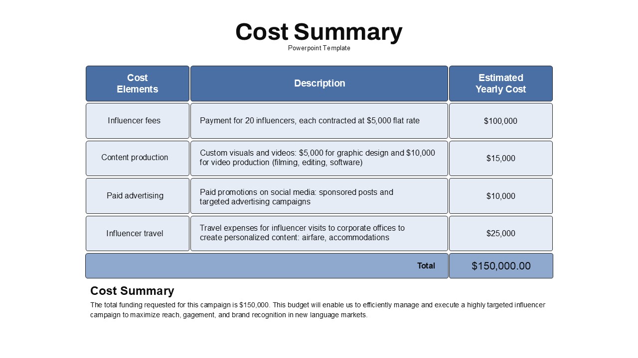
Cost Summary Table Template PPT Slide
Business Report
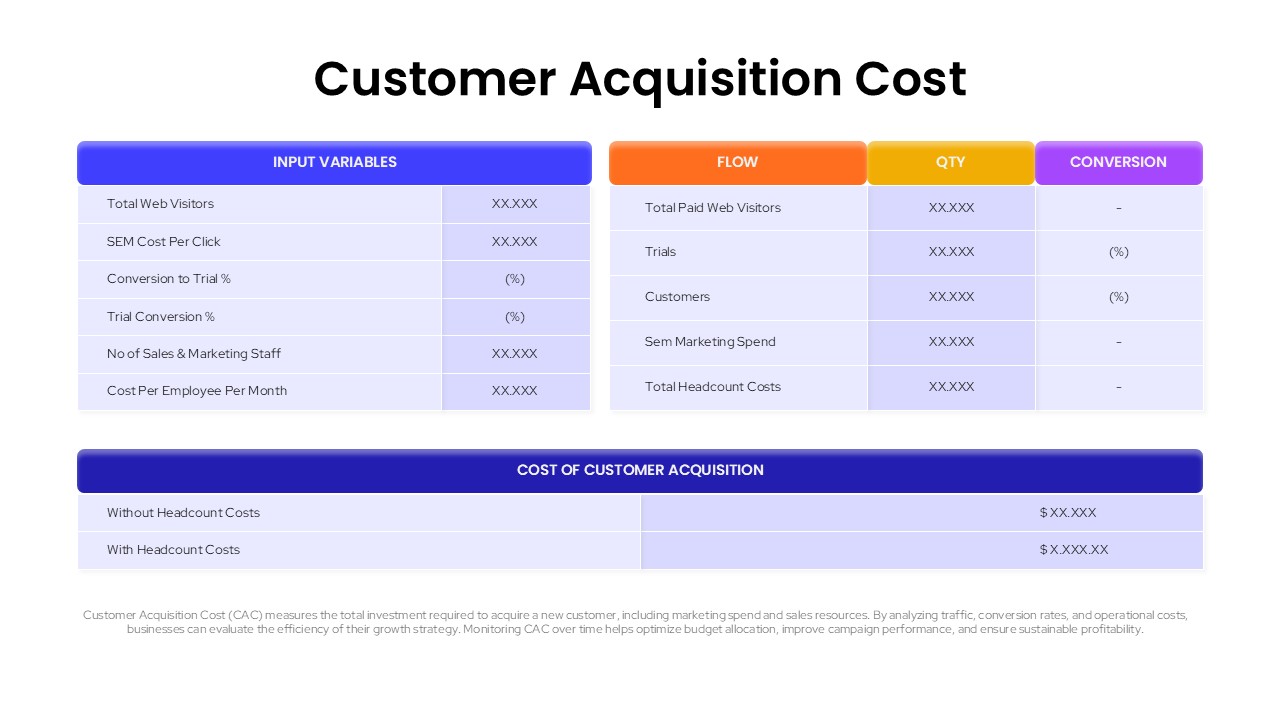
Customer Acquisition Cost (CAC) Template for PowerPoint & Google Slides
Business Strategy
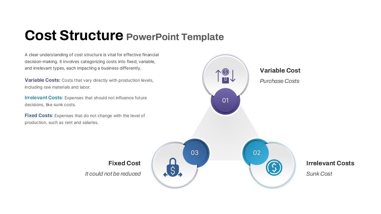
Cost Structure PPT Template and Google Slides
Finance
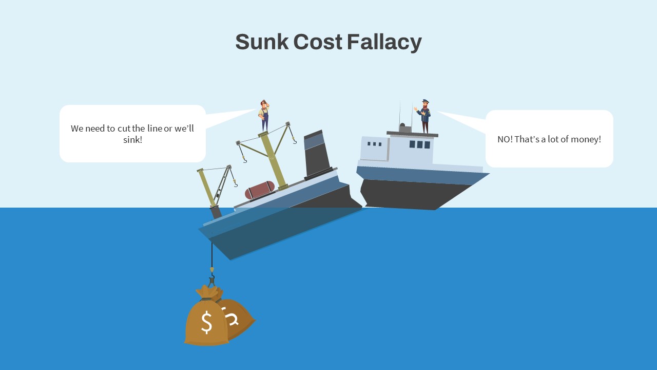
Sunk Cost Fallacy PowerPoint Template & Slides
Infographics
Cost Benefit Analysis PowerPoint Template
Comparison
Cost Benefit Analysis PowerPoint Template
Comparison
Cost Reduction Strategy PowerPoint Template
Business Strategy
Cost Comparison PowerPoint Template
Comparison
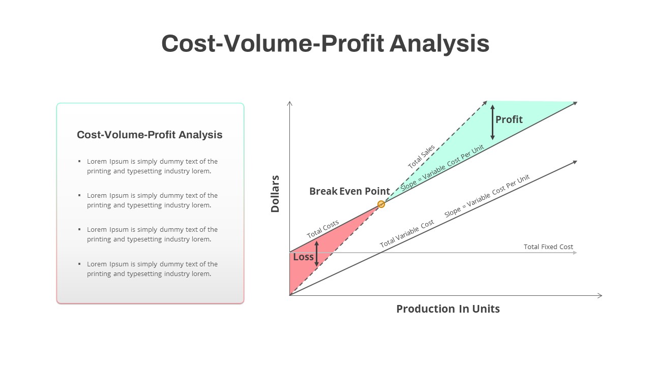
Cost Volume Profit Analysis PowerPoint Template
Finance
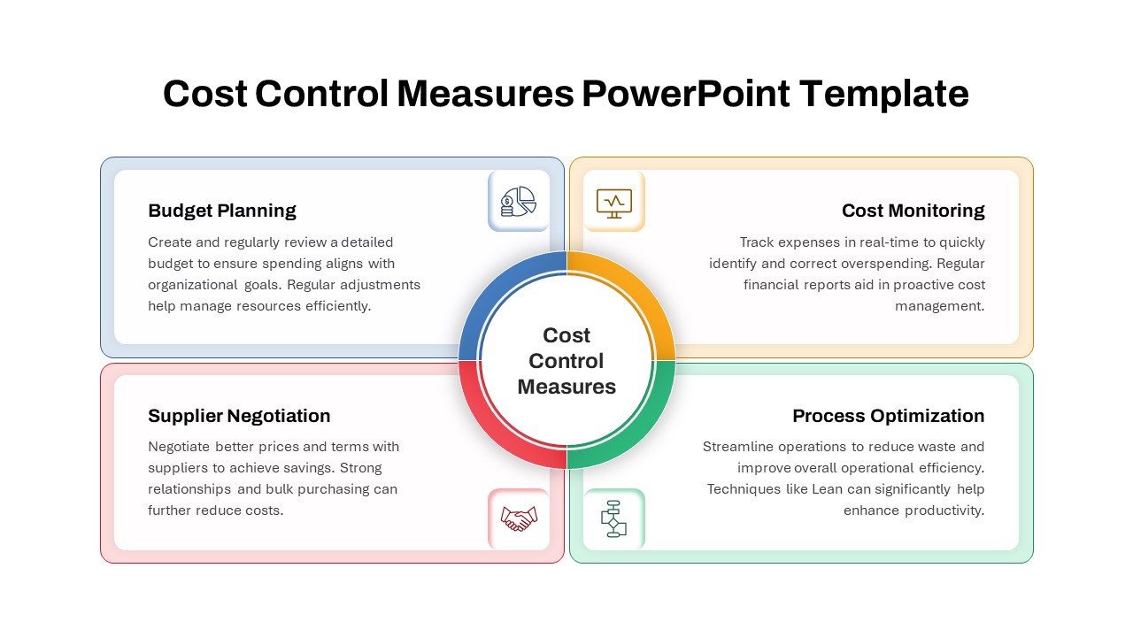
Cost Control Measures PowerPoint Template
Circular
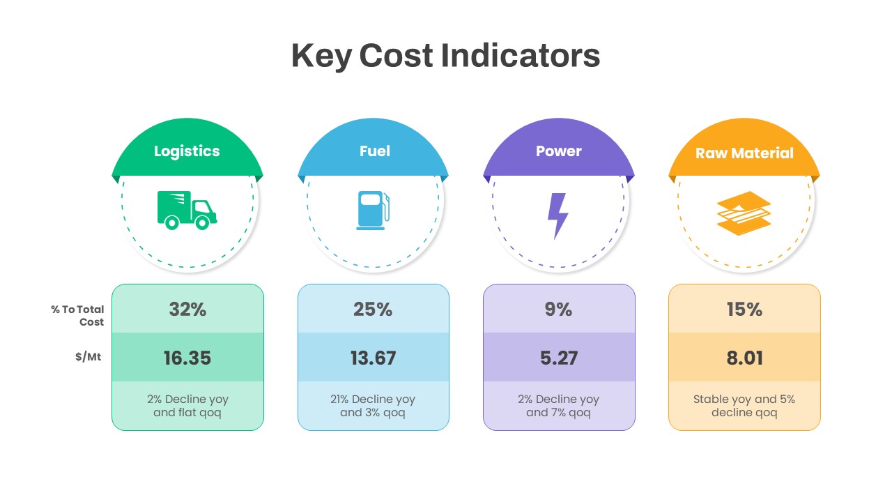
Key Cost Indicators PowerPoint Template
Finance
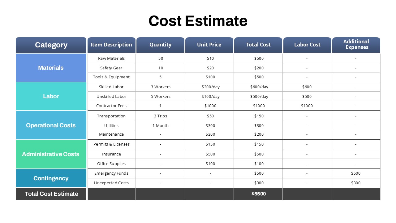
Project Cost Estimate PowerPoint Template
Project
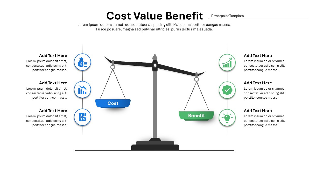
Cost Value Benefit PowerPoint Template
Charts
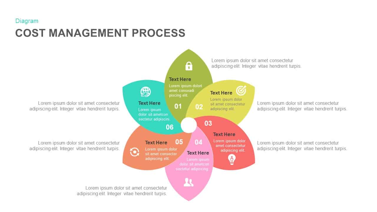
Cost Management Process Template
Process
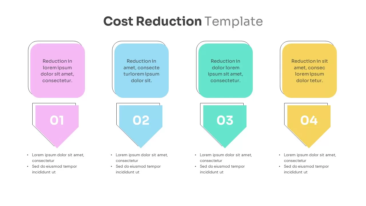
Cost Reduction Template
Business Strategy
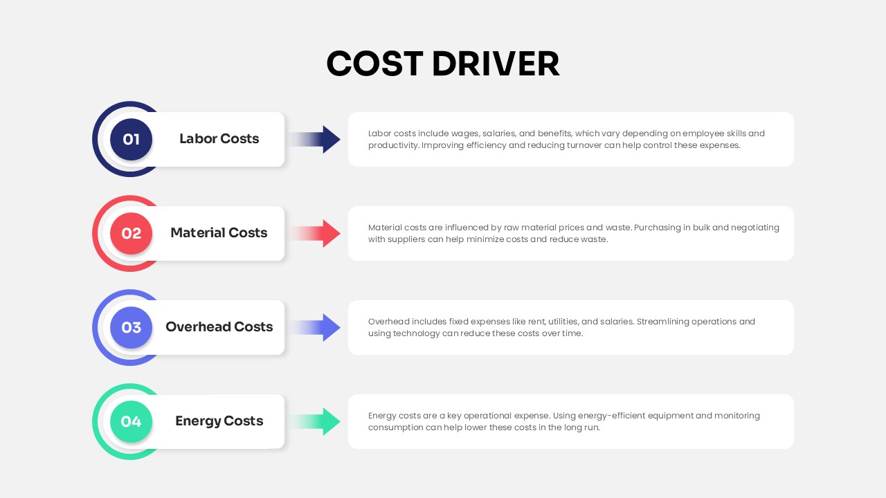
Cost Driver Infographic Slide Pack PPT Template
Process