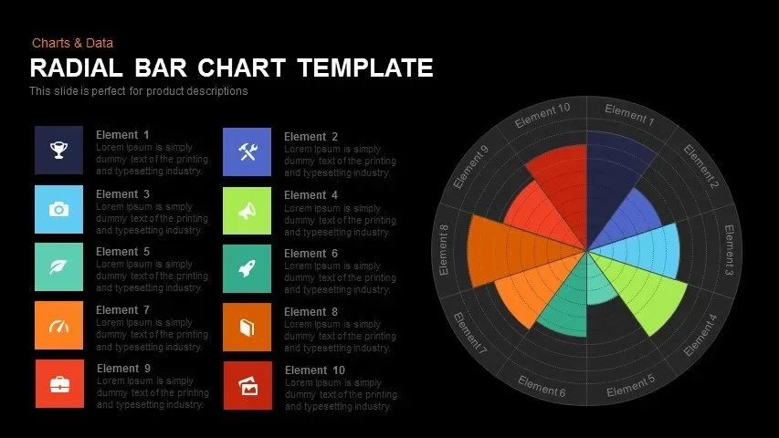
Radial Bar Chart Diagram for PowerPoint & Google Slides

Description
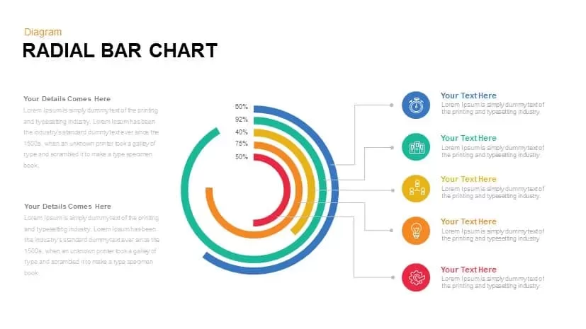
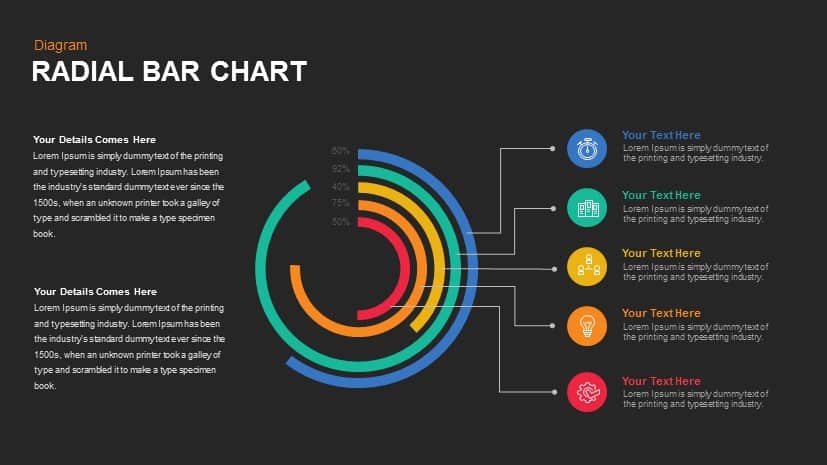
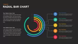
This radial bar chart diagram offers a modern and dynamic way to present data, especially when illustrating progress or performance metrics across multiple categories. The concentric circles represent different levels of achievement or completion, with each ring filled according to percentage values (e.g., 80%, 92%, etc.), making it visually appealing and easy to understand at a glance.
Each segment is color-coded and linked to corresponding icons on the right, allowing you to add detailed information or explanations for each category. The text placeholders can be easily customized to include relevant data, descriptions, or goals, making this diagram perfect for performance reviews, project progress, or comparison analyses. This sleek, colorful design will engage your audience and enhance the delivery of statistical data.
Fully editable in both PowerPoint and Google Slides, you can adjust the text, icons, and colors to align with your brand and presentation style. Whether you’re showcasing key performance indicators (KPIs), sales targets, or project milestones, this radial bar chart will help communicate your data with clarity and impact.
Who is it for
This diagram is ideal for business analysts, project managers, sales teams, and marketers who need to present data or progress indicators in a visually appealing way. It is also great for educators or consultants who want to showcase data points in a clear and engaging manner.
Other Uses
In addition to performance metrics, this diagram can be used to represent project milestones, product development stages, customer satisfaction surveys, or any multi-variable data. It is perfect for illustrating comparison metrics or showing the distribution of data across different categories.
Login to download this file

Item ID
SB00797
Related Templates

Colorful Radial Bar Chart Template for PowerPoint & Google Slides
Bar/Column
Premium

Six Arrow Radial Process Diagram template for PowerPoint & Google Slides
Infographics
Premium
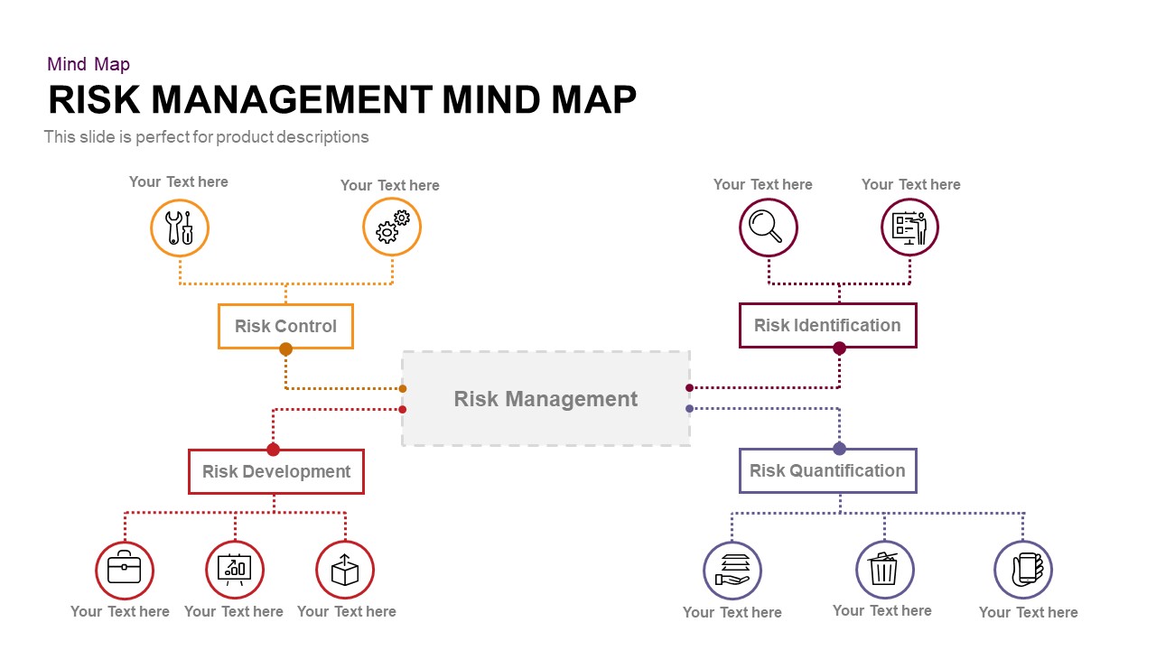
Risk Management Mind Map Radial Diagram template for PowerPoint & Google Slides
Mind Maps
Premium

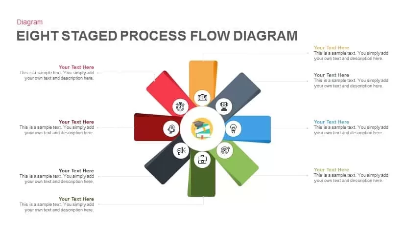
Eight-Stage Radial Process Flow Diagram Template for PowerPoint & Google Slides
Process
Premium
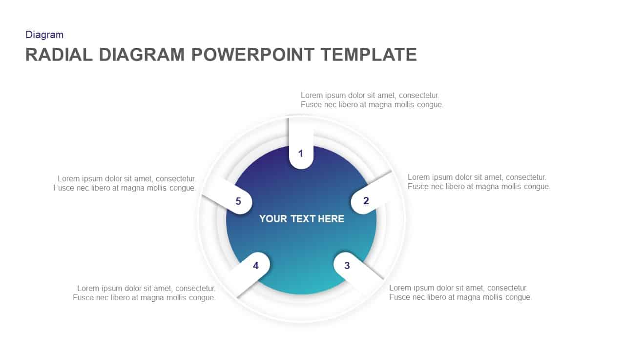
Radial Diagram for PowerPoint & Google Slides
Process
Premium
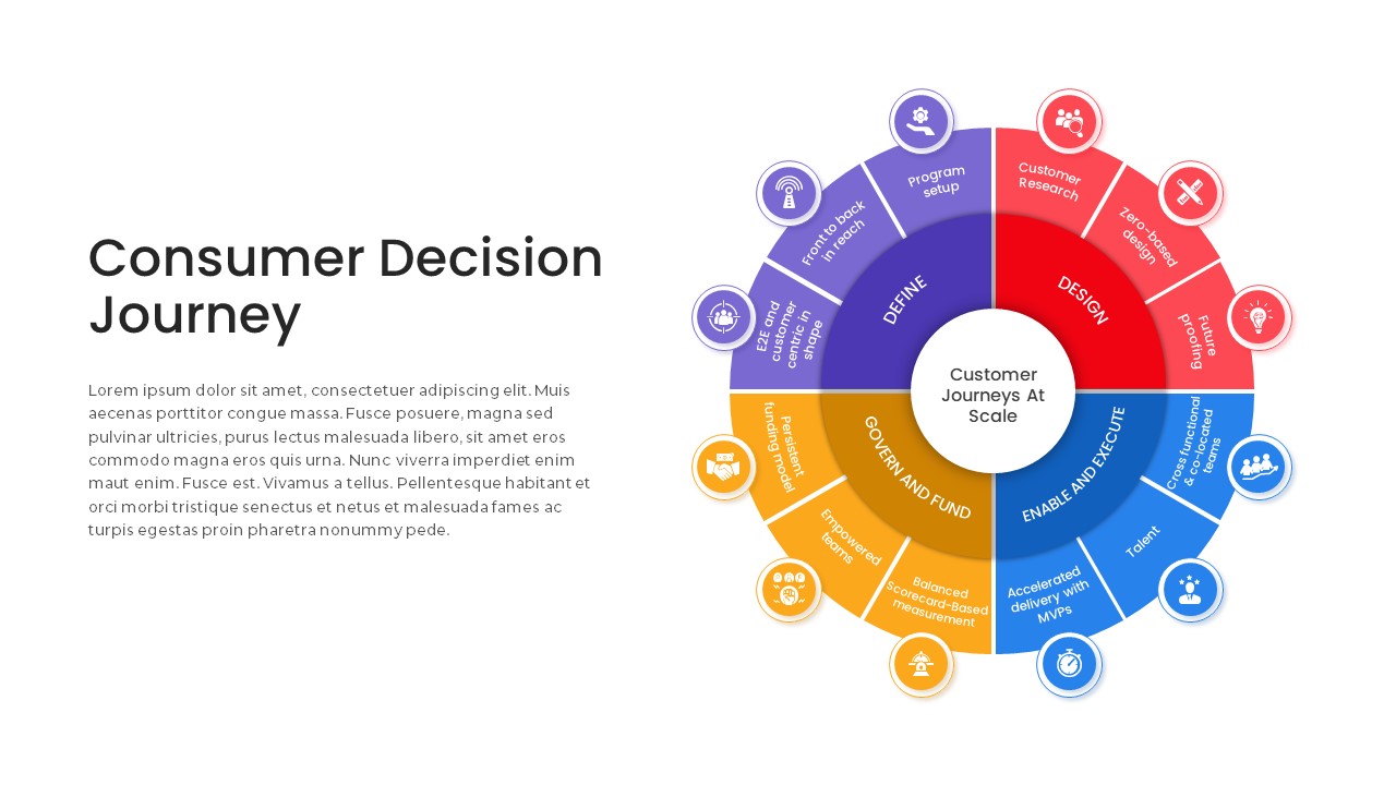
Consumer Decision Journey Radial Diagram Template for PowerPoint & Google Slides
Circle
Premium
AI Applications Radial Hub Diagram Template for PowerPoint & Google Slides
Circle
Premium
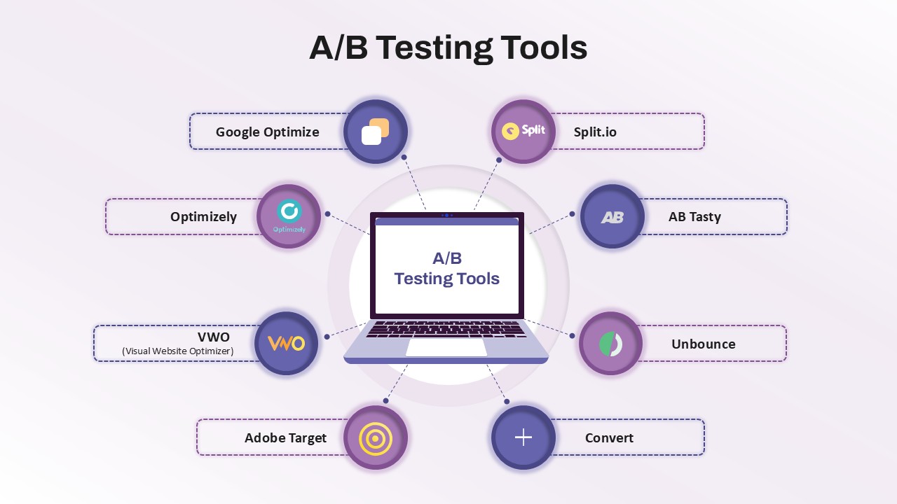
A/B Testing Tools Radial Diagram Template for PowerPoint & Google Slides
Information Technology
Premium
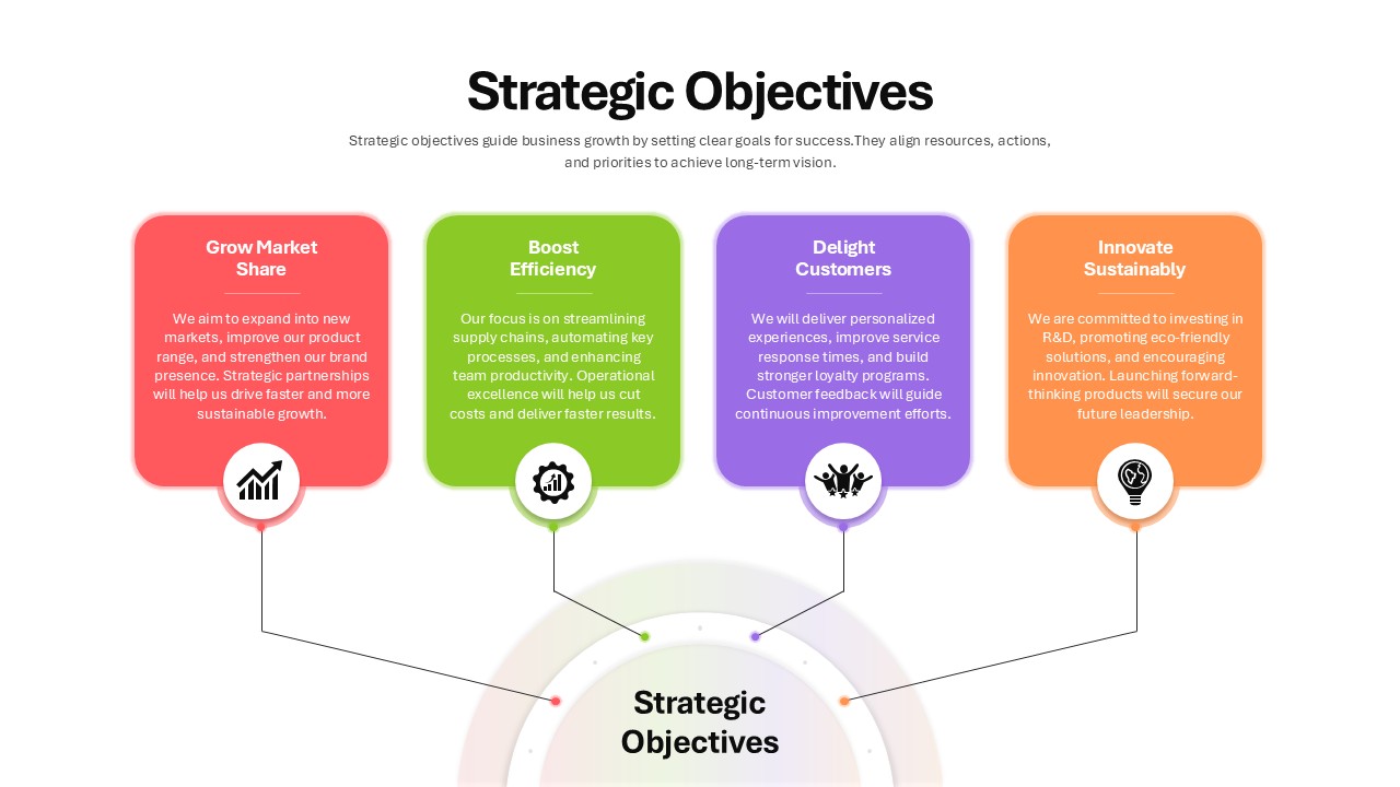
Four Strategic Objectives Radial Diagram Template for PowerPoint & Google Slides
Business Strategy
Premium
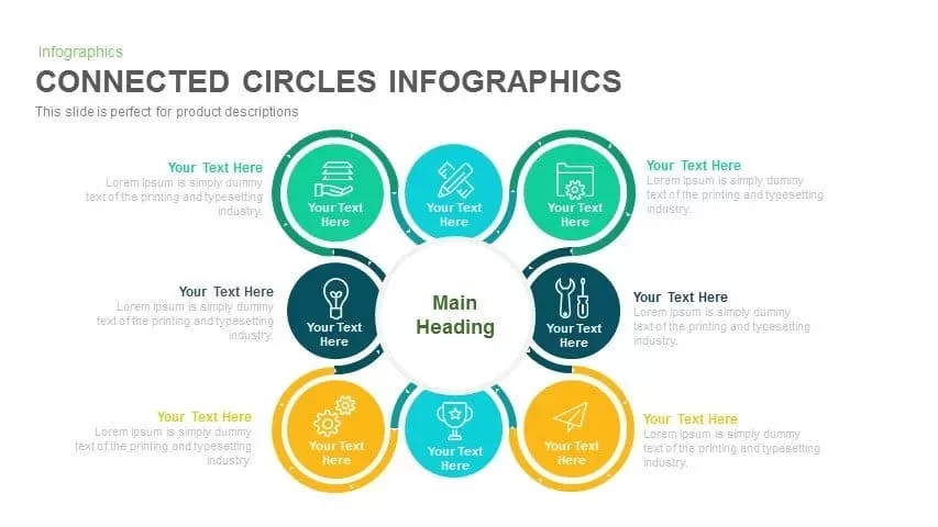
Radial Connected Circles Infographic Template for PowerPoint & Google Slides
Circle
Premium

4-Way Radial Arrow Infographic Template for PowerPoint & Google Slides
Arrow
Premium
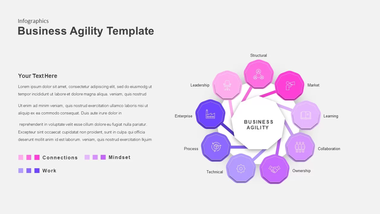
Color-Coded Business Agility Radial Template for PowerPoint & Google Slides
Business
Premium
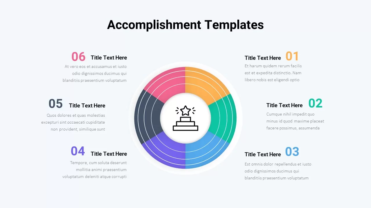
Six-Step Accomplishment Radial Infographic Template for PowerPoint & Google Slides
Accomplishment
Premium
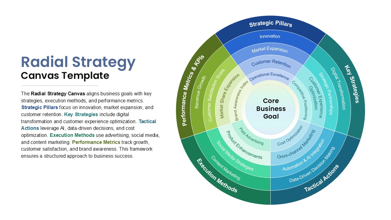
Radial Strategy Canvas for Goals Template for PowerPoint & Google Slides
Circle
Premium
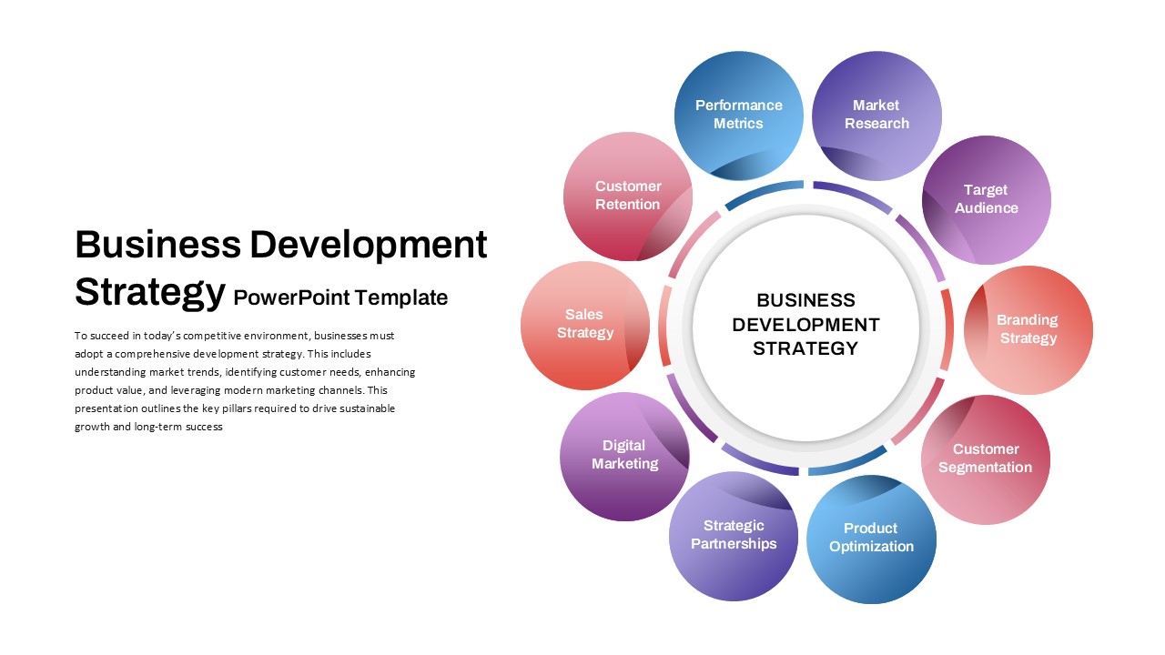
Business Development Strategy Radial Hub Template for PowerPoint & Google Slides
Circle
Premium
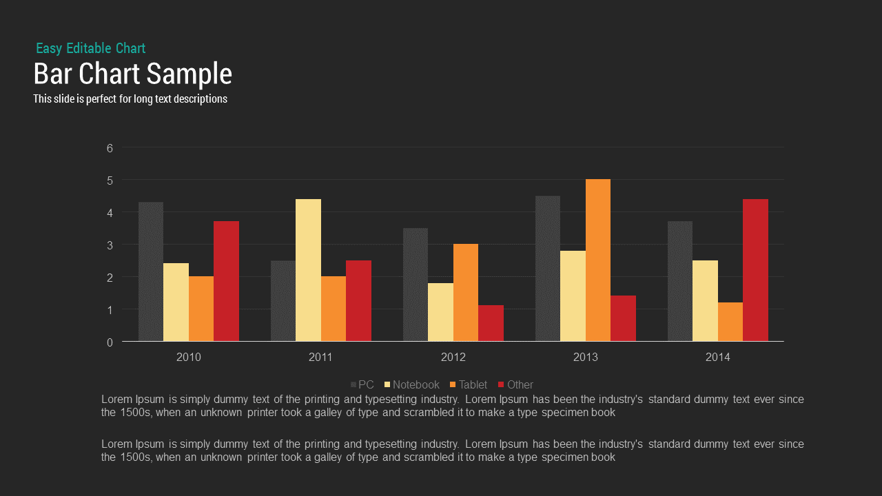
Bar Chart Sample template for PowerPoint & Google Slides
Bar/Column
Premium
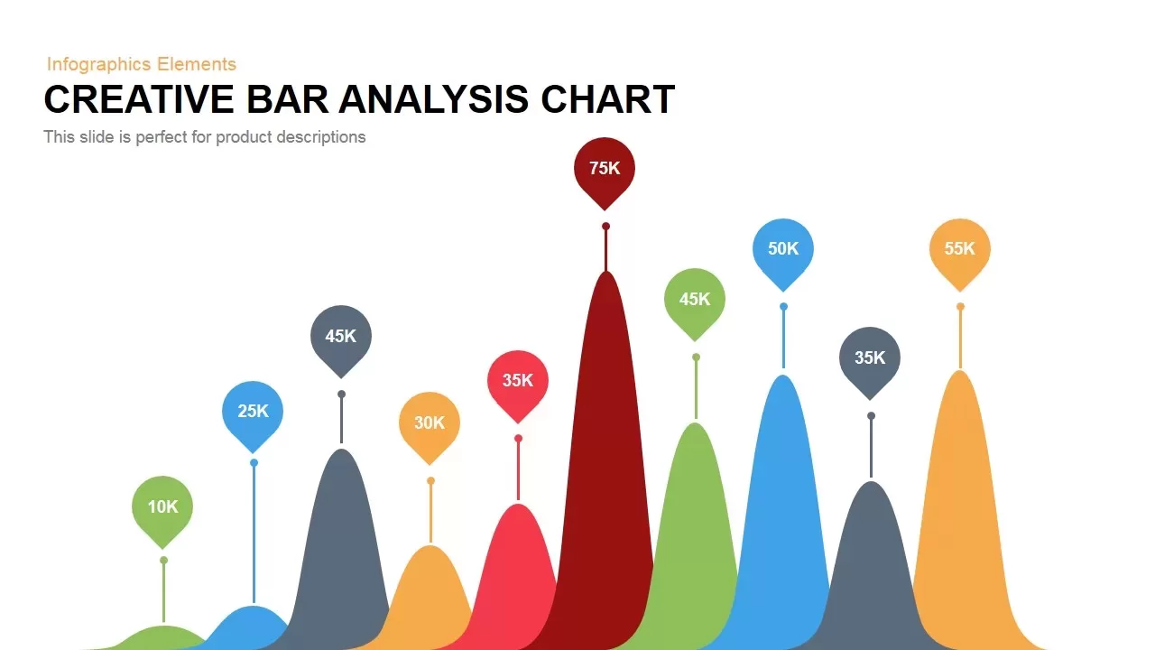
Creative Data Analysis Bar Chart template for PowerPoint & Google Slides
Bar/Column
Premium
3D Bar Chart Data Infographics Template for PowerPoint & Google Slides
Bar/Column
Premium
Creative Bar Chart template for PowerPoint & Google Slides
Charts
Premium
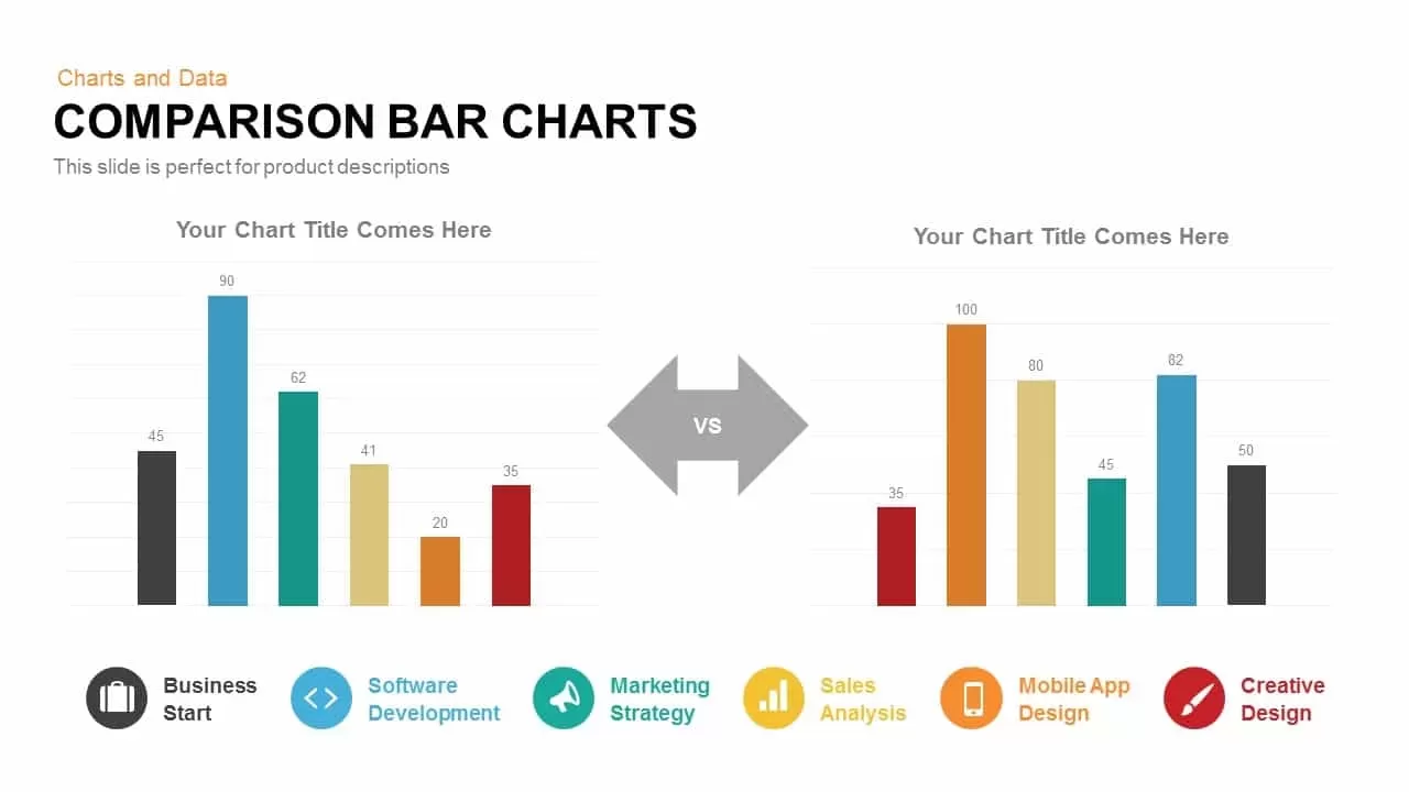
Comparison Bar Chart template for PowerPoint & Google Slides
Comparison Chart
Premium
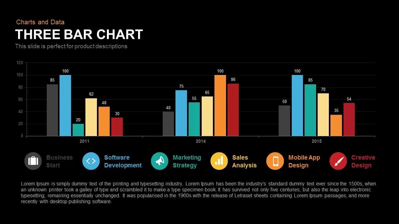
Three-Year Bar Chart template for PowerPoint & Google Slides
Charts
Premium
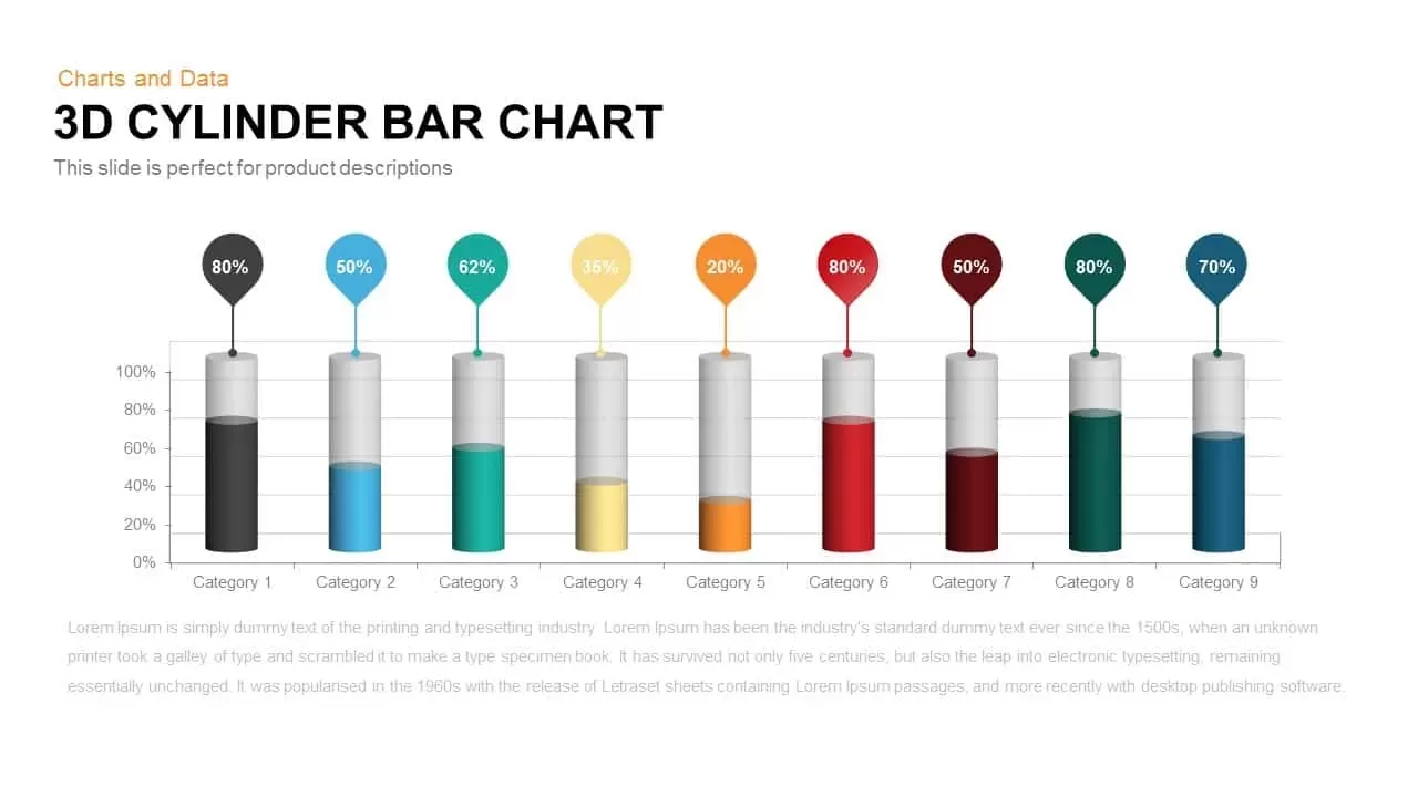
3D Cylinder Bar Chart Template for PowerPoint & Google Slides
Bar/Column
Premium
Pencil Bar Chart Data Analysis Template for PowerPoint & Google Slides
Bar/Column
Premium

Monthly Reports Bar Chart template for PowerPoint & Google Slides
Bar/Column
Premium
Sales Bar Chart for PowerPoint & Google Slides
Bar/Column
Premium
Interactive Product Comparison Bar Chart Template for PowerPoint & Google Slides
Bar/Column
Premium
Bar Data Chart Slide for PowerPoint & Google Slides
Bar/Column
Premium
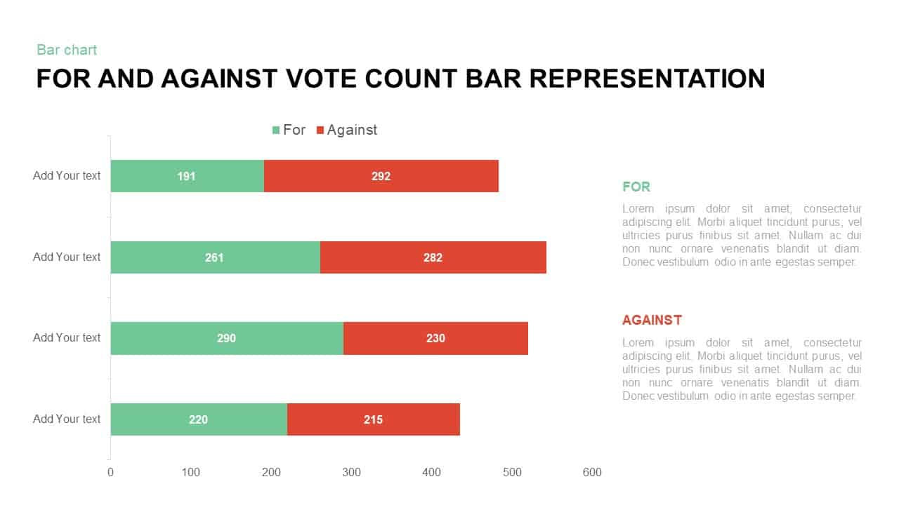
For and Against Vote Count Bar Chart Template for PowerPoint & Google Slides
Bar/Column
Premium
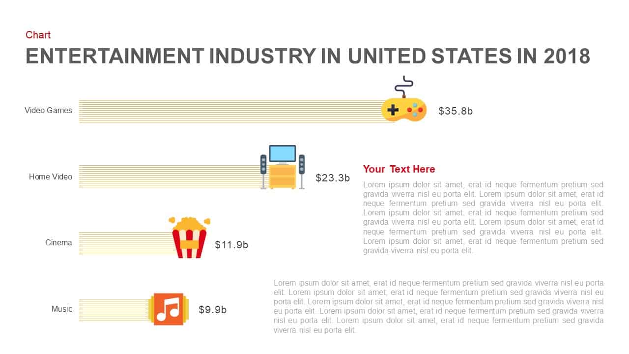
Entertainment Industry Revenue Bar Chart Template for PowerPoint & Google Slides
Bar/Column
Premium
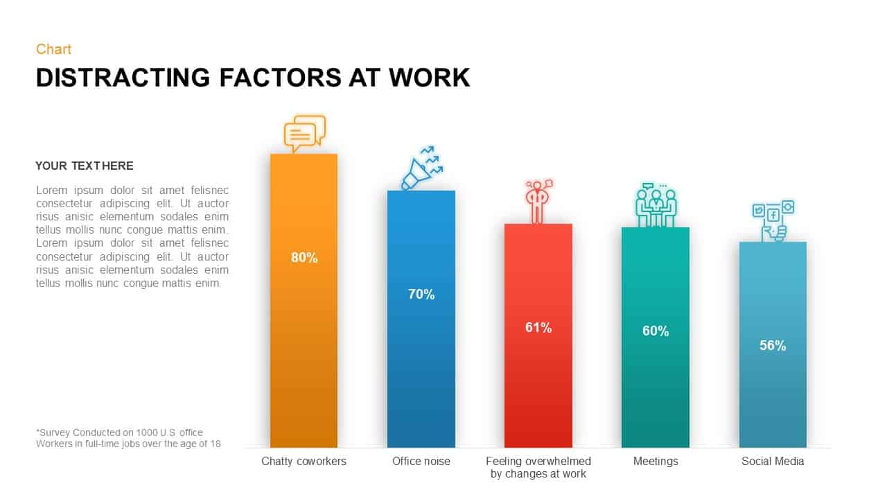
Distracting Factors at Work Bar Chart Template for PowerPoint & Google Slides
Bar/Column
Premium
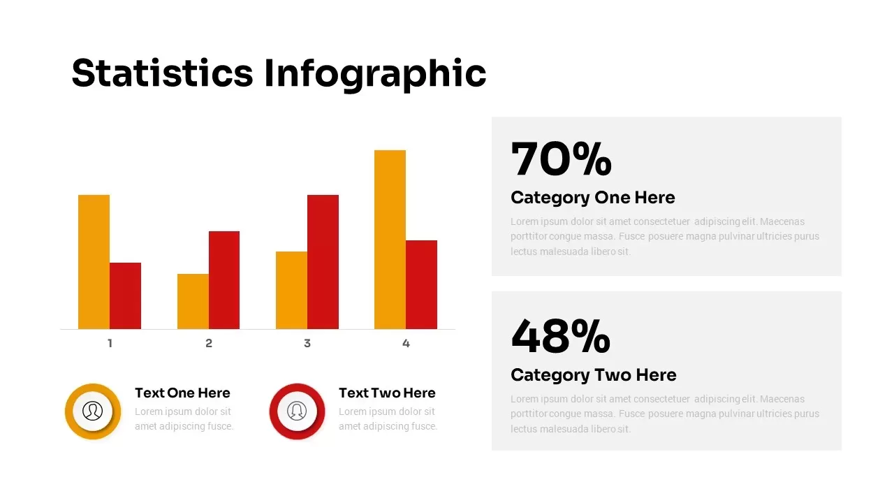
Statistics Infographic & KPI Bar Chart Template for PowerPoint & Google Slides
Bar/Column
Premium
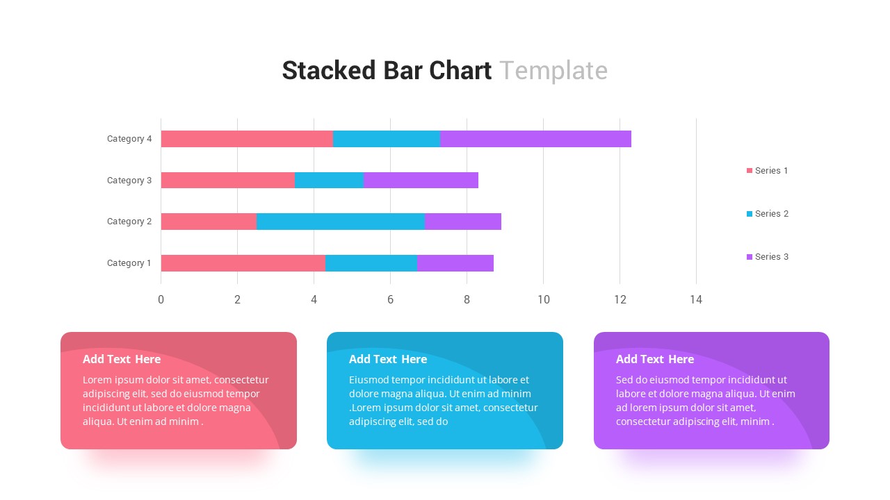
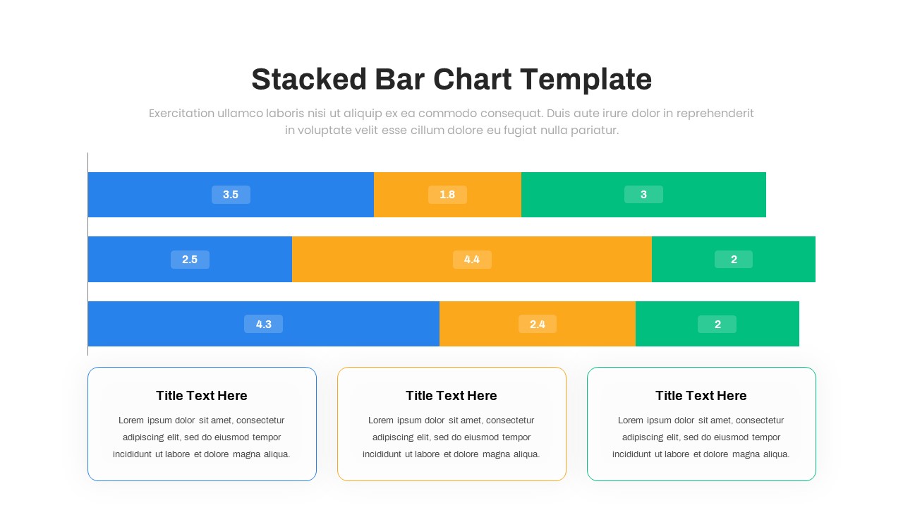
Stacked Bar Chart for PowerPoint & Google Slides
Bar/Column
Premium
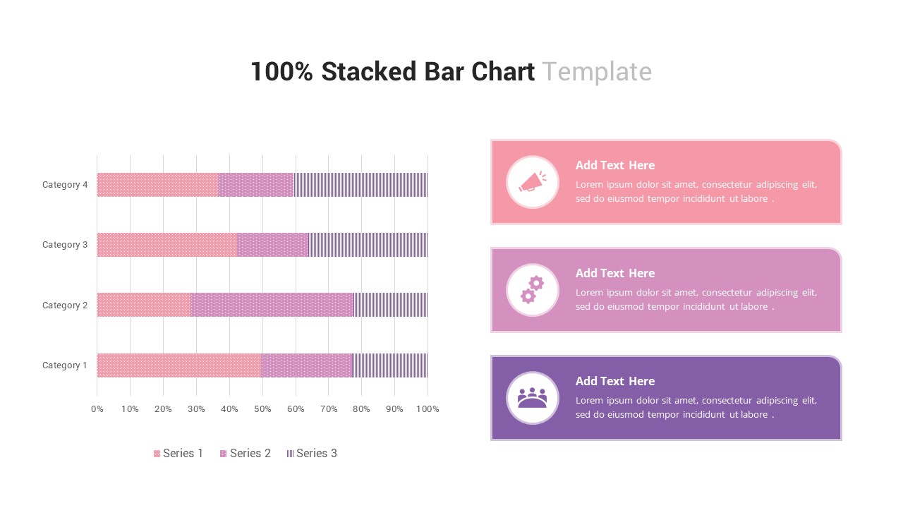
100% Stacked Bar Chart for PowerPoint & Google Slides
Bar/Column
Premium
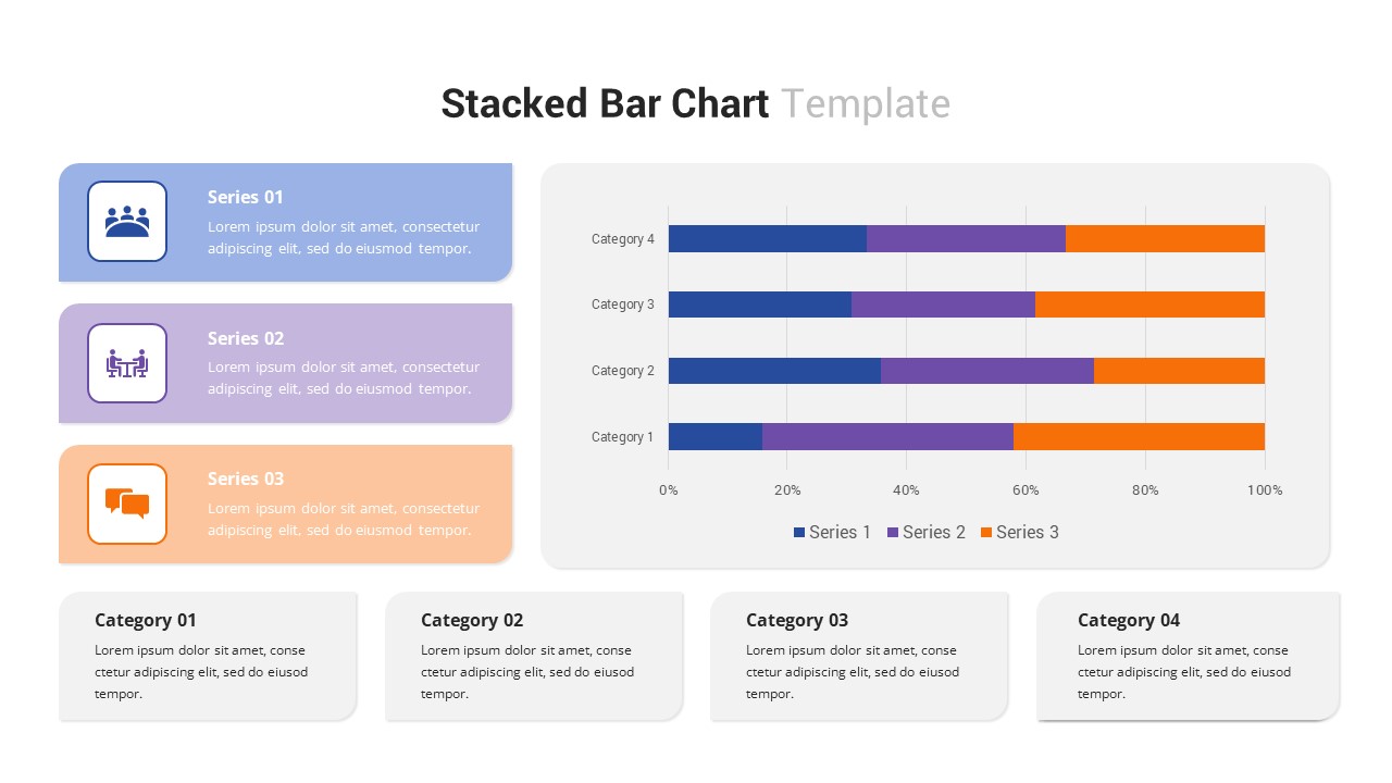
Multi-Series Stacked Bar Chart Template for PowerPoint & Google Slides
Bar/Column
Premium
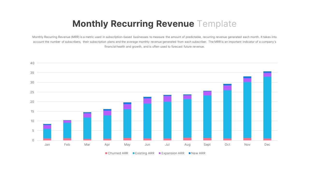
Monthly Recurring Revenue KPI Bar Chart Template for PowerPoint & Google Slides
Bar/Column
Premium
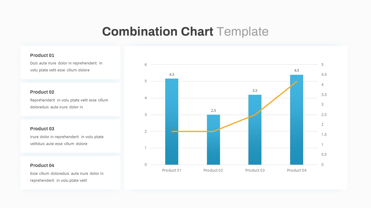
Combination Bar and Line Chart Template for PowerPoint & Google Slides
Bar/Column
Premium
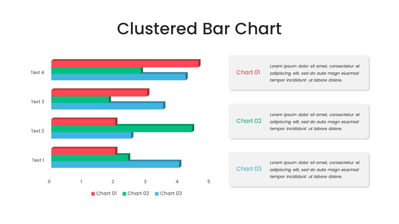
Animated Clustered Bar Chart Template for PowerPoint & Google Slides
Bar/Column
Premium
Animated Stacked Bar Chart Template for PowerPoint & Google Slides
Bar/Column
Premium
Simple Bar Chart Data Visualization Template for PowerPoint & Google Slides
Bar/Column
Premium
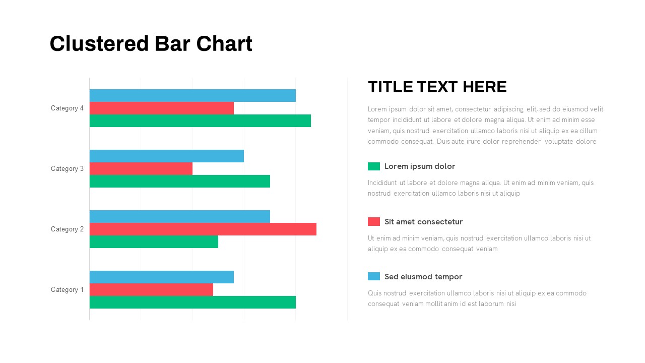
Clustered Bar Chart Comparison Template for PowerPoint & Google Slides
Bar/Column
Premium
Waterfall Bar Chart Analysis Template for PowerPoint & Google Slides
Bar/Column
Premium
Business Timeline Comparison Bar Chart Template for PowerPoint & Google Slides
Comparison Chart
Premium
Year-over-Year Stacked Gender Bar Chart Template for PowerPoint & Google Slides
Bar/Column
Premium
Mirror Bar Chart Comparison Template for PowerPoint & Google Slides
Bar/Column
Premium
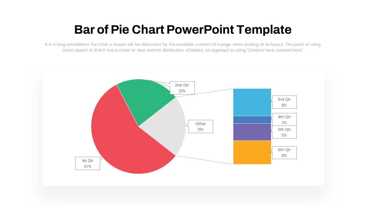
Dynamic Bar-of-Pie Chart Comparison Template for PowerPoint & Google Slides
Pie/Donut
Premium
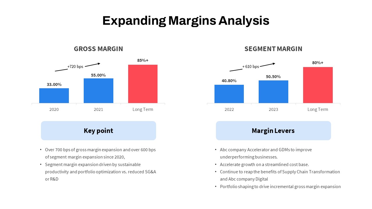
Expanding Margins Analysis Bar Chart Template for PowerPoint & Google Slides
Charts
Premium
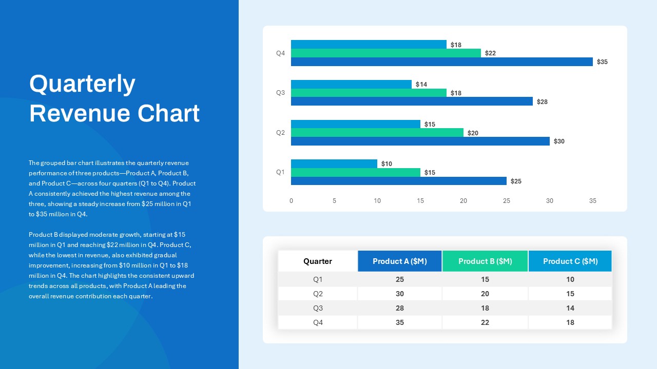
Quarterly Revenue Comparison Bar Chart Template for PowerPoint & Google Slides
Bar/Column
Premium
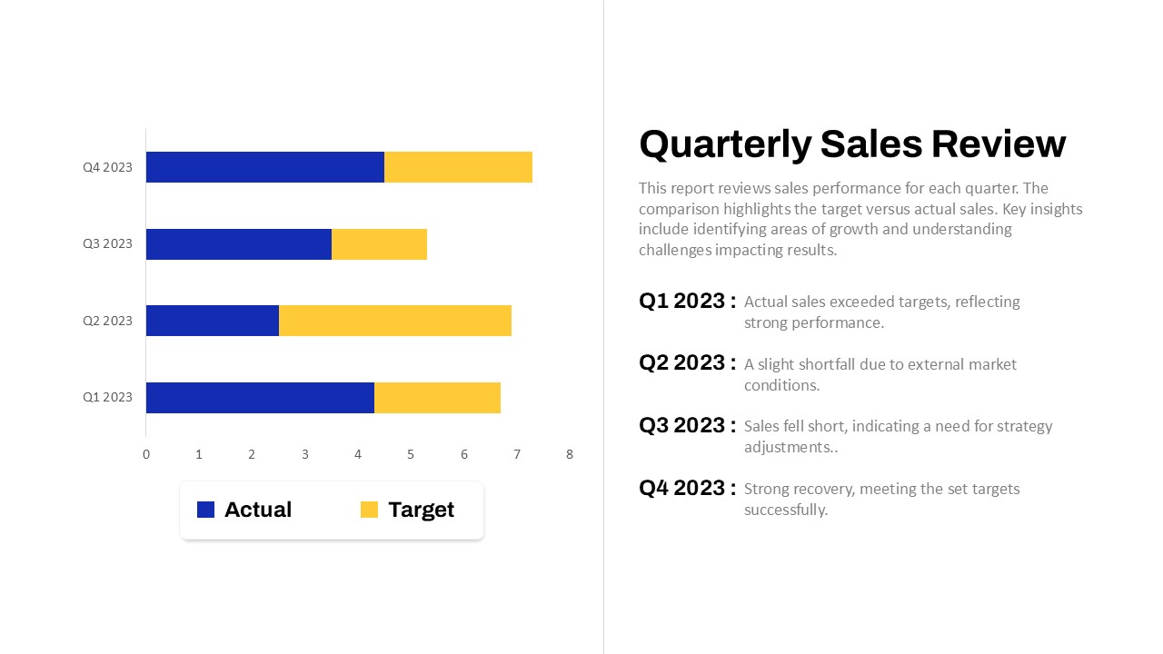
Quarterly Sales Review Bar Chart Template for PowerPoint & Google Slides
Bar/Column
Premium
Data Analysis Bar Chart with Insights Template for PowerPoint & Google Slides
Bar/Column
Free
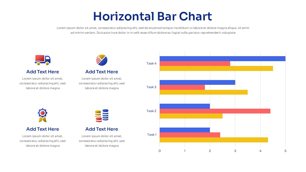
Horizontal Bar Chart Slide with Icons Template for PowerPoint & Google Slides
Bar/Column
Premium
Two-Option Bar Chart Comparison Table Template for PowerPoint & Google Slides
Comparison
Premium
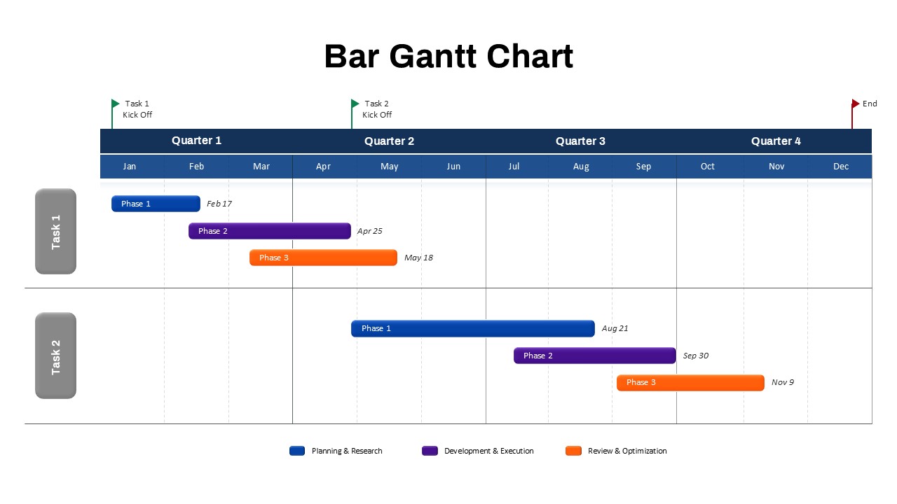
Bar Gantt Chart Template for PowerPoint & Google Slides
Gantt Chart
Premium
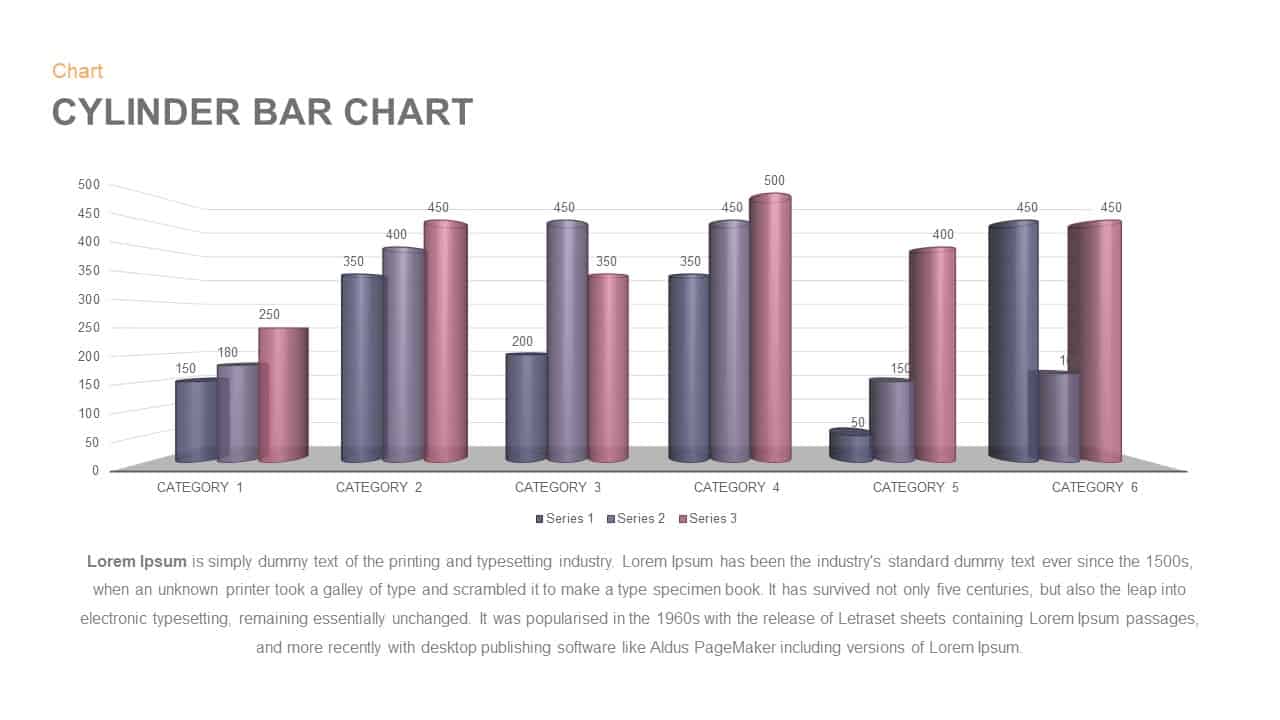
3D Cylinder Bar Chart Visualization Template for PowerPoint
Bar/Column
Premium
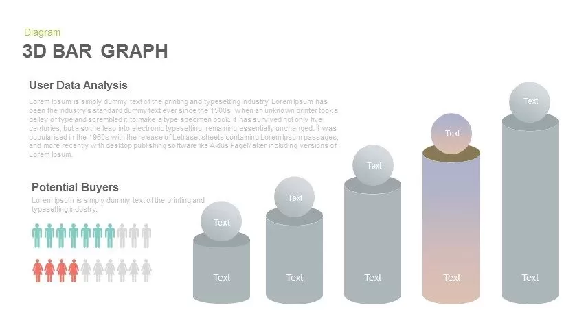
3D Bar Graph Infographic Template for PowerPoint & Google Slides
Bar/Column
Premium
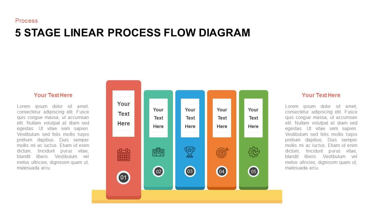
Five-Stage Vertical Bar Process Template for PowerPoint & Google Slides
Process
Premium
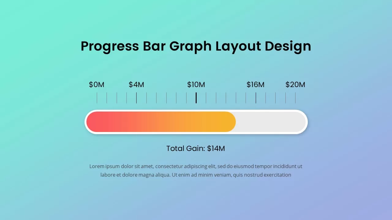
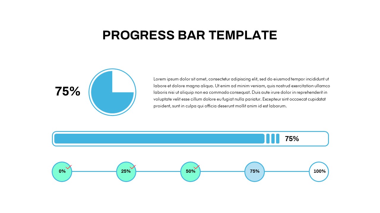
Progress Bar Graph Layout Design for PowerPoint & Google Slides
Charts
Premium
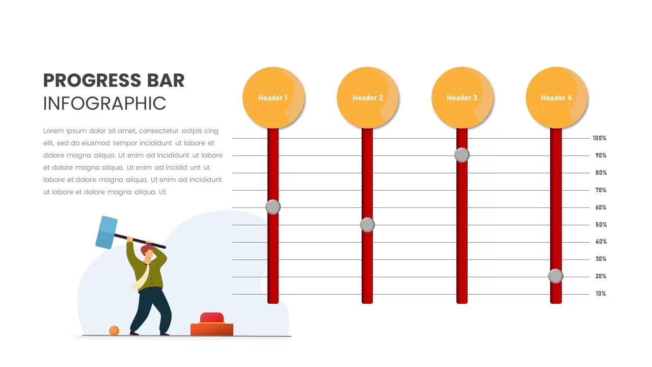
Progress Bar Infographic for PowerPoint & Google Slides
Business
Premium
Progress Bar infographic pack for PowerPoint & Google Slides
Business
Premium
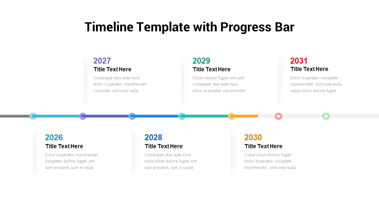
Timeline Roadmap with Progress Bar Template for PowerPoint & Google Slides
Timeline
Premium
Progress Bar and Milestone Visualization Template for PowerPoint & Google Slides
Timeline
Premium
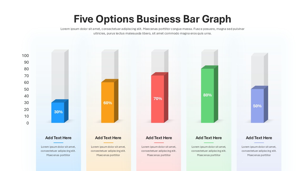
Five Options Business Bar Graph for PowerPoint & Google Slides
Business Report
Premium
Isometric Organization Chart Diagram Template for PowerPoint & Google Slides
Org Chart
Premium
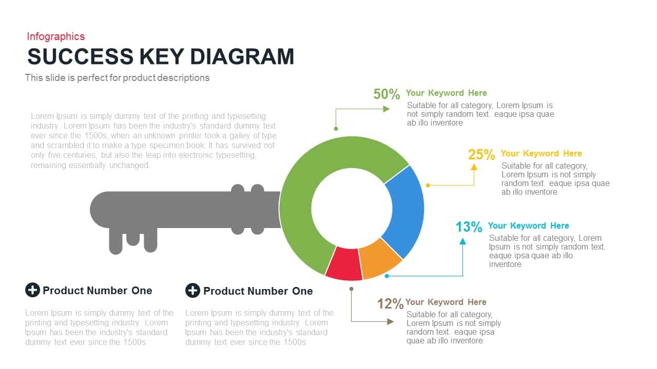
Success Key Diagram with Donut Chart Template for PowerPoint & Google Slides
Pie/Donut
Premium
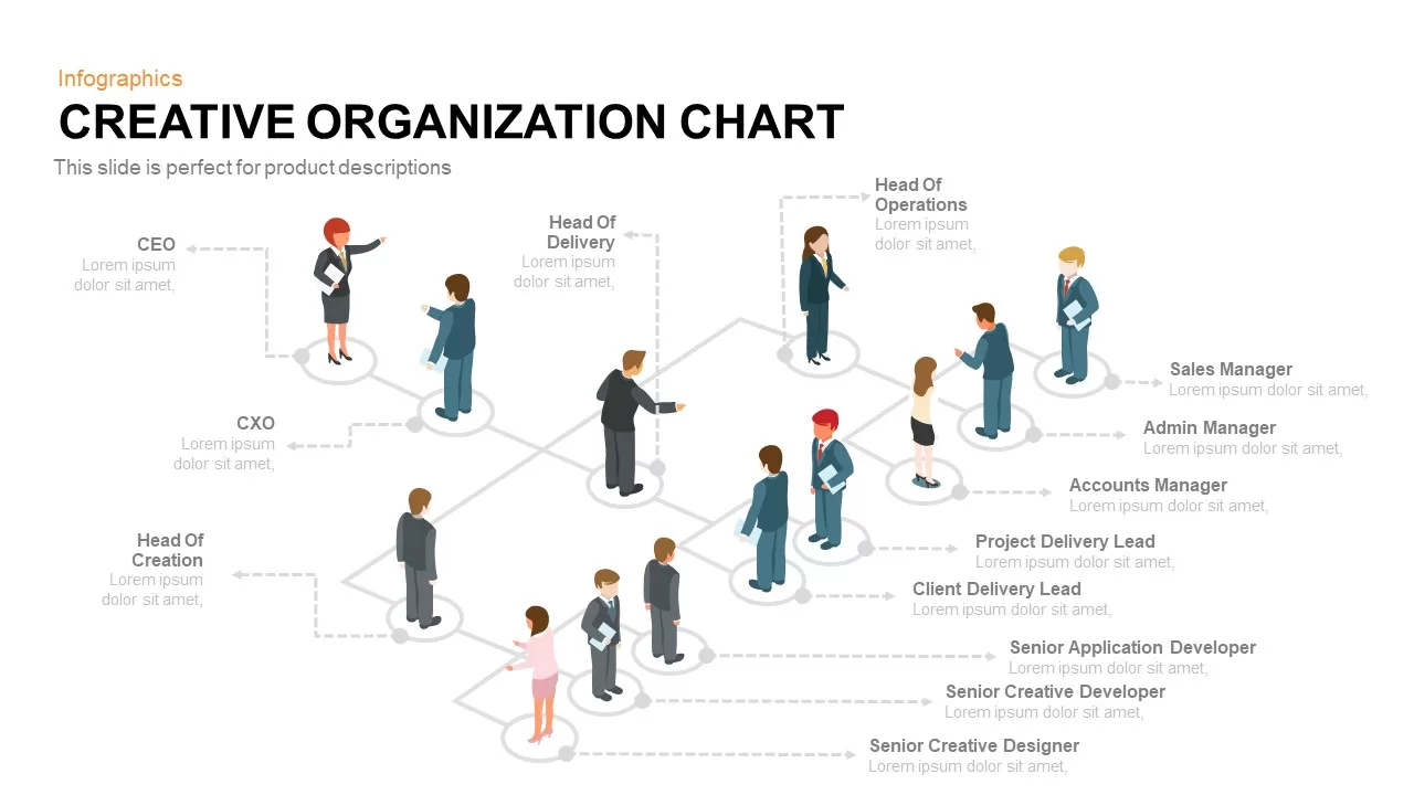
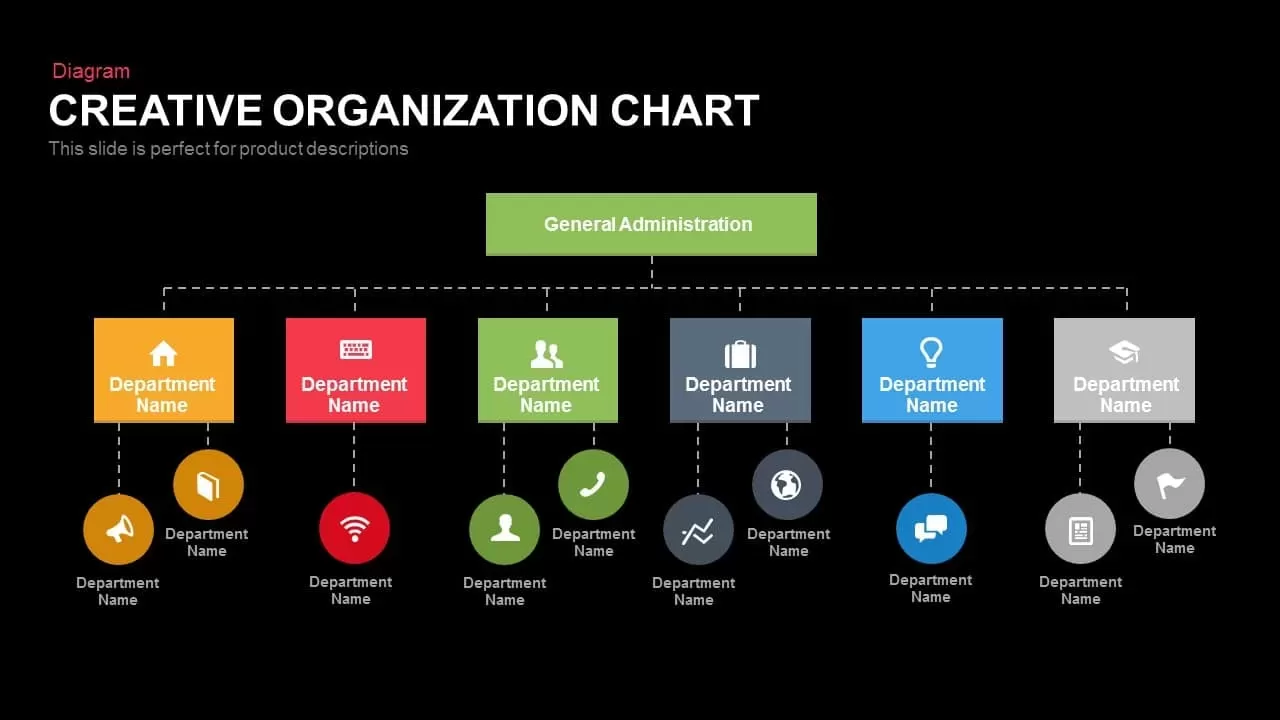
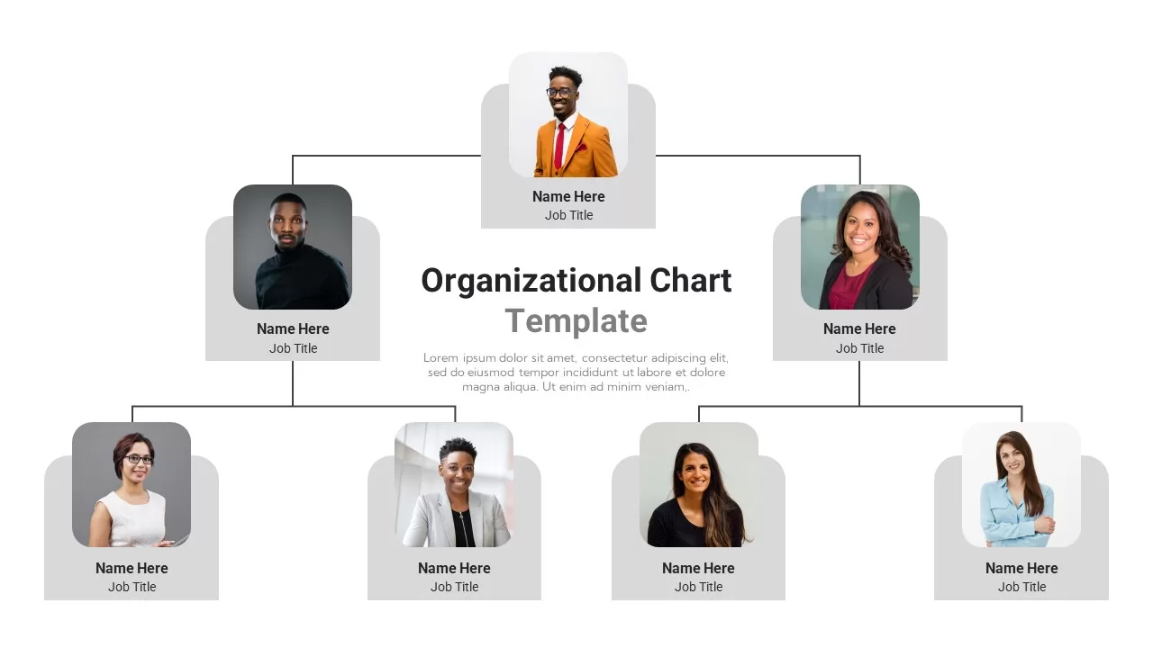
Creative Organization Chart Diagram Template for PowerPoint & Google Slides
Org Chart
Premium
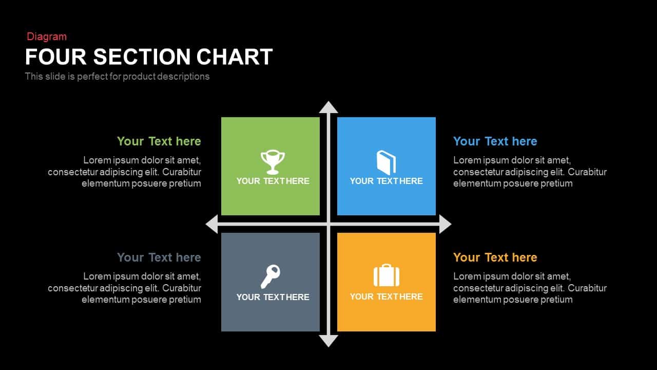
Four Section Comparison Chart Diagram Template for PowerPoint & Google Slides
Infographics
Premium
Vertical Split Flow Chart Diagram Template for PowerPoint & Google Slides
Flow Charts
Premium
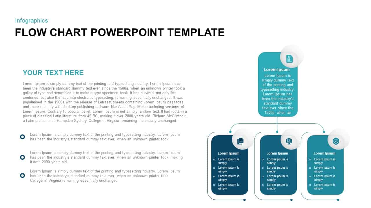
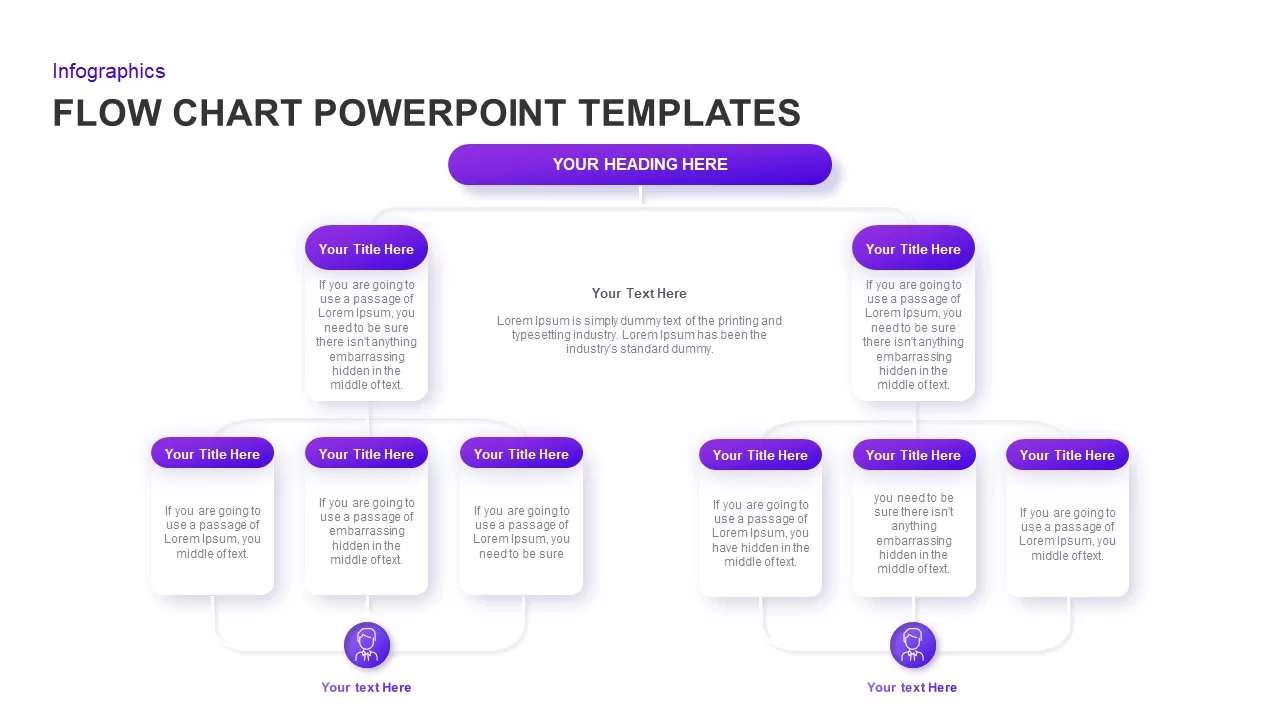
Flow Chart Diagram Template for PowerPoint & Google Slides
Flow Charts
Premium
Professional Organizational Chart Diagram Template for PowerPoint & Google Slides
Org Chart
Premium
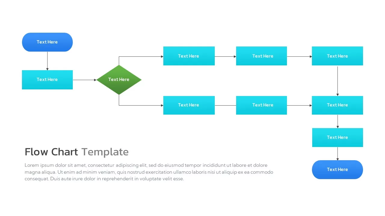
Flow Chart Diagram template for PowerPoint & Google Slides
Flow Charts
Premium
Free Circular Multi-Step Flow Chart Diagram Template for PowerPoint & Google Slides
Flow Charts
Free
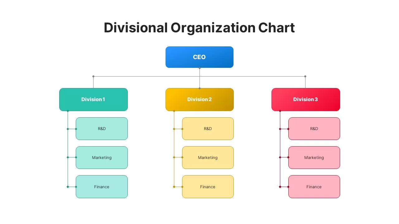
Divisional Organizational Chart Diagram Template for PowerPoint & Google Slides
Org Chart
Premium
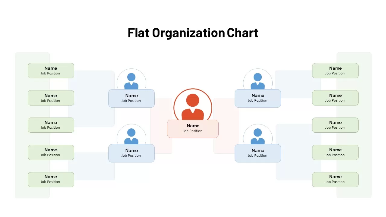
Flat Organization Chart Diagram Template for PowerPoint & Google Slides
Org Chart
Premium
Flat Organization Chart Diagram Template for PowerPoint & Google Slides
Org Chart
Premium
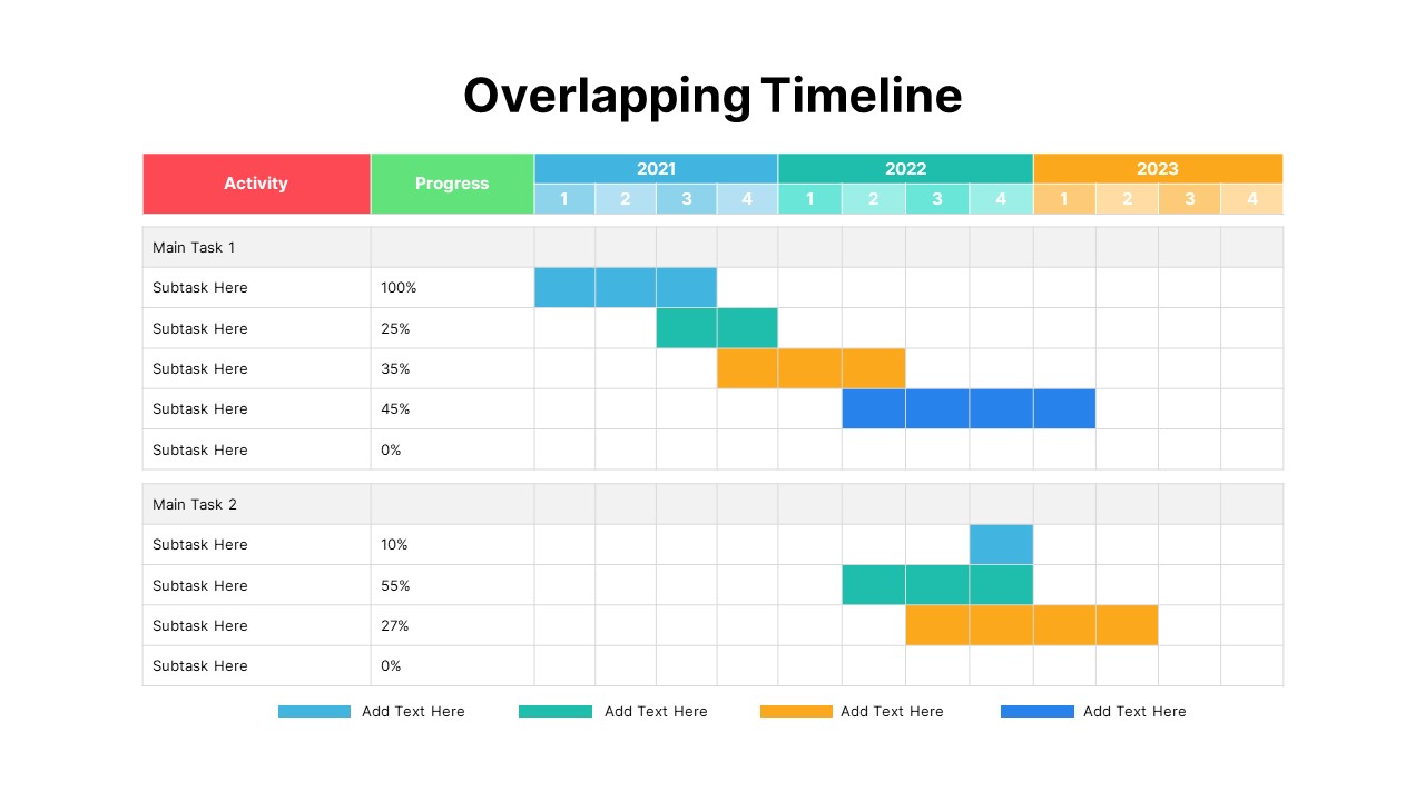
Overlapping Timeline Gantt Chart Diagram Template for PowerPoint & Google Slides
Timeline
Premium
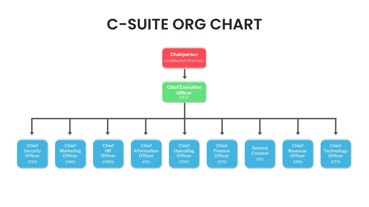
C-Suite Executive Org Chart Diagram Template for PowerPoint & Google Slides
Org Chart
Premium
Animated Hexagon Org Chart Diagram Template for PowerPoint & Google Slides
Org Chart
Premium
Upside-Down Organizational Chart Diagram Template for PowerPoint & Google Slides
Org Chart
Premium
Multi-Style Clock Chart Diagram Template for PowerPoint & Google Slides
Circle
Premium
Multi-Variation Circular Chart Diagram Template for PowerPoint & Google Slides
Circle
Premium
Inverted Organization Chart Diagram Template for PowerPoint & Google Slides
Org Chart
Premium
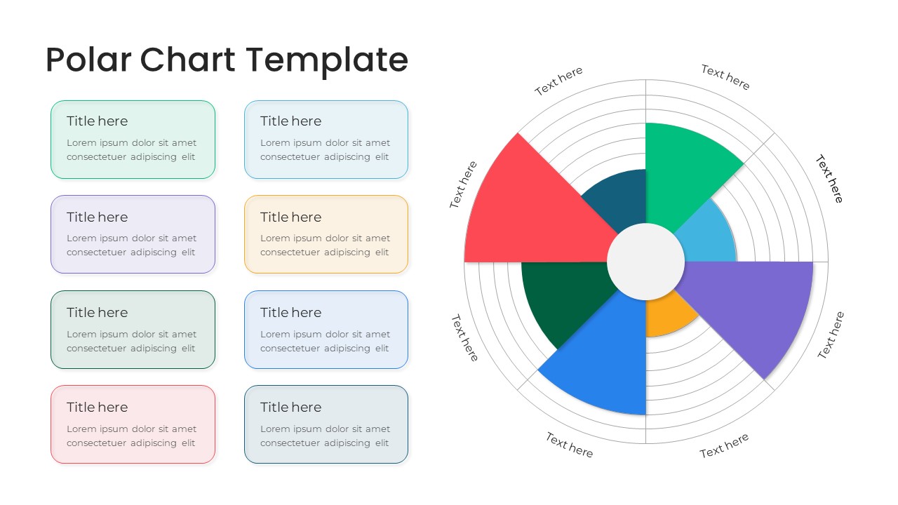
Modern Multi-Color Polar Chart Diagram Template for PowerPoint & Google Slides
Circle
Premium
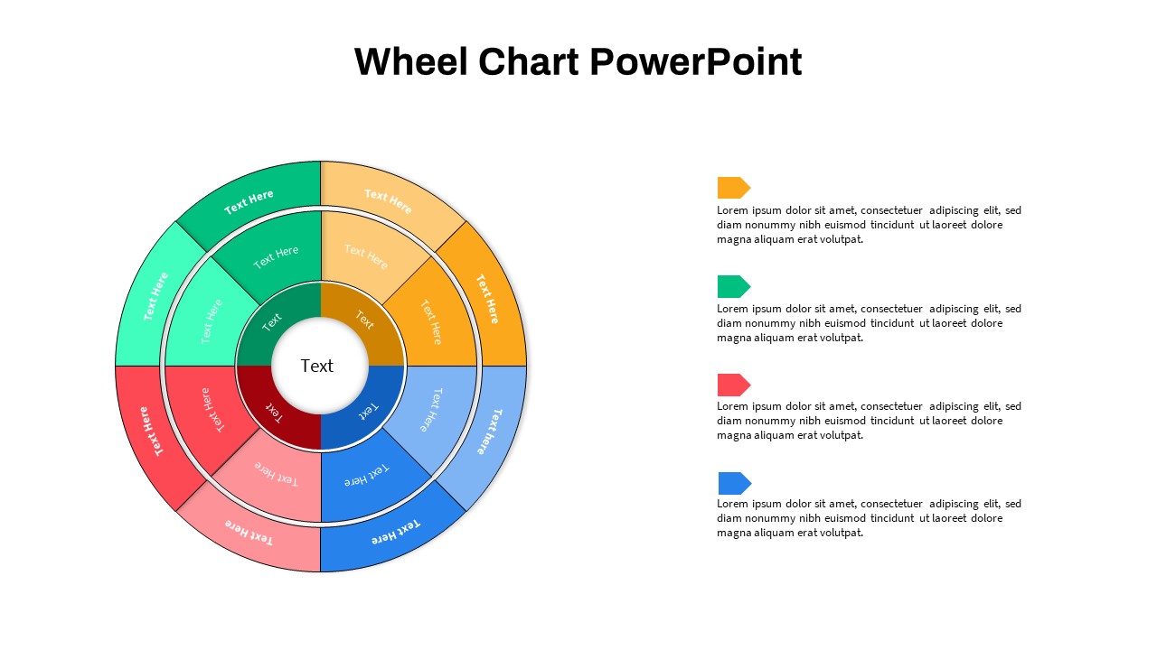
Multi-Level Wheel Chart Diagram template for PowerPoint & Google Slides
Pie/Donut
Premium
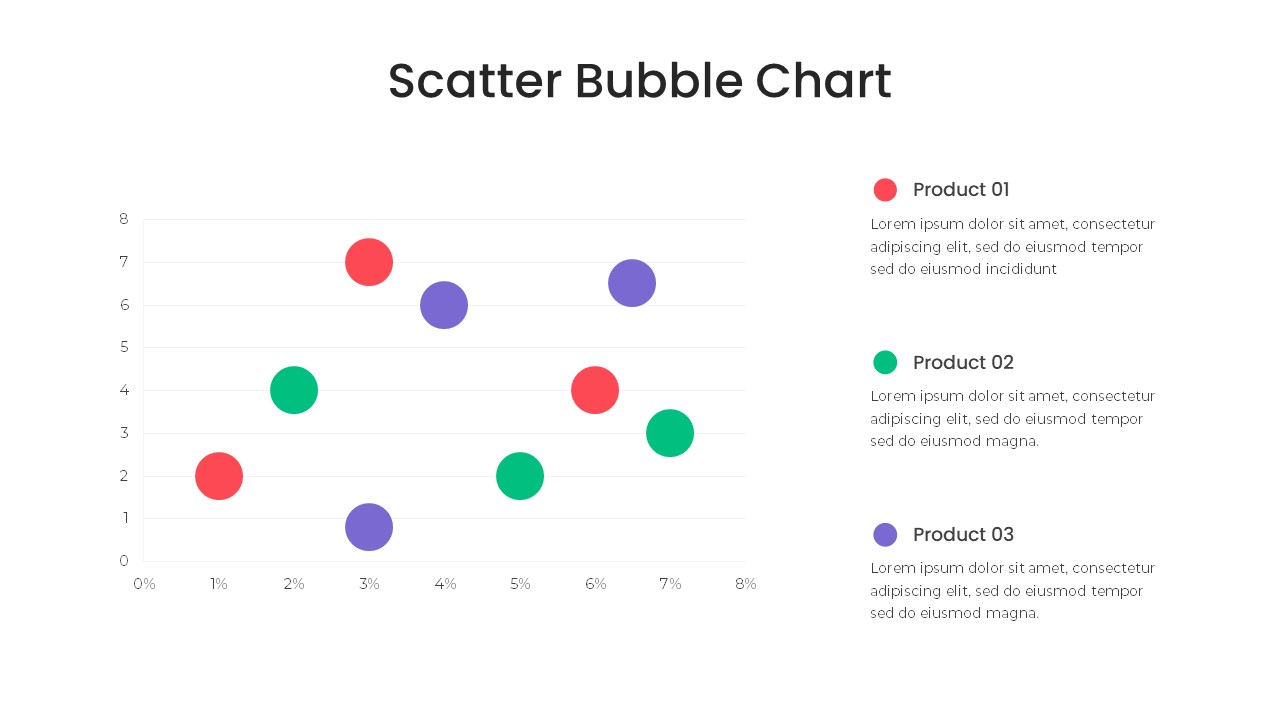
Bubble Chart Scatter, Diagram & Matrix Template for PowerPoint & Google Slides
Comparison Chart
Premium
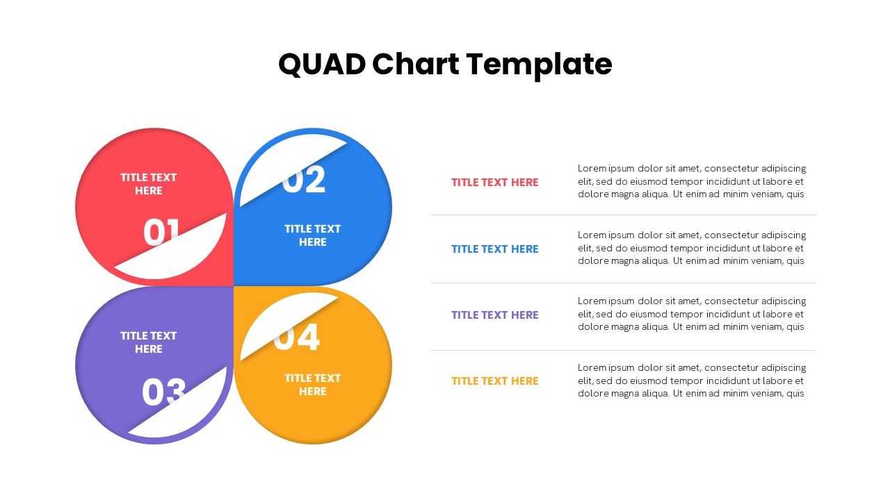
Quad Chart Infographic Pack of 8 Slides Template for PowerPoint & Google Slides
Comparison Chart
Premium
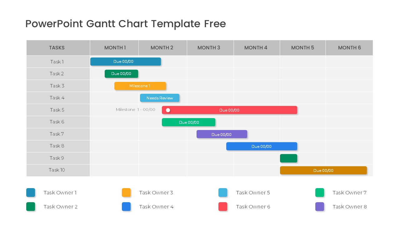
Free Professional Gantt Chart Pack – 4 Slides Template for PowerPoint & Google Slides
Gantt Chart
Free
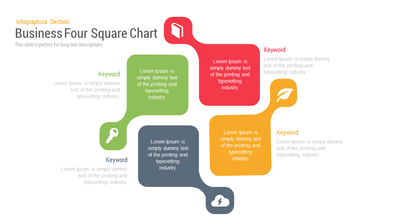
Business Four Square Chart template for PowerPoint & Google Slides
Business
Premium
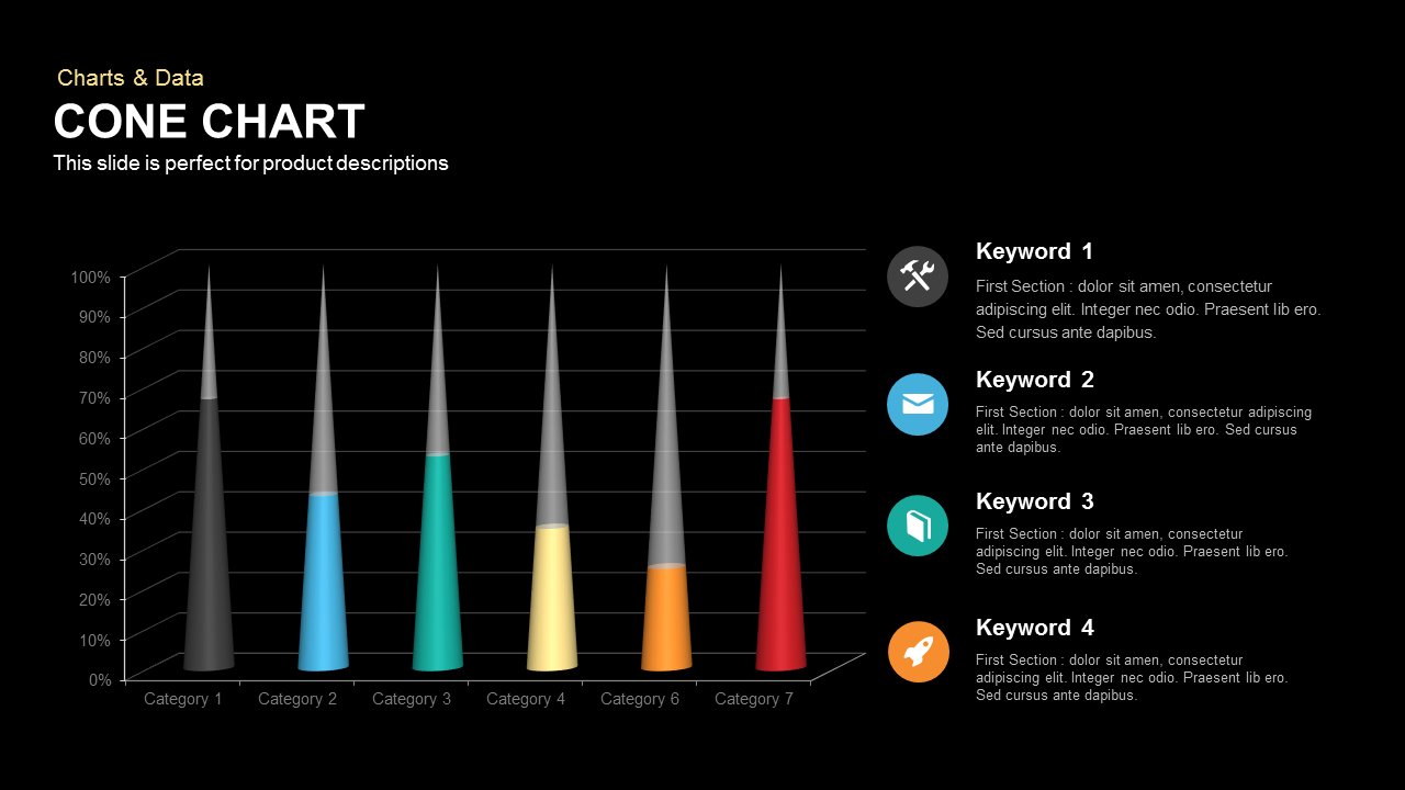
3D Cone Chart Data Visualization template for PowerPoint & Google Slides
Bar/Column
Premium
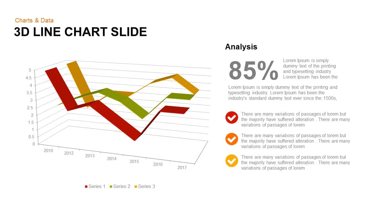
3D Line Chart for PowerPoint & Google Slides
Charts
Premium
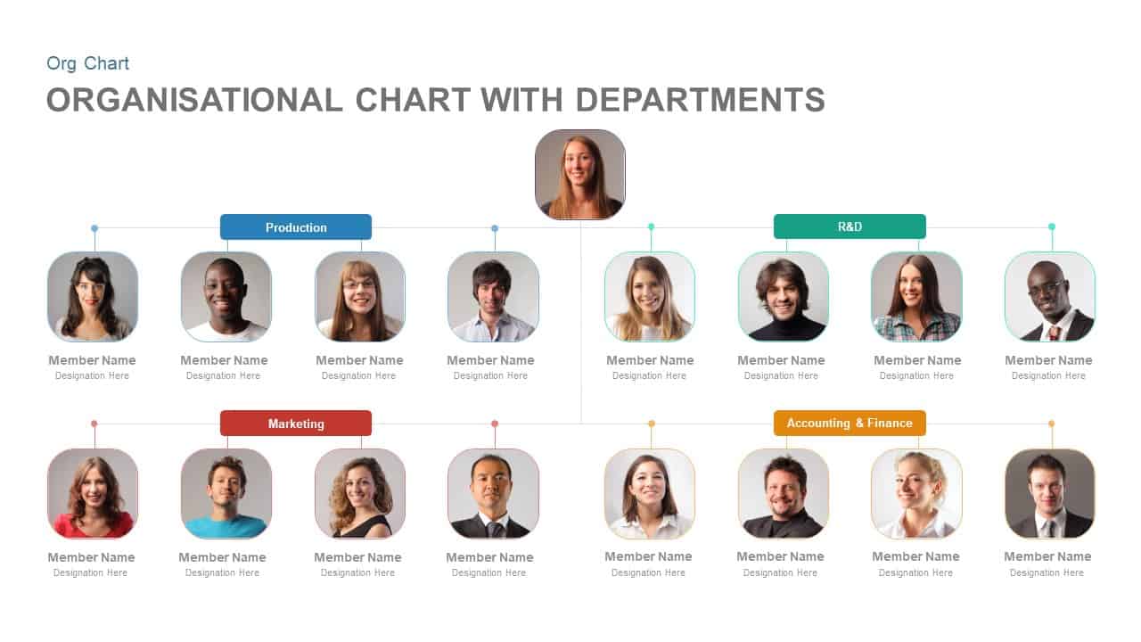
Organisational Chart with Departments Template for PowerPoint & Google Slides
Org Chart
Premium
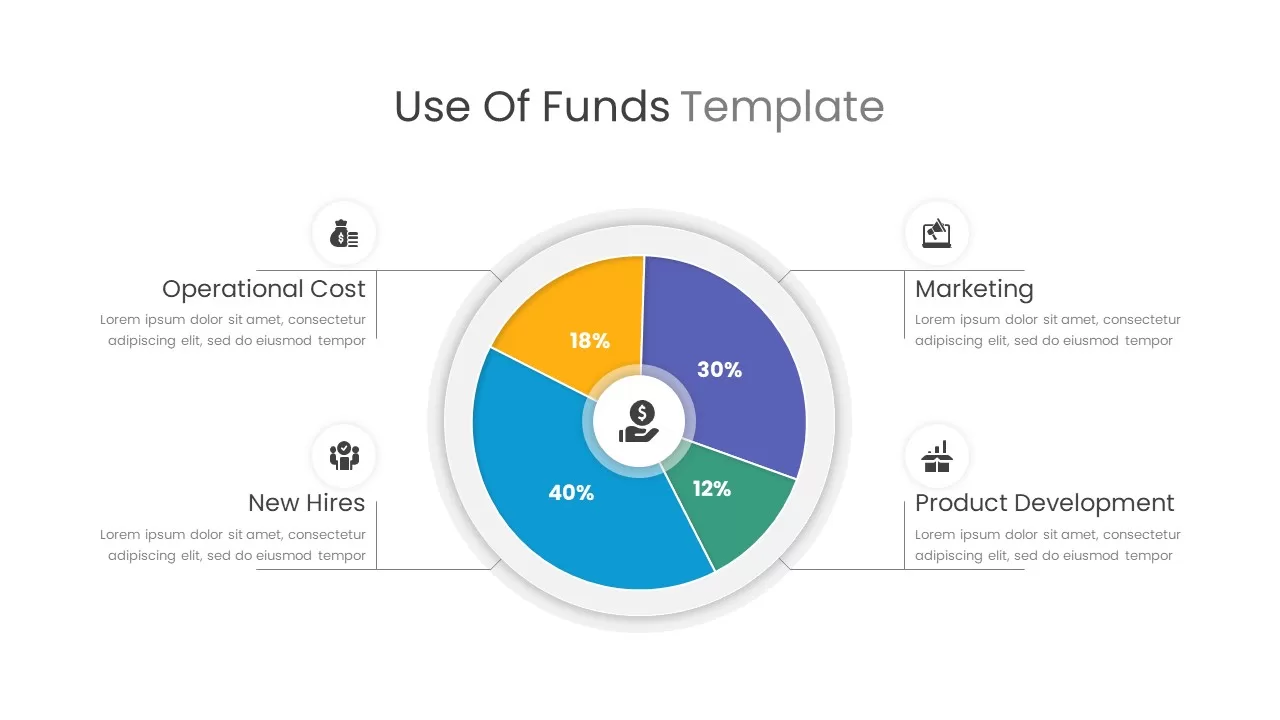
Use of Funds Donut Chart Infographic Template for PowerPoint & Google Slides
Circle
Premium
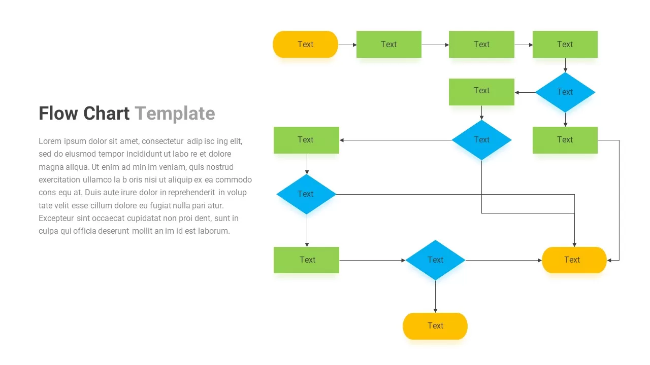
Flow Chart template for PowerPoint & Google Slides
Flow Charts
Premium
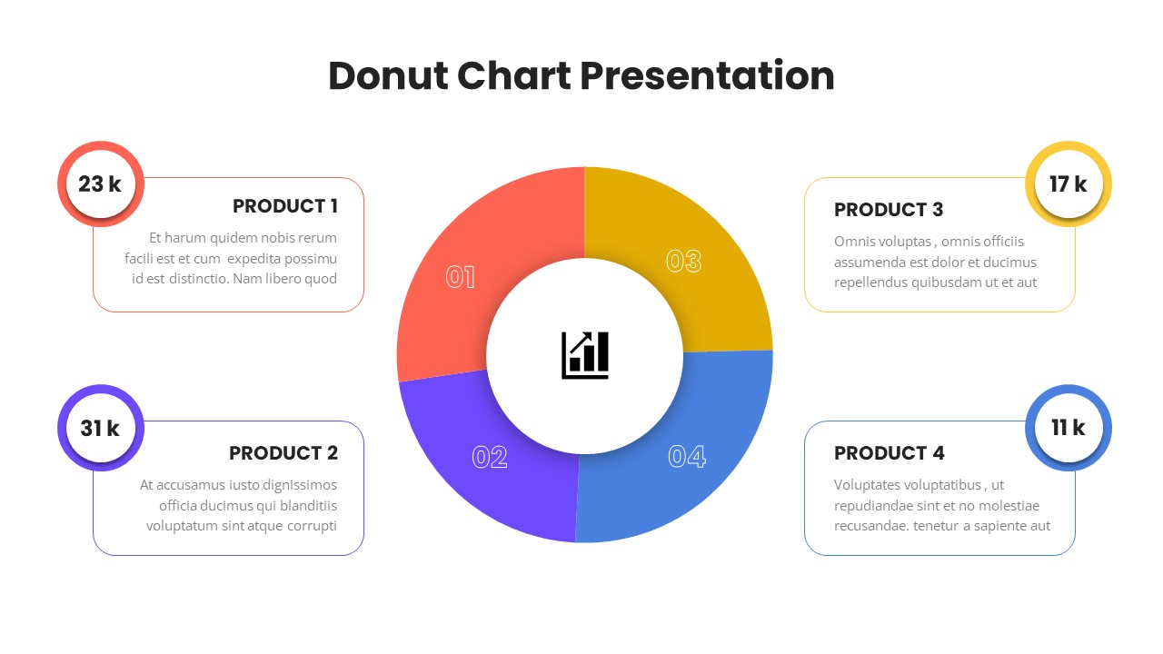
Donut Chart Presentation for PowerPoint & Google Slides
Pie/Donut
Premium
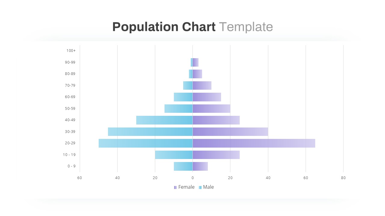
Population Pyramid Chart Analysis Template for PowerPoint & Google Slides
Bar/Column
Premium
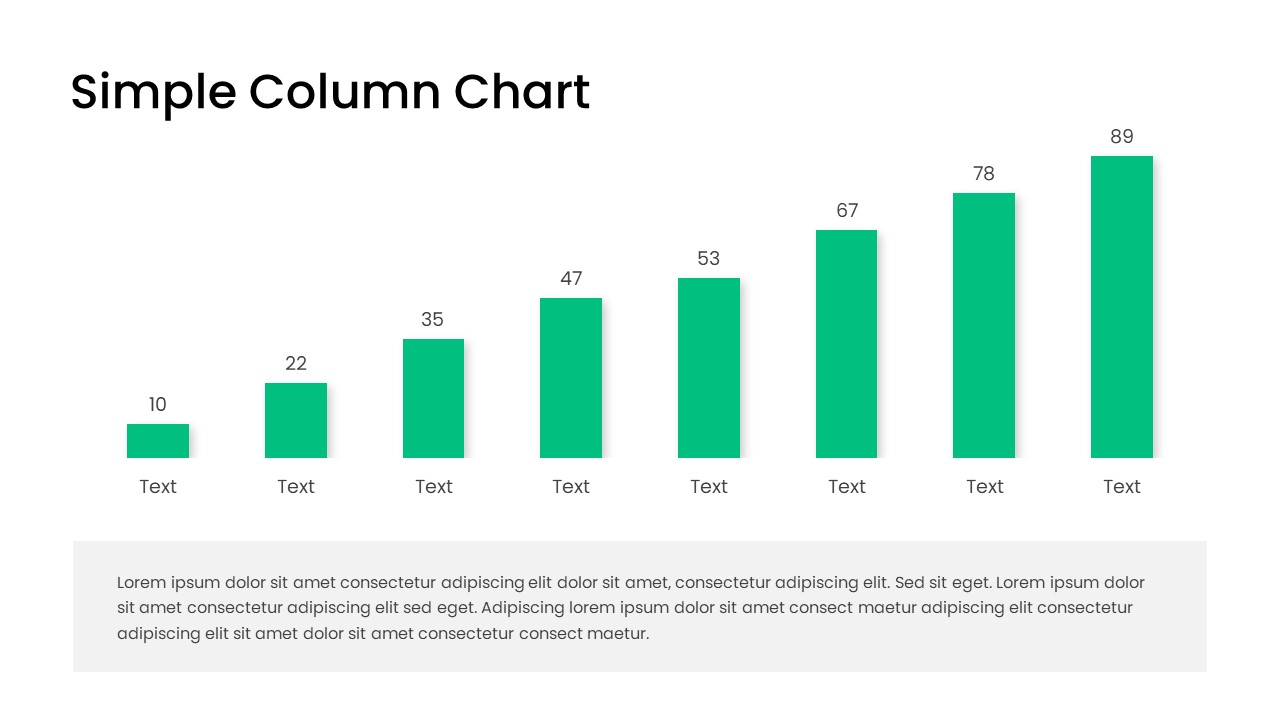
Free Editable Simple Column Chart Slide Template for PowerPoint & Google Slides
Bar/Column
Free
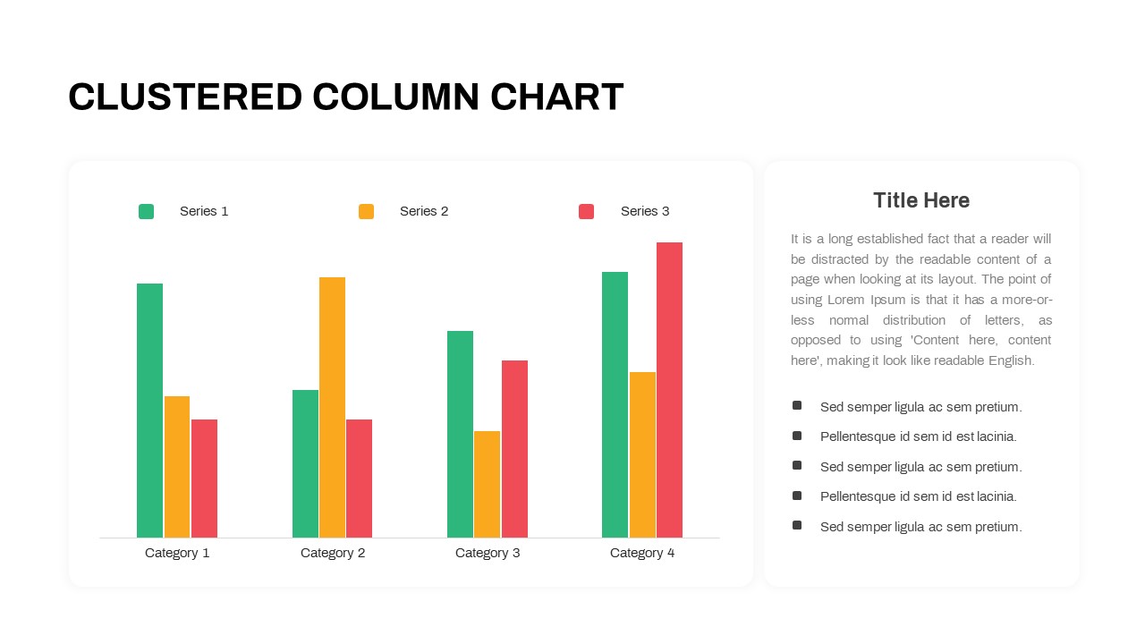
Professional Clustered Column Chart Template for PowerPoint & Google Slides
Bar/Column
Premium
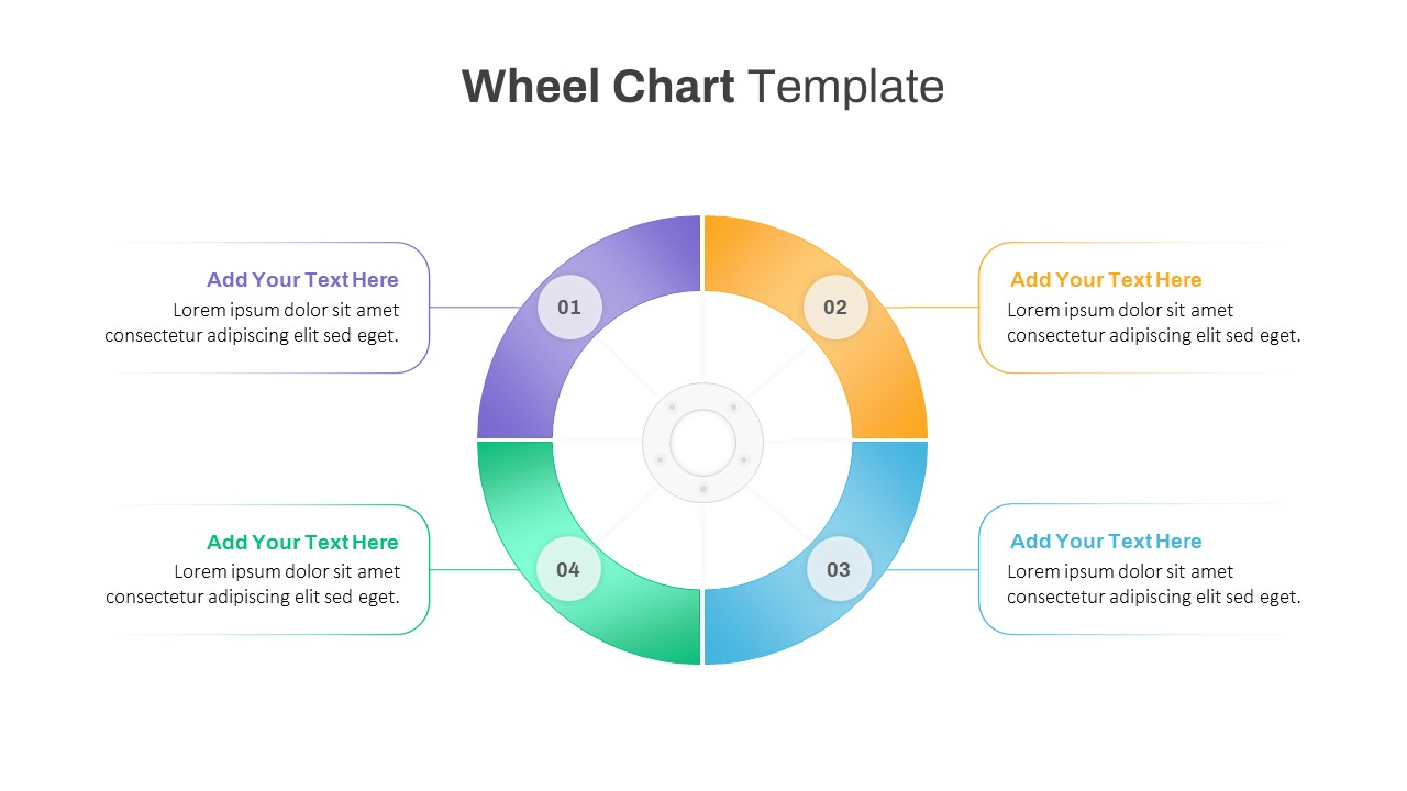
Colorful Four-Segment Wheel Chart Template for PowerPoint & Google Slides
Circle
Premium
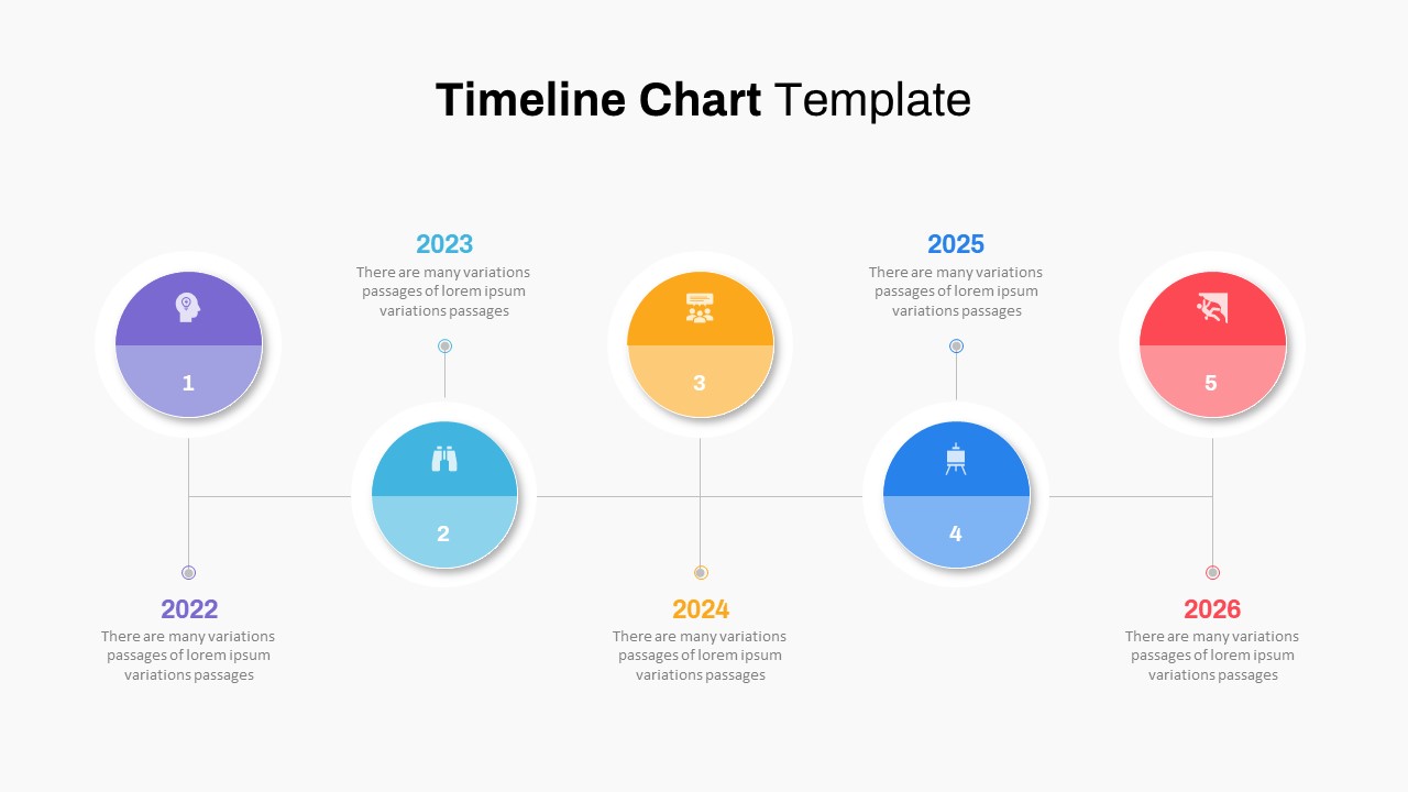
Five-Phase Horizontal Timeline Chart Template for PowerPoint & Google Slides
Timeline
Premium
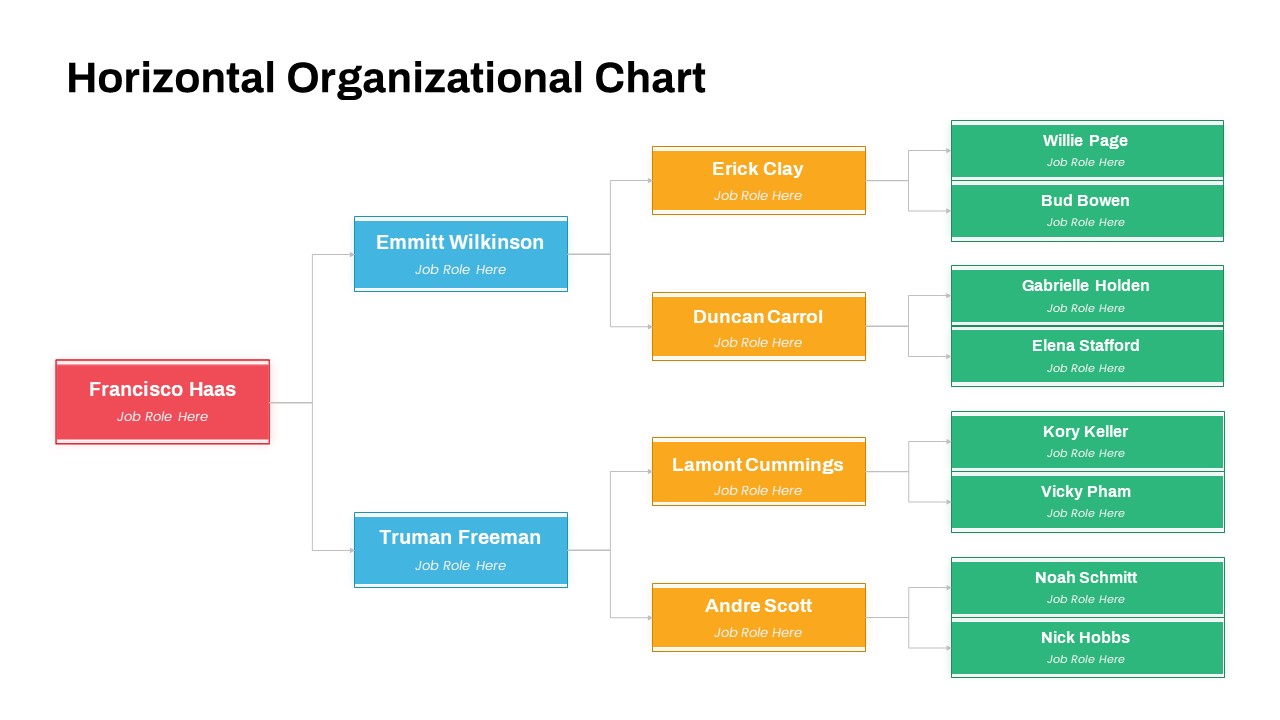
Horizontal Organizational Chart Template for PowerPoint & Google Slides
Org Chart
Premium
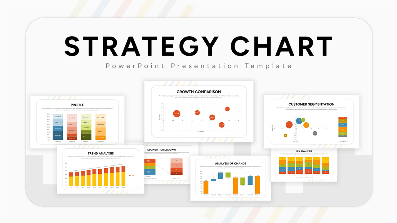
Ultimate Strategy Chart Presentation Template for PowerPoint & Google Slides
Charts
Premium
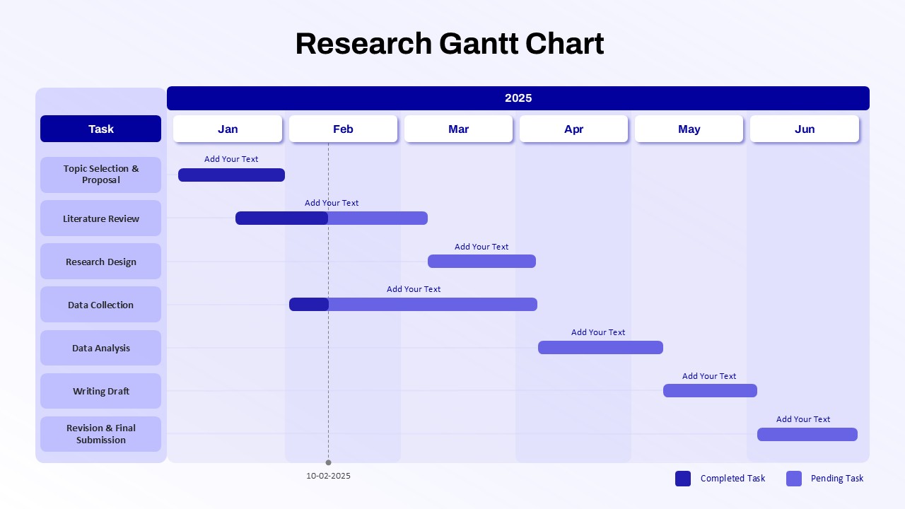
Research Gantt Chart template for PowerPoint & Google Slides
Project
Premium