Sales Growth Comparison Chart & Table Template

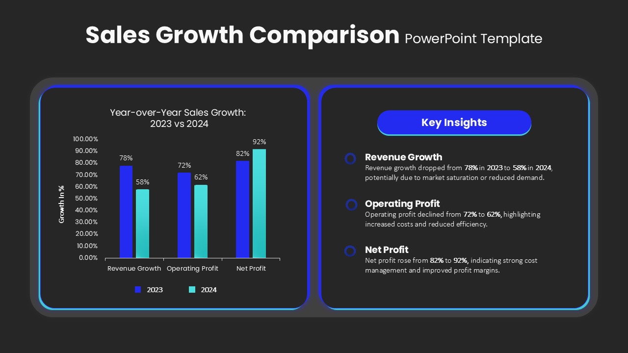
Numbers on a spreadsheet rarely convince a room the way a chart does. This sales growth comparison pack takes your year-over-year and monthly figures and turns them into two slides built for exactly that kind of conversation, whether it’s a board meeting or a quarterly review.
Slide one: the year-over-year view
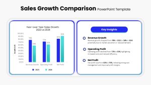
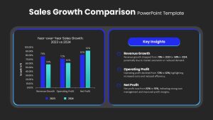
A dual bar chart sits at the center, comparing 2023 against 2024 across Revenue, Operating Profit, and Net Profit, all inside a rounded container that keeps the numbers from feeling cluttered. To the right, a Key Insights panel pulls out the story in a few lines, using bold headlines and circular icons to flag where revenue or operating profit dipped and where net profit held steady or grew, so viewers don’t have to read the chart to get the headline.
Slide two: the monthly breakdown
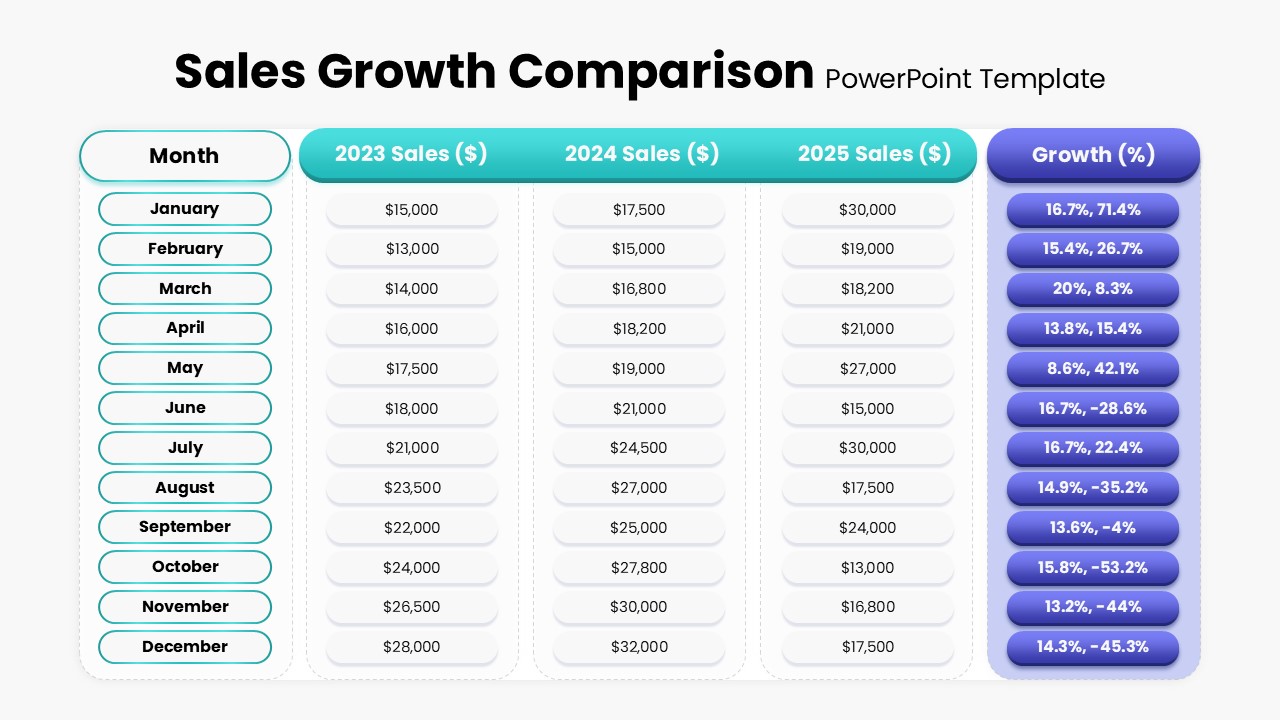
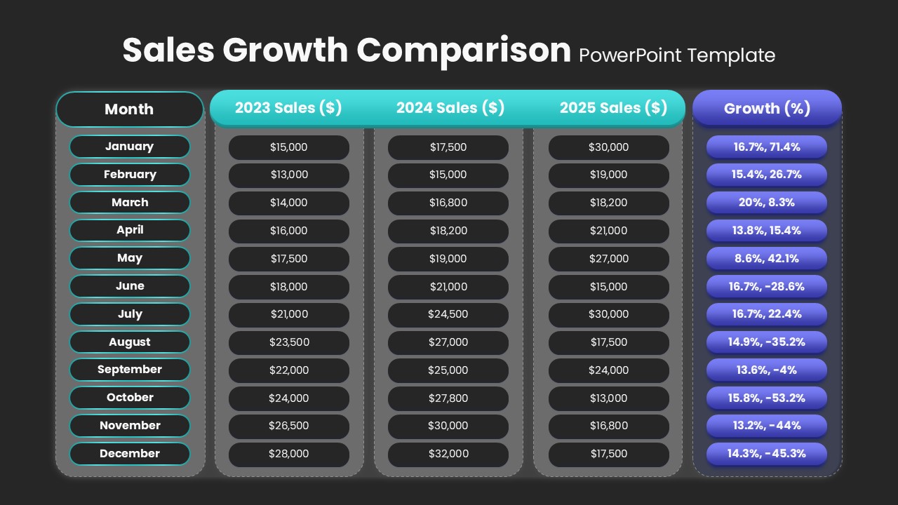
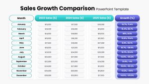
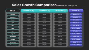
This slide trades the chart for a detailed table, tracking monthly sales across 2023, 2024, and 2025 side by side. A Growth percentage column sits in pill-shaped highlights so the trend is visible without scanning every row, and the sales figures themselves sit in softly shaded, rounded cells that stay easy to read even with three years of data on one slide.
Both slides update through linked Excel data in PowerPoint or manual entry in Google Sheets, and since the layout is modular, duplicating a slide to add another year or a new KPI takes no extra formatting work. Financial analysts, sales managers, and executives tend to use this growth comparison slide pack for investor briefings and quarterly reports, though the same table and chart format works just as well for marketing ROI comparisons, regional performance breakdowns, or a straightforward KPI dashboard once the headers and colors are swapped to match.
Login to download this file

Item ID
SB04836


Related Templates

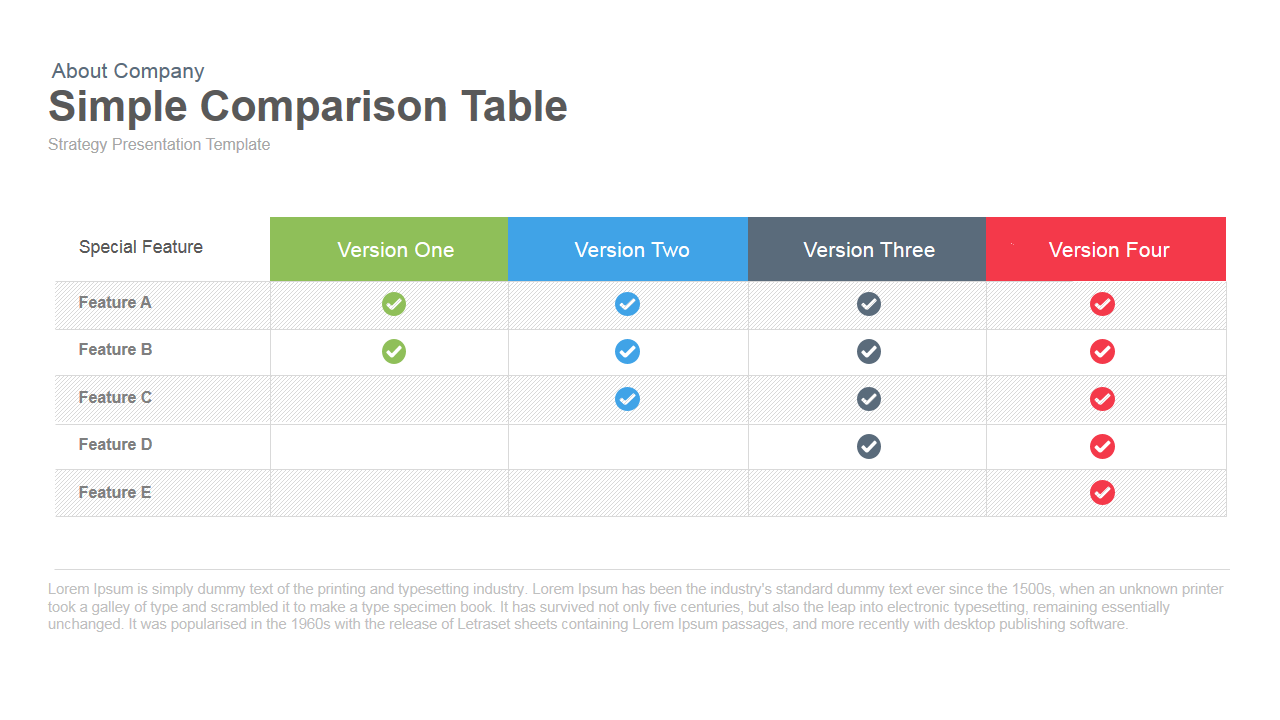
Simple Comparison Table PowerPoint Template
Comparison
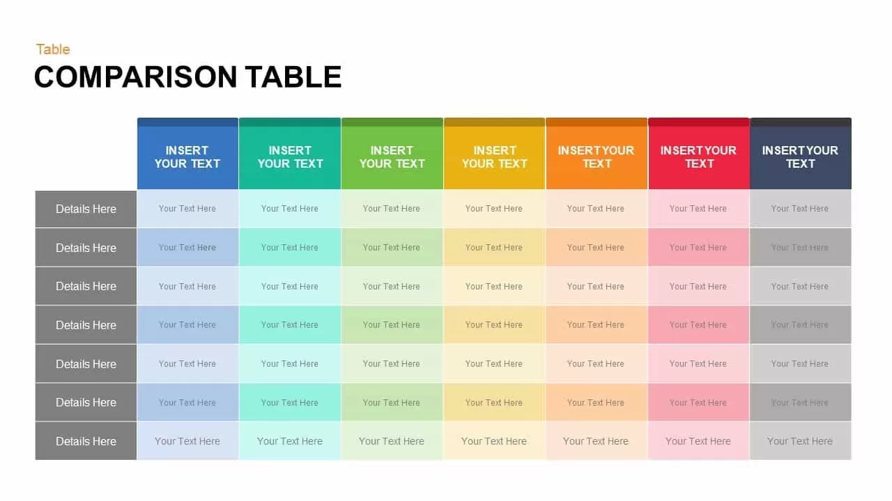
Comparison Table for PowerPoint Template
Comparison

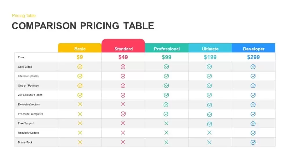
Comparison Pricing Table Template for PowerPoint & Google Slides
Comparison Chart
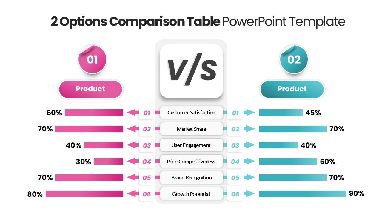
2 Options Comparison Table PowerPoint Template
Comparison
Product Feature Comparison Table Template
Comparison Chart
Table Presentation PowerPoint Template
Table
4-Column Data Table PowerPoint Template
Table
Colorful Table Presentation Template for PowerPoint & Google Slides
Table
Table Presentation Template PPT & Google Slides Theme
Comparison
5-Point Pros and Cons Comparison Table PowerPoint Template
Comparison Chart
Sales Growth PowerPoint Template
Revenue
Business Growth Metaphor Chart Template for PowerPoint & Google Slides
Business
Growth Curve Line Chart Visualization Template for PowerPoint & Google Slides
Charts
Learning Curve Performance Growth Chart Template for PowerPoint & Google Slides
Employee Performance

Revenue Growth and Target Analysis PowerPoint Template
Revenue
Growth Chart infographic
Infographics
Comparison Chart PowerPoint Template
Comparison Chart
Radar Chart Product Comparison PowerPoint Template
Comparison Chart

Circular Product Comparison Chart Template for PowerPoint & Google Slides
Comparison Chart
3-Chart Comparison PowerPoint Template
Pie/Donut