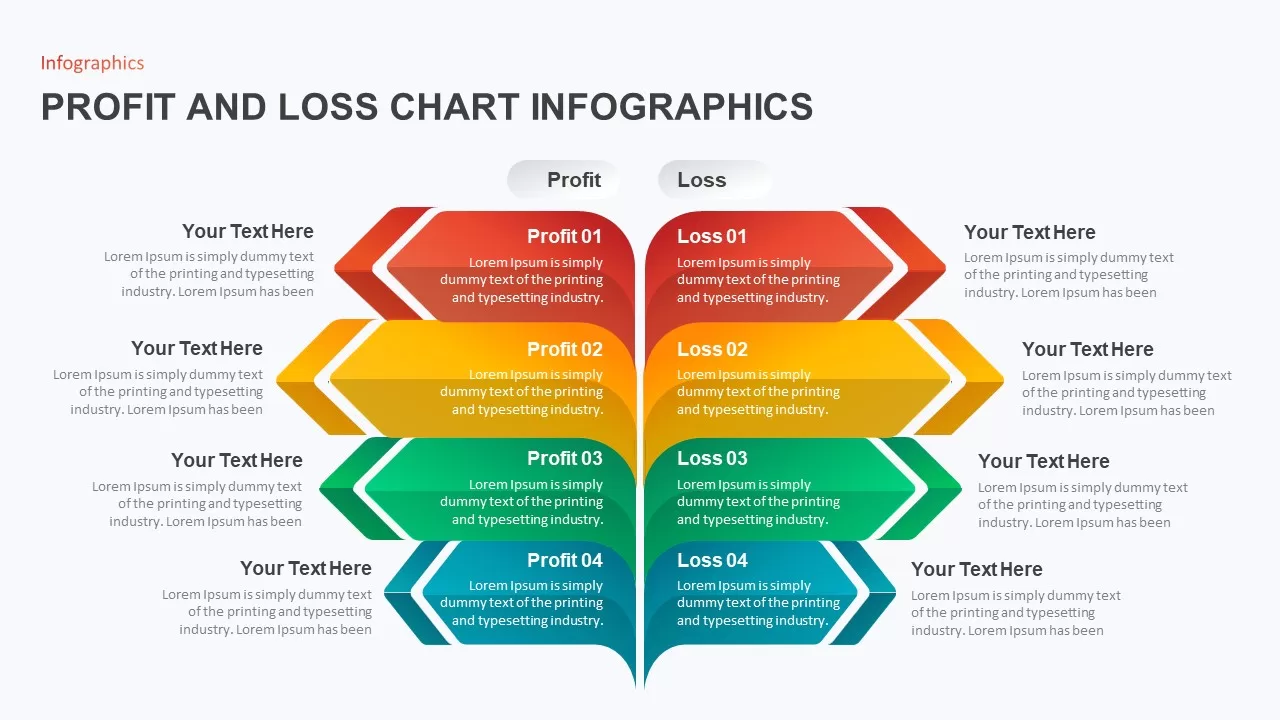
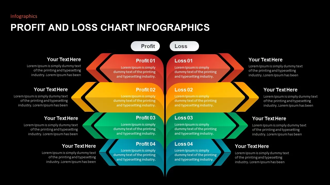
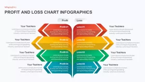
Profit and Loss Chart Infographics for PowerPoint & Google Slides
Description
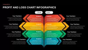
This Profit and Loss Chart Infographics template is designed to present financial data in an easily digestible format. The diagram uses color-coded arrows to separate profits and losses, with four sections dedicated to each, allowing you to break down key data points across multiple categories. The vibrant color gradients from red to green help visually differentiate the profit and loss sections, making it easier for audiences to track financial performance.
This infographic template is perfect for financial analysis, business performance reviews, or budget tracking. Each section has placeholders for text, enabling users to input specific data or insights, ensuring the information is both clear and actionable. The symmetrical design and structured layout make it a professional tool for presenting financial metrics, projections, or historical comparisons.
Fully editable in PowerPoint and Google Slides, the template can be easily customized to fit your branding, adjust color schemes, or add specific data points. Whether you’re presenting financial performance to stakeholders, reviewing quarterly results, or evaluating cost-benefit analysis, this template provides a polished, visually appealing way to communicate complex data.
Who is it for
This template is ideal for financial analysts, business managers, accountants, and consultants who need to present profit and loss data in an organized and visually engaging manner. It’s perfect for teams evaluating business performance, project budgets, or financial forecasts.
Other Uses
Beyond financial presentations, this template can be used for project management evaluations, cost analysis breakdowns, or even risk assessments where you need to present both positive and negative outcomes. It’s also suitable for marketing reports comparing the benefits and challenges of campaigns.
Login to download this file

Item ID
SB01905
Related Templates

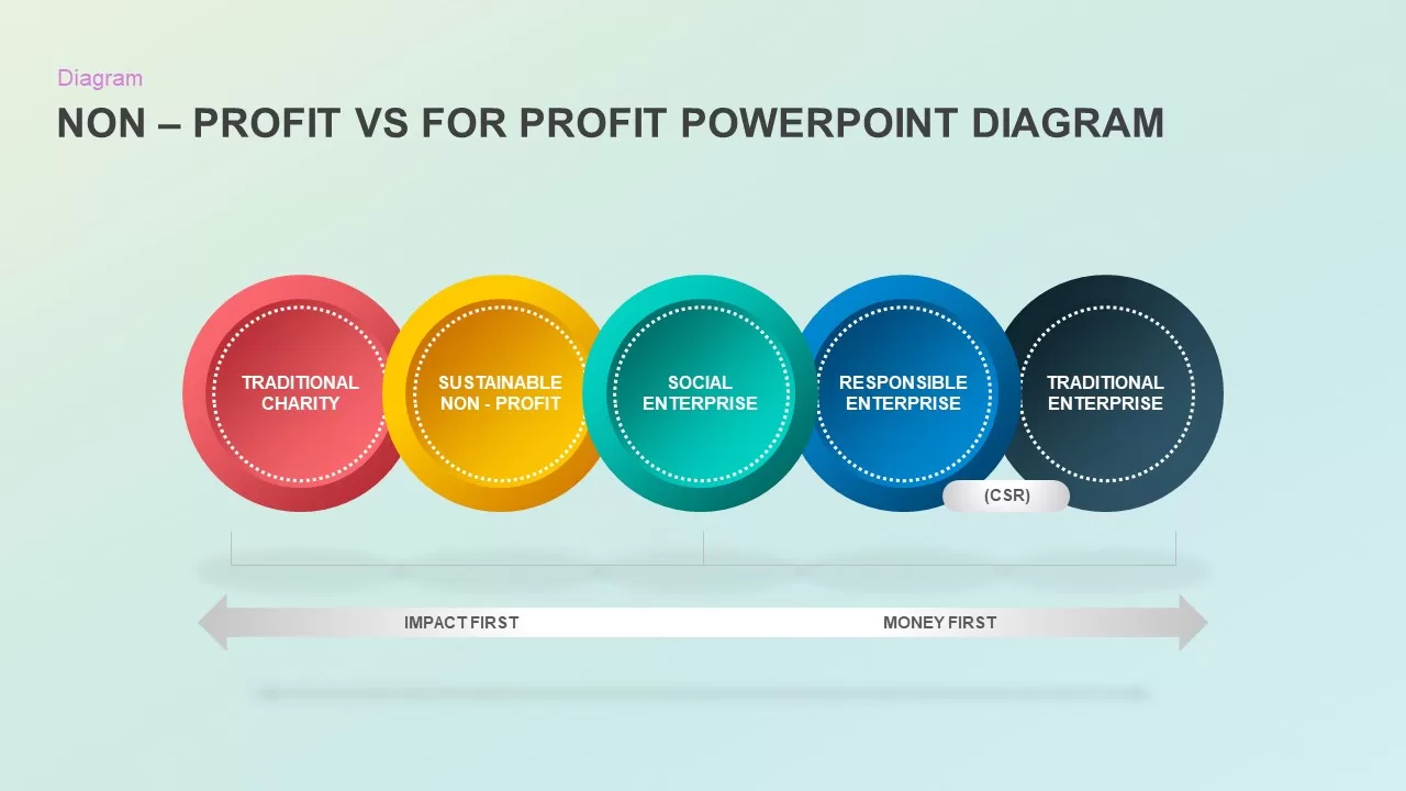
Non-Profit vs For-Profit Diagram template for PowerPoint & Google Slides
Business Models
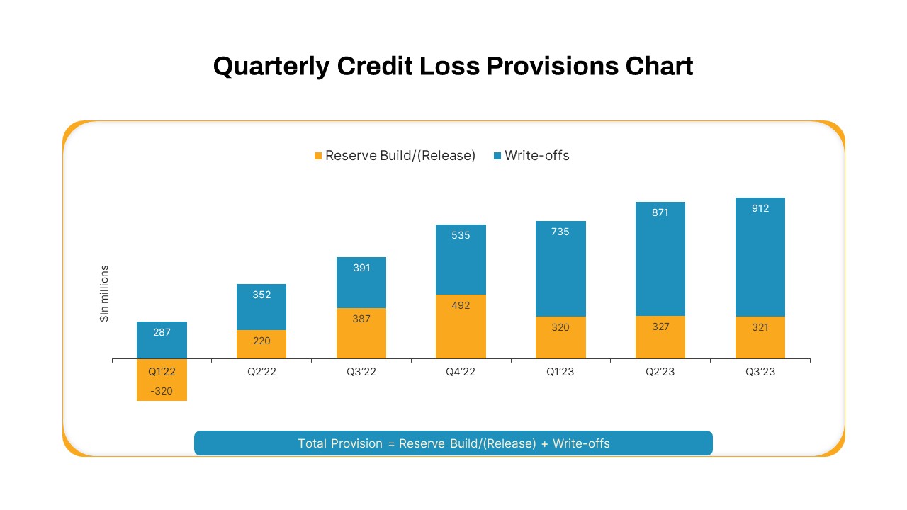
Quarterly Credit Loss Provisions Chart Template for PowerPoint & Google Slides
Bar/Column
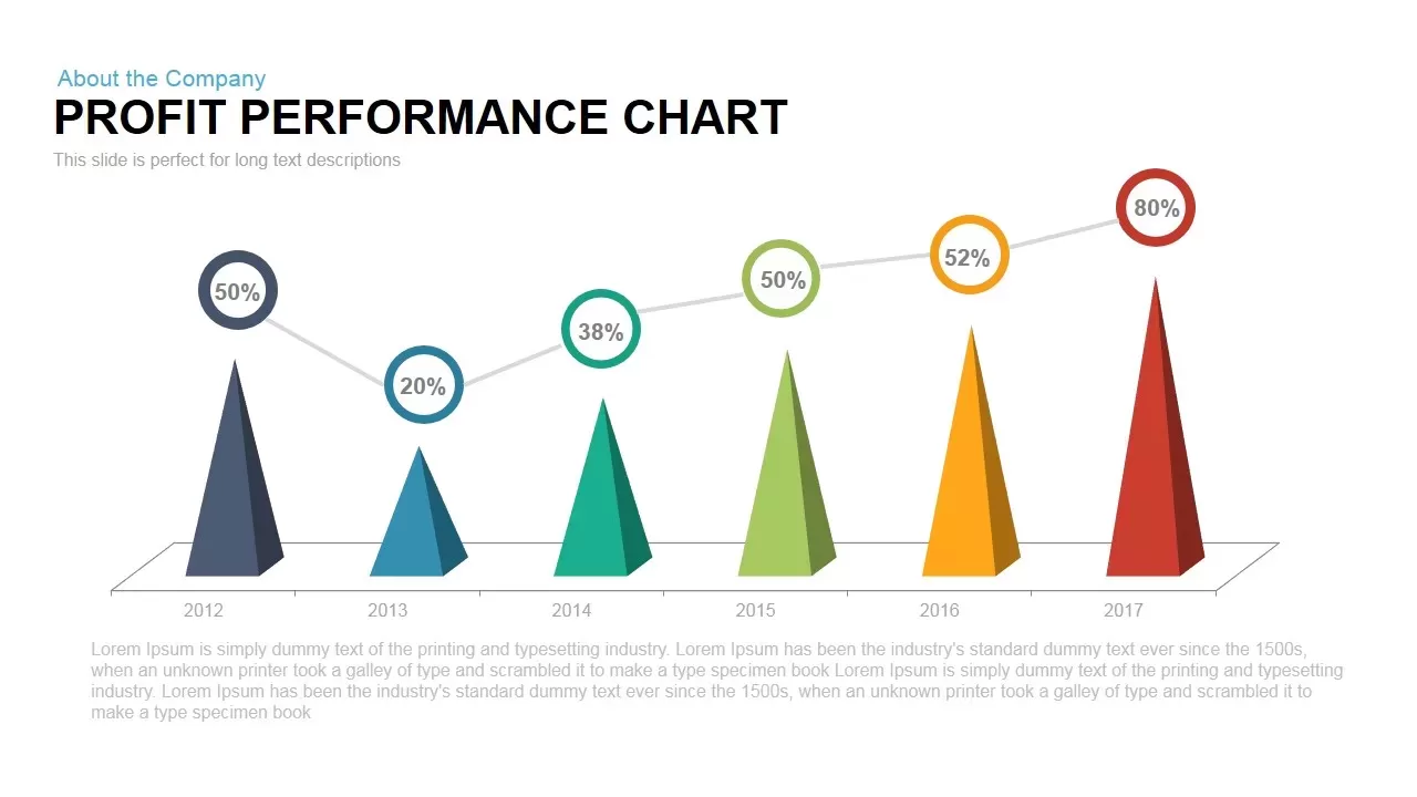
Profit Performance Trend Chart Template for PowerPoint & Google Slides
Finance
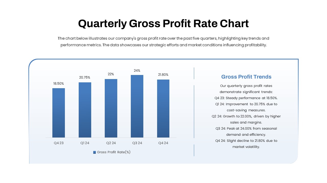
Quarterly Gross Profit Rate Chart Template for PowerPoint & Google Slides
Revenue
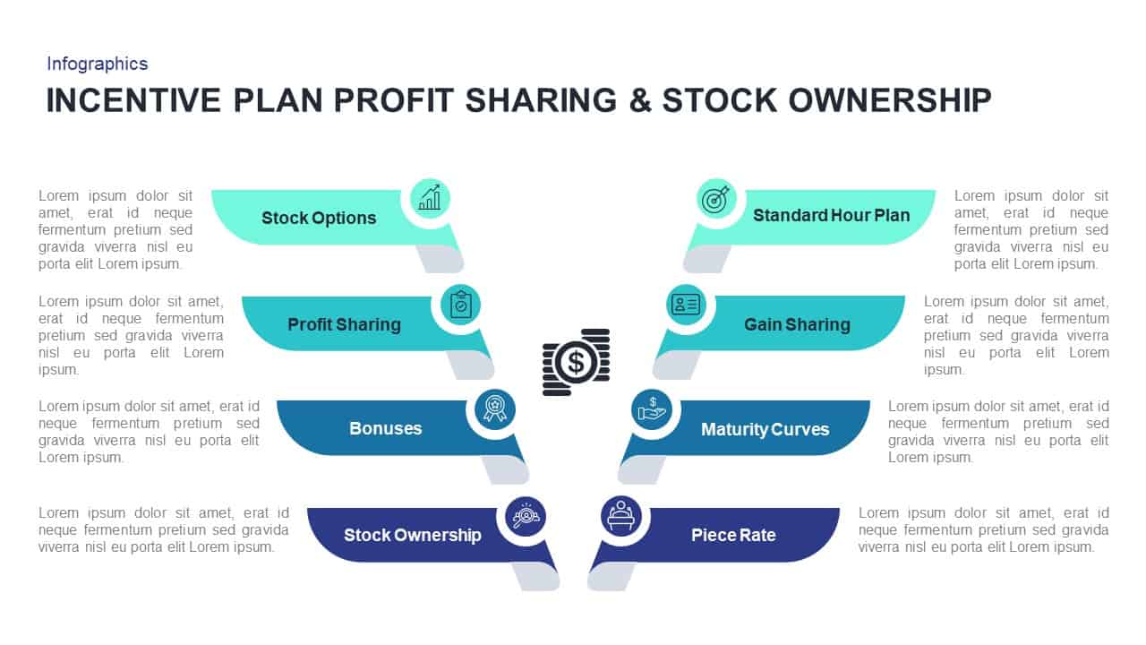
Profit Sharing & Stock Ownership Template for PowerPoint & Google Slides
Process

Non-Profit Organization Profile Deck Template for PowerPoint & Google Slides
Pitch Deck
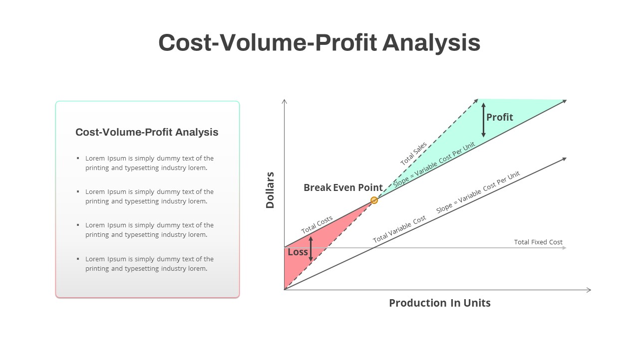
Cost-Volume-Profit Analysis Diagram Template for PowerPoint & Google Slides
Finance
3D Bar Chart Data Infographics Template for PowerPoint & Google Slides
Bar/Column
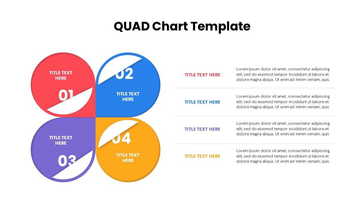
Quad Chart Infographic Pack of 8 Slides Template for PowerPoint & Google Slides
Comparison Chart
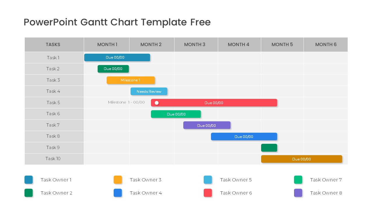
Free Professional Gantt Chart Pack – 4 Slides Template for PowerPoint & Google Slides
Gantt Chart
Free
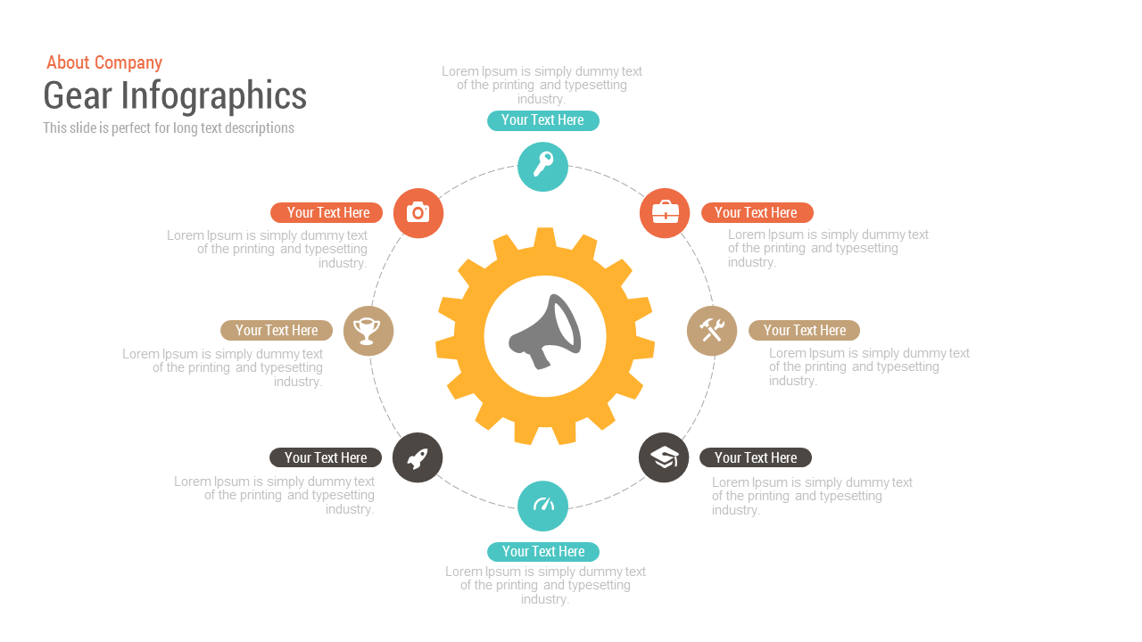
Free Gear Infographics template for PowerPoint & Google Slides
Process
Free
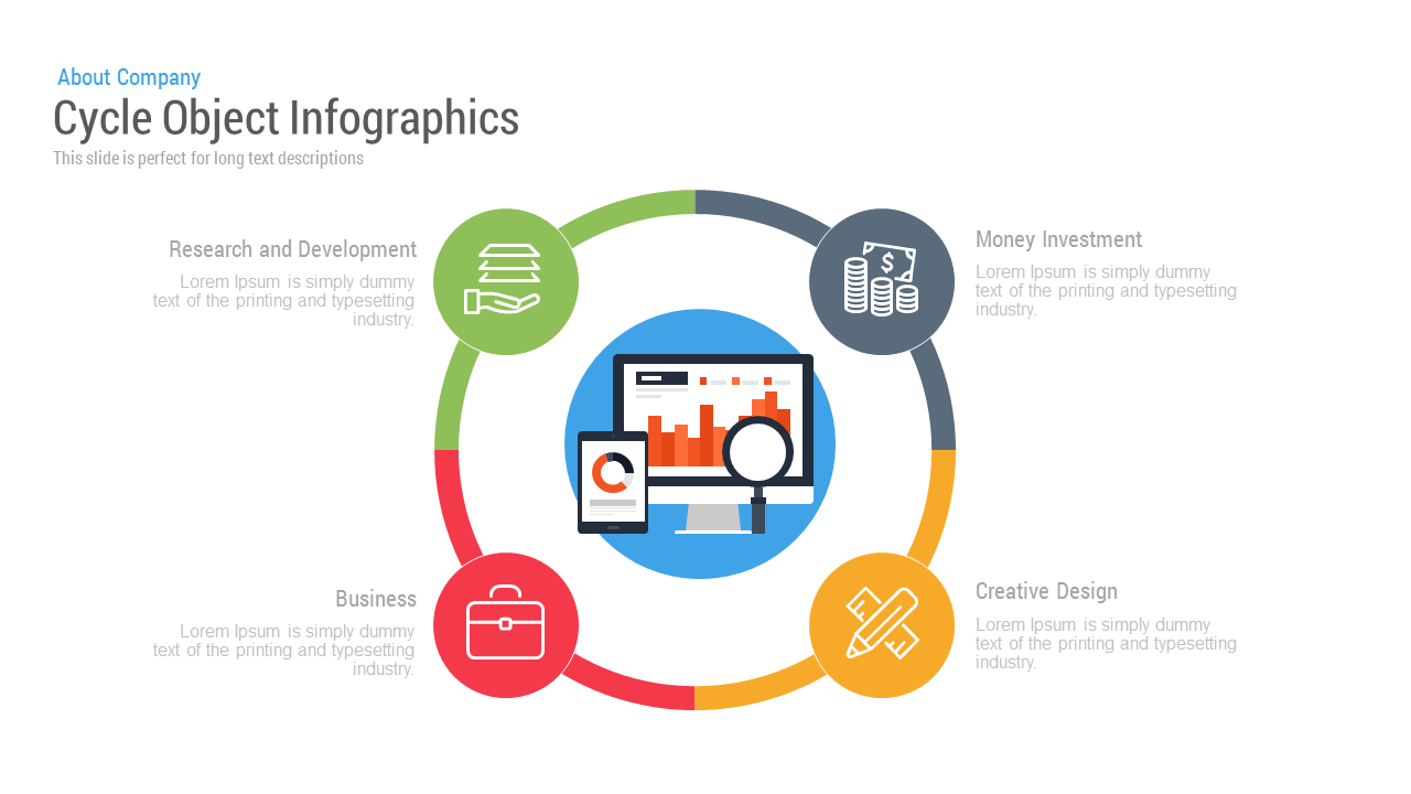
Free Cycle Object Infographics template for PowerPoint & Google Slides
Process
Free
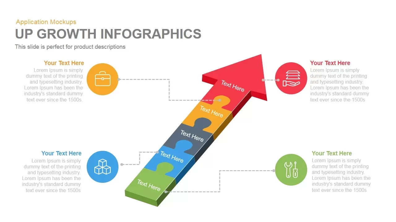
Growth Infographics template for PowerPoint & Google Slides
Arrow
Arrow Infographics template for PowerPoint & Google Slides
Infographics
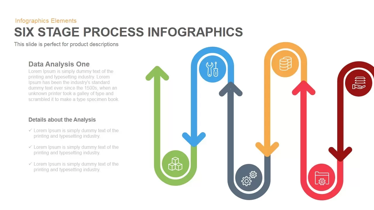
Six-Stage Process Infographics Template for PowerPoint & Google Slides
Process
Car Gear Infographics Template for PowerPoint & Google Slides
Infographics
Puzzle Pipe Infographics Process Flow Template for PowerPoint & Google Slides
Process
5-Stage Arrow Infographics Process Flow Template for PowerPoint & Google Slides
Arrow
Modern Step Growth Infographics Template for PowerPoint & Google Slides
Process
Cloud Computing Infographics template for PowerPoint & Google Slides
Cloud Computing
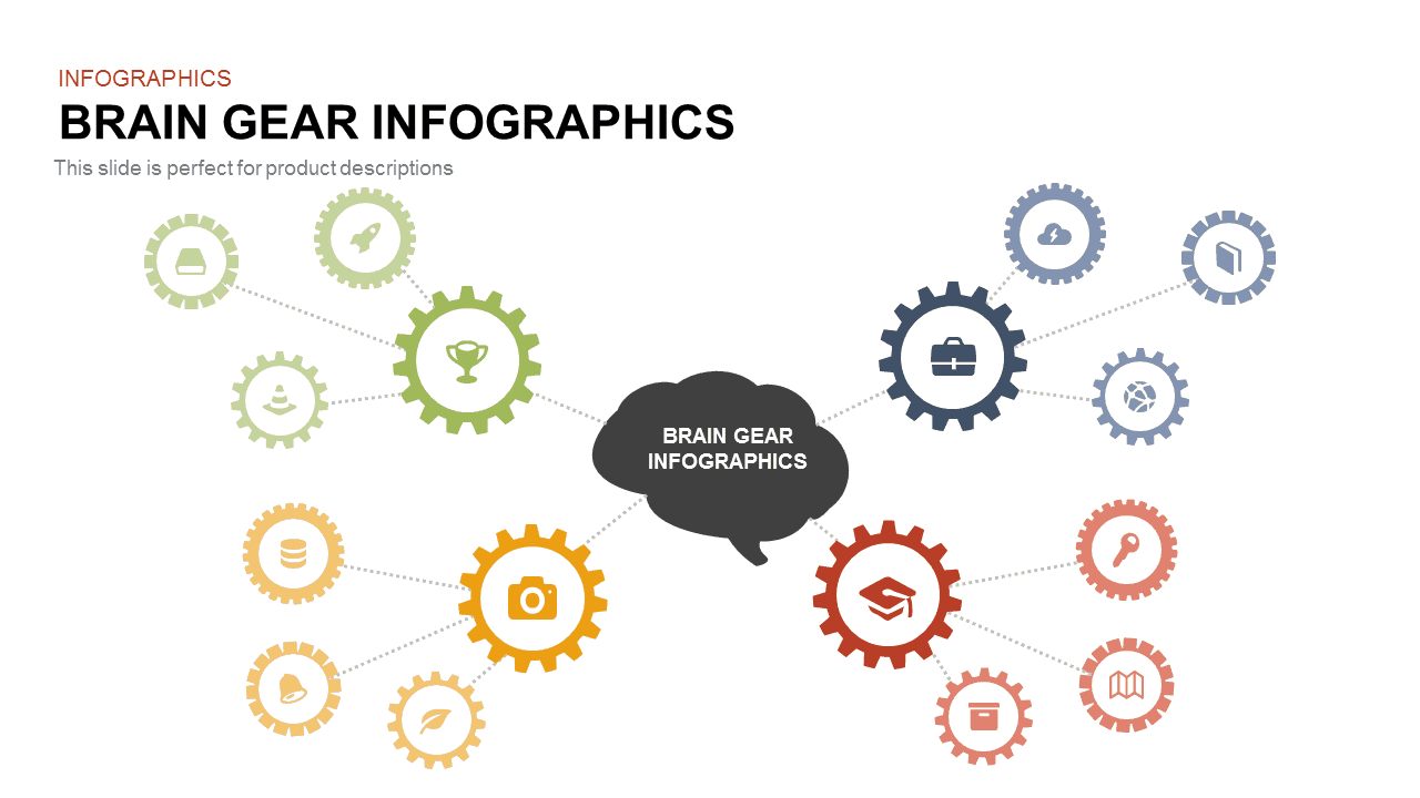
Brain Gear Hub-and-Spoke Infographics template for PowerPoint & Google Slides
Org Chart
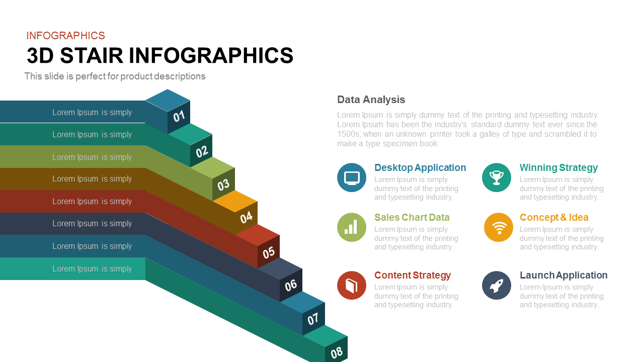
8-Step 3D Stair Infographics Slide template for PowerPoint & Google Slides
Process
Four Swoosh Arrow Infographics template for PowerPoint & Google Slides
Arrow

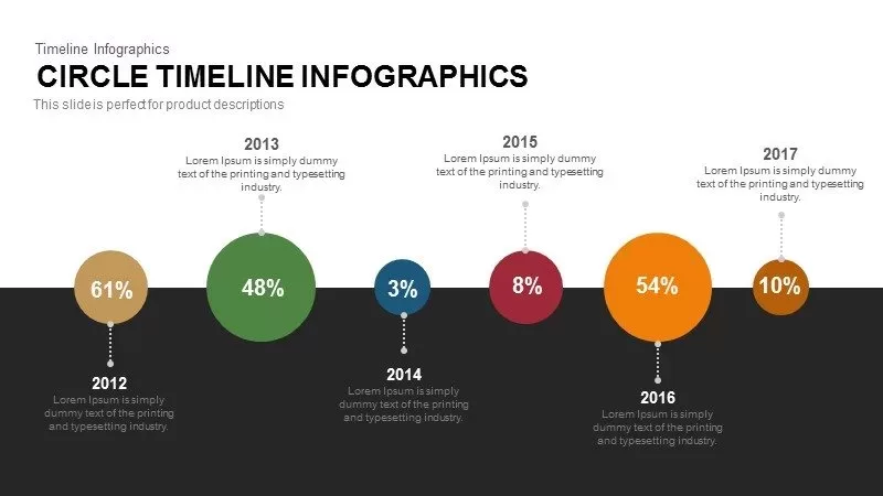
Dynamic Circle Timeline Infographics template for PowerPoint & Google Slides
Timeline

Arrow Step Infographics Workflow Template for PowerPoint & Google Slides
Arrow
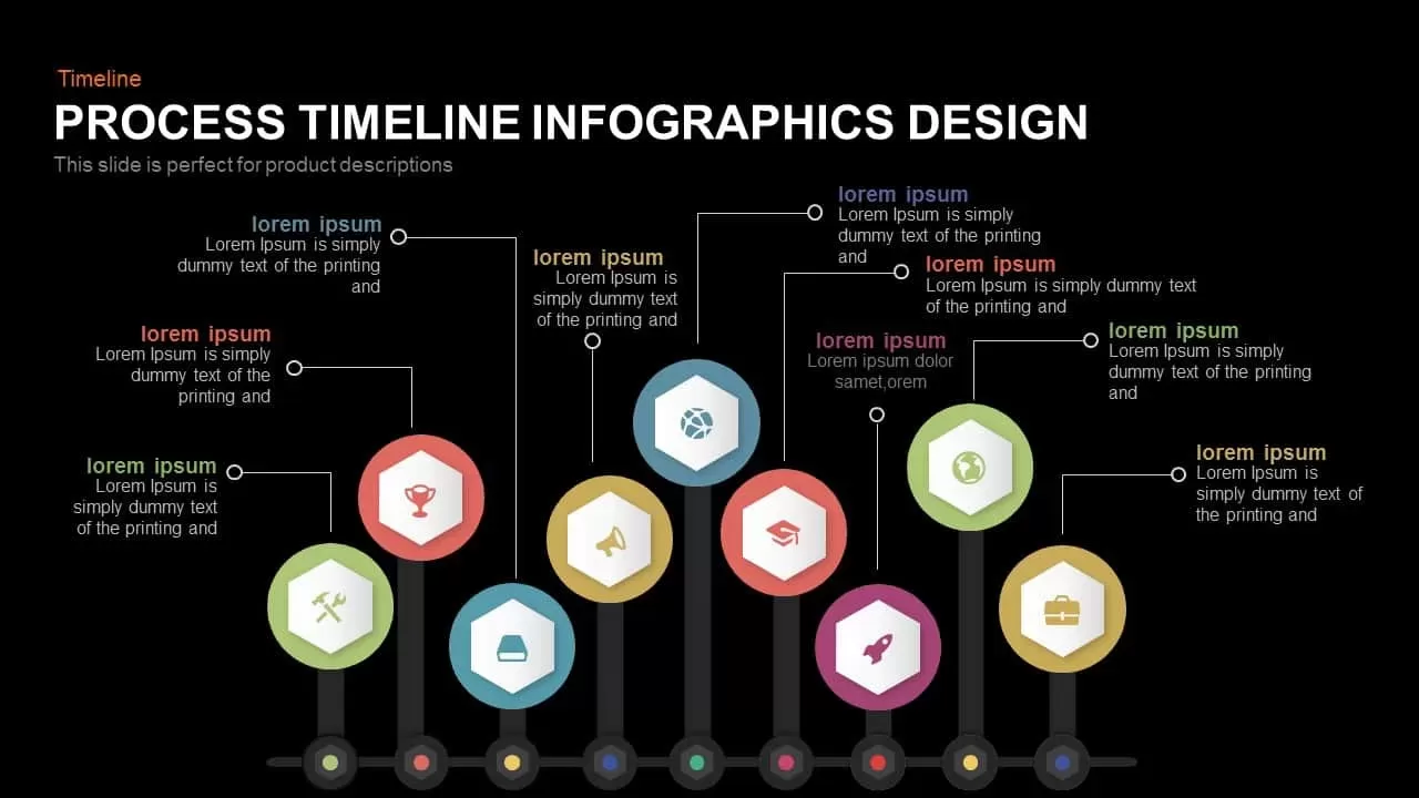
Process Timeline Infographics Design template for PowerPoint & Google Slides
Timeline
Cloud Computing Infographics template for PowerPoint & Google Slides
Cloud Computing
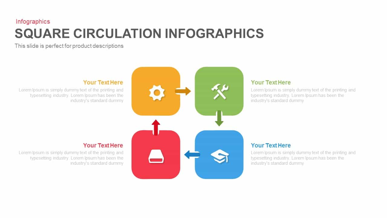
Square Circulation Infographics Template for PowerPoint & Google Slides
Process

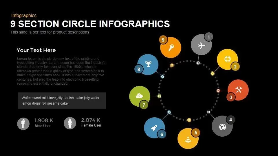
Modern 9-Section Circle Infographics Template for PowerPoint & Google Slides
Circular
Eight-Segment 3D Arrow Infographics Template for PowerPoint & Google Slides
Arrow
Multi-Stage Timeline Infographics Template for PowerPoint & Google Slides
Timeline
Five Arrow Infographics Diagram Template for PowerPoint & Google Slides
Arrow
3D Four-Directional Arrow Infographics Template for PowerPoint & Google Slides
Arrow
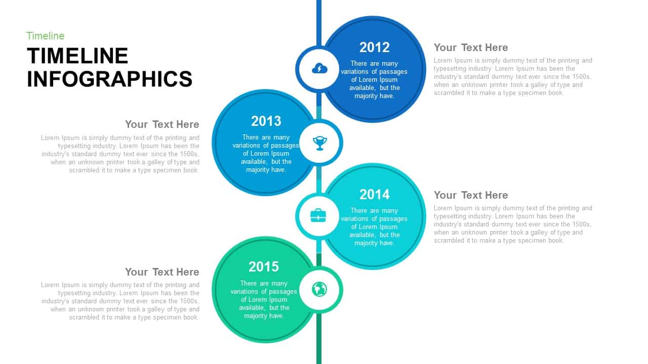
Timeline Arrow Infographics Diagram Template for PowerPoint & Google Slides
Timeline
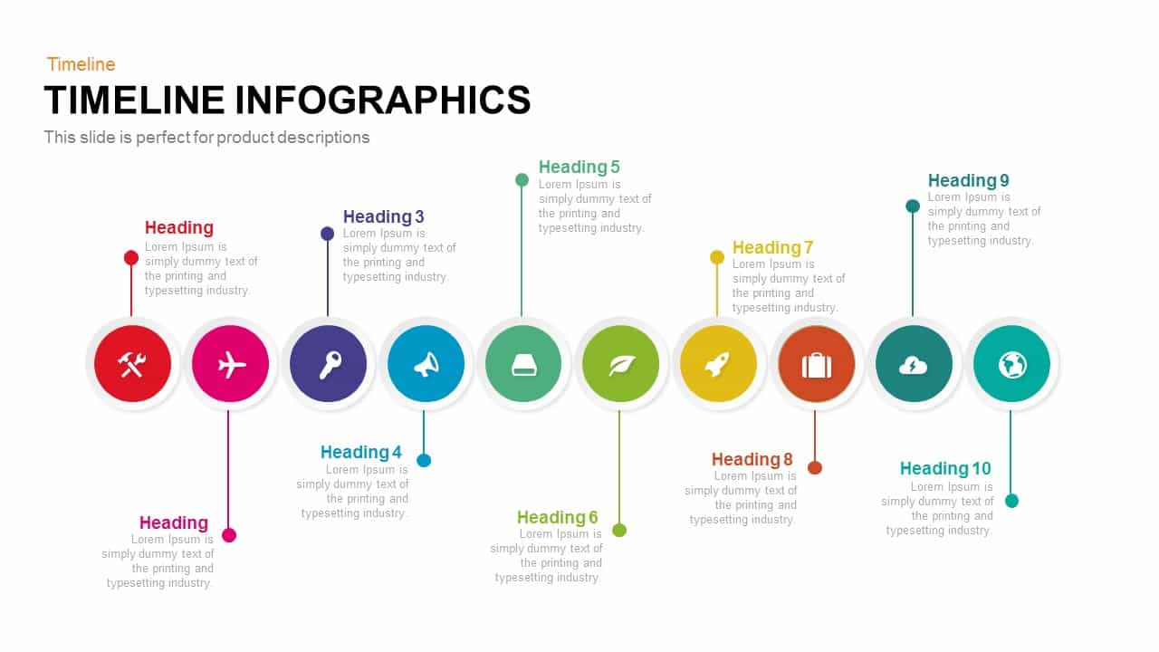
Timeline Infographics for PowerPoint & Google Slides
Timeline
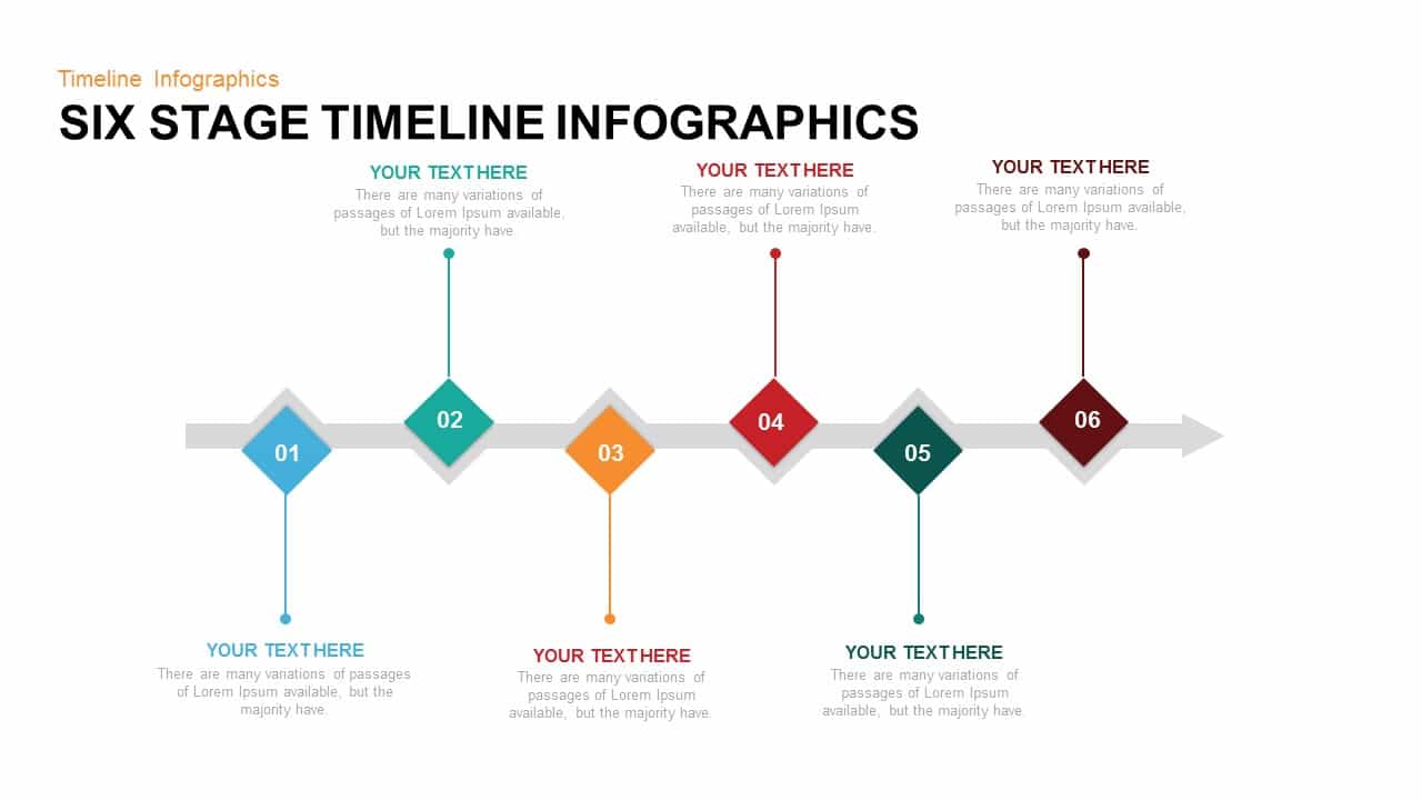
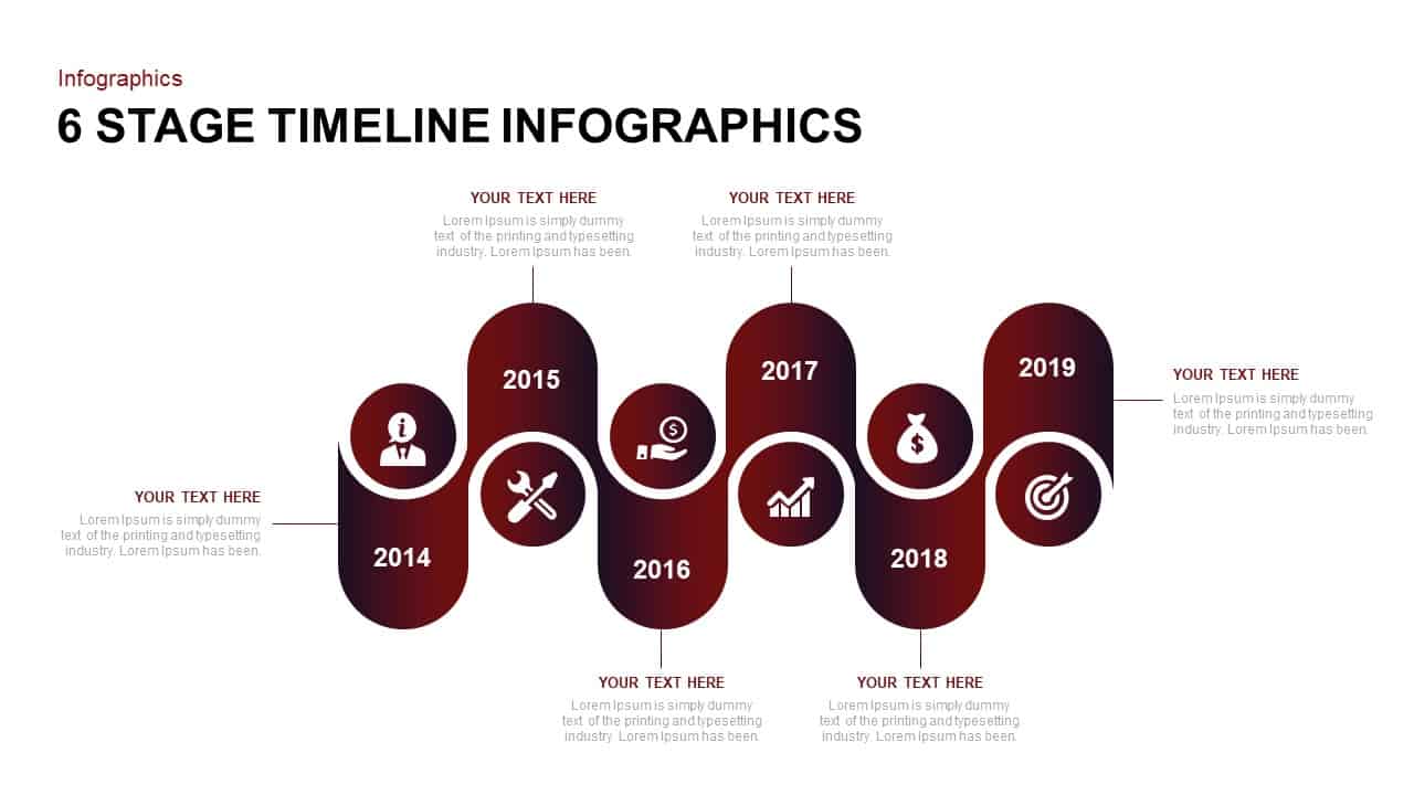
Six Stage Timeline Infographics Template for PowerPoint & Google Slides
Timeline
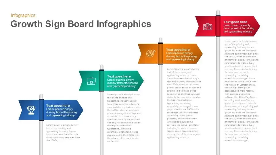
Growth Sign Board Infographics template for PowerPoint & Google Slides
Timeline
3D Arrow Infographics template for PowerPoint & Google Slides
Arrow
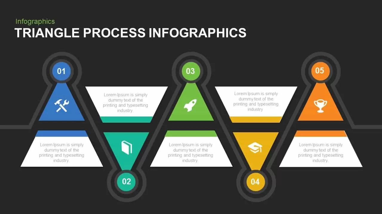
Triangle Process Infographics template for PowerPoint & Google Slides
Process
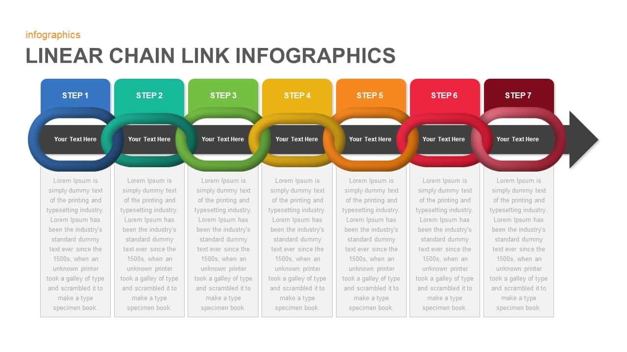
Linear Chain Link Infographics Template for PowerPoint & Google Slides
Process
Ribbon Infographics Step-by-Step Process Template for PowerPoint & Google Slides
Process
Free Bulb Puzzle Infographics Diagram Template for PowerPoint & Google Slides
Process
Free
Business Roadmap Infographics template for PowerPoint & Google Slides
Roadmap
Product Life Cycle Infographics template for PowerPoint & Google Slides
Business
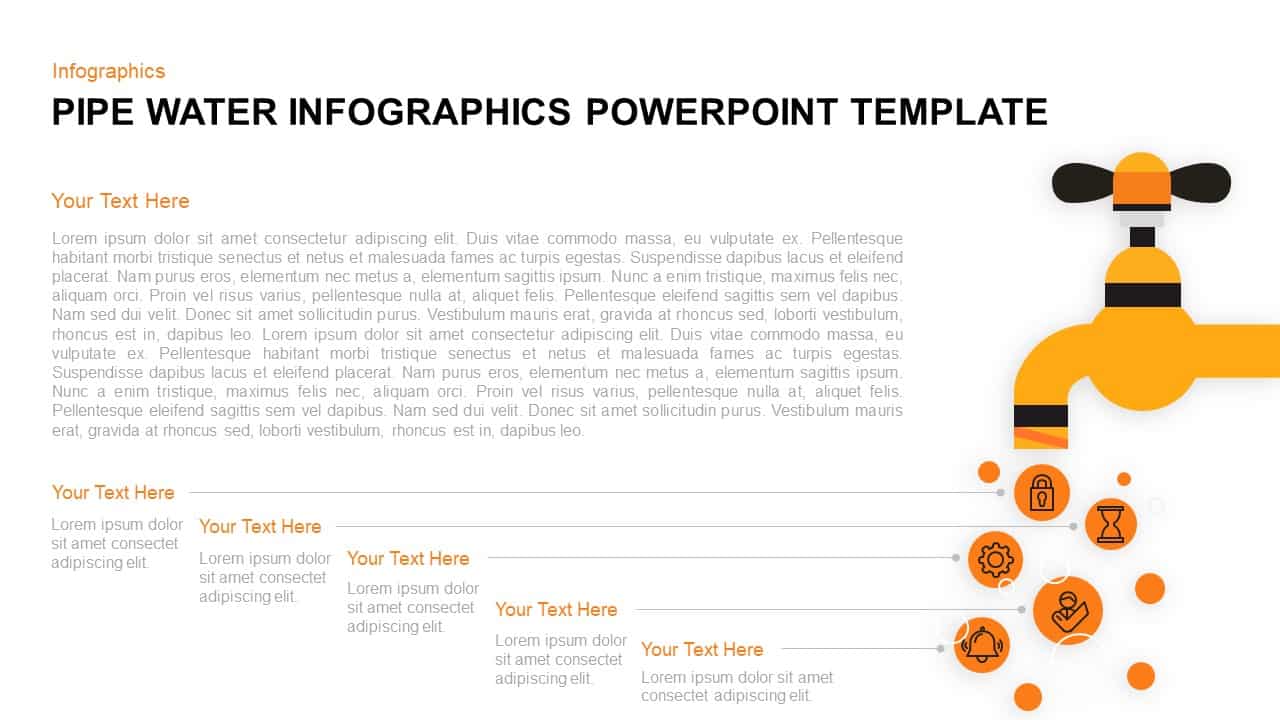
Pipe Water Infographics Flow Diagram Template for PowerPoint & Google Slides
Process
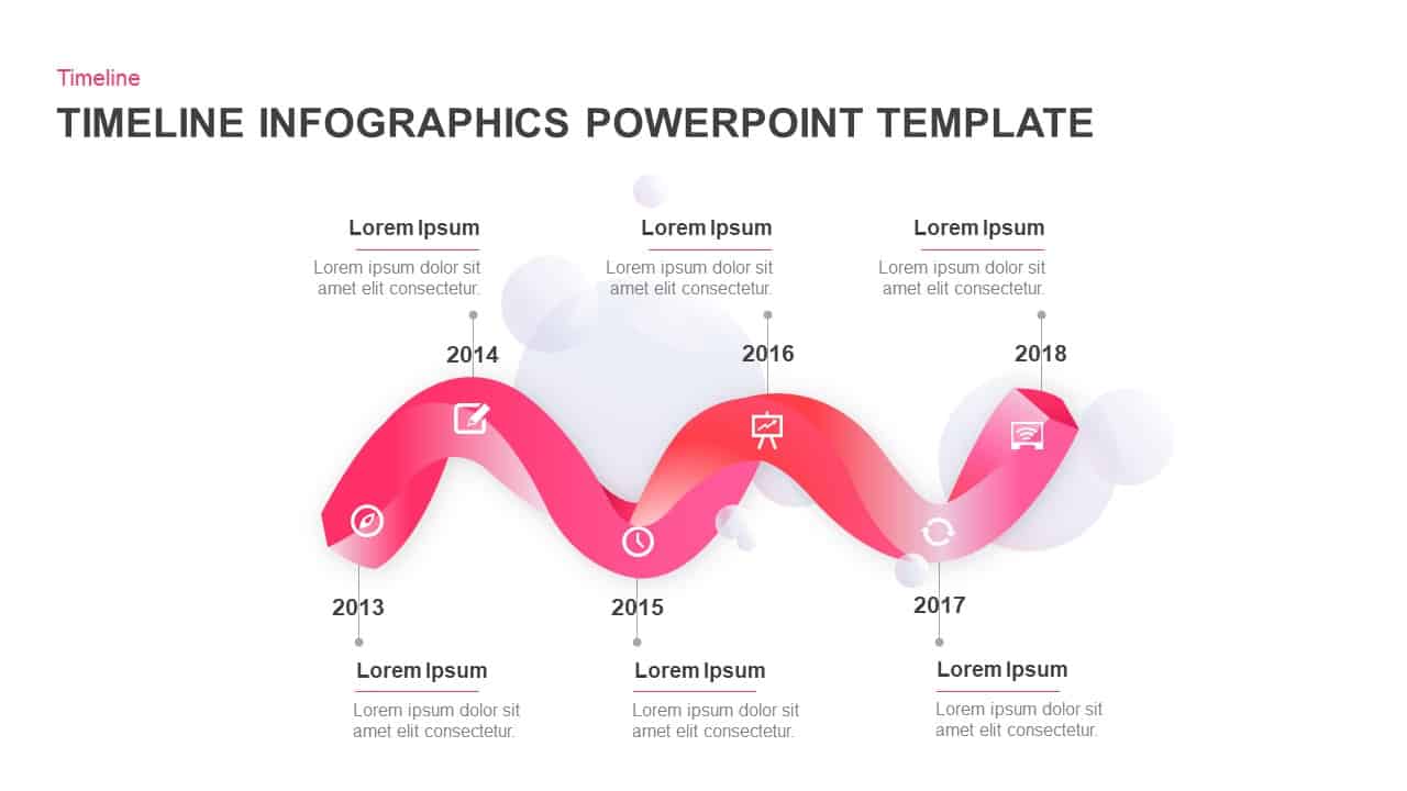
Wavy Ribbon Timeline Infographics Template for PowerPoint & Google Slides
Timeline
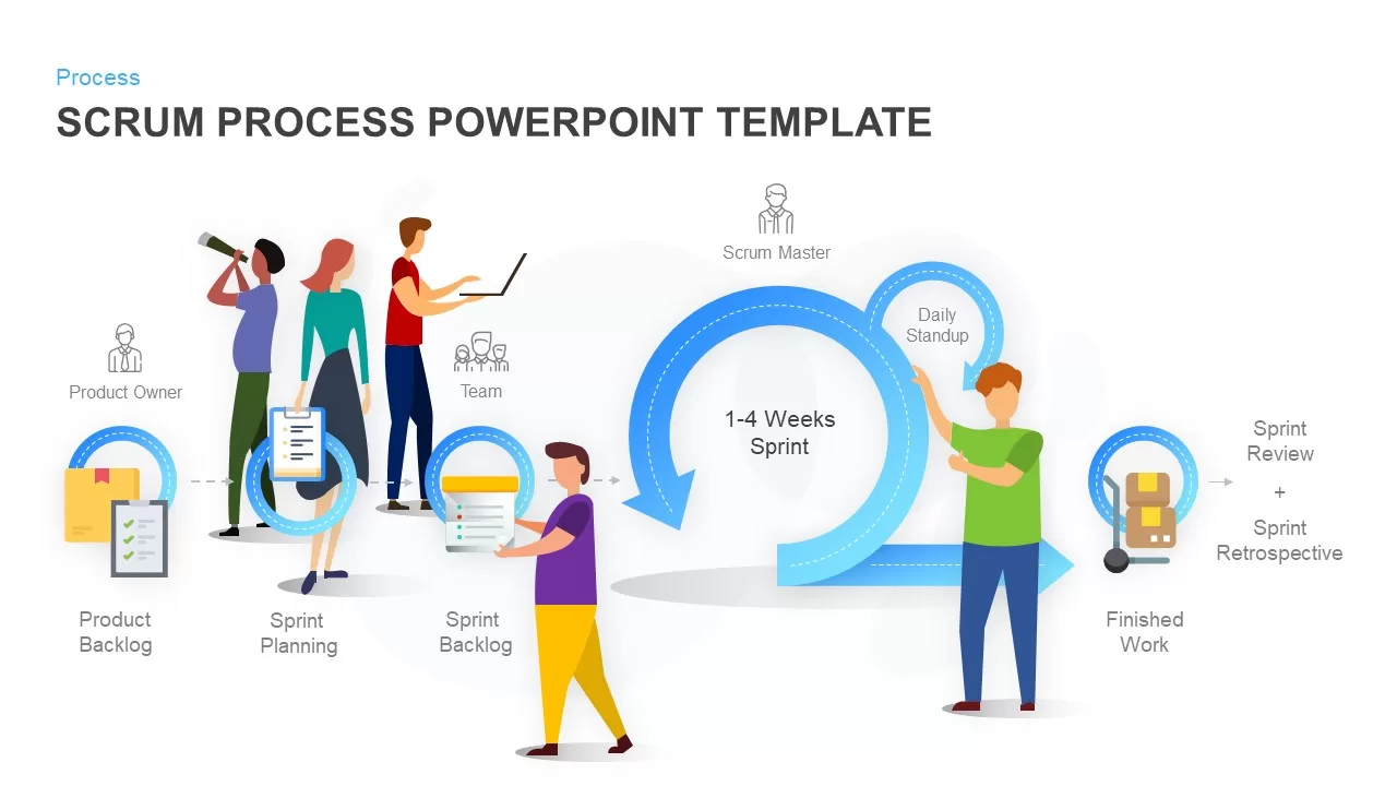
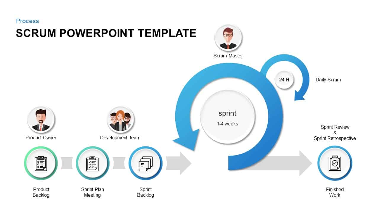
Scrum Process & Roles Infographics Template for PowerPoint & Google Slides
Scrum
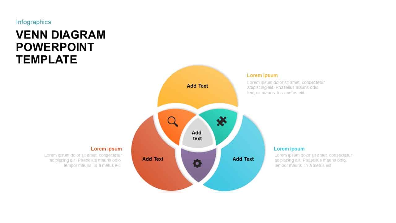
Venn Diagram Infographics Pack Template for PowerPoint & Google Slides
Circular
Comprehensive Scrum Infographics Pack Template for PowerPoint & Google Slides
Scrum
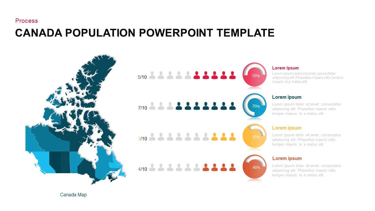
Canada Population Infographics Template for PowerPoint & Google Slides
World Maps
Editable Pillars Infographics Pack Template for PowerPoint & Google Slides
Infographics
5-Step Growth Arrow Infographics Template for PowerPoint & Google Slides
Arrow
Six-Stage Timeline Infographics Slide Template for PowerPoint & Google Slides
Timeline
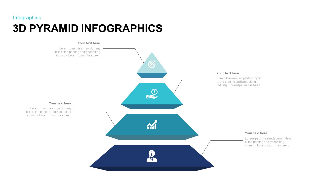
3D Pyramid Infographics Slide Template for PowerPoint & Google Slides
Pyramid
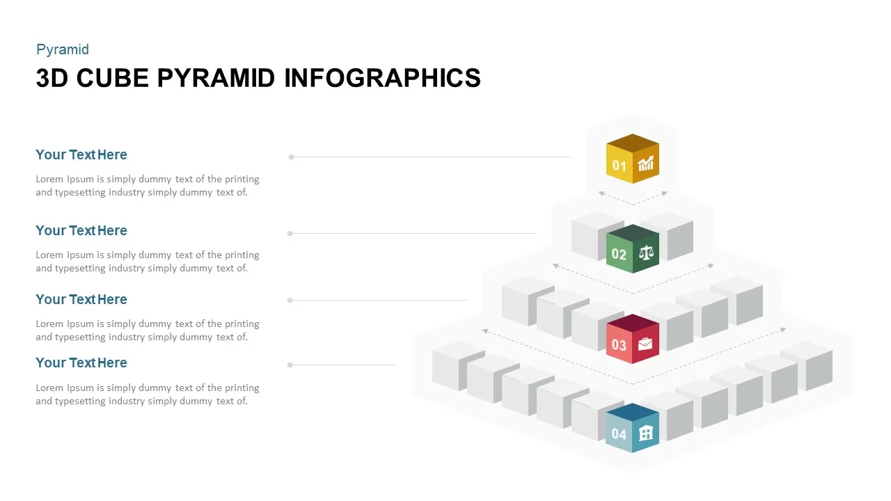
3D Cube Pyramid Infographics Slide Template for PowerPoint & Google Slides
Pyramid
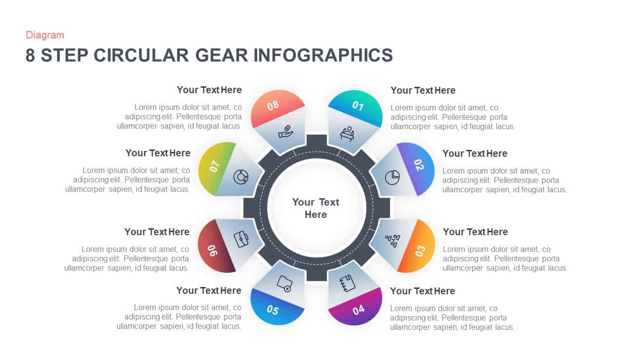
8-Step Circular Gear Infographics Diagram for PowerPoint & Google Slides
Process
Cube Core Infographics Template for PowerPoint & Google Slides
Process
Four Section Diagram Infographics template for PowerPoint & Google Slides
Process

Creative Cycle Process Infographics Template for PowerPoint & Google Slides
Process
Time Management Infographics Template for PowerPoint & Google Slides
Process
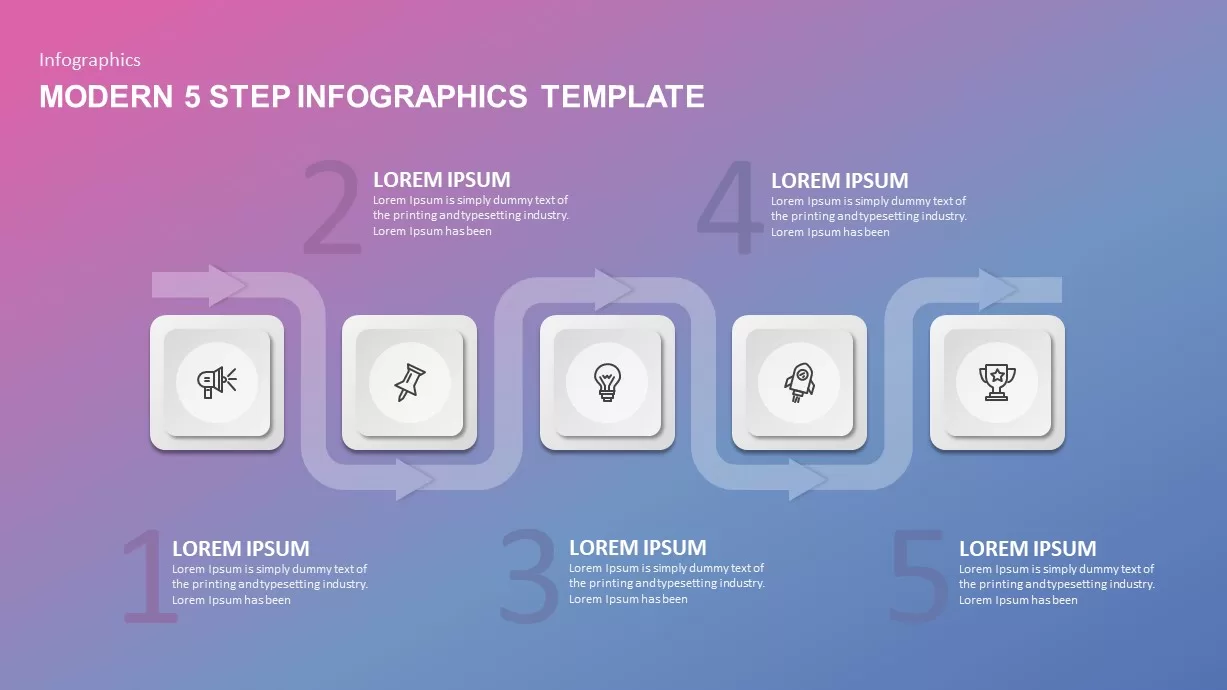
Modern 5-Step Flow Infographics Template for PowerPoint & Google Slides
Process
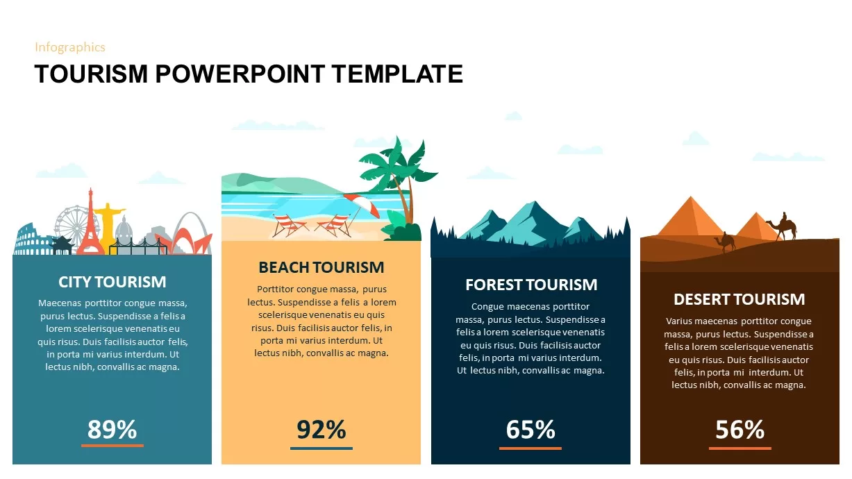
Comparative Tourism Infographics Template for PowerPoint & Google Slides
Comparison
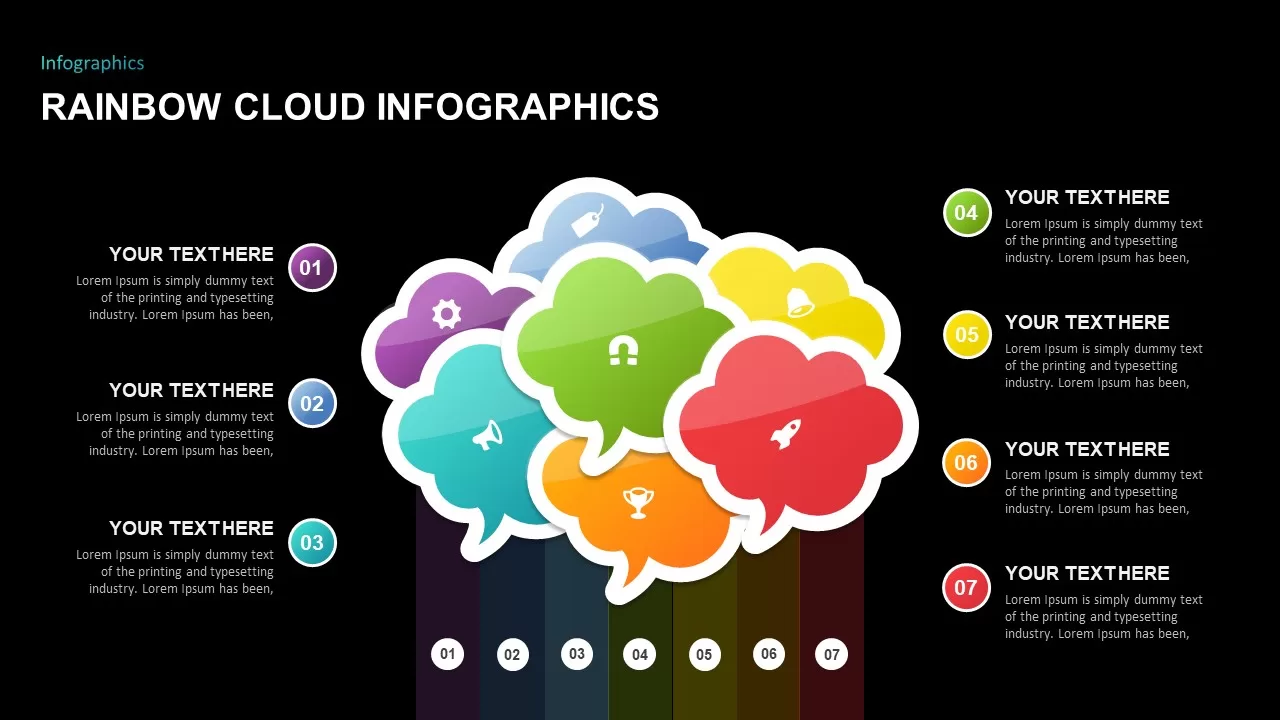
Rainbow Cloud Infographics Diagram Template for PowerPoint & Google Slides
Process
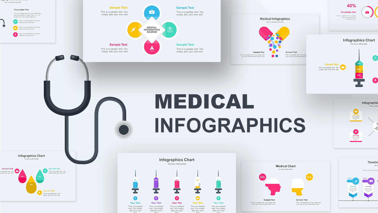
Medical Infographics Data Visualization Template for PowerPoint & Google Slides
Health
Market Segmentation & STP Infographics Pack Template for PowerPoint & Google Slides
Marketing
Road Timeline Infographics Template for PowerPoint & Google Slides
Timeline
4 Business Data Infographics Diagram for PowerPoint & Google Slides
Process
Four Step Infographics Diagram for PowerPoint & Google Slides
Process
Six-Step Circular Diagram Infographics Template for PowerPoint & Google Slides
Circular
Dynamic Gear Diagram Infographics Template for PowerPoint & Google Slides
Process
Versatile Creative Diagram Infographics Template for PowerPoint & Google Slides
Process
Versatile 3D Modular Shape Infographics Template for PowerPoint & Google Slides
Infographics
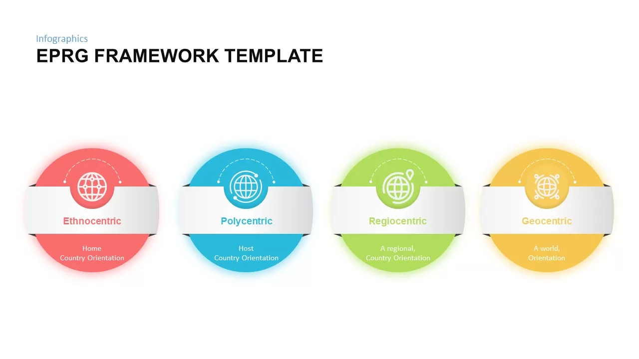
EPRG Framework Infographics for PowerPoint & Google Slides
Marketing
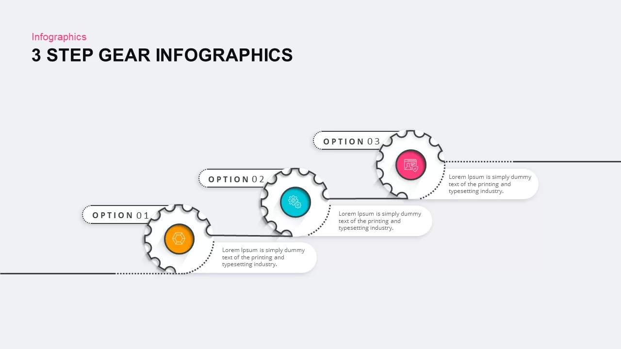
3, 4, and 5 Step Gear Infographics Template for PowerPoint & Google Slides
Process
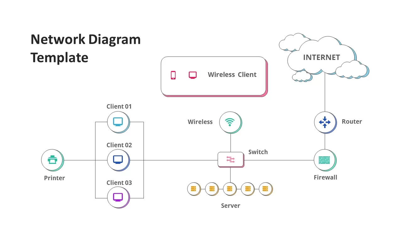
Network Diagram Infographics for PowerPoint & Google Slides
Technology
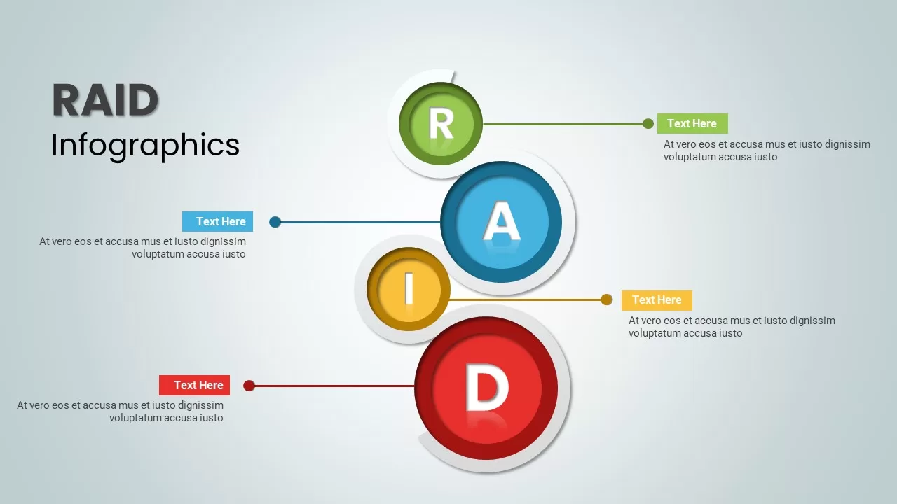
RAID Infographics template for PowerPoint & Google Slides
Business
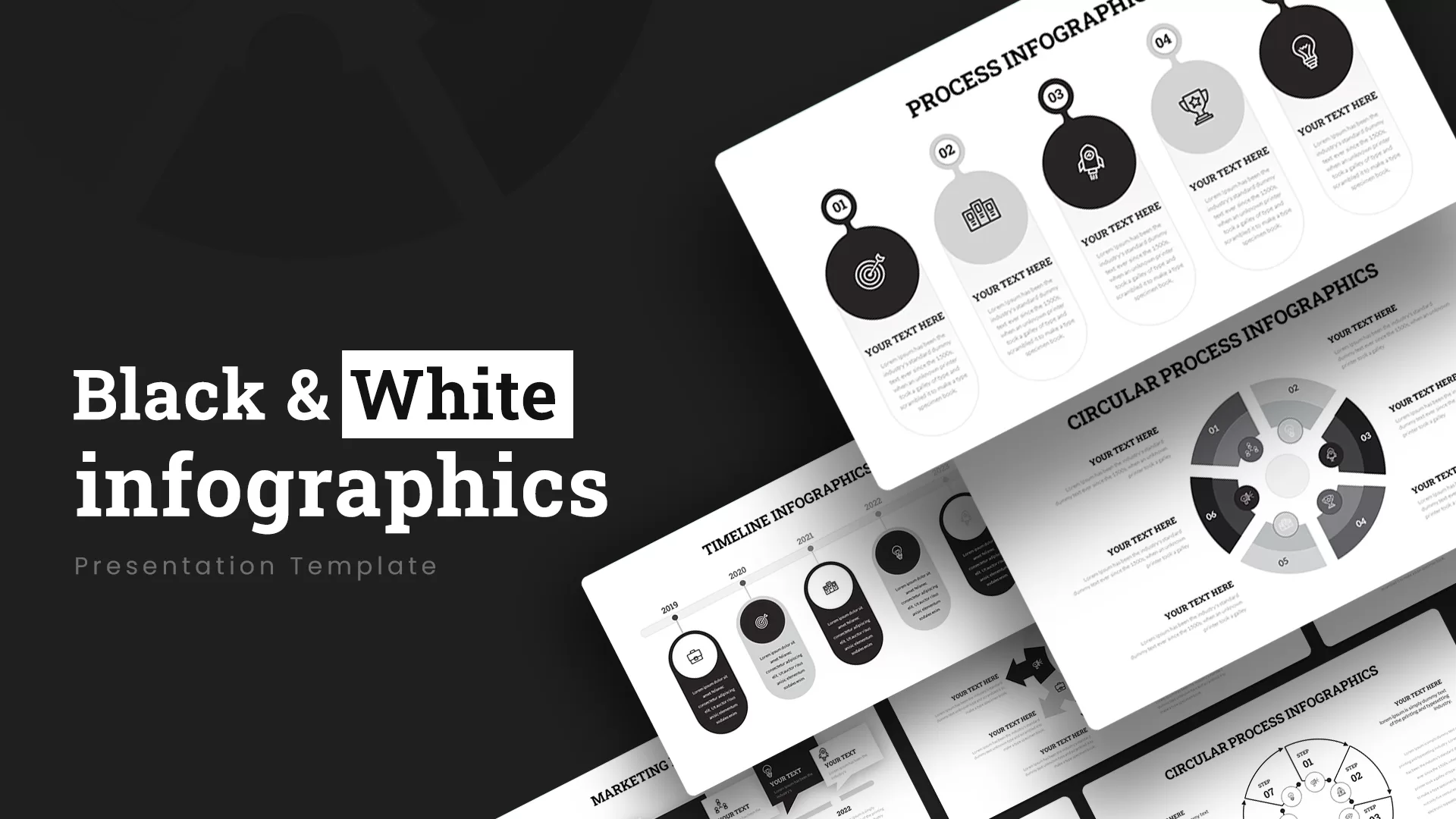
Black and White Infographics template for PowerPoint & Google Slides
Business
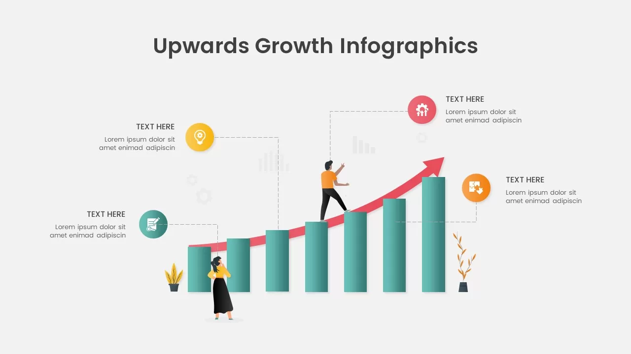
Upwards Growth Infographics for PowerPoint & Google Slides
Infographics
Free Colorful Process Flow Infographics Template for PowerPoint & Google Slides
Process
Free
Quiet Quitting Infographics Pack for PowerPoint & Google Slides
Employee Performance
Free
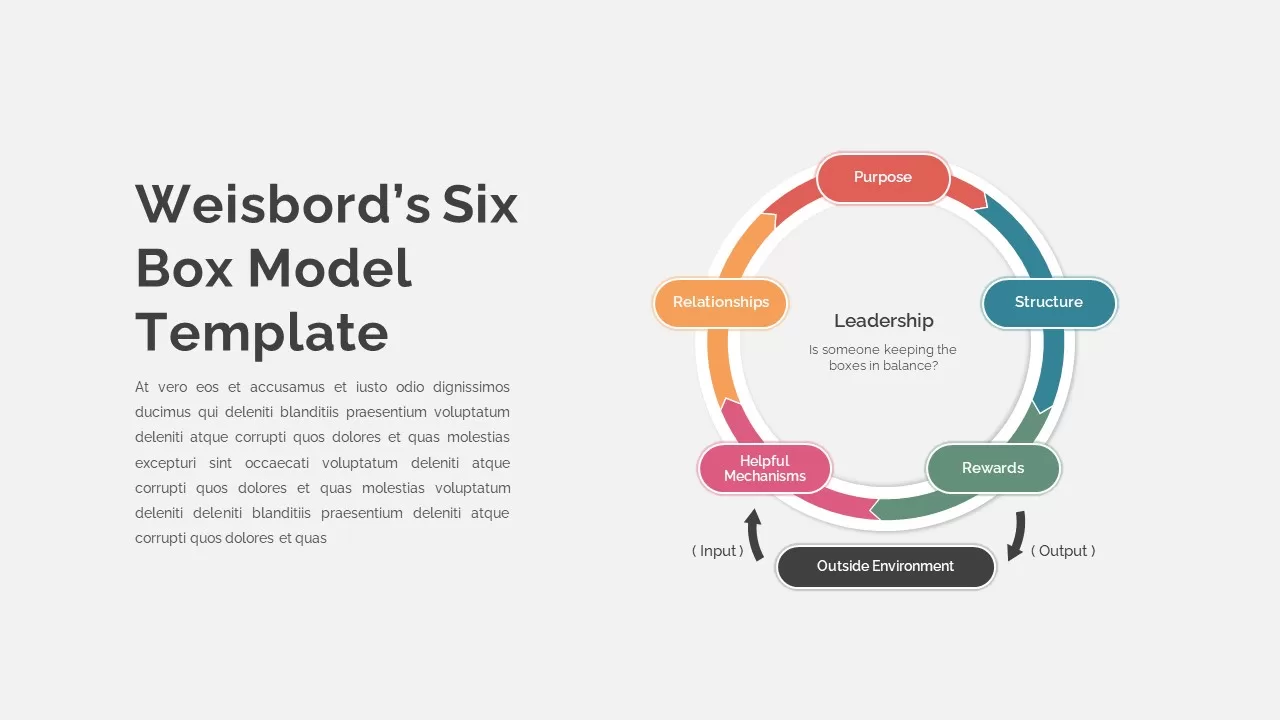
Weisbord’s Six Box Model Infographics Template for PowerPoint & Google Slides
Circular
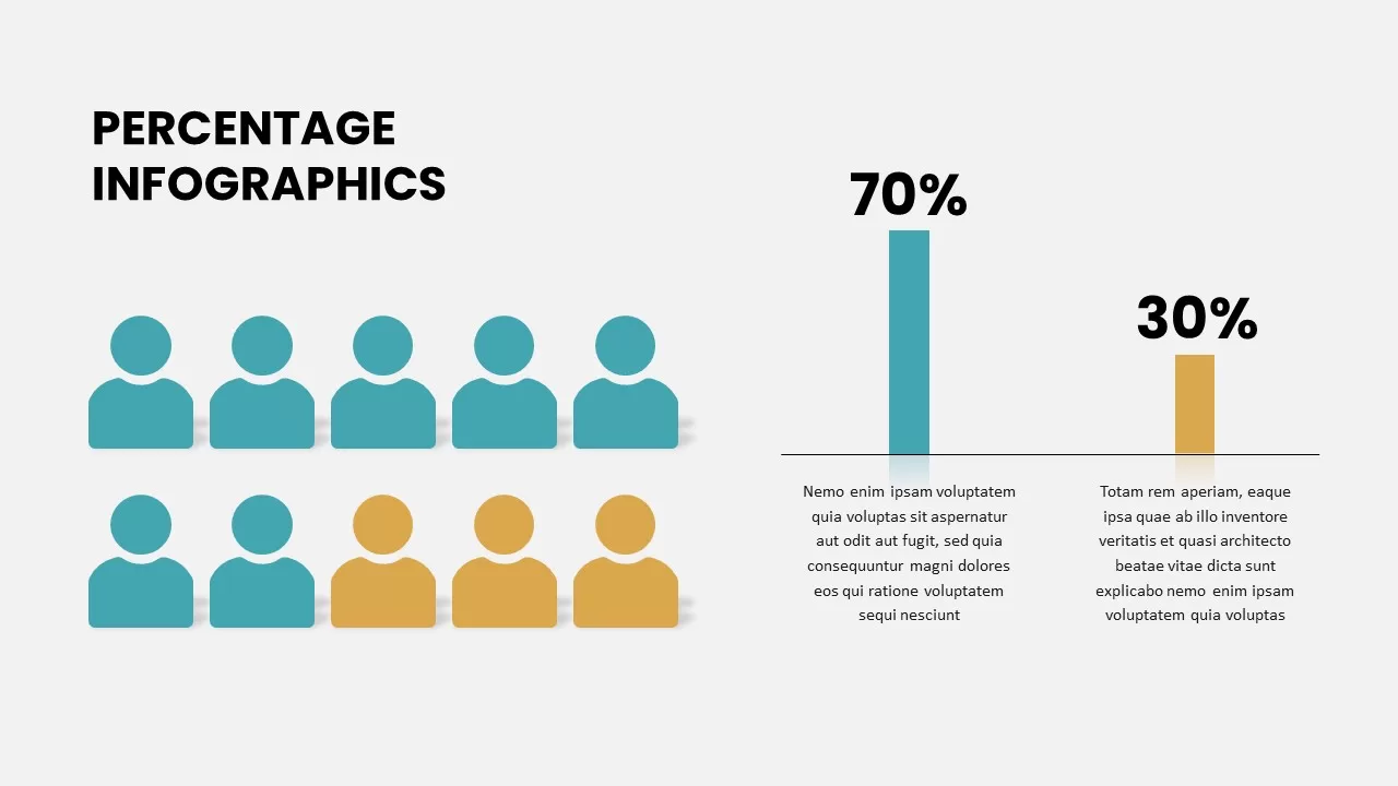
Percentage Infographics template for PowerPoint & Google Slides
Comparison
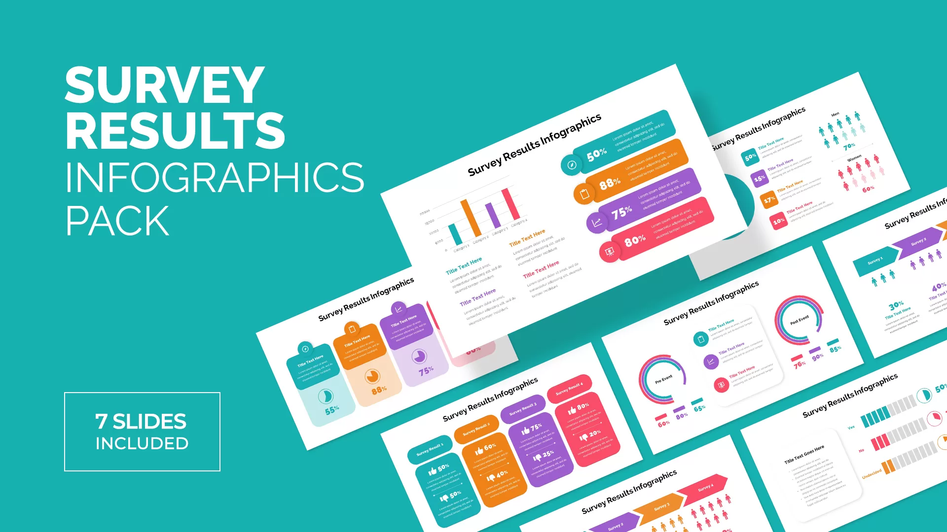
Survey Results Infographics for PowerPoint & Google Slides
Infographics
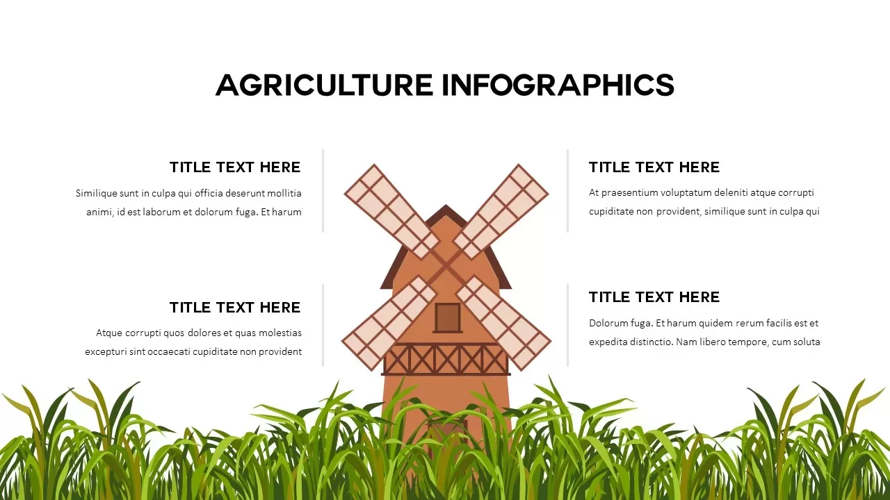
Agriculture Windmill Infographics Template for PowerPoint & Google Slides
Comparison
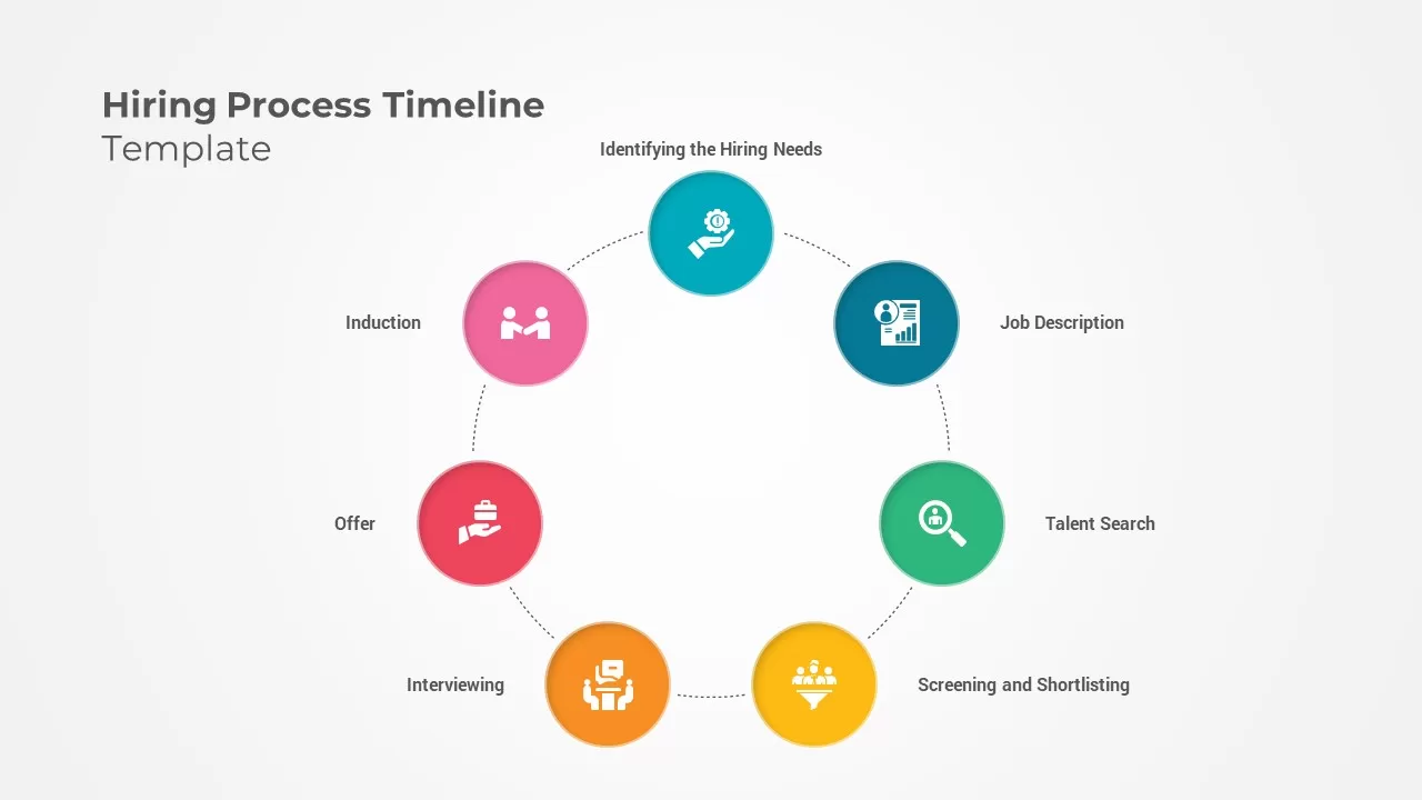
Hiring Process Timeline Infographics Template for PowerPoint & Google Slides
Recruitment
Sprint Review Process Infographics Pack Template for PowerPoint & Google Slides
Infographics
Flywheel Infographics template for PowerPoint & Google Slides
Process
Flywheel Infographics template for PowerPoint & Google Slides
Business Strategy
Shield Infographics Four-Part Framework Template for PowerPoint & Google Slides
Process
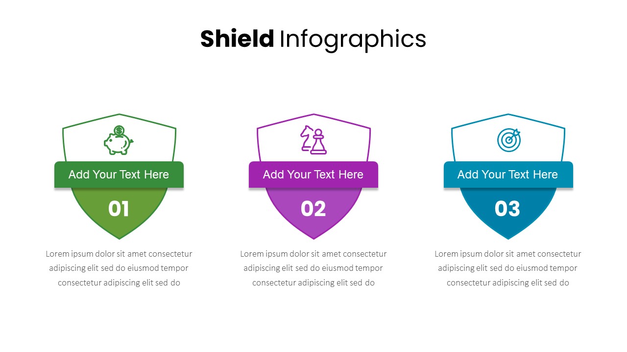
Three-Part Shield Infographics Template for PowerPoint & Google Slides
Comparison

Steps Infographics Template for PowerPoint & Google Slides
Decks
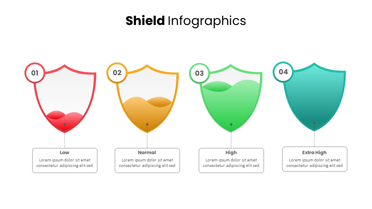
Shield Infographics Risk Indicators Template for PowerPoint & Google Slides
Infographics
DevOps Infographics & Process Flow Template for PowerPoint & Google Slides
Information Technology
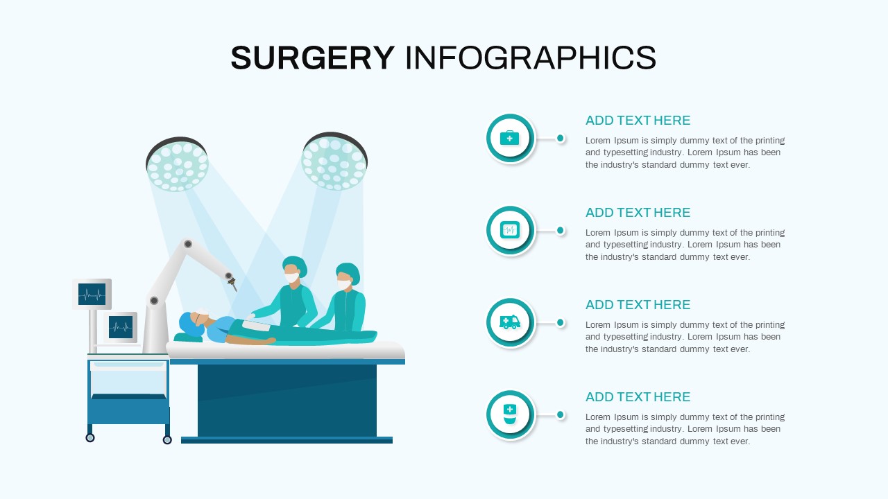
Surgery Infographics Comparison Template for PowerPoint & Google Slides
Health
Free Roadmap Infographics Pack Template for PowerPoint & Google Slides
Pitch Deck
Free
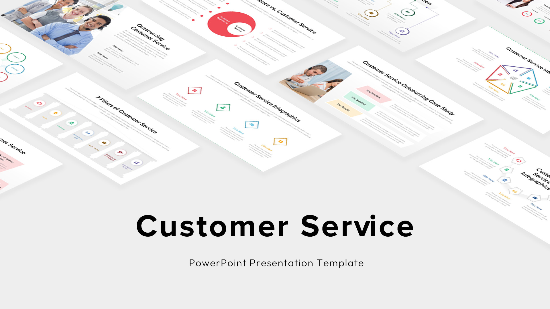
Custom Customer Service Infographics Template for PowerPoint & Google Slides
Process
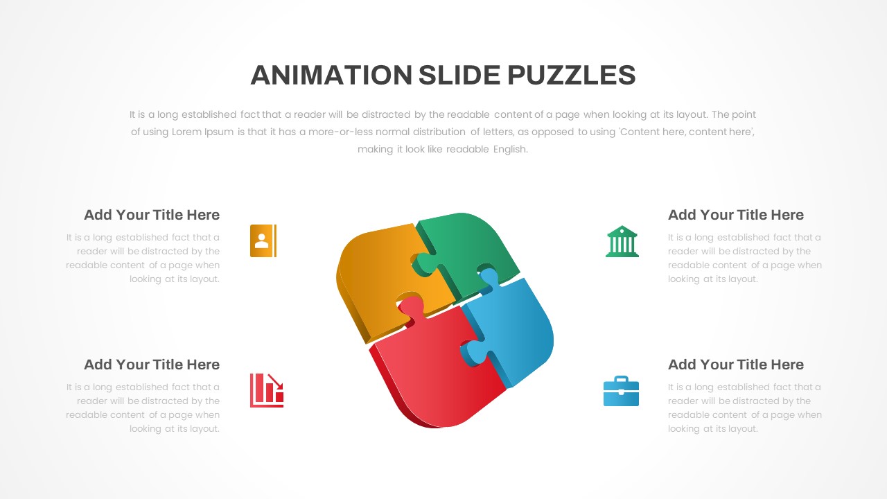
Animated Puzzle Infographics for PowerPoint & Google Slides
Business
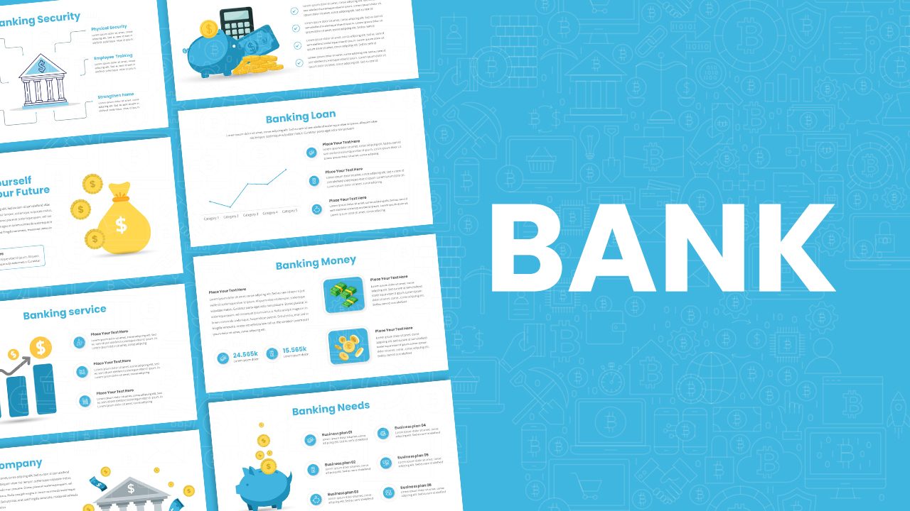
Banking Service & Finance Infographics Template for PowerPoint & Google Slides
Finance
Free
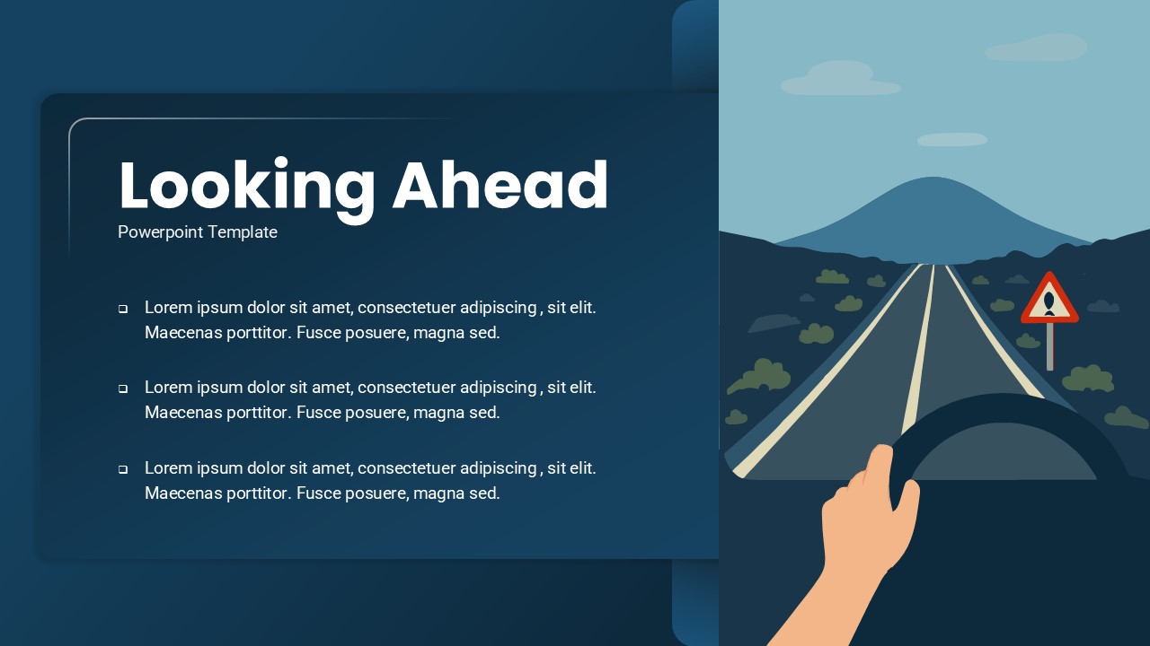
Looking Ahead 3-Slide Infographics Pack Template for PowerPoint & Google Slides
Business
Mental Health Infographics Template for PowerPoint & Google Slides
Health