Non-Profit vs For-Profit Diagram template for PowerPoint & Google Slides
Non-Profit vs For Profit PowerPoint Diagram
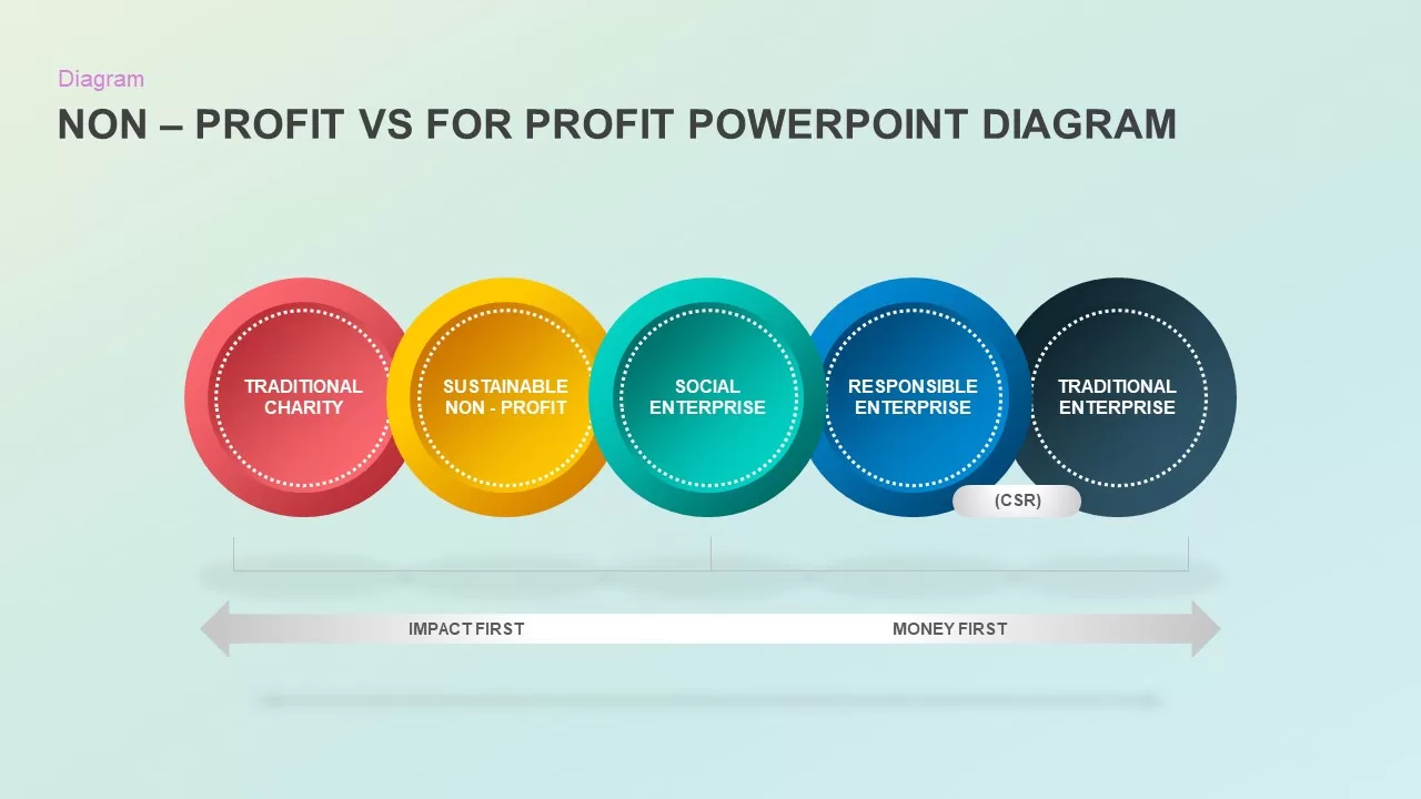
Illustrating the spectrum between mission-driven initiatives and revenue-focused commercial operations requires a clear conceptual layout. A non-profit vs for-profit diagram gives social entrepreneurs, corporate sustainability leads, and business strategists an intuitive visual model to compare organizational structures across the impact-to-profit continuum. Featuring five overlapping circular nodes positioned along a bi-directional scale, this clean infographic simplifies complex organizational models for board presentations and strategic workshops.
Map Business Models Along the Impact-to-Profit Continuum
When presenting corporate social responsibility initiatives, social enterprise models, or organizational transitions to stakeholders, demonstrating where a business sits between social impact and financial return is essential. Using a structured continuum diagram layout allows presenters to compare non-profit and commercial structures within a single visual framework.
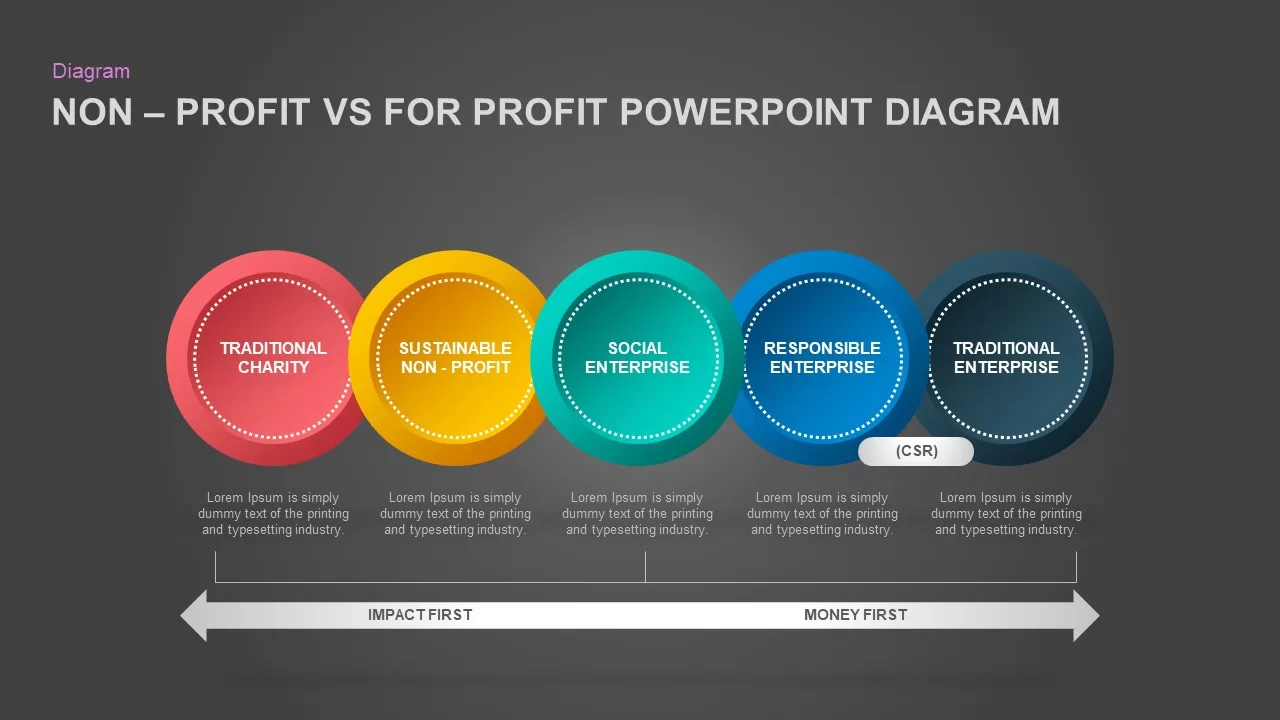
The design features five horizontally overlapping circular nodes spanning from “Traditional Charity” on the far left to “Traditional Enterprise” on the far right. Intermediary nodes highlight “Sustainable Non-Profit,” “Social Enterprise,” and “Responsible Enterprise (CSR).” Below the nodes, a double-ended arrow clearly marks the spectrum from “Impact First” goals to “Money First” drivers, providing clear context for organizational alignment.
Strategic Visual Framework for Business and Impact Planning
Whether you are teaching organizational models, pitching a hybrid business plan, or presenting CSR goals to executive leadership, comparative spectrum diagrams keep strategic concepts easy to follow.
- Five color-coded circular nodes representing the complete spectrum of non-profit and commercial business models.
- Integrated bi-directional spectrum arrow highlighting the balance between social impact and revenue generation.
- Dedicated callout for Corporate Social Responsibility (CSR) within the responsible enterprise node.
- Fully editable vector graphics, text fields, and color schemes compatible across major presentation software.
Login to download this file

Item ID
SB01835


Related Templates

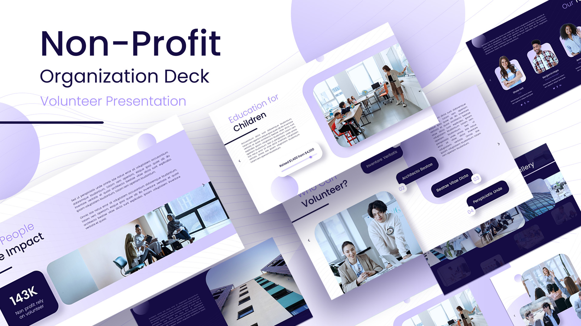
Non-Profit Organization PowerPoint Template
Pitch Deck

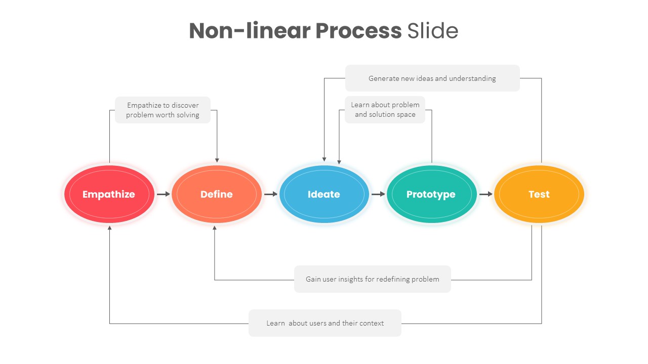
Non-Linear Process PowerPoint Template
Process
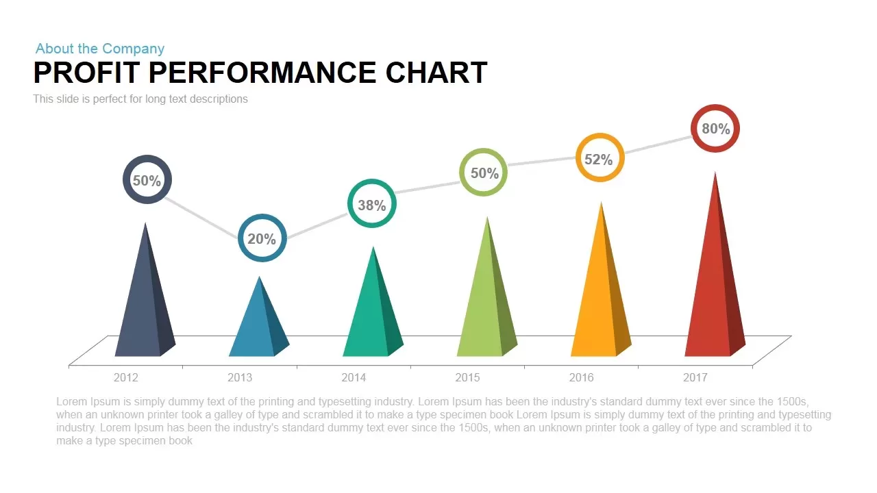
Profit Performance Chart PowerPoint Template
Finance
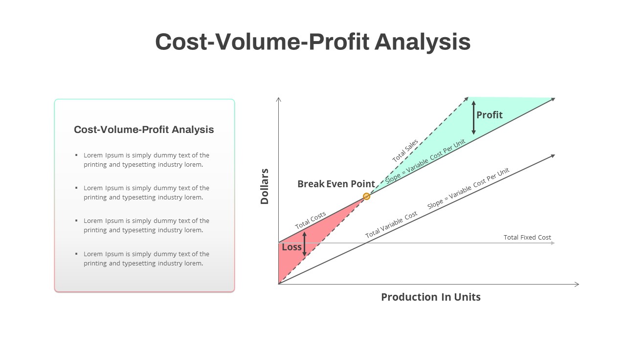
Cost Volume Profit Analysis PowerPoint Template
Finance
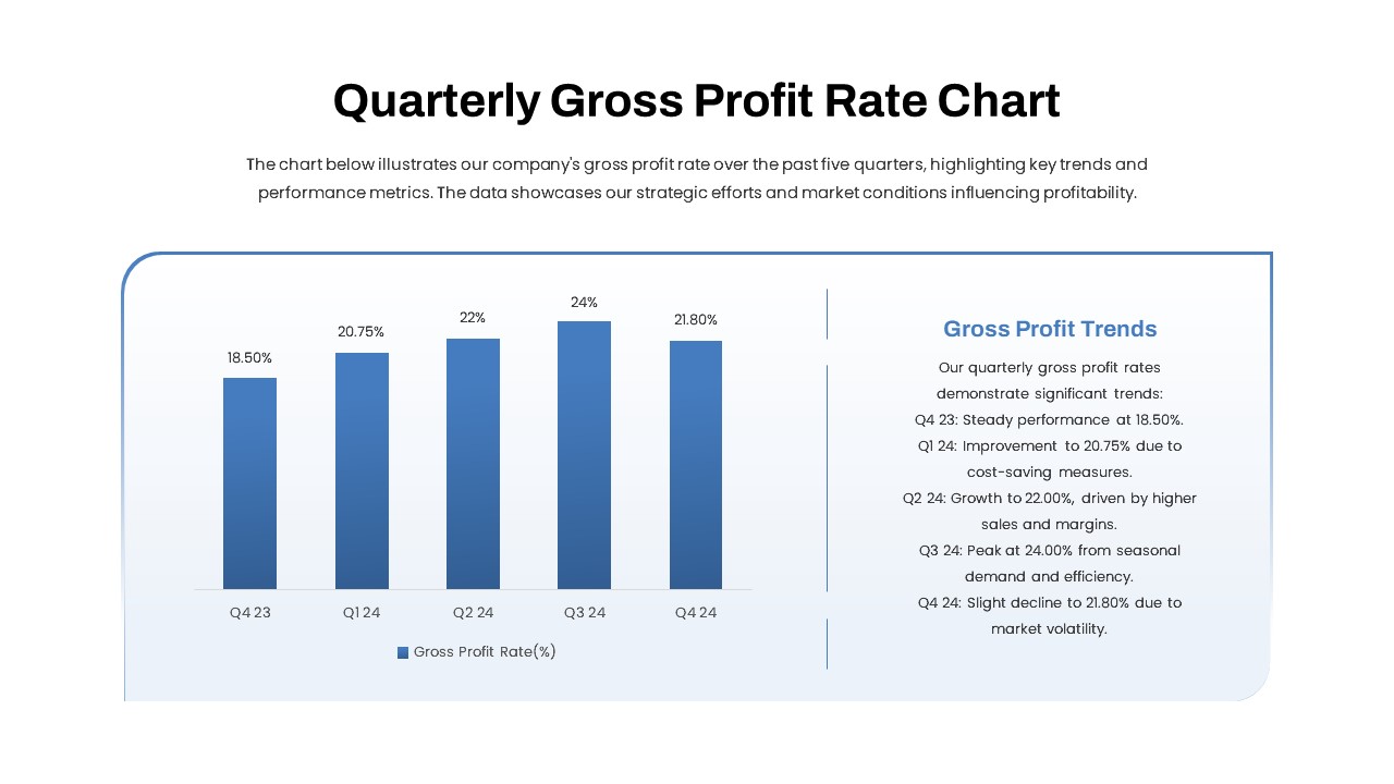
Quarterly Gross Profit Rate Chart PowerPoint Template
Revenue
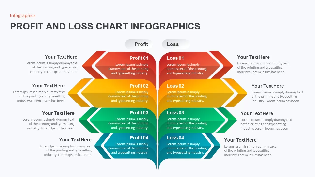
Profit and Loss Chart Infographic for PowerPoint Presentation
Business Report
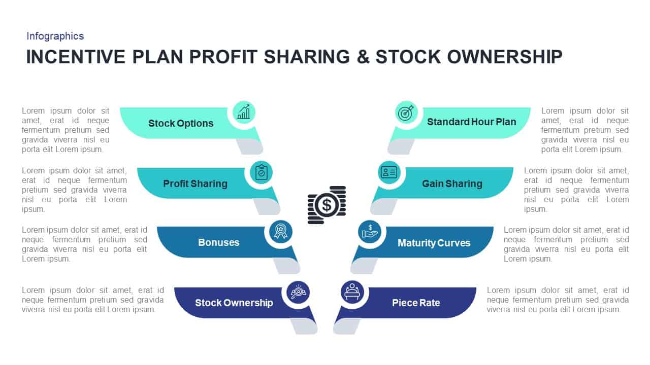
Incentive Plans Profit Sharing & Stock Ownership Presentation Template
Process
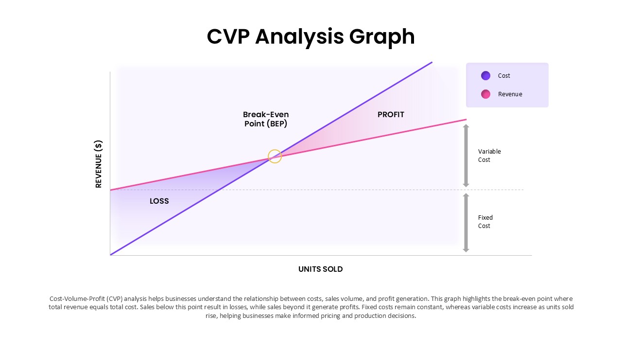
Cost Volume-Profit Analysis Graph (CVP) Template for Financial Planning Presentations
Finance