Energy Sources Comparison Infographic for PowerPoint
Renewable Energy Analysis and Sustainability Comparison
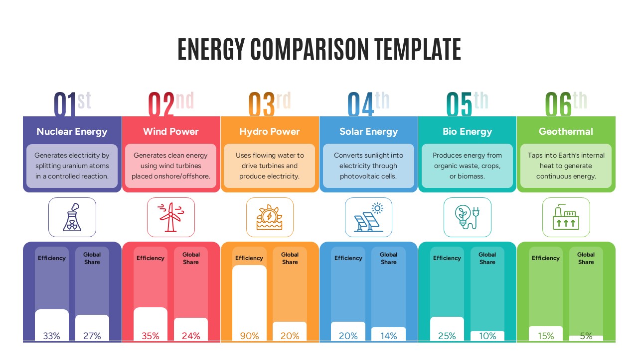
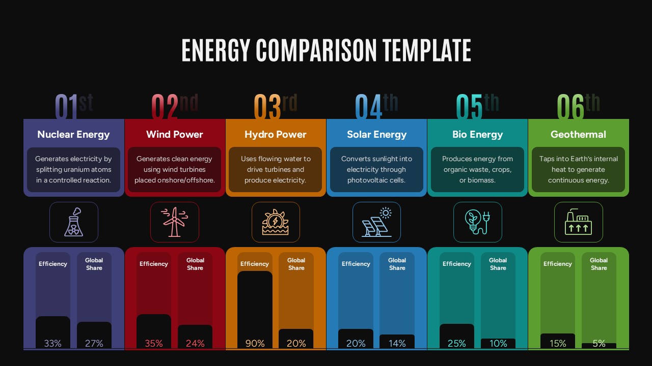
The Energy Sources Comparison Infographic is a professionally designed presentation slide that enables users to compare major energy sources through a structured and visually engaging format. Featuring Nuclear, Wind, Hydro, Solar, Bioenergy, and Geothermal power, the infographic transforms complex energy data into a clear visual comparison that audiences can understand at a glance.
Each energy source is presented in a dedicated color-coded section with concise descriptions, intuitive icons, and performance indicators. The side-by-side layout makes it easier to evaluate energy generation methods, efficiency levels, adoption rates, and sustainability impact while maintaining visual consistency throughout the presentation.
Who Should Use This Energy Comparison Infographic?
This comparison infographic is valuable for sustainability consultants presenting renewable energy strategies, researchers analyzing energy trends, and educators explaining power generation concepts in classrooms or training sessions. Energy policy professionals can use it to communicate regulatory insights and long-term energy planning initiatives to stakeholders and decision-makers.
Corporate executives, ESG managers, investment analysts, and clean energy advocates can leverage this template to showcase sustainability goals, compare energy portfolios, evaluate renewable energy opportunities, and support data-driven discussions during business reviews, investor meetings, and industry conferences.
Organizations preparing sustainability reports can use the infographic to communicate energy performance metrics in a concise format. Government agencies can incorporate it into public awareness campaigns and policy workshops focused on energy transition initiatives. Academic institutions can use it for lectures, research presentations, and environmental studies programs. The slide is equally effective for renewable energy investment pitches, climate change discussions, corporate ESG reporting, engineering briefings, technical seminars, and strategic planning sessions where energy comparisons need to be presented clearly and professionally.
Present energy insights with clarity and confidence using this Energy Sources Comparison Infographic. Customize the data, update the statistics, and tailor the design to match your presentation goals. Download the template today and create compelling energy comparison presentations that drive understanding and informed decision-making.
Login to download this file

Item ID
SB05533Designed By
Geethu


Related Templates

Energy Pyramid Template to Visualize Ecosystem Energy Flow
Pyramid
Sources of Power PowerPoint Template
Circular
Renewable Energy PowerPoint Template
Graphics
Renewable Energy Landscape Illustration Template for PowerPoint & Google Slides
Graphics
Nuclear Energy PowerPoint Deck Template
Pitch Deck
Ecological Energy Flow Pyramid for PowerPoint
Pyramid
Free
Free Solar Energy Presentation PowerPoint Template
Circular
Free
Renewable Energy Template For PowerPoint
Pitch Deck
Free Oil PowerPoint Template for Energy and Industry Presentations
Process
Free

Renewable Energy Theme For PowerPoint
Company Profile
Renewable Energy Presentation Template
Pitch Deck
Energy Saving Template
Business Strategy
Gold Scales Balance Comparison Infographic for PowerPoint & Google Slides
Comparison

A/B Testing Comparison Infographic template for PowerPoint & Google Slides
Comparison
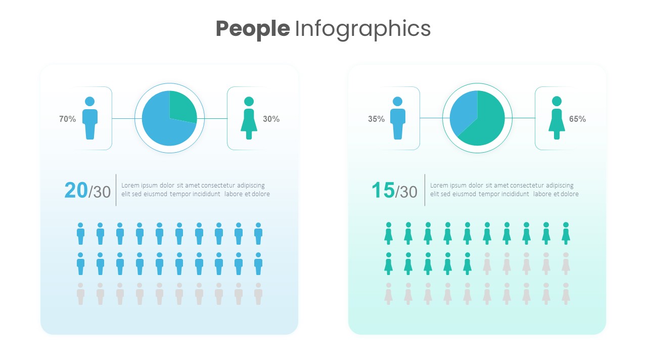
Gender Comparison People Infographic Template for PowerPoint & Google Slides
Comparison
Seller Portals Comparison Infographic Template for PowerPoint & Google Slides
Process
Category Analysis Comparison Infographic for PowerPoint & Google Slides
Comparison
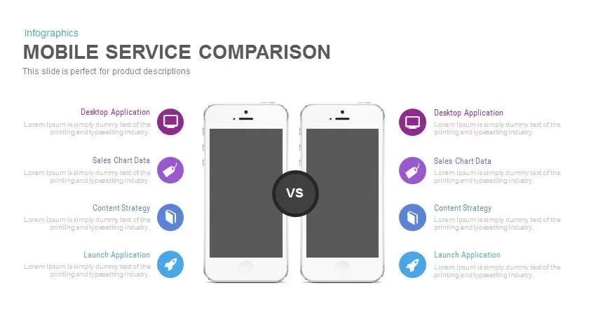
Mobile Service Comparison Template for PowerPoint
Comparison
People Demographic Comparison Chart Template for PowerPoint & Google Slides
Comparison
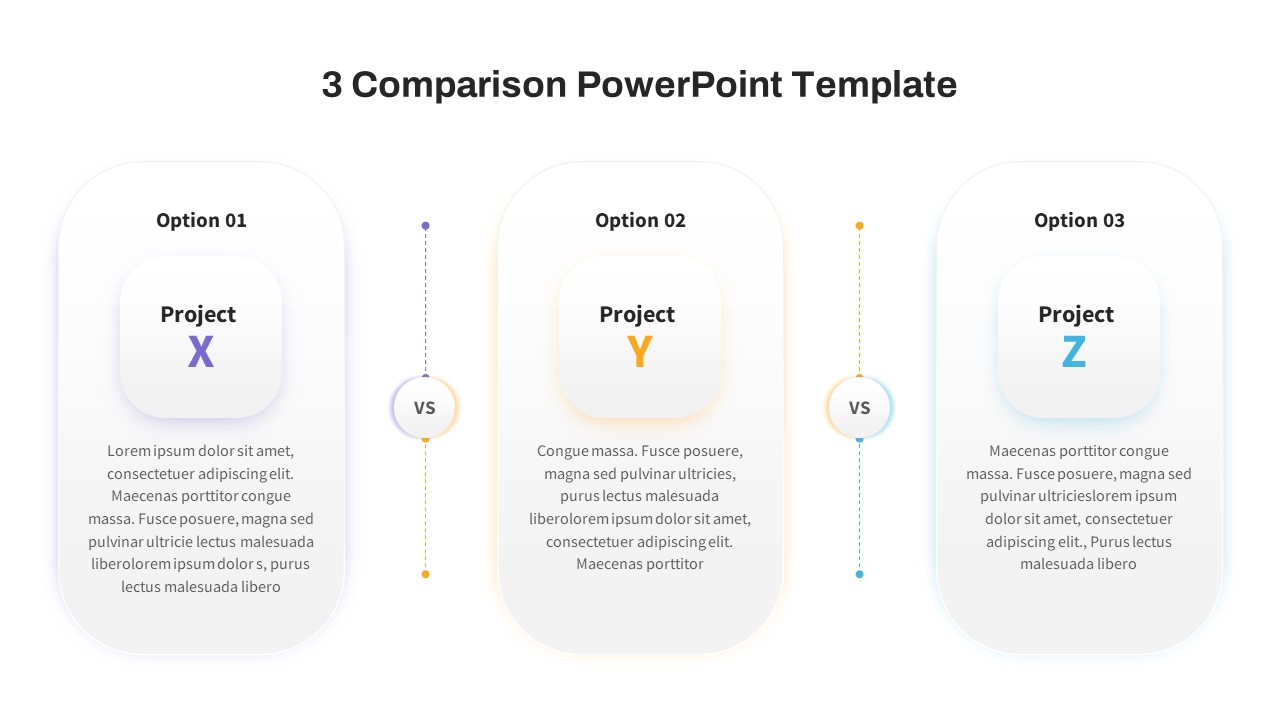
Free 3 Comparison PowerPoint Template
Comparison
Free