Comparison Chart Design Slide for PowerPoint & Google Slides
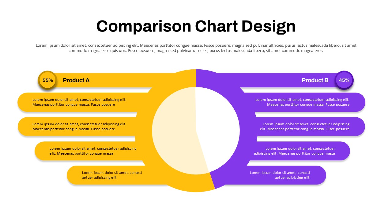

The Comparison Chart Design Presentation Template is a practical tool for showing side by side comparisons in a clean and engaging way. It works in both PowerPoint and Google Slides, so you can use it on your preferred platform without any issues. The template is easy to edit, allowing you to change text, colors, and shapes in just a few clicks. You can quickly adapt it to match your brand or presentation style without spending extra time on design.
This template is ideal for anyone who needs to present comparisons clearly and professionally. The layout is designed to guide the audience’s attention, helping them understand key differences at a glance. With organized sections and visual balance, it supports better storytelling and keeps your message focused. For more advanced visual comparisons, you can also explore comparison slides that offer additional layouts for multi-variable analysis.
Use cases include:
- Business meetings
Present product comparisons, pricing models, or performance insights in a structured way. - Project presentations
Compare strategies, timelines, or results to support decision making. - Educational slides
Simplify complex topics by presenting clear comparisons for better understanding.
Using this template helps reduce preparation time while improving the quality of your slides. It ensures your content is well-structured, visually clear, and easy to present. This makes your communication more effective and keeps your audience engaged throughout.
Get the Comparison Chart Design Presentation Template now and start building clear and professional comparison slides with confidenc
Frequently Asked Questions
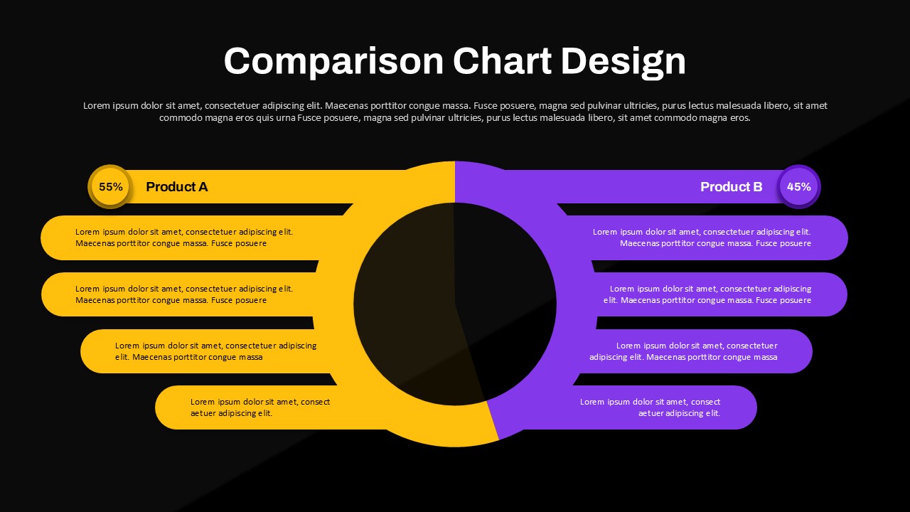
Can I customize the colors and percentages in this comparison chart?
What types of comparisons work best with this template?
Login to download this file

Item ID
SB05841Designed By
Naseeba Sithara
Related Templates

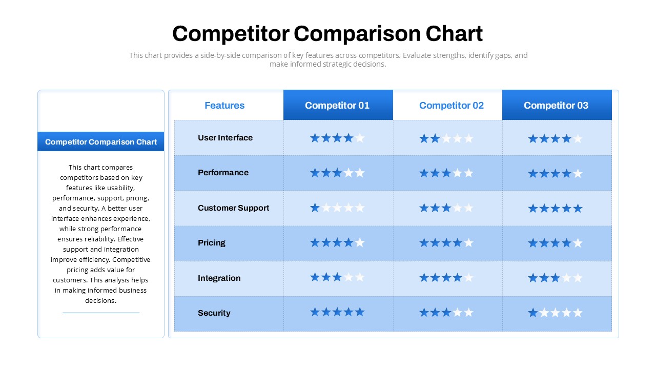
Competitor Comparison Chart Design Template for PowerPoint & Google Slides
Comparison
Tornado Chart Data Comparison Slide Template for PowerPoint & Google Slides
Bar/Column
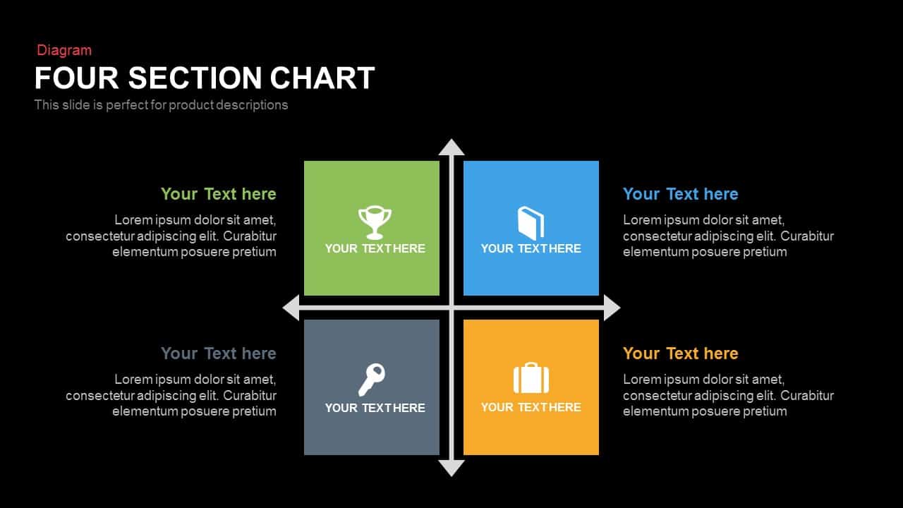
Four Section Comparison Chart Diagram Template for PowerPoint & Google Slides
Infographics
Interactive Product Comparison Bar Chart Template for PowerPoint & Google Slides
Bar/Column
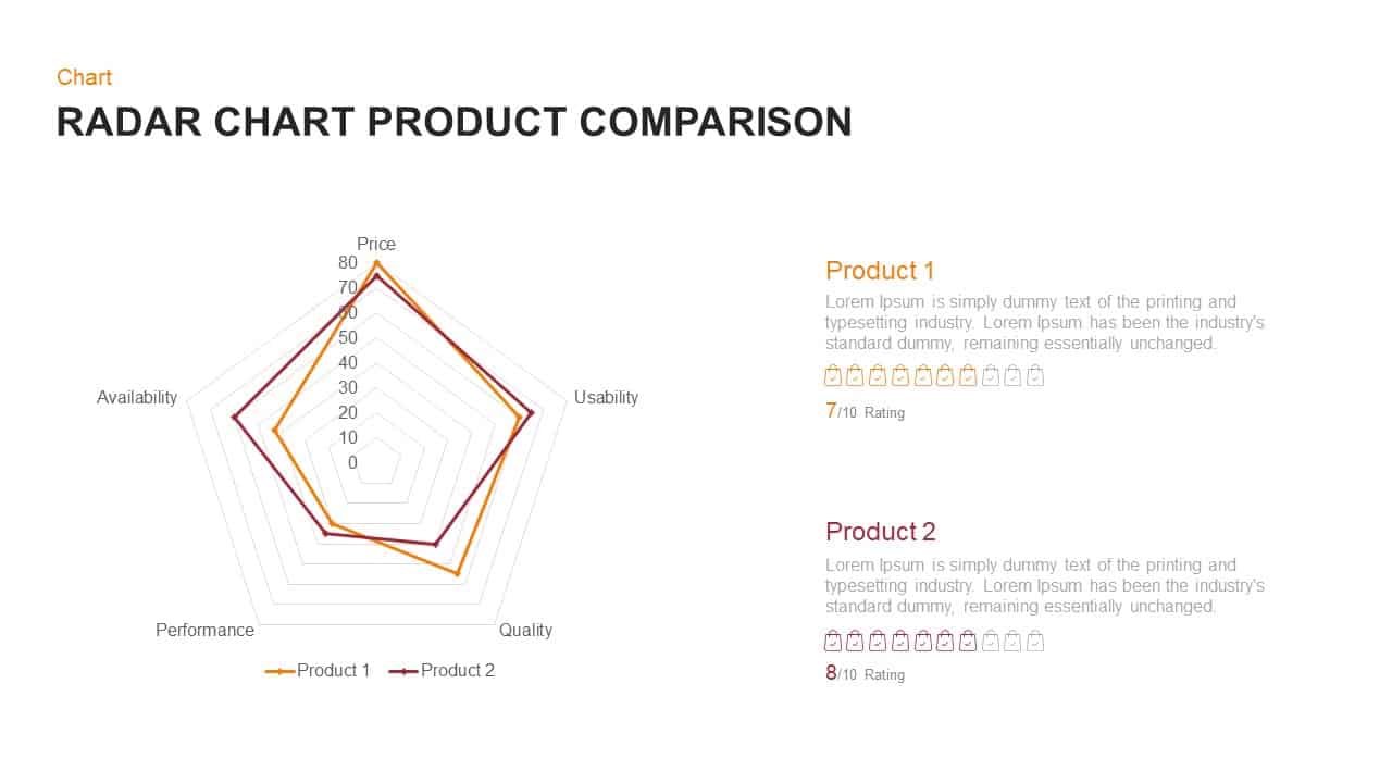
Radar Chart Product Comparison Template for PowerPoint & Google Slides
Comparison Chart

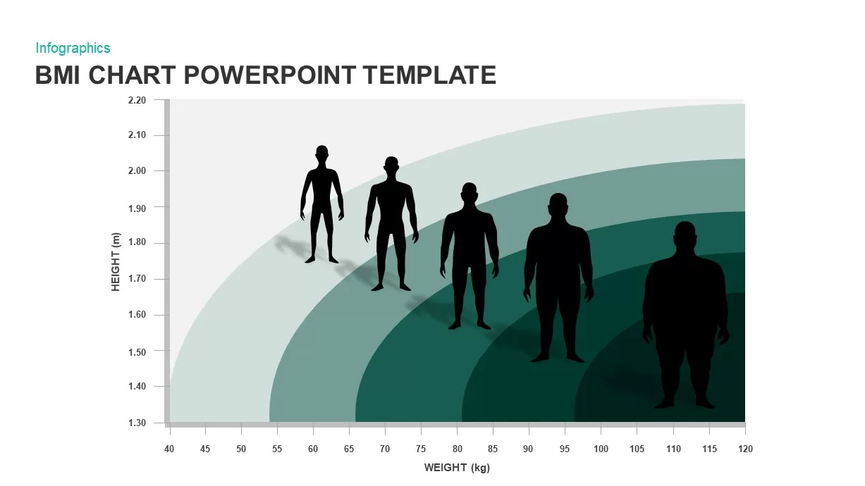
BMI Category Comparison Chart Template for PowerPoint & Google Slides
Comparison
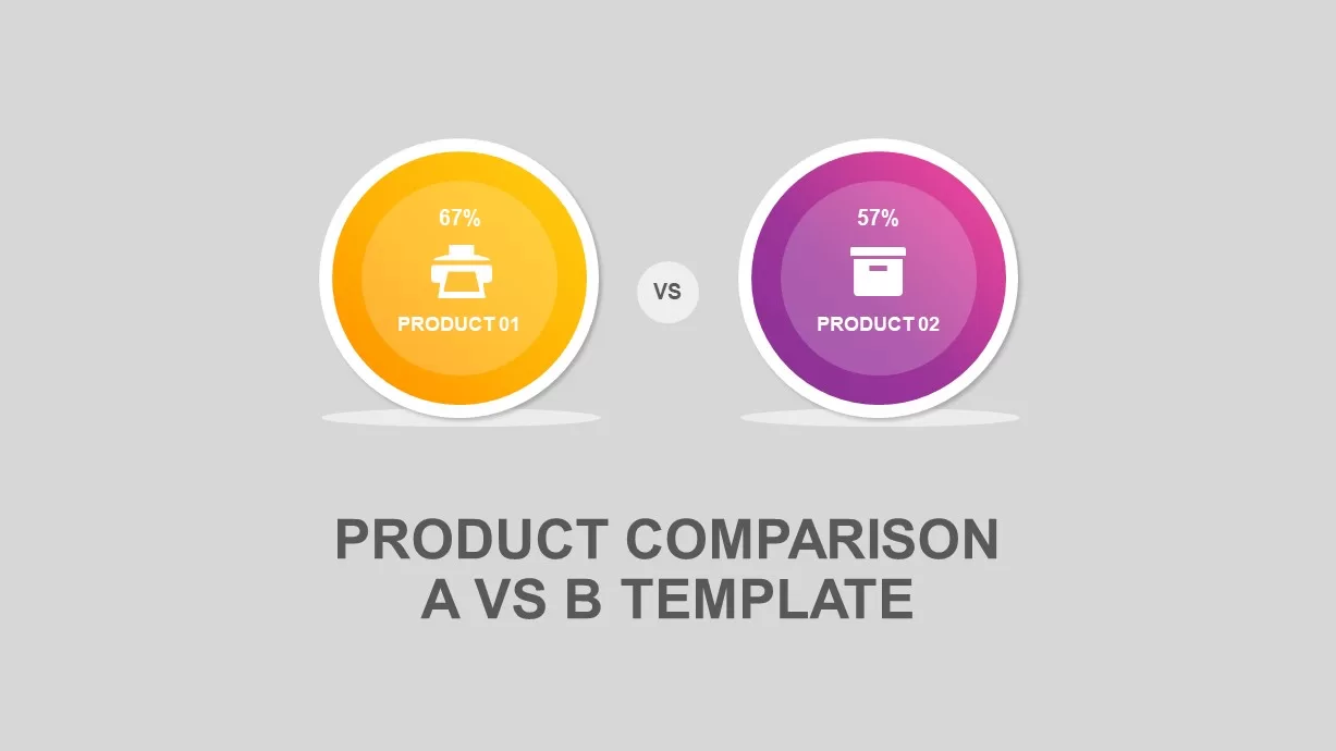
Circular Product Comparison Chart Template for PowerPoint & Google Slides
Comparison Chart
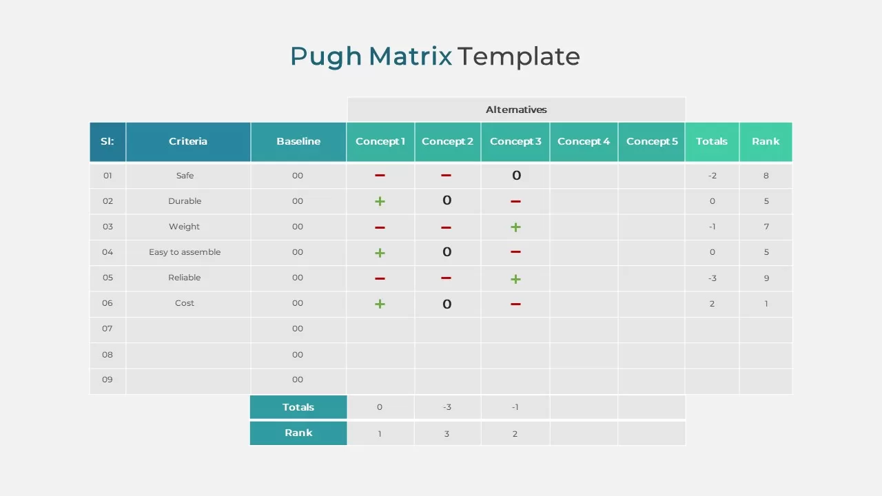
Pugh Matrix Decision Comparison Chart Template for PowerPoint & Google Slides
Comparison Chart
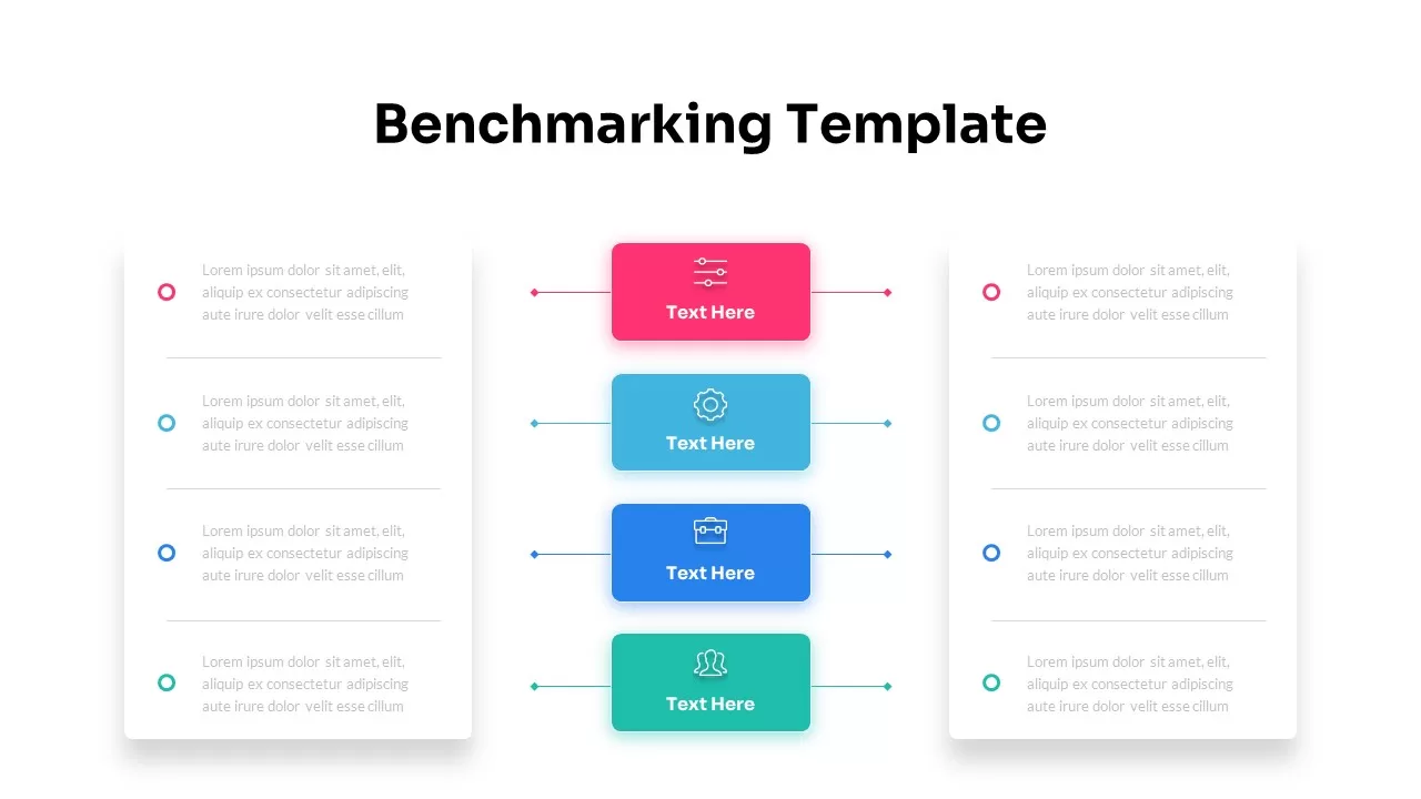
Dynamic Benchmarking Comparison Chart Template for PowerPoint & Google Slides
Comparison Chart
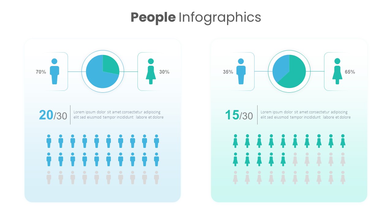
People Demographic Comparison Chart Template for PowerPoint & Google Slides
Comparison
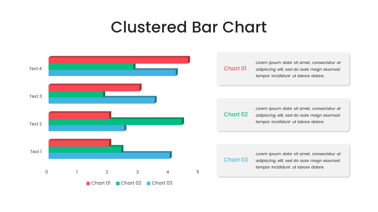
Clustered Bar Chart Comparison Template for PowerPoint & Google Slides
Bar/Column
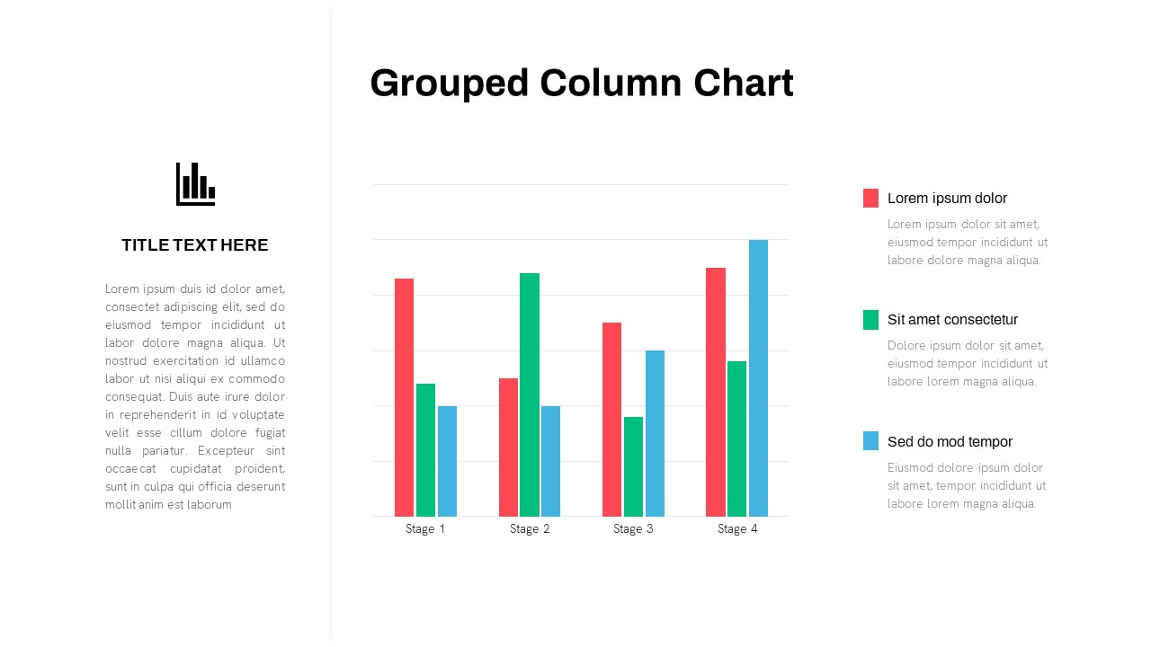
Grouped Column Chart Comparison Template for PowerPoint & Google Slides
Bar/Column
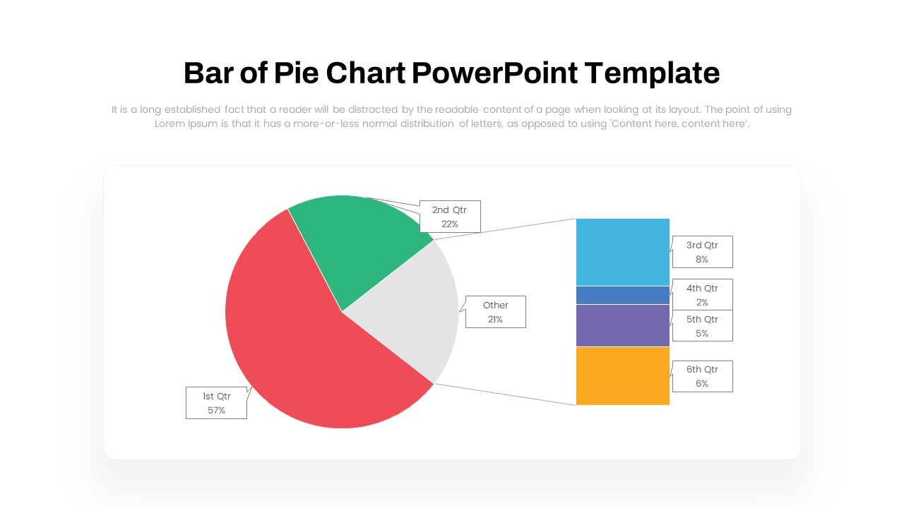
Dynamic Bar-of-Pie Chart Comparison Template for PowerPoint & Google Slides
Pie/Donut
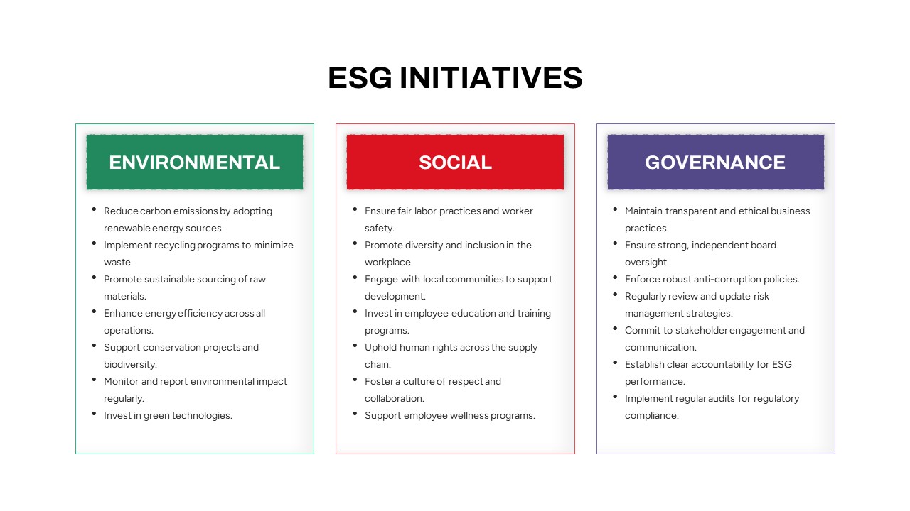
ESG Initiatives Comparison Chart Template for PowerPoint & Google Slides
Business
Two-Option Bar Chart Comparison Table Template for PowerPoint & Google Slides
Comparison
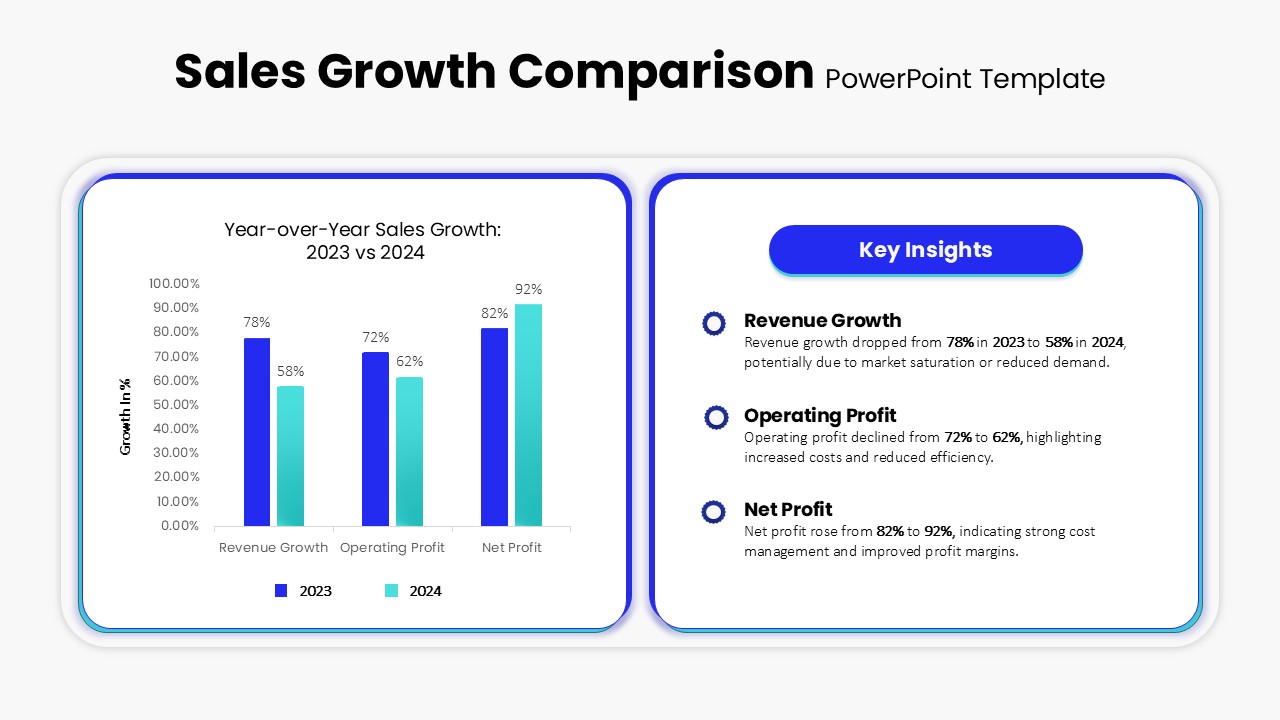
Sales Growth Comparison Chart & Table Template for PowerPoint & Google Slides
Bar/Column
Skills Gap Analysis Comparison Chart Template for PowerPoint & Google Slides
Gap
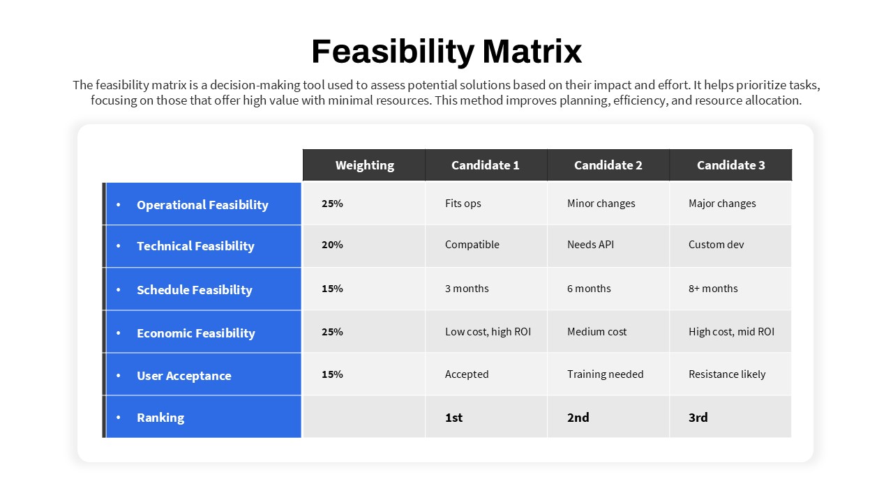
Feasibility Matrix Comparison Chart Template for PowerPoint & Google Slides
Comparison Chart
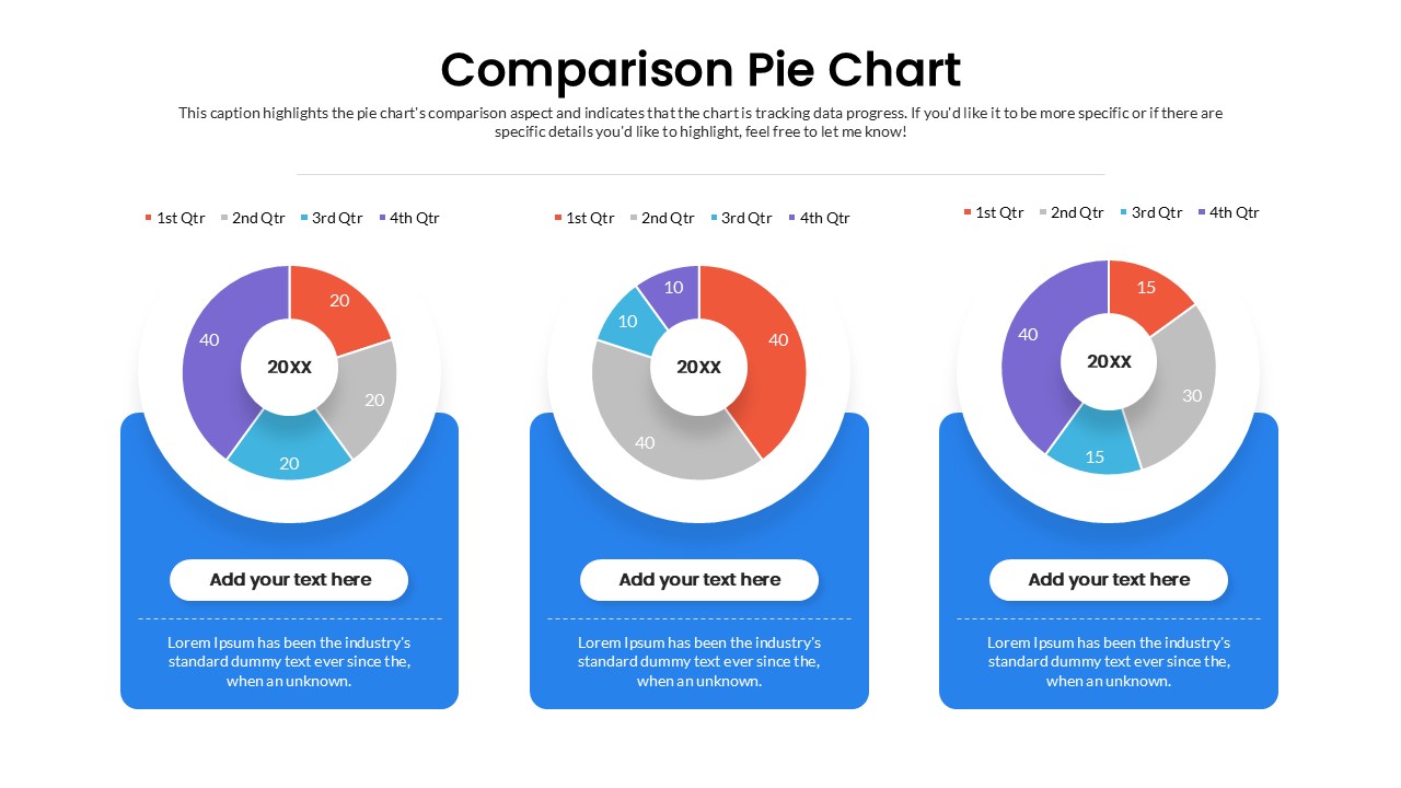
Quarterly Comparison Pie Chart Template for PowerPoint & Google Slides
Pie/Donut
Blank Comparison Chart Template for PowerPoint & Google Slides
Comparison Chart