5-Step Comparable Company Analysis Template for PowerPoint & Google Slides


Description
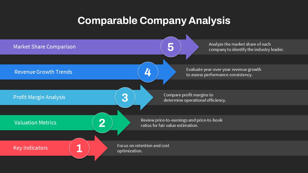
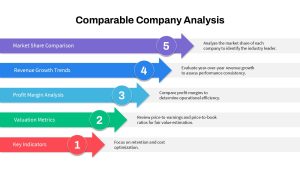
This slide presents a clear five-step arrow infographic to guide audiences through a comparable company analysis. Each horizontal arrow is color-coded—red for Key Indicators, green for Valuation Metrics, cyan for Profit Margin Analysis, blue for Revenue Growth Trends, and purple for Market Share Comparison—and numbered 1 through 5 to enforce sequential flow. To the right of each arrow, concise text placeholders describe actions such as focusing on retention and cost optimization, reviewing valuation ratios, comparing profit margins, evaluating revenue growth, and identifying market leaders. Subtle drop shadows and a white background enhance visual contrast, while consistent sans-serif typography ensures readability.
All elements are fully editable PowerPoint and Google Slides vector shapes tied to master slides and theme color palettes. Connector lines and arrowheads feature adjustable stroke weights and endpoint styles, enabling precise customization. Built-in alignment guides and snap-to layouts streamline placement, and drag-and-drop placeholders let users swap colors, replace icons, or update text in seconds. The design supports high-resolution export for large screens and print, maintaining crisp visuals across devices and aspect ratios. Slide notes and simple animation presets are included to enrich presentations and provide presenter cues.
Built on slide masters, this diagram ensures consistency with corporate themes, allowing global teams to maintain brand standards. The layout is ideal for high-level executive briefings, technical workshops, or client presentations, and supports seamless translation for international audiences.
Who is it for
Financial analysts, investment bankers, and corporate strategists will rely on this slide to benchmark peer performance and valuation. Consultants, MBA students, and investor relations teams can also leverage it to present data-driven insights during board meetings and academic projects.
Other Uses
Repurpose this layout for product comparisons, KPI dashboards, project milestone reviews, or sales territory analyses. Adjust arrow labels and colors to illustrate strategic roadmaps, performance audits, or multi-phase implementation plans.
Login to download this file

Item ID
SB04683
Related Templates

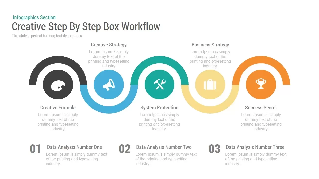
Creative Step By Step Workflow template for PowerPoint & Google Slides
Process
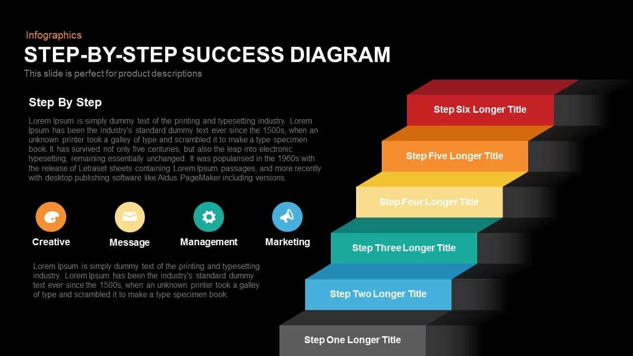
Step-by-Step Success Staircase Diagram template for PowerPoint & Google Slides
Process
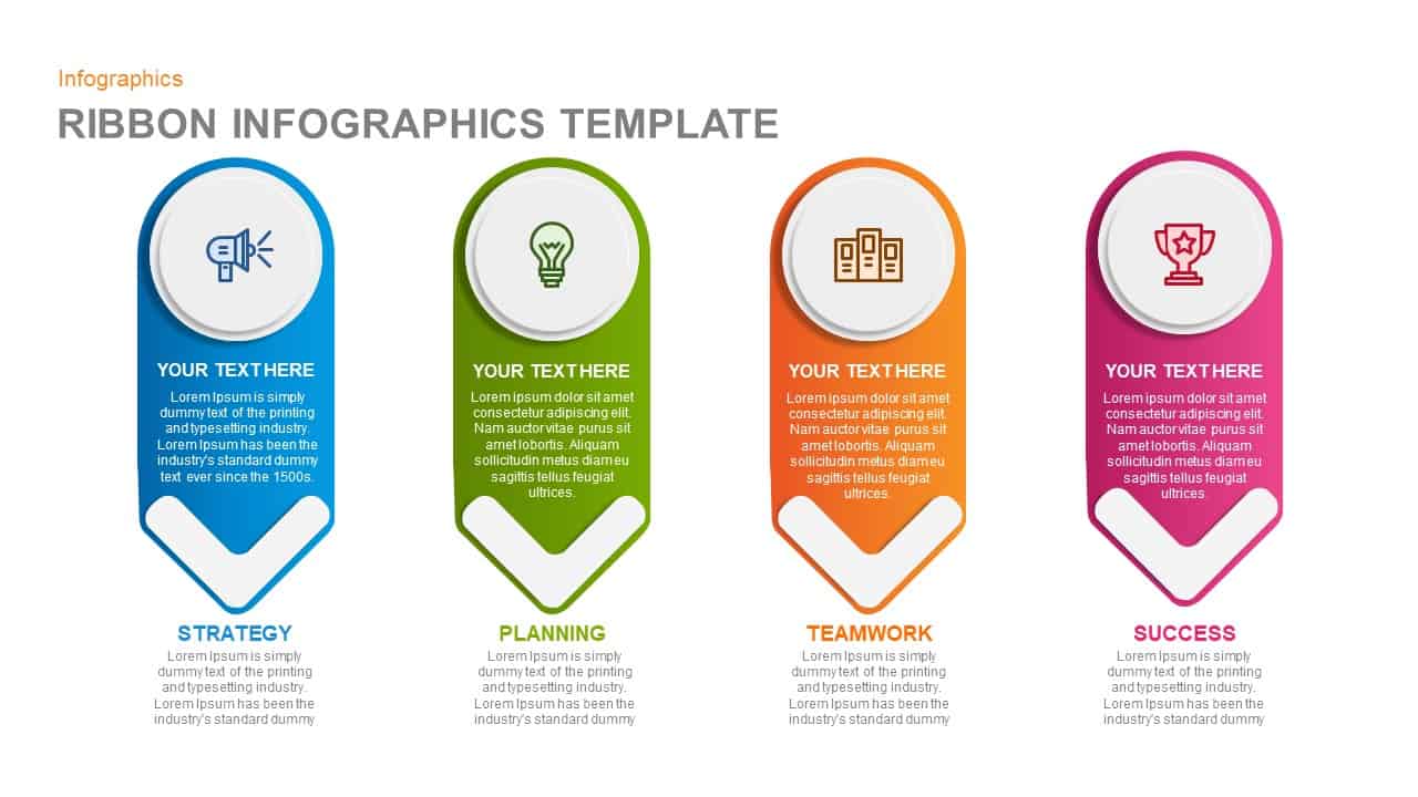
Ribbon Infographics Step-by-Step Process Template for PowerPoint & Google Slides
Process
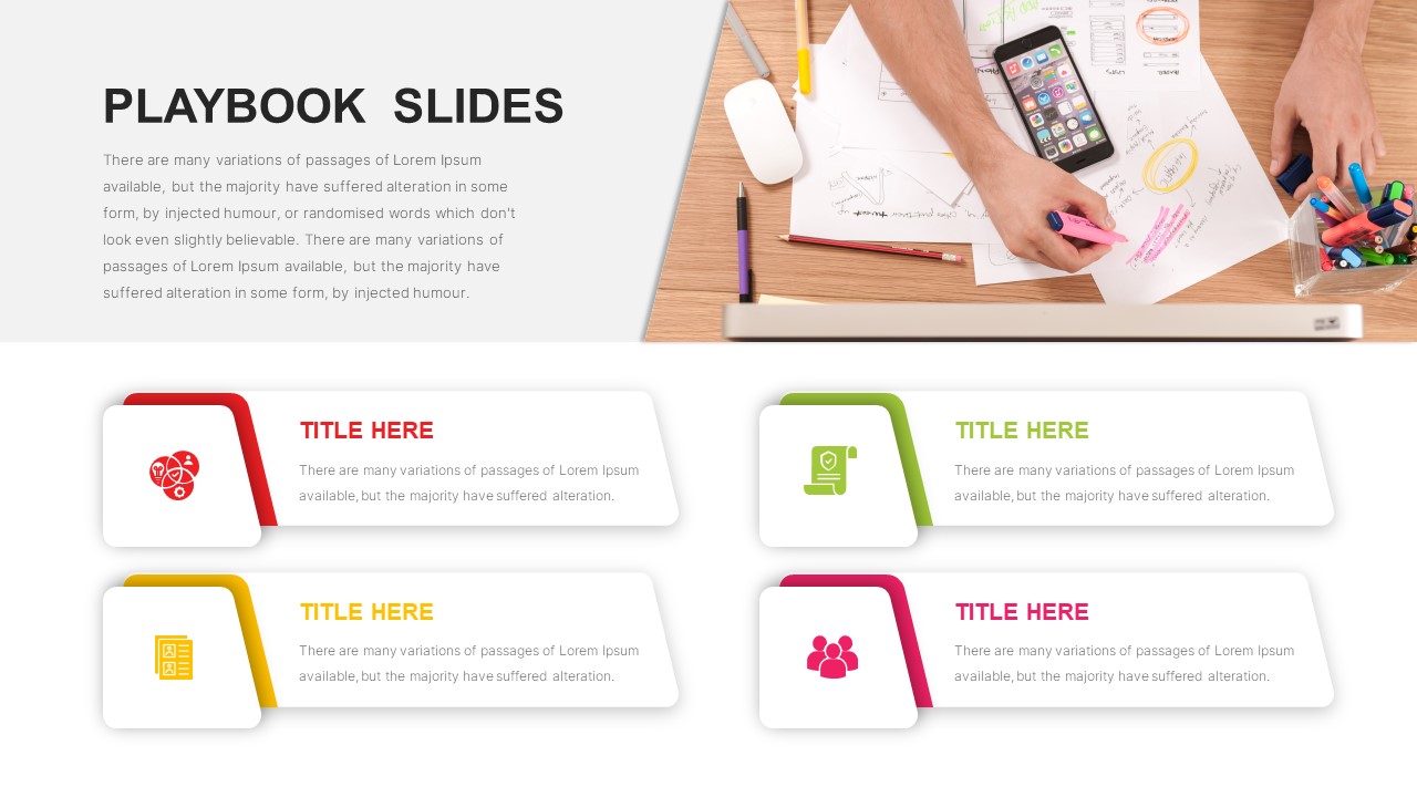
Sales Playbook Step-by-Step Process Template for PowerPoint & Google Slides
Process
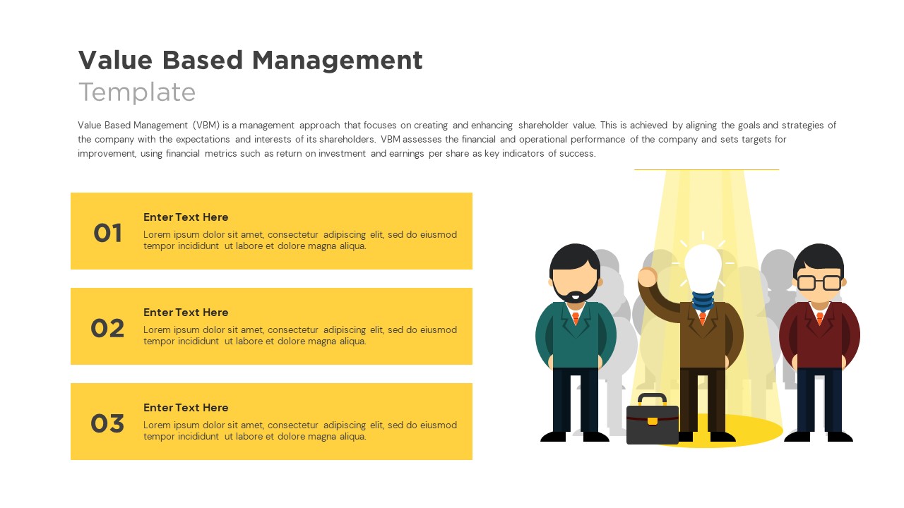
Value Based Management Step-by-Step Template for PowerPoint & Google Slides
Business Strategy
Top 10 Step-by-Step Image & Text Layouts Template for PowerPoint & Google Slides
Graphics
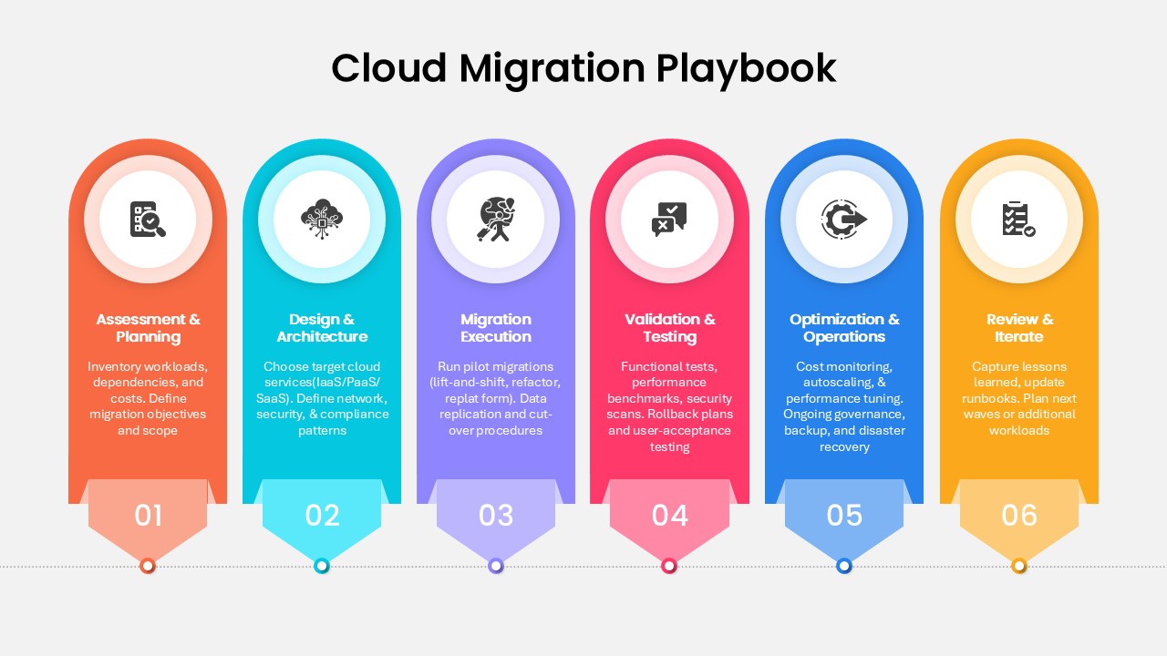
Step-by-Step Cloud Migration Playbook Template for PowerPoint & Google Slides
Cloud Computing
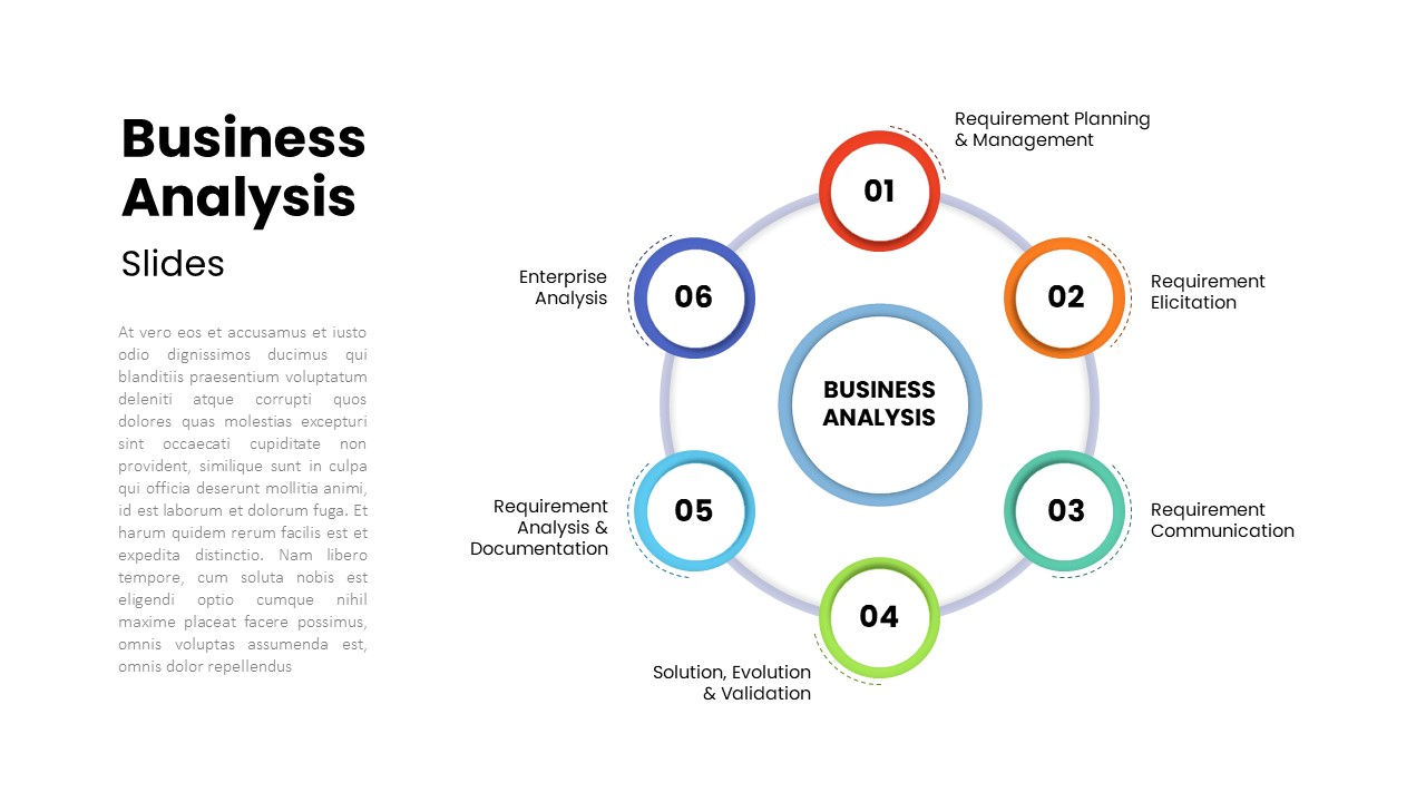
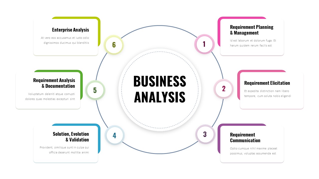
Six-Step Business Analysis Diagram template for PowerPoint & Google Slides
Circular
Six-Step Business Analysis Template for PowerPoint & Google Slides
Process
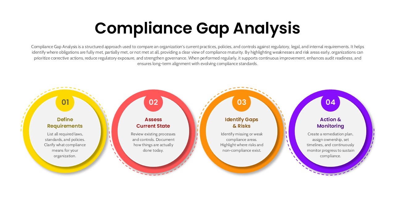
4 Step Compliance Gap Analysis Process Template for PowerPoint & Google Slides
Risk Management
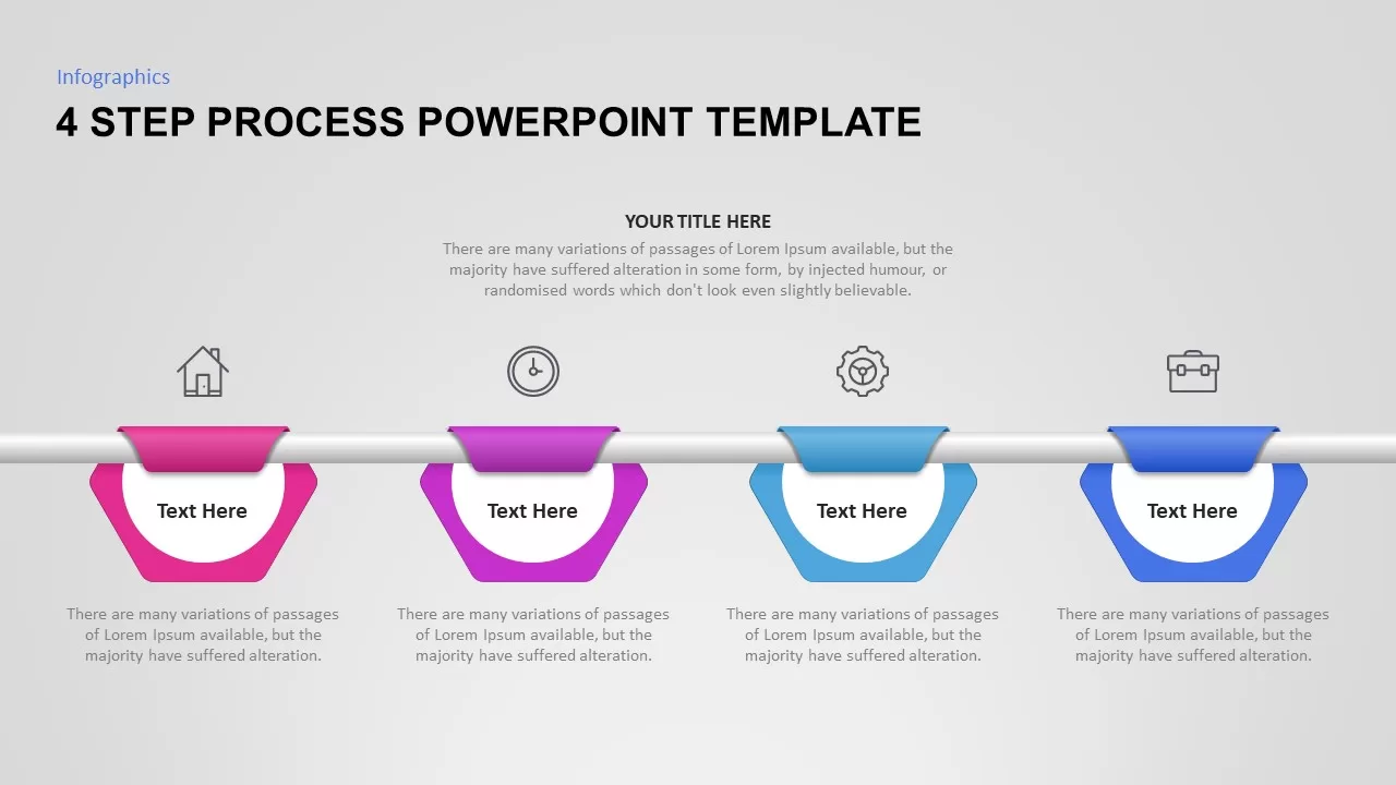
4 Step Process PowerPoint & Google Slides Template for PowerPoint & Google Slides
Process
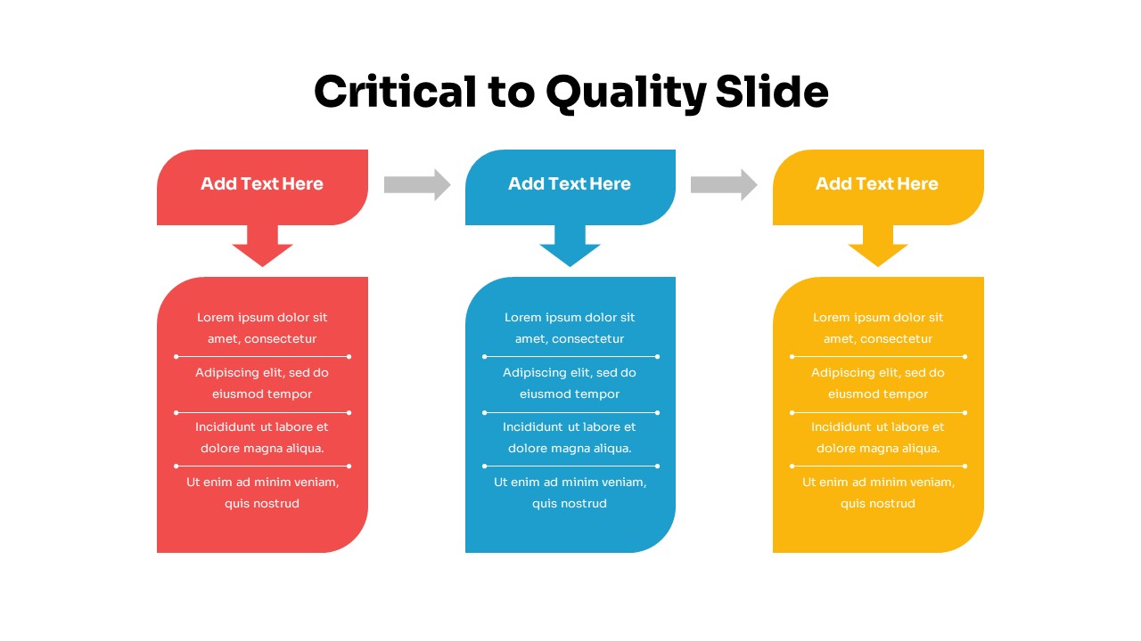
Three-Step Critical to Quality Slides Template for PowerPoint & Google Slides
Process
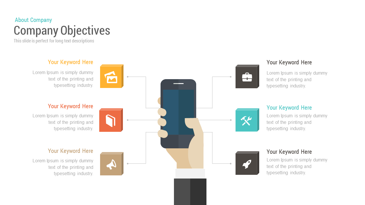
Free Company Objectives template for PowerPoint & Google Slides
Business Strategy
Free

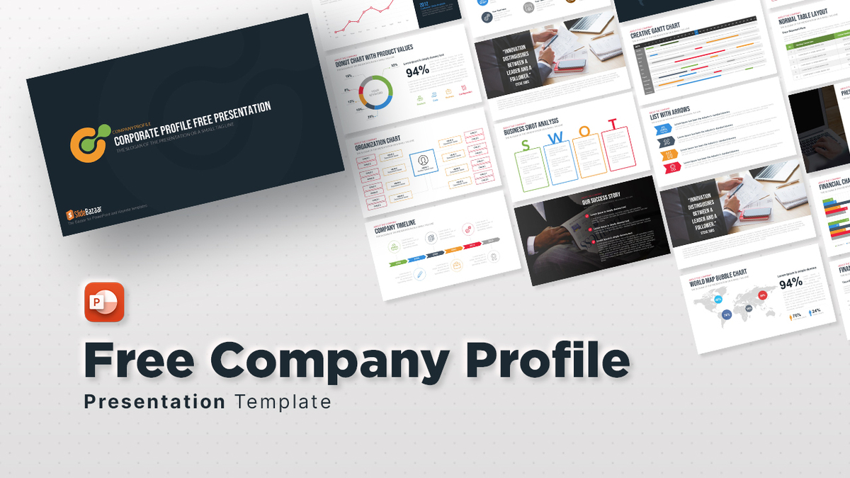
Free Company Profile template for PowerPoint & Google Slides
Company Profile
Free
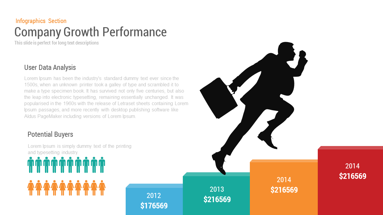
Company Growth template for PowerPoint & Google Slides
Charts
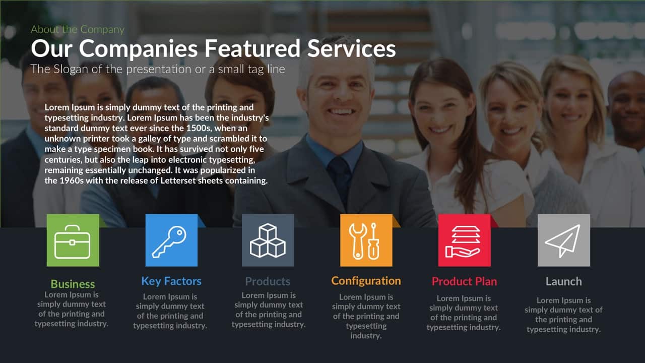
Company’s Featured Services Template for PowerPoint & Google Slides
Company Profile
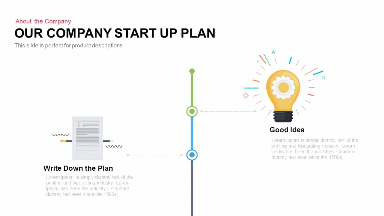
Company Startup Plan Timeline Slide Template for PowerPoint & Google Slides
Timeline
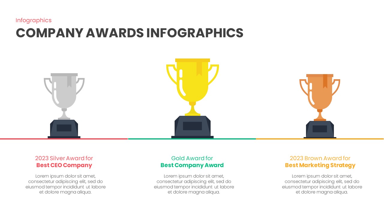
Company Awards Slide template for PowerPoint & Google Slides
Infographics
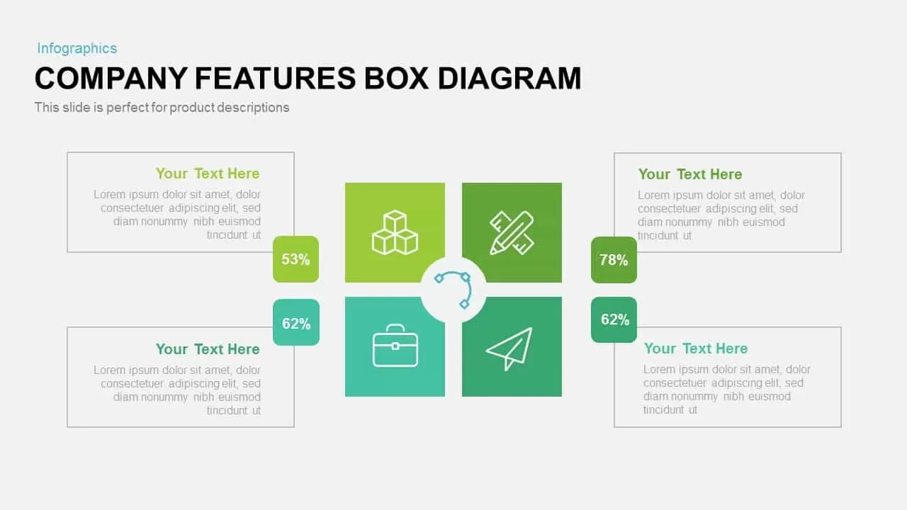
Custom Company Features Box Diagram Template for PowerPoint & Google Slides
Comparison
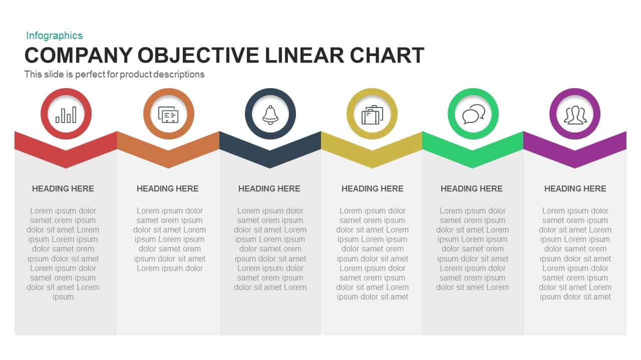
Company Objective Linear Chart Template for PowerPoint & Google Slides
Flow Charts

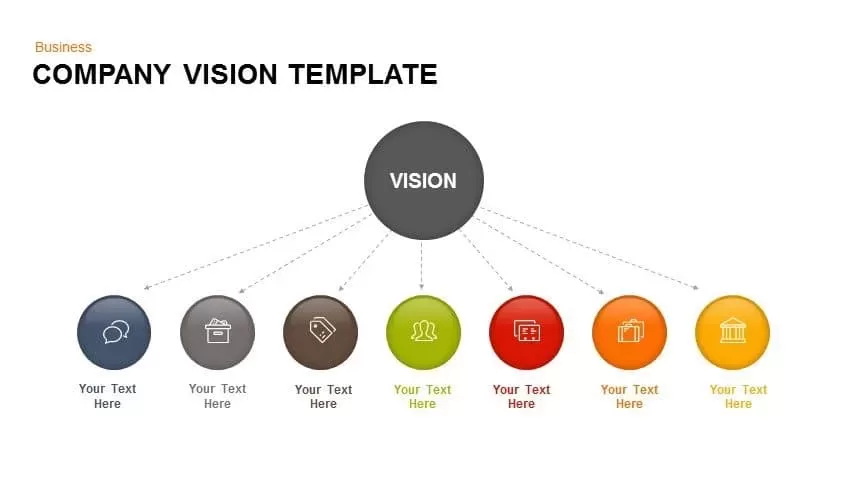
Company Vision Hub and Spoke Infographic Template for PowerPoint & Google Slides
Vision and Mission

Ultimate Free Company Profile Pitch Deck Template for PowerPoint & Google Slides
Company Profile
Free
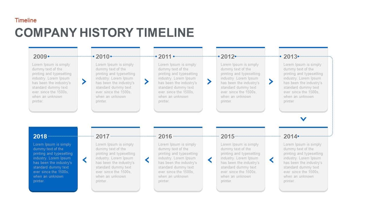
Company History Timeline Roadmap Template for PowerPoint & Google Slides
Timeline

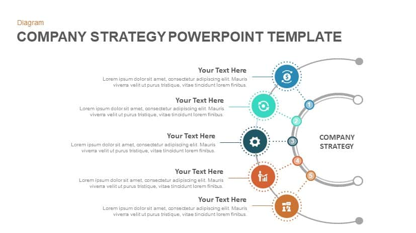
Company Strategy template for PowerPoint & Google Slides
Business Strategy
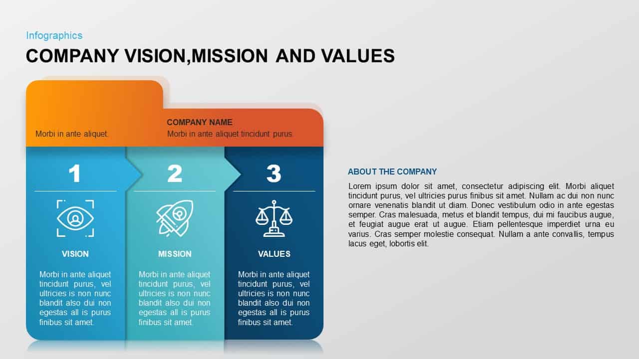
Company Vision, Mission & Values Diagram Template for PowerPoint & Google Slides
Vision and Mission

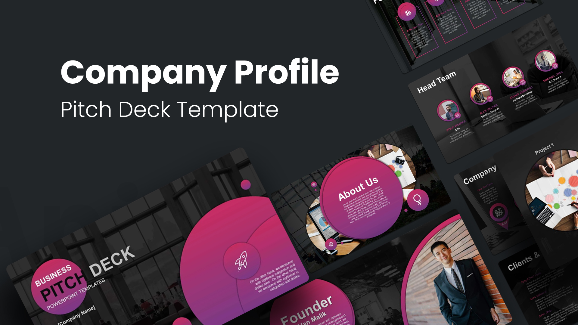
Company Profile Pitch Deck Design Template for PowerPoint & Google Slides
Company Profile
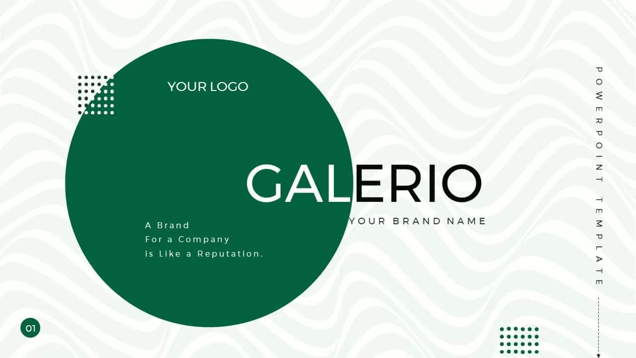
Modern Galerio Company Profile Deck template for PowerPoint & Google Slides
Company Profile
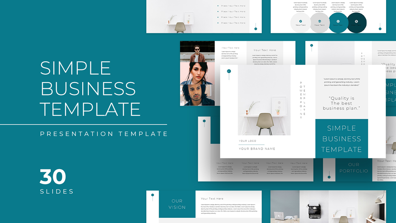
Simple Business Company Profile Deck Template for PowerPoint & Google Slides
Company Profile
Gradient Business Company Profile Template for PowerPoint & Google Slides
Company Profile
Modern Isometric Company Profile Template for PowerPoint & Google Slides
Company Profile
Corporate Solutions & Company Profile Template for PowerPoint & Google Slides
Company Profile
Purple Gradient Company Profile Deck Template for PowerPoint & Google Slides
Company Profile
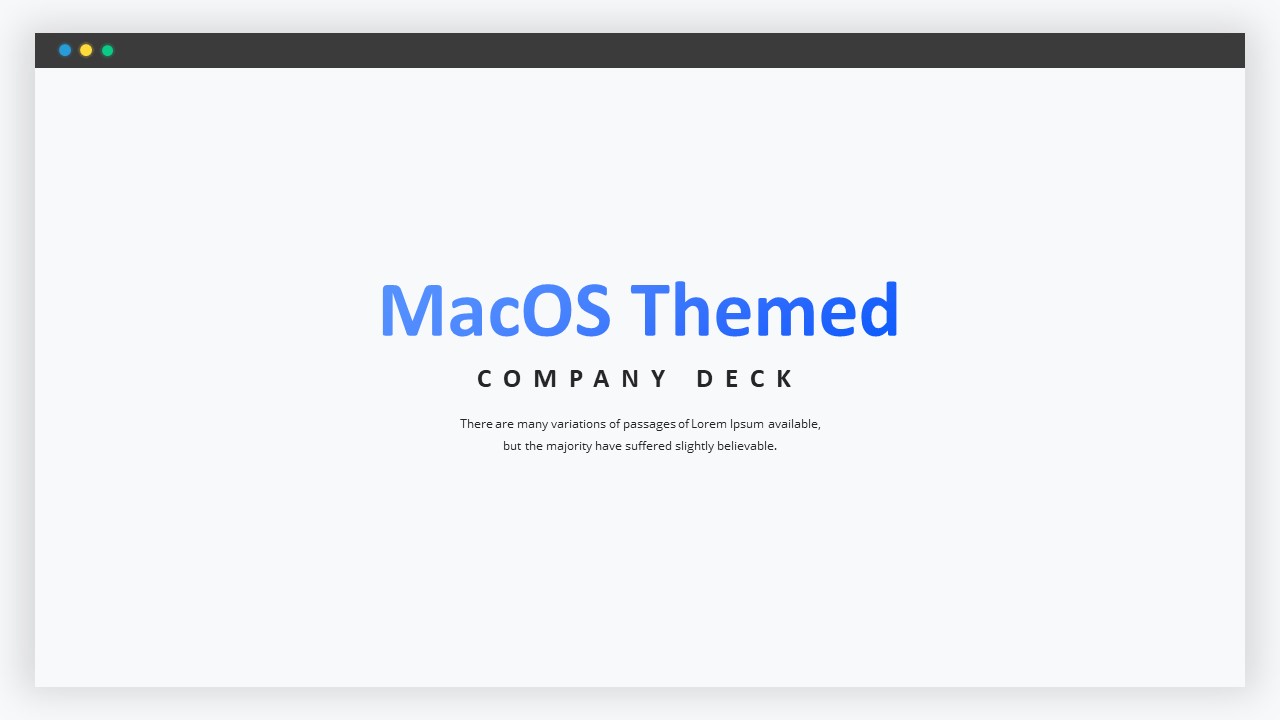
MacOS Themed Company Profile Deck Template for PowerPoint & Google Slides
Information Technology
Company Profile Overview template for PowerPoint & Google Slides
Company Profile
Medical Company Profile Slide Deck Template for PowerPoint & Google Slides
Company Profile
Free Helooo Creative Company Profile Template for PowerPoint & Google Slides
Company Profile
Free
Swipewire Company Portfolio Template for PowerPoint & Google Slides
Pitch Deck
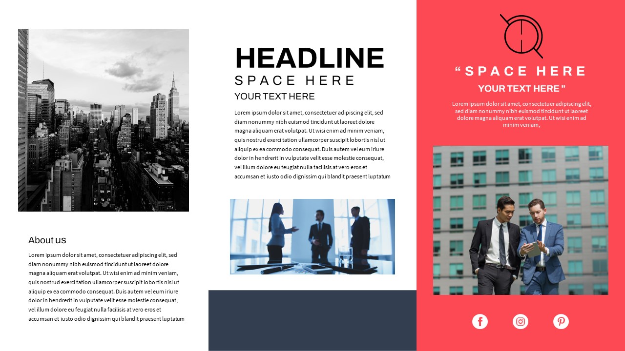
Business Company Profile Template for PowerPoint & Google Slides
Company Profile
Redbox Company Profile Template for PowerPoint & Google Slides
Company Profile
Free App Development Company Profile template for PowerPoint & Google Slides
Company Profile
Free
METCONNECT Company Profile Template for PowerPoint & Google Slides
Company Profile
Gradient Company Profile Presentation Template for PowerPoint & Google Slides
Company Profile
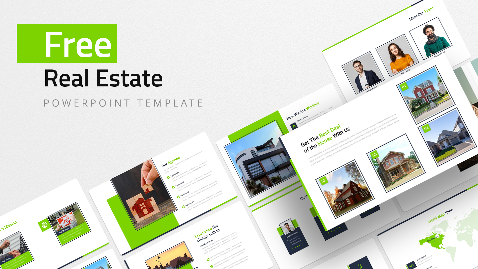
Free Real Estate Company Profile Template for PowerPoint & Google Slides
Company Profile
Free
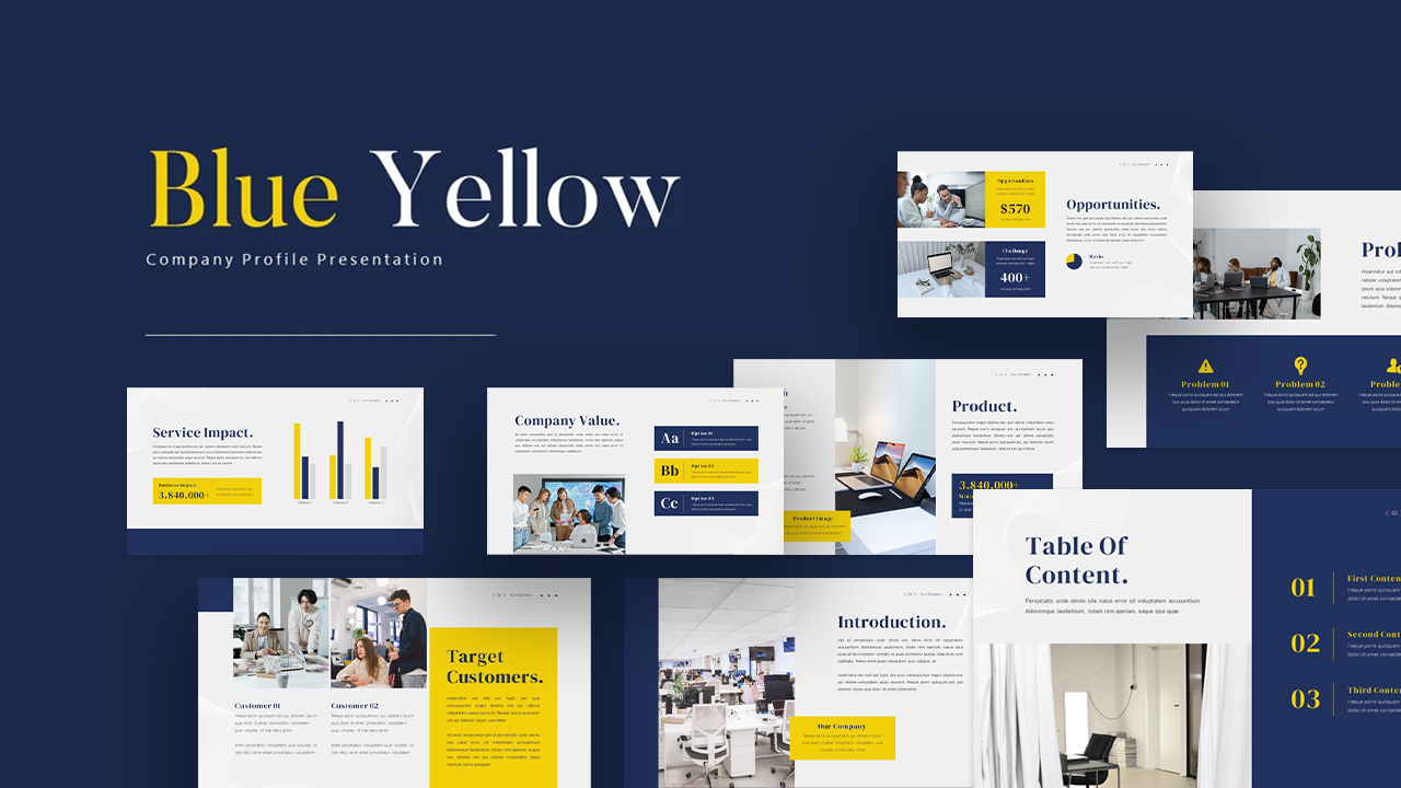
Modern Blue Yellow Company Profile Template for PowerPoint & Google Slides
Company Profile
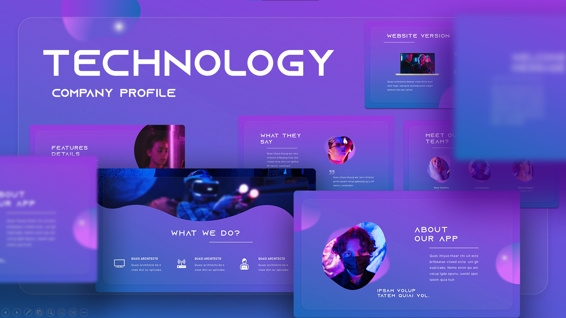
Technology Company Profile Deck Template for PowerPoint & Google Slides
Information Technology
E-commerce Company Profile Presentation Template for PowerPoint & Google Slides
Company Profile
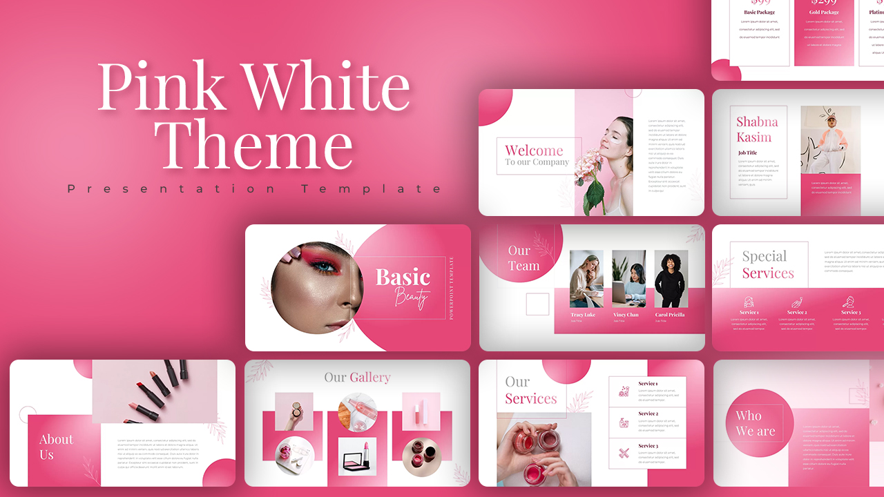
Pink White Theme Company Profile template for PowerPoint & Google Slides
Company Profile
Black and White Company Profile Deck Template for PowerPoint & Google Slides
Company Profile

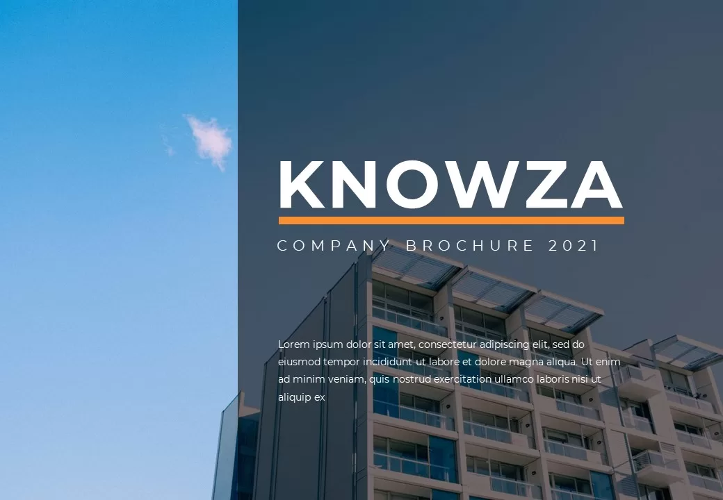
Knowza Company Brochure Template for PowerPoint & Google Slides
Company Profile
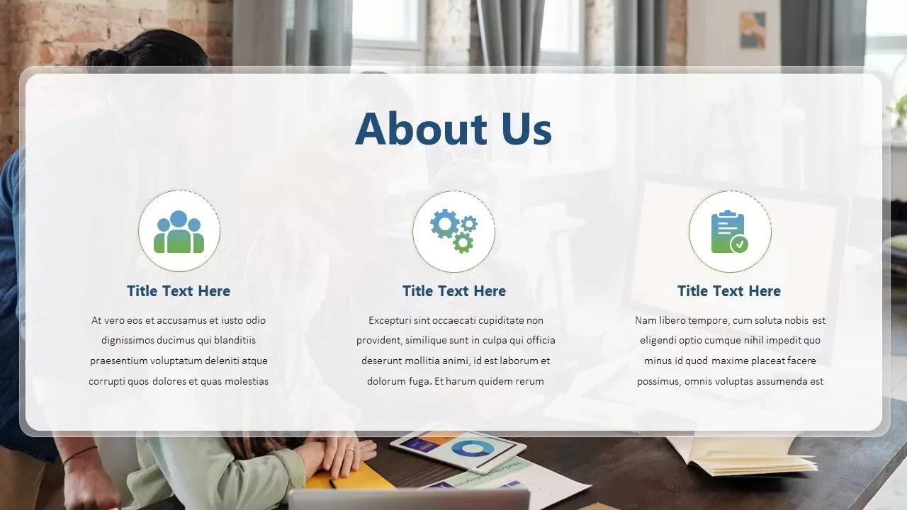
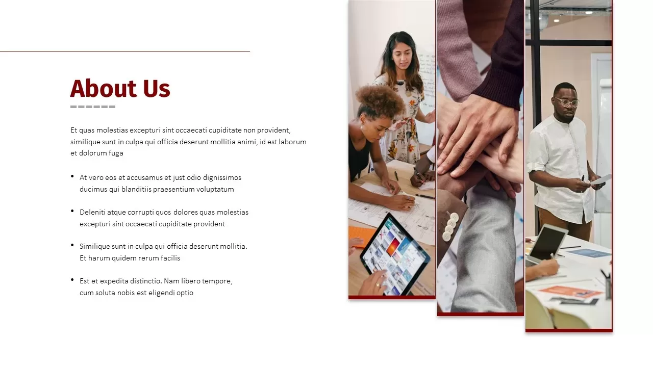
Professional Company About Us Slide Template for PowerPoint & Google Slides
Company Profile
Professional Corporate Company About Us Template for PowerPoint & Google Slides
Graphics
Modern Company Profile About Us Slide Template for PowerPoint & Google Slides
Company Profile
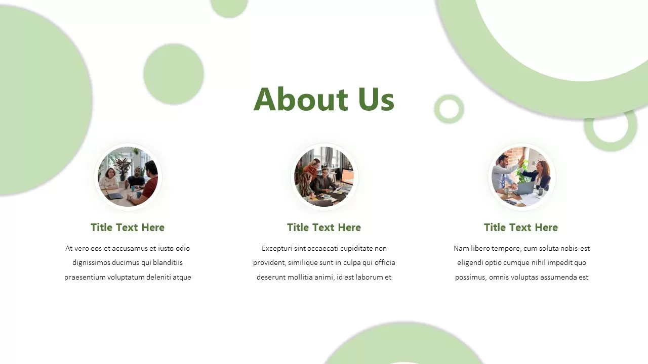
Modern Company About Us Slide Template for PowerPoint & Google Slides
Marketing
Drone Business Company Profile Template for PowerPoint & Google Slides
Company Profile
About Us Company Profile Template for PowerPoint & Google Slides
Marketing
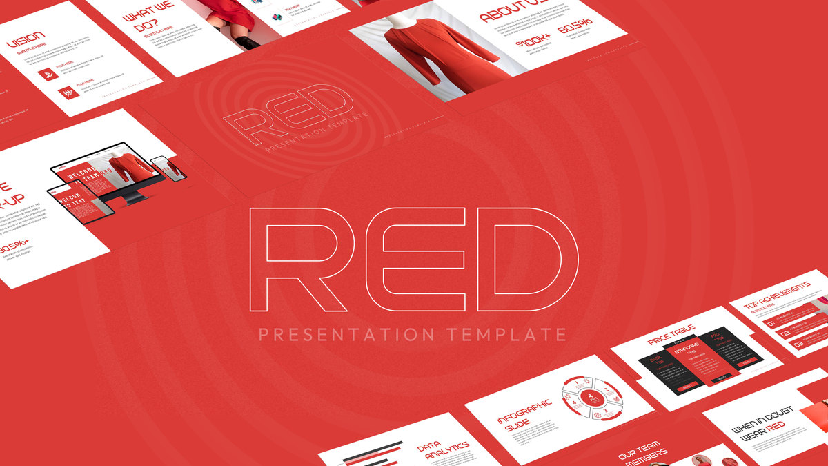
Red Company Profile Presentation Template for PowerPoint & Google Slides
Company Profile
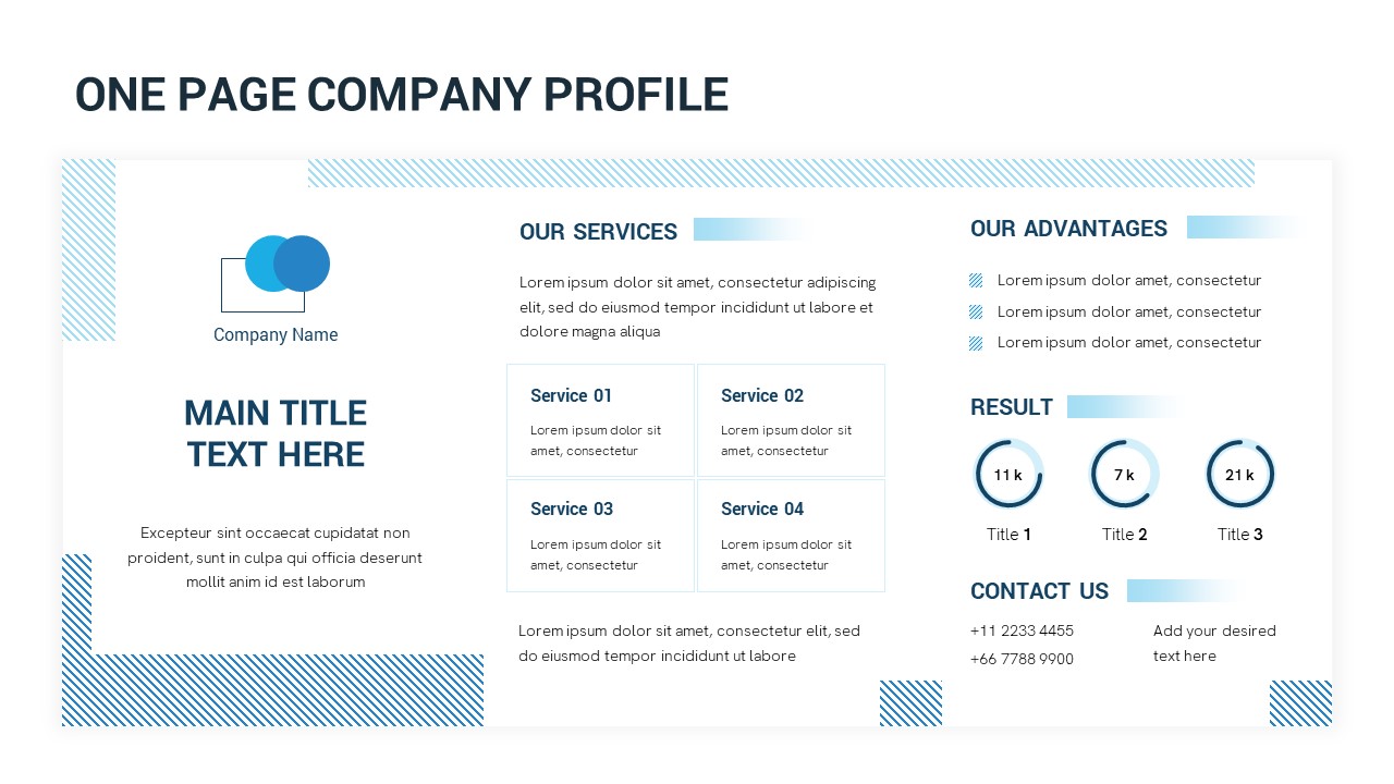
One-Page Company Profile Overview Template for PowerPoint & Google Slides
Company Profile
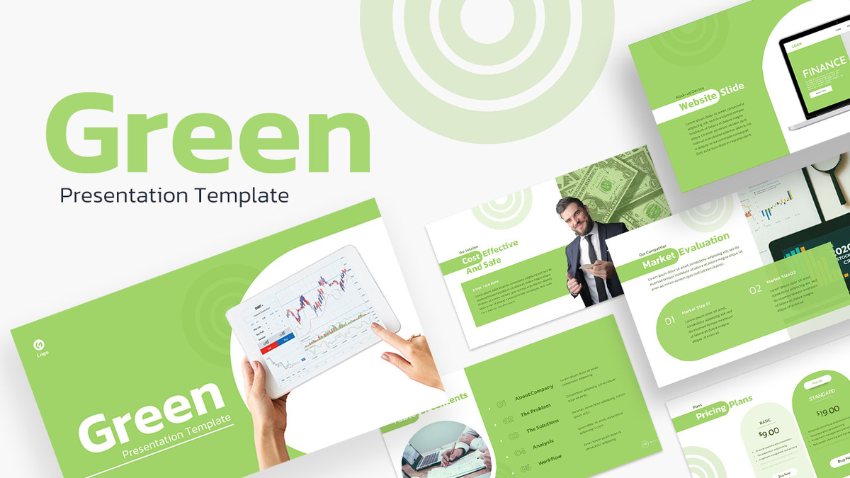
Green Company Profile Introduction Template for PowerPoint & Google Slides
Company Profile
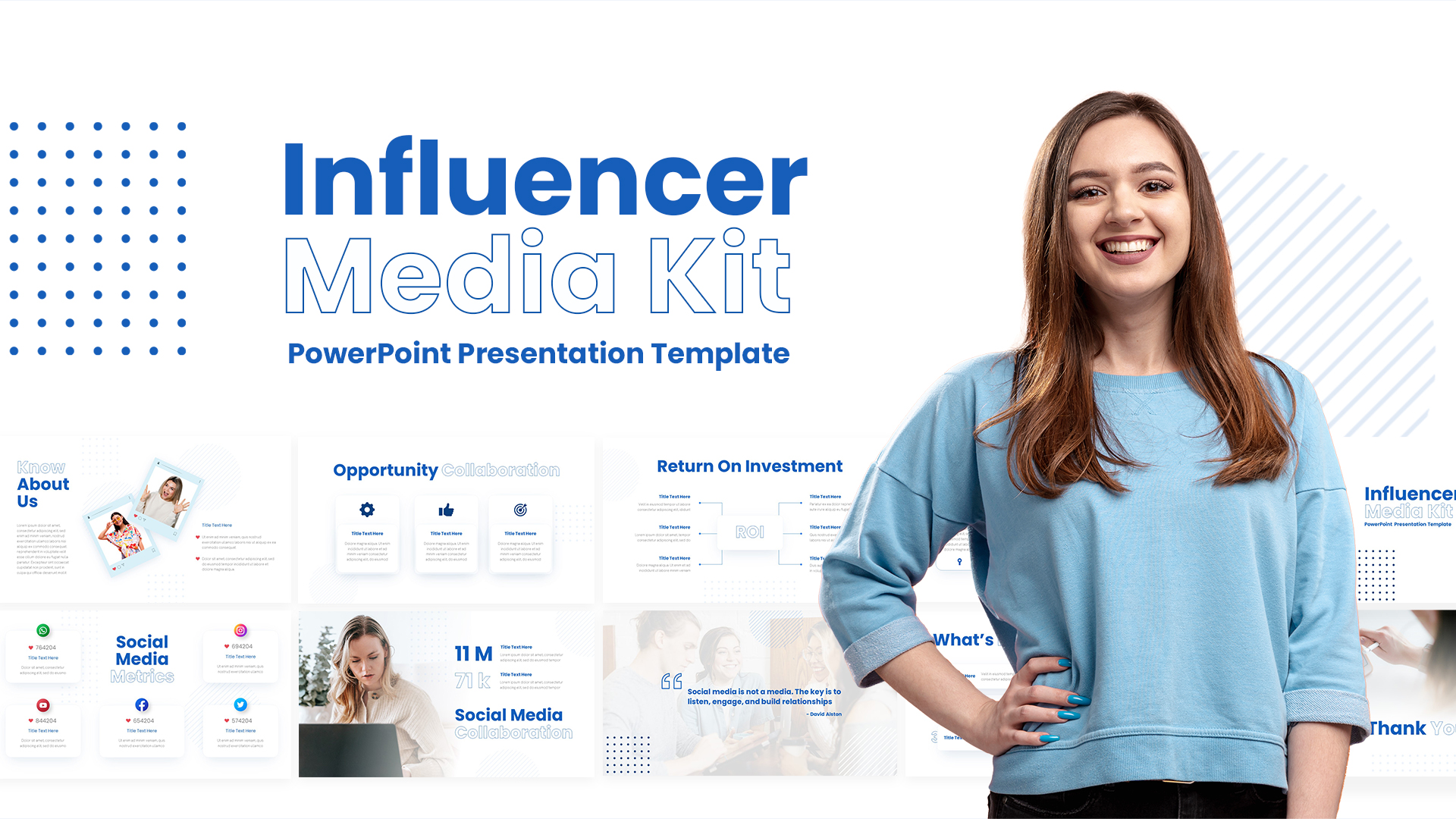
Influencer Media Kit Company Profile Template for PowerPoint & Google Slides
Company Profile
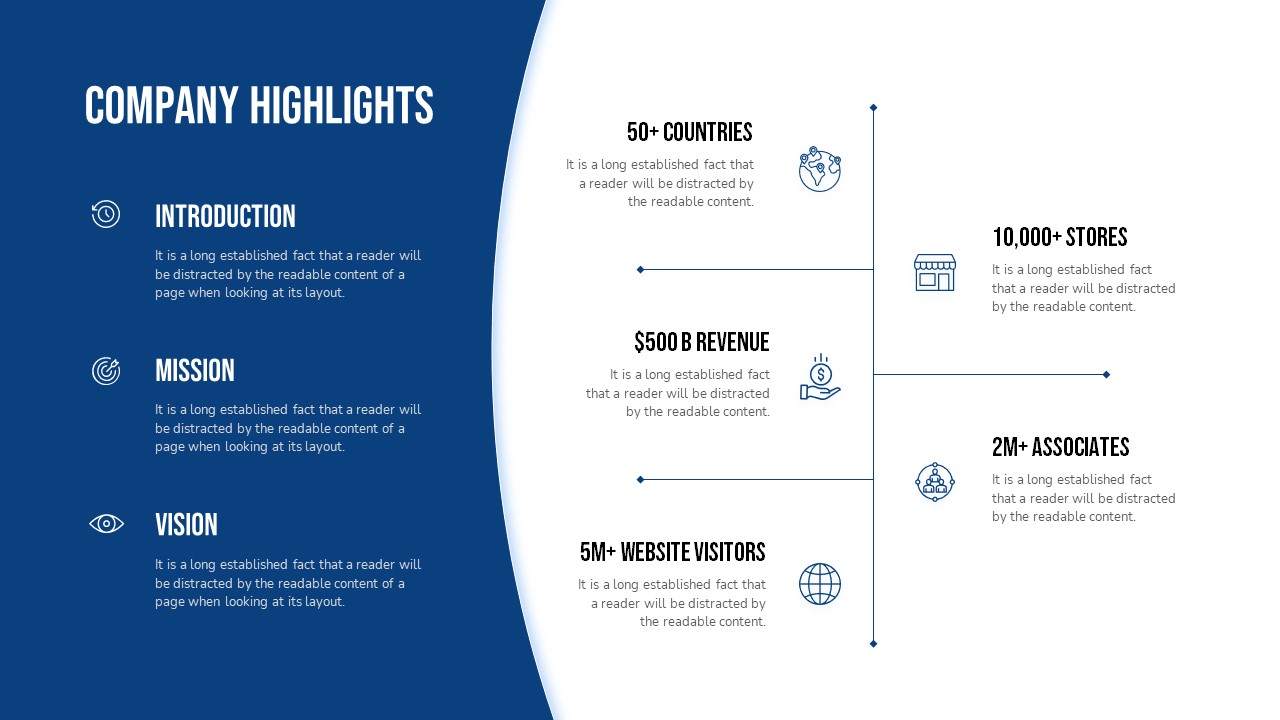
Company Highlights Profile Presentation Template for PowerPoint & Google Slides
Business
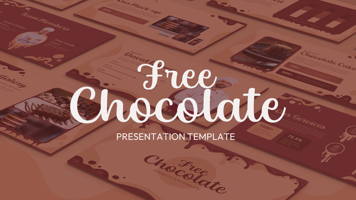
Free Chocolate Company Profile Slide Template for PowerPoint & Google Slides
Company Profile
Free
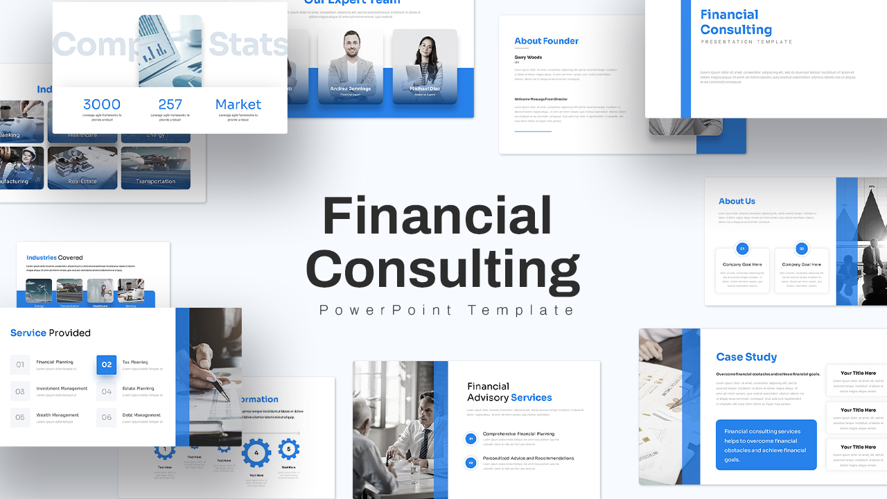
Financial Consulting Company Profile Template for PowerPoint & Google Slides
Finance
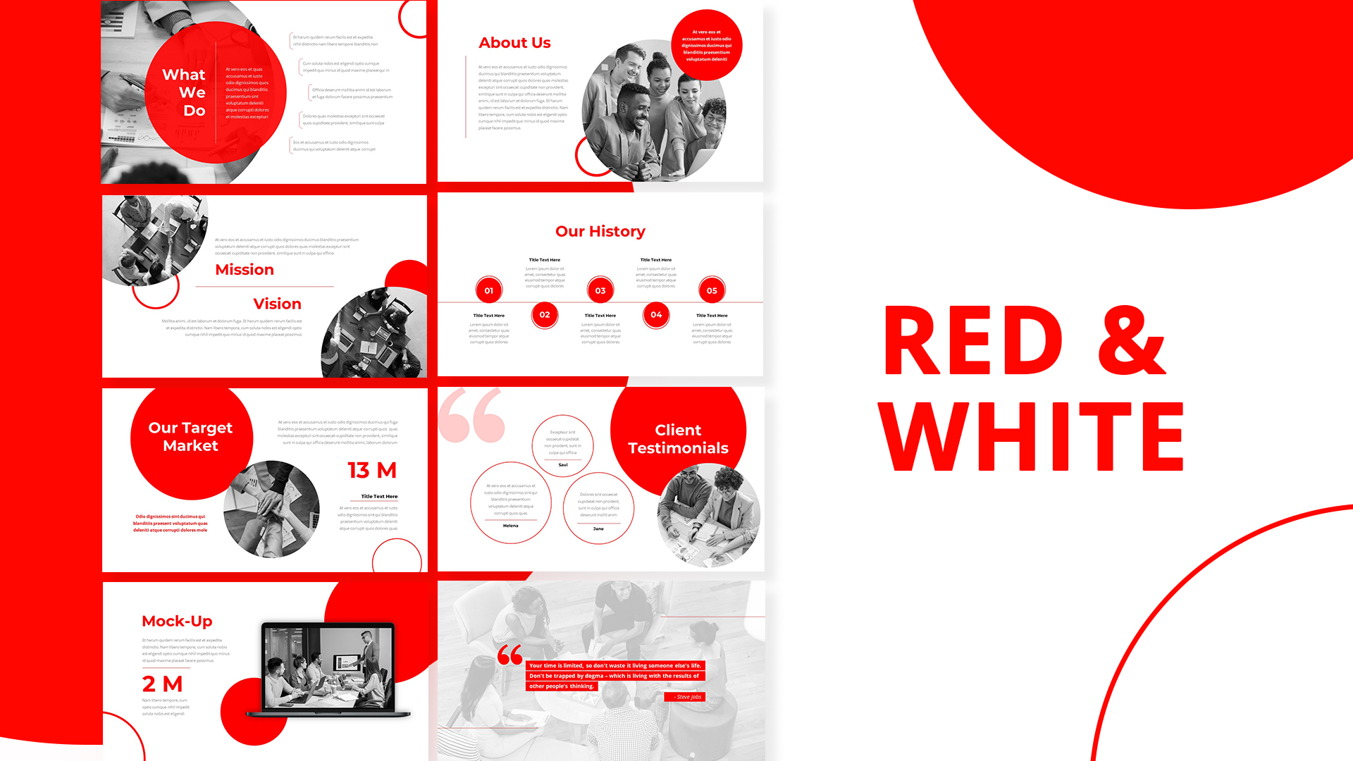
Red & White Company Profile Pitch Deck Template for PowerPoint & Google Slides
Company Profile
Electronics Company Profile Presentation Template for PowerPoint & Google Slides
Decks
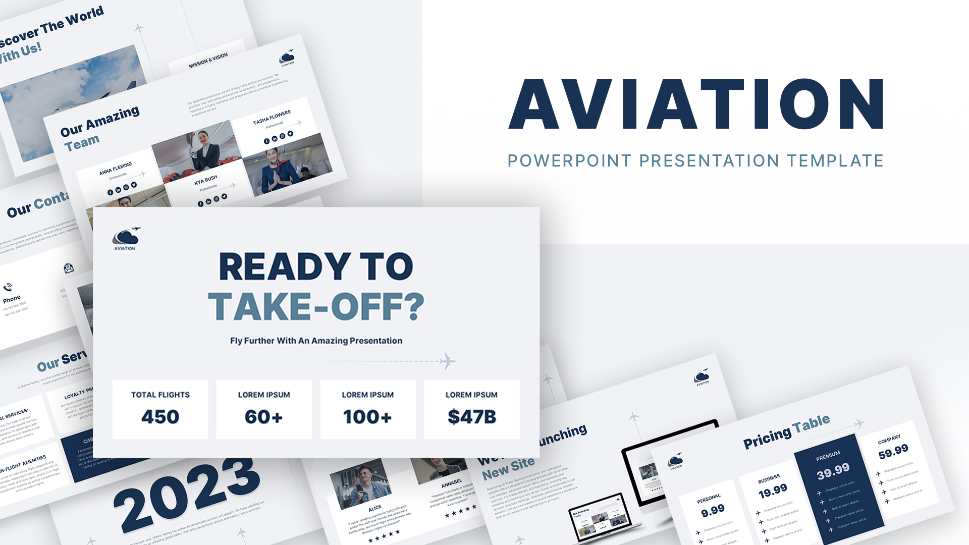
Aviation Industry Company Profile Deck Template for PowerPoint & Google Slides
Company Profile
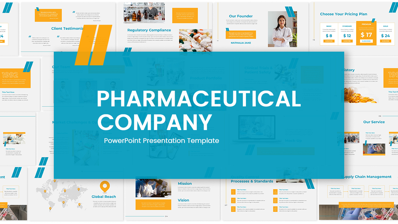
Pharmaceutical Company Profile Deck Template for PowerPoint & Google Slides
Company Profile
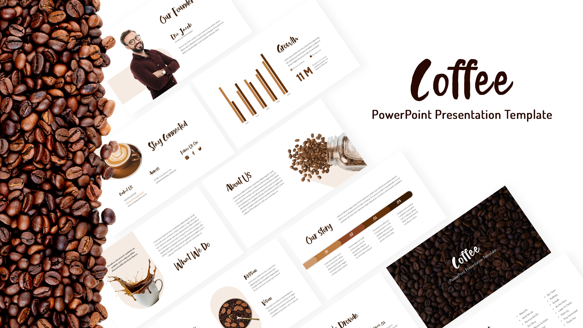
Free Coffee Company Profile Presentation Template for PowerPoint & Google Slides
Company Profile
Free
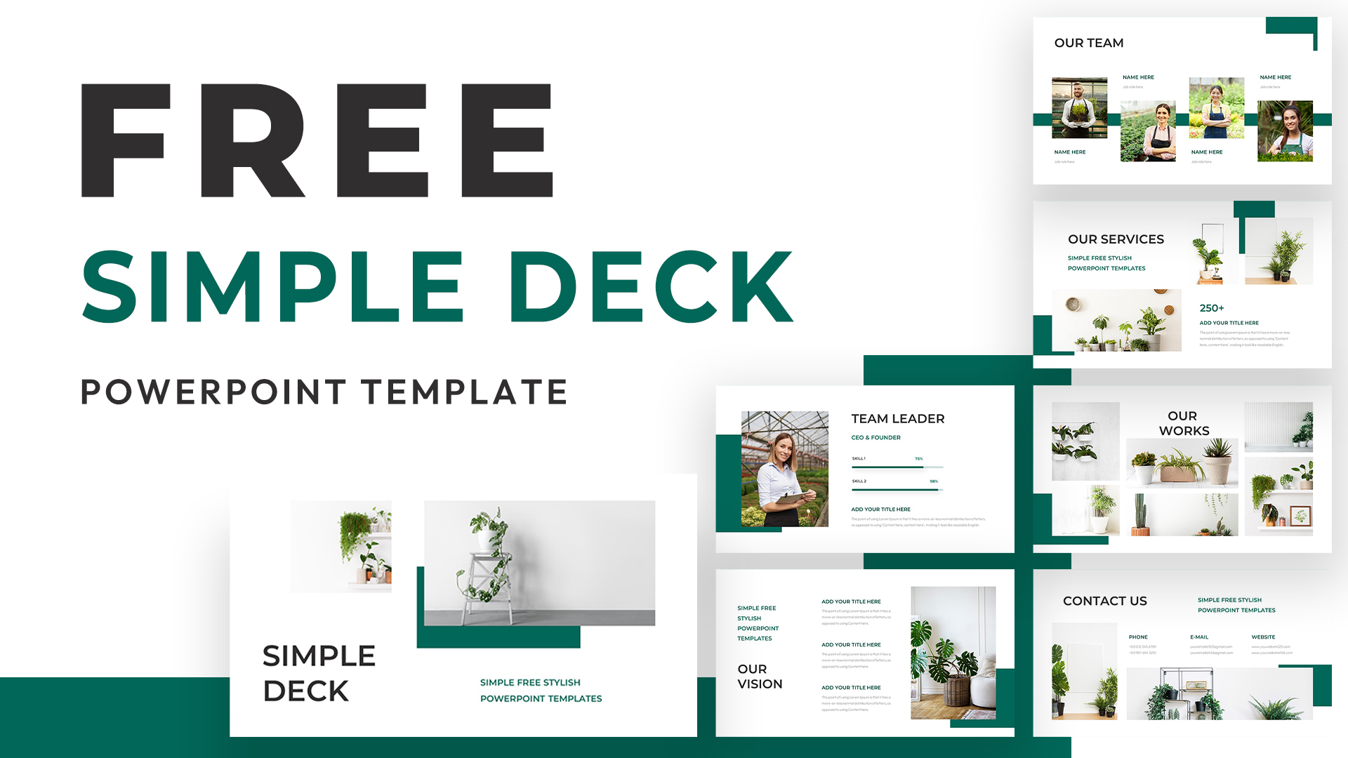
Free Simple Green Plant Company Profile Deck Template for PowerPoint & Google Slides
Company Profile
Free

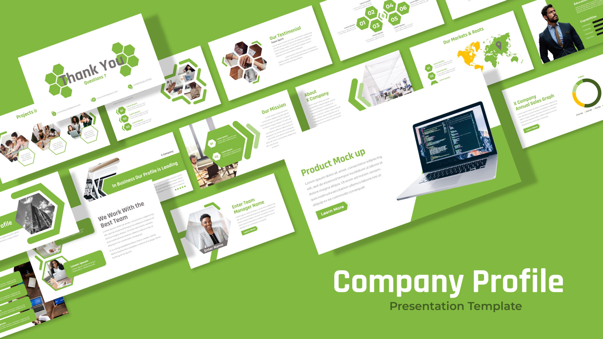
Free Green Hexagon Company Profile Template for PowerPoint & Google Slides
Company Profile
Free
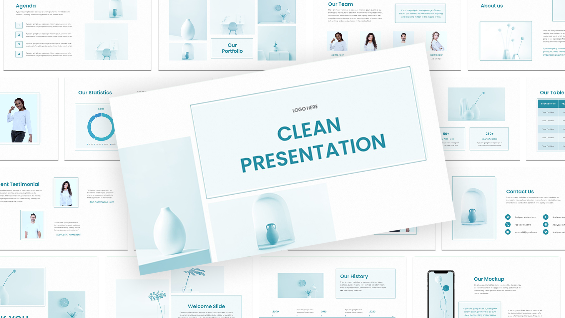
Free Clean Company Profile Presentation Template for PowerPoint & Google Slides
Company Profile
Free
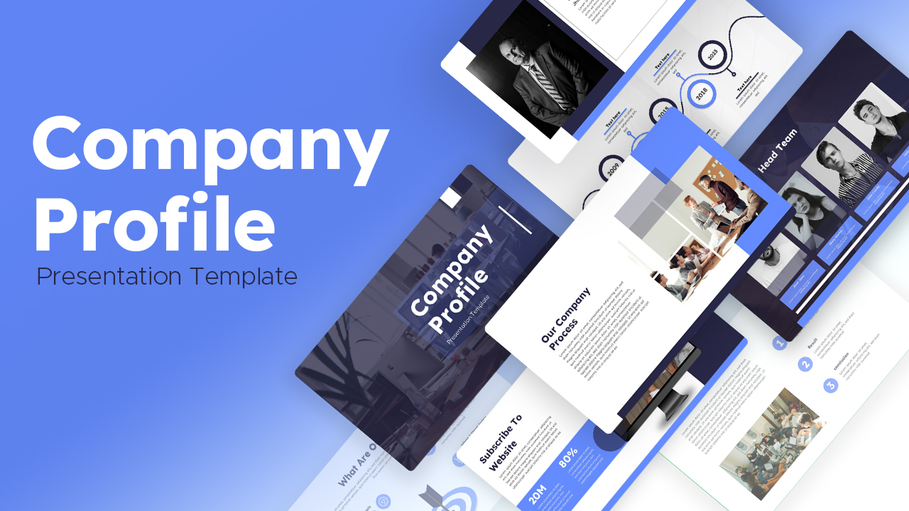
Free Modern Blue Company Profile Deck Template for PowerPoint & Google Slides
Company Profile
Free
Free Modern Company Profile About Us Slide Template for PowerPoint & Google Slides
Company Profile
Free
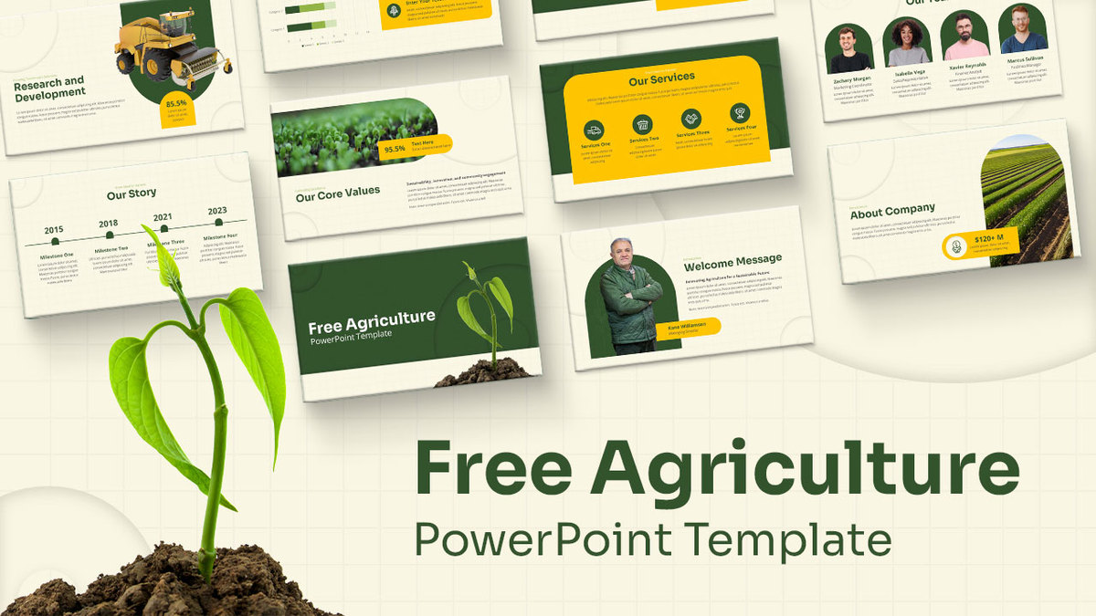
Free Agriculture Company Profile Pitch Deck template for PowerPoint & Google Slides
Company Profile
Free
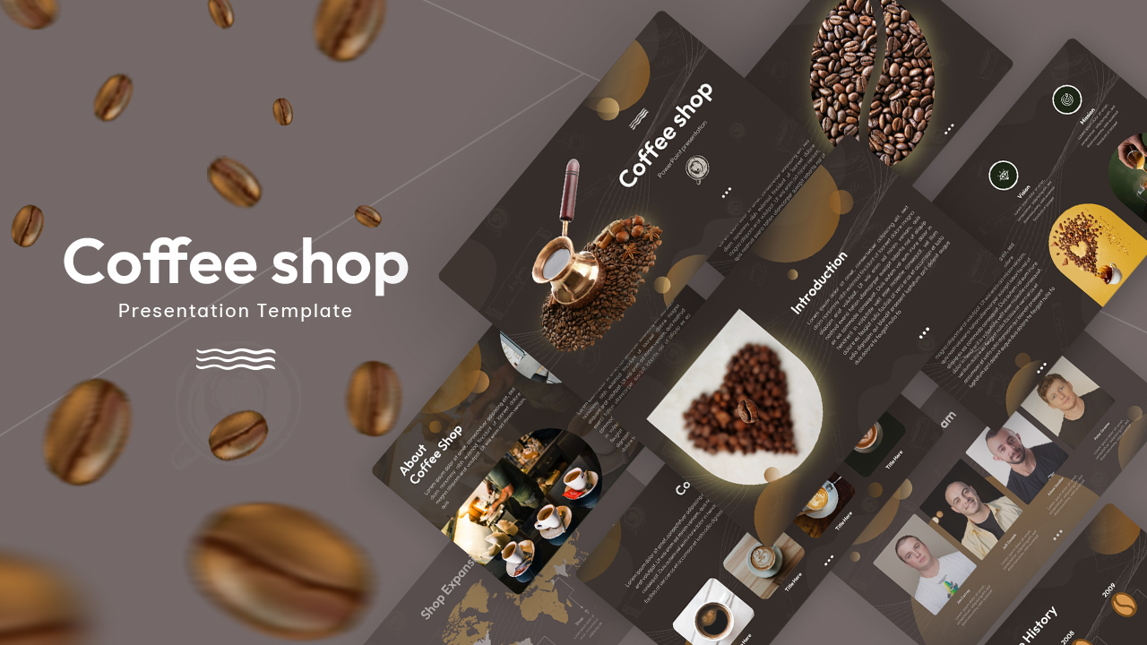
Free Dark Coffee Shop Company Profile Template for PowerPoint & Google Slides
Company Profile
Free
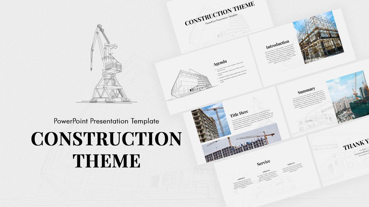
Minimal Construction Company Profile Template for PowerPoint & Google Slides
Company Profile
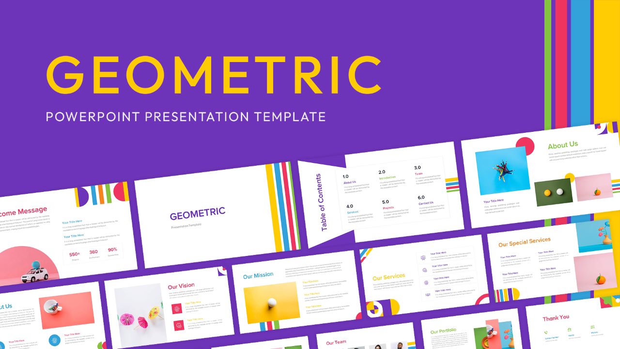
Geometric Company Profile Design Template for PowerPoint & Google Slides
Company Profile
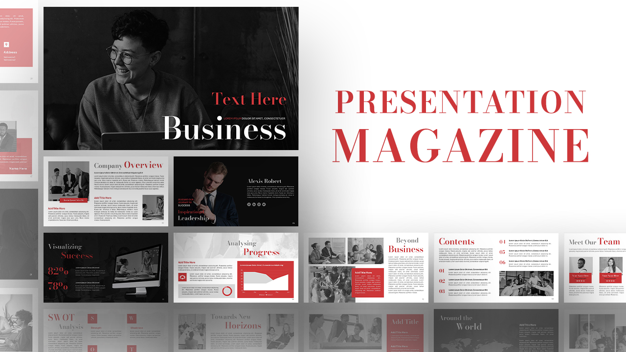
Presentation Magazine Company Overview Template for PowerPoint & Google Slides
Company Profile
AI Tech Agency Company Profile Deck Template for PowerPoint & Google Slides
Company Profile
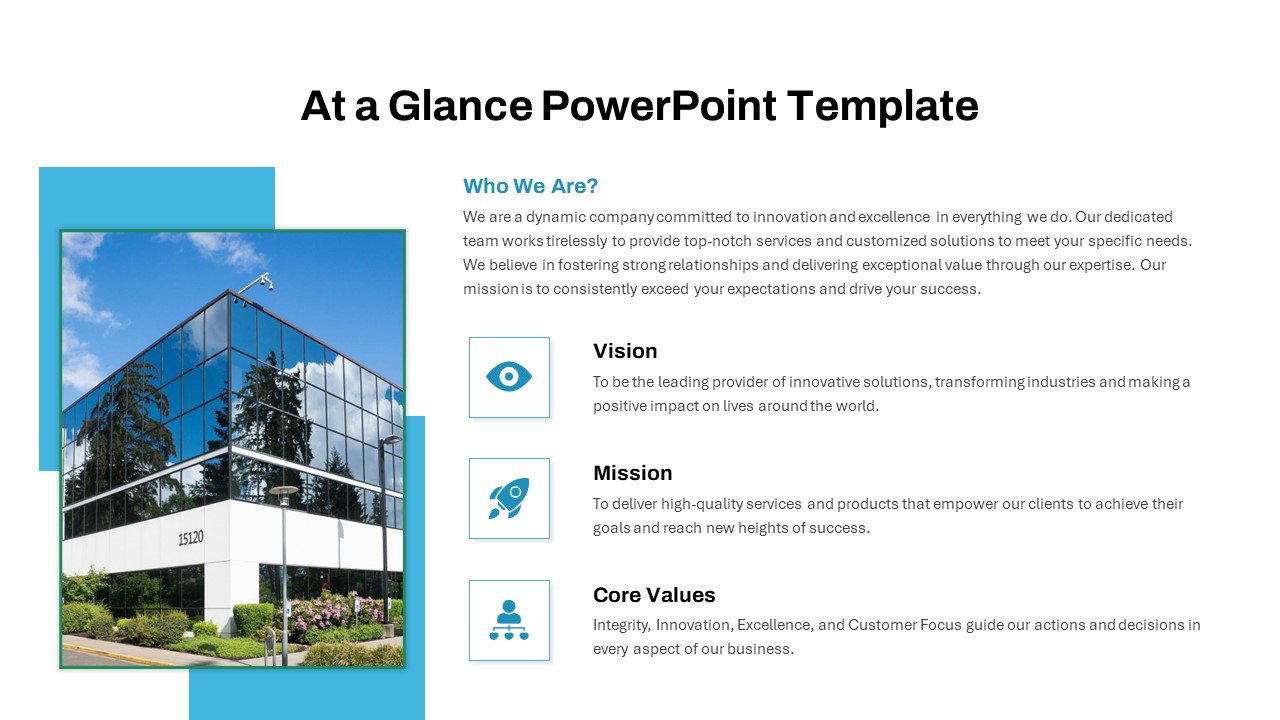
At a Glance Company Profile Overview Template for PowerPoint & Google Slides
Company Profile
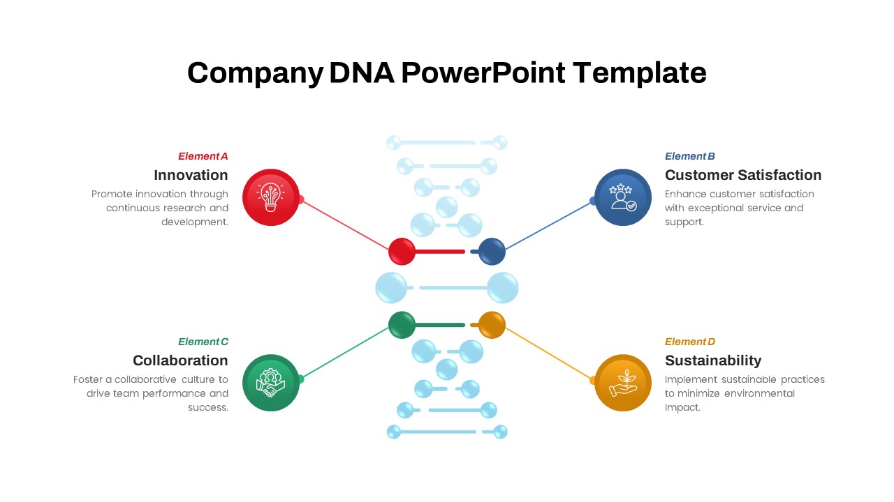
Company DNA Framework Slide Deck Template for PowerPoint & Google Slides
Circular
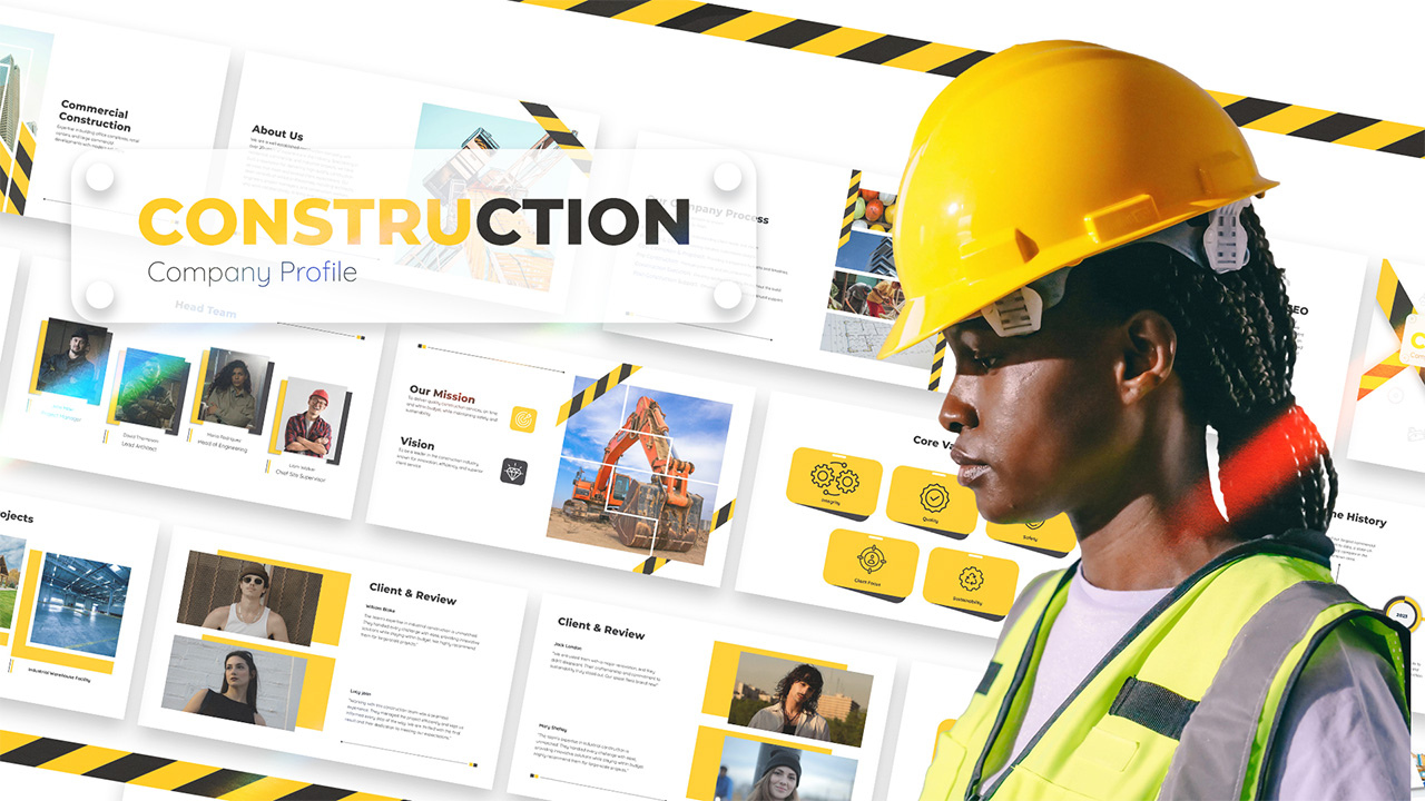
Construction Company Profile Deck Template for PowerPoint & Google Slides
Company Profile
Company Anniversary Celebration Deck Template for PowerPoint & Google Slides
Company Profile
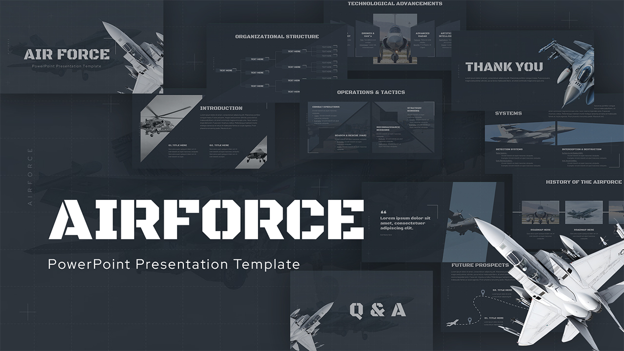
Air Force Company Profile Presentation Template for PowerPoint & Google Slides
Company Profile
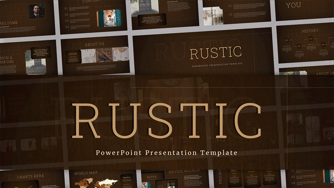
Rustic Company Profile Presentation Template for PowerPoint & Google Slides
Decks
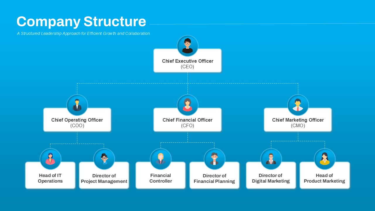
Company Structure Hierarchical Org Chart Template for PowerPoint & Google Slides
Org Chart
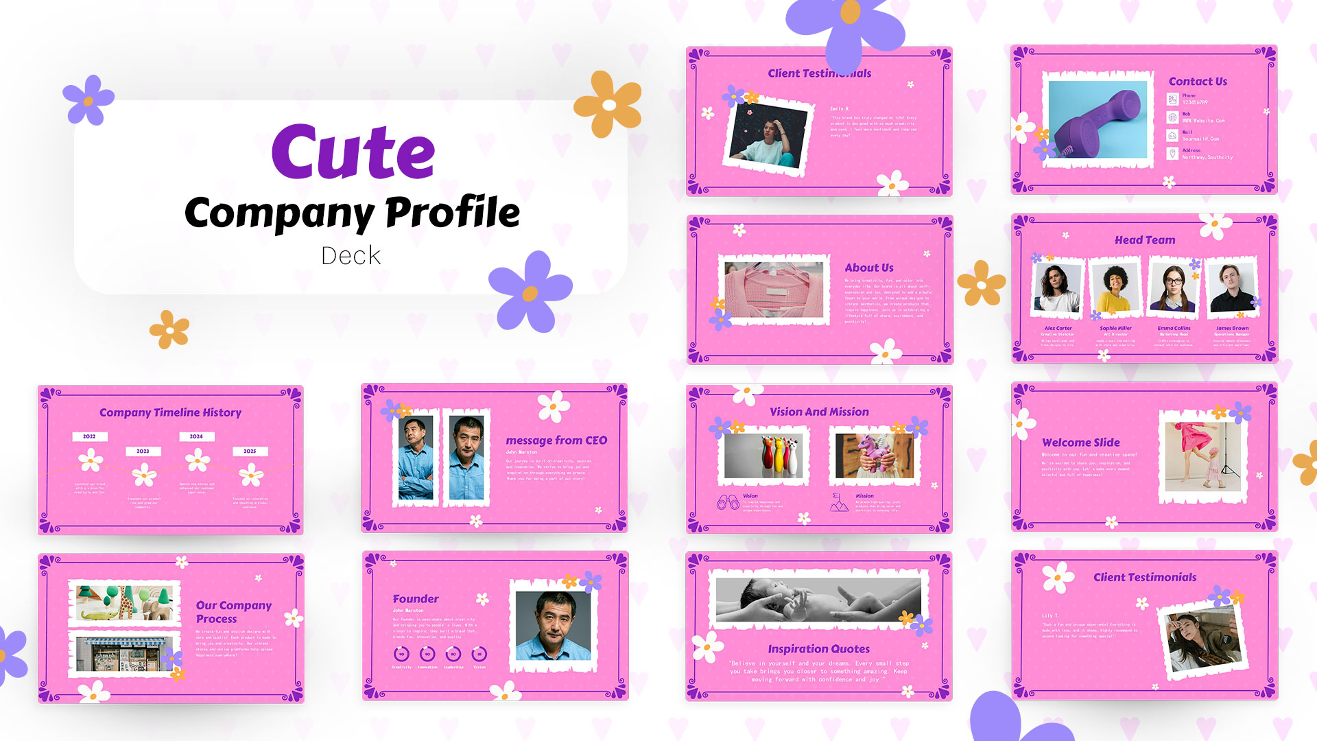
Cute Company Profile Presentation Deck Template for PowerPoint & Google Slides
Company Profile
Interior Design Company Profile Deck Template for PowerPoint & Google Slides
Company Profile
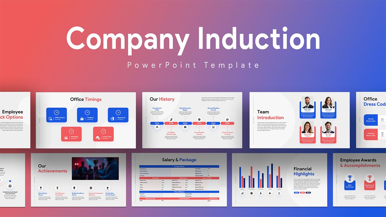
Company Induction Template for PowerPoint & Google Slides
Company Profile
Hospital Company Profile Presentation Template for PowerPoint & Google Slides
Decks
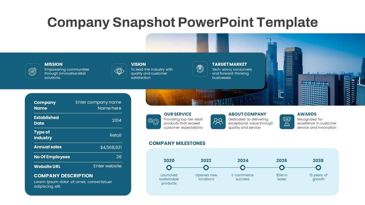
Company Snapshot template for PowerPoint & Google Slides
Company Profile
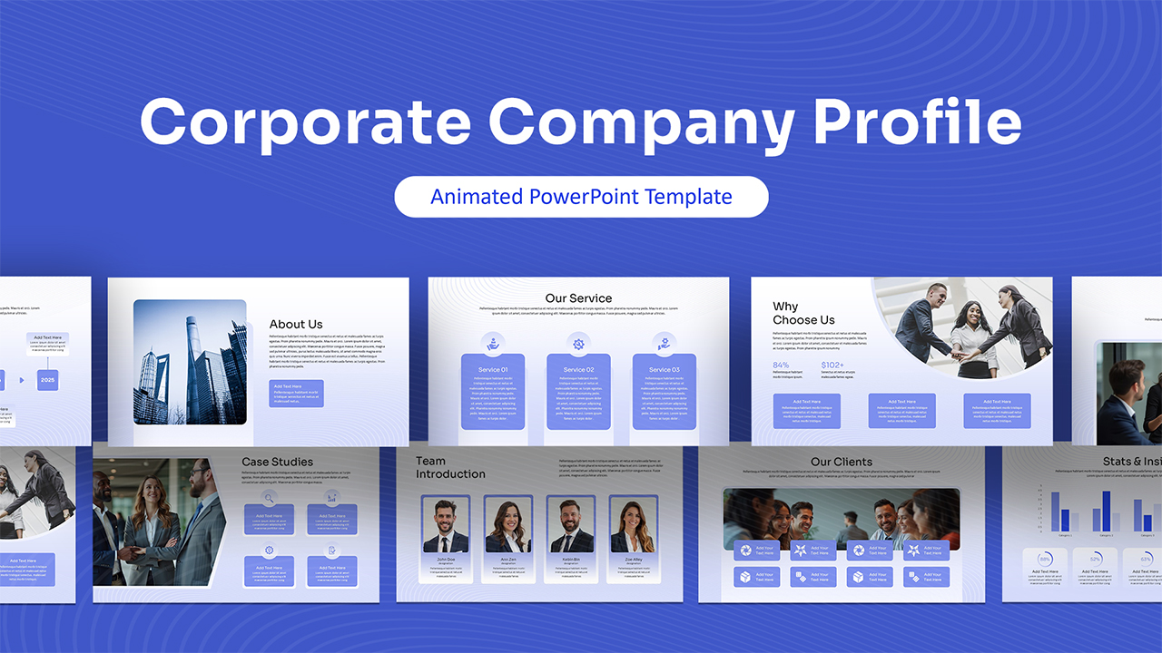
Animated Corporate Company Profile Deck Template for PowerPoint & Google Slides
Company Profile
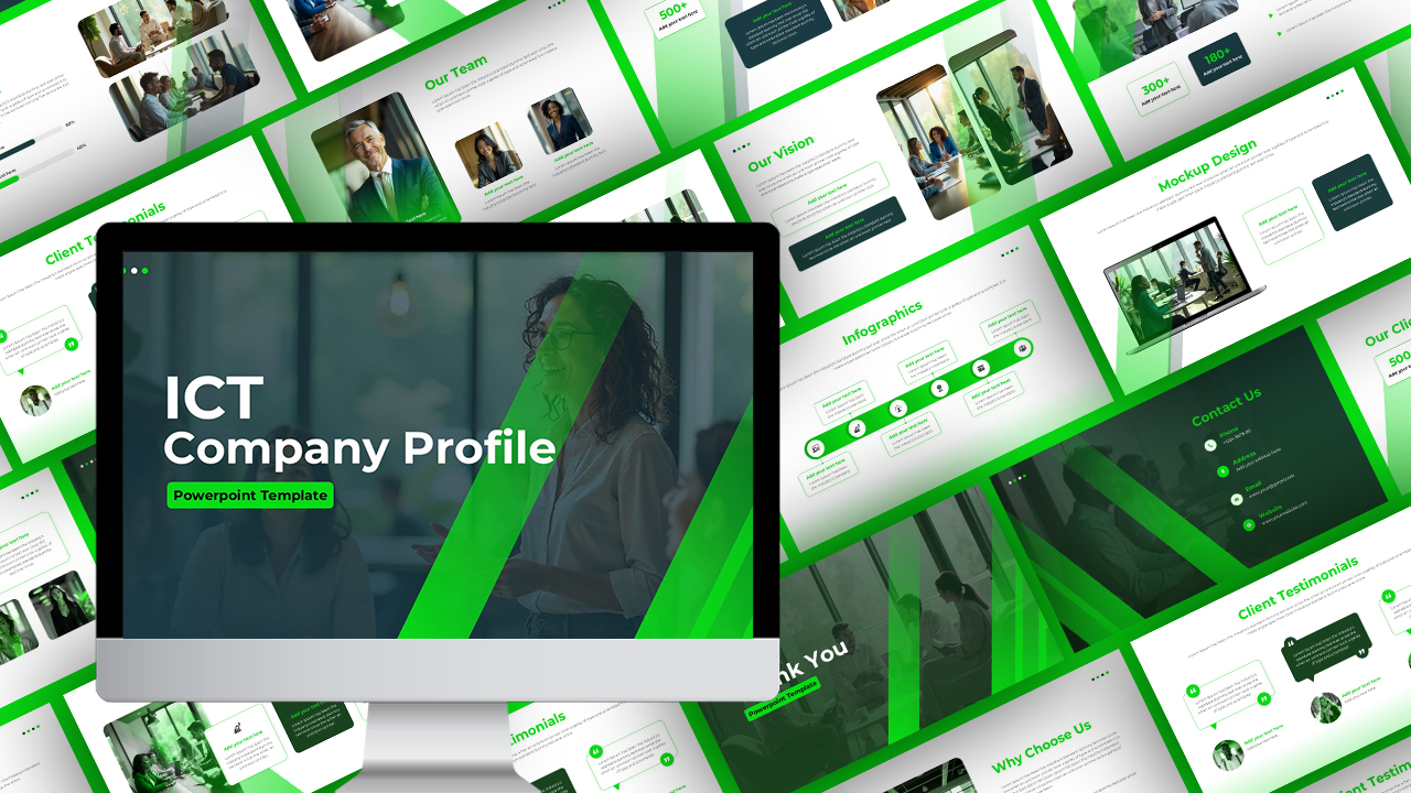
ICT Company Profile Deck Template for PowerPoint & Google Slides
Company Profile
Animated Corporate Company Profile Template for PowerPoint & Google Slides
Company Profile
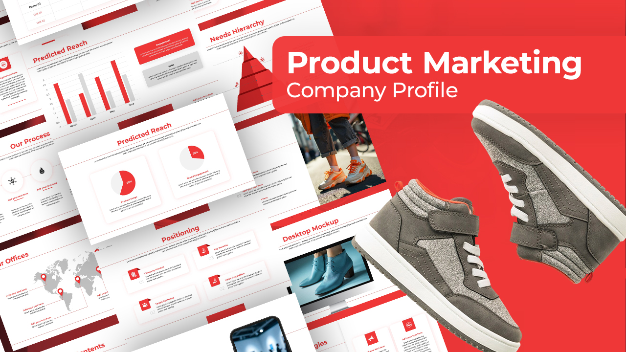
Product Marketing Company Profile Deck Template for PowerPoint & Google Slides
Company Profile
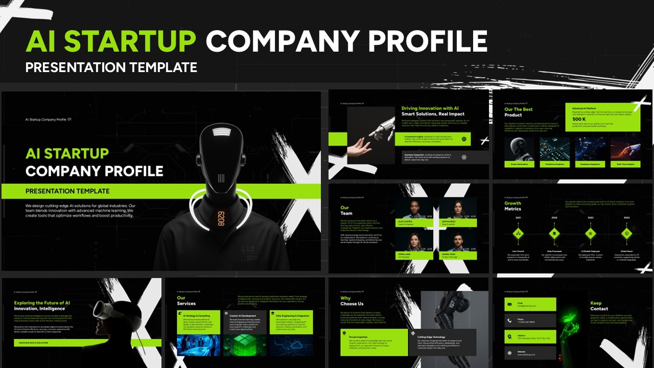
AI Startup Company Profile Template for PowerPoint & Google Slides
Company Profile
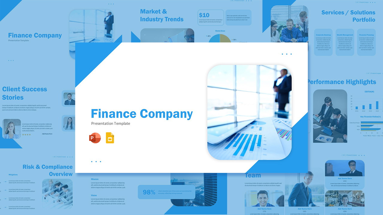
Finance Company Template for PowerPoint & Google Slides
Finance
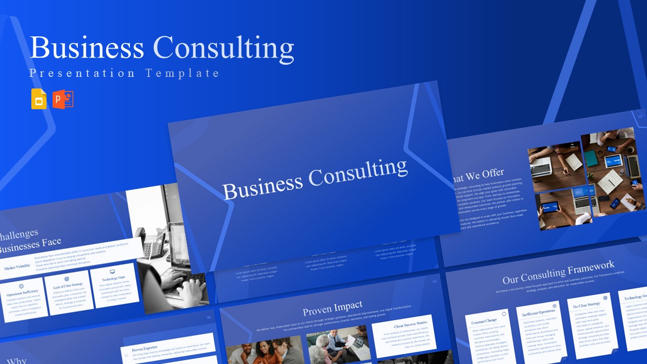
Business Consulting Company Profile Template for PowerPoint & Google Slides
Consulting
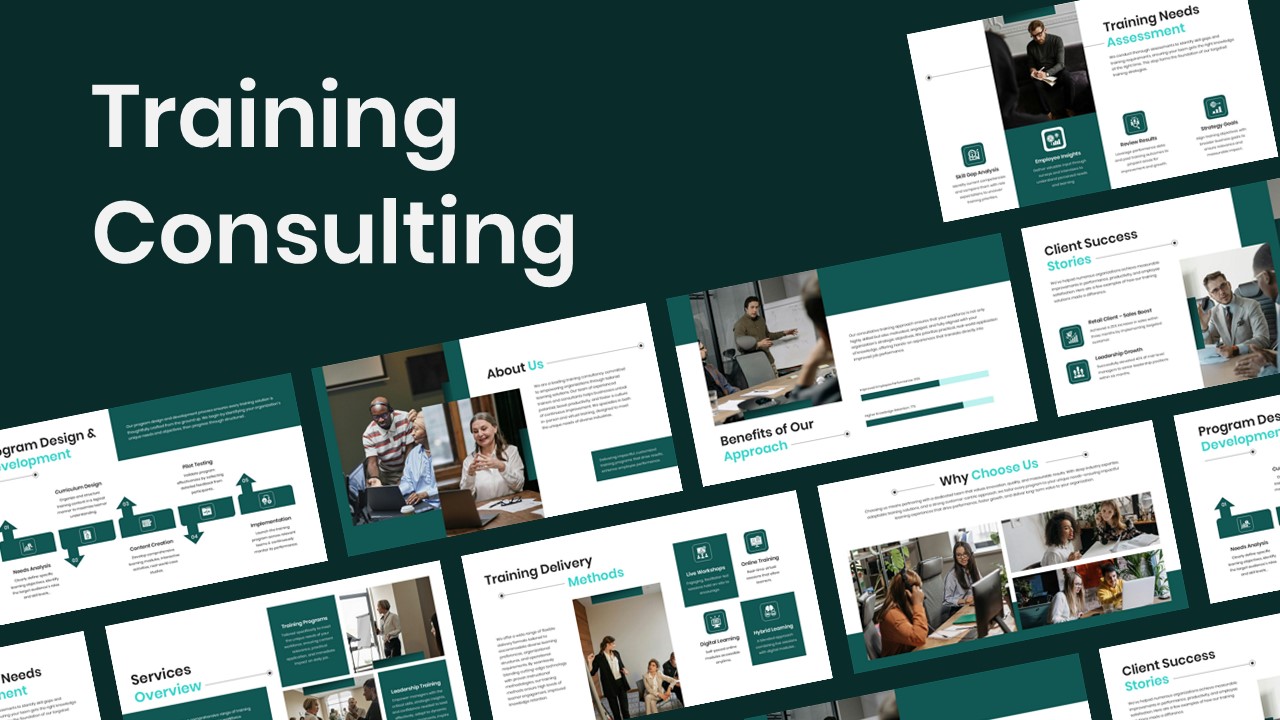
Training Consulting Company Profile Template for PowerPoint & Google Slides
Company Profile
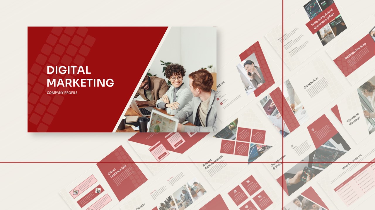
Digital Marketing Company Profile Template for PowerPoint & Google Slides
Digital Marketing
Cyber Security Company Profile Presentation for PowerPoint & Google Slides
Business Proposal