
6 Alternatives To Pie Charts for Your Presentations

If you use many pie charts in your presentations and are looking for pie chart alternatives, this article will help you out. There are many reasons why someone would not want to use a pie chart. It could be to get rid of monotony or to use a graph more suited to your data.
For me, it’s usually hunger. Pie charts make me really hungry.

Here are six brilliant alternatives to pie charts. You can use them to present your business data instead of using pie charts.
Table of Contents:
1. Introduction
2. What Is A Pie Chart?
3. When Should You Use A Pie Chart?
4. Six Alternatives To Pie Charts
- Stacked bar chart
- Treemap chart
- Donut Chart
- Waffle Chart
- Packed Bubble Chart
- Radar Chart
5. Conclusion
What Is A Pie Chart?
A pie chart is a graphical visualization strategy that presents data in the shape of a circle. This chart works best with only a few variables.
They are generally used to display the relative or proportional data in a single chart.
Let’s look at when you should use a pie chart and when you shouldn’t.
When should you use a pie chart?
The pie charts are most often used in the following two cases:we
- To show that one segment of the total data is relatively large or small.
- If you want the viewers to have a basic sense of the parts to the whole relationship in your data.
Moreover, they are often used in businesses to show various things such as the percentage of different types of customers, revenue from various products, profits from different countries, etc.
They can not be used for multiple variables. In such cases, people use their alternatives.
Six Alternatives To Pie Charts
Let’s dive right in and look at some pie chart alternatives.
1. Stacked Bar Chart
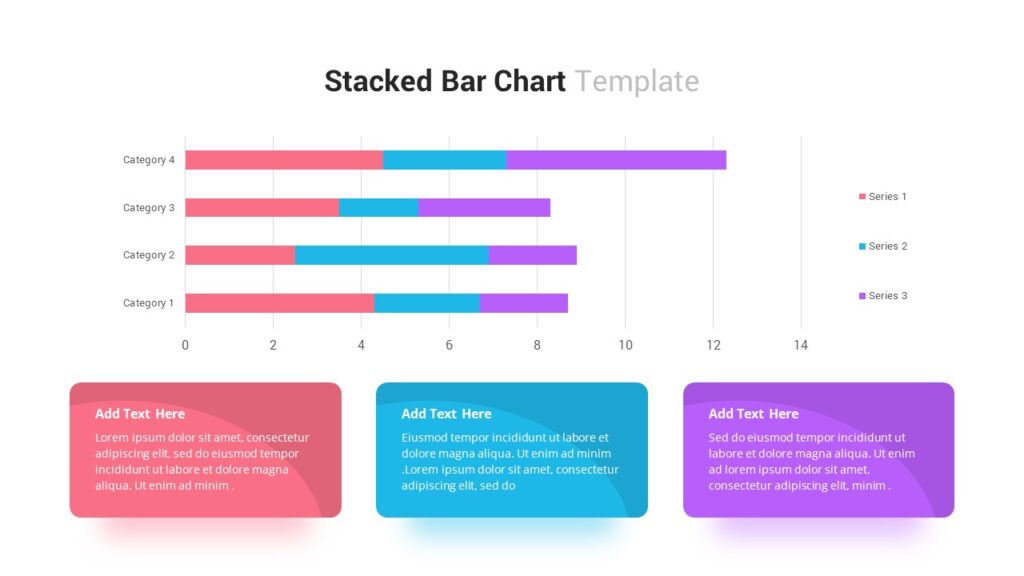
The very first pie chart alternative in our list is a stacked bar chart.
It is a kind of bar chart that presents the comparison and composition of absolute or relative variables over time.
A stacked bar chart, also known as a column chart, looks like a series of bars and columns stacked upon each other.
You can use a stacked bar chart if you have to show more than three variables because pie charts work best with only two-three variables.
A column/ stacked bar chart helps the viewer to see the difference based on the size of a linear display.
Some may even say that they look cooler than pie charts!
2. Tree Map Chart
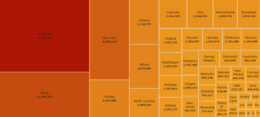
Another pie chart alternative in our list is none other than a tree map.
Sometimes the data that you want to present is quite simple, but the story behind the data is multi-dimensional. In such cases, a tree map is used.
It is a data visualization strategy that presents hierarchical data by making use of rectangles of decreasing sizes to make a treemap. This is often known as nesting.
Just like its name, a treemap represents the data in the shape of a tree with many branches and sub-branches. It is quite easy to read.
They are great at picking huge amounts of data and then depicting it in a compact, visually appealing, and easy-to-read manner. The readers can easily read the treemap and make comparisons quickly.
3. Donut Chart
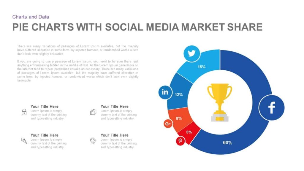
Donuts and pie are similar, right? Likewise, donut charts and pie charts are also quite similar. They both show the relationship between different parts to a whole part.
The circle represents the whole or 100%. It can be used to display additional data. The other proportions are expressed in different colors for ease of interpretation.
Moreover, the signature hole at the center reminds people of donuts. That’s why it’s called the Donut chart. That hole is what makes Donut charts more favorable than pie charts.
At first, it may look like donut charts are nothing but an aesthetic visualization of data. But no, other than being an attractive chart, they serve some important purposes.
The Donut charts assist in avoiding confusion about area parameters which confuses people while using pie charts.
In addition to this, pie charts give an immediate sense of the overall proportions. While the donut chart hooks the reader’s eye to the arc of the circle and explains more.
4. Waffle Chart
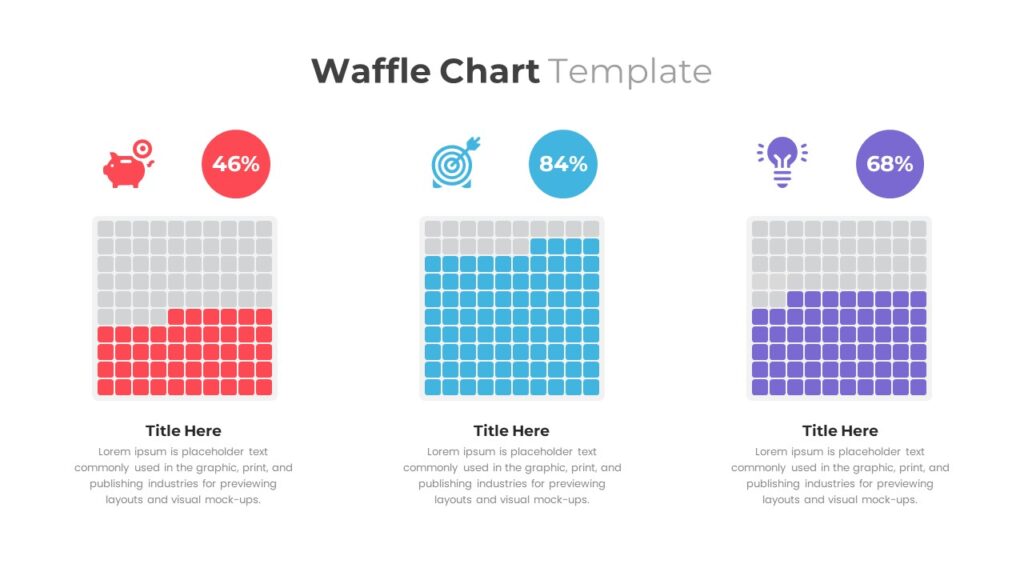
Donuts, Waffles, Pie, all these charts are just making me more hungry.
Anyway, a waffle chart looks just like a waffle. It is a 10 by 10 grid of various squares where every square accounts for 1%. Thus, the total of the squares is 100%.
The waffle chart contains many small squares, out of which the colored squares show the data.
Moreover, it is comparatively easy to read. It displays the progress of a goal and the completion percentage.
Waffle charts are not so common, and that’s why they need some explanation.
Nevertheless, they are a good alternative to use in place of pie charts.
5. Packed Bubble Chart
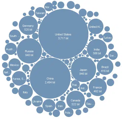
If you hate squares for some reason, then worry not; the packed Bubble chart is just for you.
The packed bubble charts are the visualizations where the color and size of the bubbles are utilized to visualize the business data.
This chart shows the relational values without using the X and Y axis. As the name suggests, the bubbles are packed tightly to make the most use of space.
Packed bubble charts work great when you want to display the data by size without using the same old squares.
6. Radar Chart
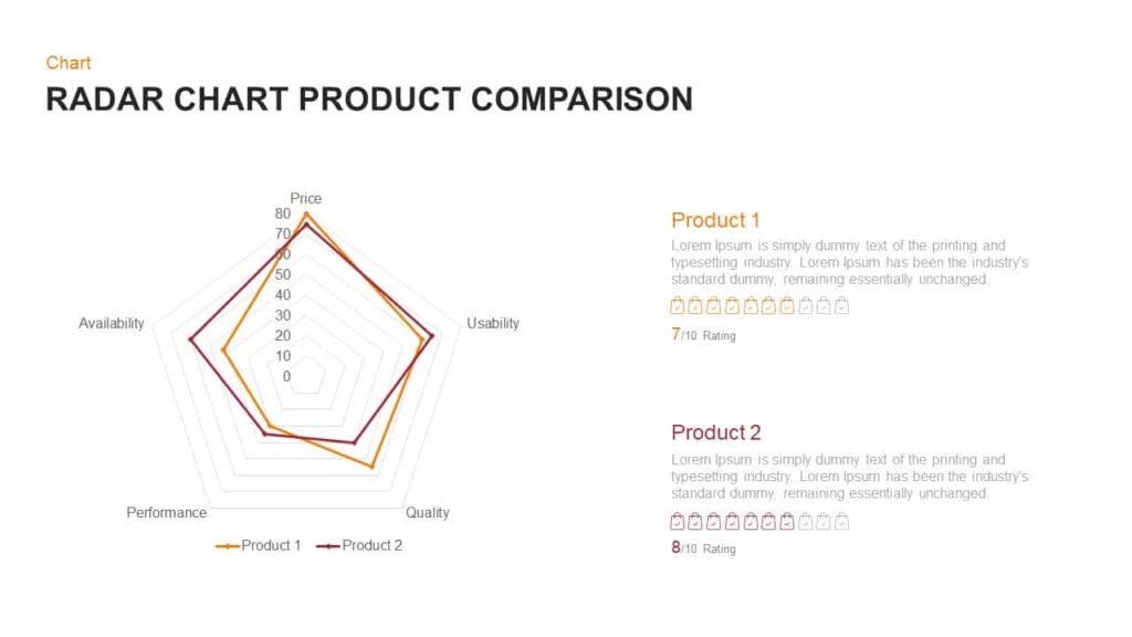
A radar chart is an explanatory data visualization tool in which more than three variables are compared on a two-dimensional axis.
The radar chart looks more like a spider web, with a mid-axis with around three spokes known as radii. The data values are mentioned on these spokes.
Moreover, the chart is mainly designed to show the differences, similarities, and outliers for that particular service or product.
The greatest benefit of using radar charts is that they can plot many variables. These different plots are then connected to create an irregular polygon shape that represents a group.
It is also known as spider chart, cobweb chart, web chart, polar chart, or star chart.
Conclusion
Here comes the end of our article on alternatives to the pie chart. These visualizations work great if you want to use them in place of pie charts.
You can surely make your reports more interesting by using different visuals to present data. However, be sure to use the right chart for the right job.
Related Articles
-
 October 16th, 2025
Quarterly Tool Reviews: Stay Ahead of New Presentation Software That Could Help Your Team
Blog Post -
 April 17th, 2024
Visual Hierarchy in Presentations: “Hack” Your Audience’s Eyes
Blog Post -
 April 17th, 2024
Easy PowerPoint Animations for Your Next Presentation
Blog Post