Table Presentation Template for PPT & Google Slides
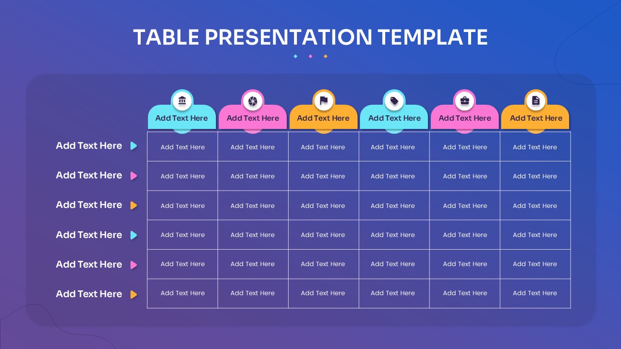
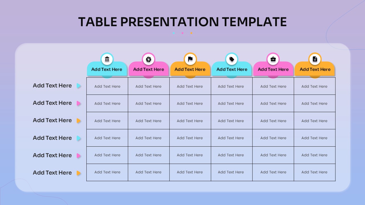
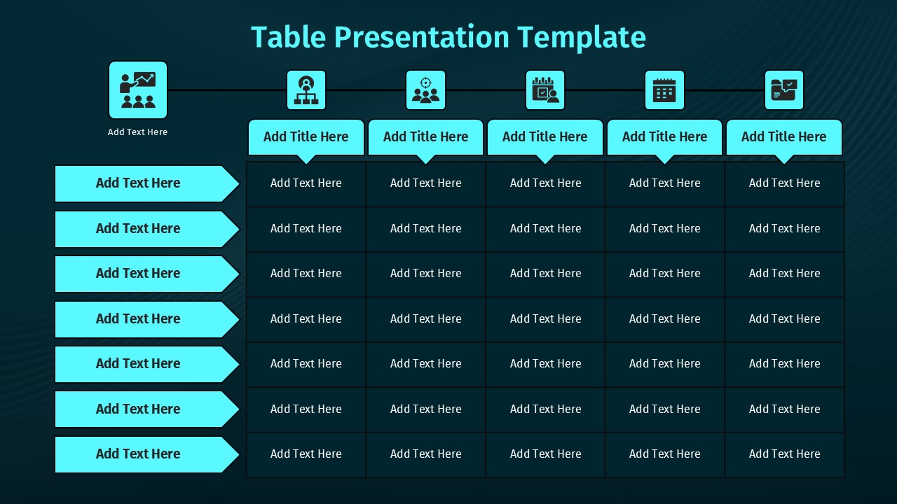
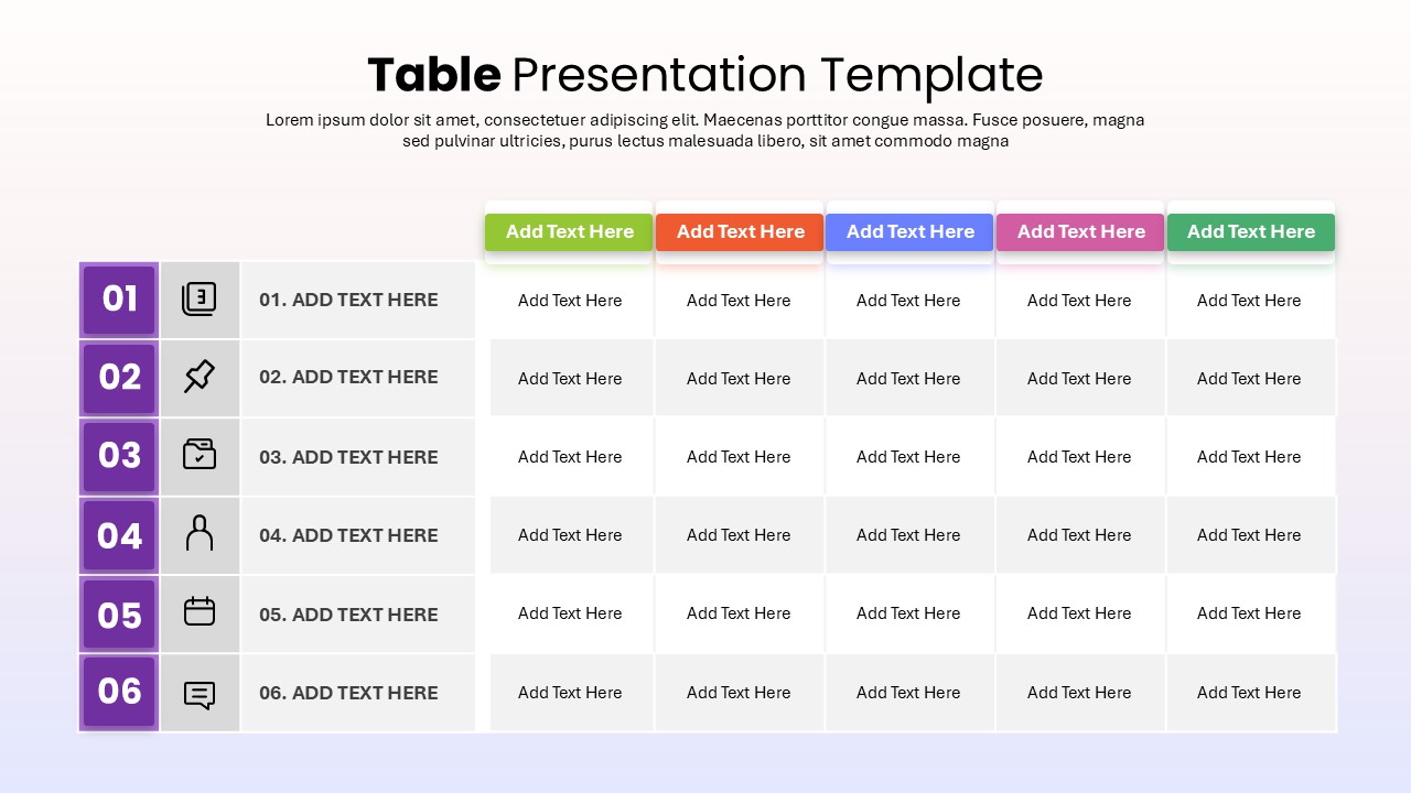
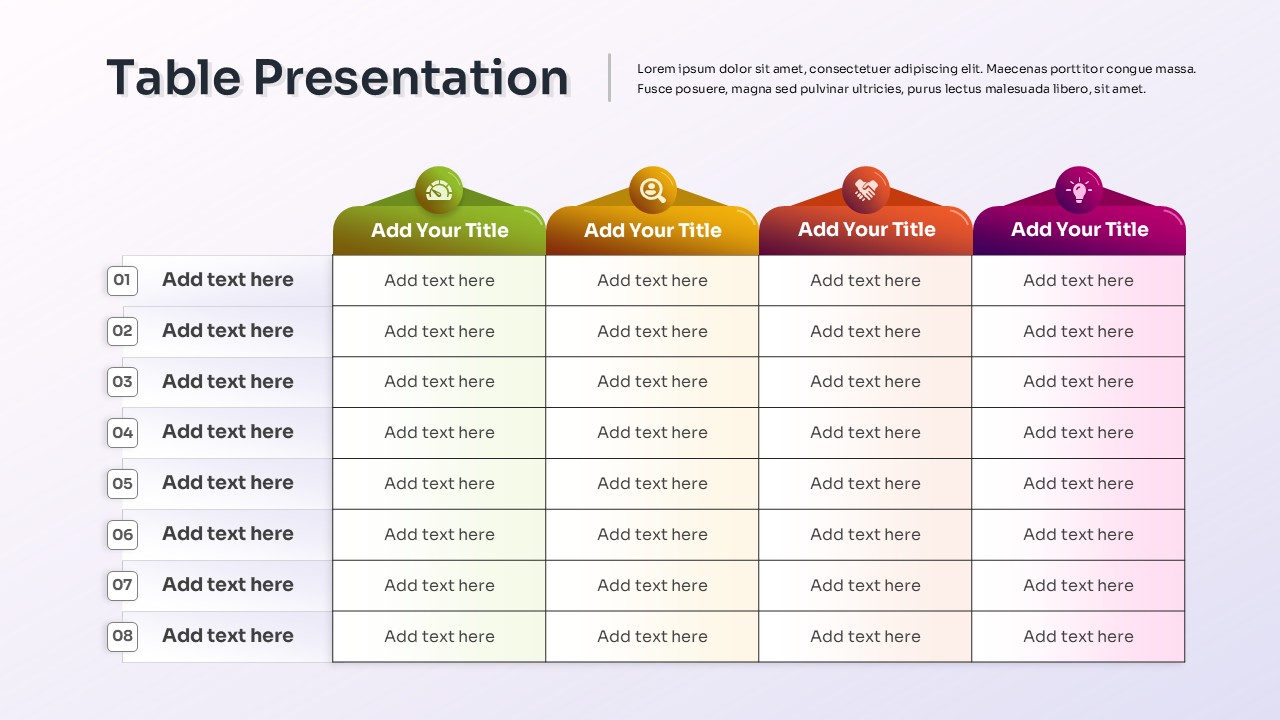
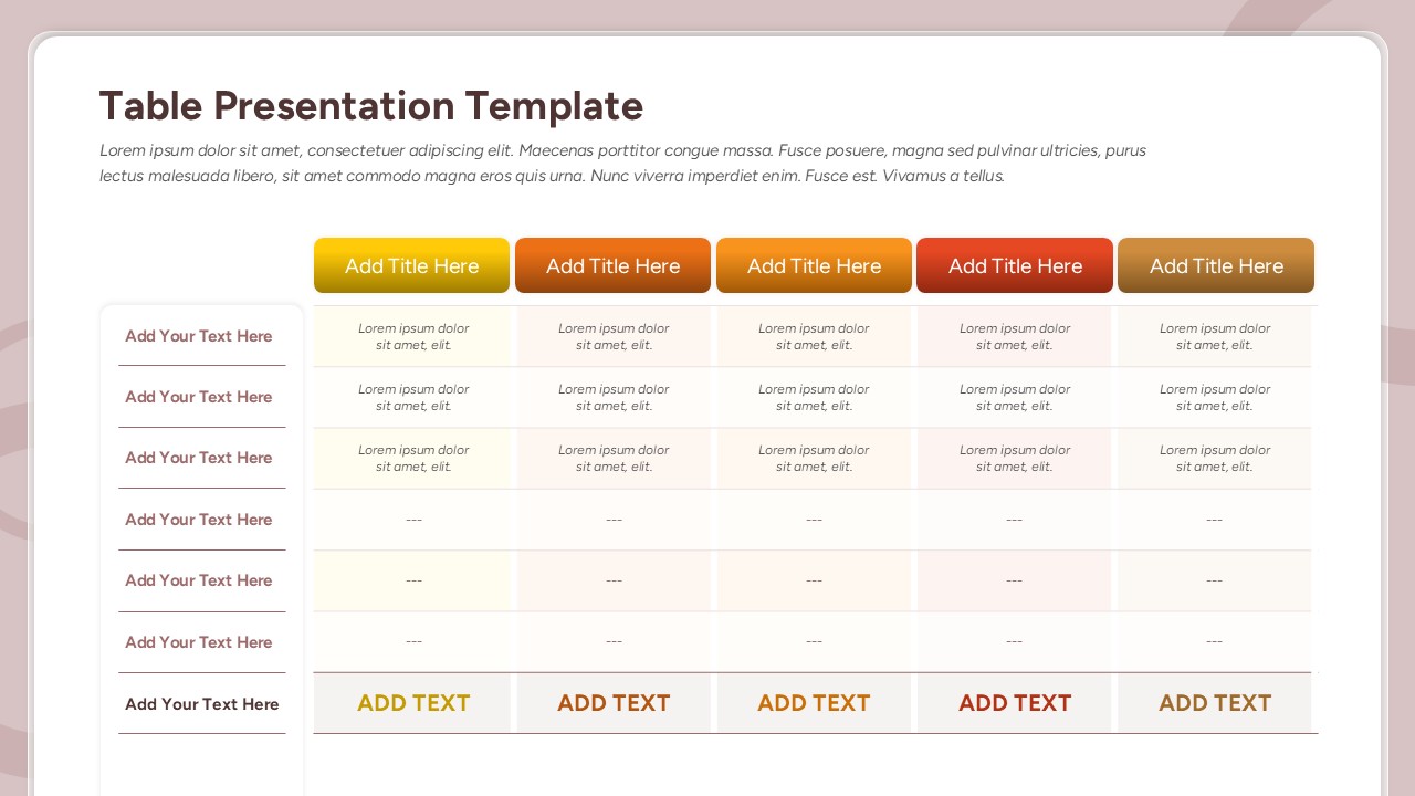
What’s the fastest way to compare six categories of data without losing anyone halfway through the slide? Color. This table presentation template uses a six-column, six-row grid, each section marked with its own color so a viewer can track a specific row or column without losing their place.
- Six columns, each topped with a rounded tab and an icon marking its focus area
- Six rows, each with a colored indicator on the left guiding the eye across the grid
- A dark blue-to-purple gradient background that makes the cyan, pink, orange, and purple accents pop
- Icons above each column for quick visual recognition during a live presentation
- A clean matrix layout built for structured comparisons rather than a wall of plain text
The contrast between the dark background and the bright column colors keeps the grid easy to follow even on a projector or during a virtual meeting where screen quality can vary.
Project managers and analysts use this comparison table slide for KPI dashboards and task tracking, while business leaders use it for quarterly reviews and competitive benchmarking. Educators and trainers use the same structure for curriculum outlines or organized lesson content. Beyond standard business comparisons, the grid adapts easily to event planning, scheduling, or resource allocation, and every element stays editable, so text, icons, and colors update in a few clicks. It works the same way in both PowerPoint and Google Slides.
Login to download this file

Item ID
SB05483Designed By
Athira


Related Templates

Table of Contents Presentation template for PowerPoint & Google Slides
Agenda
Table Presentation PowerPoint Template
Table
6-Row Highlight Table PowerPoint Template
Table
4-Column Data Table PowerPoint Template
Table
Colorful Table Presentation PowerPoint Template
Table
Table with Columns template for PowerPoint & Google Slides
Comparison Chart
Puzzle-Style SWOT Analysis Table Diagram Template for PowerPoint & Google Slides
SWOT
Four-Step Numbered Table of Contents Template for PowerPoint & Google Slides
Agenda
Four-Step Agenda Table of Contents Template for PowerPoint & Google Slides
Agenda
Free Lesson Plan Table Slide Template for PowerPoint & Google Slides
Agenda
Free
Cost Summary Table Template PPT Slide
Business Report
Project Tracking Dashboard Table Template
Project Status
Action Items PowerPoint Template
Project Status
Action Tracker Table Template
Business
Training Plan Table Layout Template for PowerPoint & Google Slides
Employee Performance
Business Data Table Template for PowerPoint & Google Slides
Table
Table Presentation Template PPT & Google Slides Theme
Comparison
5-Point Pros and Cons Comparison Table PowerPoint Template
Comparison Chart
Creative Table Template for PowerPoint & Google Slides
Table
Scamper Table Template for PowerPoint & Google Slides
Table