SaaS Customer Churn Presentation Template
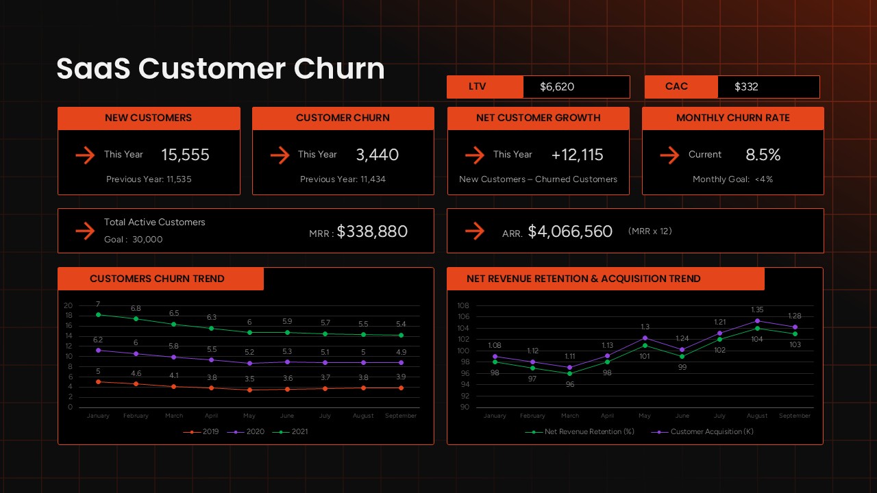
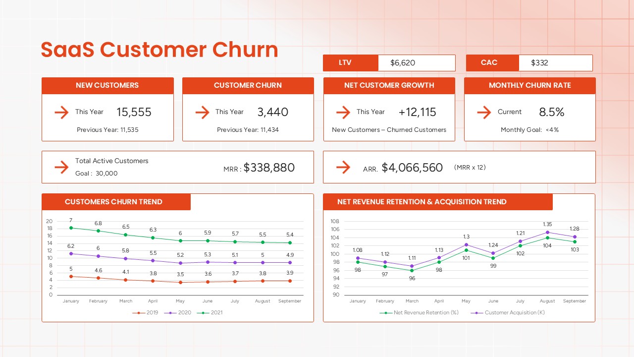
SaaS churn data can be difficult to interpret when it sits across spreadsheets and separate reports. This SaaS Customer Churn presentation template for PowerPoint brings key retention and revenue metrics together in a single dark dashboard layout. LTV and CAC appear as headline figures, while four metric cards show new customers, customer churn, net customer growth, and monthly churn rate alongside previous-year and target benchmarks. A wider summary section highlights total active customers, MRR, and ARR, giving teams a quick view of their current customer and revenue position. The lower section features two line charts, with one showing the churn trend from 2019 to 2021 and the other presenting net revenue retention by customer acquisition month.
The PPT template uses a bold orange and black palette with a fine grid background, creating a technical dashboard style for business reporting. Each chart, metric card, label, and data point is editable in PowerPoint. You can replace the sample figures, update targets, modify chart values, or adjust the visual styling without recreating the slide from scratch.
This PowerPoint dashboard works well for:
- SaaS founders sharing retention and growth results with investors
- Customer success and RevOps teams reviewing churn targets
- Finance teams comparing ARR, MRR, CAC, and customer retention
- Growth and marketing teams analyzing acquisition and retention results
The dashboard uses native PowerPoint elements instead of a single flattened image. This allows users to edit the content directly and open the presentation in Google Slides while retaining the core dashboard structure and visual design.
Frequently Asked Questions
What metrics are included in the SaaS Customer Churn template?
Can I edit the KPI values and chart data in this template?
Login to download this file

Item ID
SB05916Designed By
Naseeba Sithara


Related Templates

Customer Churn PowerPoint Template
Customer Journey
Customer Churn Rate Analysis template
Business Report
Strategic Roadmap Template for User Growth, Scalability, and Reducing Churn
Business
Modern SaaS Business Pitch Deck Presentation Template
Business Proposal
SAAS Features template for PowerPoint & Google Slides
Cloud Computing
Customer Satisfaction Survey Result Presentation Template
Marketing
Customer Journey PowerPoint Presentation Template
Customer Journey
Customer Acquisition Strategy Template for PowerPoint Template
Customer Journey
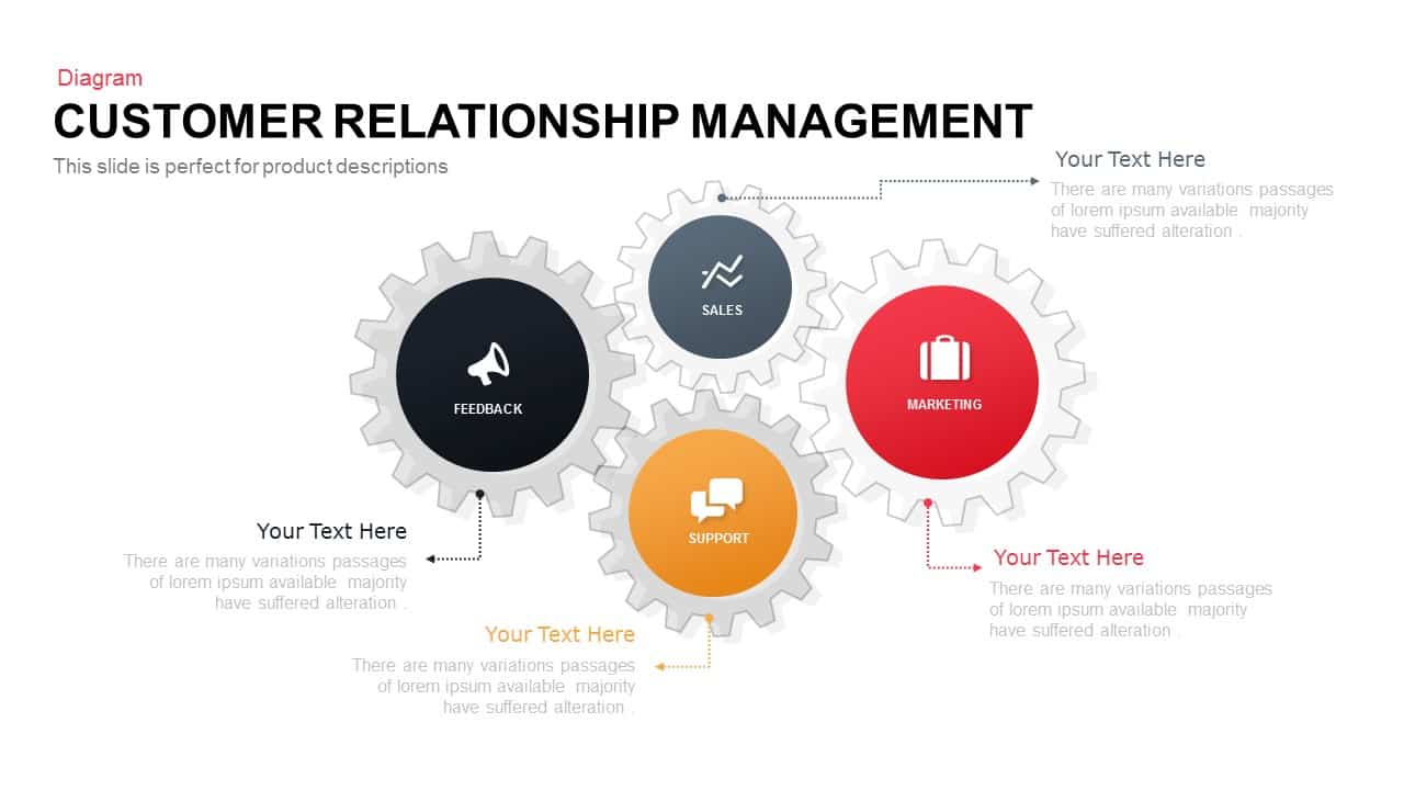
Customer Relationship Management PowerPoint Template
Customer Experience

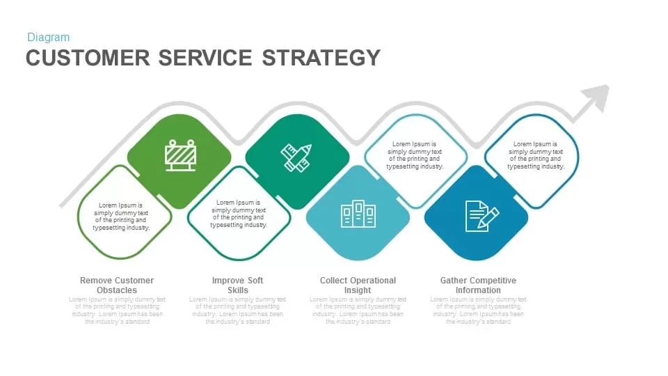
Customer Service Strategy Diagram Template
Business Strategy
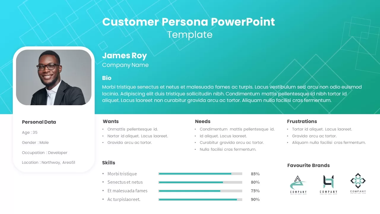
Customer Persona Profile template for PowerPoint & Google Slides
Marketing
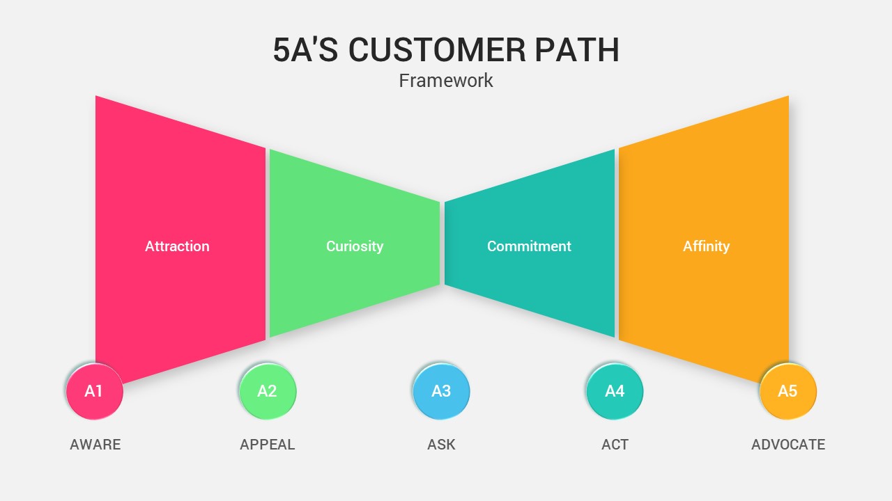
5A’s Customer Path PowerPoint Template
Process
5A’s Customer Path Funnel Diagram Template for PowerPoint & Google Slides
Funnel
Customer Support PowerPoint Template
Customer Experience
Customer Issue Resolving Template
Customer Experience
Customer Response & Feedback Process template
Business Proposal
Customer Segmentation PowerPoint Template
Marketing
Customer Journey Stages PowerPoint Template
Business
Customer Experience Journey Template for PowerPoint & Google Slides
Customer Journey
Customer Profile Template
Business