K-Means Clustering Process Diagram Template for PowerPoint & Google Slides
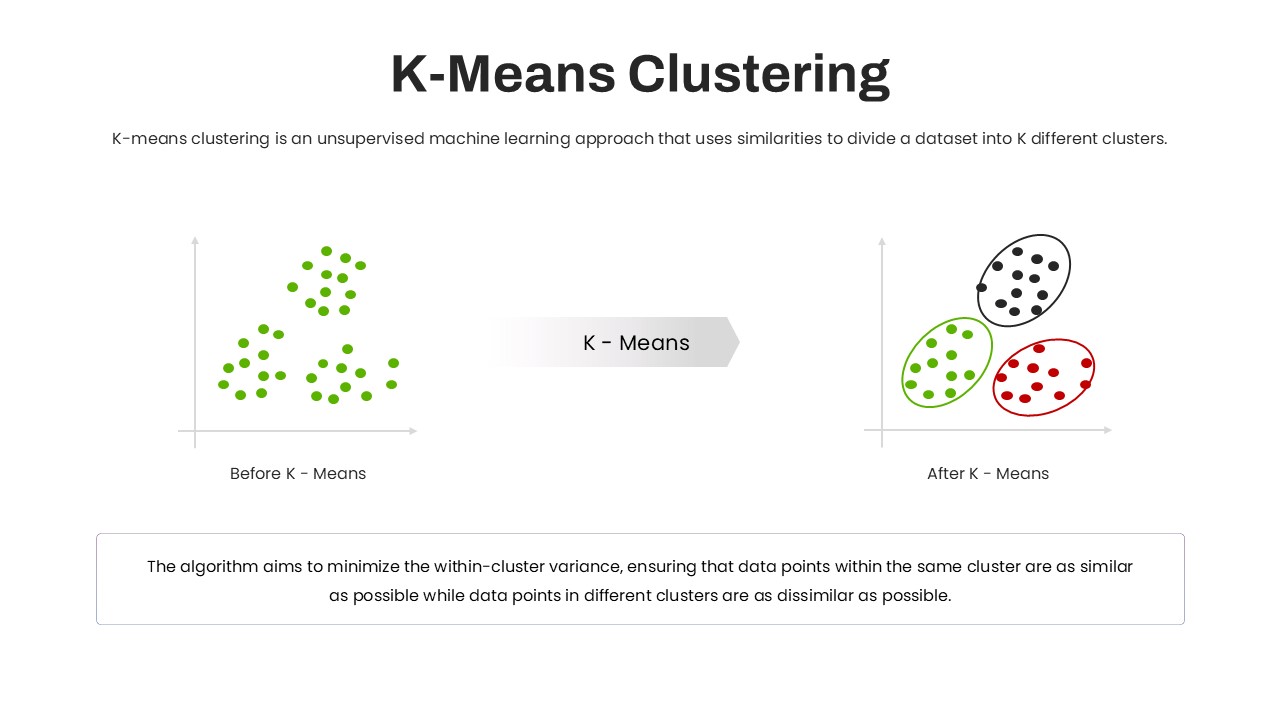

Leverage this K-Means clustering process diagram slide to visualize how unsupervised machine learning divides data into K clusters. The slide features two scatter plots—Before K-Means and After K-Means—connected by an arrow labeled “K-Means.” On the left, raw data points appear in a single color, illustrating ungrouped observations. On the right, points are enclosed within three color-coded ellipses representing the final clusters, emphasizing within-cluster similarity and between-cluster dissimilarity. A bottom text box highlights the algorithm’s objective to minimize within-cluster variance, ensuring clarity for audiences new to clustering concepts.
This fully editable template includes customizable chart axes, marker shapes, and ellipse colors to align with your brand palette or presentation theme. Master slide support and intuitive placeholders enable you to adjust node counts, labels, and cluster numbers in seconds. The clean, minimal layout—with ample white space and clear typography—ensures maximum readability on any device. Icons and connectors maintain visual consistency, while the balanced composition directs attention to both the process flow and technical insights.
Optimized for PowerPoint and Google Slides, this slide preserves high-resolution graphics and seamless formatting across platforms. Whether you are teaching a data science workshop, presenting to stakeholders, or documenting an analytics project, this diagram accelerates engagement and understanding. Use the placeholder arrow to illustrate variations such as hierarchical clustering or DBSCAN, or duplicate the layout to compare different clustering parameters. By simplifying complex algorithmic steps into intuitive visuals, this process diagram empowers presenters to communicate data-driven insights with confidence. The slide’s scalable vector elements ensure crisp display, while color-coded clusters and minimal iconography support rapid comprehension of clustering results.
Who is it for
Data scientists, machine learning engineers, analytics consultants, and educators will benefit from this process diagram when explaining clustering concepts, training teams, or sharing model outcomes. Project managers and business analysts can also use it to illustrate segmentation strategies to stakeholders.
Other Uses
Beyond K-Means, repurpose this layout for comparative analyses of algorithms like hierarchical clustering or DBSCAN, or to illustrate data segmentation in marketing, customer profiling, or anomaly detection workflows.
Login to download this file

Item ID
SB05012
Related Templates

Gear Process Diagram PowerPoint Template for PowerPoint & Google Slides
Process
Sales Process Workflow Funnel Diagram PowerPoint Template for PowerPoint & Google Slides
Funnel
5 Arrow Process Diagram Template for PowerPoint & Google Slides
Infographics
Six Hexagon Stages Process Flow Diagram Template for PowerPoint & Google Slides
Process
6-Step Arrow Process Diagram Template for PowerPoint & Google Slides
Process
Modern 4-Step Cyclic Process Diagram Template for PowerPoint & Google Slides
Circular
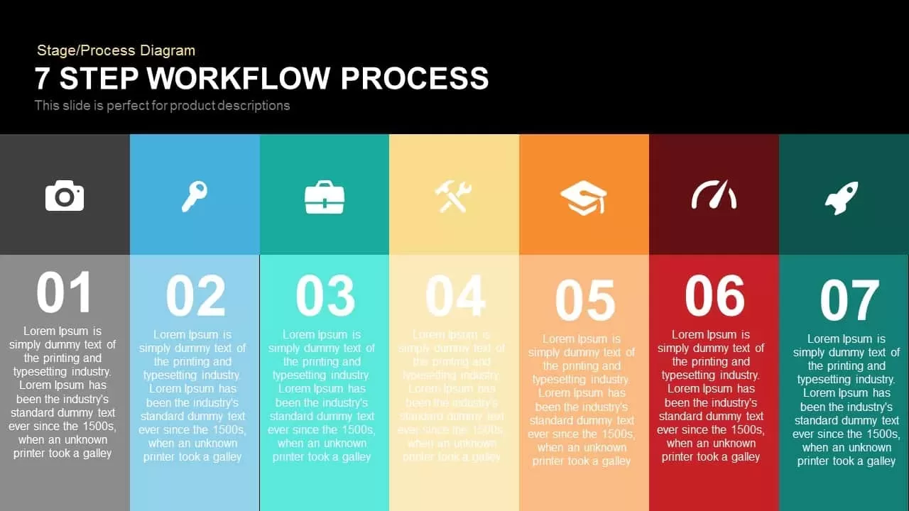
7-Step Workflow Process Diagram Template for PowerPoint & Google Slides
Process
Colorful Arrow Process Diagram Template for PowerPoint & Google Slides
Arrow
Process Flow Diagram template for PowerPoint & Google Slides
Infographics
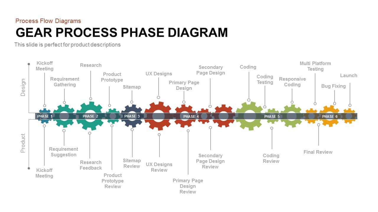
Gear Process Phase Diagram template for PowerPoint & Google Slides
Process

Five-Step Gear Process Diagram Template for PowerPoint & Google Slides
Process
Three Stage 3D Arrow Process Diagram Template for PowerPoint & Google Slides
Process

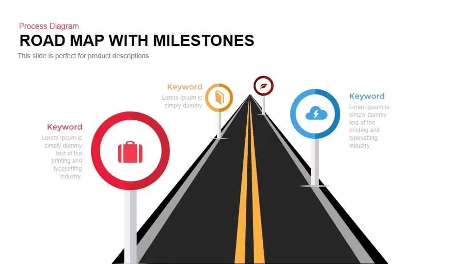
Roadmap with Milestones Process Diagram Template for PowerPoint & Google Slides
Roadmap
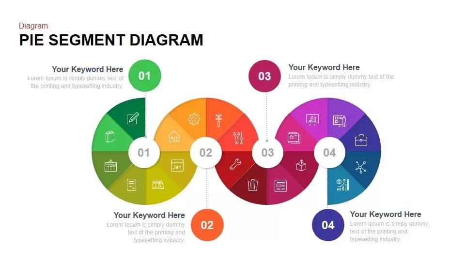
Pie Segment Diagram Four-Step Process Template for PowerPoint & Google Slides
Pie/Donut
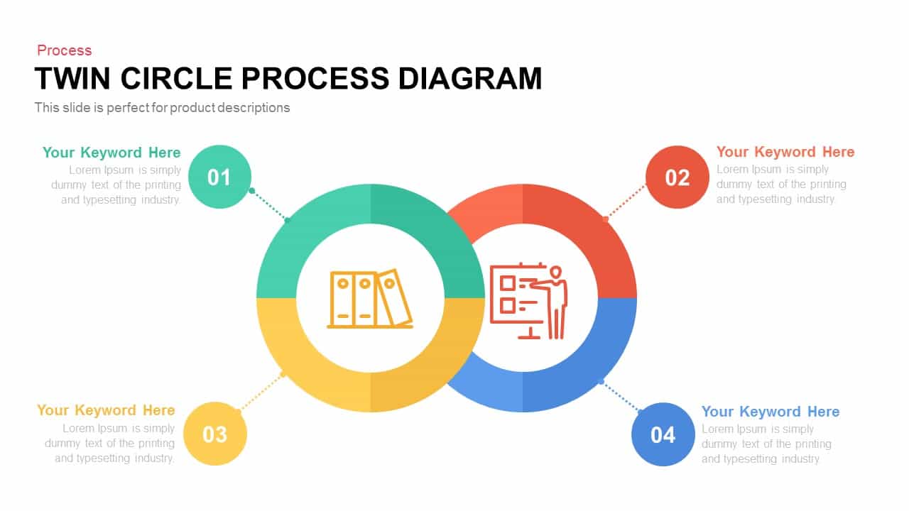
Editable Twin Circle Process Diagram Template for PowerPoint & Google Slides
Process
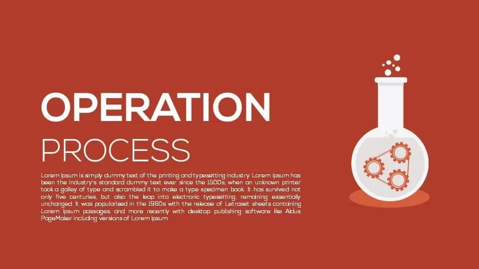
Operation Process Metaphor Diagram Template for PowerPoint & Google Slides
Process
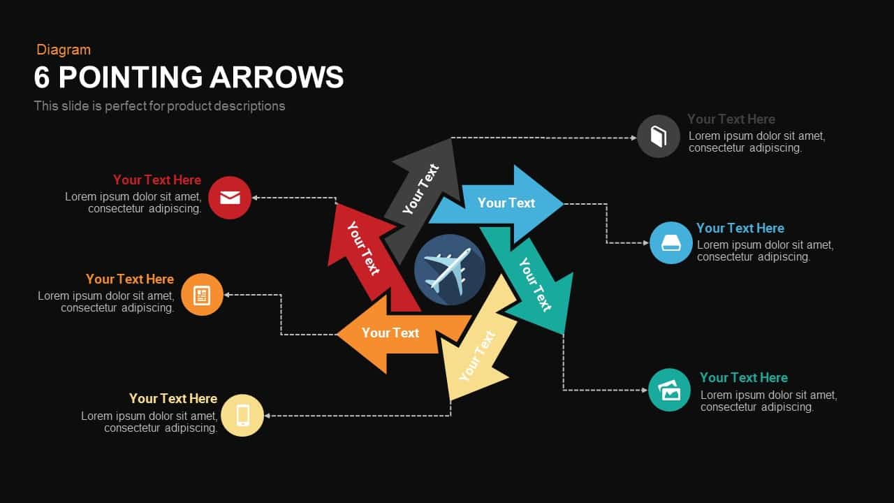
Six Pointing Arrow Process Diagram Template for PowerPoint & Google Slides
Arrow
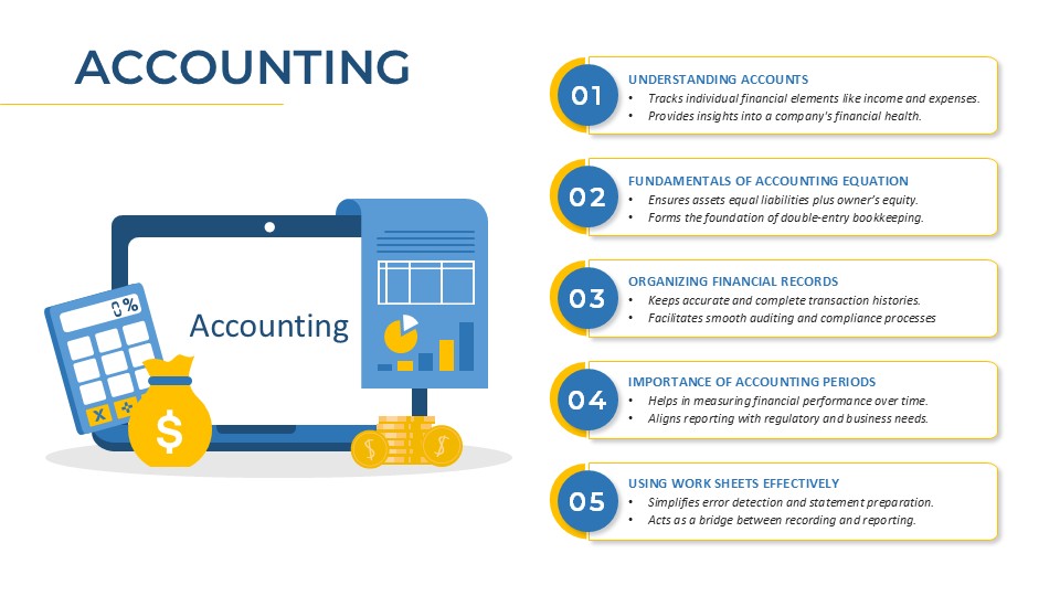
Accounting Process Metaphor Diagram Template for PowerPoint & Google Slides
Accounting
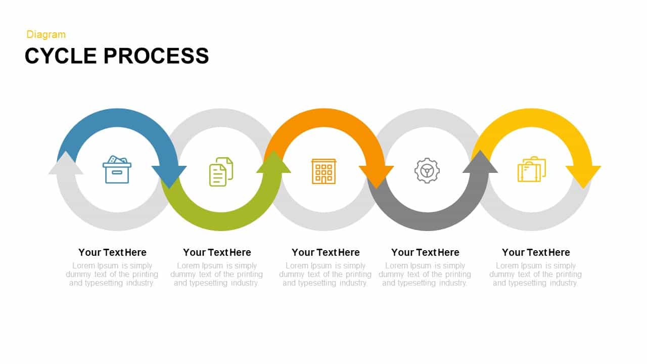
Modern Five-Stage Cycle Process Diagram Template for PowerPoint & Google Slides
Process
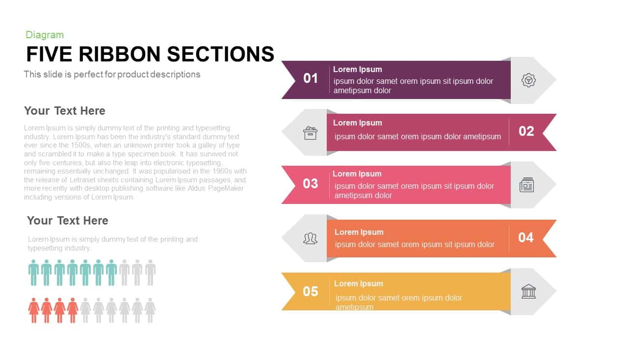
Five Ribbon Sections Process Diagram Template for PowerPoint & Google Slides
Process
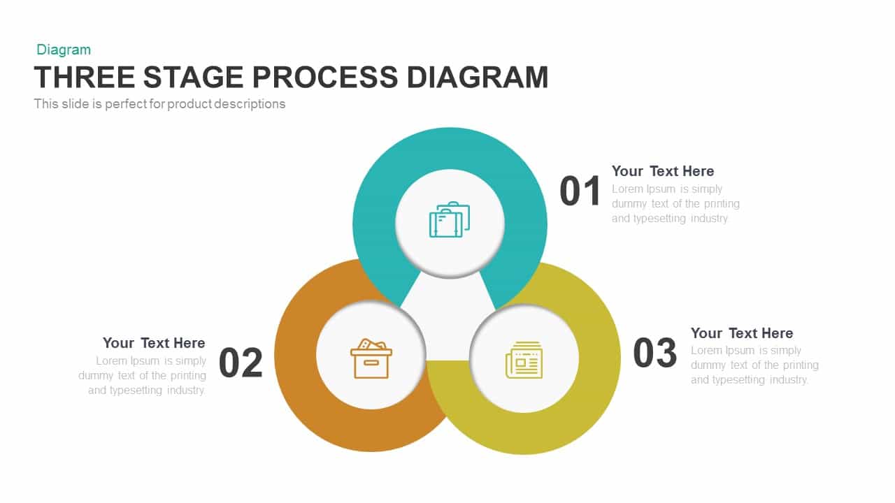
Engaging Three-Stage Process Diagram Template for PowerPoint & Google Slides
Process
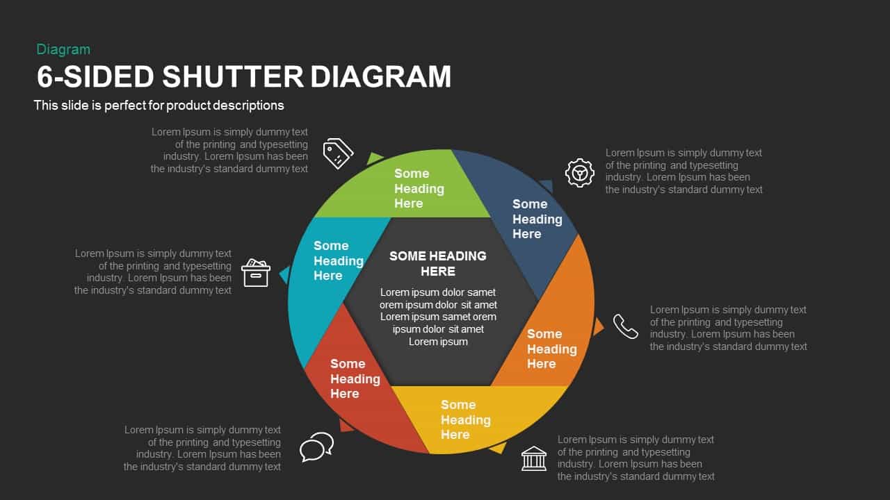
Six-Sided Shutter Diagram Process Flow Template for PowerPoint & Google Slides
Process
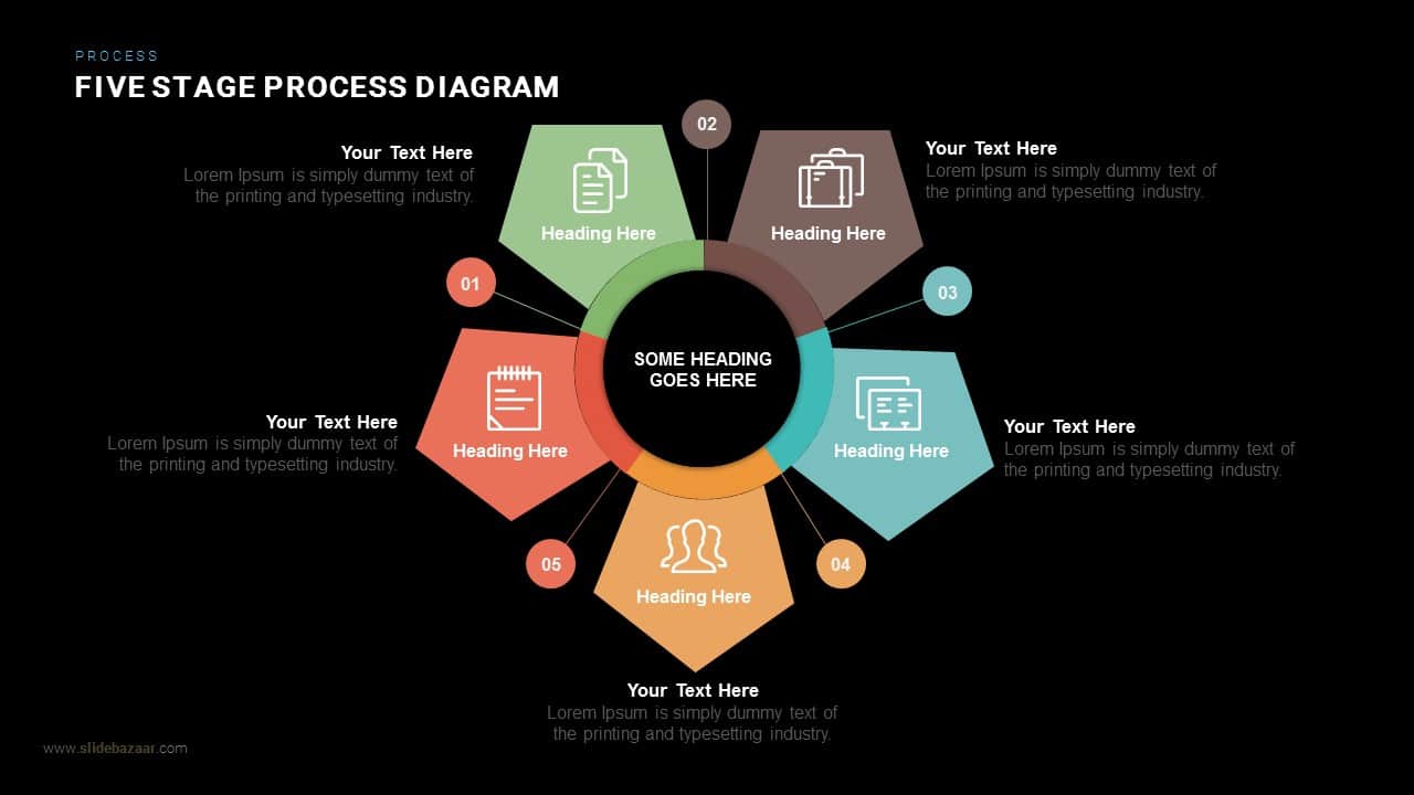
Five Stage Process Diagram Infographic Template for PowerPoint & Google Slides
Process

Six-Process Circular Arrow Diagram Template for PowerPoint & Google Slides
Circular
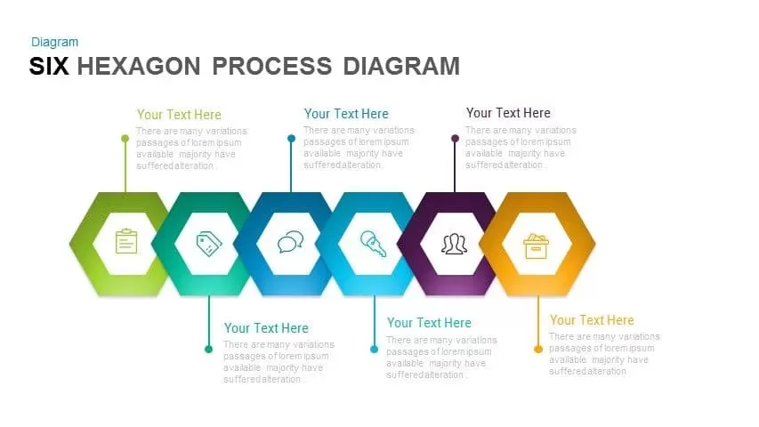
Six-Step Hexagon Process Diagram Template for PowerPoint & Google Slides
Process
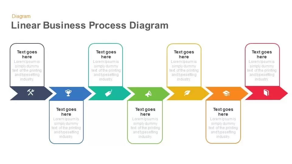
Linear Business Process Diagram template for PowerPoint & Google Slides
Process
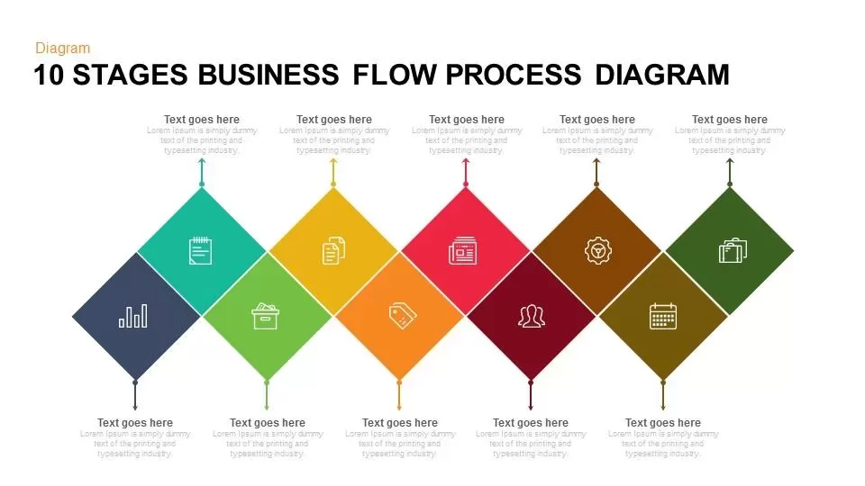
10 Stages Business Flow Process Diagram template for PowerPoint & Google Slides
Business
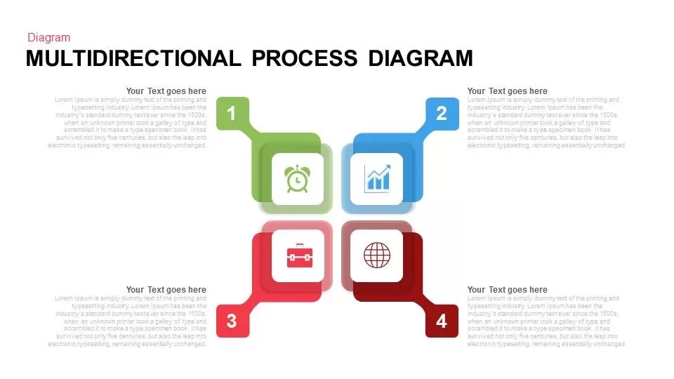
Multidirectional Process Diagram template for PowerPoint & Google Slides
Process

Elegant Process Support Arrow Diagram Template for PowerPoint & Google Slides
Arrow
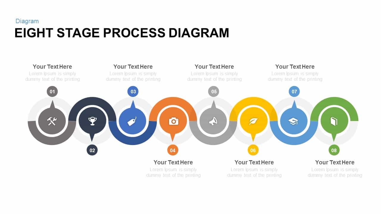
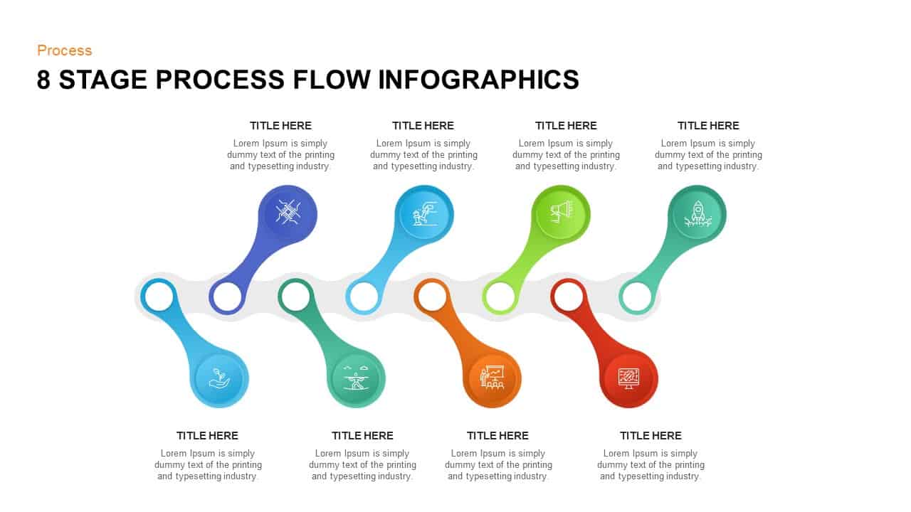
Eight Stage Process Diagram template for PowerPoint & Google Slides
Process
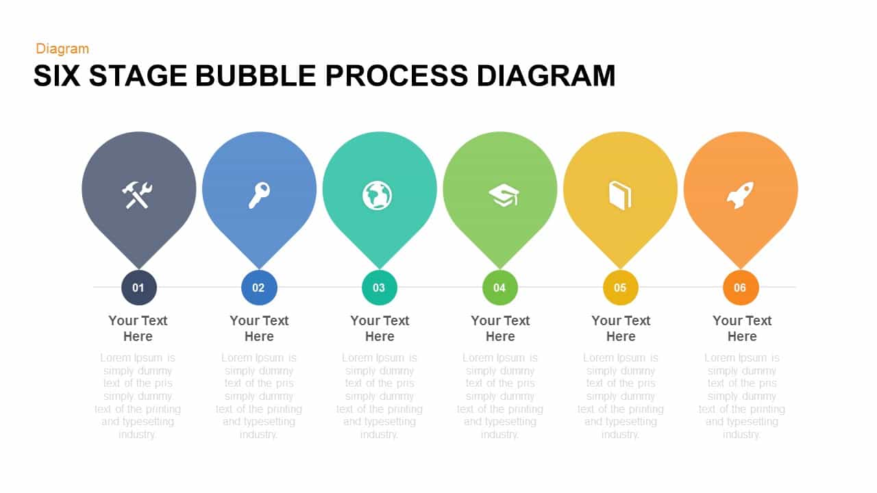
Free Six Stage Bubble Process Diagram template for PowerPoint & Google Slides
Process
Free
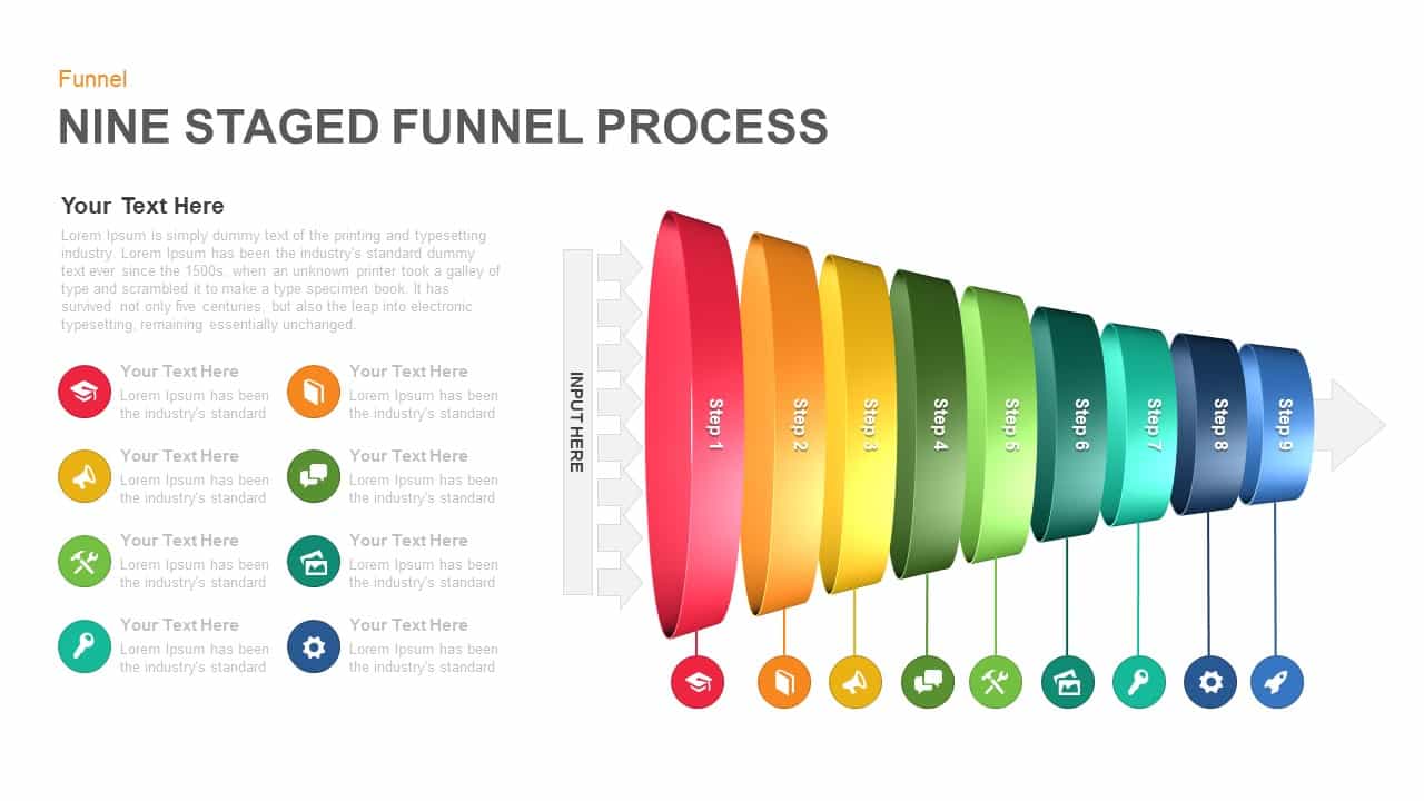
Nine-Stage 3D Funnel Process Diagram Template for PowerPoint & Google Slides
Funnel
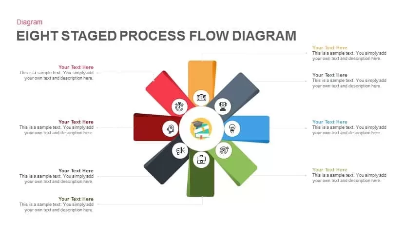
Eight-Stage Radial Process Flow Diagram Template for PowerPoint & Google Slides
Process
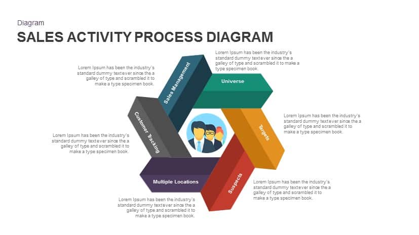
Sales Activity Hexagon Process Diagram Template for PowerPoint & Google Slides
Process
Four-Plus Process Flow Diagram Template for PowerPoint & Google Slides
Process

Modern Five-Step Circles Process Diagram Template for PowerPoint & Google Slides
Circular
Ten-Stage Business Process Diagram Template for PowerPoint & Google Slides
Process
Six-Step Vertical Process Diagram Template for PowerPoint & Google Slides
Process
Six Sigma Gear Process Diagram Template for PowerPoint & Google Slides
Process
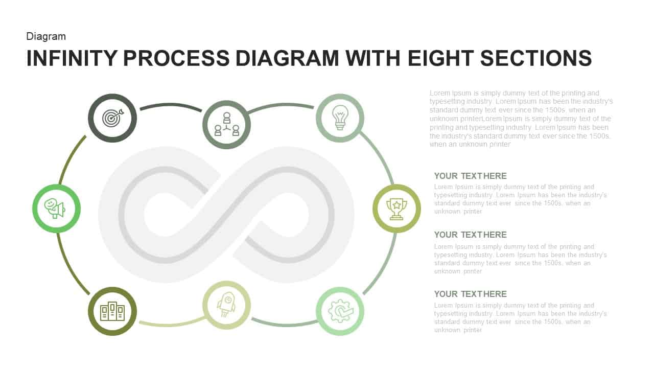
Infinity Process Diagram template for PowerPoint & Google Slides
Process
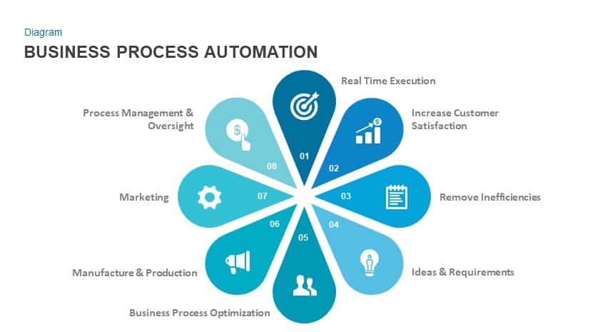
Business Process Automation Diagram Template for PowerPoint & Google Slides
Process
Free Six-Stage Arrow Process Diagram Template for PowerPoint & Google Slides
Process
Free
Six-Step Linear Arrow Process Diagram Template for PowerPoint & Google Slides
Process
Five-Step Diamond Process Diagram Template for PowerPoint & Google Slides
Process
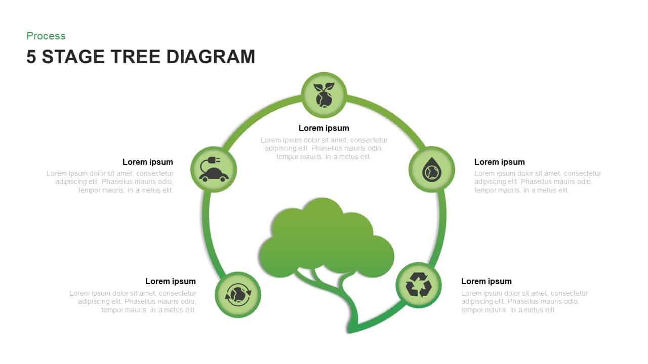
Five-Stage Eco Tree Process Diagram Template for PowerPoint & Google Slides
Process
Six-Stage Circular Diagram Process Template for PowerPoint & Google Slides
Circular
Three-Way Decision Process Arrow Diagram Template for PowerPoint & Google Slides
Arrow
Six-Step Hexagon Process Flow Diagram Template for PowerPoint & Google Slides
Process
Six-Stage Infinity Loop Process Diagram Template for PowerPoint & Google Slides
Process
3D Seven-Stage Process Flow Diagram Template for PowerPoint & Google Slides
Process
Circular CRM Process Diagram Infographic Template for PowerPoint & Google Slides
Circular
Converging Arrows Process Diagram Template for PowerPoint & Google Slides
Arrow
Supply Chain Management Process Diagram Template for PowerPoint & Google Slides
Process
Compass-Themed Six-Step Process Diagram Template for PowerPoint & Google Slides
Process
Iterative Process Model Diagram Template for PowerPoint & Google Slides
Process
Why What How Process Diagram Template for PowerPoint & Google Slides
Process
4 Stage Linear Process Flow Diagram Template for PowerPoint & Google Slides
Process
6-Step Business Process Flow Diagram Template for PowerPoint & Google Slides
Process
Three-Step Flowchart Process Diagram Template for PowerPoint & Google Slides
Flow Charts
Process Methodology Overview Diagram Template for PowerPoint & Google Slides
Process
Value Chain Circular Process Diagram Template for PowerPoint & Google Slides
Business Models
Sales Process Improvement Gear Diagram Template for PowerPoint & Google Slides
Process
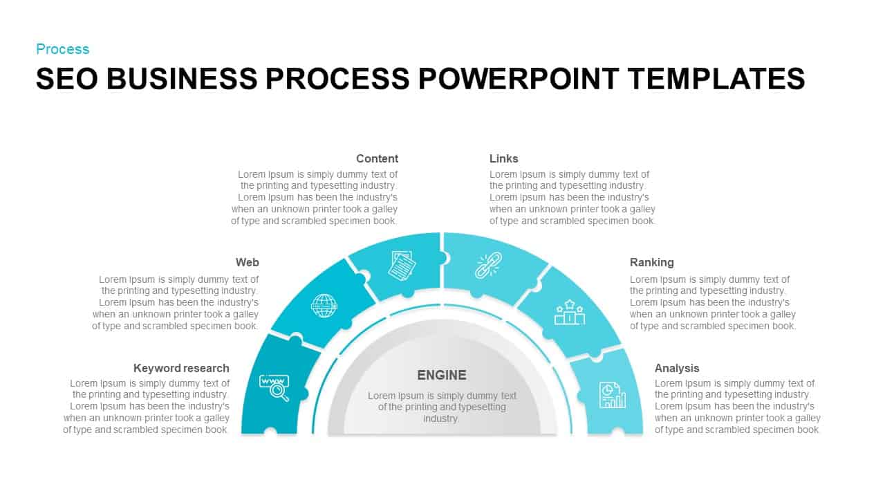
SEO Business Process Puzzle Diagram Template for PowerPoint & Google Slides
Process
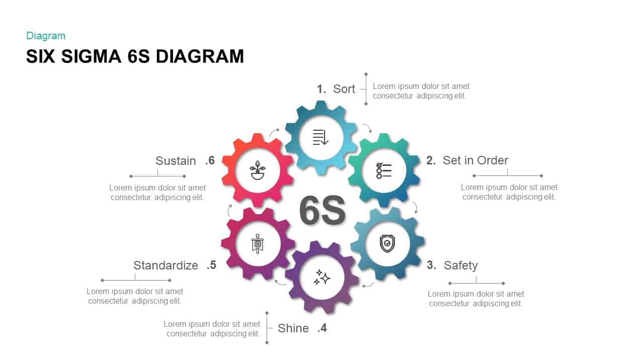
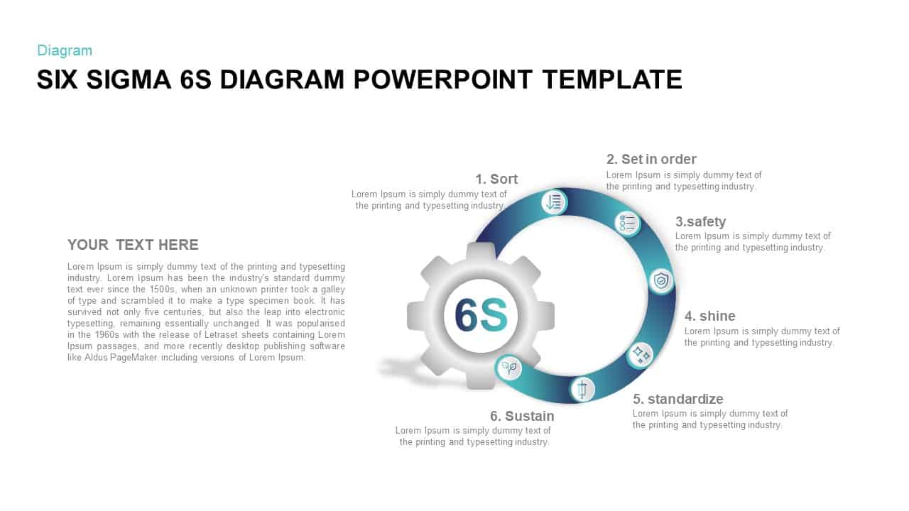
Six Sigma 6S Process Diagram Template for PowerPoint & Google Slides
Process
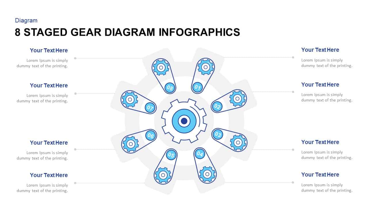
Eight-Stage Gear Diagram Process Template for PowerPoint & Google Slides
Process
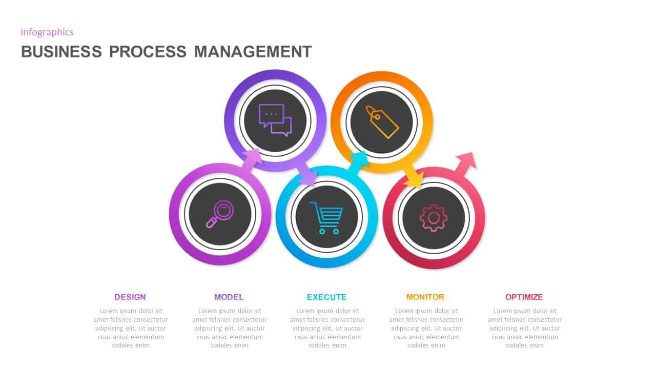
Business Process Management Flow Diagram Template for PowerPoint & Google Slides
Process
Colorful 8-Stage Droplet Process Flow Diagram Template for PowerPoint & Google Slides
Process

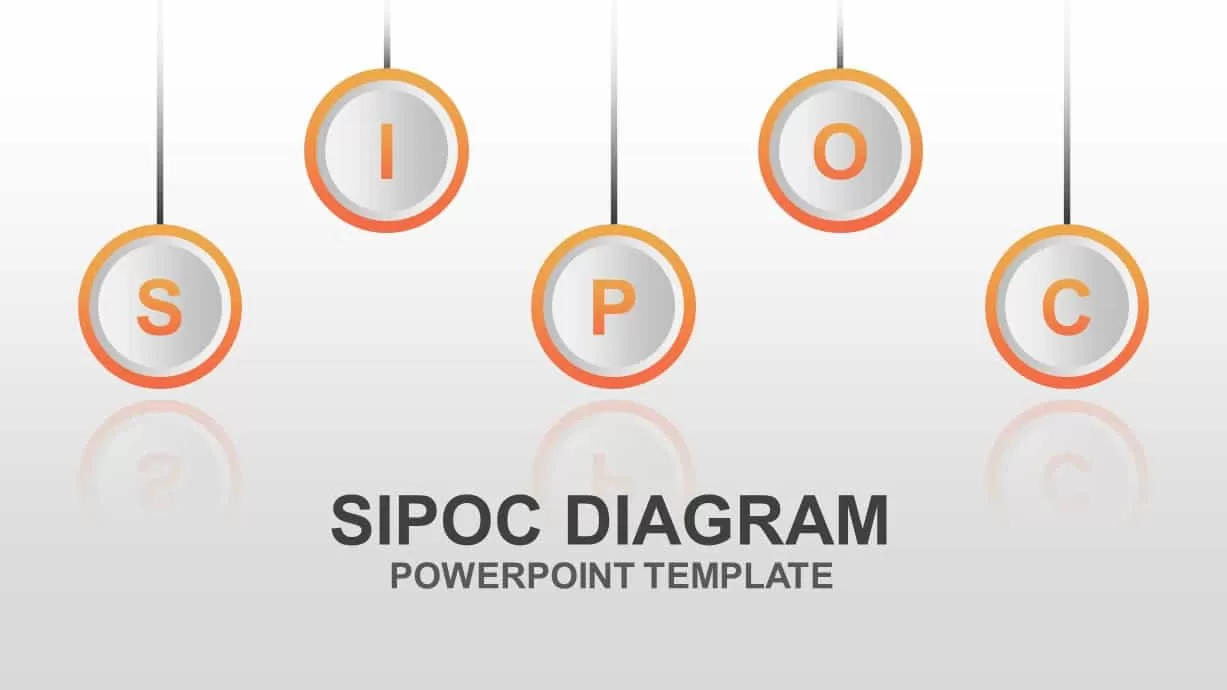
Editable SIPOC Process Diagram Deck Template for PowerPoint & Google Slides
Pitch Deck
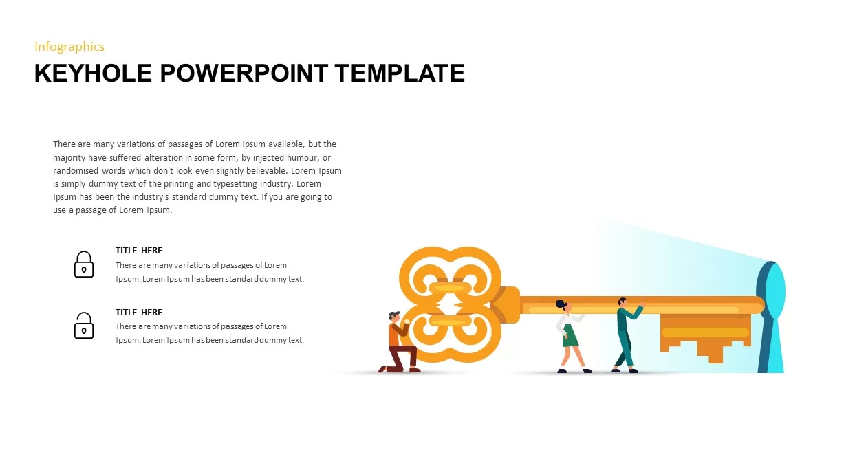
Keyhole Infographic Process Diagram Template for PowerPoint & Google Slides
Process
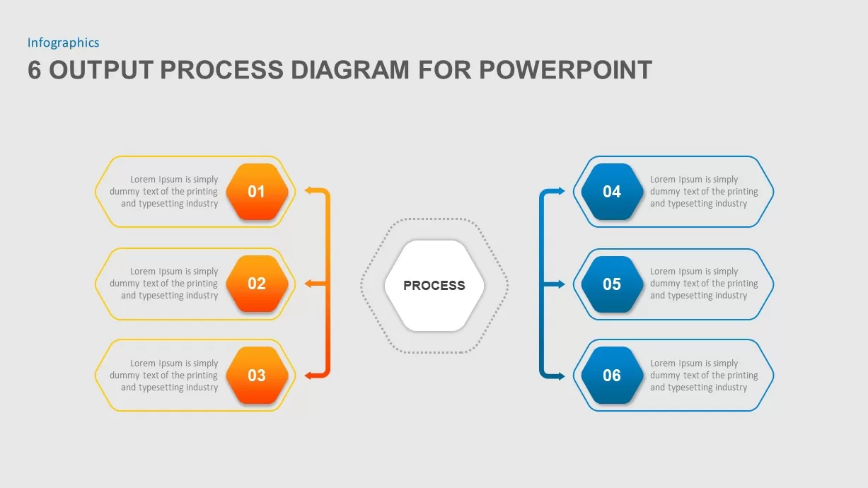
Six-Step Output Process Diagram Template for PowerPoint & Google Slides
Process
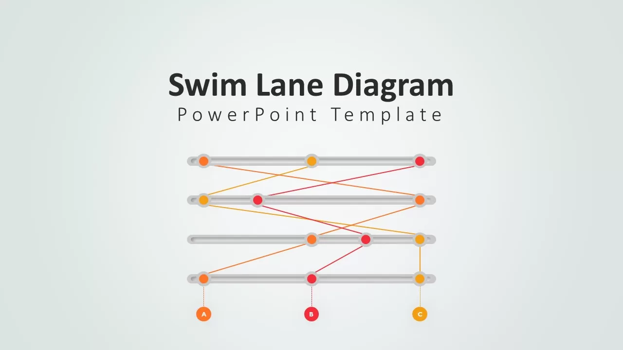
Swim Lane Diagram PowerPoint & Google Slides Template for Process Mapping
Business Strategy
Creative Infinity Loop Process Diagram Template for PowerPoint & Google Slides
Process
Problem Solving Process Diagram Template for PowerPoint & Google Slides
Process
Curved Arrow Process Flow Diagram Template for PowerPoint & Google Slides
Process
Elegant PDCA Four-Step Process Diagram Template for PowerPoint & Google Slides
Process
Chain Link Process Infographic Diagram Template for PowerPoint & Google Slides
Process
Chain Link Process Infographic Diagram Template for PowerPoint & Google Slides
Process
10 Step Circular Process Diagram Template for PowerPoint & Google Slides
Circular
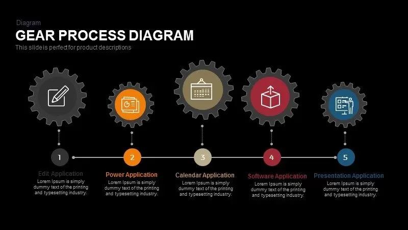
Gear Process Diagram Template for PowerPoint & Google Slides
Process
E-Waste Management Process Flow Diagram Template for PowerPoint & Google Slides
Process
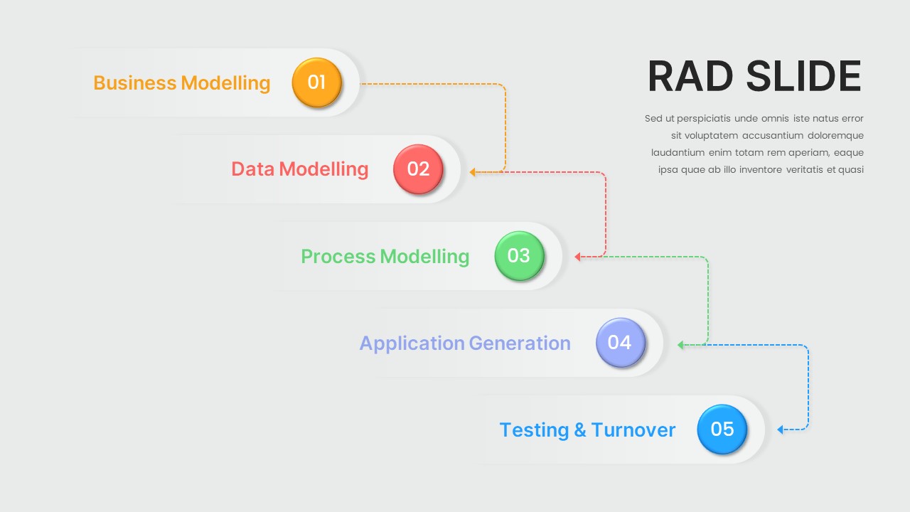
Five-Step Modelling Process Diagram Template for PowerPoint & Google Slides
Process
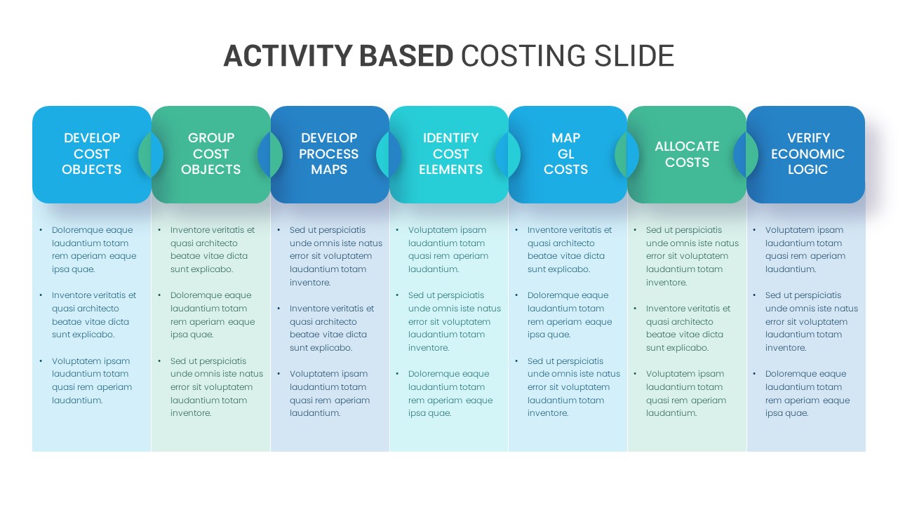
Activity Based Costing Process Diagram Template for PowerPoint & Google Slides
Process
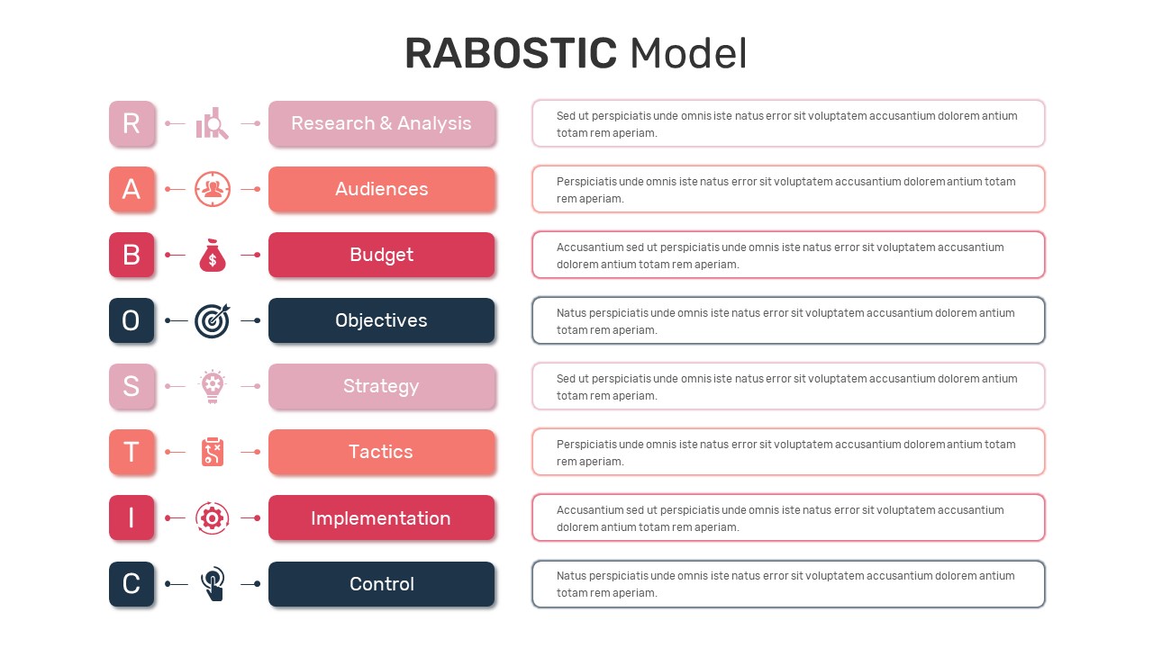
RABOSTIC Marketing Model Process Diagram Template for PowerPoint & Google Slides
Process
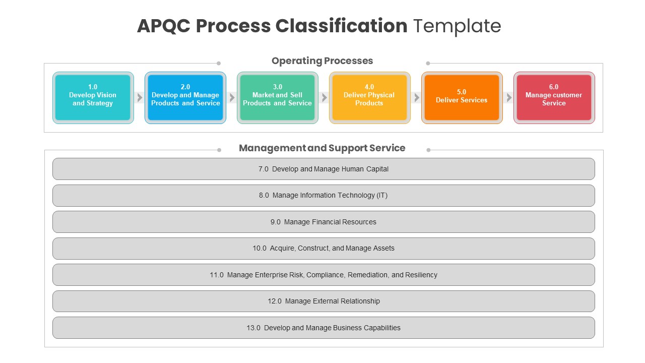
APQC Process Classification Diagram Template for PowerPoint & Google Slides
Process
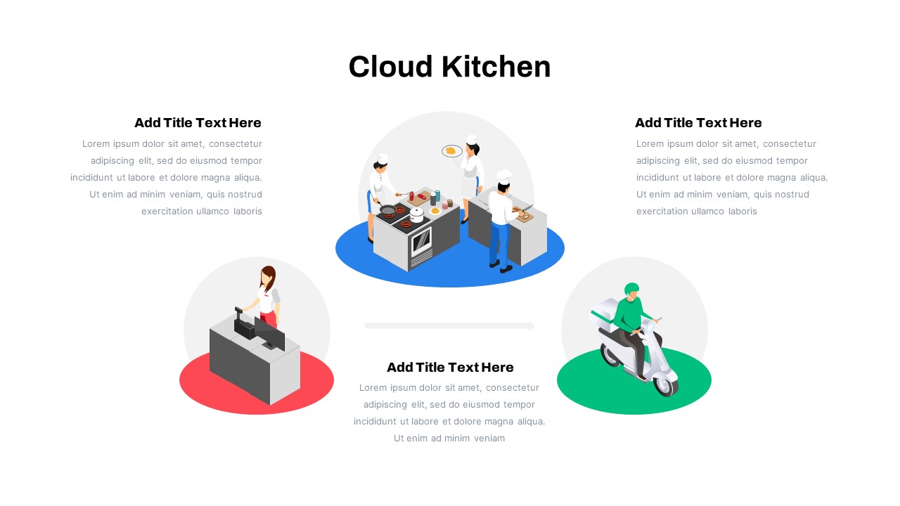
Cloud Kitchen Business Process Diagram Template for PowerPoint & Google Slides
Process
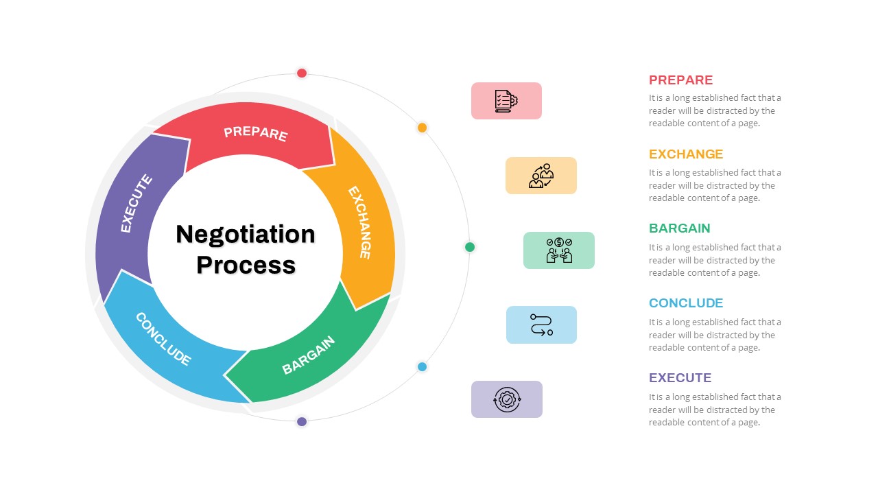
Negotiation Process Circular Diagram Template for PowerPoint & Google Slides
Circular
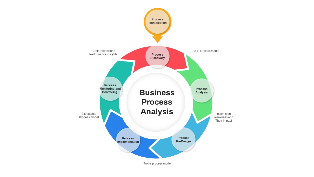
Business Process Analysis Cycle Diagram Template for PowerPoint & Google Slides
Business Strategy
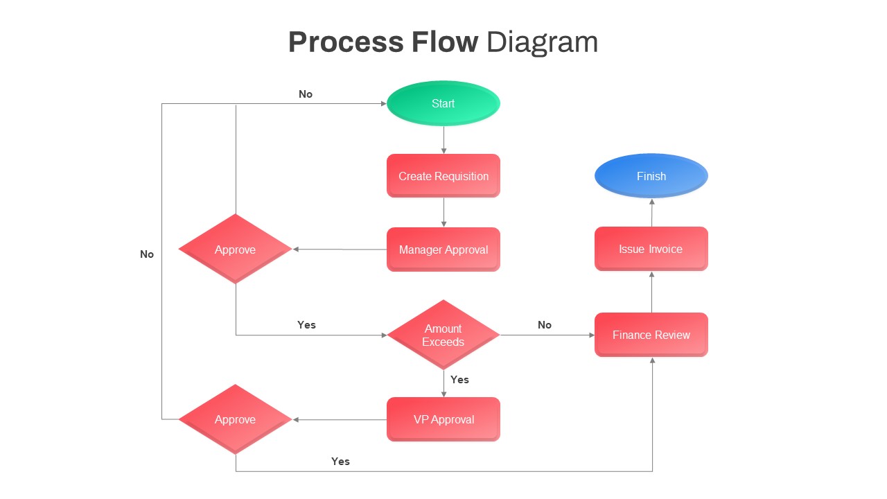
Comprehensive Process Flow Diagram Template for PowerPoint & Google Slides
Process
Repeating Overlapping Process Diagram Template for PowerPoint & Google Slides
Process
Animated Gears Process Flow Diagram Template for PowerPoint & Google Slides
Process
Free UI/UX Process Timeline Diagram Template for PowerPoint & Google Slides
Process
Free
Culture Change Circular Process Diagram Template for PowerPoint & Google Slides
Process
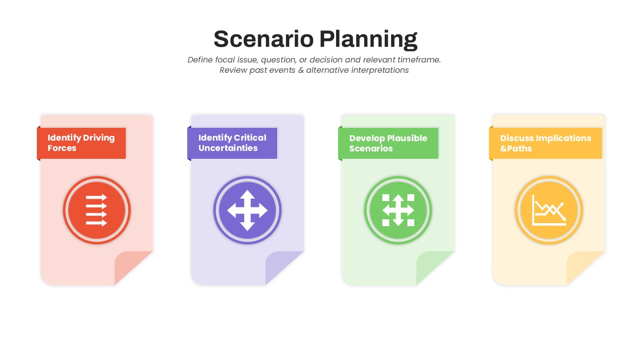
Scenario Planning Process Diagram Template for PowerPoint & Google Slides
Process
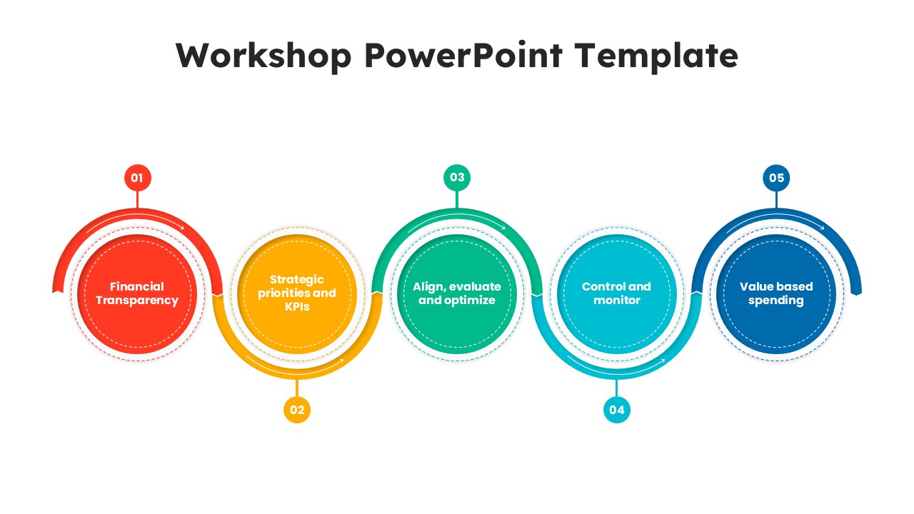
Workshop 5-Step Circular Process Diagram Template for PowerPoint & Google Slides
Circular
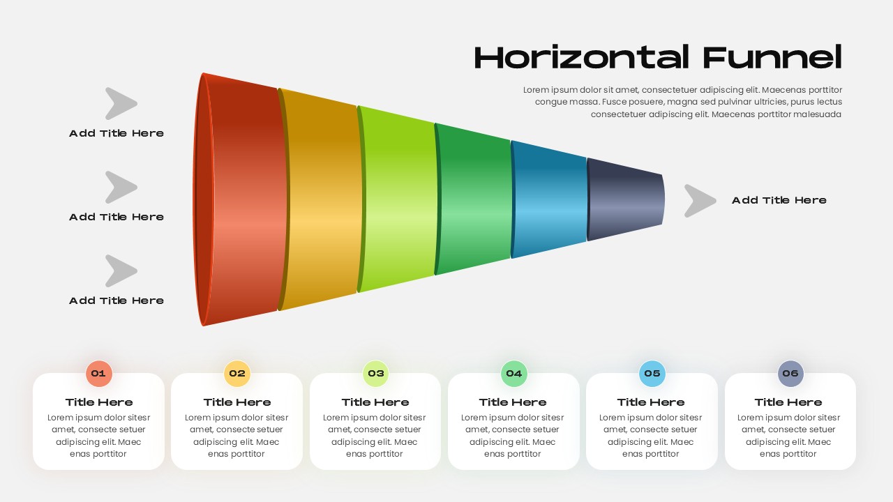
Horizontal Funnel Diagram Process Template for PowerPoint & Google Slides
Funnel
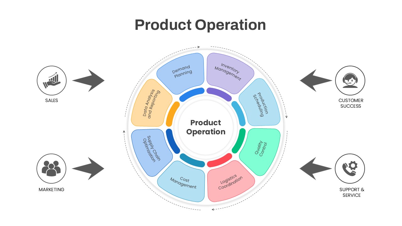
Product Operation Process Diagram Template for PowerPoint & Google Slides
Process
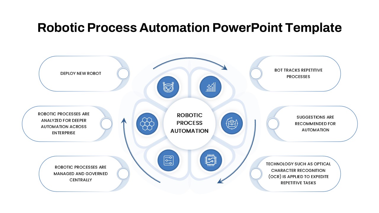
Robotic Process Automation Diagram Template for PowerPoint & Google Slides
Process
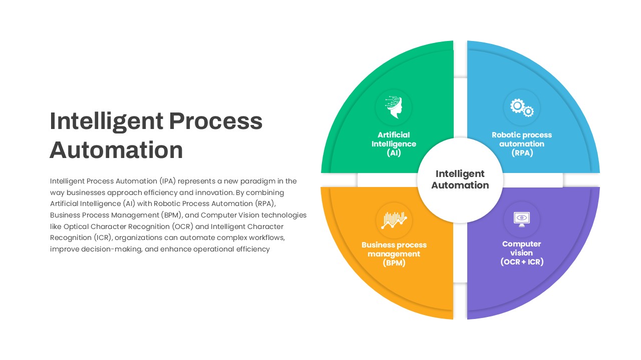
Intelligent Process Automation Diagram Template for PowerPoint & Google Slides
Circular
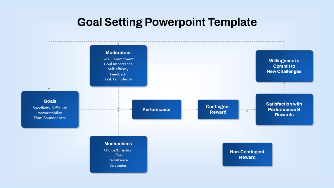
Goal-Setting Process Flow Diagram Template for PowerPoint & Google Slides
Goals
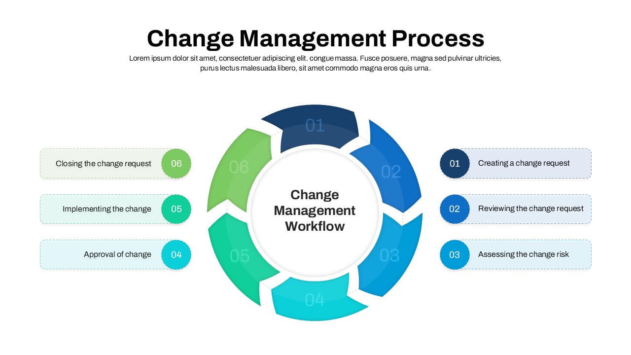
Change Management Process Cycle Diagram Template for PowerPoint & Google Slides
Process