Hits and Misses Performance Comparison Template
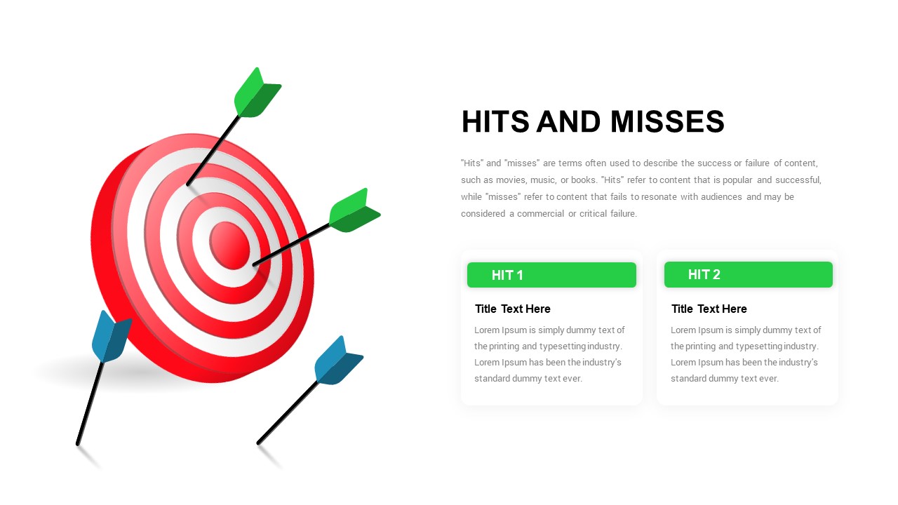
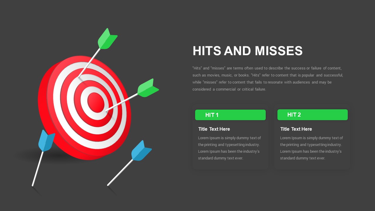
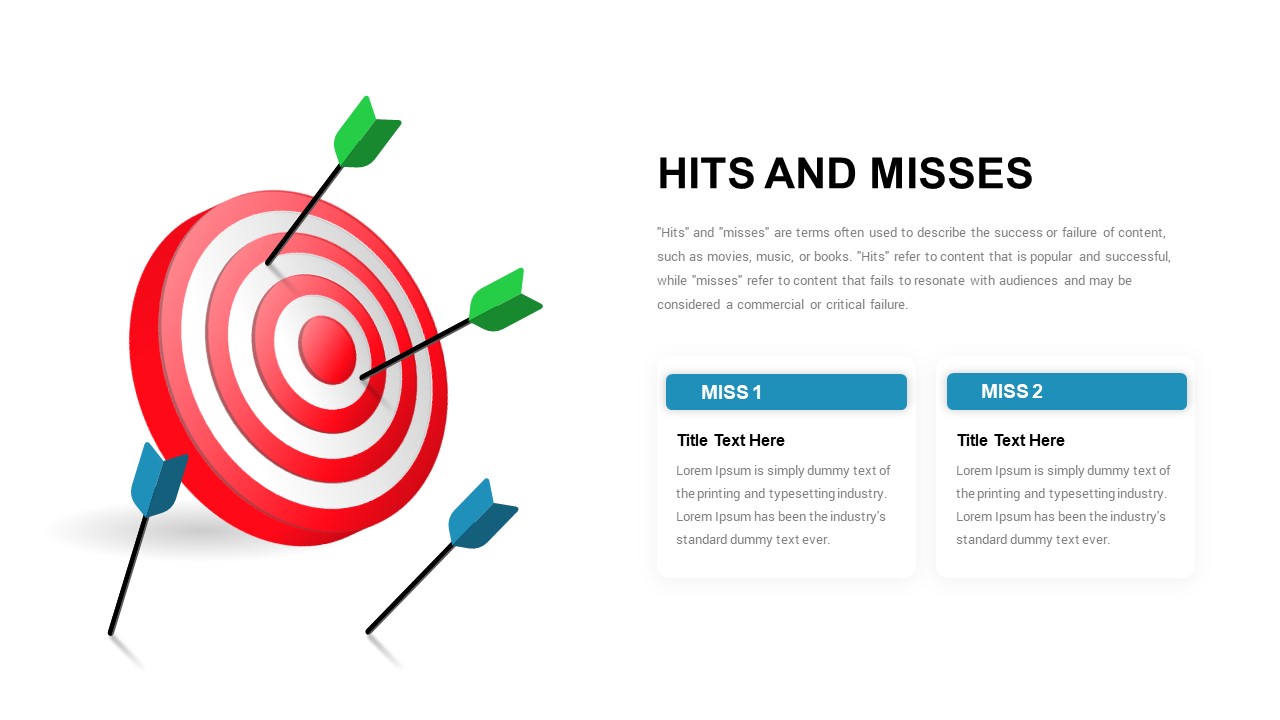
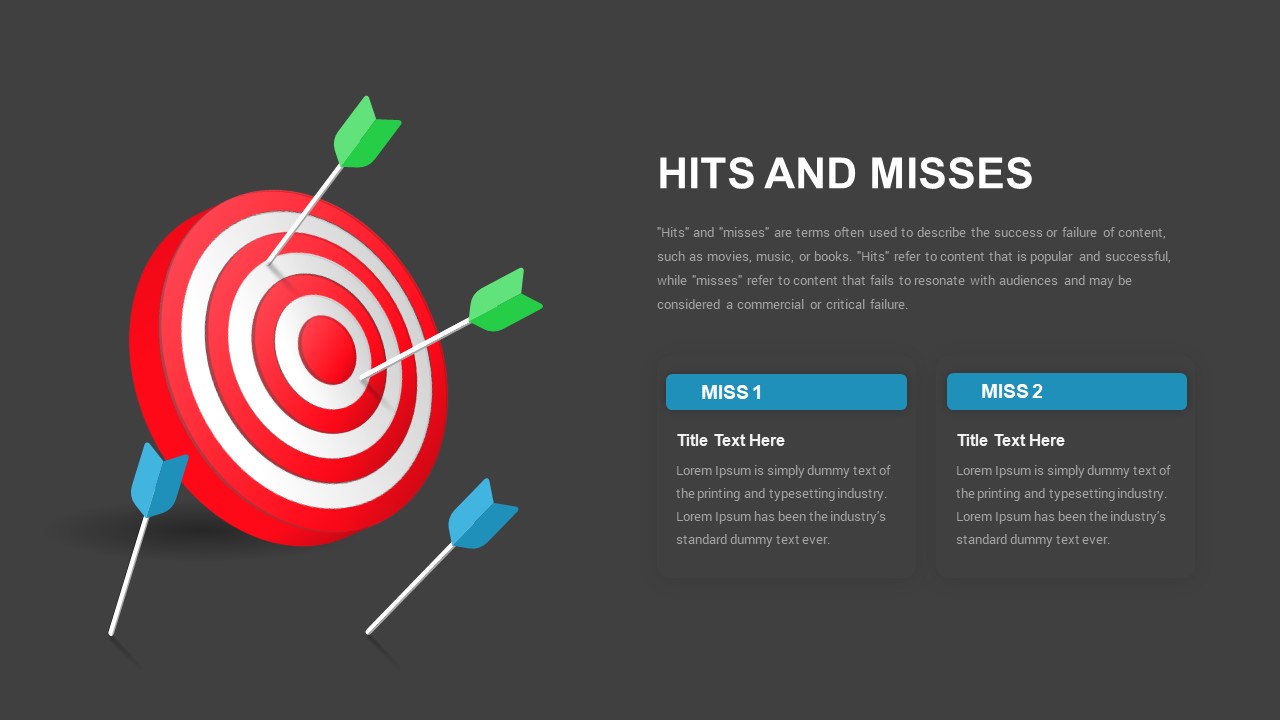
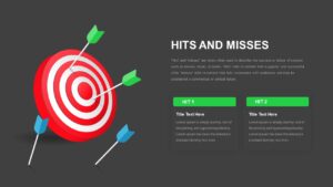

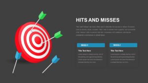
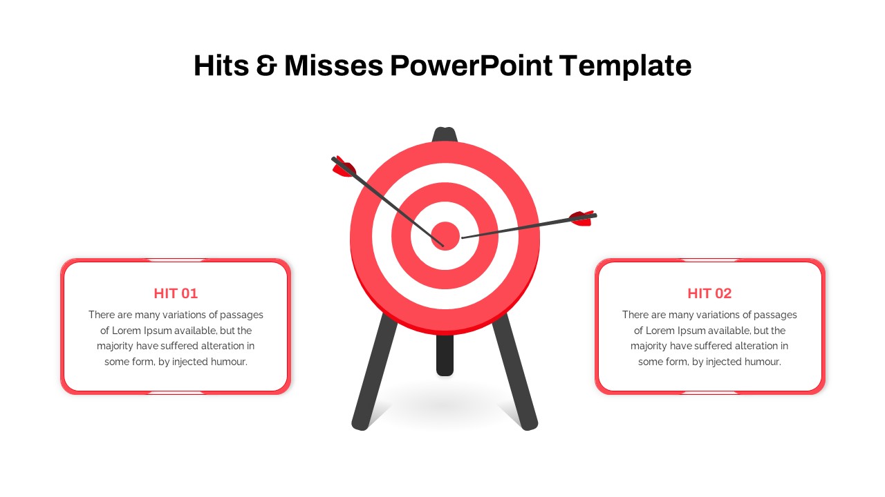
Effective performance reviews depend on clearly distinguishing between what succeeded and what fell short, rather than presenting both within a single, crowded slide. This hits and misses template addresses that need with a bullseye visual, positioning green arrows at the center to represent wins and blue arrows on the ground to represent shortfalls.
Included variations
- Two layouts featuring green “Hit 1” and “Hit 2” content cards, designed to highlight successes
- Two layouts featuring blue “Miss 1” and “Miss 2” content cards, designed to address underperformance or lessons learned
- Each pair is available in both light and dark background versions, providing four total layout options built around a consistent visual anchor
Recommended usage
The hits version is well suited for quarterly reviews or campaign summaries where the objective is to showcase measurable wins. The misses version is appropriate for retrospective meetings, where the focus shifts to identifying what underperformed and why. For comprehensive post-mortem presentations, both variants can be used in sequence, allowing a team to review successes and shortcomings separately while maintaining visual consistency across the presentation.
Each content card accommodates a title and two to three lines of supporting text, and the target illustration remains fully editable, allowing arrow colors to be adjusted to align with organizational branding. Additional cards can be duplicated to accommodate more than two points, or removed if fewer are needed, without disrupting the overall balance of the layout. This template functions identically in both PowerPoint and Google Slides.
Login to download this file

Item ID
SB03493


Related Templates

Hits & Misses PowerPoint Template
Pitch Deck
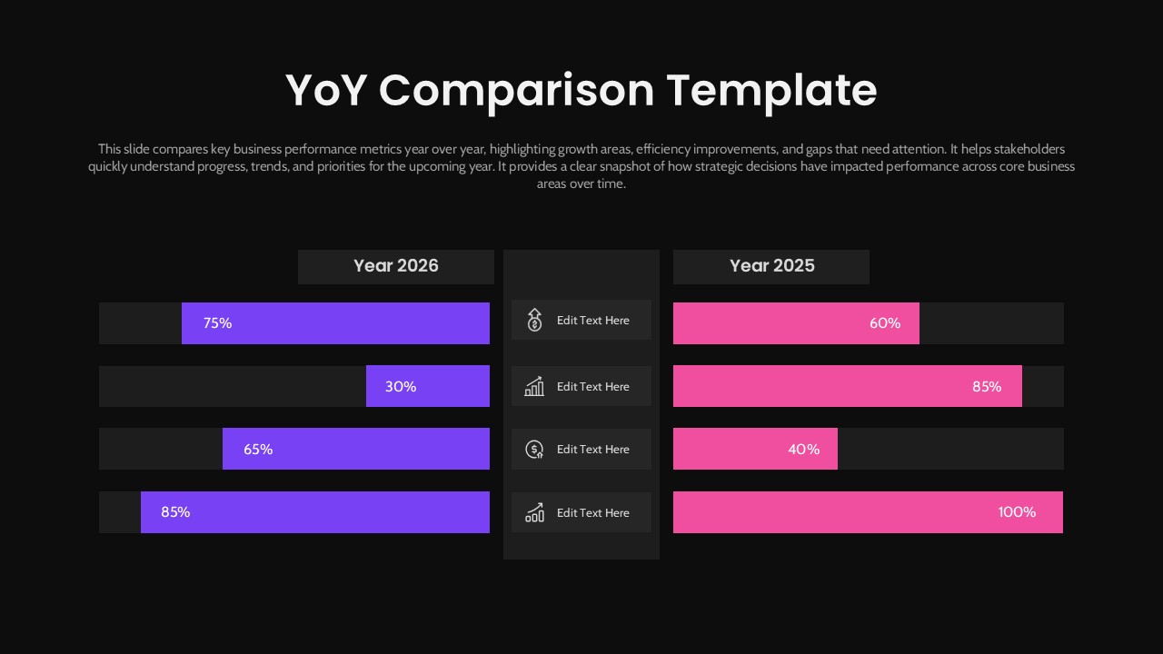
Year-over-Year Performance Comparison Template
Comparison Chart
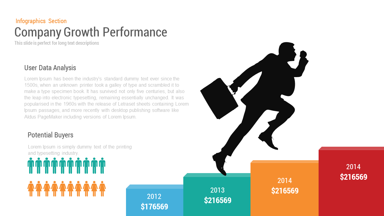
Company Growth Performance Template
Charts
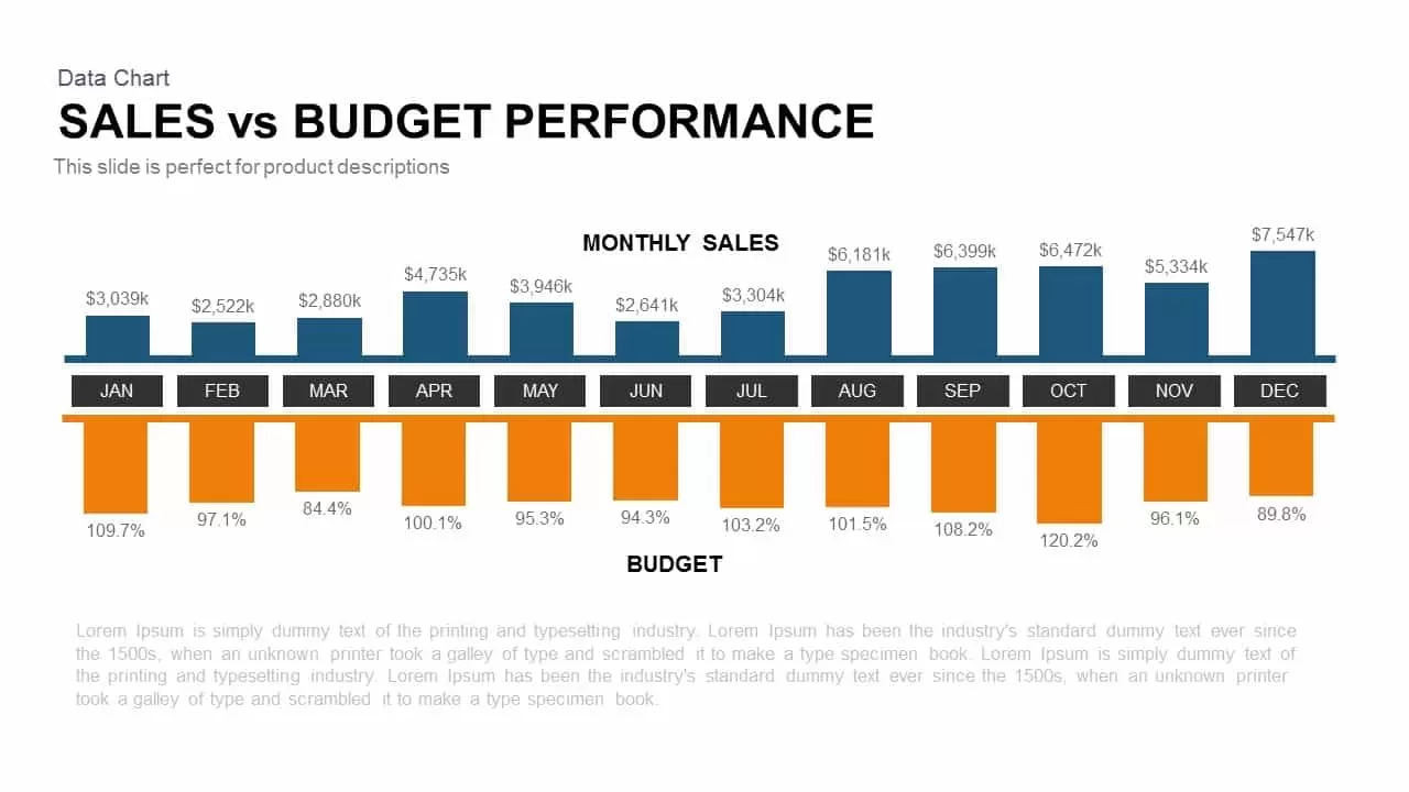
Sales vs Budget Performance Chart Template for PowerPoint & Google Slides
Bar/Column
Performance Review Process Management Cycle template for PowerPoint & Google Slides
Employee Performance
Social Media Performance Dashboard Template for PowerPoint & Google Slides
Bar/Column
Performance Management Review Process Template
Process
Website Performance Dashboard Template
Business Report
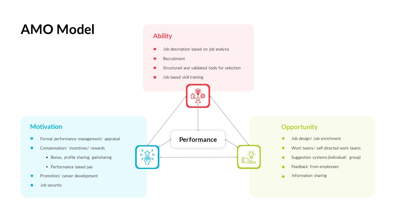
AMO Performance Model Feedback Diagram Template for PowerPoint & Google Slides
Employee Performance
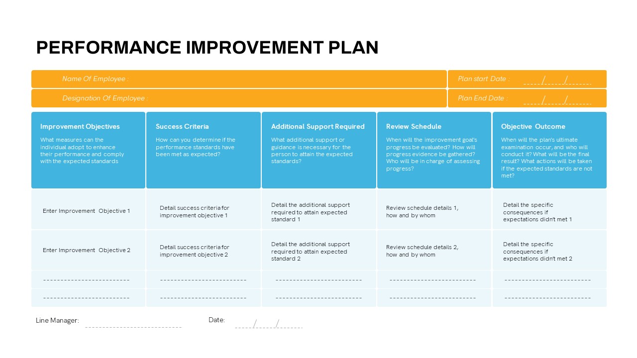
Performance Improvement Plan PowerPoint Template
Employee Performance
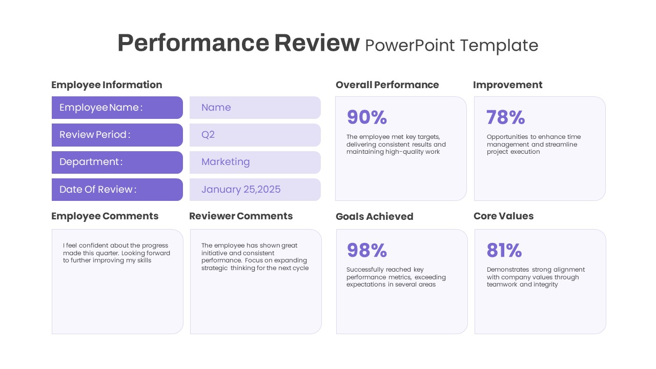
Performance Review PowerPoint template
Employee Performance
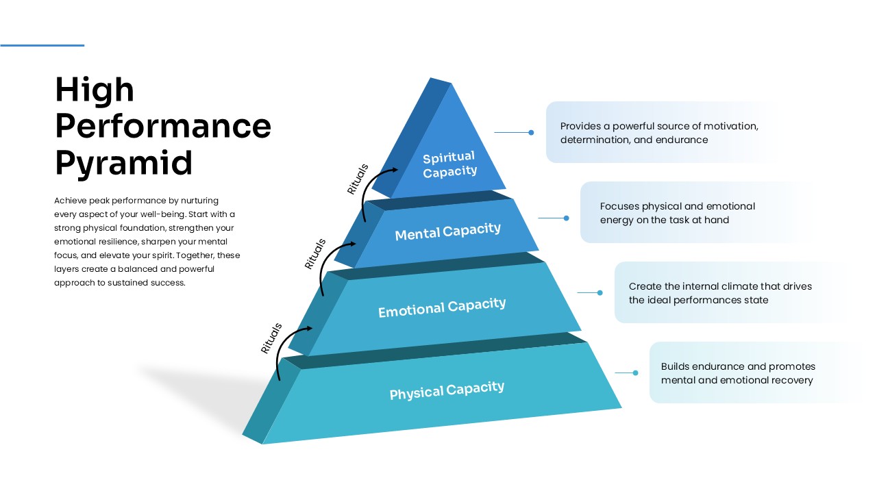
High-Performance Pyramid Diagram Template
Pyramid
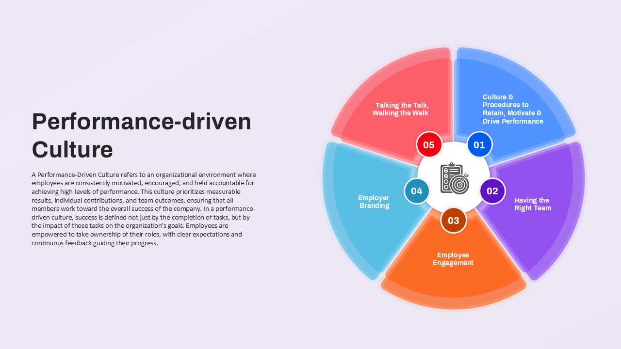
Performance-Driven Culture Template for PPT & Google Slides Theme
Leadership
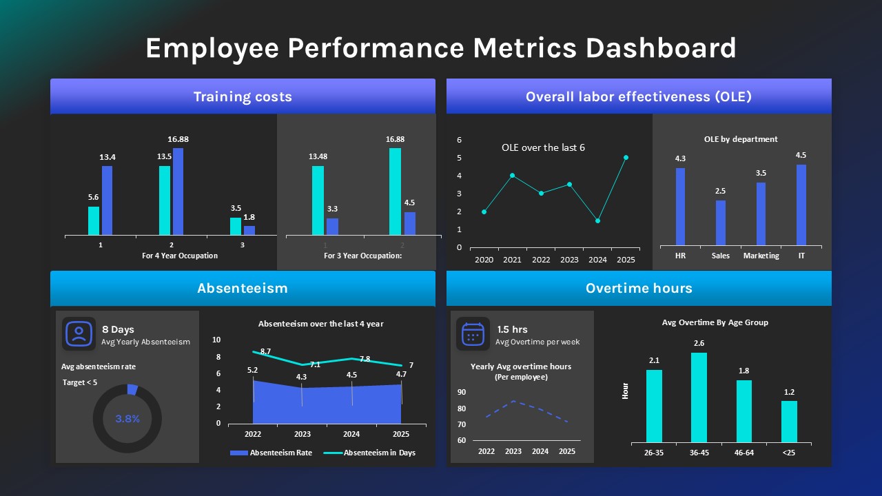
Employee Performance Metrics Dashboard PowerPoint Template
Employee Performance
Google Ads Presentation PowerPoint Template
Digital Marketing
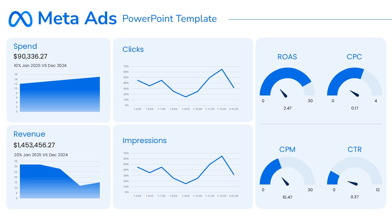
Meta Ads Report PowerPoint Template
Advertising
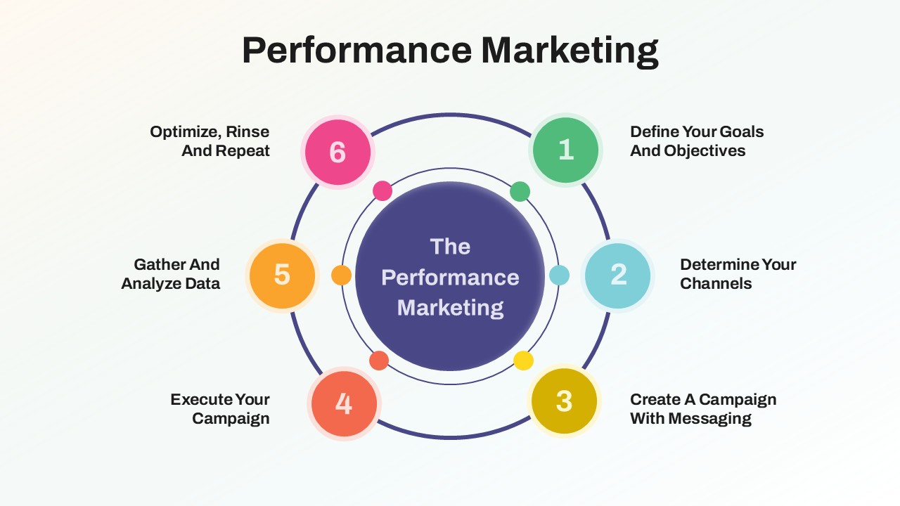
Performance Marketing Strategy template
Digital Marketing
LinkedIn Reporting Dashboard Template
Digital Marketing
Learning Curve Performance Growth Chart Template for PowerPoint & Google Slides
Employee Performance
Drexler-Sibbet Team Performance Model Template for PowerPoint & Google Slides
Business Strategy