Excel-Driven Gradient Timeline Chart Template for PowerPoint & Google Slides
Description
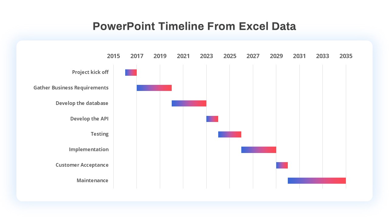
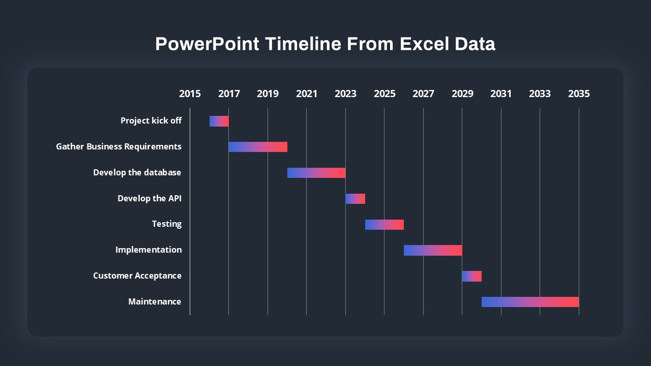
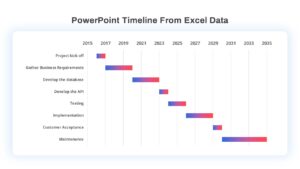
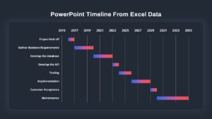
Leverage this Excel-driven gradient timeline chart to visualize project phases and milestones with precision and style. This fully editable slide imports date-driven data from Excel and renders each task bar in a smooth blue-to-red gradient, mapped against year markers from 2015 to 2035. Adjustable vector bars, gridlines, and labels ensure seamless integration with your brand palette and enable you to highlight kickoff, development, testing, implementation, and maintenance phases.
Built on PowerPoint and Google Slides master layouts, the slide preserves chart formatting and gradient fills across platforms. Simply update your Excel worksheet, refresh the data link in PowerPoint, or replace placeholder bars in Google Slides to reflect new timelines instantly. The clean white card background with subtle drop-shadow focuses attention on the gradient bars and descriptive labels, making complex schedules easy to scan at a glance.
Ideal for stakeholder briefings, strategic roadmaps, and progress reports, this timeline chart supports live data updates and custom date ranges. Add or remove tasks, adjust bar lengths, or tweak axis intervals to match any project scope. With its combination of data-driven accuracy and polished design, this template elevates your presentations and streamlines schedule communication.
Who is it for
Project managers, business analysts, product owners, and PMO leads will benefit from this slide when tracking deliverables, communicating timelines, or aligning teams on milestones. Consultants, financial planners, and operations managers can also use it to map out roadmaps and resource plans.
Other Uses
Repurpose this layout for Gantt-style status reports, resource allocation charts, milestone tracking, or executive dashboards. Use the gradient bars to illustrate budget burn-down, risk assessment timelines, or multi-phase marketing campaigns.
Login to download this file

Item ID
SB03734
Related Templates

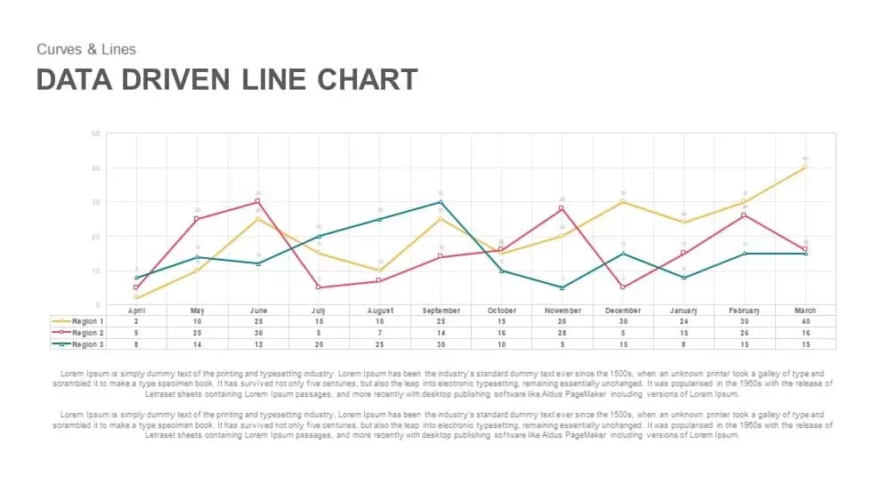
Data-Driven Line Chart Diagram Template for PowerPoint
Comparison Chart
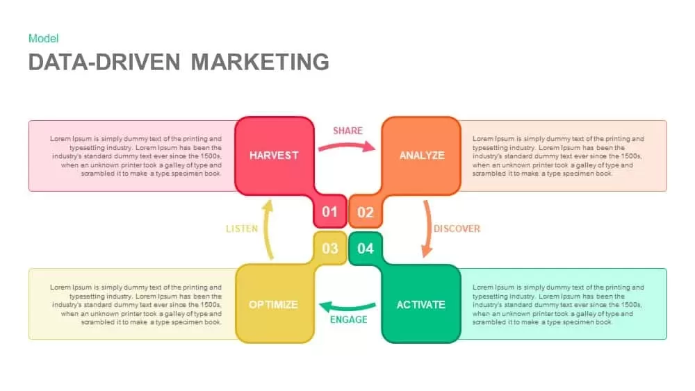
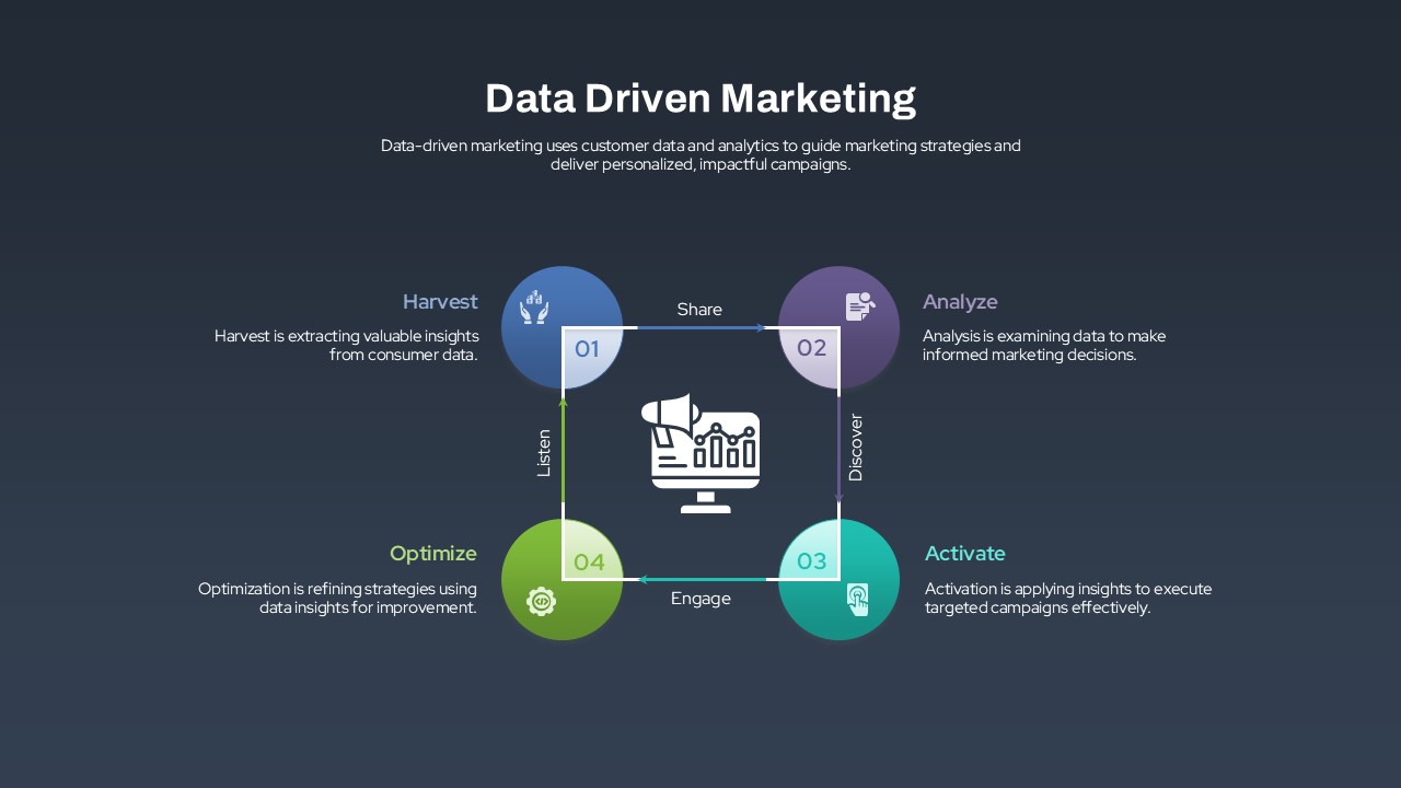
Data-Driven Marketing Cycle Diagram Template for PowerPoint & Google Slides
Customer Journey

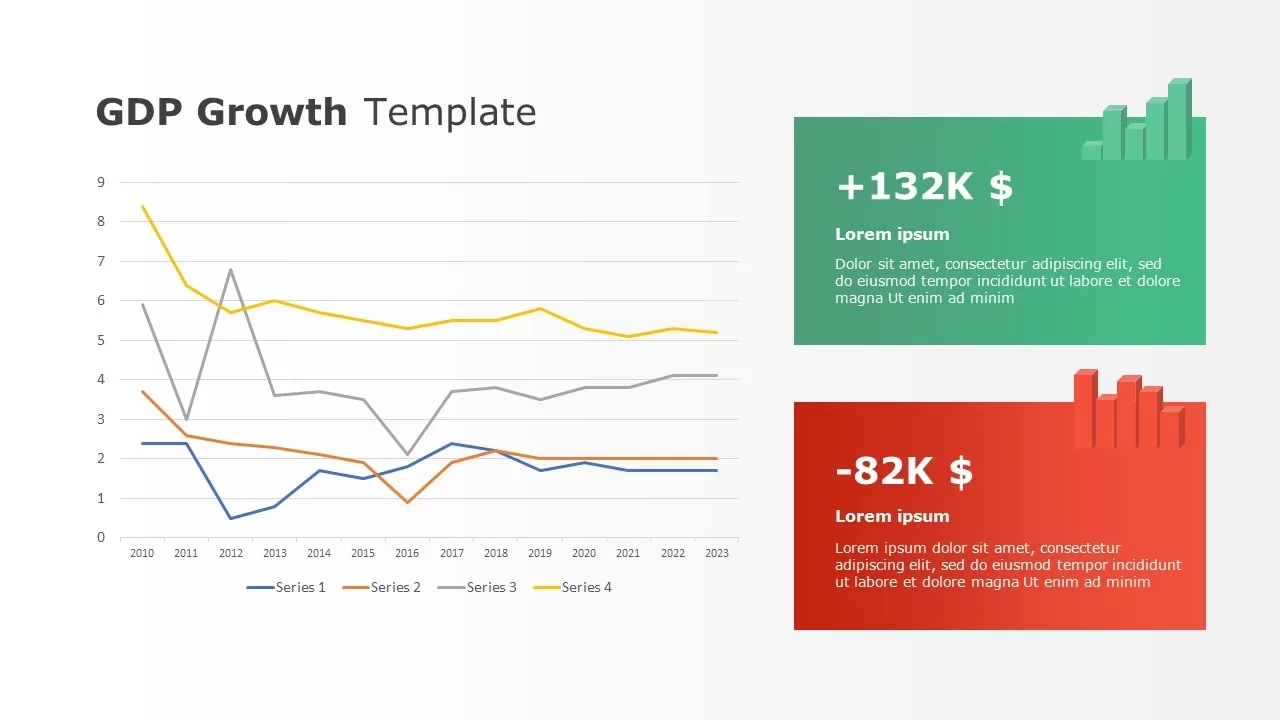
Data-driven GDP Growth Infographic Pack Template for PowerPoint & Google Slides
Infographics
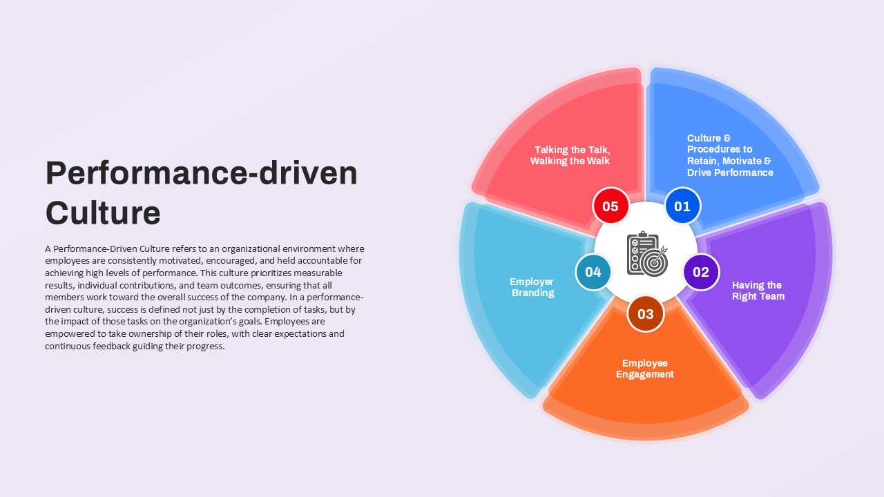
Performance-driven Culture framework template for PowerPoint & Google Slides
Leadership
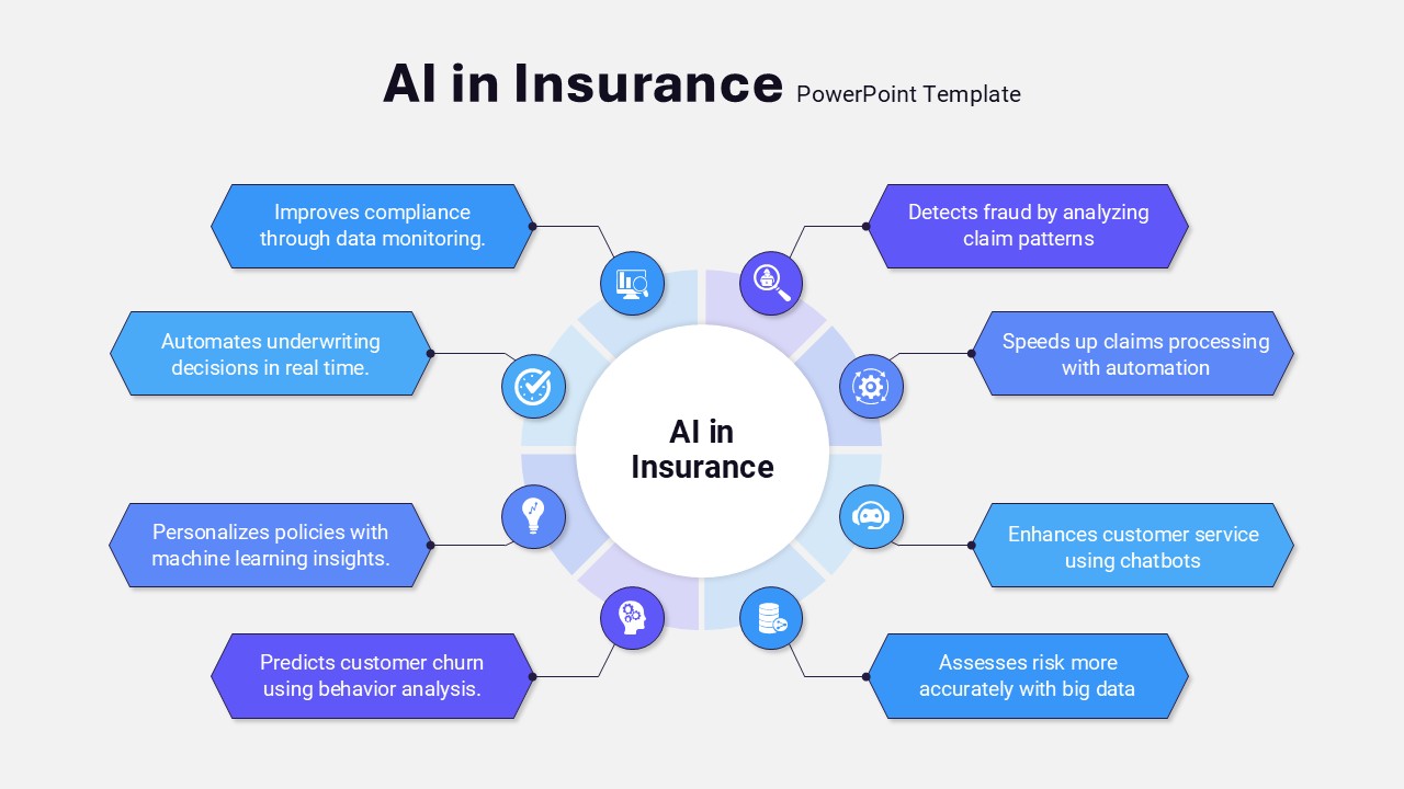
Data-Driven AI in Insurance Infographic Template for PowerPoint & Google Slides
Circular
Data-Driven Marketing Lifecycle Diagram Template for PowerPoint & Google Slides
Process
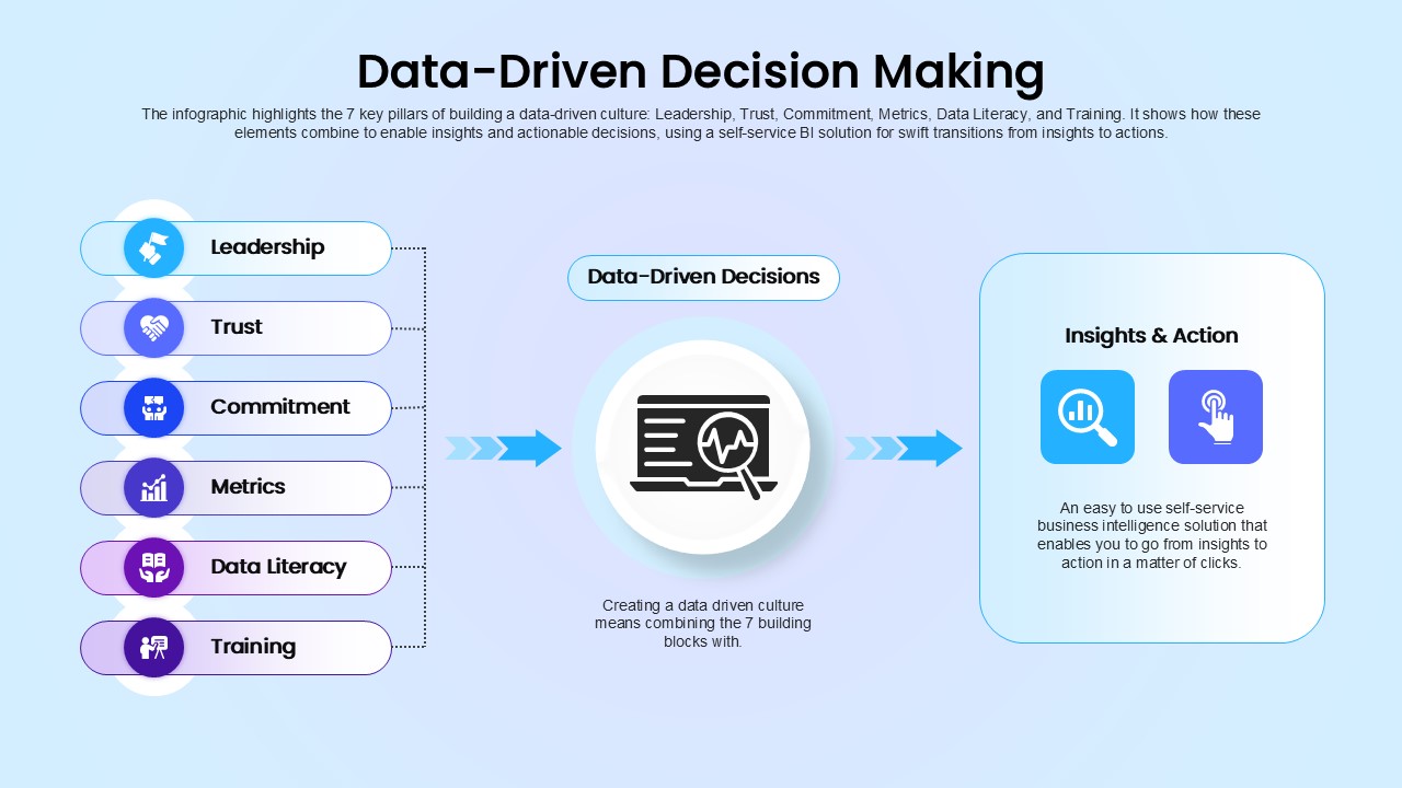
Data-Driven Decision Making overview template for PowerPoint & Google Slides
Business
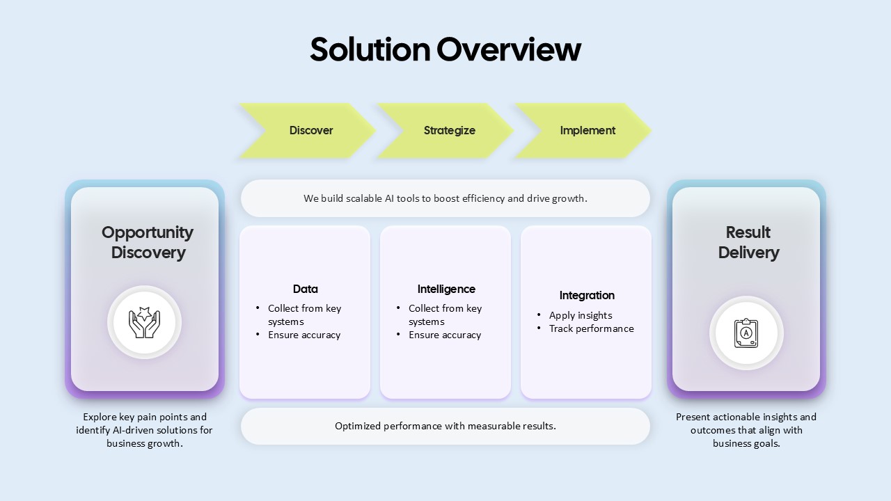
AI-Driven Solution Overview for PowerPoint & Google Slides
AI
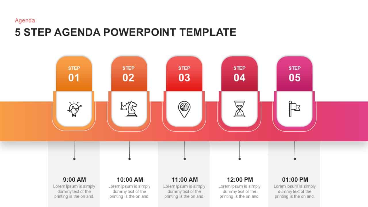
Five-Step Gradient Agenda Timeline Template for PowerPoint & Google Slides
Agenda
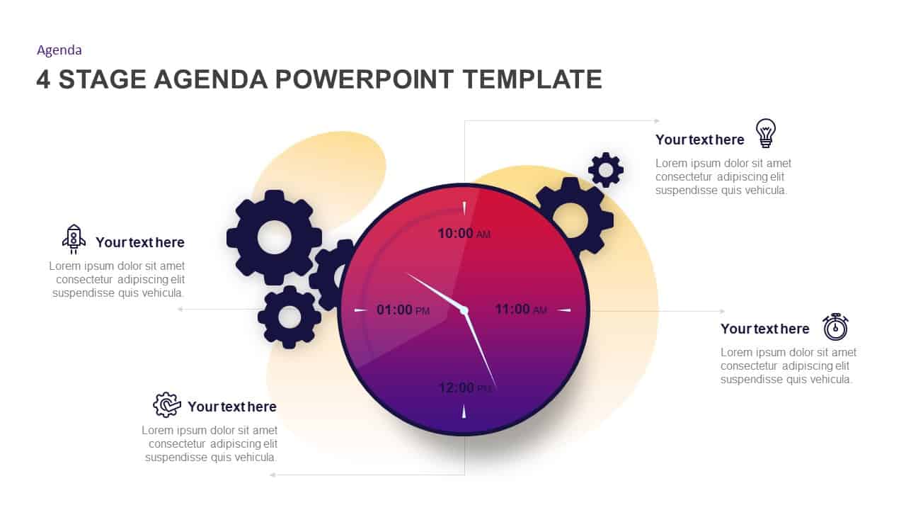
Gradient Clock Agenda Timeline Diagram Template for PowerPoint & Google Slides
Agenda
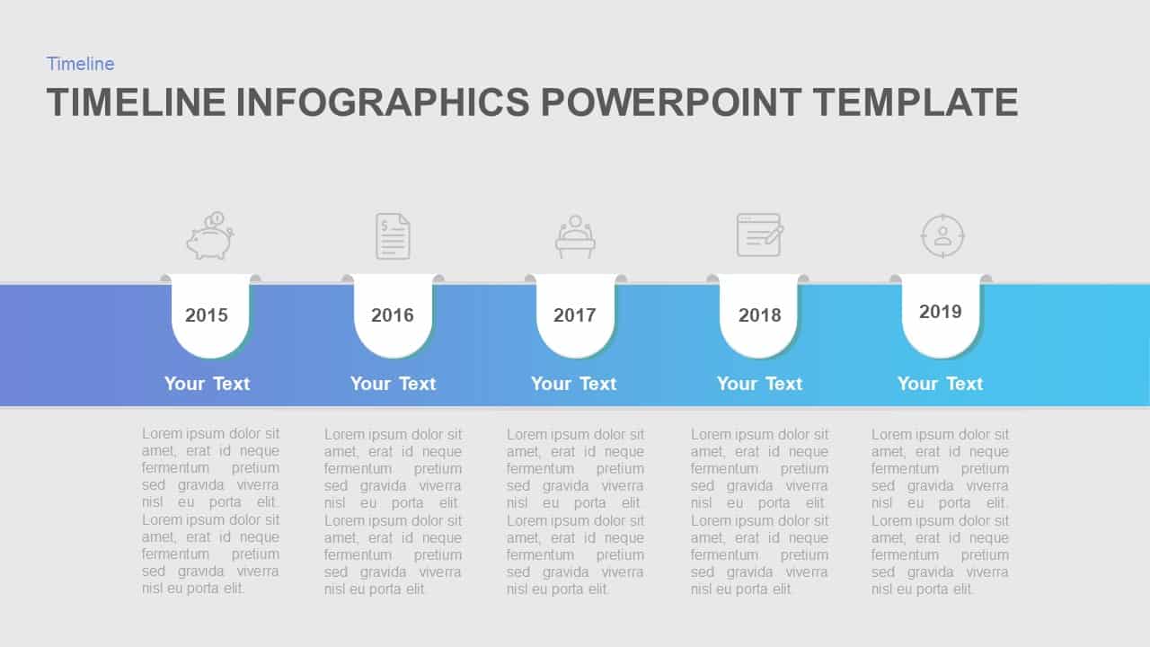
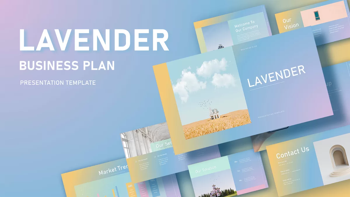
Five-Year Gradient Timeline Infographic Template for PowerPoint & Google Slides
Timeline
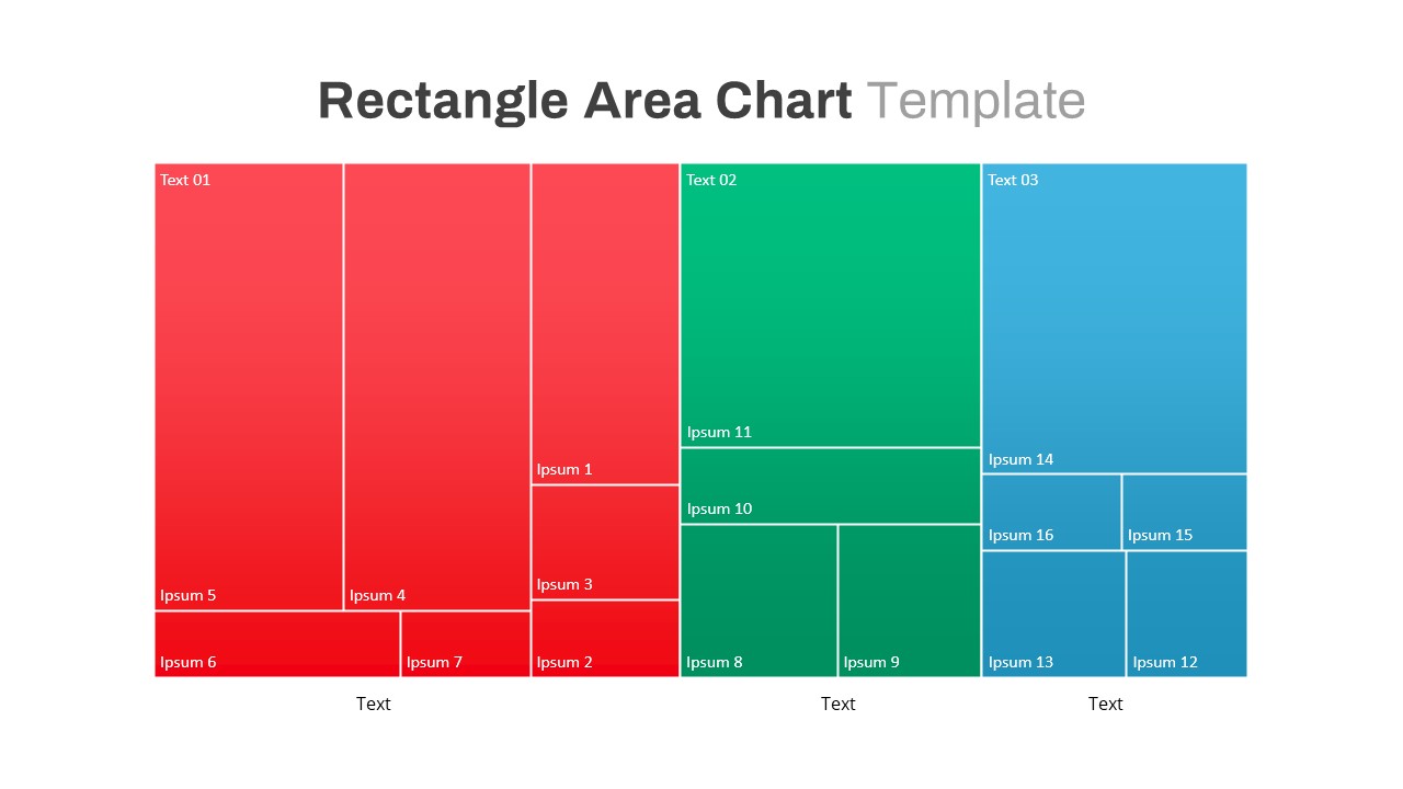
Rectangle Area Chart with Gradient Fill Template for PowerPoint & Google Slides
Comparison Chart

Free Modern Gradient Wave Welcome Slides Template for PowerPoint & Google Slides
Free
Free
Gradient 12-Point Agenda Slide Template for PowerPoint & Google Slides
Business Report
Gradient Seven-Stage Bubble Workflow Template for PowerPoint & Google Slides
Process
Gradient Ten-Step Flowchart Diagram Template for PowerPoint & Google Slides
Process
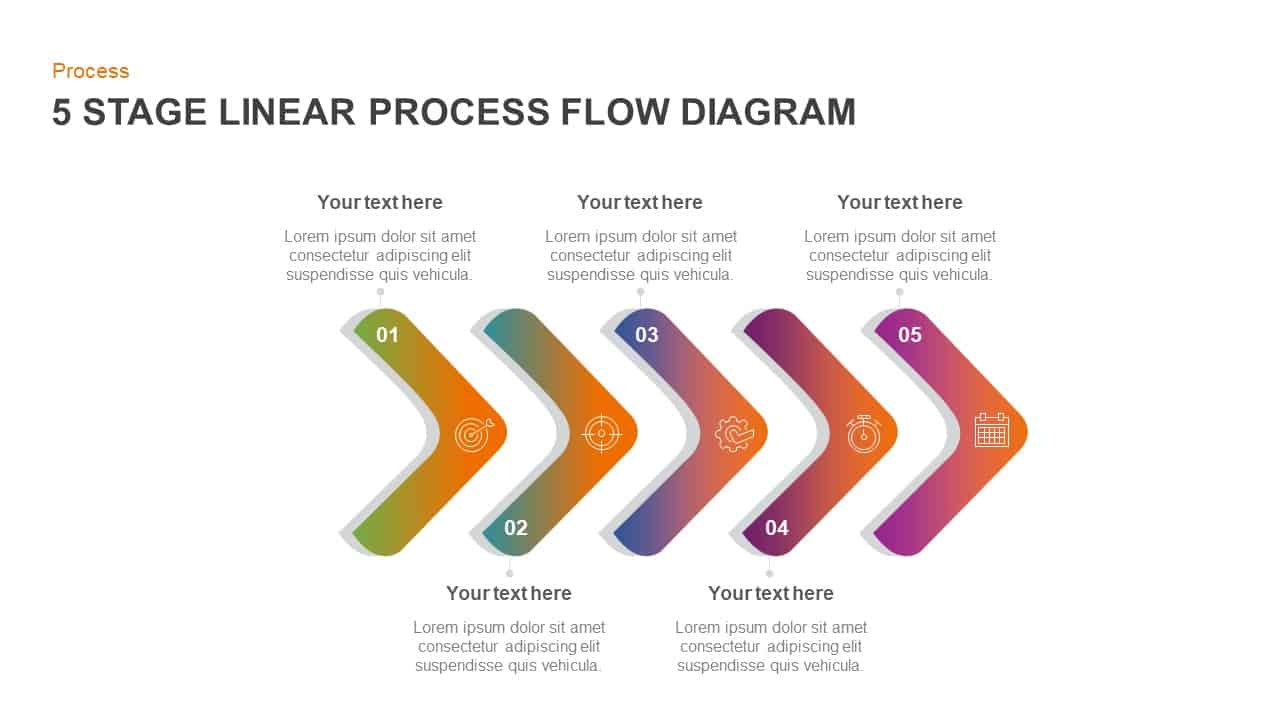
Gradient Chevron Five-Stage Process Flow Template for PowerPoint & Google Slides
Arrow
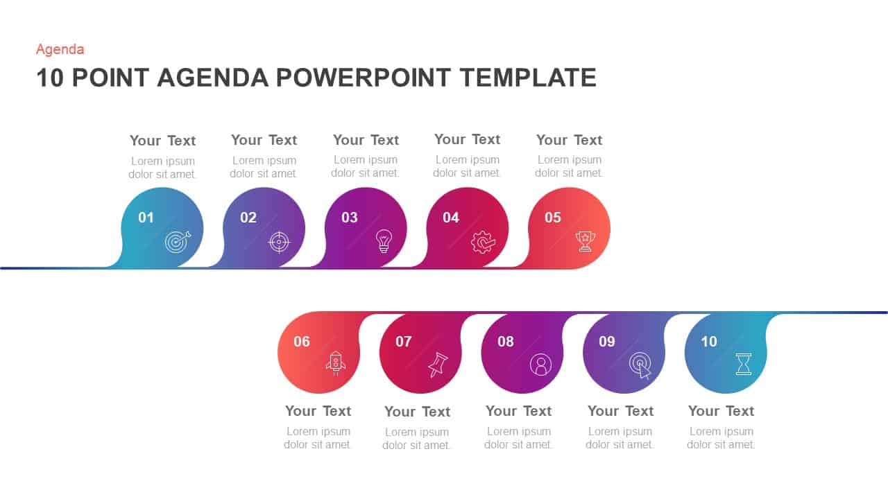
10-Point Gradient Agenda Flow Diagram Template for PowerPoint & Google Slides
Agenda
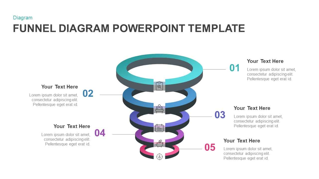
Gradient 5-Stage Funnel Infographic Template for PowerPoint & Google Slides
Funnel
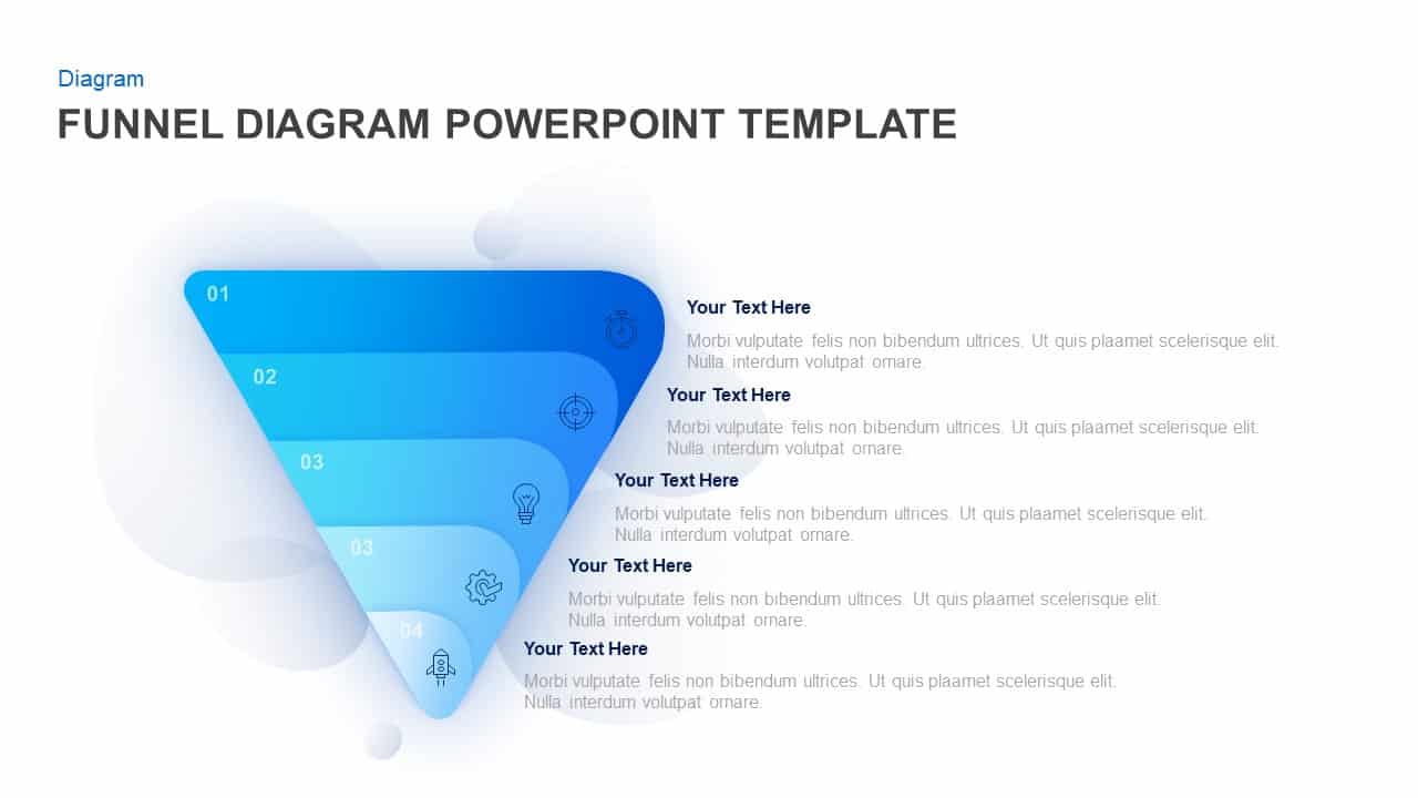
Five-Step Gradient Blue Funnel Diagram Template for PowerPoint & Google Slides
Funnel
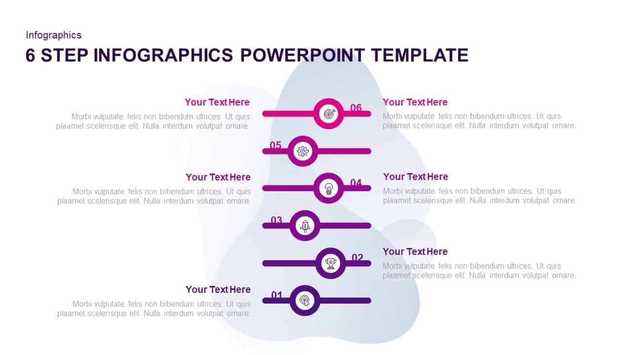
Six-Step Purple Gradient Infographics Template for PowerPoint & Google Slides
Process
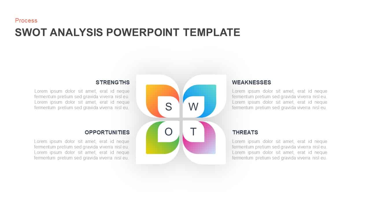
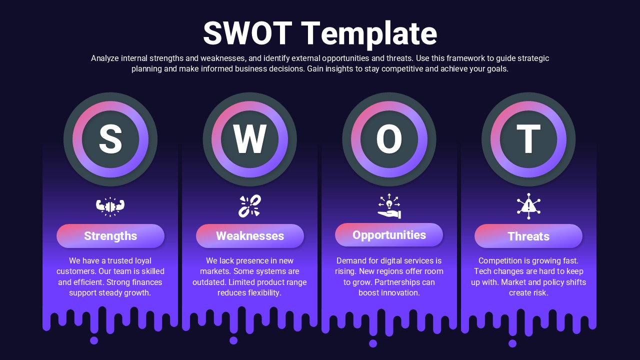
Gradient Petal SWOT Analysis Quadrant Template for PowerPoint & Google Slides
SWOT
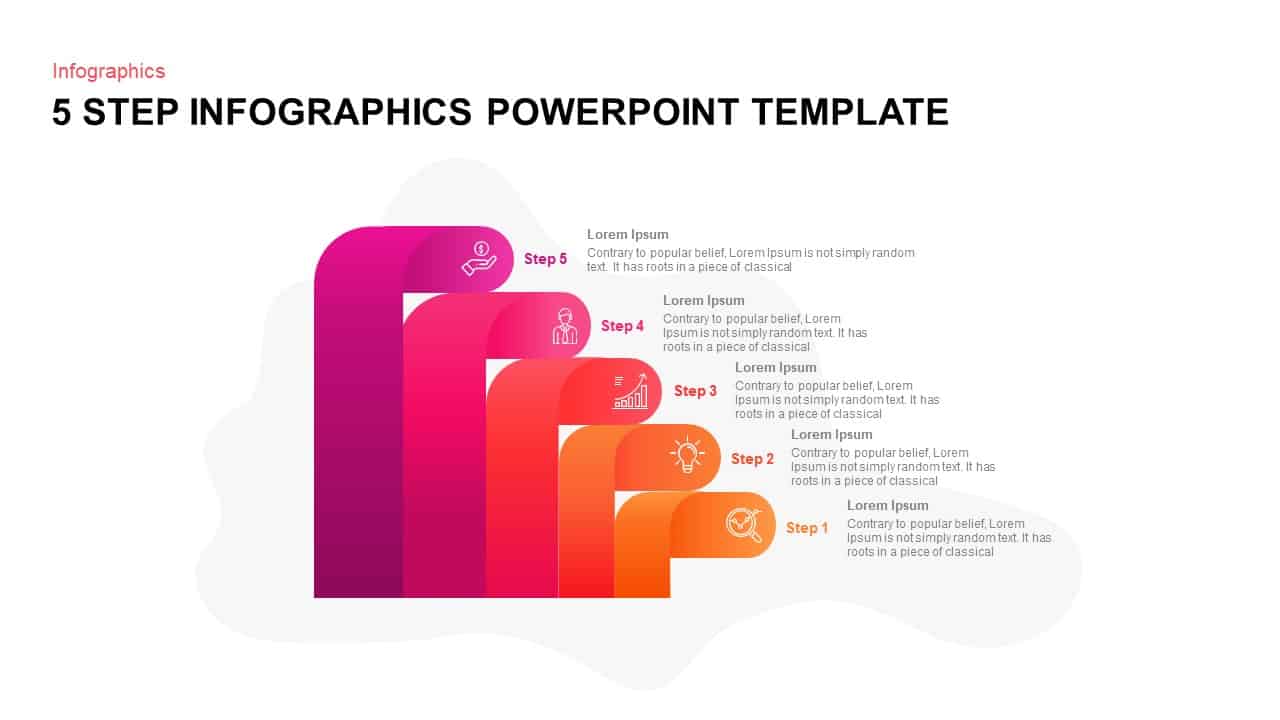
Gradient 5-Step Infographic Process Template for PowerPoint & Google Slides
Process
Gradient Business Company Profile Template for PowerPoint & Google Slides
Company Profile
Gradient Annual Plan & Strategy Deck Template for PowerPoint & Google Slides
Decks
5-Step Circular Gradient Process Flow Template for PowerPoint & Google Slides
Process
Purple Gradient Company Profile Deck Template for PowerPoint & Google Slides
Company Profile
Gradient Company Profile Presentation Template for PowerPoint & Google Slides
Company Profile
Cybersecurity Dark Gradient Presentation Template for PowerPoint & Google Slides
Company Profile
Gradient SWOT Quadrant Diagram Template for PowerPoint & Google Slides
SWOT
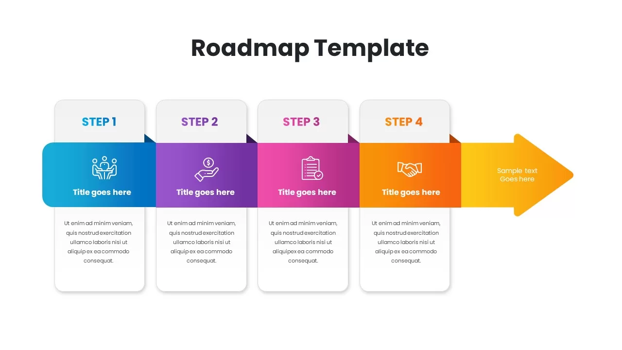
Gradient Four-Step Roadmap Diagram Template for PowerPoint & Google Slides
Roadmap
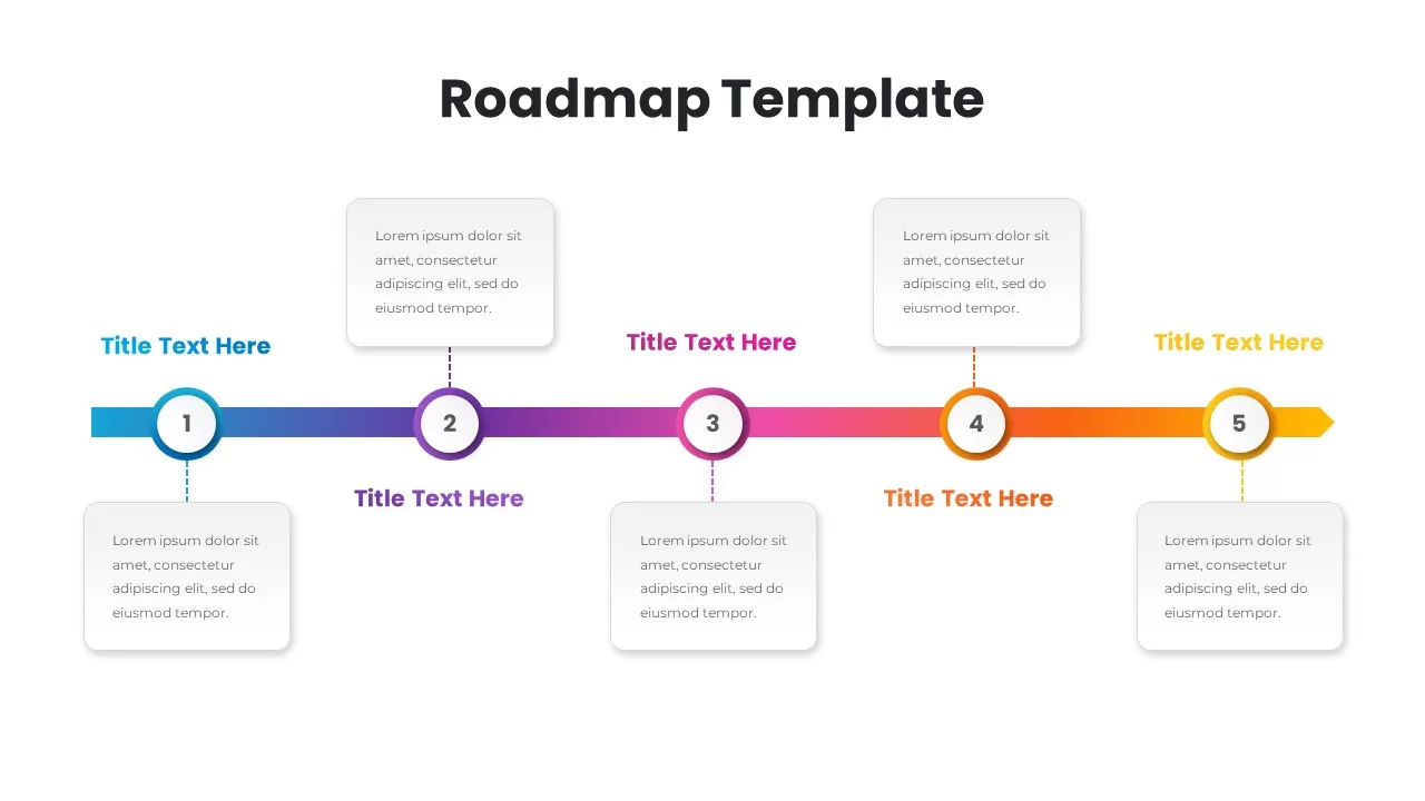
Gradient Five-Step Roadmap Diagram Template for PowerPoint & Google Slides
Roadmap
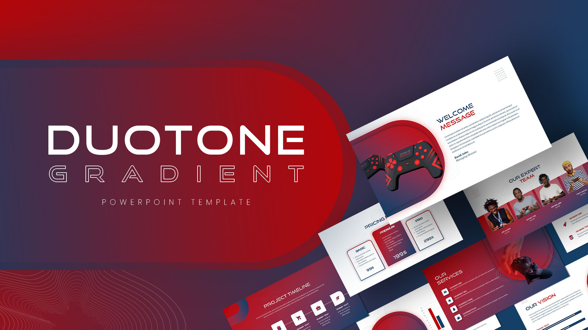
Duotone Gradient PowerPoint & Google Slides Template for Presentations
Technology
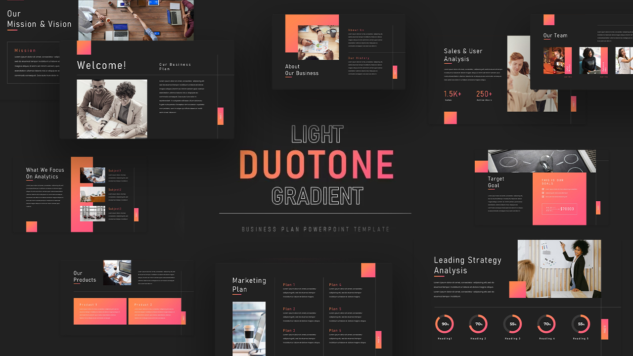
Light Duotone Gradient Business Plan PowerPoint & Google Slides Template
Company Profile

Gradient Business Plan Presentation Template for PowerPoint & Google Slides
Business Plan
Gradient Cloud Computing Dark Cover Template for PowerPoint & Google Slides
Pitch Deck
FinTech Industry Gradient Cover Template for PowerPoint & Google Slides
Pitch Deck
Modern Gradient Startup Pitch Deck Template for PowerPoint & Google Slides
Pitch Deck
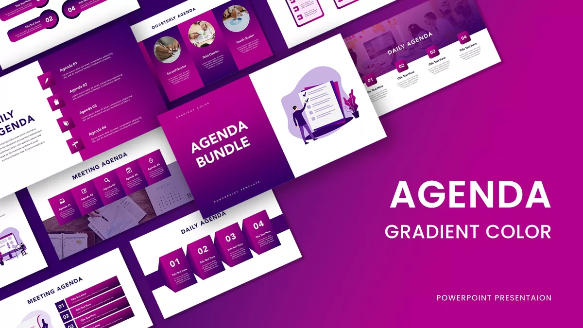
Gradient Color Agenda Slide Bundle Template for PowerPoint & Google Slides
Agenda
Modern Gradient Business Plan Deck Template for PowerPoint & Google Slides
Pitch Deck
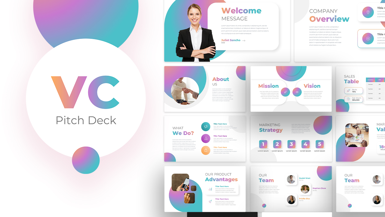
Vibrant Gradient VC Pitch Deck Template for PowerPoint & Google Slides
Pitch Deck
Gradient Business Strategy Pitch Deck Template for PowerPoint & Google Slides
Pitch Deck
Gradient Triangle Business Plan Deck Template for PowerPoint & Google Slides
Business Plan
IoT Technology Gradient Presentation Template for PowerPoint & Google Slides
Information Technology
Success Marketing Gradient Pamphlet Template for PowerPoint & Google Slides
Marketing
Finance Pitch Deck Template with Green Gradient for PowerPoint & Google Slides
Pitch Deck
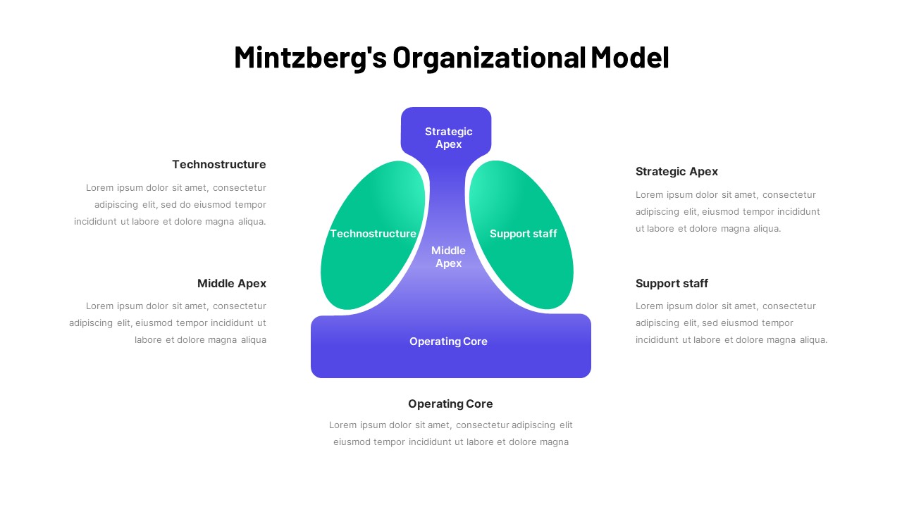
Mintzberg Organizational Model Gradient Template for PowerPoint & Google Slides
Business
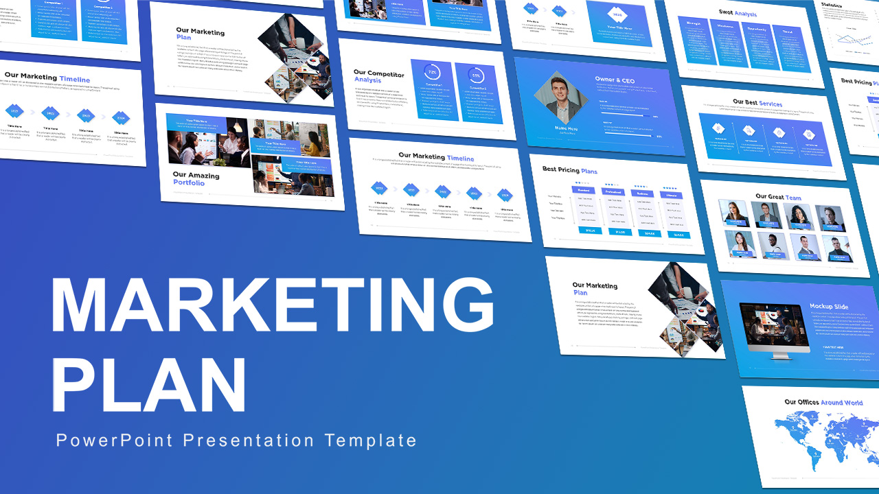
Free Blue Gradient Marketing Plan Slide Deck Template for PowerPoint & Google Slides
Marketing
Free
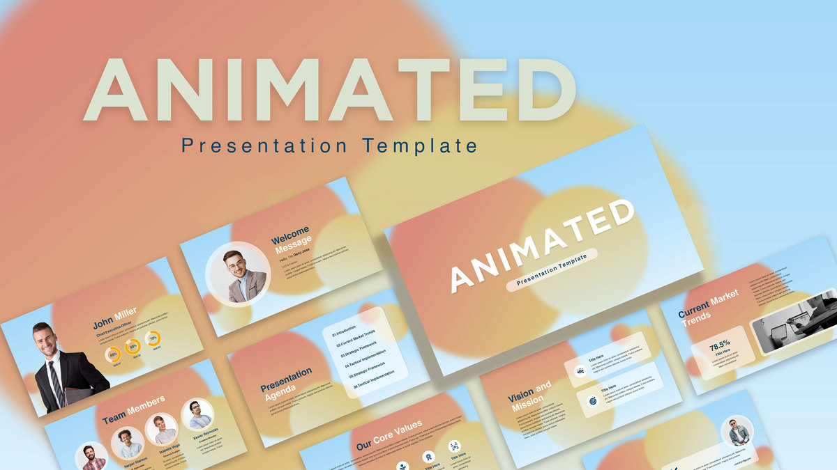
Free Animated Gradient Corporate Presentation Template for PowerPoint & Google Slides
Company Profile
Free
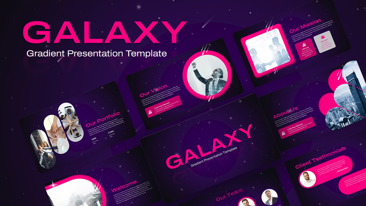
Galaxy Gradient Presentation Template for PowerPoint & Google Slides
Company Profile
Abstract Geometric Gradient Presentation Template for PowerPoint & Google Slides
Pitch Deck
Abstract Gradient Presentation Template for PowerPoint & Google Slides
Pitch Deck
Free Futuristic Neon Gradient Presentation Template for PowerPoint & Google Slides
Pitch Deck
Free
Free Gradient Seminar Workshop Template for PowerPoint & Google Slides
Free
Free
Cyber Security Dark Blue Gradient Template for PowerPoint & Google Slides
Information Technology
Pink Floral Gradient Background Template for PowerPoint & Google Slides
Graphics
Watercolor Splash Gradient Presentation Template for PowerPoint & Google Slides
Pitch Deck
Abstract Dark Gradient Presentation Template for PowerPoint & Google Slides
Pitch Deck
Green Organic Gradient Background Template for PowerPoint & Google Slides
Company Profile
Free Event Management Gradient Template for PowerPoint & Google Slides
Company Profile
Free
AI & Future of Work Gradient Cover Slide Template for PowerPoint & Google Slides
AI
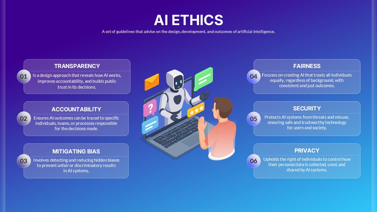
Dark AI Ethics Gradient Diagram Template for PowerPoint & Google Slides
Infographics
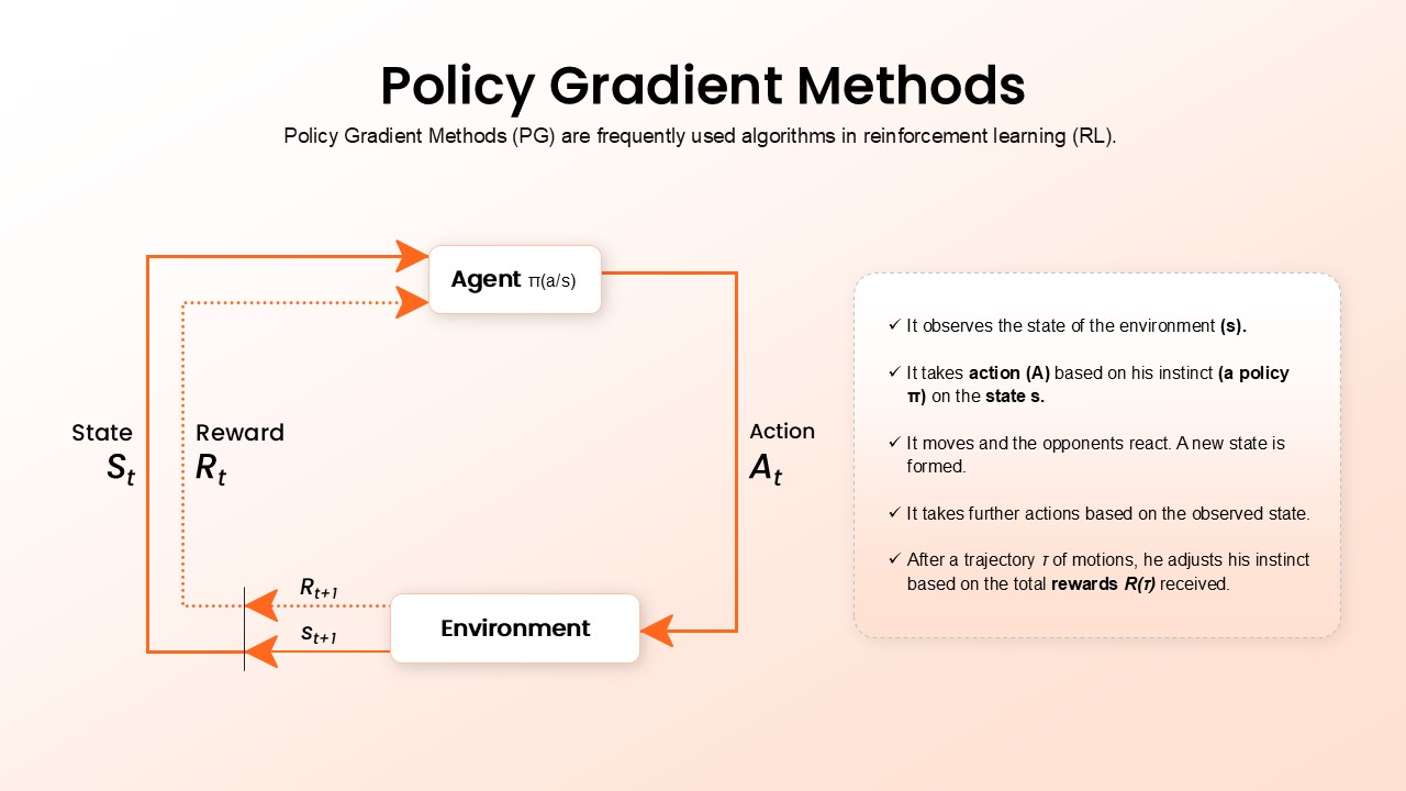
Policy Gradient Methods Flow Diagram Template for PowerPoint & Google Slides
AI
Neon Gradient SWOT Business Template for PowerPoint & Google Slides
SWOT

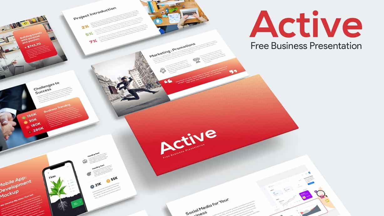
Active Gradient Business Pitch Deck for PowerPoint & Google Slides
Pitch Deck
Free
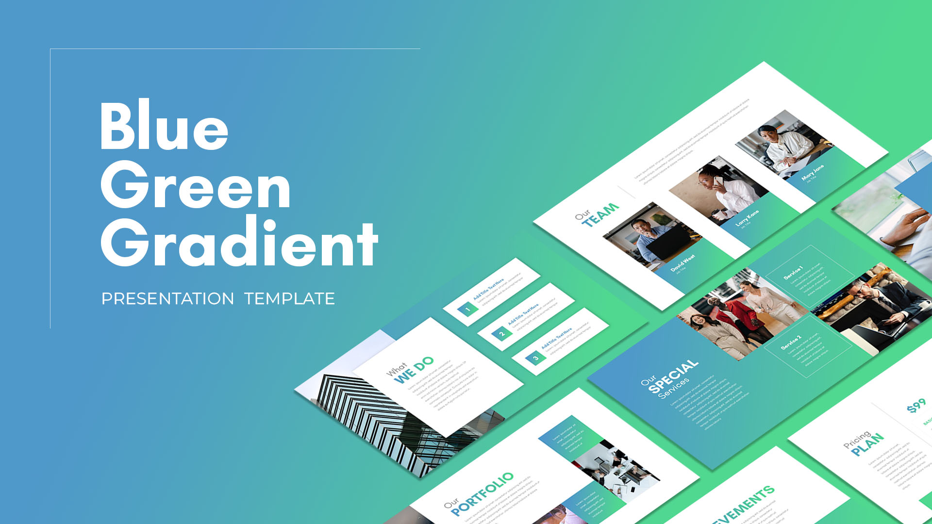
Blue Green Gradient Presentation for PowerPoint & Google Slides
Company Profile
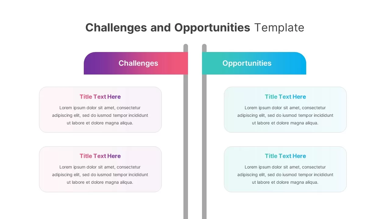
Gradient Challenges and Opportunities Slide for PowerPoint & Google Slides
Opportunities Challenges
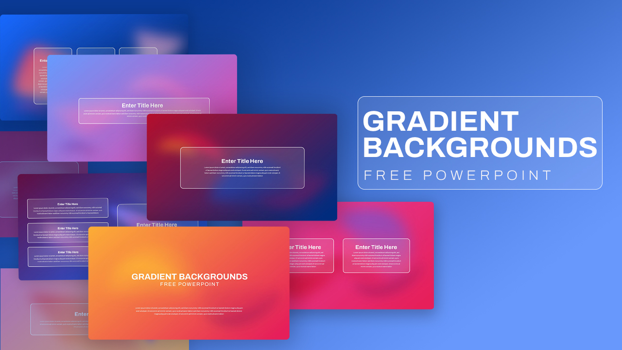
Free Gradient Backgrounds Presentation for PowerPoint & Google Slides
Graphics
Free
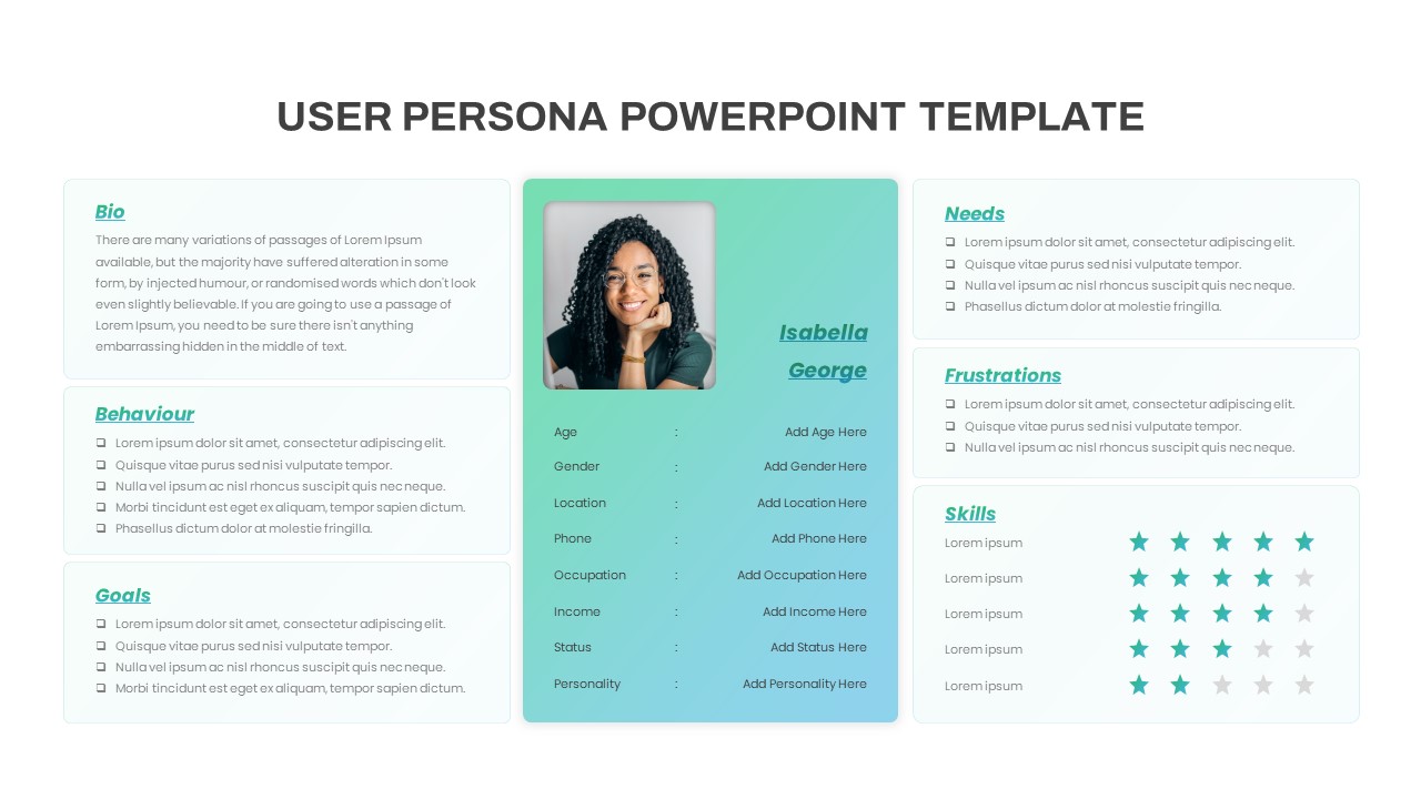
Free Gradient User Persona Profile Slide for PowerPoint & Google Slides
Recruitment
Free
Vibrant Abstract Gradient Theme for PowerPoint & Google Slides
Decks
Fintech Gradient Slide Deck for PowerPoint & Google Slides
Decks
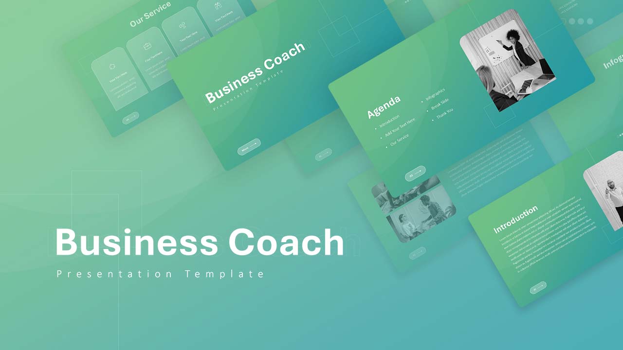
Business Coach Gradient Deck for PowerPoint & Google Slides
Business

Gradient Abstract Business Deck for PowerPoint & Google Slides
Decks
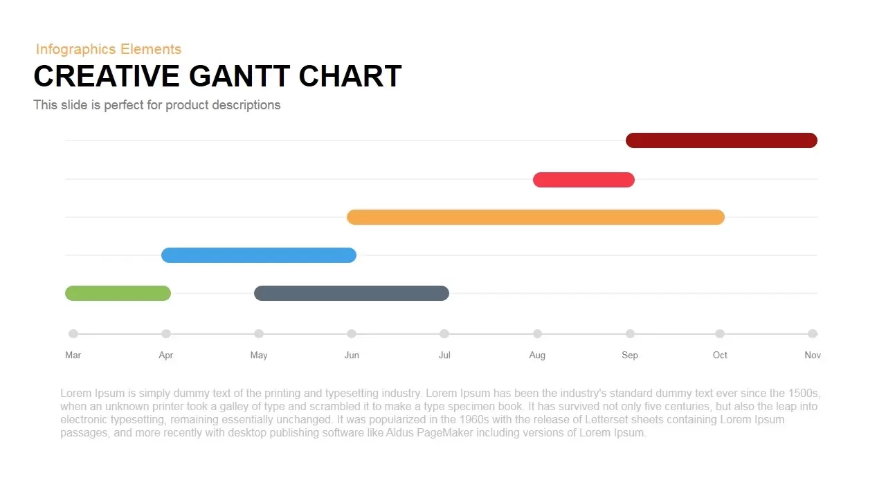
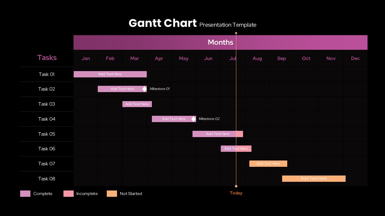
Creative Dynamic Gantt Chart Timeline Template for PowerPoint & Google Slides
Timeline

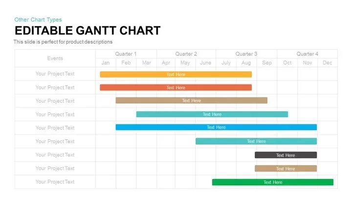
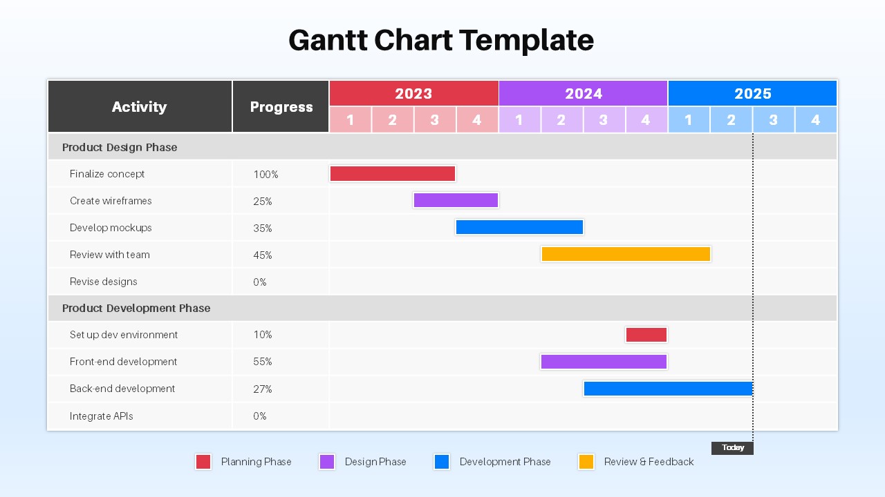
Fully Editable Gantt Chart Timeline template for PowerPoint & Google Slides
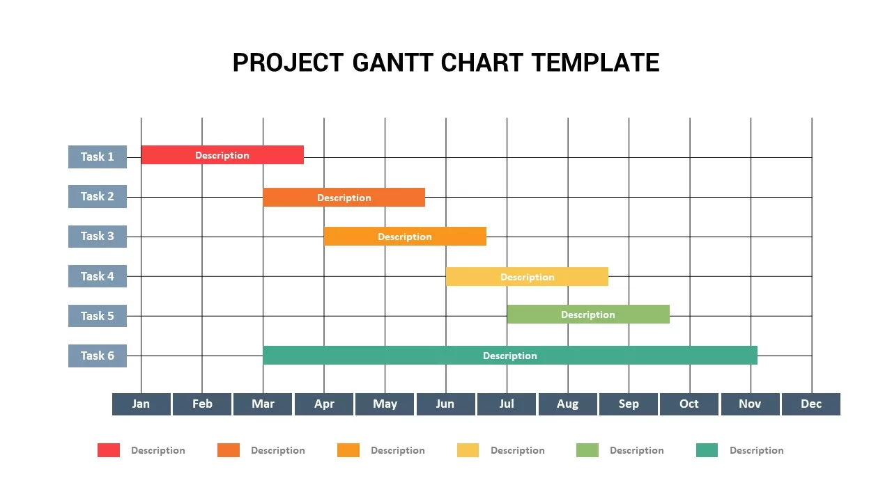
Gantt Chart

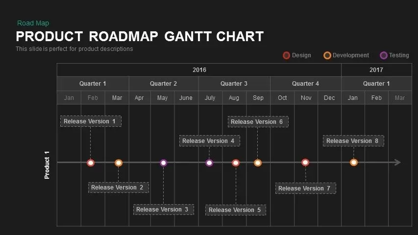
Product Roadmap Gantt Chart Timeline template for PowerPoint & Google Slides
Gantt Chart
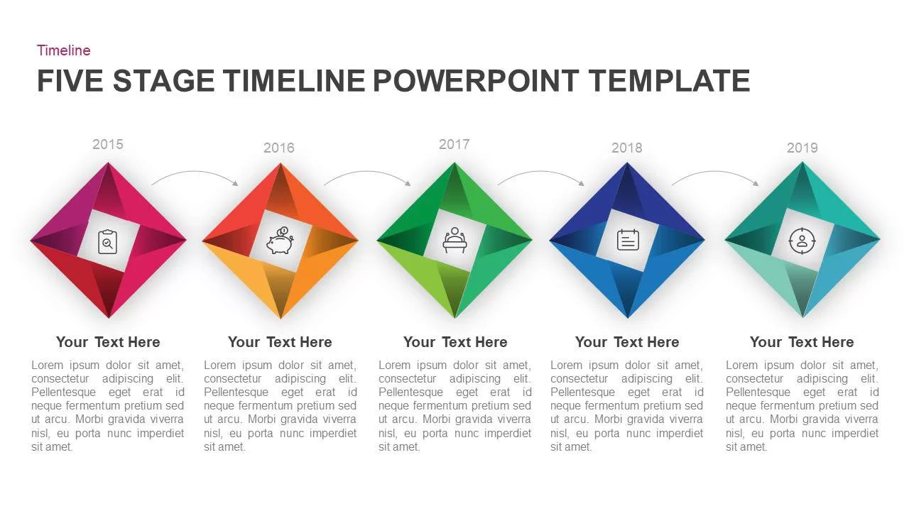
Five-Stage Diamond Timeline Chart Template for PowerPoint & Google Slides
Timeline
Interactive Project Gantt Chart Timeline Template for PowerPoint & Google Slides
Gantt Chart
Annual Project Gantt Chart Timeline Template for PowerPoint & Google Slides
Gantt Chart
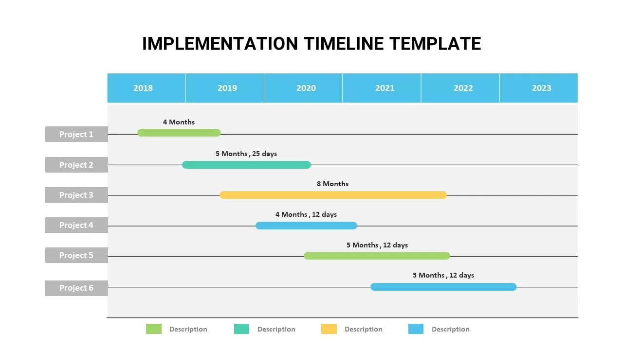
Animated Implementation Timeline Chart Template for PowerPoint & Google Slides
Timeline
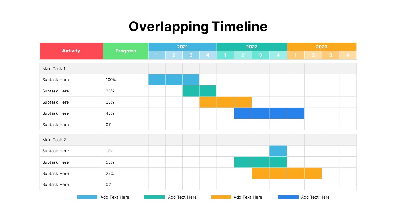
Overlapping Timeline Gantt Chart Diagram Template for PowerPoint & Google Slides
Timeline
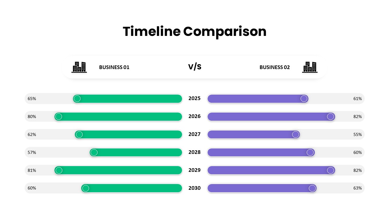
Business Timeline Comparison Bar Chart Template for PowerPoint & Google Slides
Comparison Chart
Five-Phase Horizontal Timeline Chart Template for PowerPoint & Google Slides
Timeline
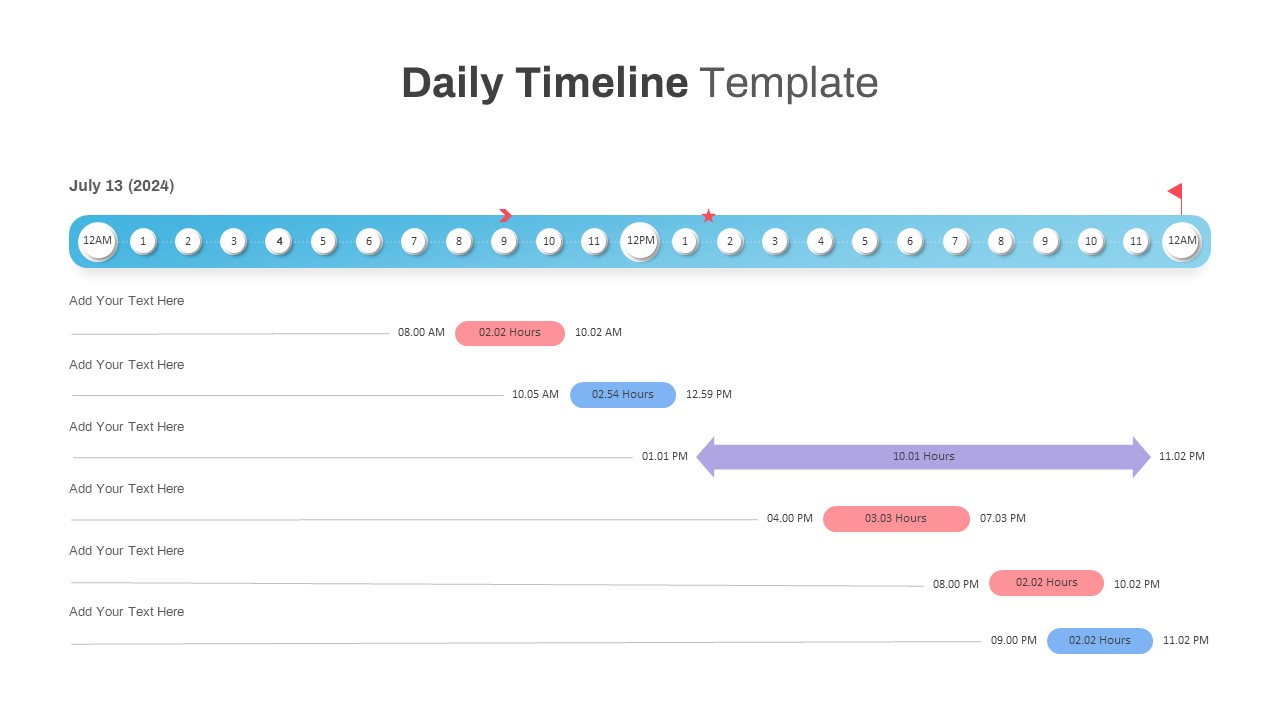
Interactive Daily Timeline Schedule Chart Template for PowerPoint & Google Slides
Timeline
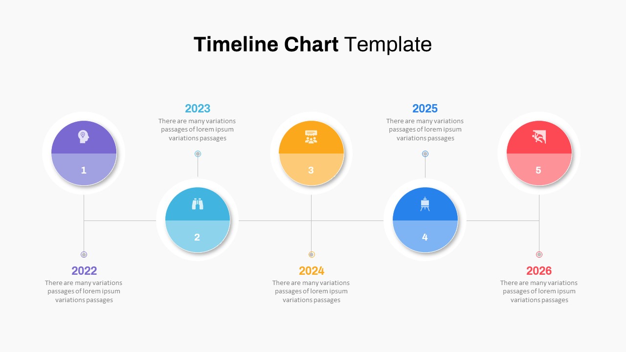
Professional Milestone Timeline Chart Template for PowerPoint & Google Slides
Timeline
Project Tracker Timeline Gantt Chart Template for PowerPoint & Google Slides
Project Status
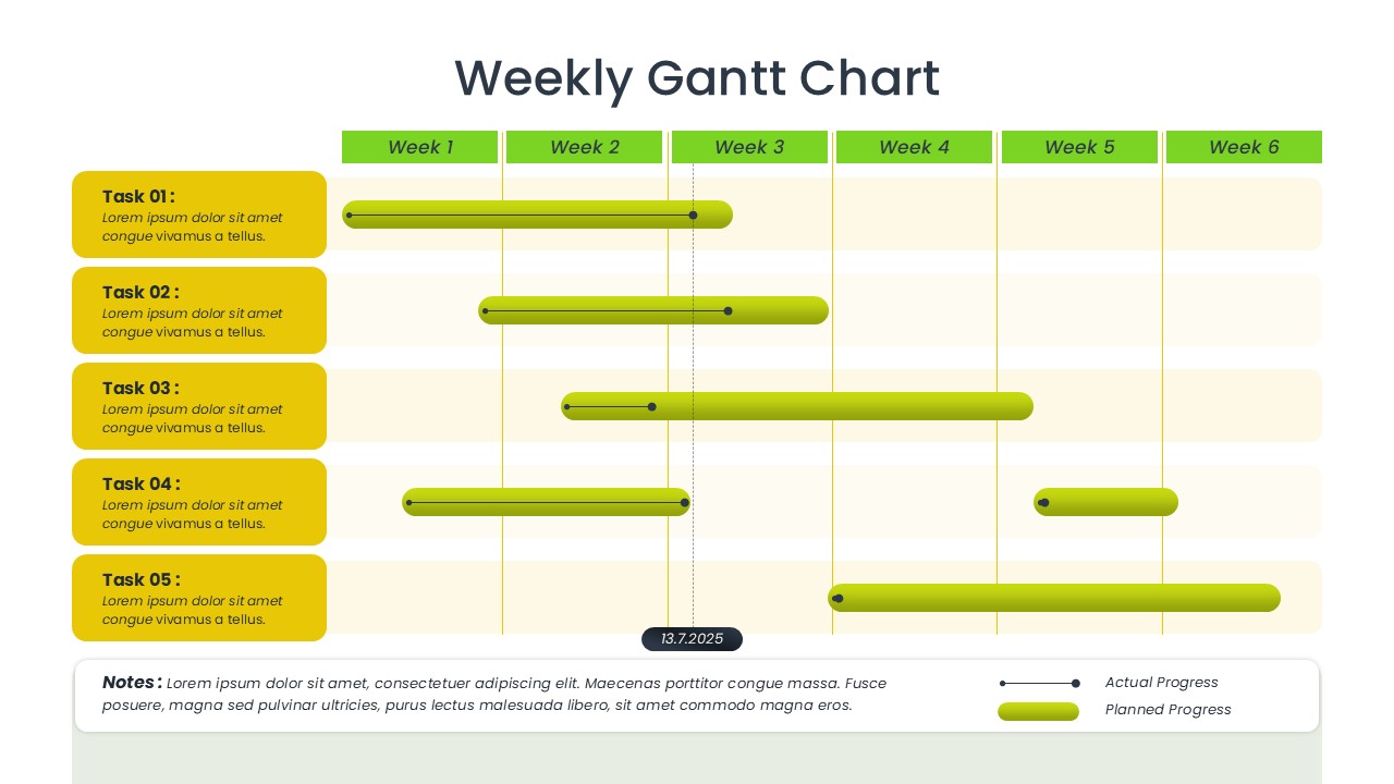
Weekly Gantt Chart Project Timeline Template for PowerPoint & Google Slides
Gantt Chart
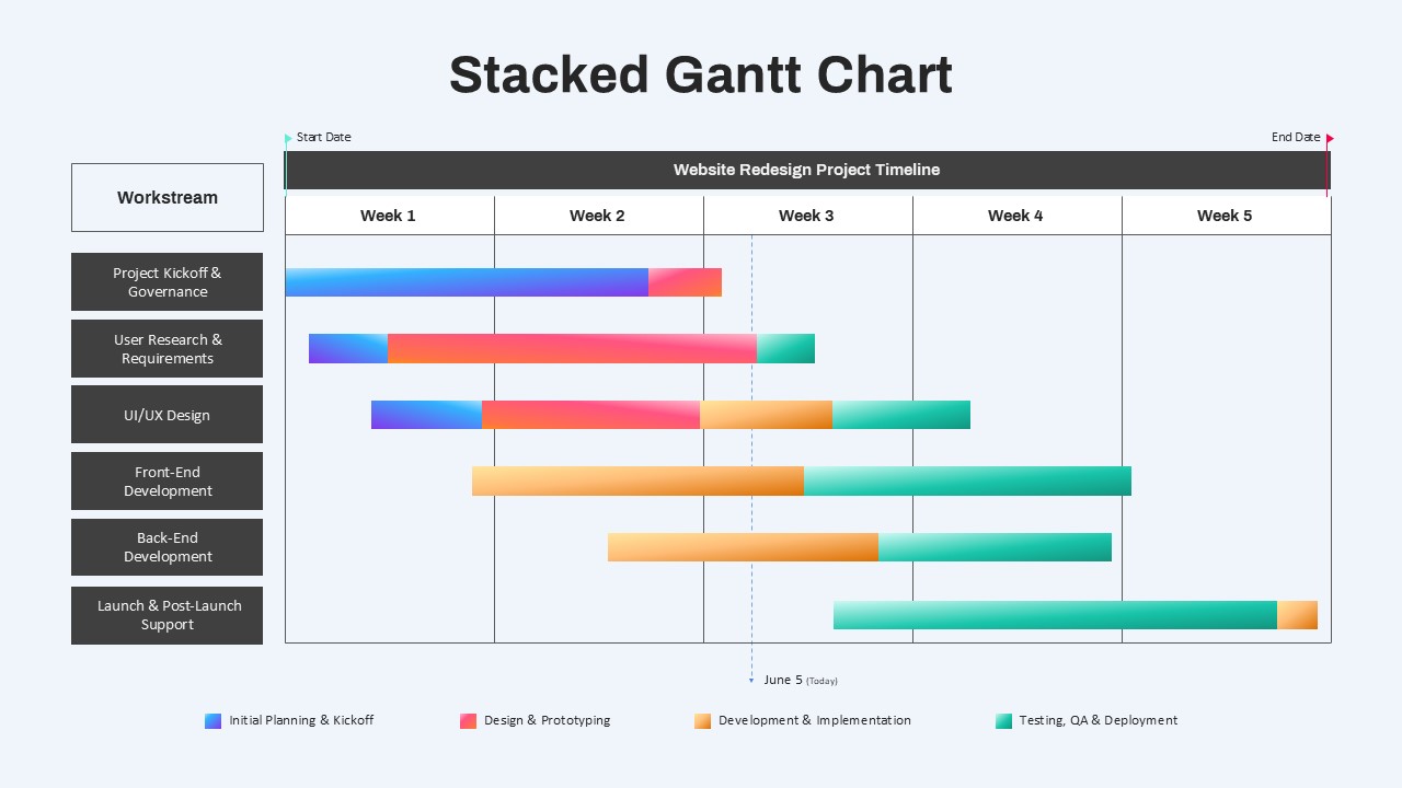
Stacked Gantt Chart Timeline Slide Template for PowerPoint & Google Slides
Gantt Chart
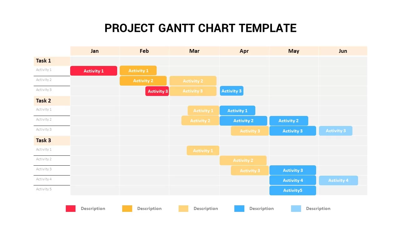
Project Timeline Gantt Chart Template for PowerPoint & Google Slides
Gantt Chart
7 Step 6 Month Gantt Chart Timeline Template for PowerPoint & Google Slides
Gantt Chart
Colorful Annual Gantt Chart Timeline Template for PowerPoint & Google Slides
Gantt Chart
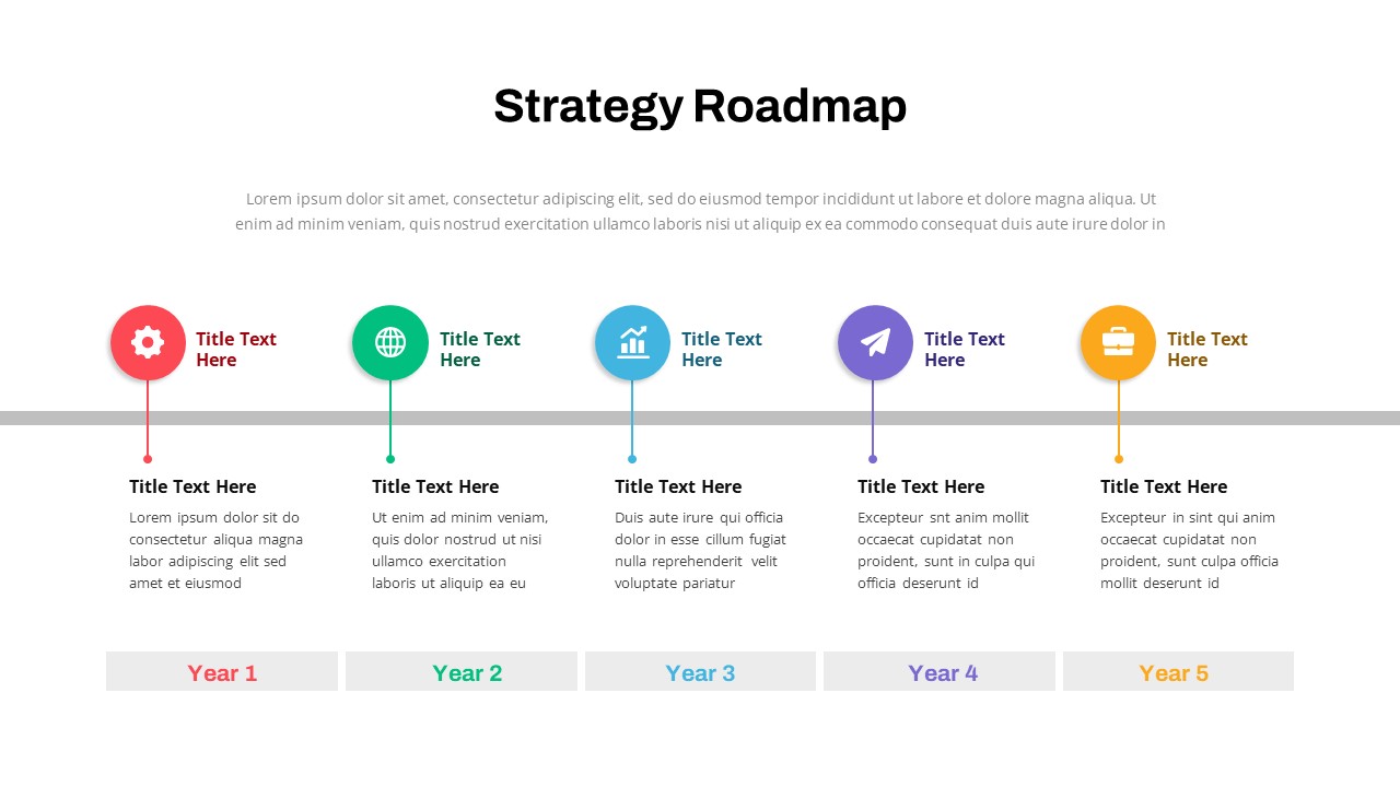
Strategy Roadmap Timeline Slides Template for PowerPoint & Google Slides
Roadmap
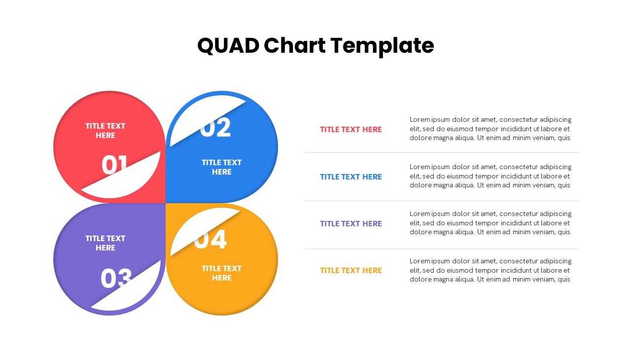
Quad Chart Infographic Pack of 8 Slides Template for PowerPoint & Google Slides
Comparison Chart
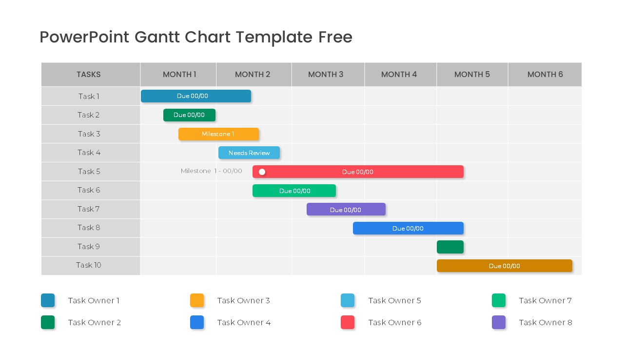
Free Professional Gantt Chart Pack – 4 Slides Template for PowerPoint & Google Slides
Gantt Chart
Free
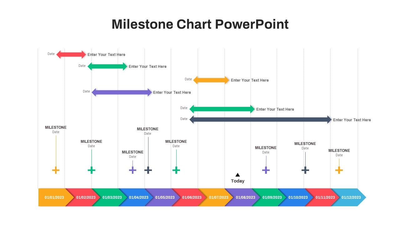
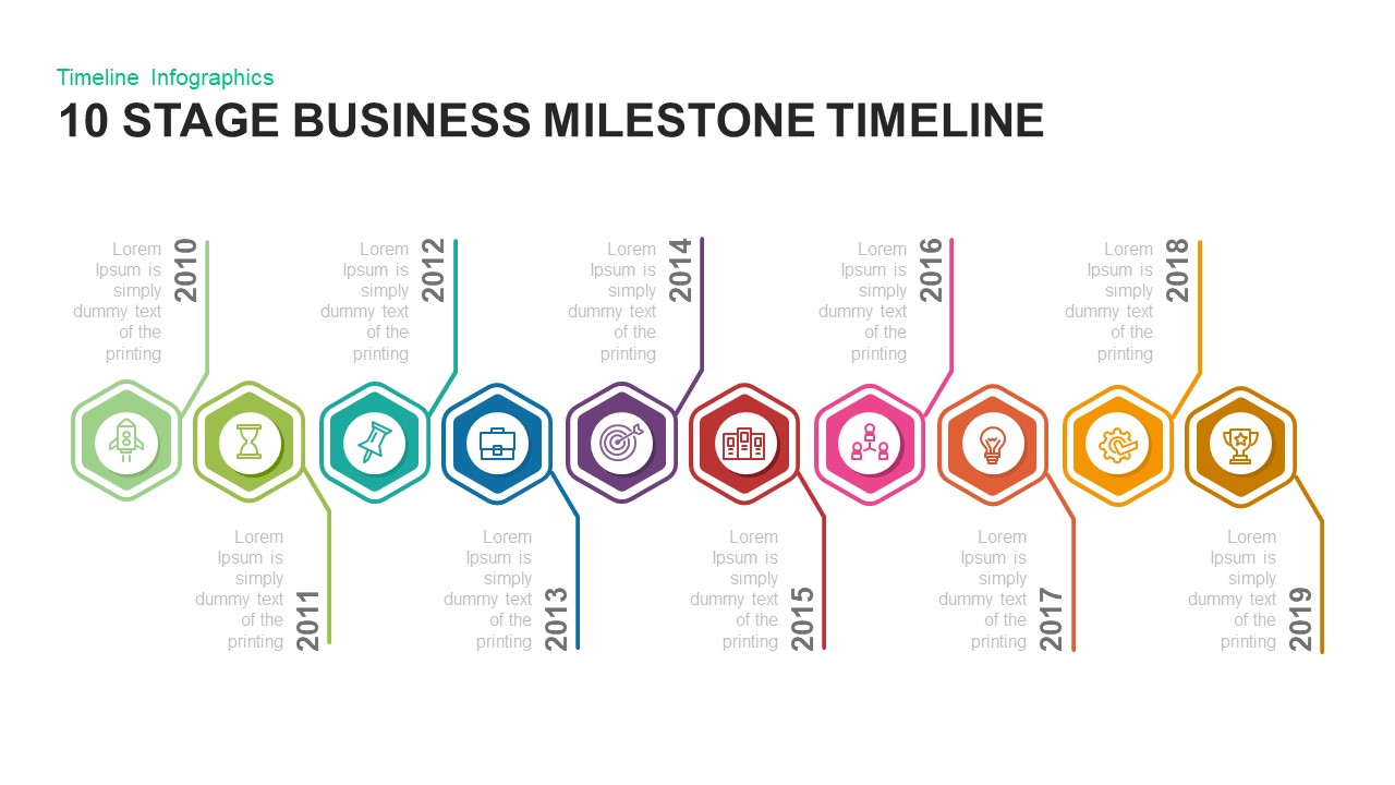
10 Stage Business Milestone Timeline PowerPoint Template for PowerPoint & Google Slides
Timeline
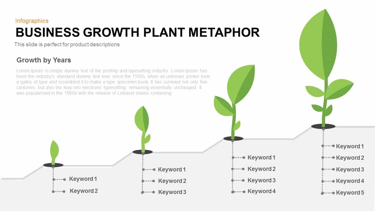
Business Growth Plant Metaphor Timeline Template for PowerPoint & Google Slides
Business Strategy
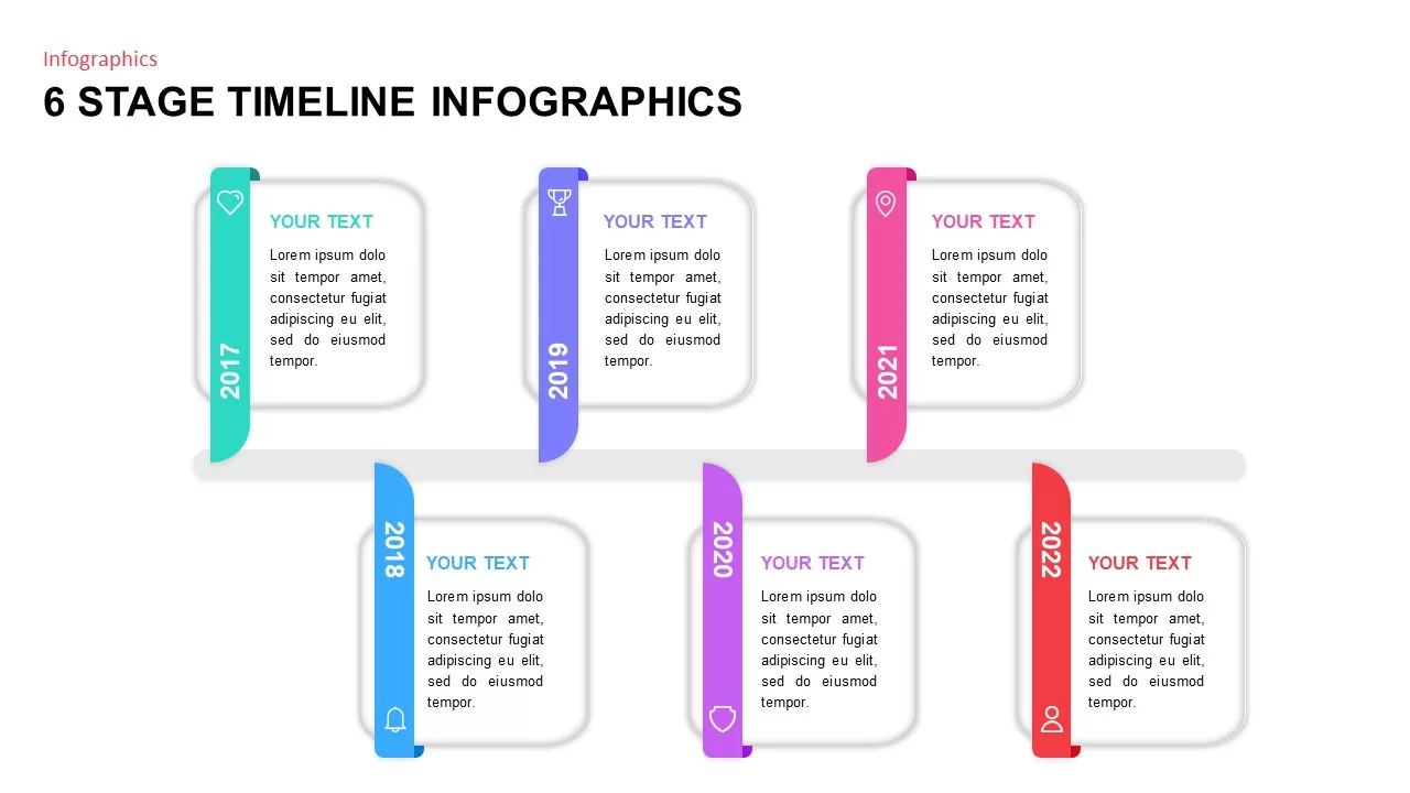
6 Stage Timeline Infographics template for PowerPoint & Google Slides
Timeline
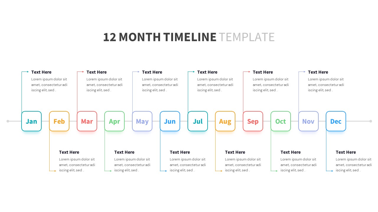
Versatile 12-Month Multi-Style Timeline Template for PowerPoint & Google Slides
Timeline
Multi-color Curved Timeline Roadmap Template for PowerPoint & Google Slides
Timeline
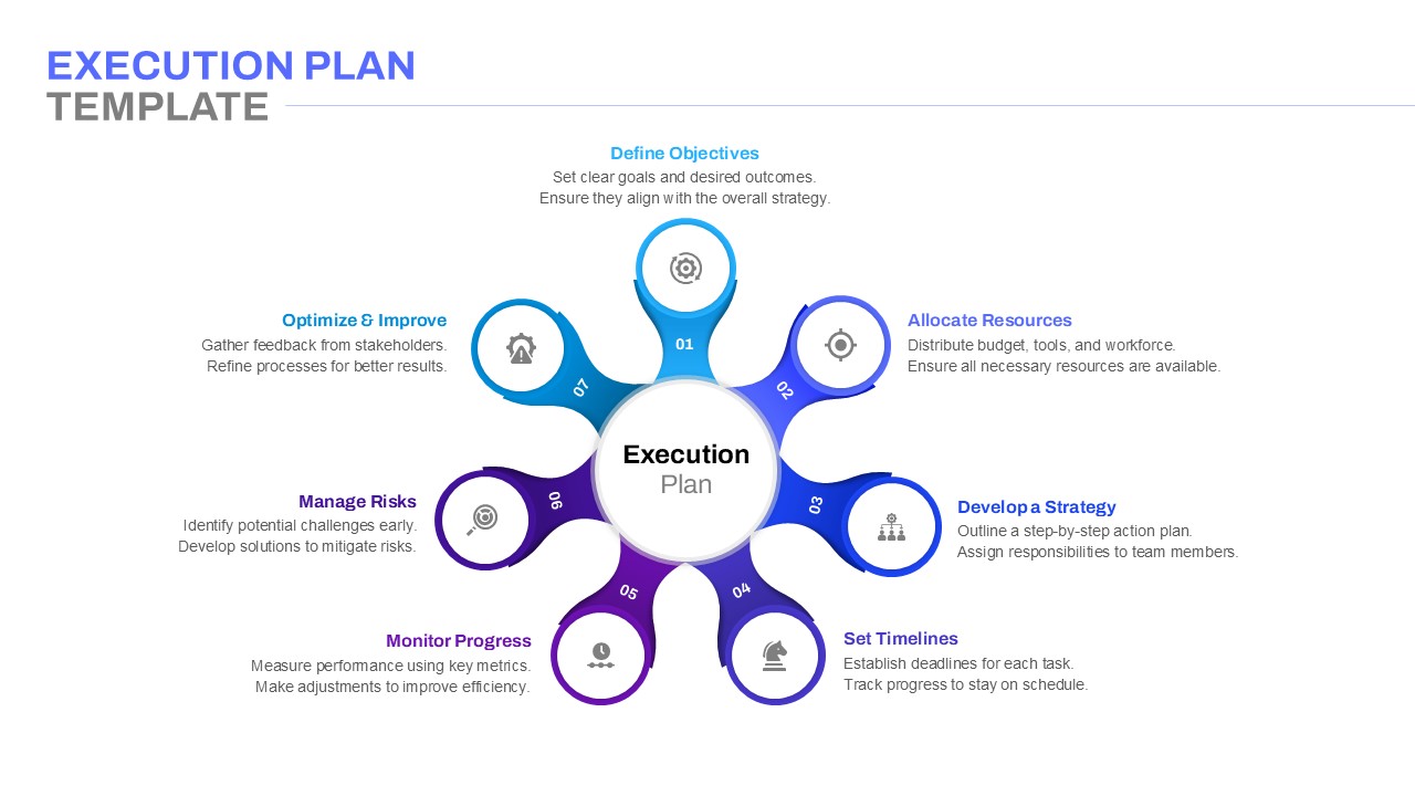
Execution Plan Timeline Diagram Template for PowerPoint & Google Slides
Timeline