Two Directional Arrow Infographic Template for PowerPoint & Google Slides
Description
This slide features a bold, dual-directional arrow infographic designed to visualize contrasting data streams and comparative metrics with clarity. Three interlocking arrows—green, blue, and red—wrap around a central icon placeholder, guiding the eye along two opposing flows. Each arrow head includes a prominent percentage call-out, while a concise “Data Analysis” section on the left provides context and explanatory text. On the right, three keyword callouts with matching icons offer space for feature highlights, benefits, or product attributes. The clean white backdrop, flat color palette, and ample white space ensure your message remains the focus, while master slide layouts and editable shapes enable quick customization of colors, icons, and text. Explore more arrow templates to find versatile layouts for process visualization, comparative metrics, and multi-
Who is it for
Product managers, marketing teams, data analysts, and business consultants will find this infographic ideal for comparing performance indicators, showcasing A/B test results, or illustrating parallel workflows. Executives and project leads can leverage the directional arrows to communicate strategic priorities and opposite trends in boardroom presentations.
Other Uses
Beyond side-by-side comparisons, repurpose this slide for visualizing bidirectional processes, contrasting customer journeys, or mapping risk vs. reward scenarios. Use the arrow flows to depict supply chain directions, timeline overlaps, or benefit/cost analyses. Duplicate and resize elements to create multi-stage roadmaps, decision trees, or feature breakdowns. For related designs, check out the timeline arrow slide for sequential workflows or the 5-step arrow diagram template for structured multi-step presentations.
Login to download this file

Item ID
SB00456
Related Templates

Different Directional Arrow Infographic Template for PowerPoint & Google Slides
Arrow
3D Arrow Directional template for PowerPoint & Google Slides
Arrow

Four Directional Arrow Diagram Template for PowerPoint & Google Slides
Arrow
3D Four-Directional Arrow Infographics Template for PowerPoint & Google Slides
Arrow
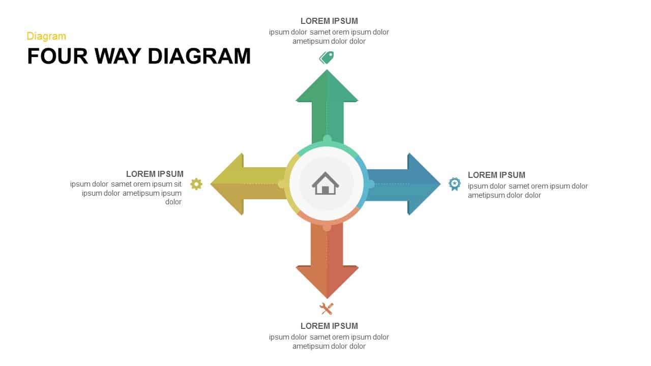
Four-Way Directional Arrow Diagram Template for PowerPoint & Google Slides
Arrow
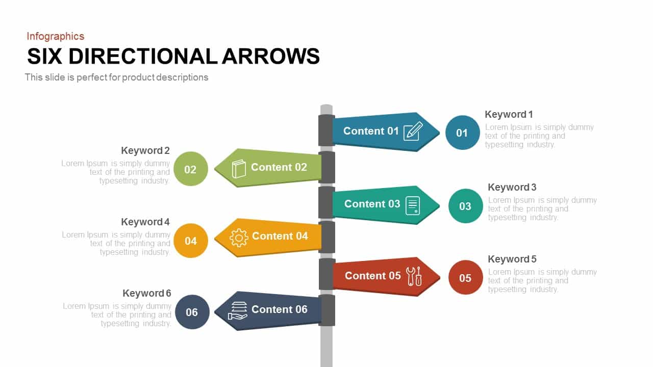
Six Directional Arrows Infographic Template for PowerPoint & Google Slides
Arrow
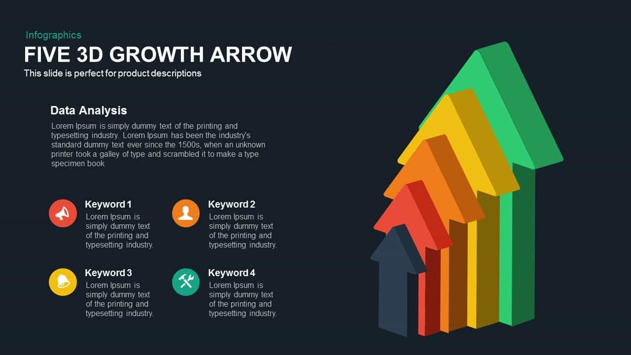
Five 3D Growth Arrow Infographic Slide Template for PowerPoint & Google Slides
Arrow
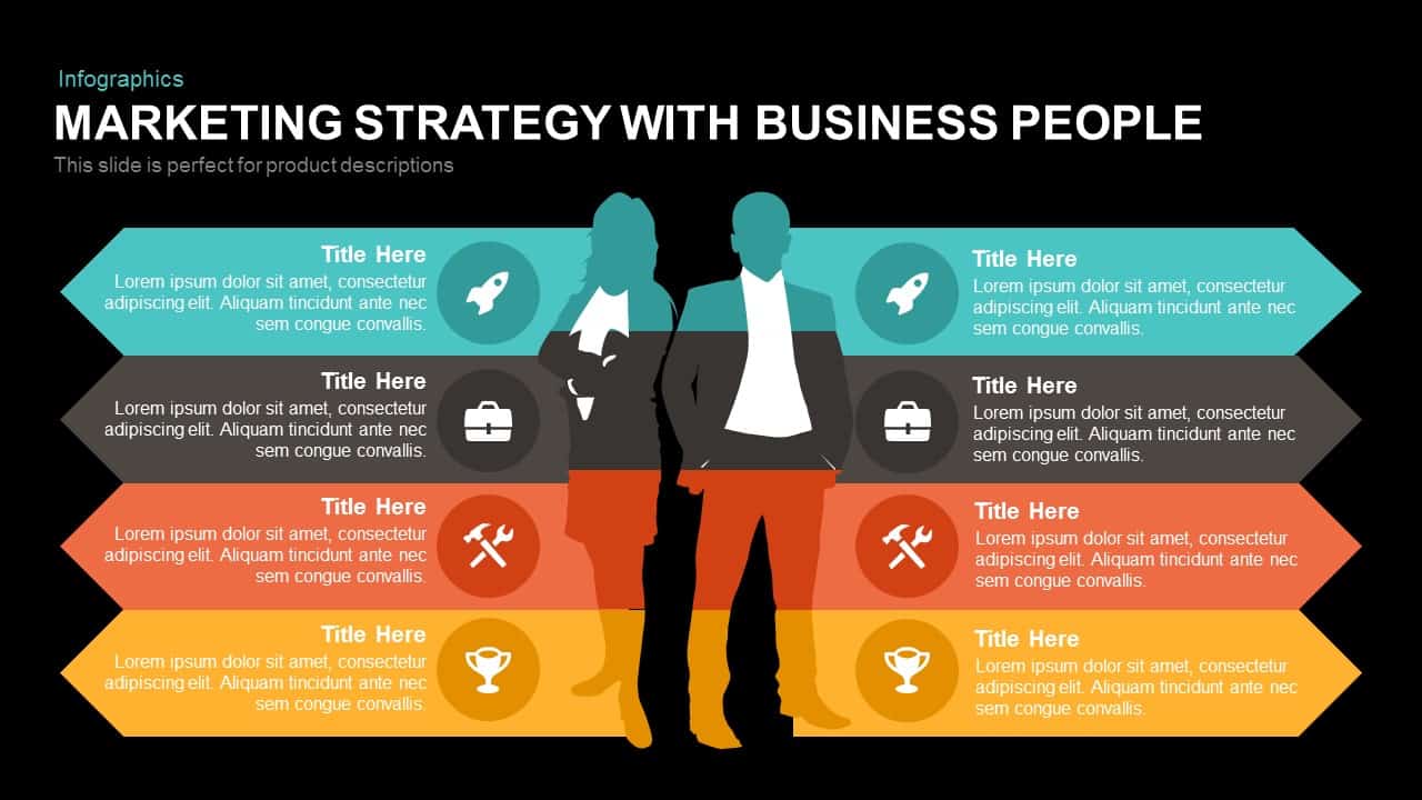
Marketing Strategy Arrow Infographic Template for PowerPoint & Google Slides
Comparison
Five Up Arrow Infographic Diagram Template for PowerPoint & Google Slides
Arrow

Arrow Infographic Template for PowerPoint & Google Slides
Arrow
Four-Section Arrow Infographic Diagram Template for PowerPoint & Google Slides
Arrow
Five-Stage Growth Arrow Infographic Template for PowerPoint & Google Slides
Arrow

Eight Post-It Note Arrow Infographic Template for PowerPoint & Google Slides
Arrow
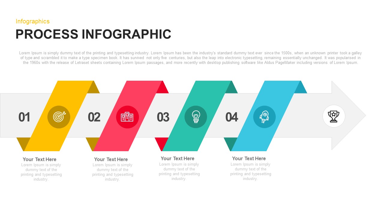
Four-Step Arrow Process Infographic Template for PowerPoint & Google Slides
Arrow
Arrow Timeline Infographic Slide Template for PowerPoint & Google Slides
Timeline
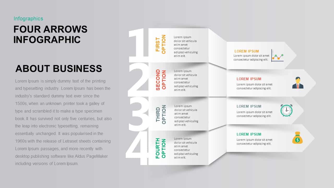
Four-Option 4-Step Arrow Infographic Template for PowerPoint & Google Slides
Arrow
Dynamic Growth Arrow Step Infographic Template for PowerPoint & Google Slides
Process
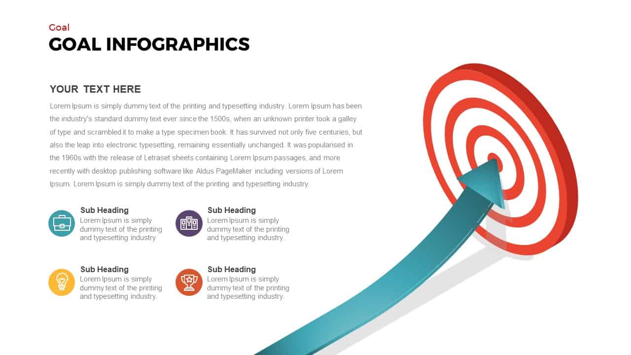
Goal Arrow and Target Infographic Template for PowerPoint & Google Slides
Goals
3D Block Arrow Infographic Diagram Template for PowerPoint & Google Slides
Arrow

4-Way Radial Arrow Infographic Template for PowerPoint & Google Slides
Arrow
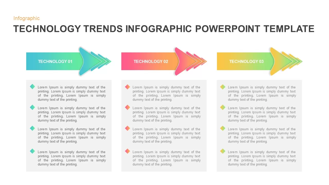
Technology Arrow Infographic Template for PowerPoint & Google Slides
Pitch Deck
Upward Arrow infographic template for PowerPoint & Google Slides
Infographics
Arrow infographic template for PowerPoint & Google Slides
Business
Free Multi-Year Arrow Timeline Infographic Template for PowerPoint & Google Slides
Timeline
Free
Curved Arrow Process Flow Infographic Template for PowerPoint & Google Slides
Process
Free Curved Arrow Infographic Diagram Template for PowerPoint & Google Slides
Arrow
Free
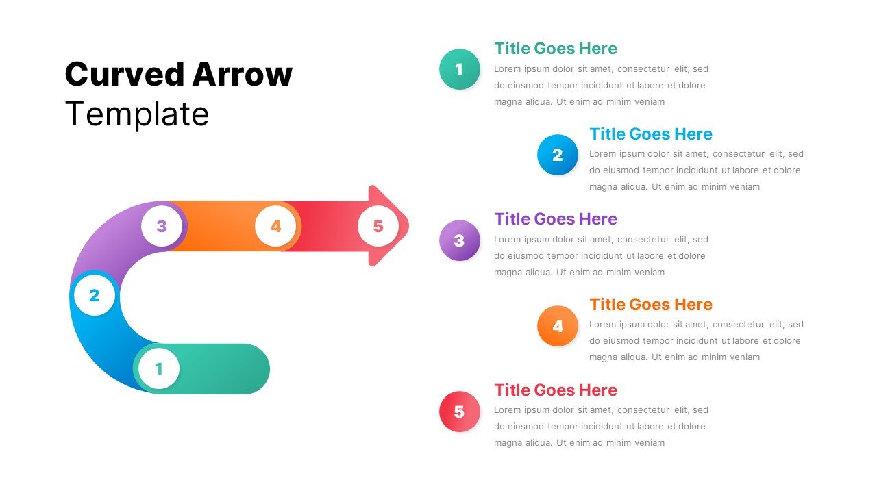
5-Step Curved Arrow Infographic Template for PowerPoint & Google Slides
Arrow
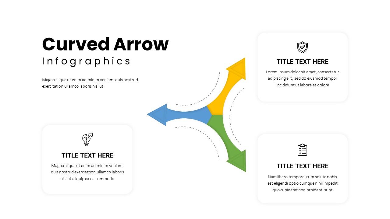
Three-Path Curved Arrow Infographic Template for PowerPoint & Google Slides
Arrow
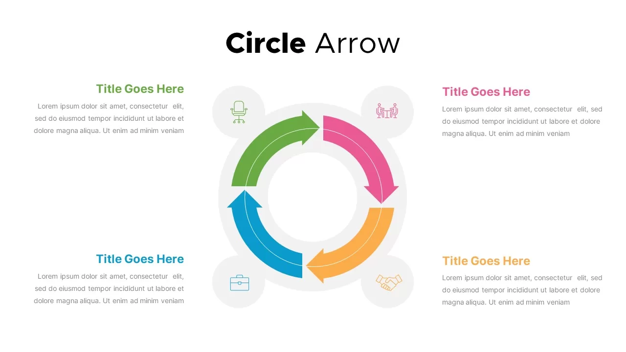
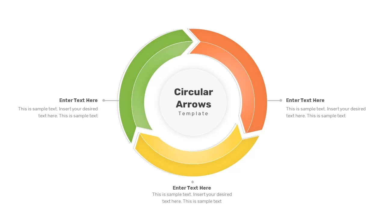
Four-Stage Circle Arrow Infographic Template for PowerPoint & Google Slides
Circular
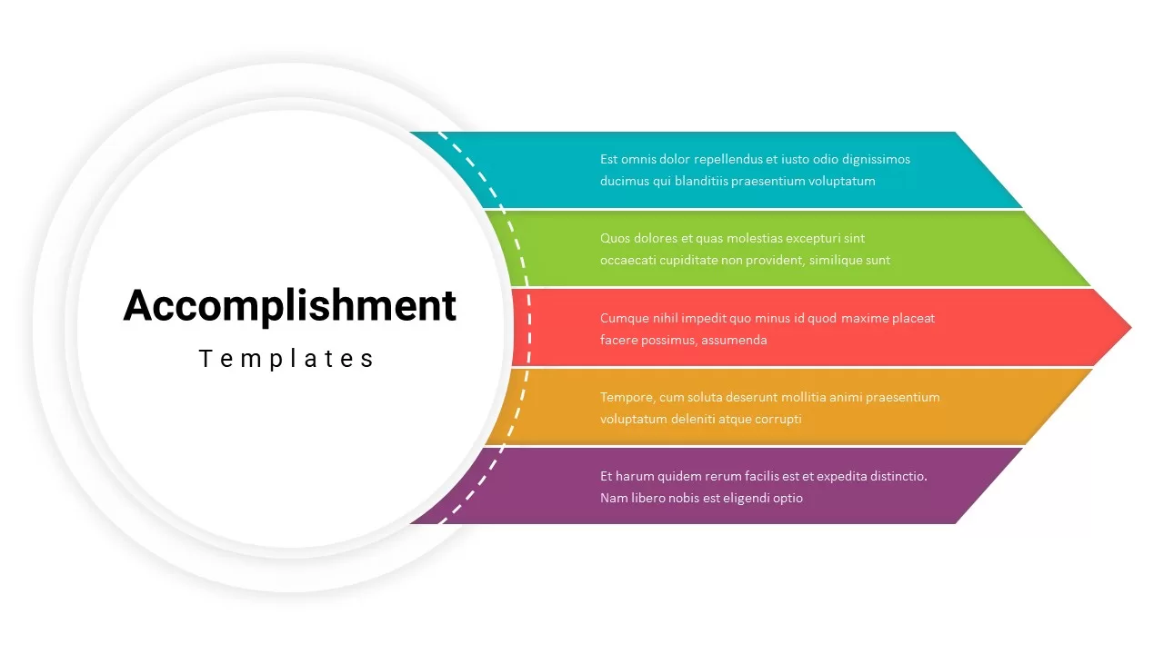
Accomplishment Arrow Infographic Template for PowerPoint & Google Slides
Accomplishment
Five-Stage Circular Arrow Infographic Template for PowerPoint & Google Slides
Circular
Four-Stage Circle Arrow Infographic Template for PowerPoint & Google Slides
Circular
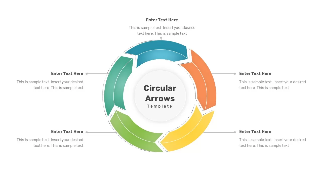
Six-Segment Circular Arrow Infographic Template for PowerPoint & Google Slides
Circular
Social Media Infographic Arrow Layout Template for PowerPoint & Google Slides
Arrow
Bow and Arrow Goal Infographic Slide Template for PowerPoint & Google Slides
Goals
Arrow Infographics template for PowerPoint & Google Slides
Infographics
4 Step Arrow Diagram template for PowerPoint & Google Slides
Arrow
5-Step Arrow Diagram template for PowerPoint & Google Slides
Arrow
3D Arrow Infographics Circular Flow Template for PowerPoint & Google Slides
Arrow
Business Lifecycle Arrow Template for PowerPoint & Google Slides
Infographics
5 Arrow Process Diagram Template for PowerPoint & Google Slides
Infographics
Six Arrow Radial Process Diagram template for PowerPoint & Google Slides
Infographics
6-Step Arrow Process Diagram Template for PowerPoint & Google Slides
Process
5-Stage Arrow Infographics Process Flow Template for PowerPoint & Google Slides
Arrow
Colorful Arrow Process Diagram Template for PowerPoint & Google Slides
Arrow
Arrow Process Diagram Template for PowerPoint & Google Slides
Process
5 Arrow Diagram template for PowerPoint & Google Slides
Arrow
3D Sphere Arrow Process Diagram template for PowerPoint & Google Slides
Arrow
Four Swoosh Arrow Infographics template for PowerPoint & Google Slides
Arrow

Three Stage 3D Arrow Process Diagram Template for PowerPoint & Google Slides
Process
Arrow Step Infographics Workflow Template for PowerPoint & Google Slides
Arrow
Dynamic Arrow Process Template for PowerPoint & Google Slides
Process

Strategy Arrow and Gear Icons Template for PowerPoint & Google Slides
Infographics
Eight-Segment 3D Arrow Infographics Template for PowerPoint & Google Slides
Arrow
Five Arrow Infographics Diagram Template for PowerPoint & Google Slides
Arrow
Five-Stage Arrow Infographics Timeline Template for PowerPoint & Google Slides
Arrow
Seven-Stage Arrow Process Diagram Template for PowerPoint & Google Slides
Process
Improvement Growth Arrow Metaphor Template for PowerPoint & Google Slides
Bar/Column
Five-Stage Direct Flow Arrow Process Template for PowerPoint & Google Slides
Arrow
Five-Stage Circle Arrow Diagram Template for PowerPoint & Google Slides
Circular
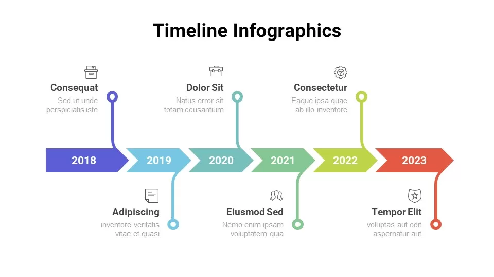
Timeline Arrow Infographics Diagram Template for PowerPoint & Google Slides
Timeline
Seven-Segment Circular Arrow Diagram Template for PowerPoint & Google Slides
Arrow
8-Step Circular Arrow Diagram Template for PowerPoint & Google Slides
Arrow
Six-Process Circular Arrow Diagram Template for PowerPoint & Google Slides
Circular
8 Steps Arrow Process Diagram template for PowerPoint & Google Slides
Process
Four-Point Arrow Cycle Diagram Template for PowerPoint & Google Slides
Arrow
Six-Step Two-Sided Arrow Diagram Template for PowerPoint & Google Slides
Process
Four-Staged Business Arrow Diagram Template for PowerPoint & Google Slides
Process
Five-Stage Cyclic Process Arrow Diagram Template for PowerPoint & Google Slides
Process
Eight-Step Inward Arrow Diagram Template for PowerPoint & Google Slides
Arrow
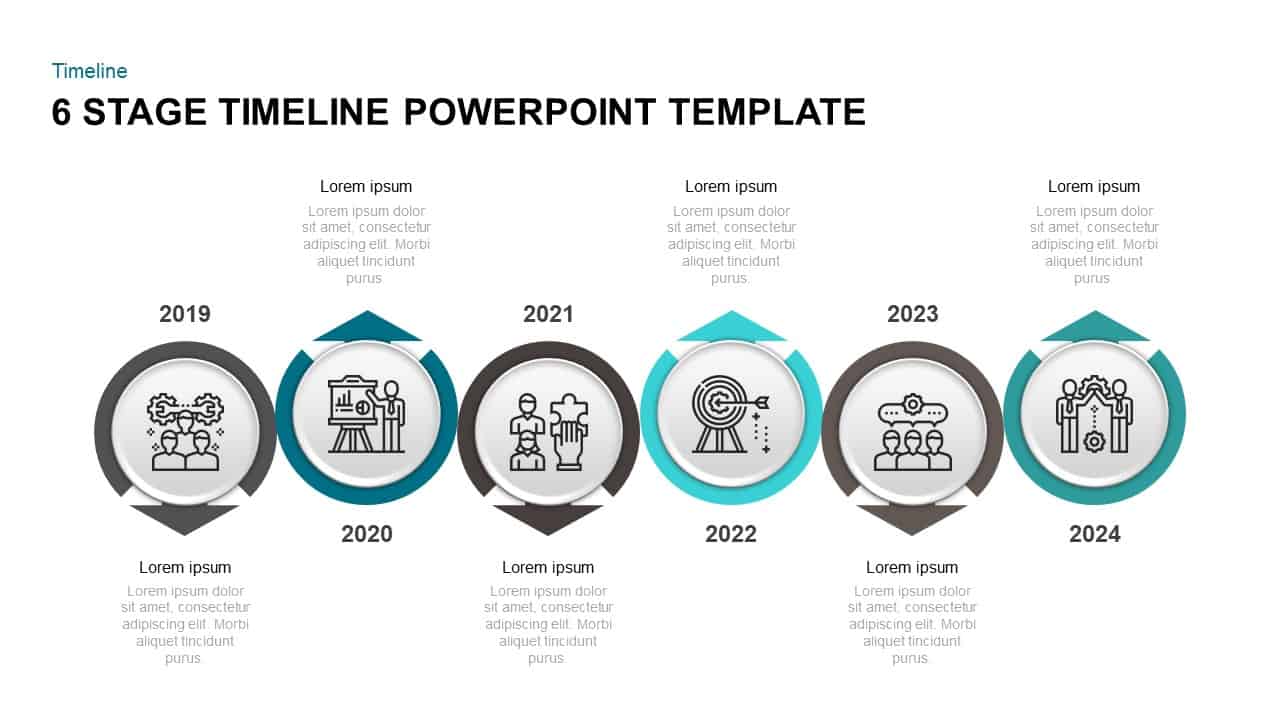
Six-Stage Arrow Timeline Diagram Template for PowerPoint & Google Slides
Timeline
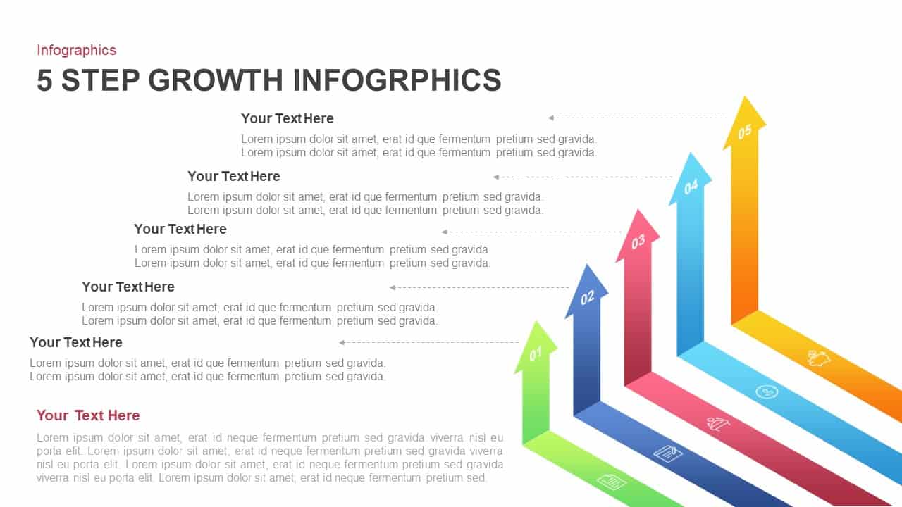
5-Step Growth Arrow Infographics Template for PowerPoint & Google Slides
Arrow
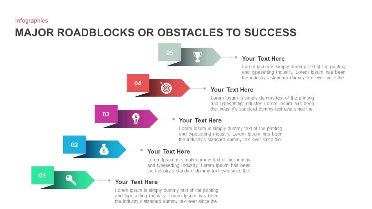
Major Roadblocks to Success Arrow Template for PowerPoint & Google Slides
Arrow
Agile Work Streams Arrow Diagram Template for PowerPoint & Google Slides
Process
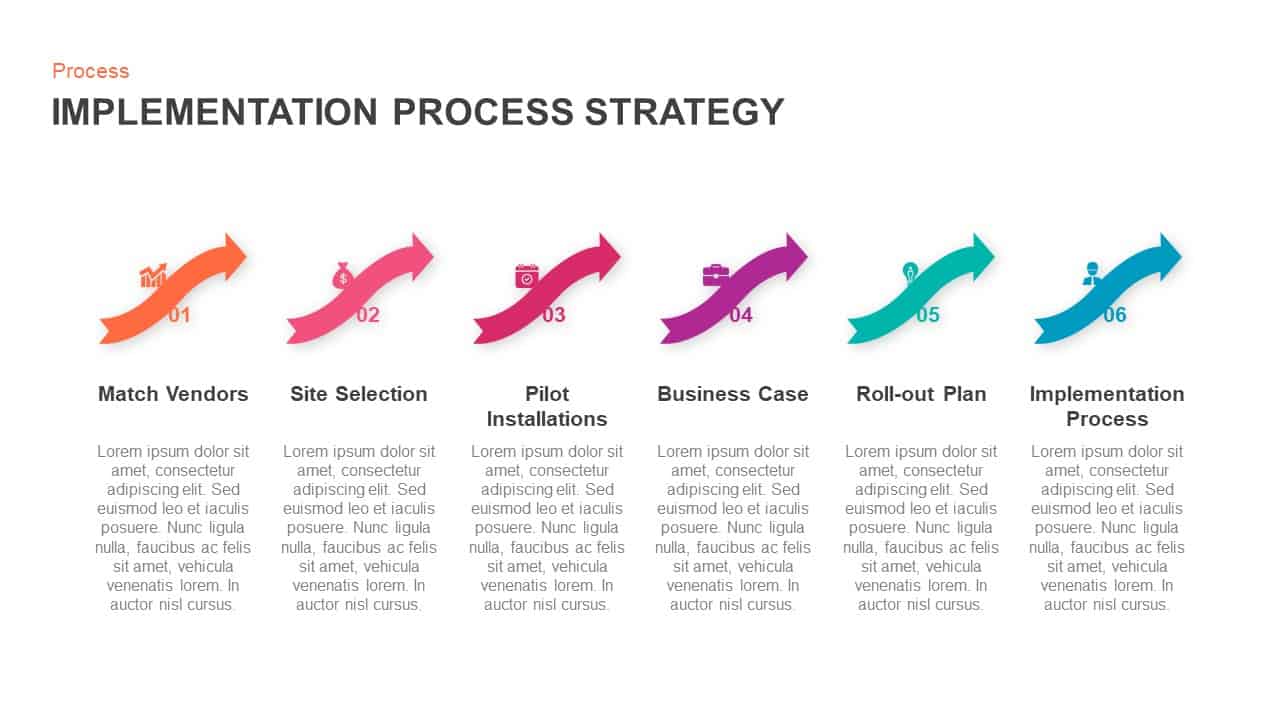
Implementation Process Strategy Arrow Template for PowerPoint & Google Slides
Arrow
Multi-Color Five-Step Curved Arrow Template for PowerPoint & Google Slides
Process
Curved Arrow Process Flow Diagram Template for PowerPoint & Google Slides
Process
Dynamic Curved Arrow Process Roadmap Template for PowerPoint & Google Slides
Process
Curved Arrow Process Flow Diagram Template for PowerPoint & Google Slides
Arrow
Free Curved Arrow Progress Chart template for PowerPoint & Google Slides
Project
Free
Curved Arrow Flow Diagram template for PowerPoint & Google Slides
Business
3D Curved Arrow Growth Process Slide Template for PowerPoint & Google Slides
Process
Curved Arrow Flow Template for PowerPoint & Google Slides
Process
Dual-Stage Circular Arrow Cycle Template for PowerPoint & Google Slides
Process
Four-Step Curved Arrow Process Template for PowerPoint & Google Slides
Process
Three-Segment Circular Arrow Cycle Template for PowerPoint & Google Slides
Circular
Six-Segment Circular Arrow Cycle Template for PowerPoint & Google Slides
Circular
Curved Arrow Process Flow template for PowerPoint & Google Slides
Process
Curved Arrow Process Flow template for PowerPoint & Google Slides
Process
Curved Arrow Progression template for PowerPoint & Google Slides
Process
Circle Arrow Process Flow template for PowerPoint & Google Slides
Process
Three-Step Curved Arrow Process Diagram Template for PowerPoint & Google Slides
Arrow
Hand-Drawn Four-Step Curved Arrow Diagram Template for PowerPoint & Google Slides
Arrow
Circular Arrow Process Diagram Template for PowerPoint & Google Slides
Circular
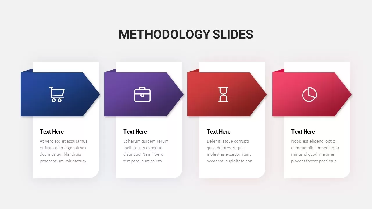
Colorful Arrow Methodology Steps Template for PowerPoint & Google Slides
Process
Pentagon Arrow Process Diagram Template for PowerPoint & Google Slides
Process
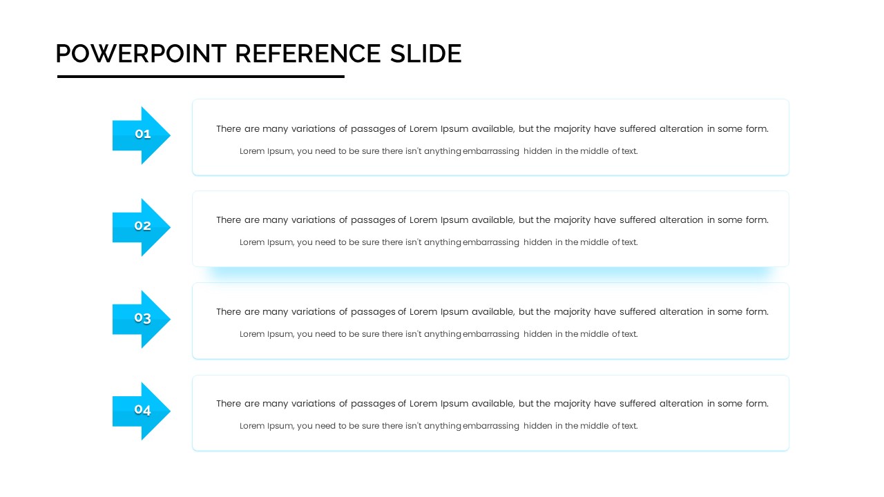
Four-Step Arrow Reference Diagram Slide Template for PowerPoint & Google Slides
Arrow
Arrow Line Chart Template for PowerPoint & Google Slides
Comparison Chart
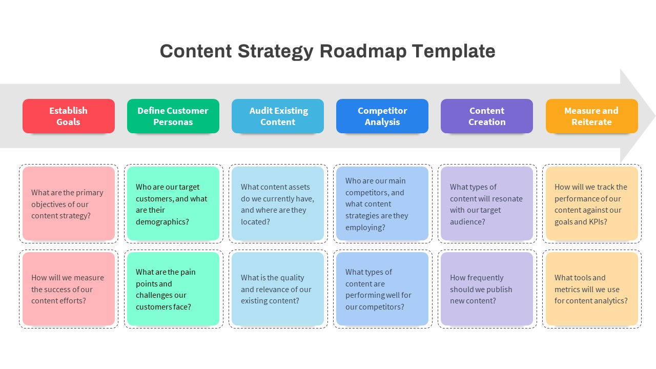
Content Strategy Roadmap Arrow Template for PowerPoint & Google Slides
Roadmap
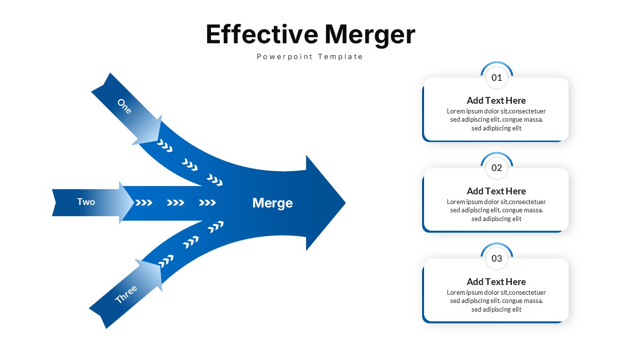
Effective Merger Arrow Diagram Template for PowerPoint & Google Slides
Arrow