Cohort Analysis Template for PowerPoint & Google Slides
Visualize User Retention and Engagement Trends with a Cohort Analysis Dashboard
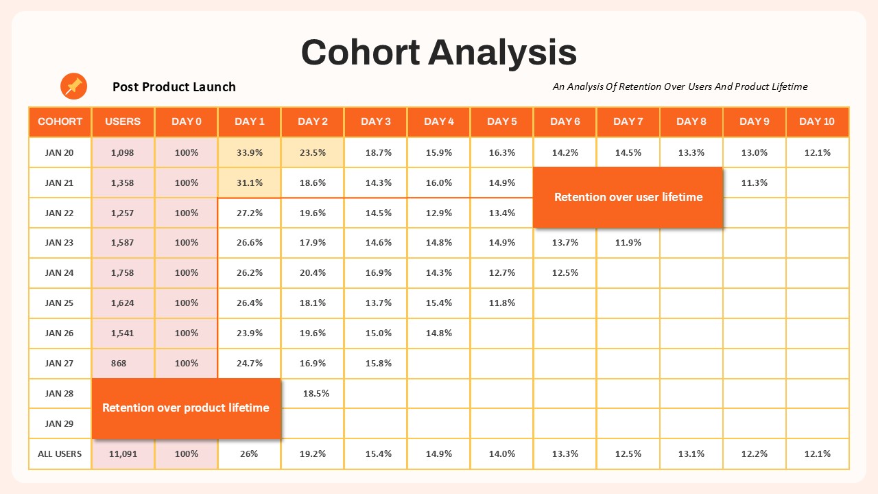
Cohort analysis is one of the most effective ways to understand user retention and engagement over time. By grouping users based on a shared starting point—such as signup date, product launch, or campaign entry—teams can track how behavior changes across specific periods and identify trends that may be hidden in aggregate data. A cohort analysis chart makes it easy to compare retention rates, evaluate onboarding effectiveness, measure the impact of growth experiments, and uncover opportunities to improve customer lifetime value across SaaS, mobile app, e-commerce, and subscription-based businesses.
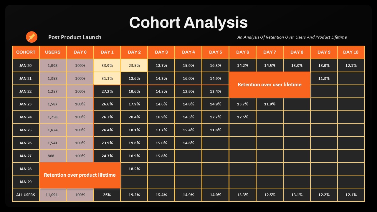
This Cohort Analysis Template transforms complex retention data into a structured, easy-to-read dashboard. The layout organizes cohorts by start date in rows and time since acquisition in columns, helping stakeholders quickly compare performance across Day 0 through Day 10 or any custom timeframe. With its bold header design, clear grid structure, and editable formatting, the template can be customized for weekly, monthly, churn, reactivation, feature adoption, or subscription renewal analysis. Users can apply heat maps, add annotations, adjust percentage metrics, and highlight key insights to create data-driven presentations in both PowerPoint and Google Slides.
Whether you’re preparing a product review, board presentation, growth report, or customer success update, this comparison template provides a clear framework for turning retention metrics into actionable insights. Download the template today to visualize user behavior, identify performance drivers, and make smarter decisions that improve long-term engagement and retention.
Login to download this file

Item ID
SB05494Designed By
Naseeba


Related Templates

PEST Analysis Template for PowerPoint & Google Slides
PEST
PESTLE Analysis Deck Template for PowerPoint & Google Slides
Decks

Employee Skills Analysis Template for PowerPoint and Google Slides
Employee Performance

Break-Even Analysis template for PowerPoint & Google Slides
Process
Gartner Magic Quadrant Analysis Template for PowerPoint & Google Slides
Business
Root Cause Analysis Template PowerPoint and Google Slides
Business Strategy
Competitor Analysis Template PowerPoint and Google Slides
Competitor Analysis
IQ Scale Analysis Diagram template for PowerPoint & Google Slides
Employee Performance
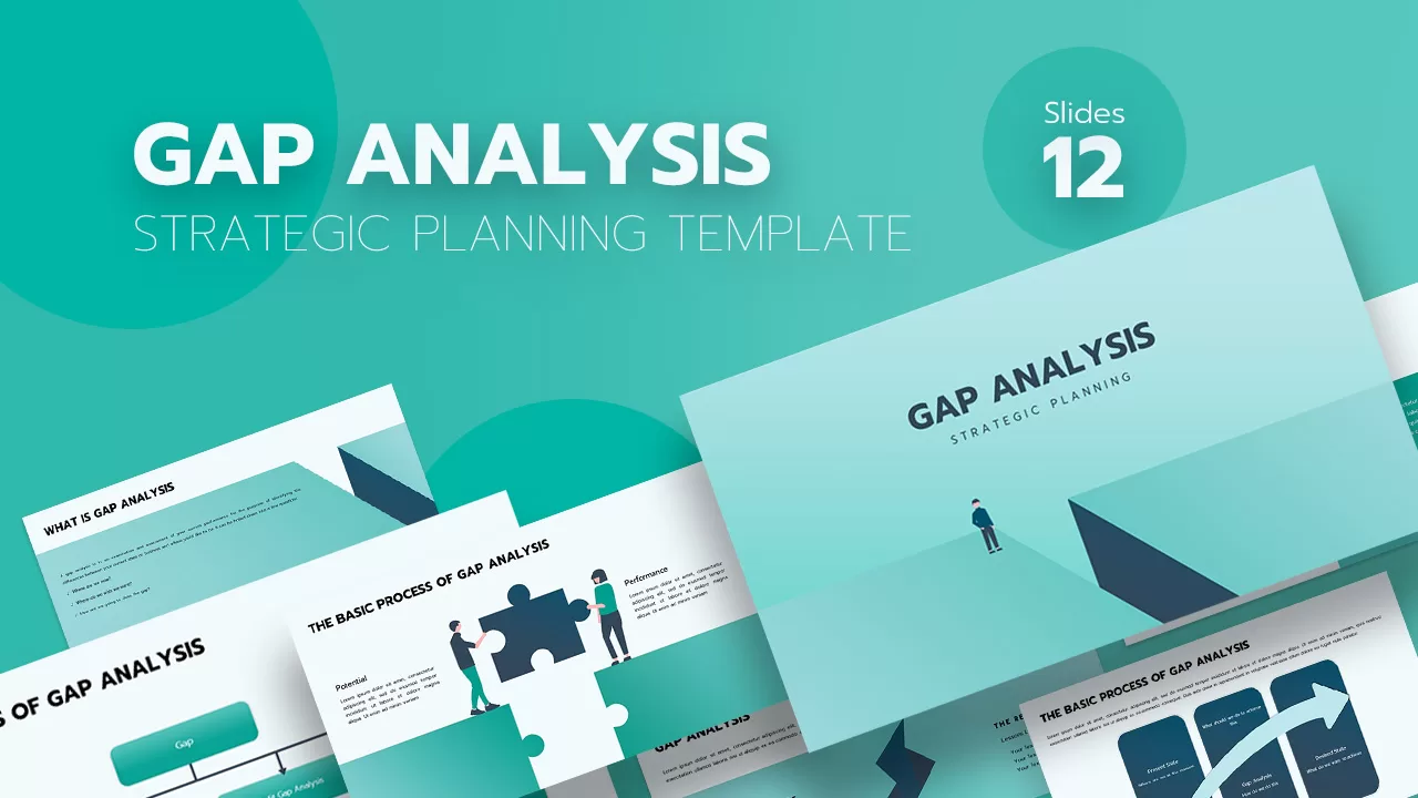
Gap Analysis Strategic Planning Template for PowerPoint & Google Slides
Gap
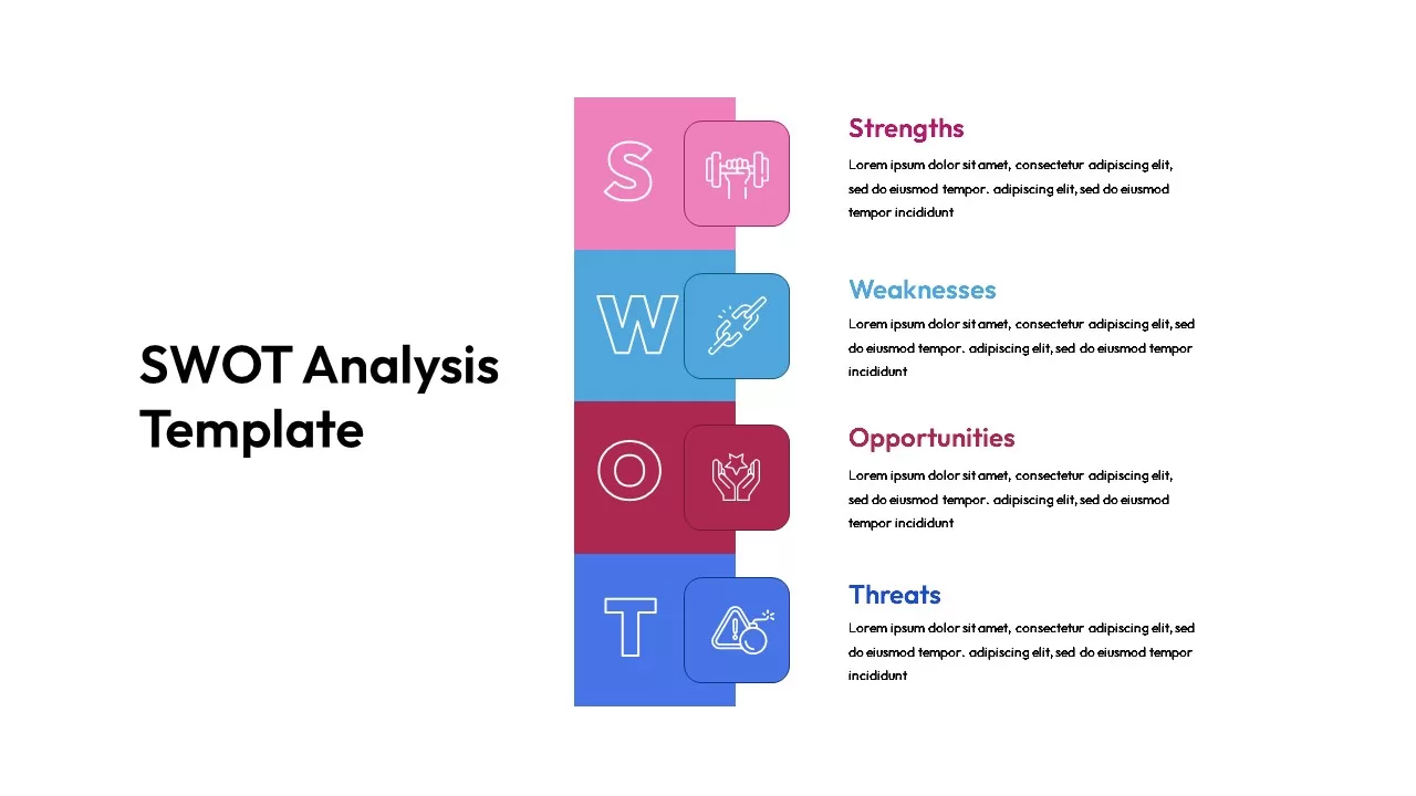
Vertical SWOT Analysis Template for PowerPoint & Google Slides
SWOT
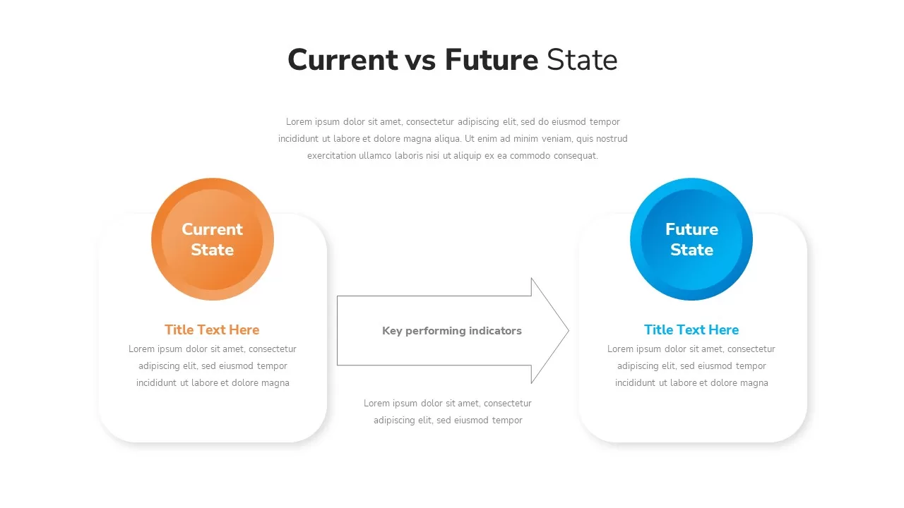
Current vs Future State Analysis template for PowerPoint & Google Slides
Comparison
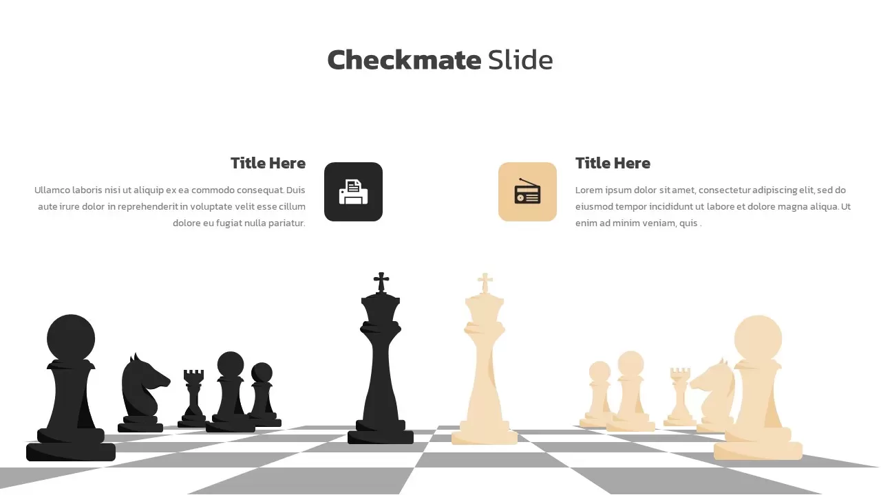
Checkmate Slide for Competitor Analysis Template for PowerPoint & Google Slides
Competitor Analysis
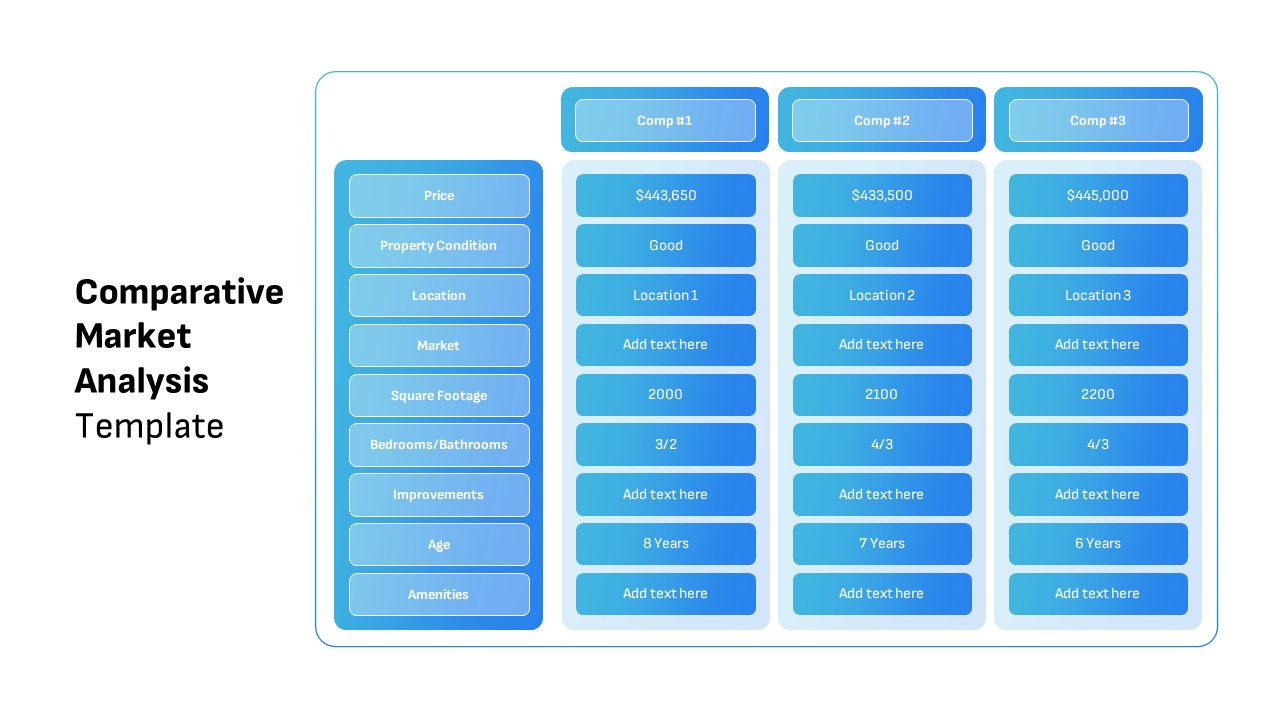
Comparative Market Analysis Template for PowerPoint & Google Slides
Comparison
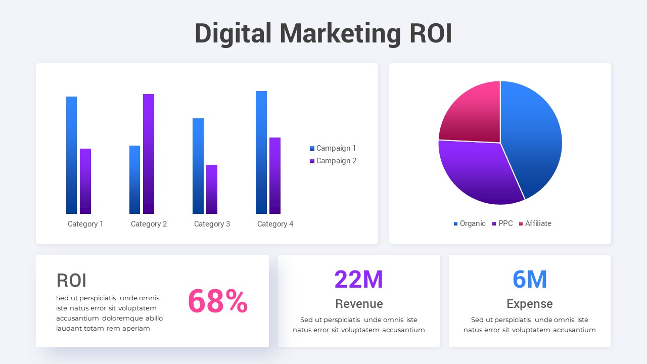
Digital Marketing ROI Analysis template for PowerPoint & Google Slides
Digital Marketing
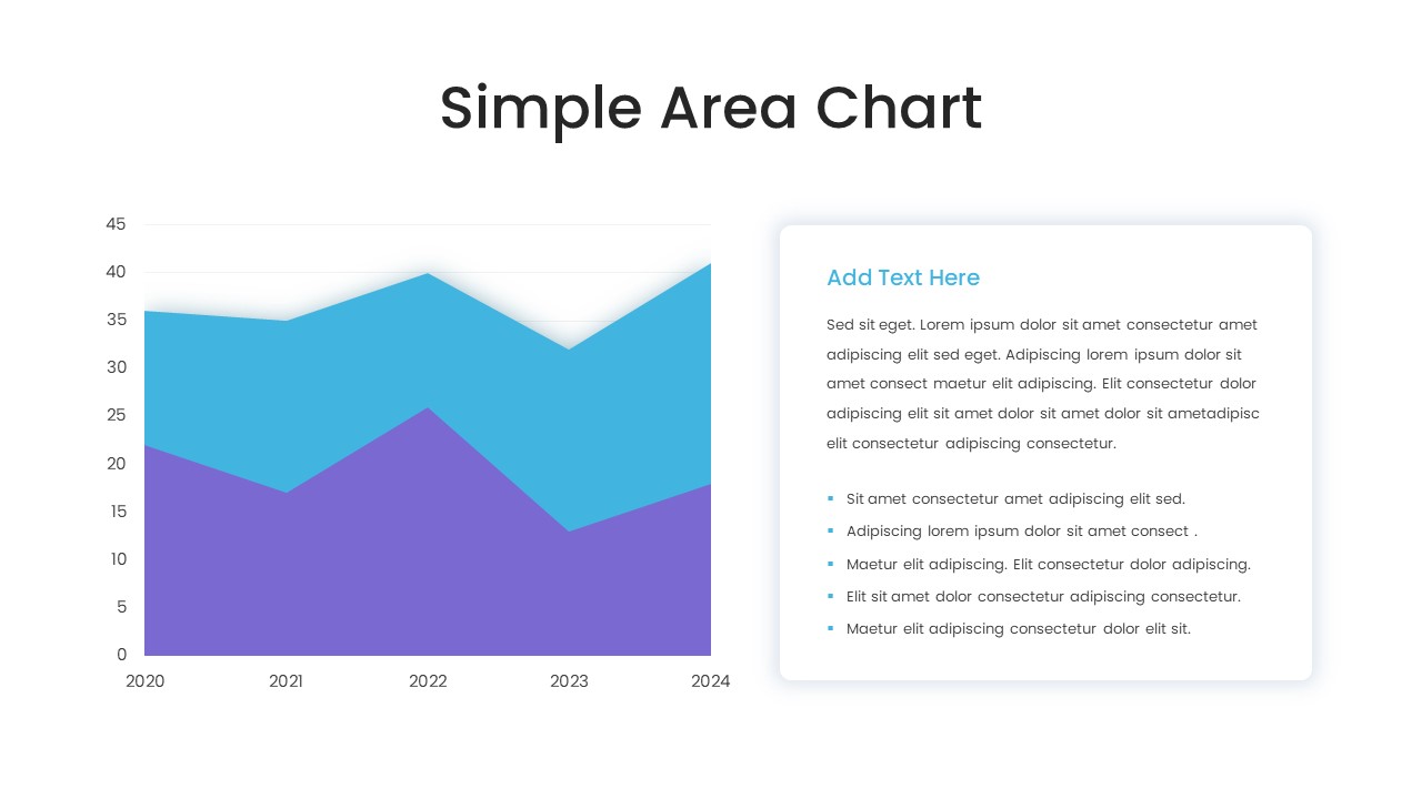
Simple Area Chart Data Trends Analysis Template for PowerPoint & Google Slides
Comparison Chart
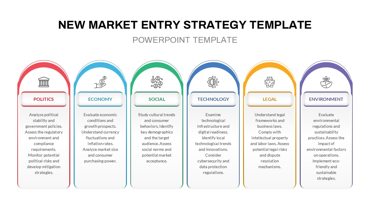
PESTLE Analysis for Market Entry Template for PowerPoint & Google Slides
PEST
5-Step Comparable Company Analysis Template for PowerPoint & Google Slides
Arrow
Failure Mode Effects Analysis (FMEA) Slide Template for PowerPoint & Google Slides
Process
3D Quadrant SWOT Analysis Template for PowerPoint & Google Slides
SWOT
Financial Gap Analysis Framework Template for PowerPoint & Google Slides
Finance