Classification Vs Regression Diagram Template for PowerPoint & Google Slides


Description
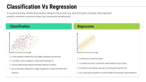
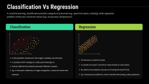
Use this side-by-side infographic to demystify machine learning tasks by contrasting classification and regression approaches. The left panel features a scatter plot with a curved decision boundary, illustrating how classification separates data into discrete groups. The right panel presents a linear fit line through continuous points to demonstrate regression’s focus on numerical prediction. Each panel includes editable axes, data markers, and boundary or trend lines, allowing you to swap datasets, adjust colors, or relabel variables in seconds. Below each graphic, bullet lists concisely describe key aspects—target variable types, prediction goals, boundary definitions, and real-world examples like spam detection versus house-price forecasting.
Built for PowerPoint and Google Slides, this template leverages master slides and vector shapes to ensure lossless scaling across any screen size. Replace placeholder plots with your own charts, update text in the provided placeholders, or swap icons to suit your brand. Theme controls let you apply corporate colors globally, adjust font styles, and toggle between light and dark backgrounds with a single click. Grouped elements and smart guides maintain alignment when you move panels or resize text boxes. Use preconfigured entrance animations to reveal each method sequentially—helping audiences grasp differences before you dive into details.
Whether you’re leading an AI workshop, briefing executives on model selection, or teaching introductory data-science classes, this slide streamlines content creation and elevates your narrative. The clean, minimal design balances clarity with visual appeal, ensuring complex concepts resonate with both technical and non-technical audiences.
Who is it for
Data scientists, machine learning engineers, and analytics instructors will leverage this diagram to compare categorical versus continuous modeling techniques during workshops, stakeholder presentations, and university lectures.
Other Uses
Repurpose this layout to contrast any two analytical methods—such as supervised versus unsupervised learning, parametric versus non-parametric models, or A/B testing versus multivariate testing—by relabeling panels and swapping sample charts.
Login to download this file

Item ID
SB05297
Related Templates

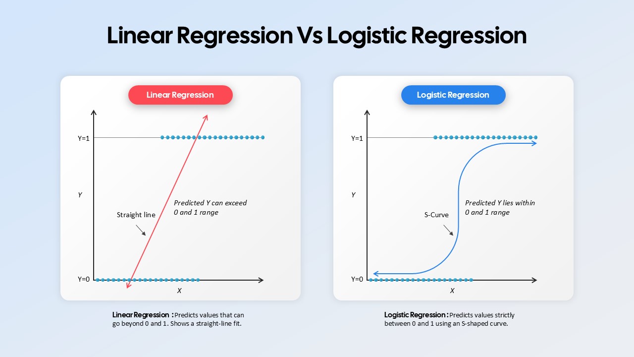
Linear Regression vs Logistic Regression Comparison template for PowerPoint & Google Slides
Comparison
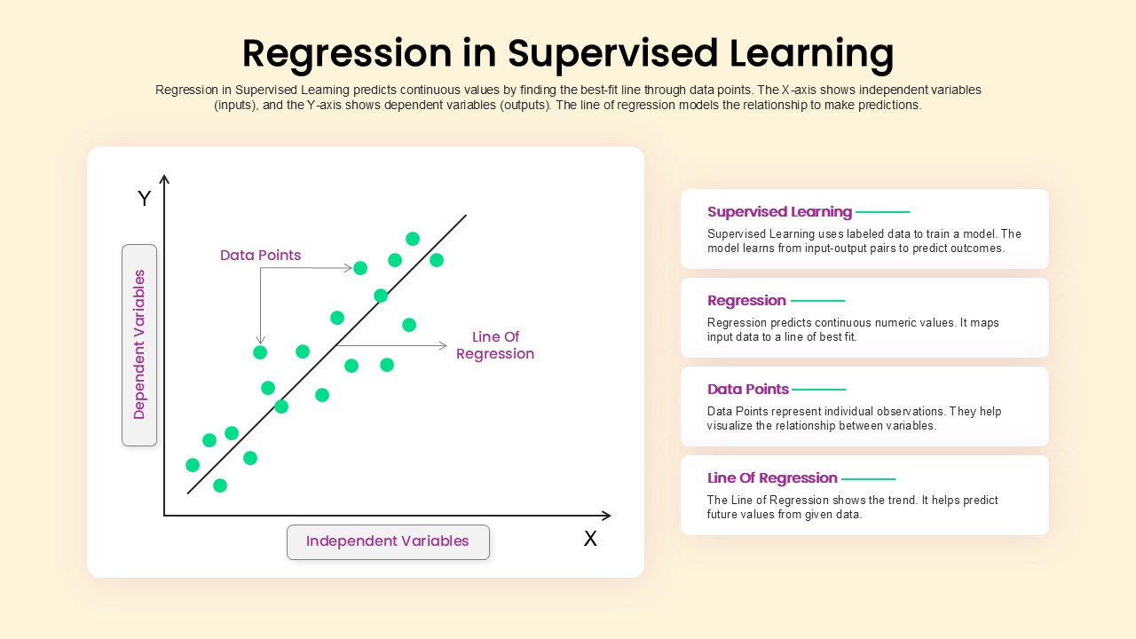
Regression in Supervised Learning Overview template for PowerPoint & Google Slides
Process
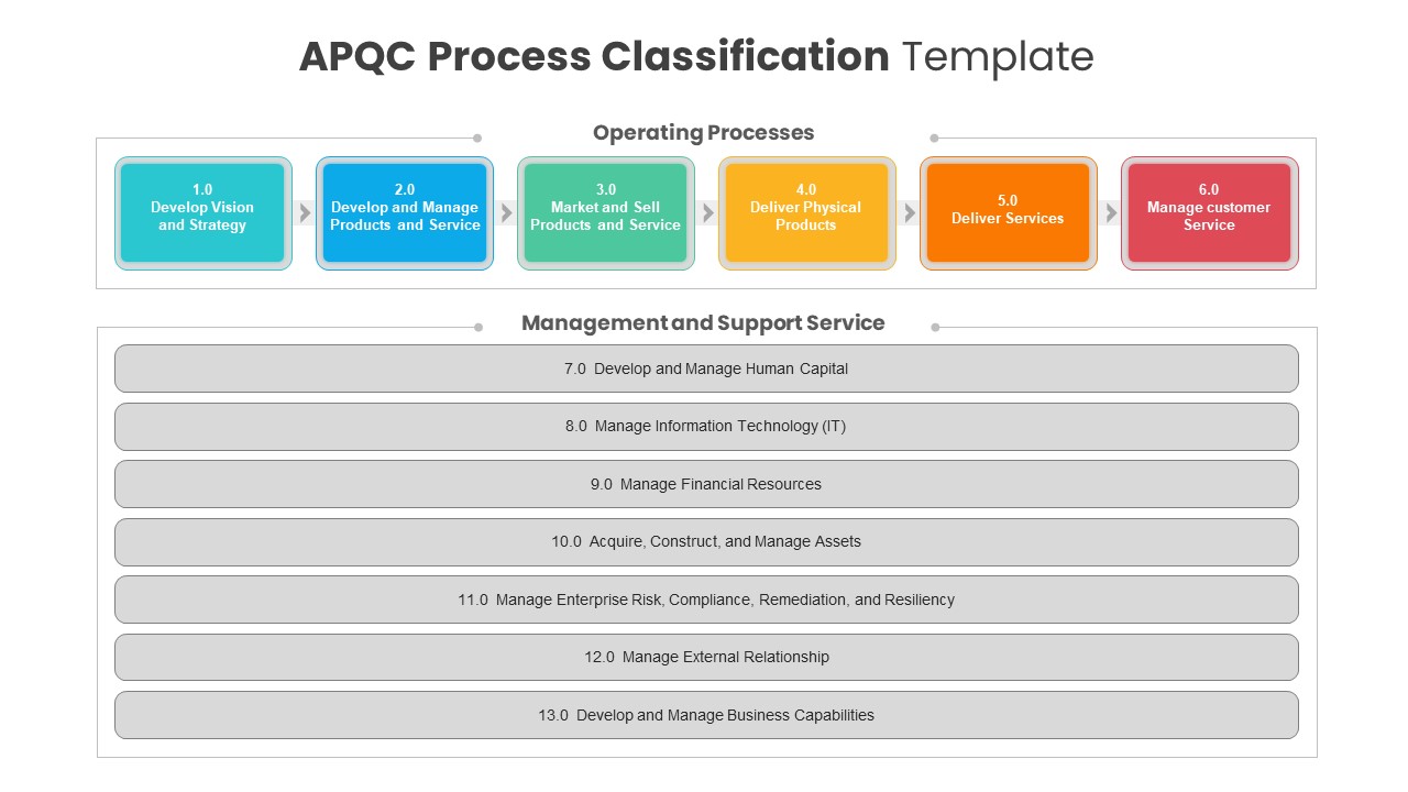
APQC Process Classification Diagram Template for PowerPoint & Google Slides
Process
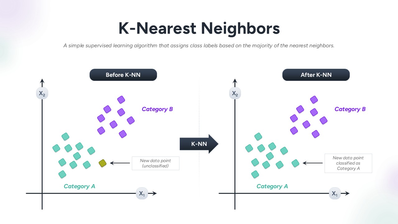
K-Nearest Neighbors Classification Overview template for PowerPoint & Google Slides
Technology
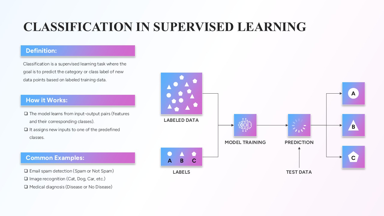
Classification in Supervised Learning template for PowerPoint & Google Slides
Infographics
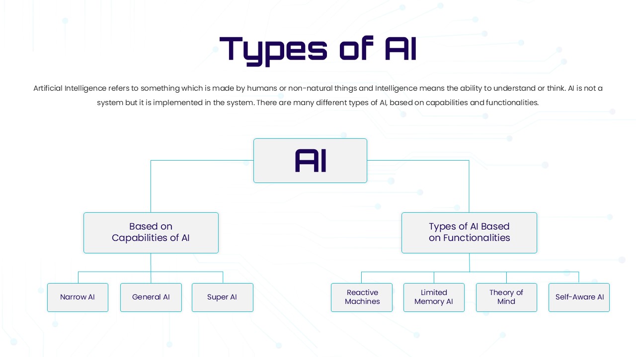
Types of AI Classification Hierarchy Template for PowerPoint & Google Slides
AI
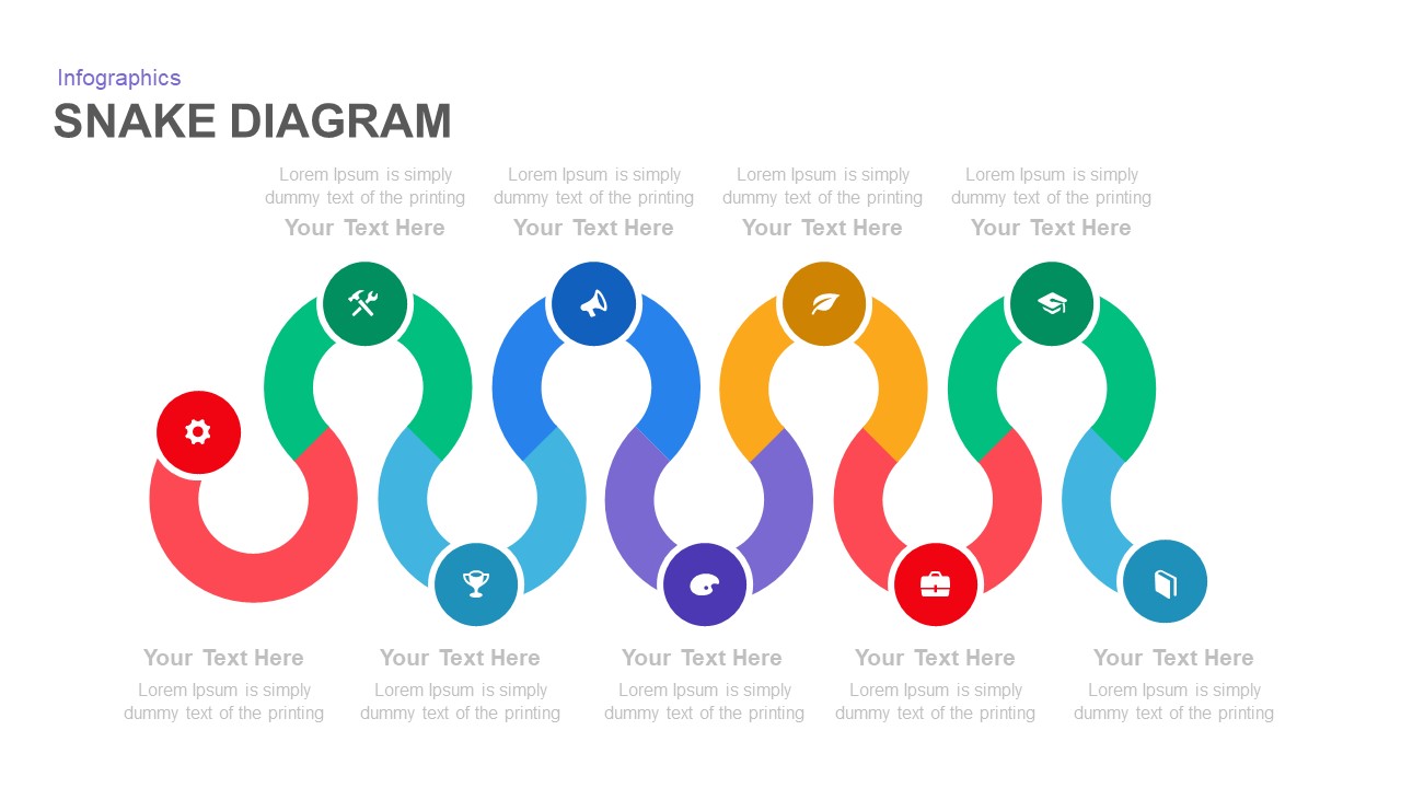
Snake Diagram Pack of 8 Slides template for PowerPoint & Google Slides
Process
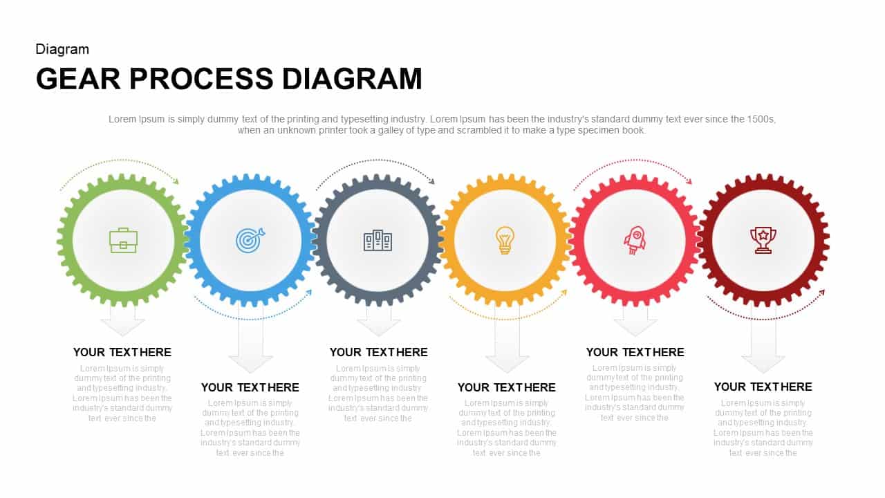
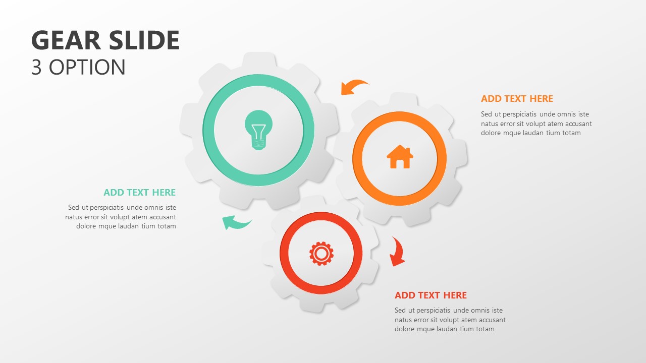
Gear Process Diagram PowerPoint Template for PowerPoint & Google Slides
Process
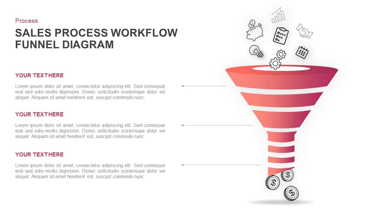
Sales Process Workflow Funnel Diagram PowerPoint Template for PowerPoint & Google Slides
Funnel
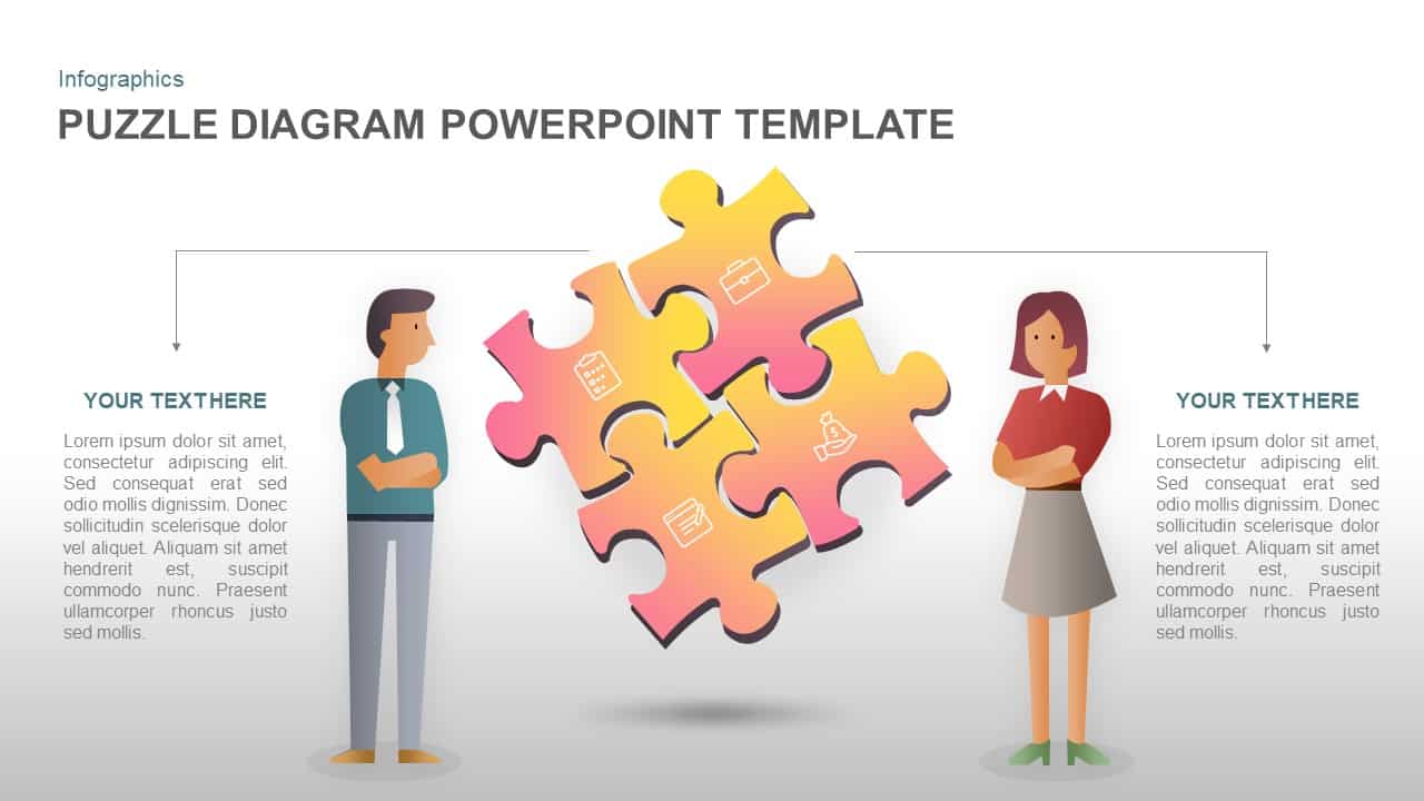
Puzzle Diagram PowerPoint Template for PowerPoint & Google Slides
Process
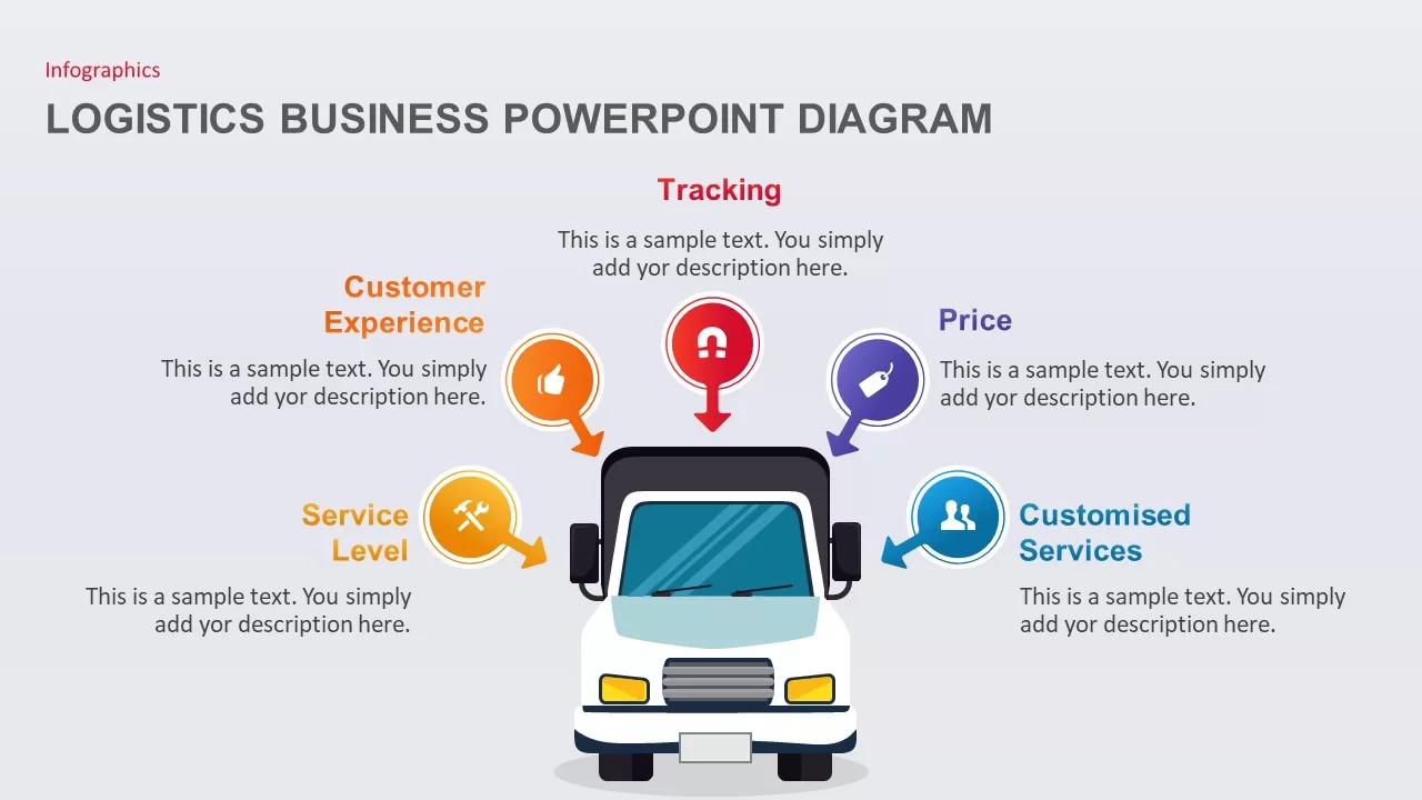
Transportation Logistics PowerPoint Diagram template for PowerPoint & Google Slides
Process
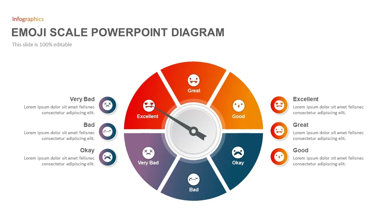
Emoji Scale PowerPoint Diagram for PowerPoint & Google Slides
Infographics
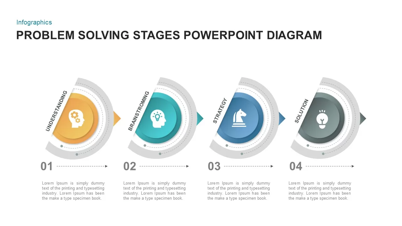
4 Step Problem Solving PowerPoint Diagram for PowerPoint & Google Slides
Process
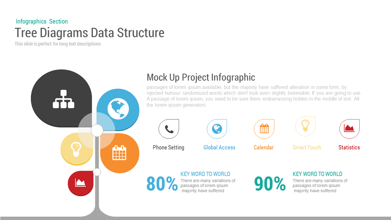
Tree Diagram template for PowerPoint & Google Slides
Decision Tree
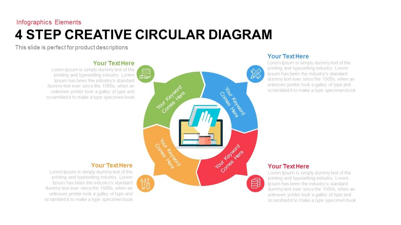
4 Step Creative Circular Diagram Template for PowerPoint & Google Slides
Infographics
Six Arrow Radial Process Diagram template for PowerPoint & Google Slides
Infographics
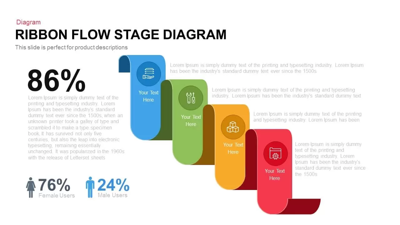
Ribbon Flow Diagram template for PowerPoint & Google Slides
Process
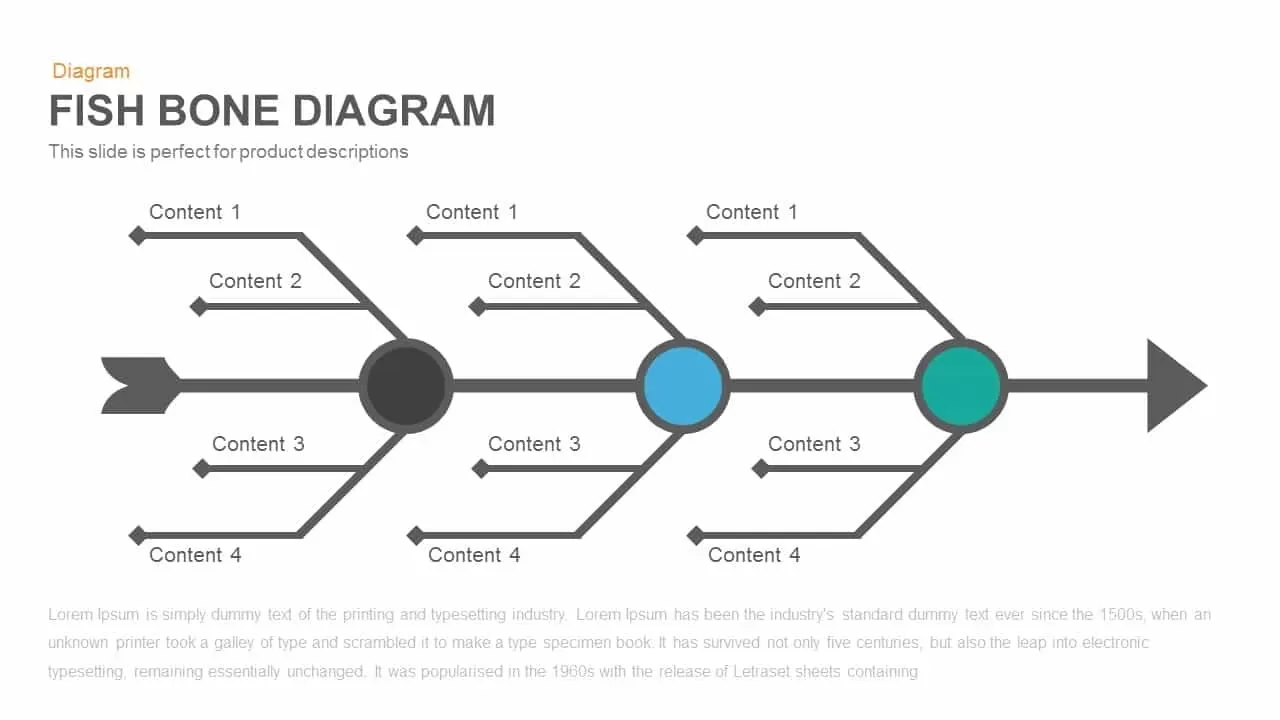
Three-Section Fishbone Process Diagram template for PowerPoint & Google Slides
Process
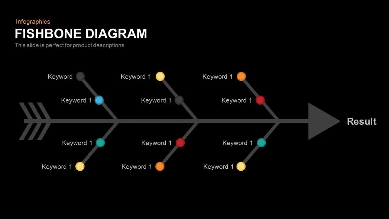
Fishbone RCA Diagram Template for PowerPoint & Google Slides
Business Strategy
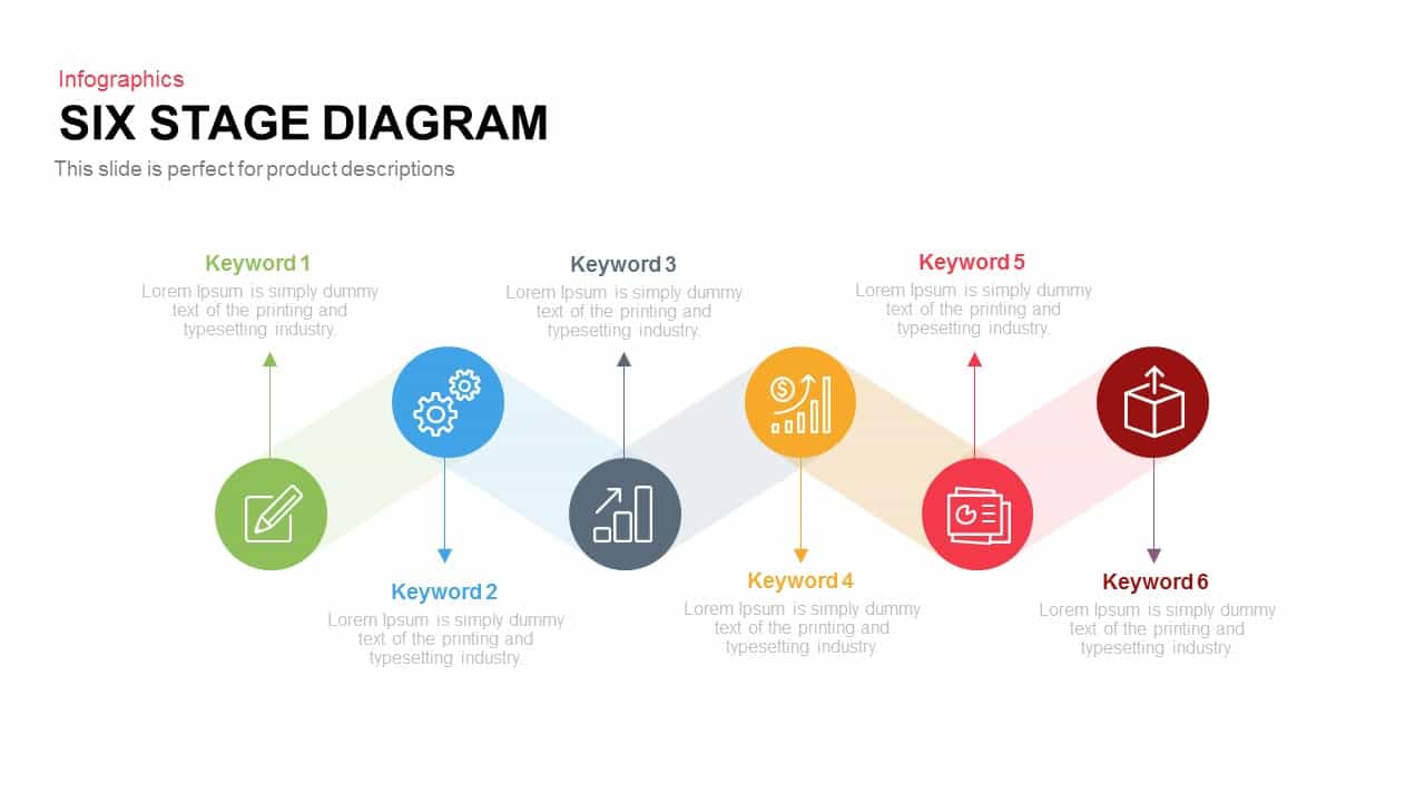
Six Stage Zigzag Process Diagram Template for PowerPoint & Google Slides
Process
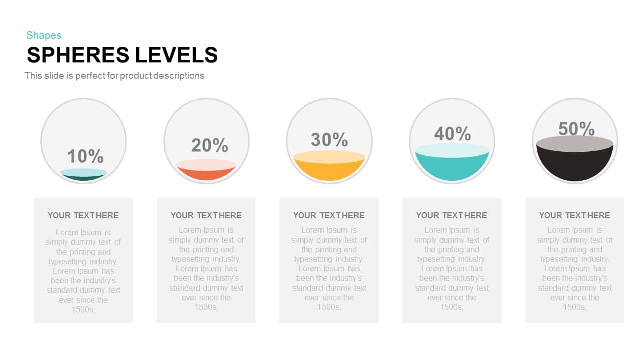
Five-Level Sphere Indicators Diagram template for PowerPoint & Google Slides
Infographics
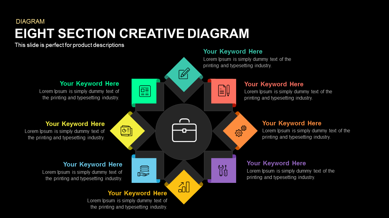
Eight-Section Circular Diagram template for PowerPoint & Google Slides
Circular
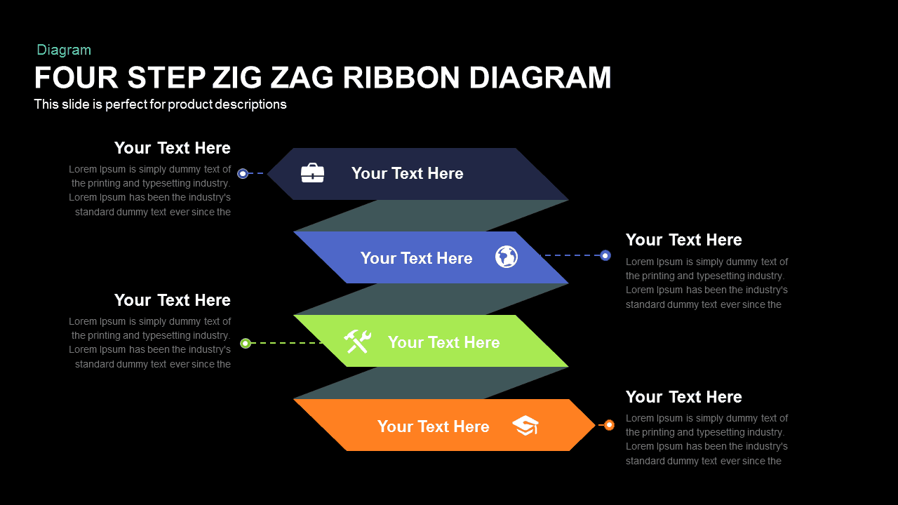
Four-Step Zigzag Ribbon Diagram template for PowerPoint & Google Slides
Arrow

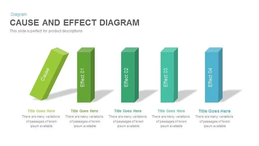
Cause and Effect Diagram Infographic Template for PowerPoint & Google Slides
Bar/Column
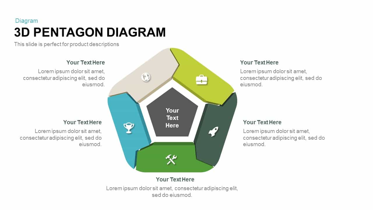
3D Pentagon Diagram template for PowerPoint & Google Slides
Process
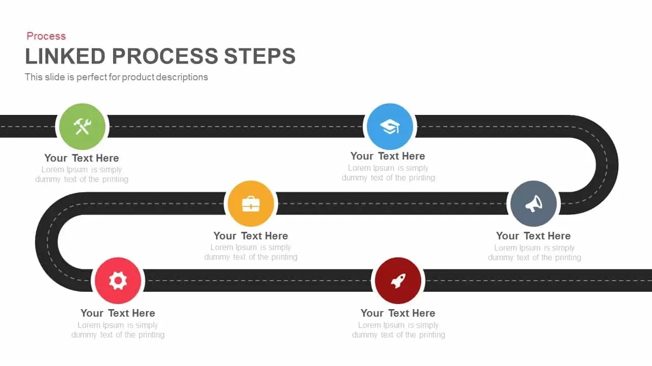
Roadmap Six-Step Process Diagram Template for PowerPoint & Google Slides
Roadmap

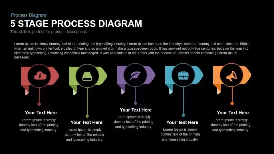
5 Stage Process Diagram Slide Overview Template for PowerPoint & Google Slides
Process
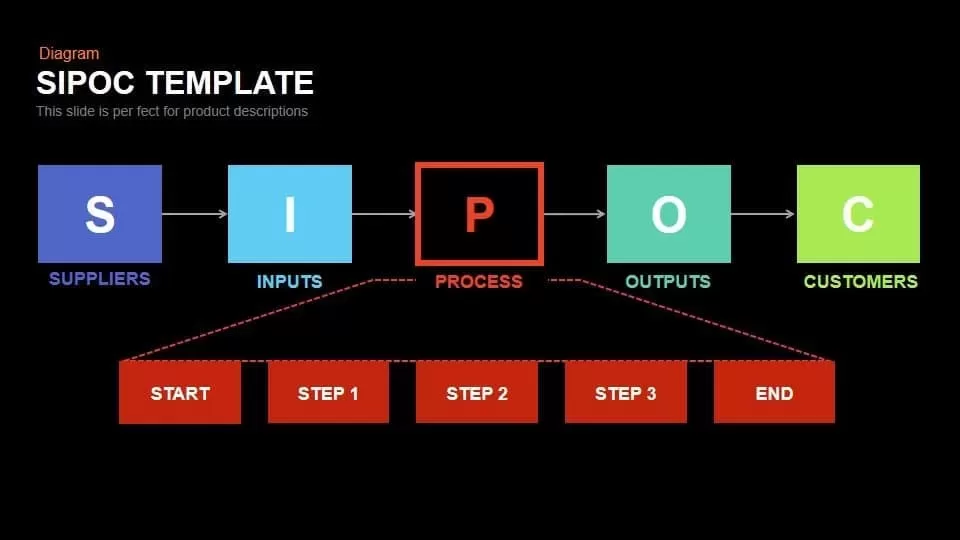
SIPOC Diagram with Process Breakdown Template for PowerPoint & Google Slides
Process

Light Bulb Idea Circular Diagram Template for PowerPoint & Google Slides
Infographics
Four Directional Arrow Diagram Template for PowerPoint & Google Slides
Arrow
Professional 4-Piece 3D Pyramid Diagram Template for PowerPoint & Google Slides
Pyramid
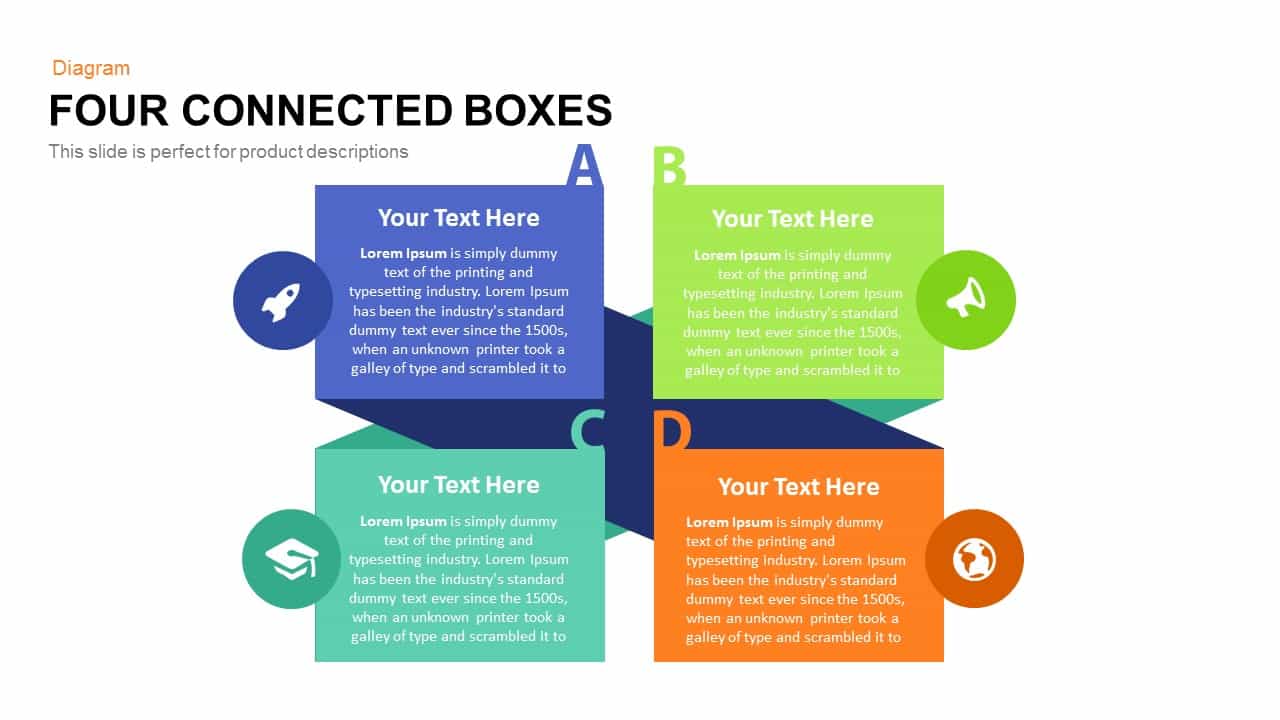
Simple Four Connected Boxes Diagram Template for PowerPoint & Google Slides
Business Models
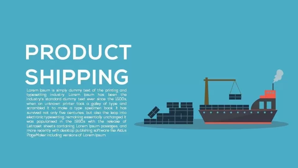
Product Shipping Metaphor Diagram Template for PowerPoint & Google Slides
Process
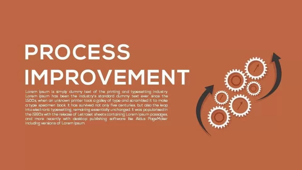
Process Improvement Metaphor Diagram Template for PowerPoint & Google Slides
Process
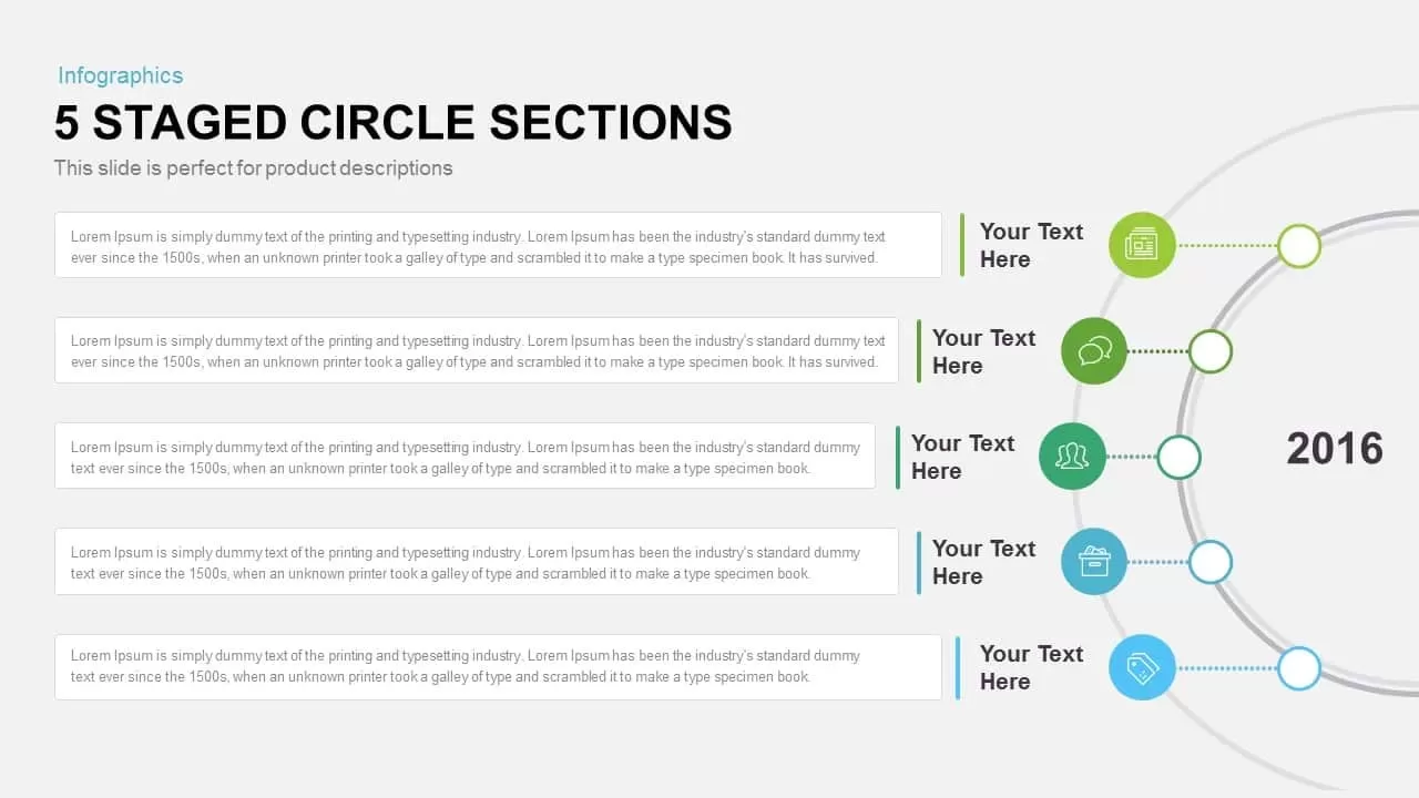
Five-Staged Circle Sections Diagram Template for PowerPoint & Google Slides
Circular
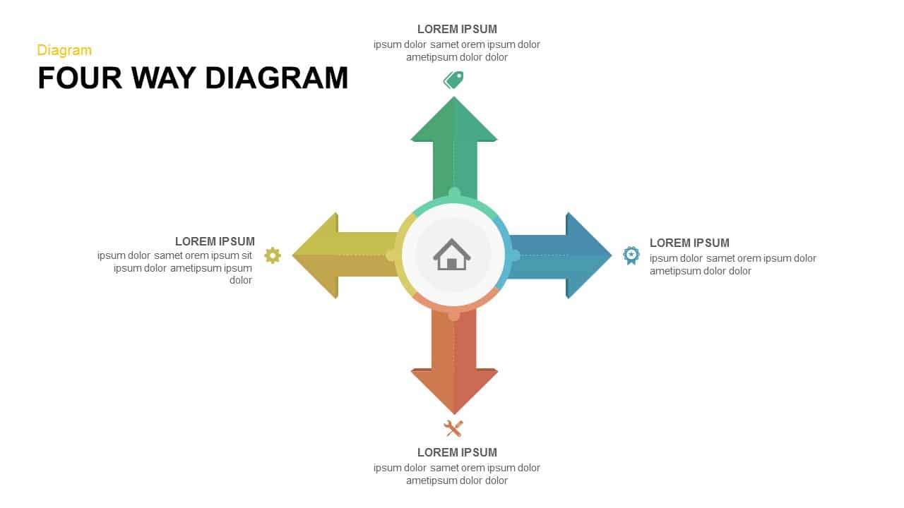
Four-Way Directional Arrow Diagram Template for PowerPoint & Google Slides
Arrow
Business Strategy Infographics Diagram Template for PowerPoint & Google Slides
Business Strategy
Six-Staged Gear Diagram Framework Template for PowerPoint & Google Slides
Process
8-Step Circular Arrow Diagram Template for PowerPoint & Google Slides
Arrow
Funnel Flow Diagram template for PowerPoint & Google Slides
Funnel
Six-Step Two-Sided Arrow Diagram Template for PowerPoint & Google Slides
Process

Interactive Gap Analysis Puzzle Diagram Template for PowerPoint & Google Slides
Gap
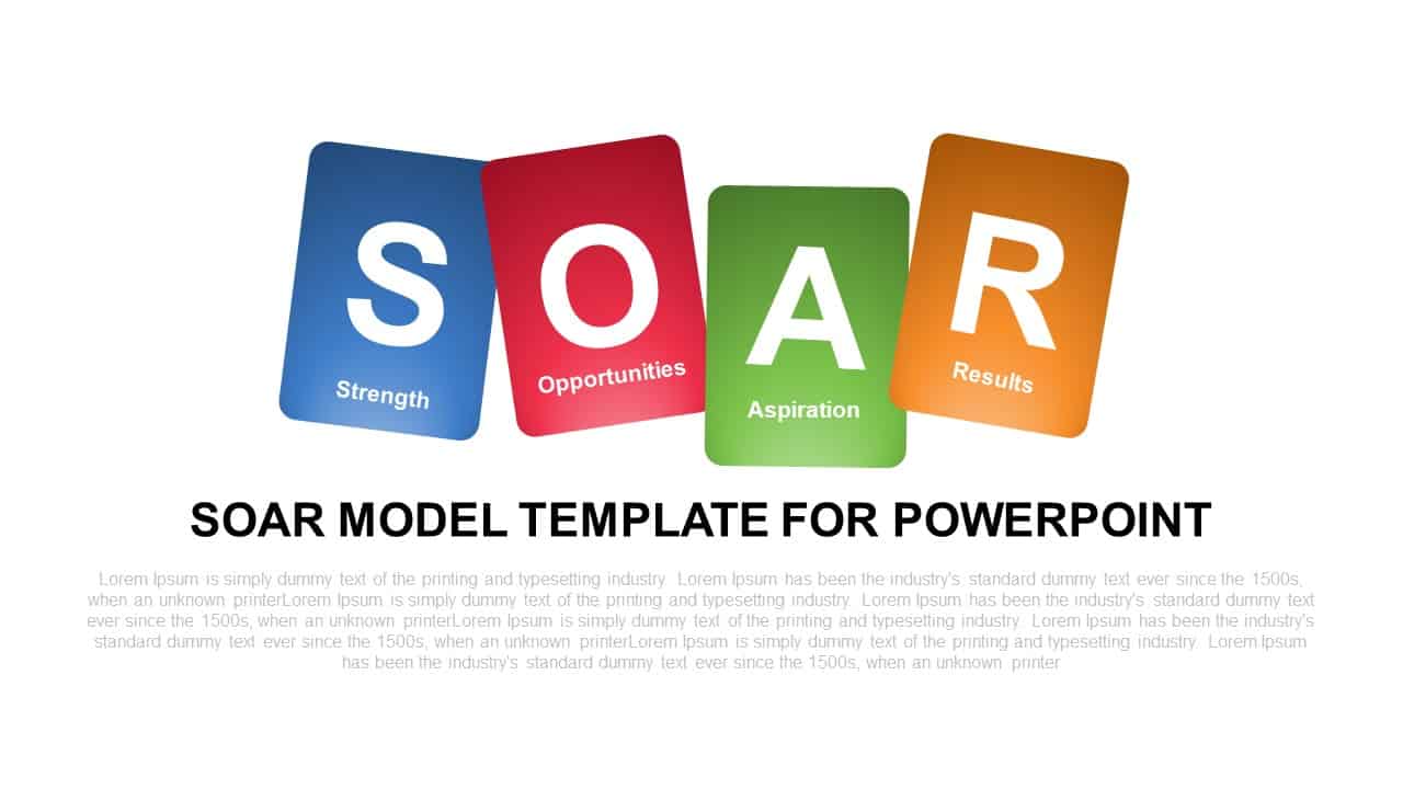
SOAR Strategic Model Card Diagram Template for PowerPoint & Google Slides
Process
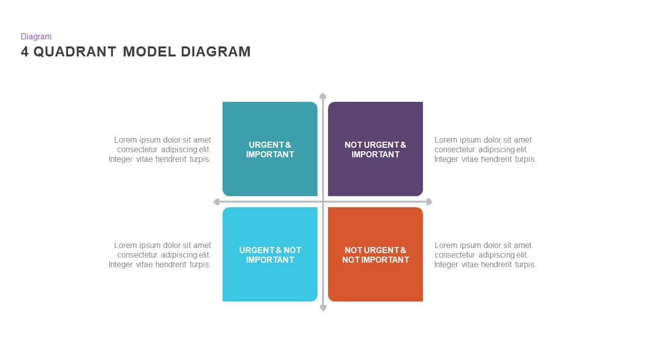
4 Quadrant Model Diagram template for PowerPoint & Google Slides
Process
Eight-Step Inward Arrow Diagram Template for PowerPoint & Google Slides
Arrow
Six-Stage Gear Wheel Diagram Template for PowerPoint & Google Slides
Circular
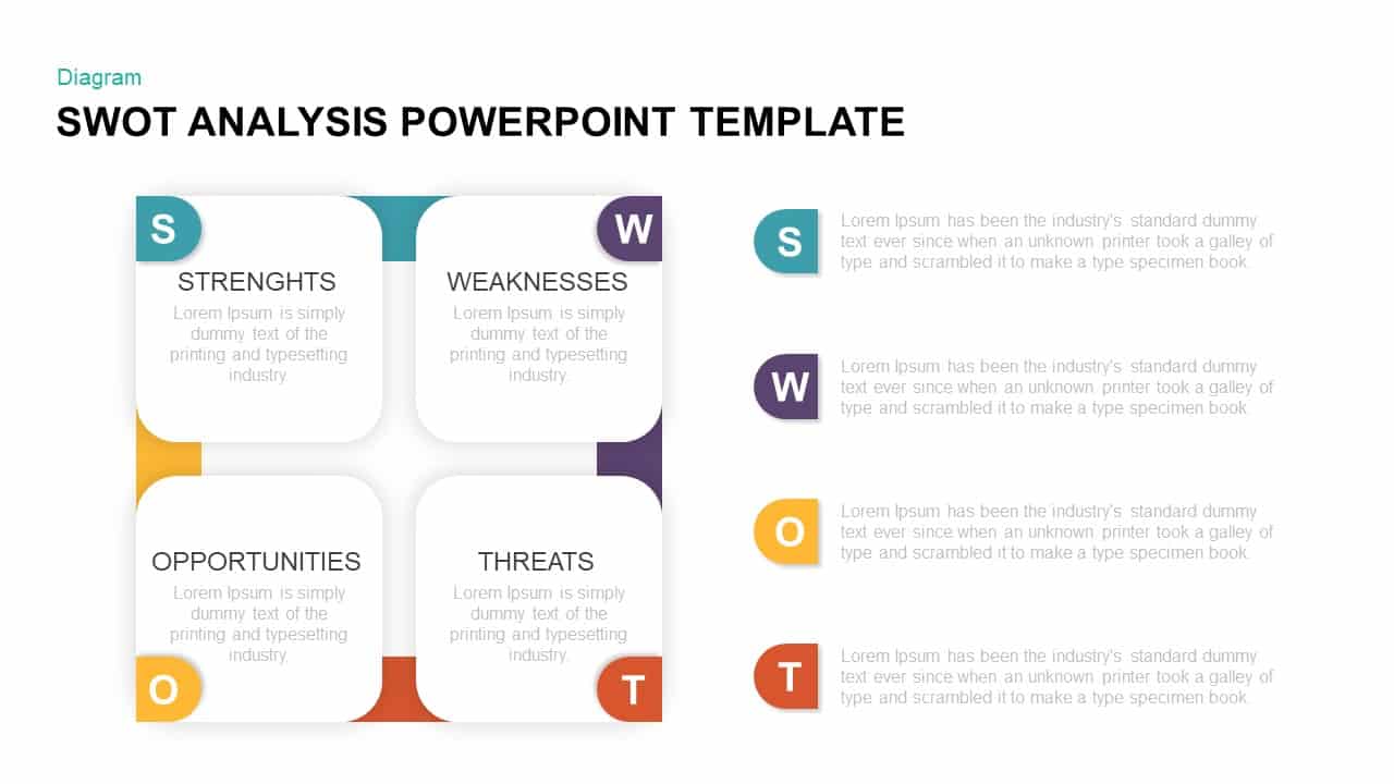
Four-Quadrant SWOT Analysis Diagram Template for PowerPoint & Google Slides
SWOT
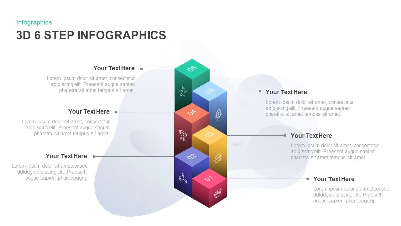
3D 6-Step Infographics Process Diagram Template for PowerPoint & Google Slides
Infographics
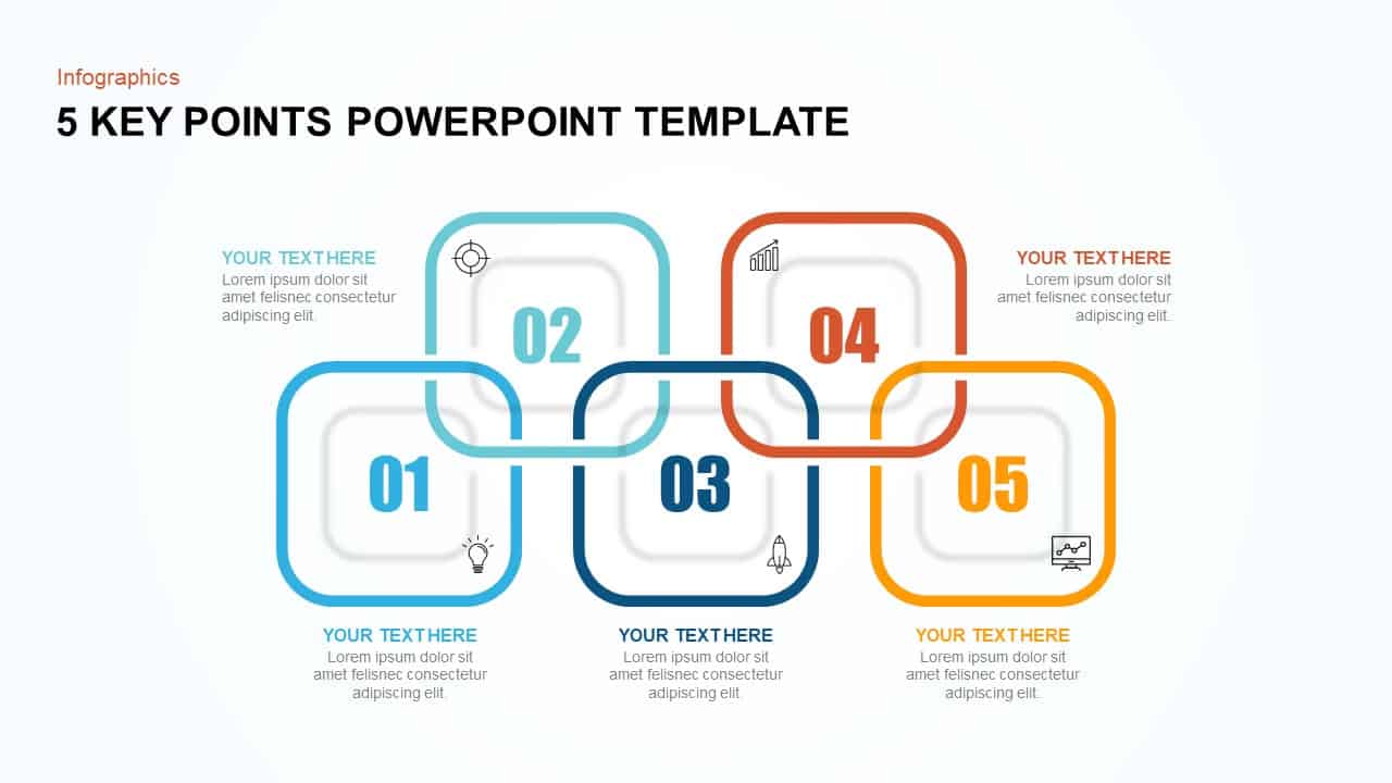
5 Key Points Infographic Diagram Template for PowerPoint & Google Slides
Process
Circular Three-Step Infographic Diagram Template for PowerPoint & Google Slides
Circular
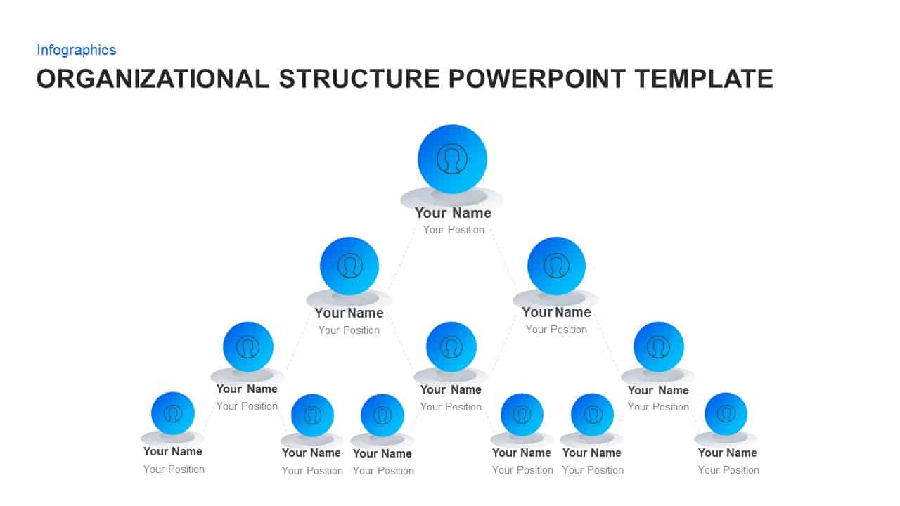
Organizational Structure Diagram Template for PowerPoint & Google Slides
Org Chart
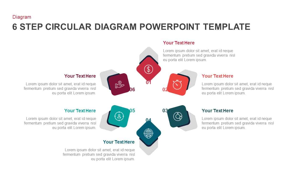
6-Step Circular Process Flow Diagram Template for PowerPoint & Google Slides
Process
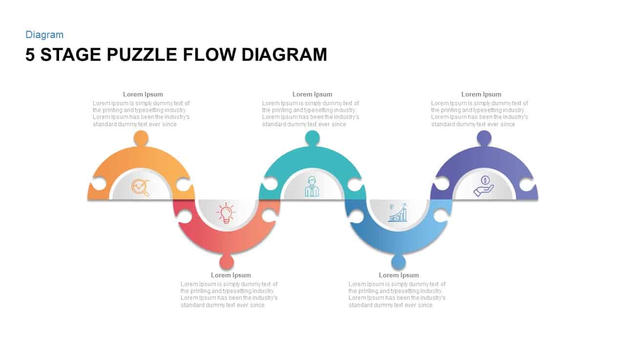
Five Stage Puzzle Flow Diagram Template for PowerPoint & Google Slides
Process
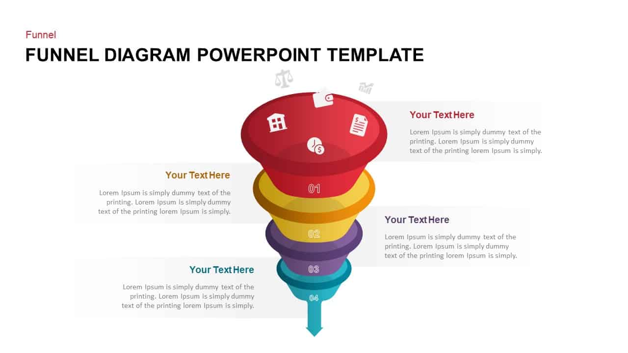
Four-Stage Funnel Diagram Infographic Template for PowerPoint & Google Slides
Funnel

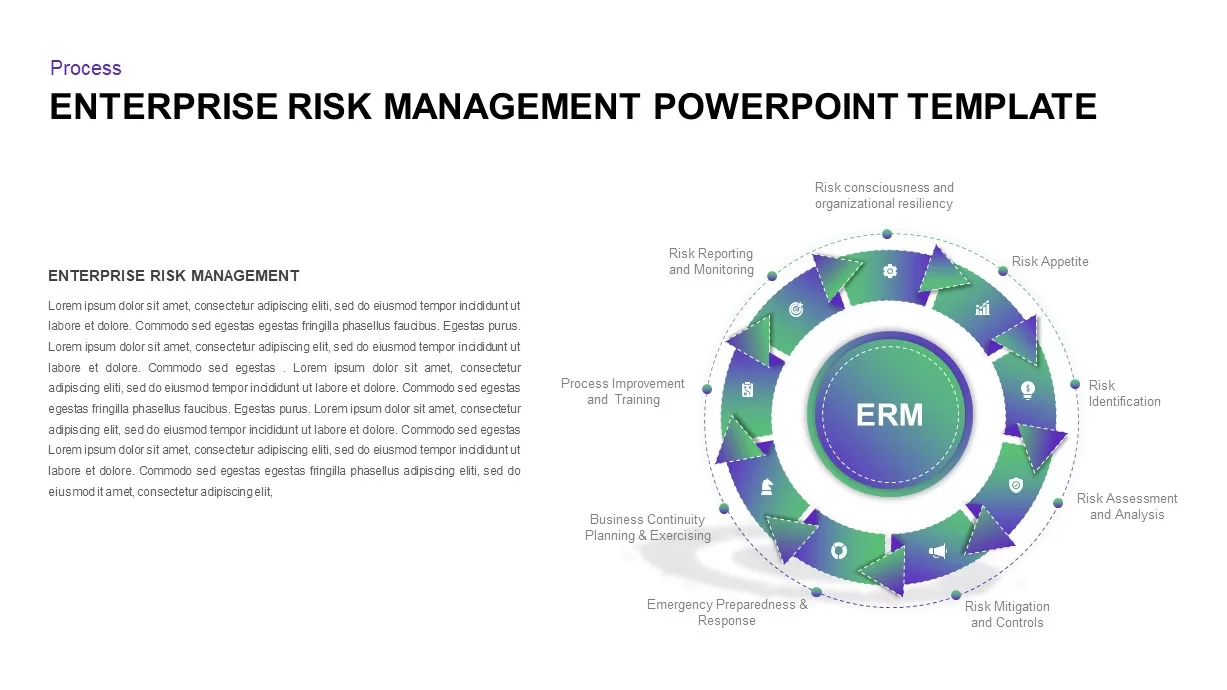
Enterprise Risk Management Cycle Diagram Template for PowerPoint & Google Slides
Process
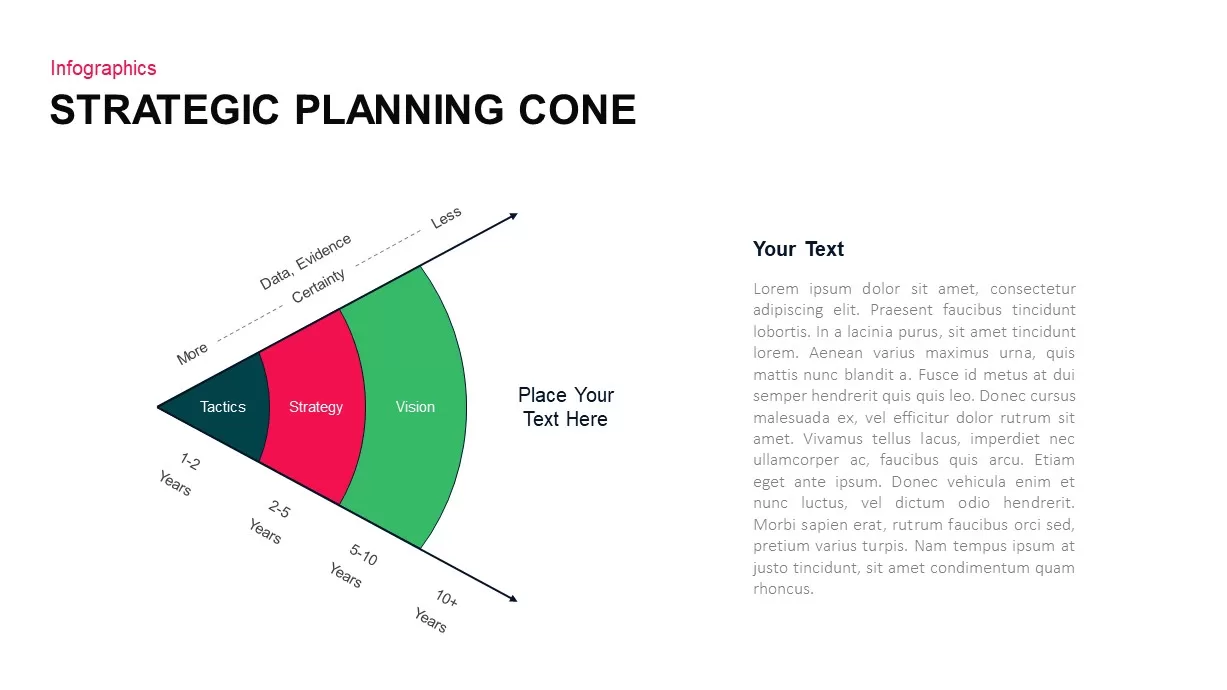
3-Part Strategic Planning Cone Diagram Template for PowerPoint & Google Slides
Process
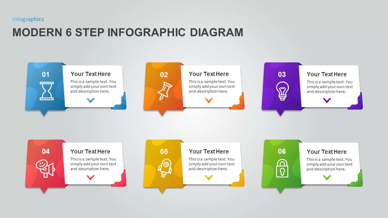
Modern 6 Step Infographic Diagram template for PowerPoint & Google Slides
Process
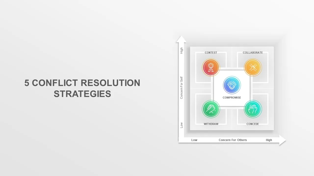
Conflict Resolution Strategies Diagram Template for PowerPoint & Google Slides
Infographics
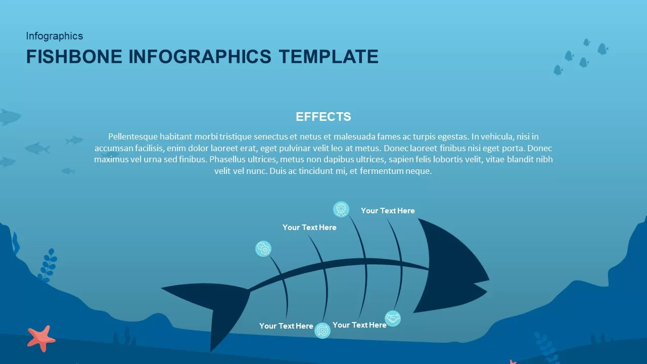
Underwater Fishbone Cause-Effect Diagram Template for PowerPoint & Google Slides
Process
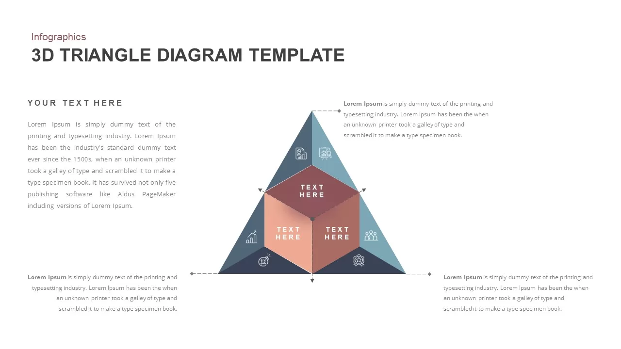
3D Triangle Diagram Infographic Template for PowerPoint & Google Slides
Pyramid
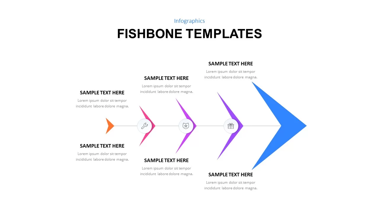
Fishbone Process Diagram template for PowerPoint & Google Slides
Infographics
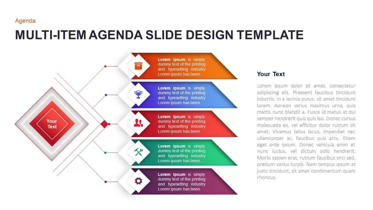
Multi-Item Agenda Hub-and-Spoke Diagram Template for PowerPoint & Google Slides
Agenda
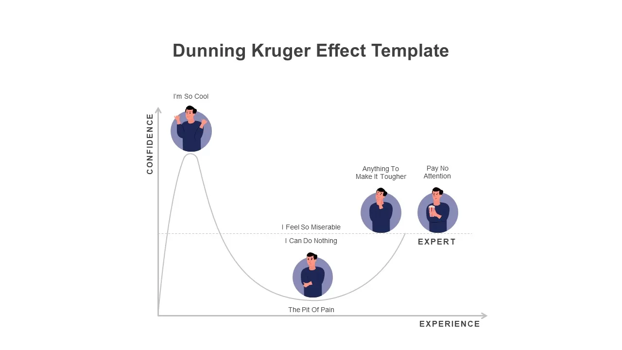
Modern Dunning Kruger Effect Diagram Template for PowerPoint & Google Slides
Business
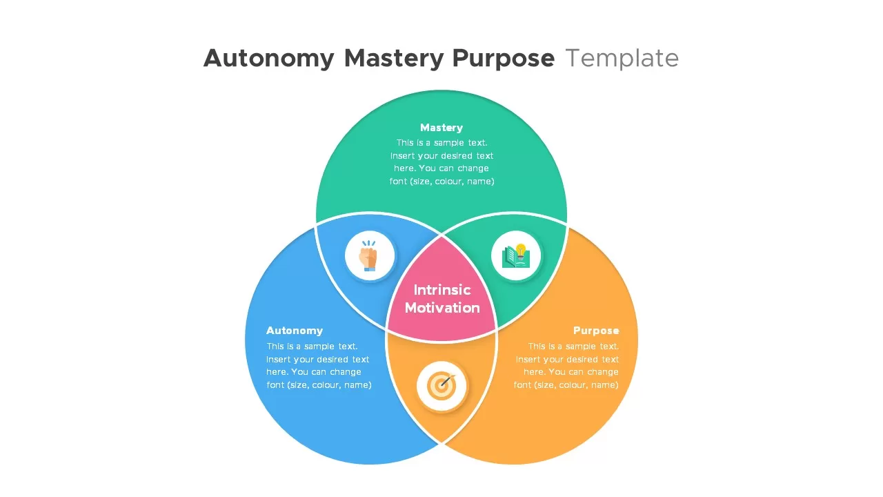
Autonomy, Mastery & Purpose Venn Diagram Template for PowerPoint & Google Slides
Circular
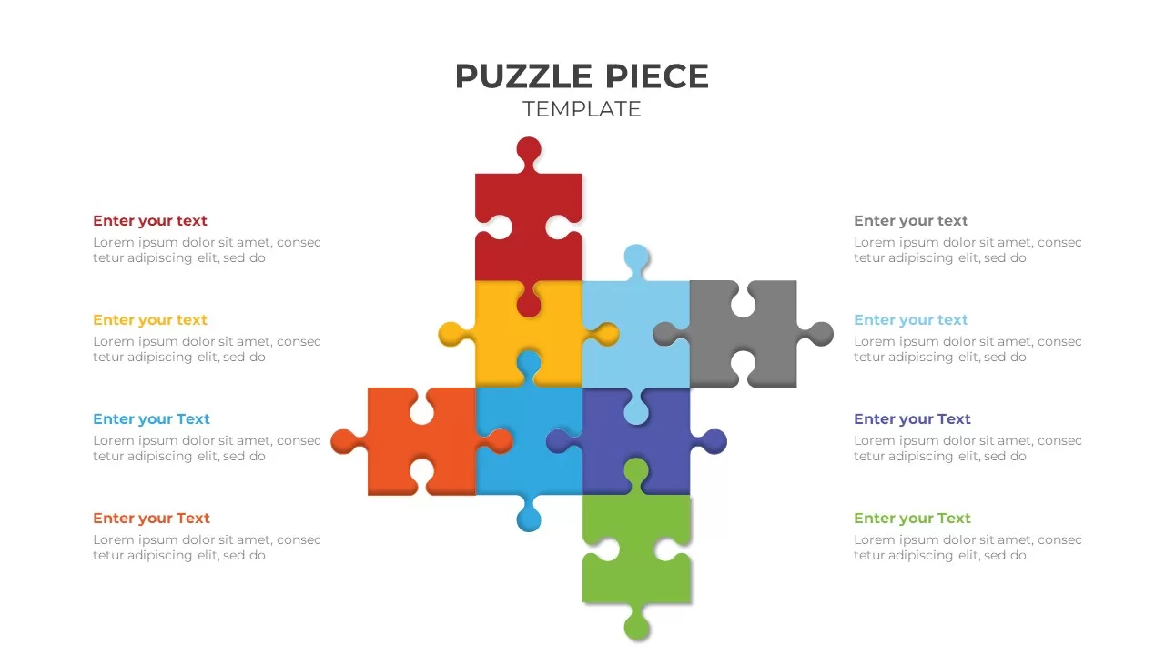
Colorful Eight-Piece Puzzle Diagram Template for PowerPoint & Google Slides
Process
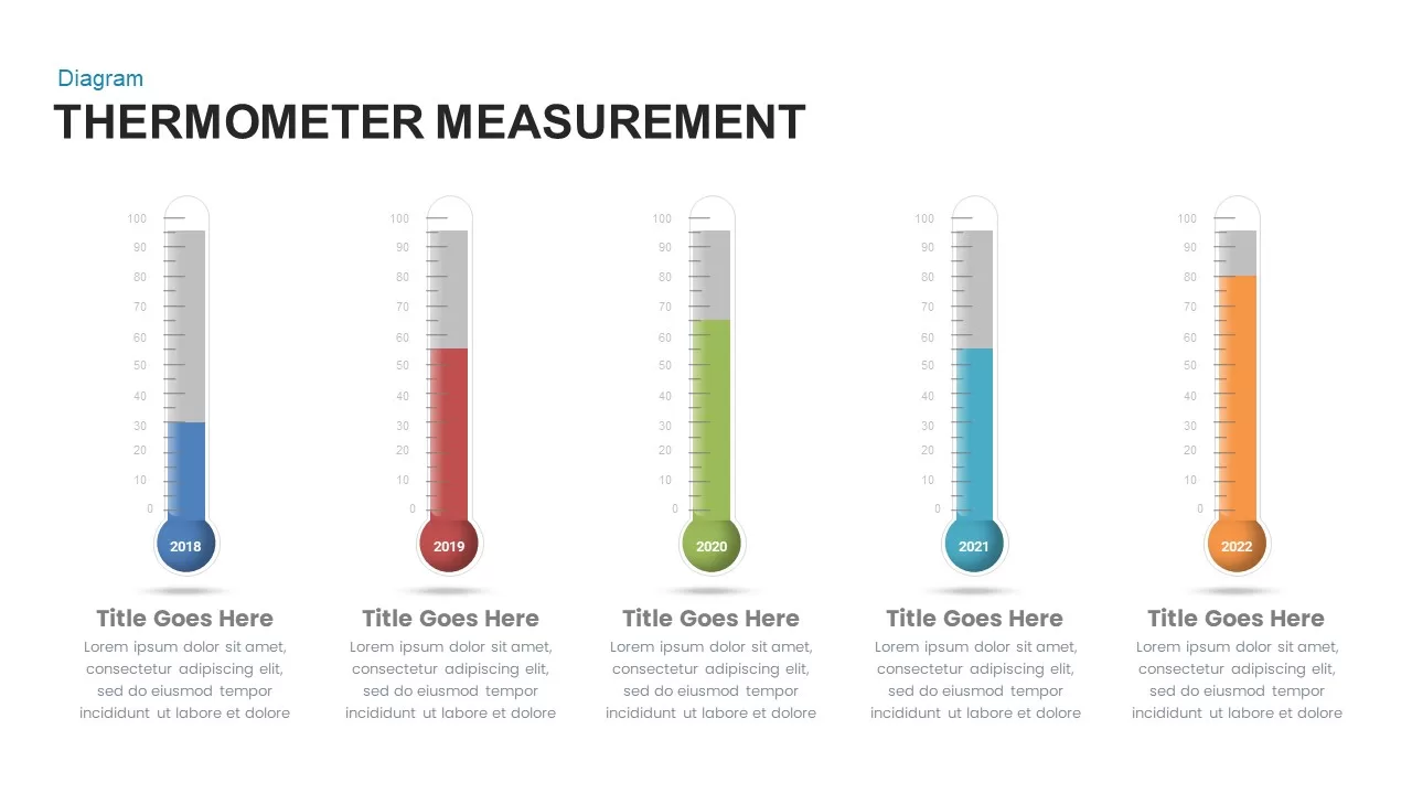
Thermometer Measurement Timeline Diagram Template for PowerPoint & Google Slides
Timeline
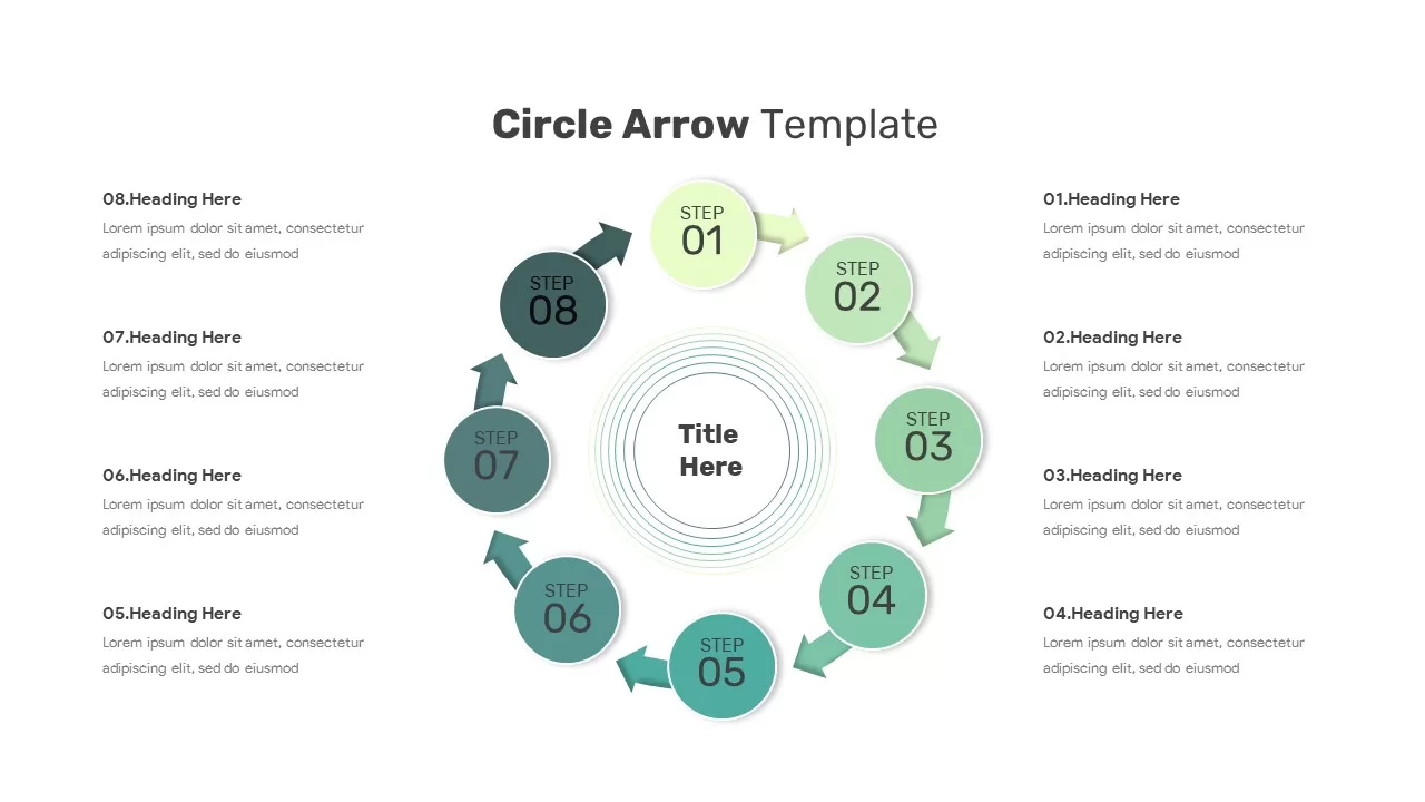
Circular Arrow Process Diagram Template for PowerPoint & Google Slides
Circular
Three-Step Hub and Spoke Diagram Template for PowerPoint & Google Slides
Circular
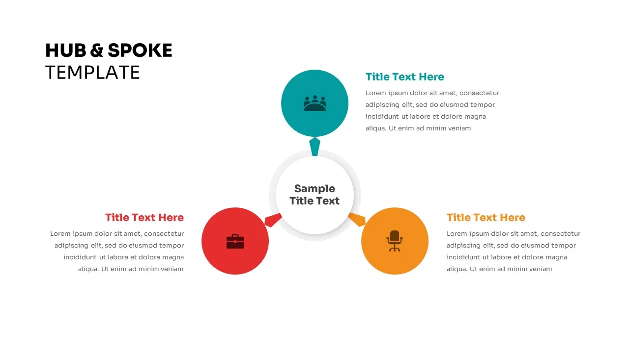
Four-Point Hub and Spoke Diagram Template for PowerPoint & Google Slides
Business Strategy
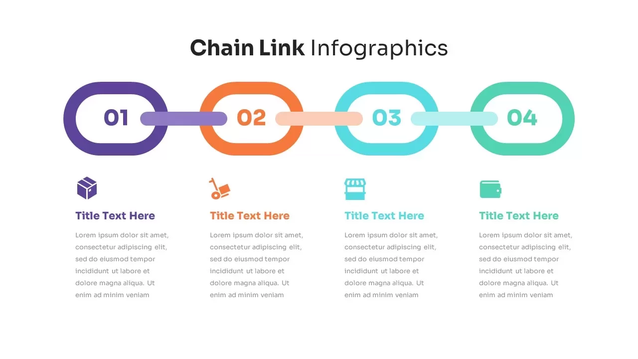
Chain Link Process Infographic Diagram Template for PowerPoint & Google Slides
Process
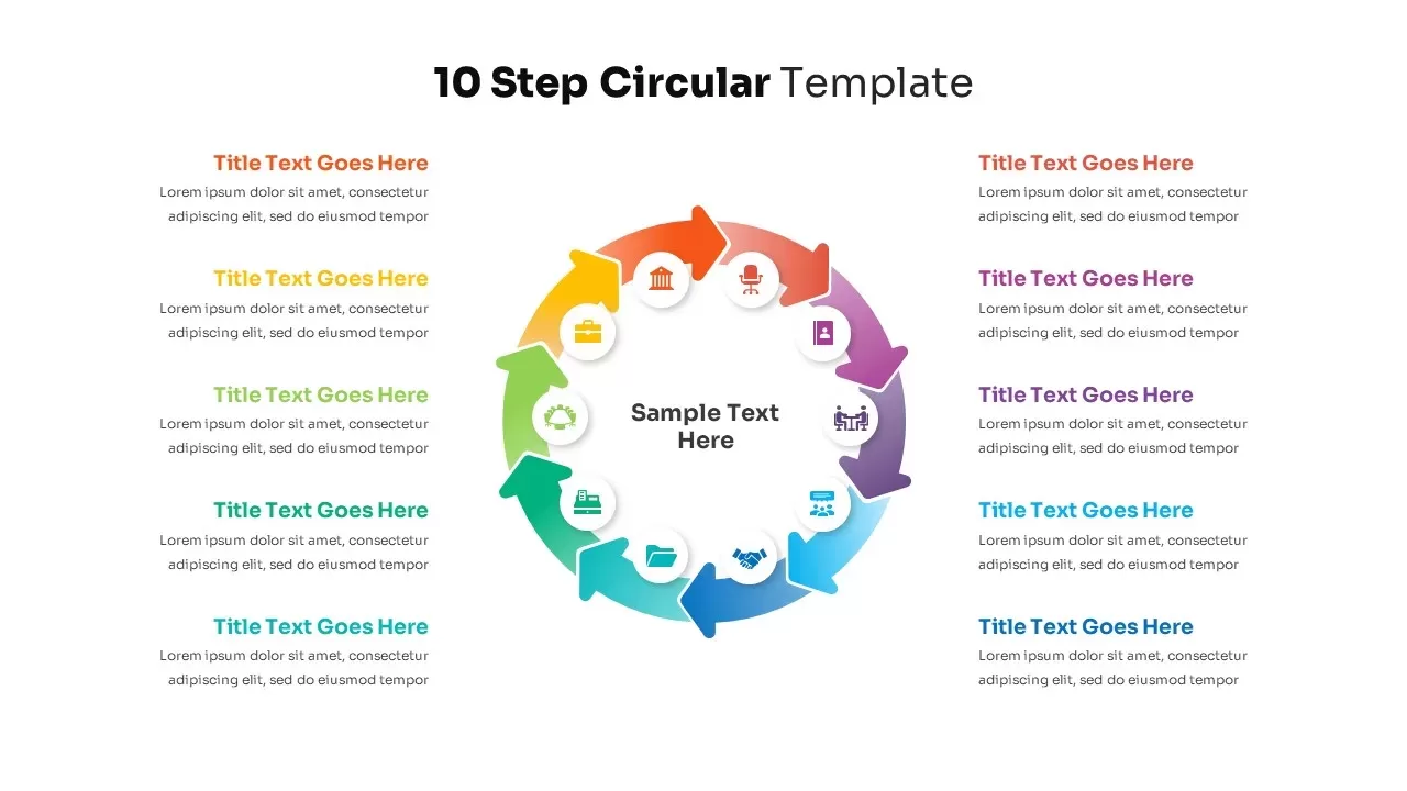
10-Step Circular Process Diagram Template for PowerPoint & Google Slides
Process
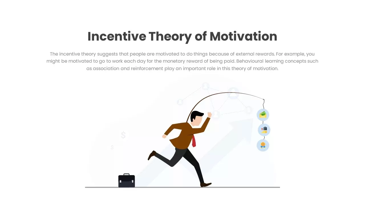
Incentive Theory of Motivation Diagram Template for PowerPoint & Google Slides
Employee Performance
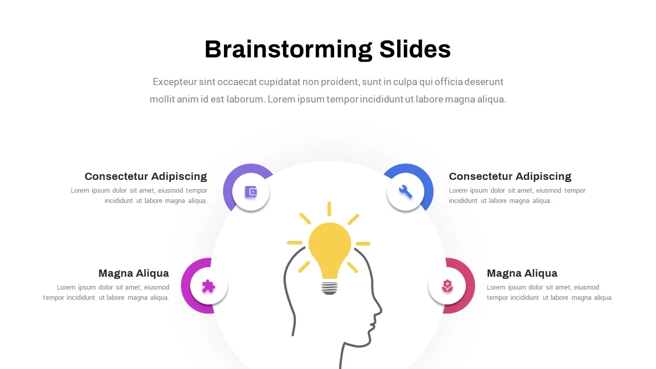
Creative Brainstorming Process Diagram Template for PowerPoint & Google Slides
Process
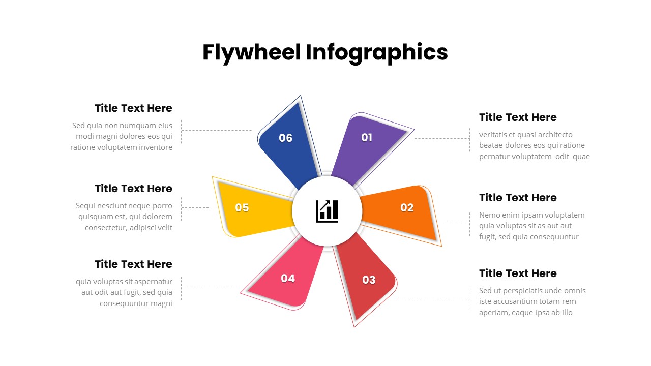
Six-Step Colorful Flywheel Diagram Template for PowerPoint & Google Slides
Circular
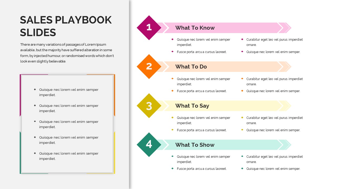
Sales Playbook Process Steps Diagram Template for PowerPoint & Google Slides
Marketing
Gear Process Diagram Template for PowerPoint & Google Slides
Process
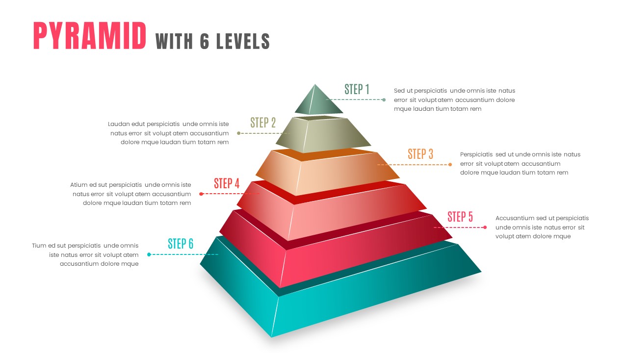
3D Six-Level Pyramid Diagram Infographic Template for PowerPoint & Google Slides
Pyramid
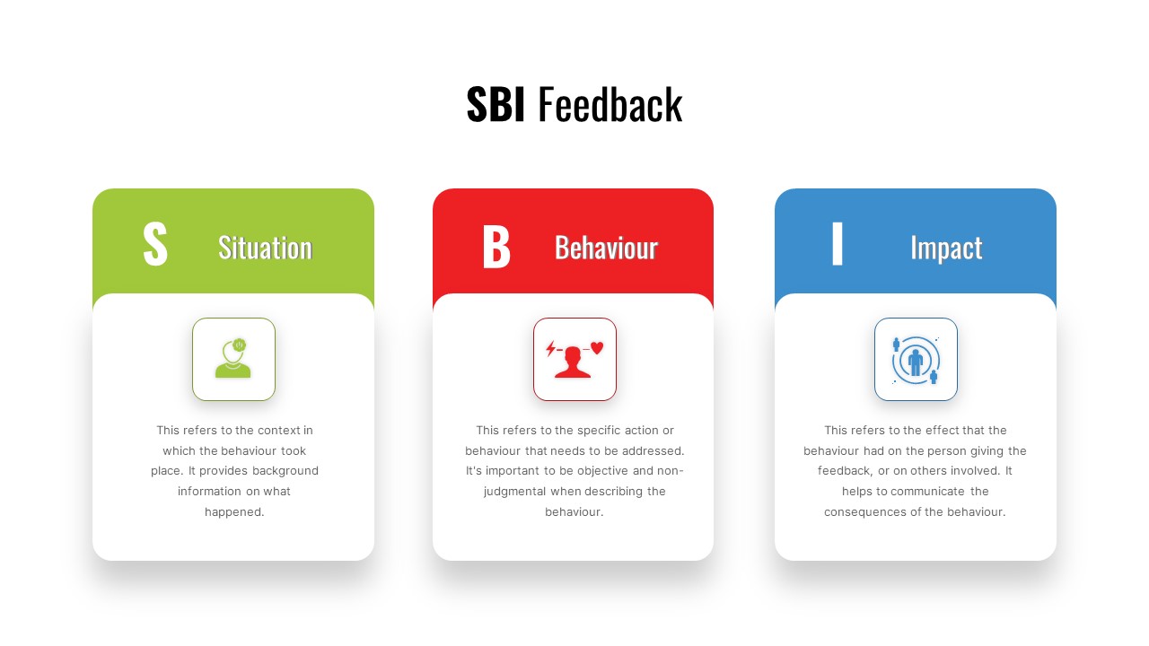
SBI Feedback Model Process Diagram Template for PowerPoint & Google Slides
Process
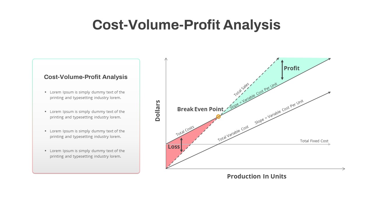
Cost-Volume-Profit Analysis Diagram Template for PowerPoint & Google Slides
Finance
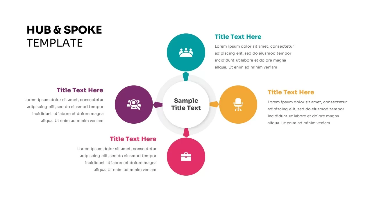
AI Rules Hub and Spoke Diagram Template for PowerPoint & Google Slides
AI
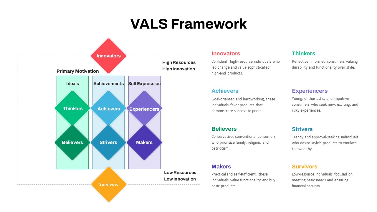
VALS Segmentation Framework Diagram Template for PowerPoint & Google Slides
Marketing
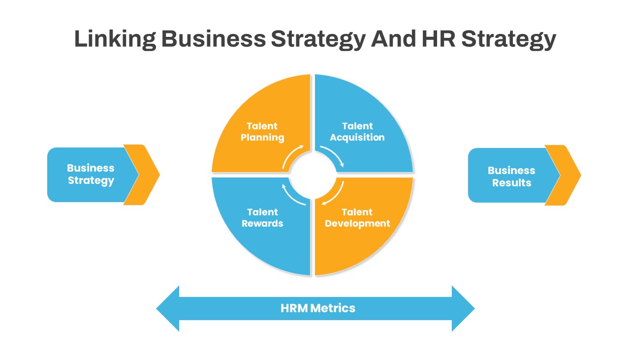
Linking Business HR Strategy Circular Diagram Template for PowerPoint & Google Slides
Business Strategy
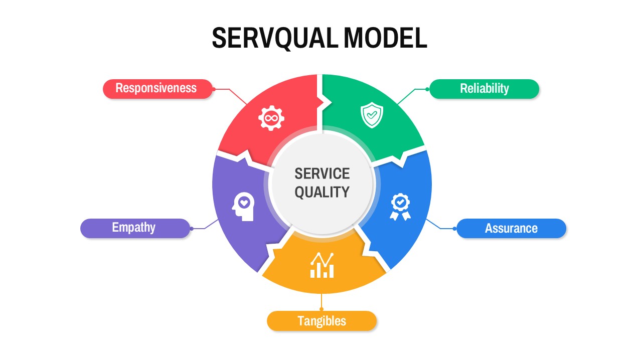
Circular SERVQUAL Model Diagram Template for PowerPoint & Google Slides
Business Strategy
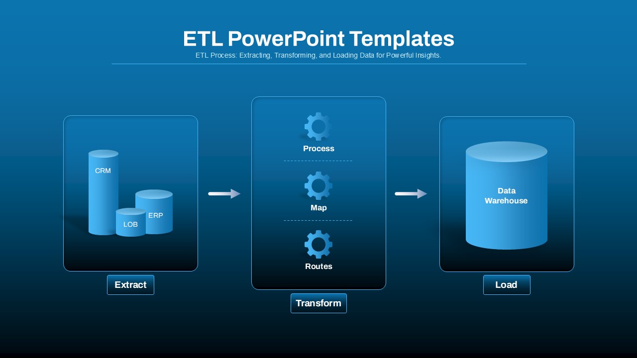
ETL Data Pipeline Workflow Diagram Template for PowerPoint & Google Slides
Process
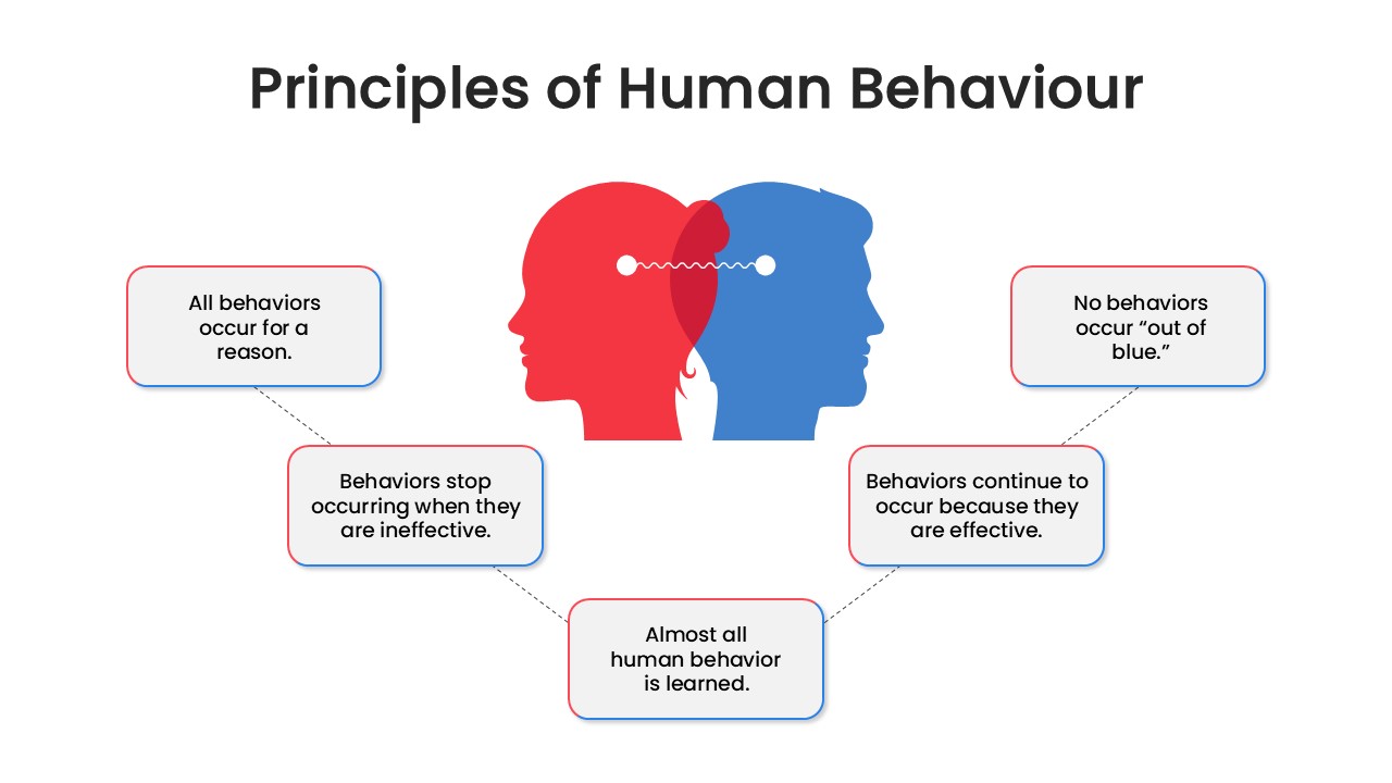
Human Behavior Principles Diagram Template for PowerPoint & Google Slides
Circular
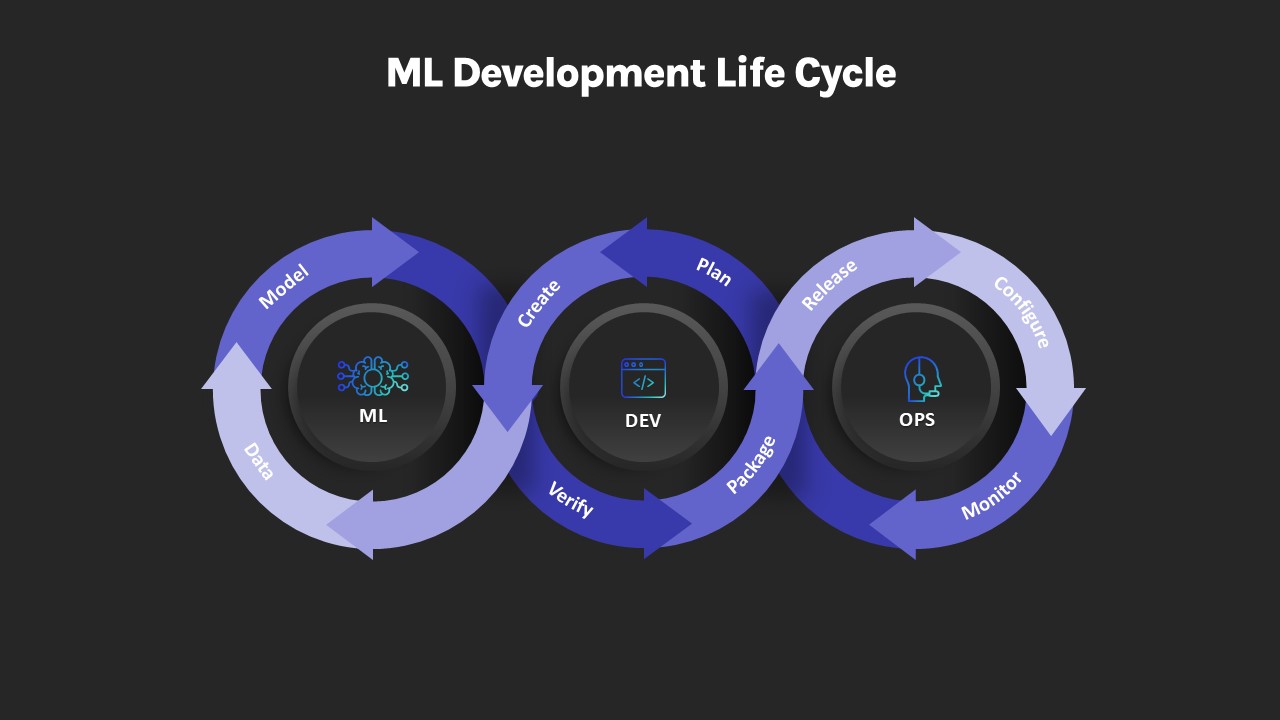
ML Development Life Cycle Diagram Template for PowerPoint & Google Slides
Machine Learning
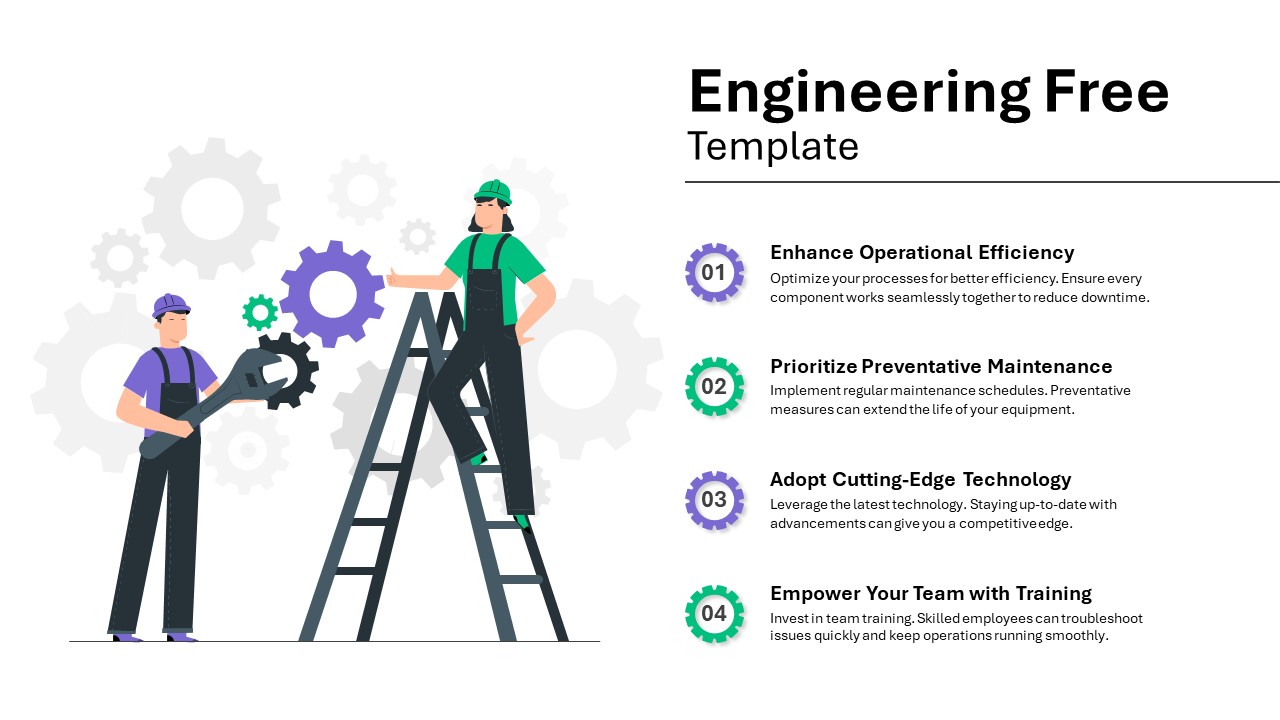
Engineering Efficiency Diagram Template for PowerPoint & Google Slides
Process
Free
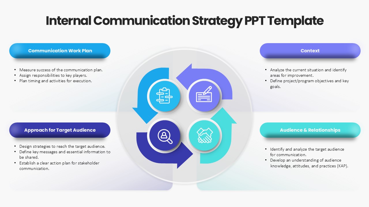
Internal Communication Strategy Diagram Template for PowerPoint & Google Slides
Process
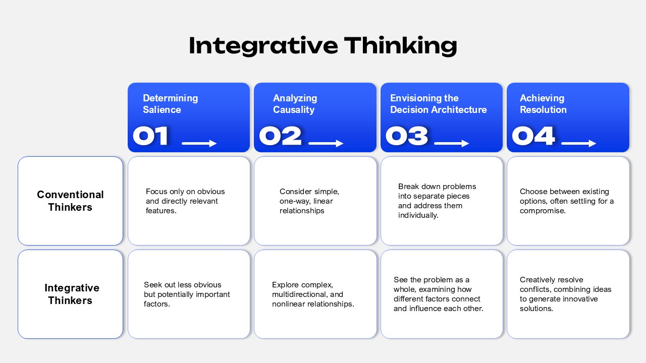
Integrative Thinking Comparison Diagram Template for PowerPoint & Google Slides
Comparison
Market Share Comparison Diagram Template for PowerPoint & Google Slides
Comparison Chart
Product Features Diagram Template for PowerPoint & Google Slides
Process
Bowtie Diagram Prevention & Recovery Template for PowerPoint & Google Slides
Decision Tree
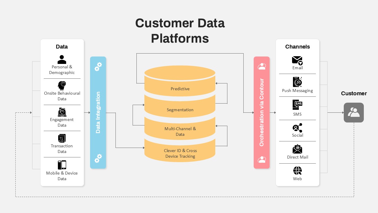
Customer Data Platform Workflow Diagram Template for PowerPoint & Google Slides
Information Technology
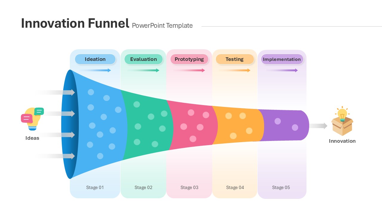
Innovation Funnel Process Diagram Template for PowerPoint & Google Slides
Funnel
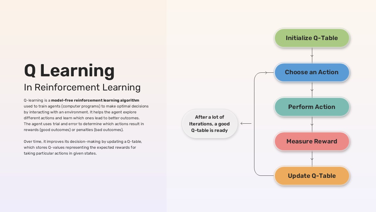
Q-Learning Process Flow Diagram Template for PowerPoint & Google Slides
Process
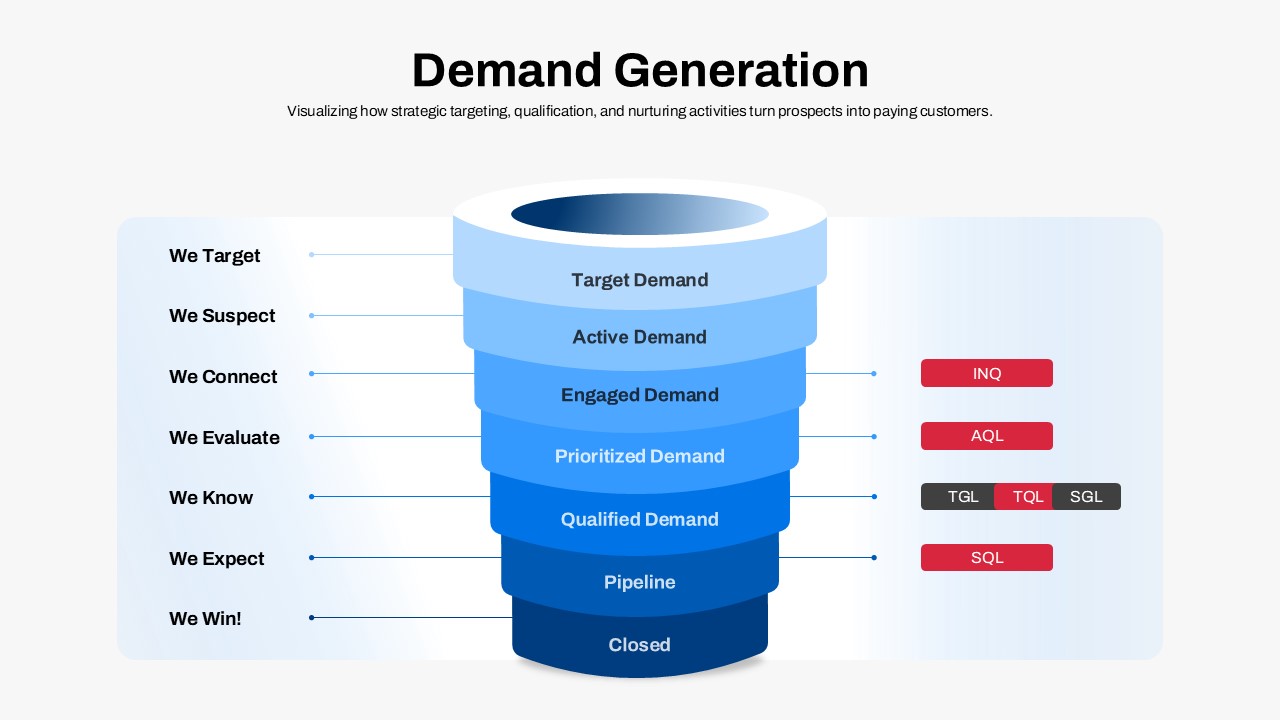
Demand Generation Funnel Process Diagram Template for PowerPoint & Google Slides
Funnel
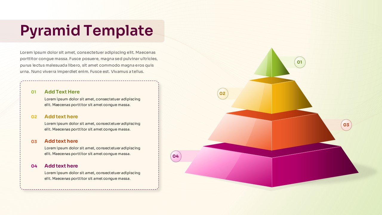
Four-Level Colorful Pyramid Diagram Template for PowerPoint & Google Slides
Pyramid
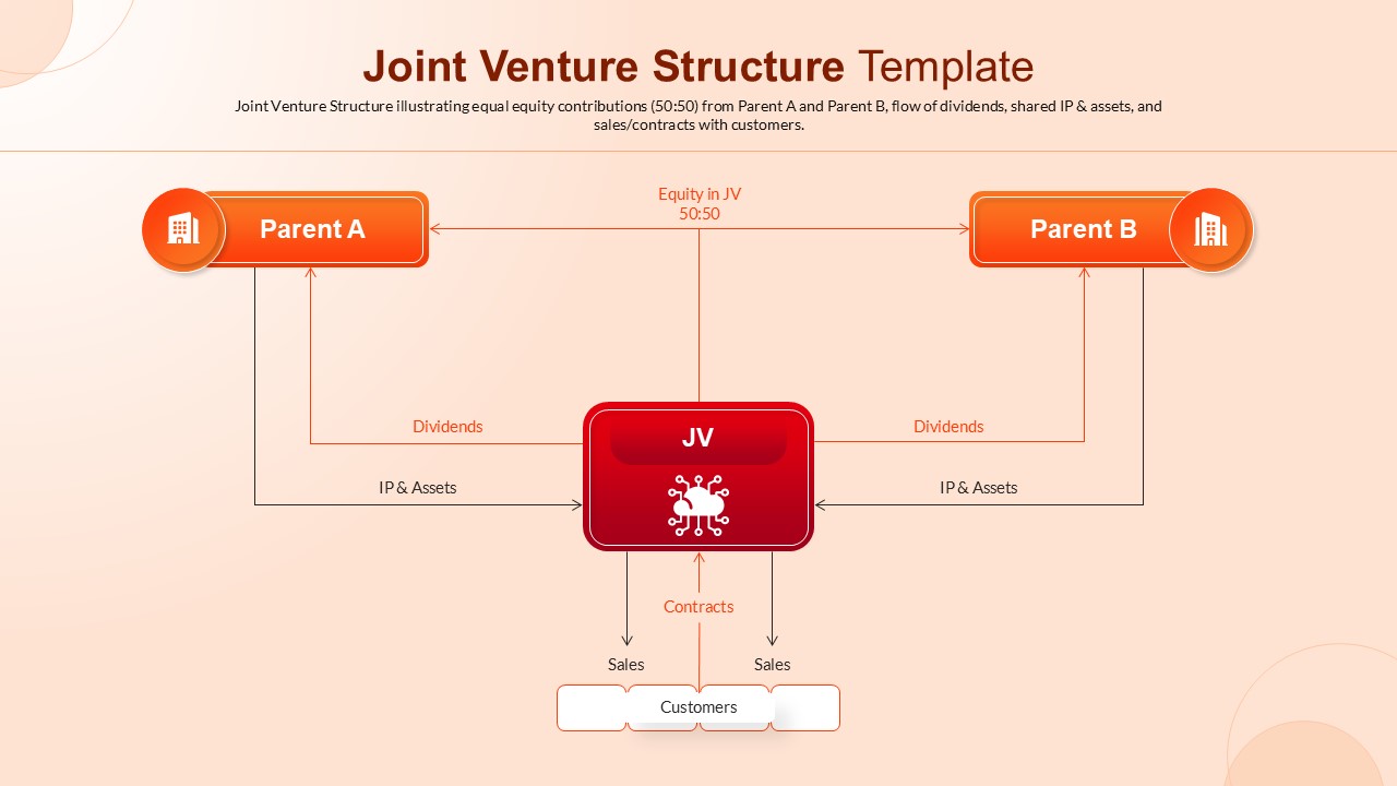
Joint Venture Structure Diagram Template for PowerPoint & Google Slides
Flow Charts
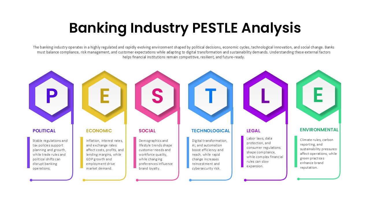
Banking Industry PESTLE Analysis Diagram Template for PowerPoint & Google Slides
PEST
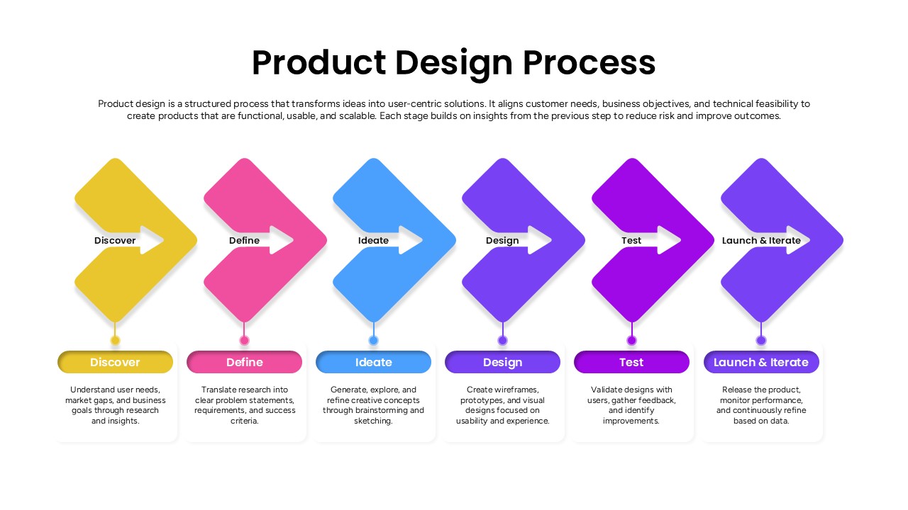
Product Design Process Flow Diagram Template for PowerPoint & Google Slides
Process