Year in Review KPI Highlights Slide for PowerPoint & Google Slides
Year in Review PowerPoint Template
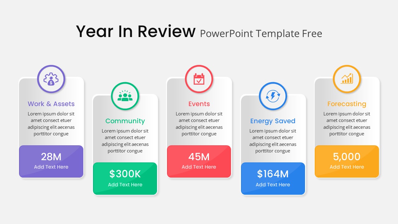
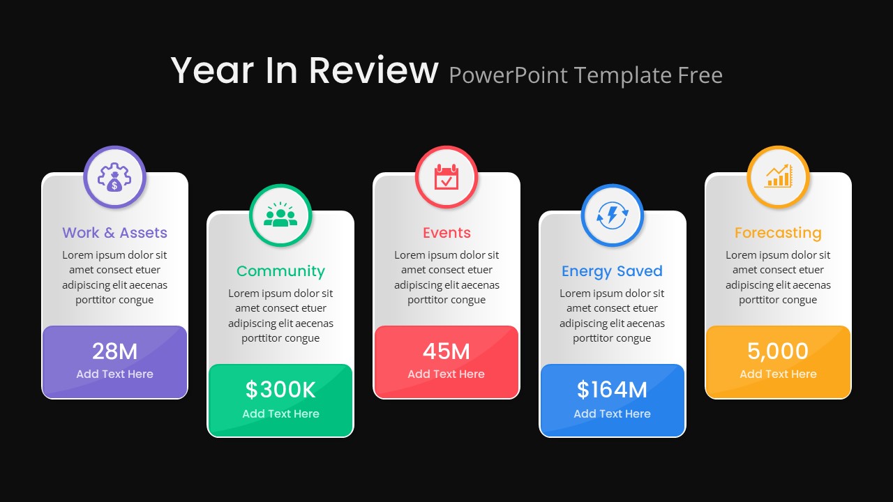
At the end of every year, there is a moment where someone in the organization has to stand up and answer the question everyone is thinking: so, what did we actually accomplish? That conversation needs structure. It needs visuals. And it needs a layout that lets the numbers speak for themselves without you having to explain every single data point out loud.
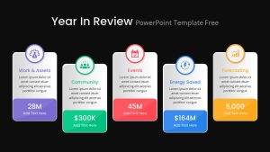
This year in review PowerPoint template is built around exactly that kind of presentation. Five vertical card blocks sit side by side across the slide, each one dedicated to a specific performance metric. Work and Assets, Community, Events, Energy Saved, and Forecasting each get their own color-coded card with a unique icon and a text block that gives you room for both the headline number and any supporting context you want to add underneath it.
The visual separation between cards is intentional. When you have five different metrics on one slide, the last thing you want is for the audience to have to work to figure out where one category ends and the next begins. The color coding, the rounded corners, and the drop shadows handle that separation automatically, so your audience can scan the slide quickly and land on the number they care about without getting lost.
A Fully Editable Year End Review PowerPoint Template for PowerPoint and Google Slides
Every element across this slide is fully customizable in both PowerPoint and Google Slides. Swap out the placeholder figures with your actual KPIs, replace the icons with ones that better represent your organization’s focus areas, or adjust the color themes to match your brand identity. The sans-serif typography and clean layout hold up well regardless of how much you change inside each card, so the slide keeps its professional look even after you have made it your own.
The layout works just as well on screen during a live presentation as it does exported as a PDF for a printed annual report or an emailed executive summary. Rounded corners and drop shadows are subtle enough to add visual polish without looking overdone, and the ample white space inside each card means there is always room for your data to breathe without the slide ever feeling crowded.
If your organization tracks more than five metrics, you can duplicate cards and extend the layout. If five is too many for what you need to show, removing a card keeps the remaining ones balanced without any manual realignment work on your end.
Who Is It For
Corporate executives, business analysts, marketing teams, sustainability officers, and department heads who pull together annual summaries or quarterly performance reviews will find this template genuinely useful. If your job involves presenting numbers to a leadership team or a board and you want those numbers to land with impact rather than disappear into a table, this layout gives you a strong starting point.
Other Uses
The card-based structure works for more than just year-end presentations. Use it for ESG reporting, CSR performance highlights, startup pitch decks, nonprofit activity reviews, sales dashboards, or strategic planning sessions where you need to present multiple KPIs in a single, coherent view. The five-card format is flexible enough to carry almost any set of metrics you need to showcase, regardless of industry or organizational size.
Login to download this file

Item ID
SB04034
Related Templates

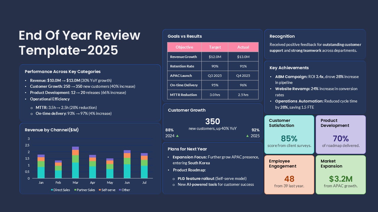
End of Year Review Dashboard Template for PowerPoint & Google Slides
Business Report
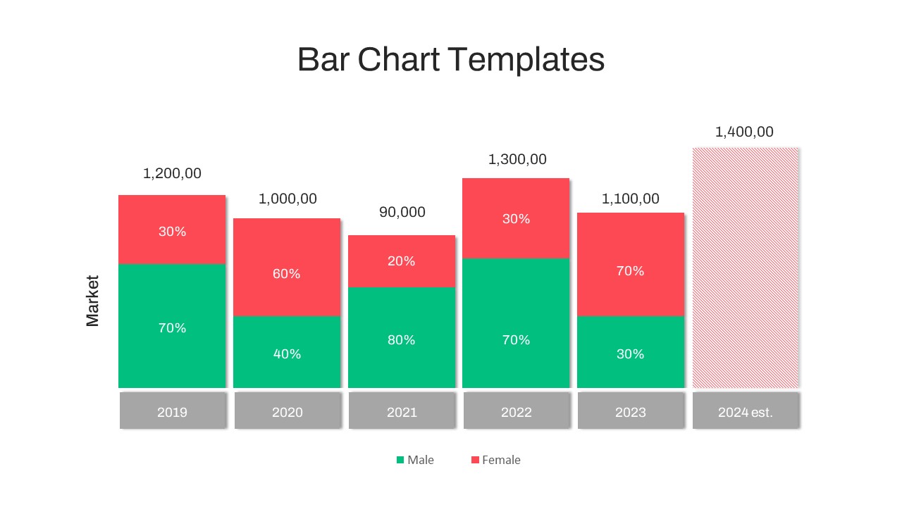
Year-over-Year Stacked Gender Bar Chart Template for PowerPoint & Google Slides
Bar/Column
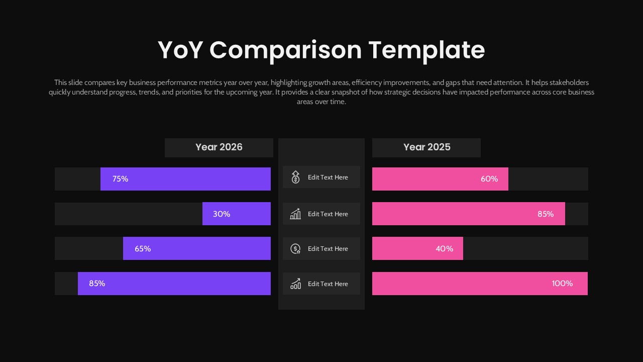
Year-over-Year Performance Comparison Template for PowerPoint & Google Slides
Comparison Chart
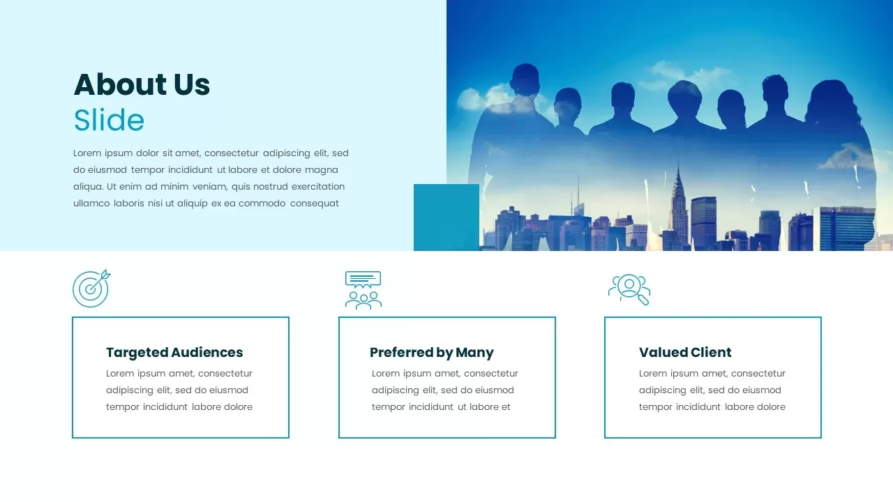
About Us Slide with Feature Highlights Template for PowerPoint & Google Slides
Marketing
About Us Slide with Icon Highlights Template for PowerPoint & Google Slides
Business
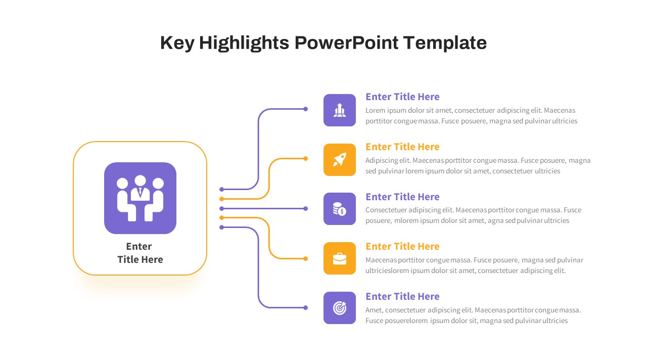
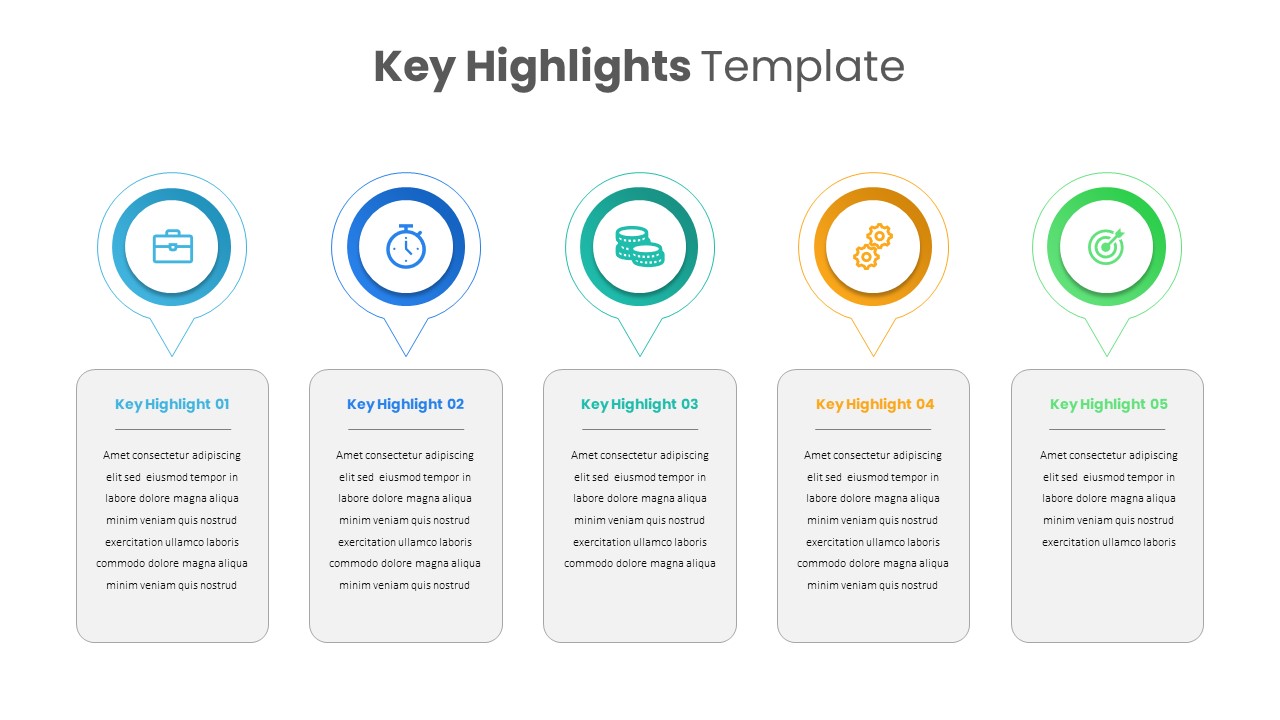
Key Highlights Slide Template PPT & Google Slides
Accomplishment
Free

Smartphone Feature Highlights template for PowerPoint & Google Slides
Business
Five-Block Section Feature Highlights Template for PowerPoint & Google Slides
Comparison
Horizontal Smartphone Feature Highlights Template for PowerPoint & Google Slides
Graphics
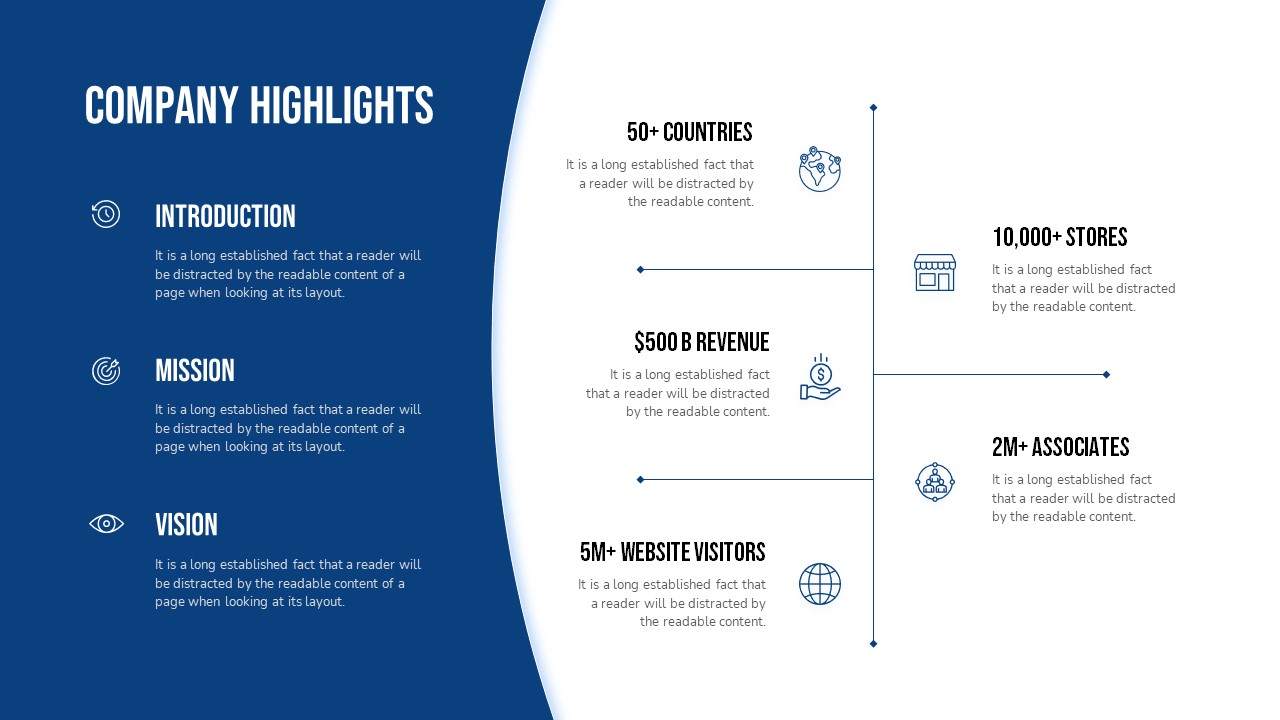
Company Highlights Profile Presentation Template for PowerPoint & Google Slides
Business
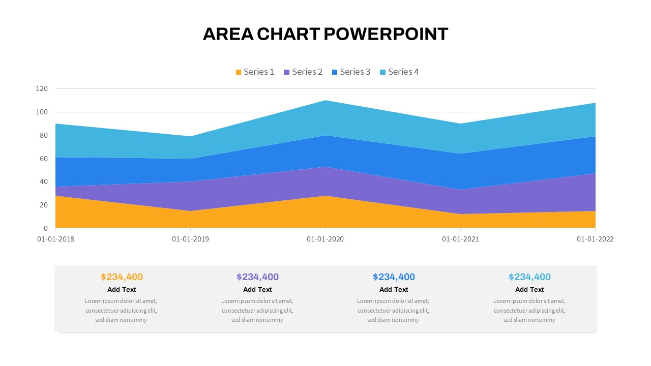
Stacked Area Chart with Financial Highlights for PowerPoint & Google Slides
Finance
Wavy Timeline with Image Highlights Template for PowerPoint & Google Slides
Timeline
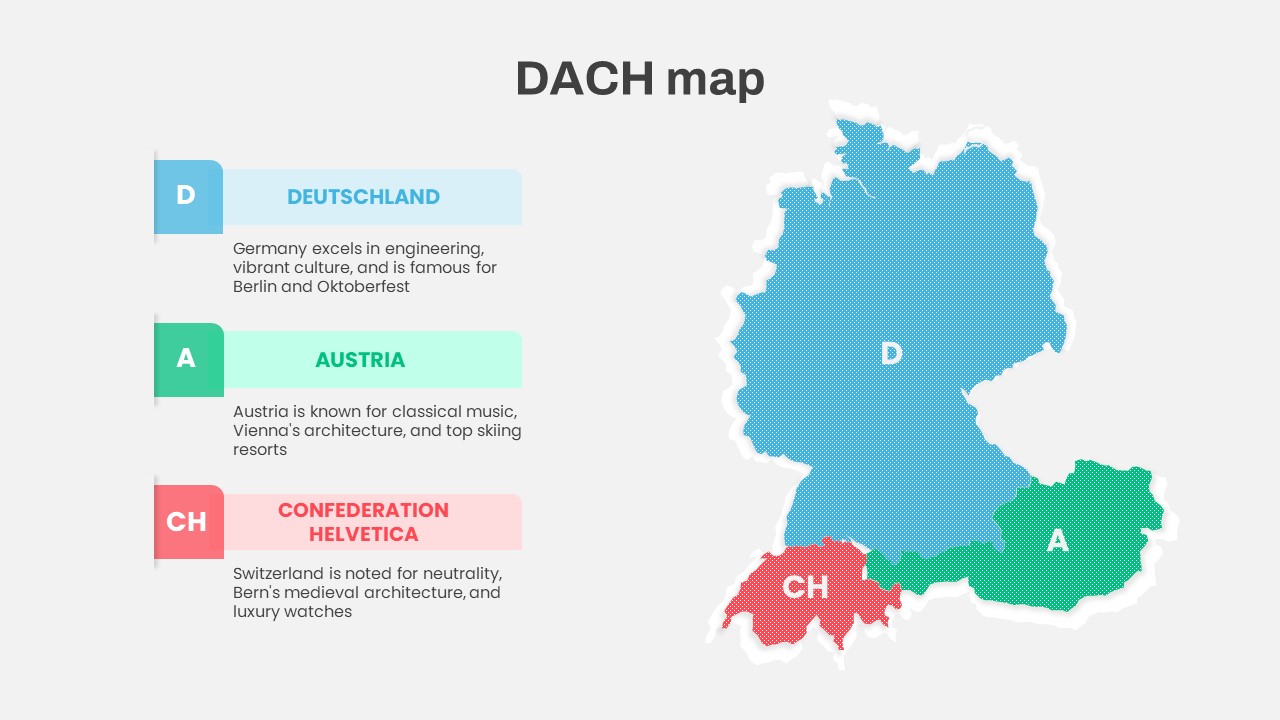
DACH Region Map with Country Highlights Template for PowerPoint & Google Slides
Maps
Key Highlights PowerPoint Template
Business
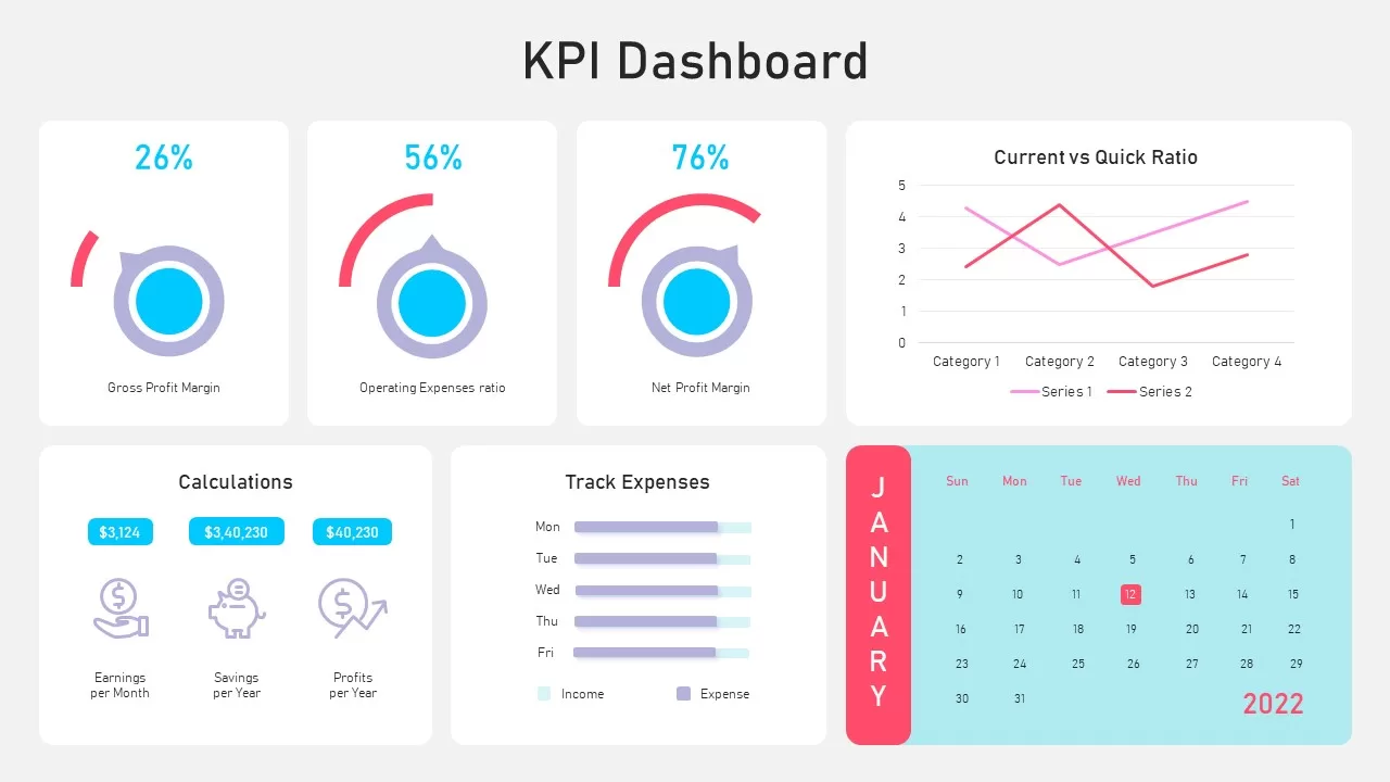
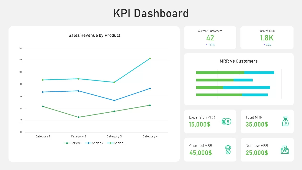
Performance KPI Dashboard Slide Template for PowerPoint & Google Slides
Business Report
KPI Dashboard Data Overview Slide Template for PowerPoint & Google Slides
Bar/Column
Professional Team Collage & KPI Slide Template for PowerPoint & Google Slides
Business
Free KPI Dashboard Template for PowerPoint & Google Slides
Charts
Free
Asia Map with KPI Metrics and Legend Template for PowerPoint & Google Slides
World Maps

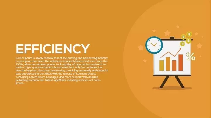
Efficiency KPI Dashboard Metaphor Template for PowerPoint & Google Slides
Infographics

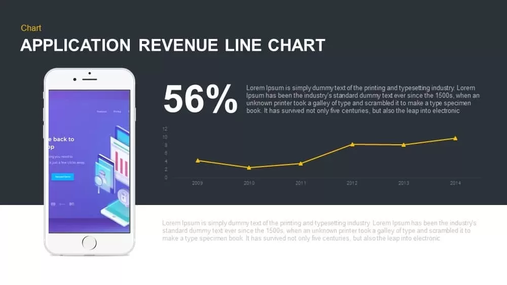
Application Revenue Line Chart KPI Template for PowerPoint & Google Slides
Revenue
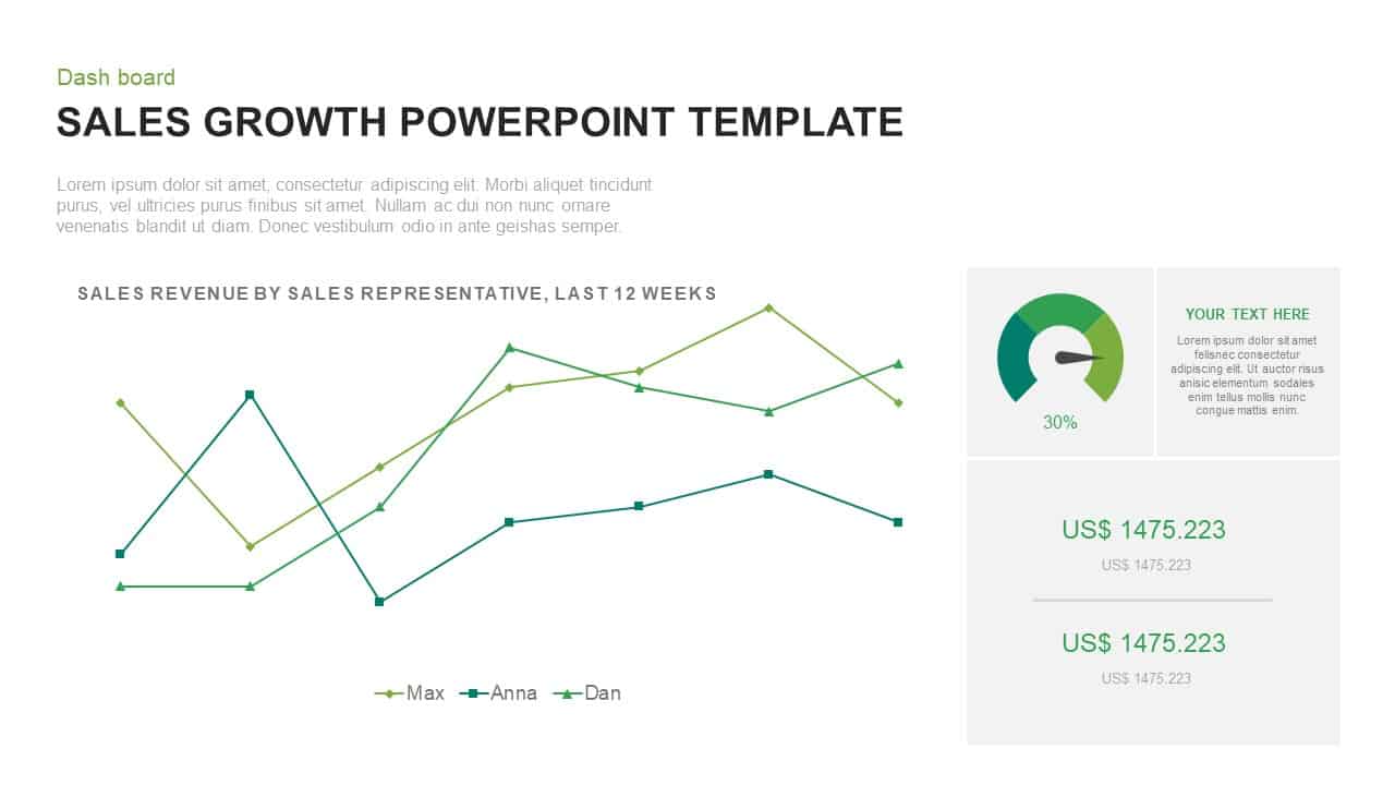
Sales Growth Dashboard: KPI Gauge & Line Template for PowerPoint & Google Slides
Revenue
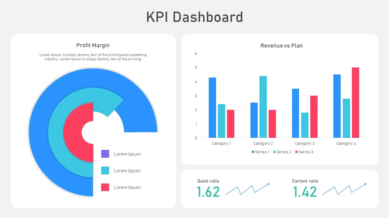
KPI Dashboard template for PowerPoint & Google Slides
Business Report
KPI Dashboard Overview template for PowerPoint & Google Slides
Finance
KPI Dashboard Data Visualization Template for PowerPoint & Google Slides
Bar/Column
Circular Image Gallery & KPI Metrics Template for PowerPoint & Google Slides
Pie/Donut
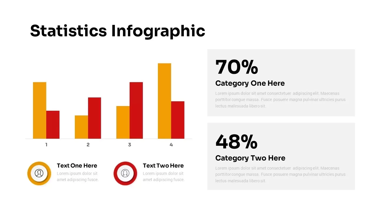
Statistics Infographic & KPI Bar Chart Template for PowerPoint & Google Slides
Bar/Column
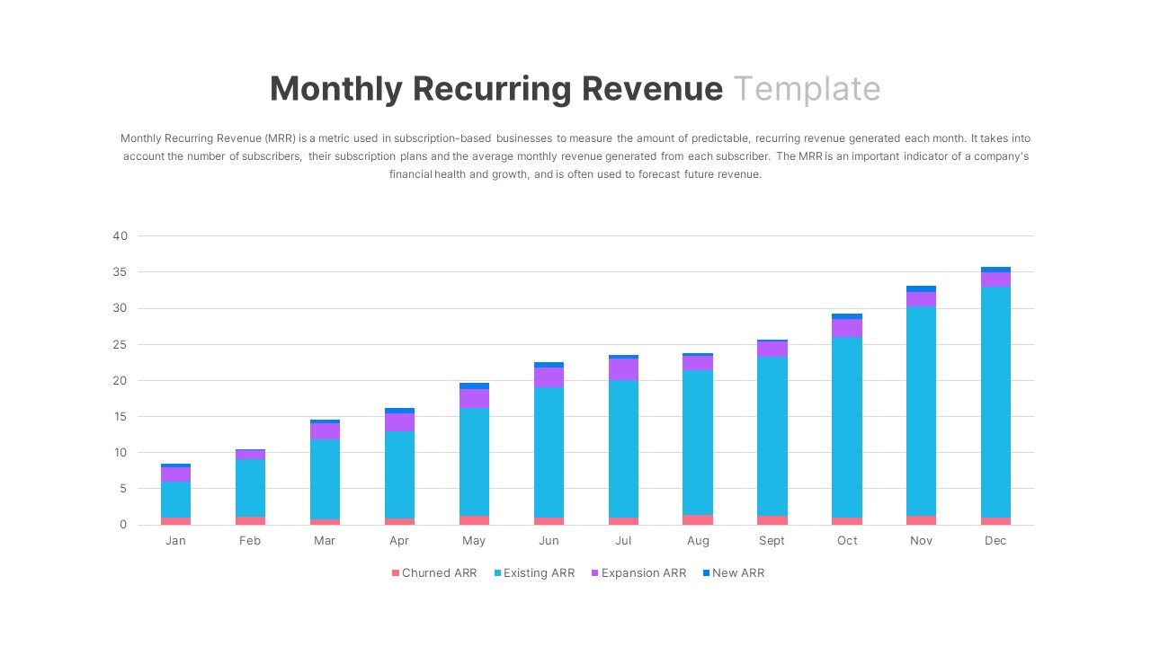
Monthly Recurring Revenue KPI Bar Chart Template for PowerPoint & Google Slides
Bar/Column
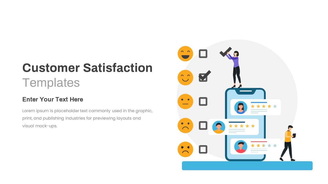
Customer Satisfaction KPI Dashboard Template for PowerPoint & Google Slides
Customer Experience
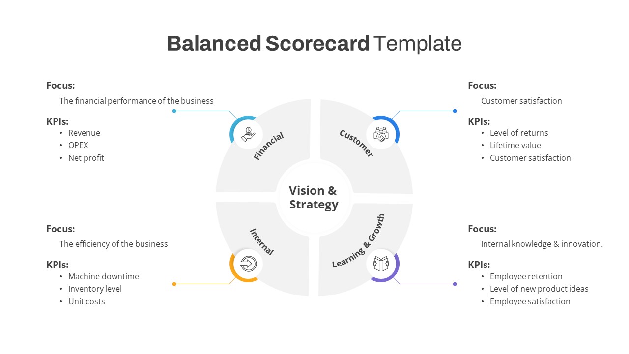
Free Balanced Scorecard Quadrant KPI Layout Template for PowerPoint & Google Slides
Employee Performance
Free
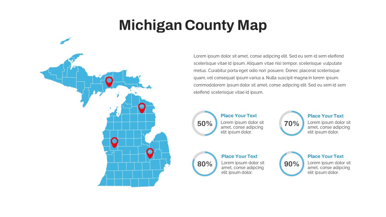
Michigan County Map with KPI Dashboard Template for PowerPoint & Google Slides
World Maps
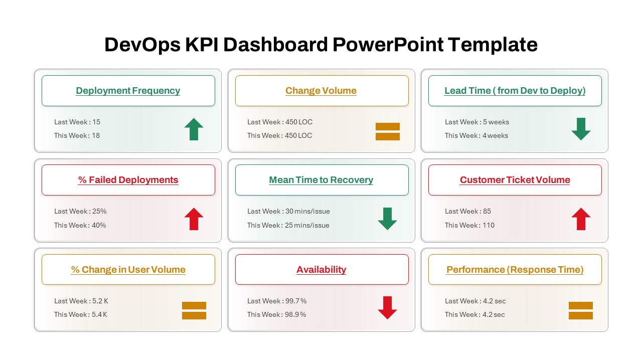
DevOps KPI Dashboard Performance Metrics Template for PowerPoint & Google Slides
Software Development
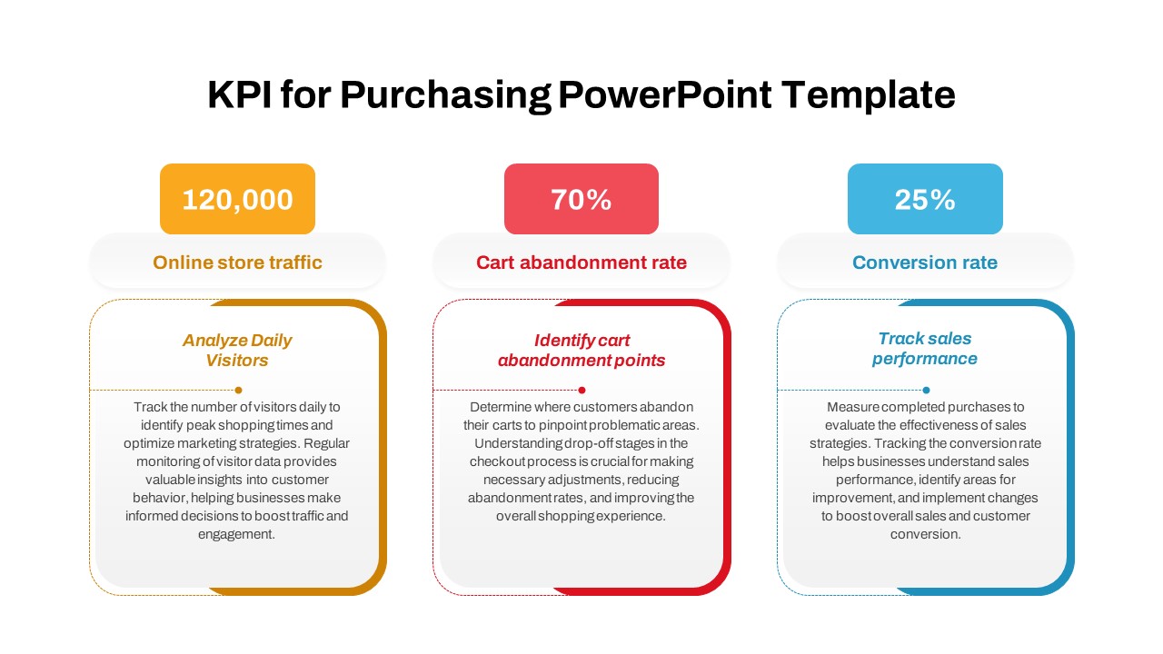
Purchasing KPI Metrics Dashboard Template for PowerPoint & Google Slides
Business Report
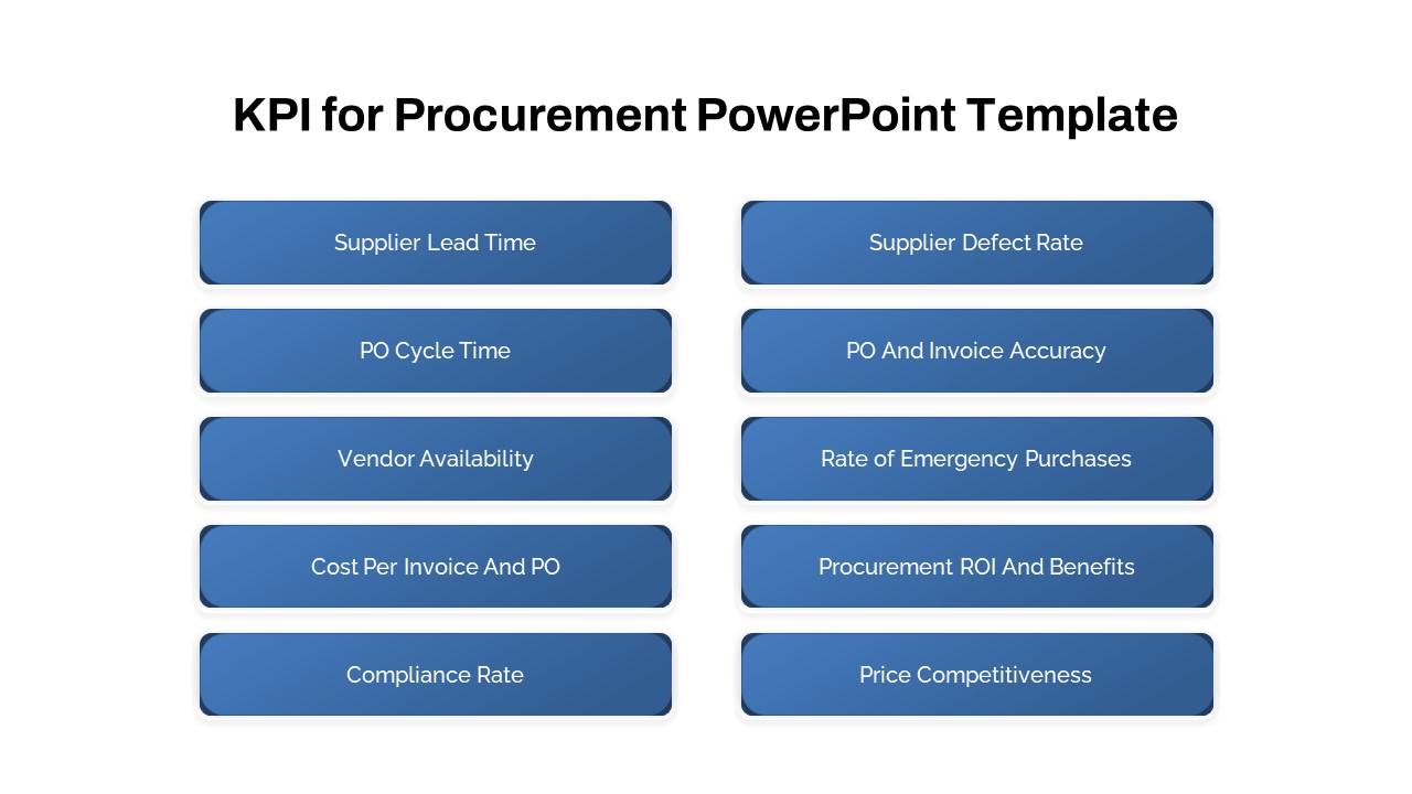
Procurement KPI Dashboard & Metrics Template for PowerPoint & Google Slides
Business Report
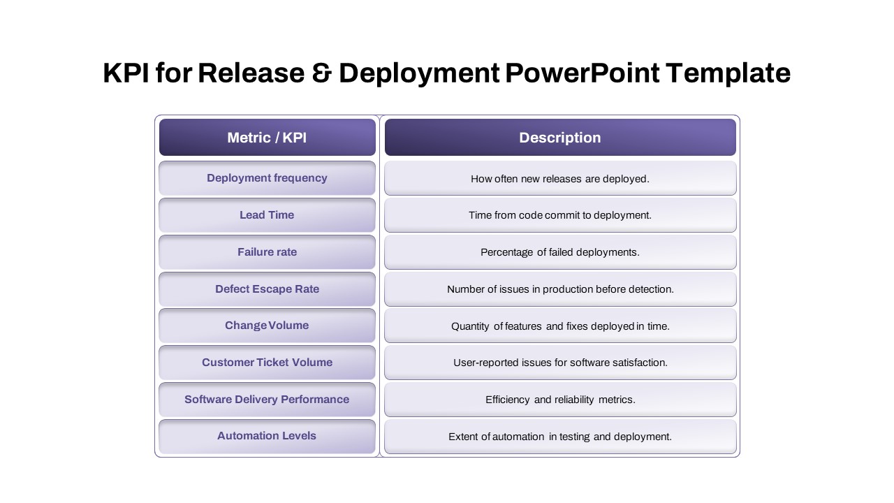
Comprehensive Release & Deployment KPI Template for PowerPoint & Google Slides
Software Development
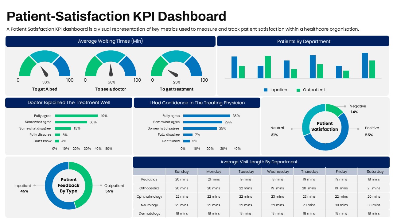
Patient-Satisfaction KPI Dashboard for PowerPoint & Google Slides
Business
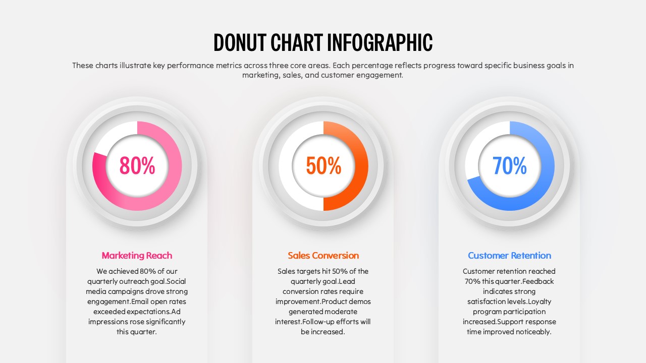
Three Segment Donut Chart KPI Infographic Template for PowerPoint & Google Slides
Pie/Donut
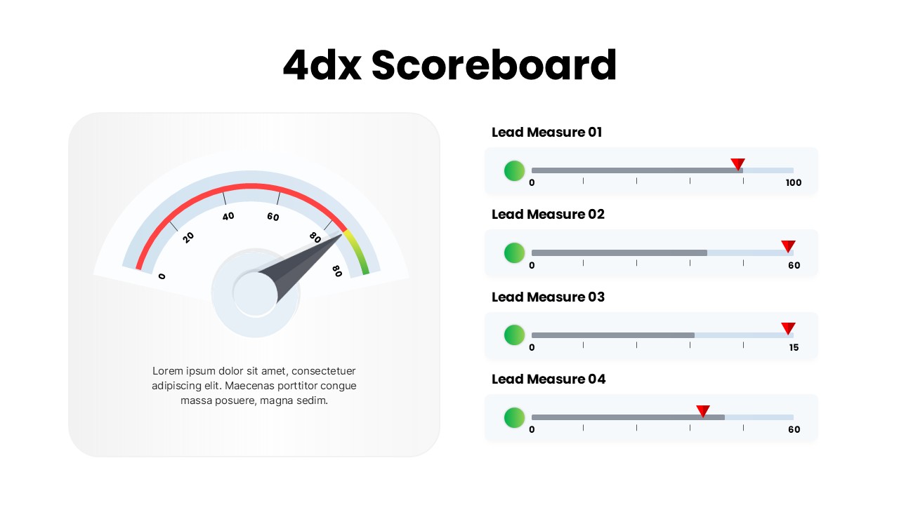
4DX Scoreboard KPI Gauge Dashboard Template for PowerPoint & Google Slides
Business Strategy
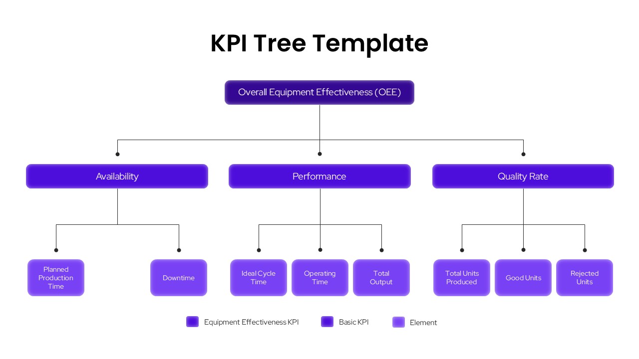
KPI Tree OEE Breakdown Template for PowerPoint & Google Slides Presentations
Infographics
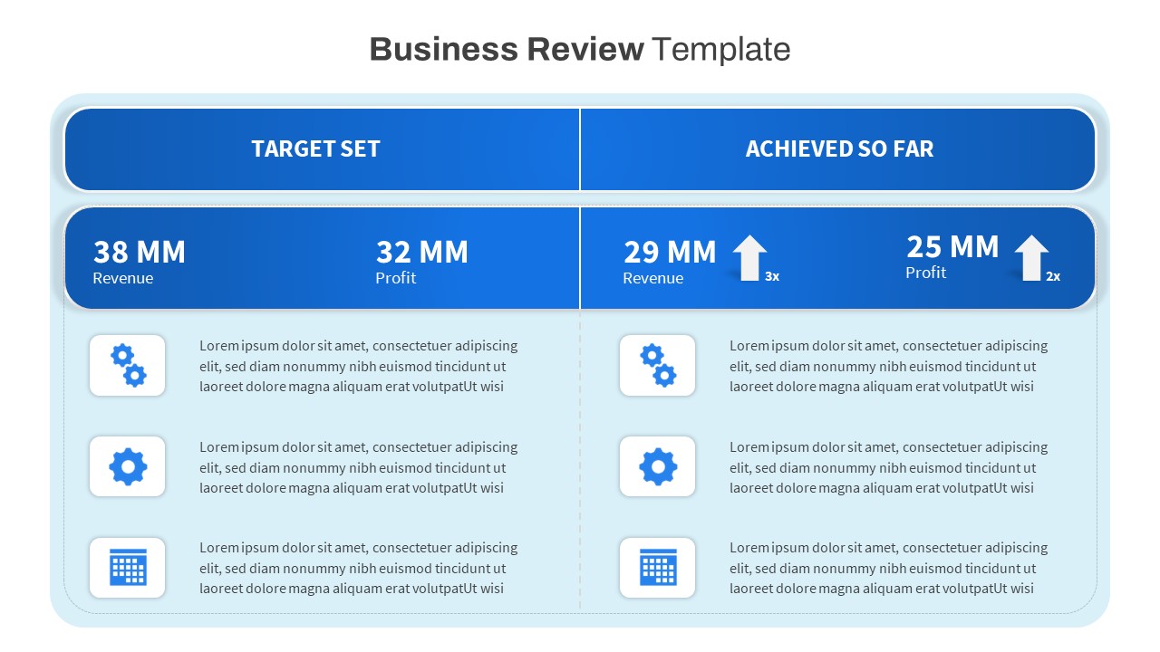
Free Business Review Comparison Slide for PowerPoint & Google Slides
Business Report
Free
Free Elegant Happy New Year Greeting Slide Template for PowerPoint & Google Slides
Graphics
Free
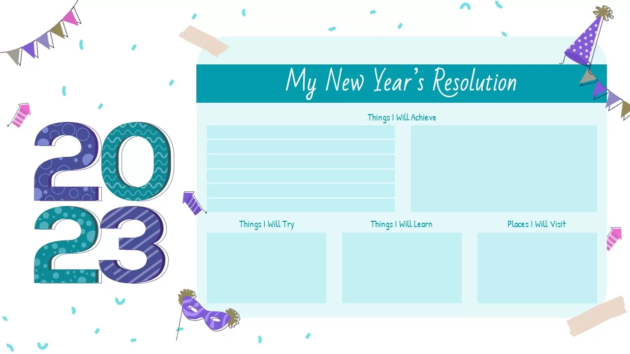
Free New Year’s Resolution Slides Pack for PowerPoint & Google Slides 2023
Graphics
Free
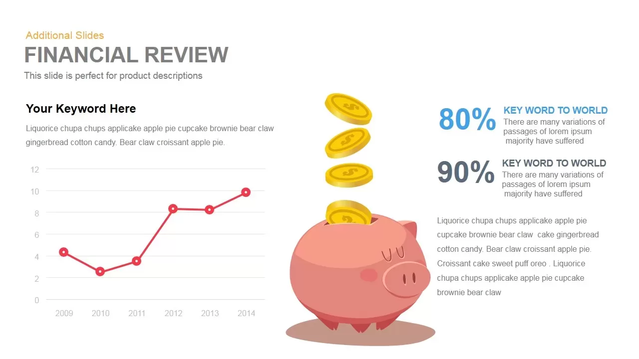
Financial Review template for PowerPoint & Google Slides
Finance
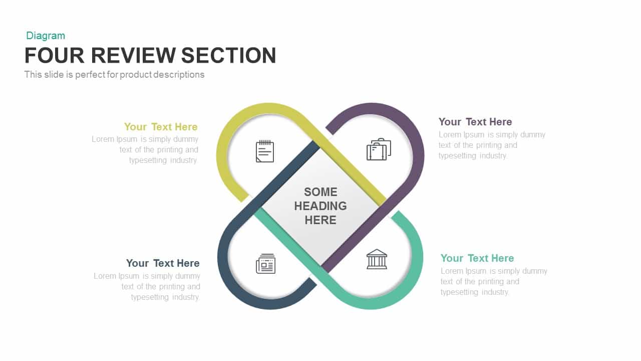
Clean Four-Section Review Diagram Template for PowerPoint & Google Slides
Agenda
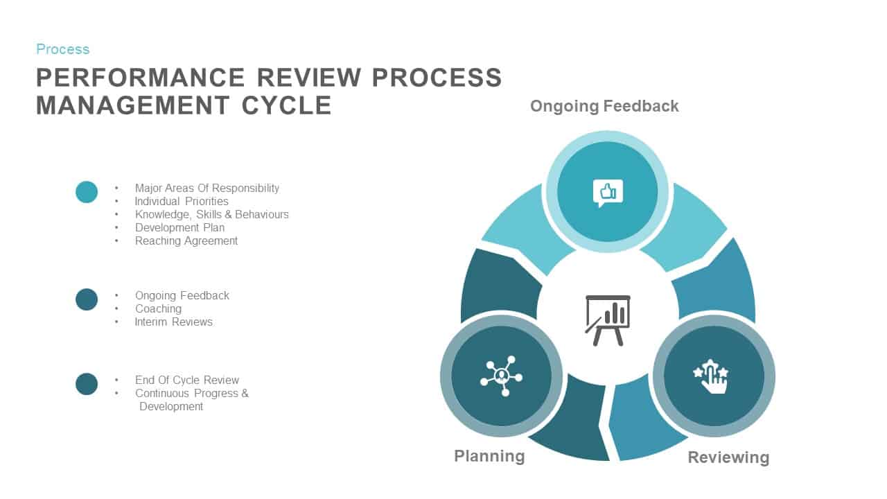
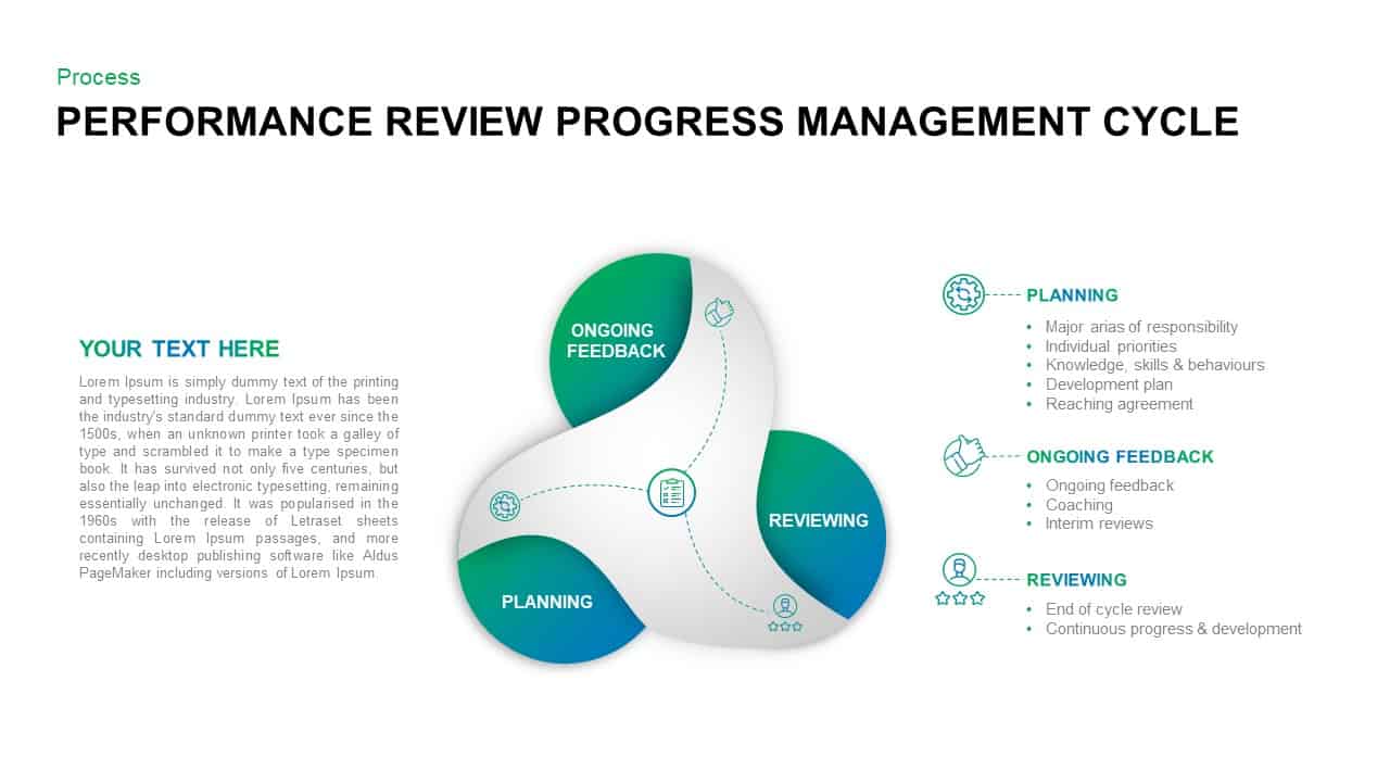
Performance Review Process Management Cycle template for PowerPoint & Google Slides
Employee Performance
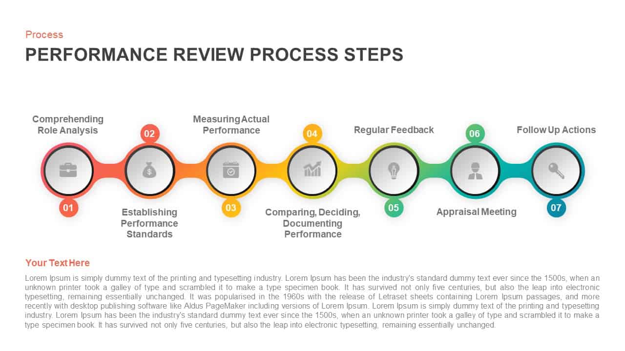
Performance Review Process Steps Template for PowerPoint & Google Slides
Employee Performance
Performance Review Progress Management Template for PowerPoint & Google Slides
Process
Book Review PPT Template & Google Slides
Business
Business Review Deck with Market Updates Template for PowerPoint & Google Slides
Company Profile
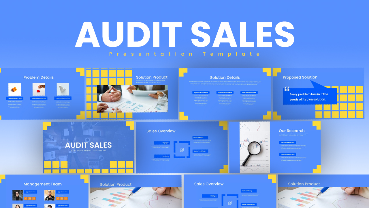
Audit Sales Review Presentation Template for PowerPoint & Google Slides
Decks
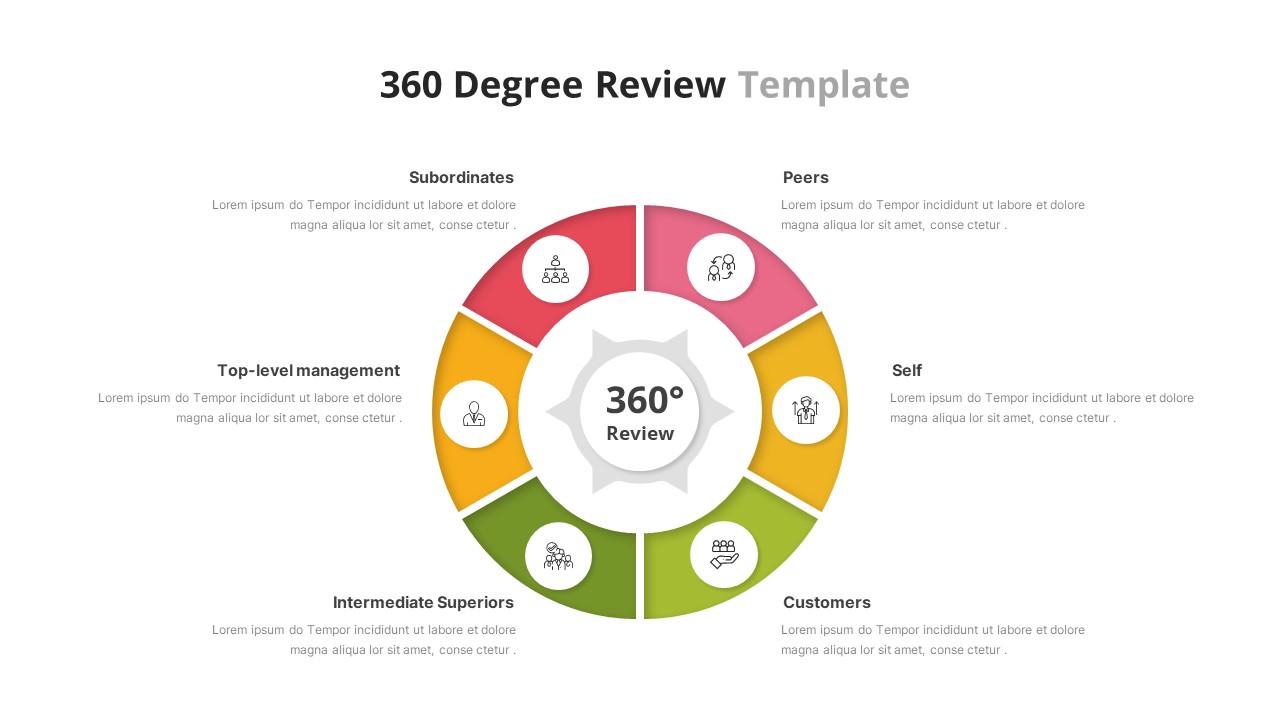
360 Degree Review Template for PowerPoint & Google Slides
Employee Performance
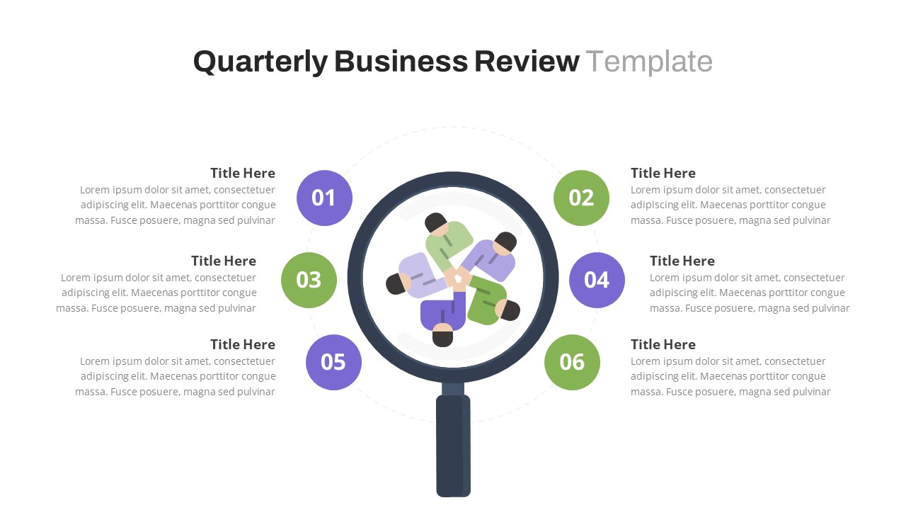
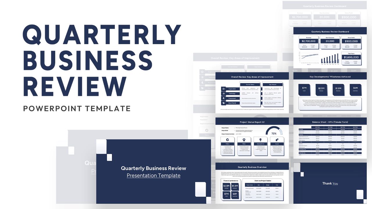
Free Quarterly Business Review PowerPoint Template & Google Slides
Business
Free

Free Stylized Book Review Layout for PowerPoint & Google Slides
Company Profile
Free
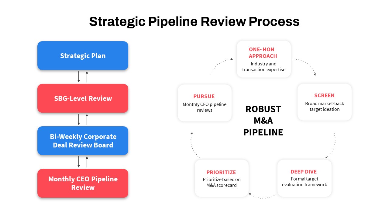
Strategic Pipeline Review Diagram Template for PowerPoint & Google Slides
Business Strategy
Quarterly Business Review Dashboard Template for PowerPoint & Google Slides
Pitch Deck
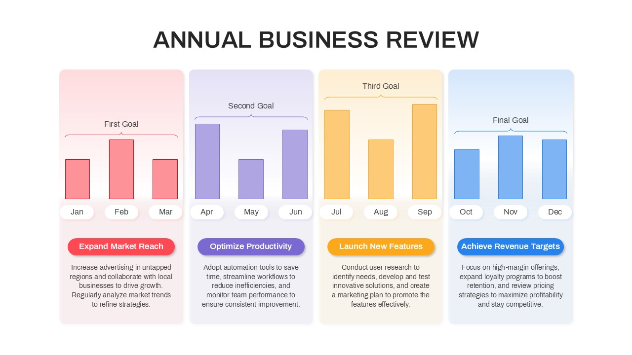
Annual Business Review Timeline Template for PowerPoint & Google Slides
Timeline
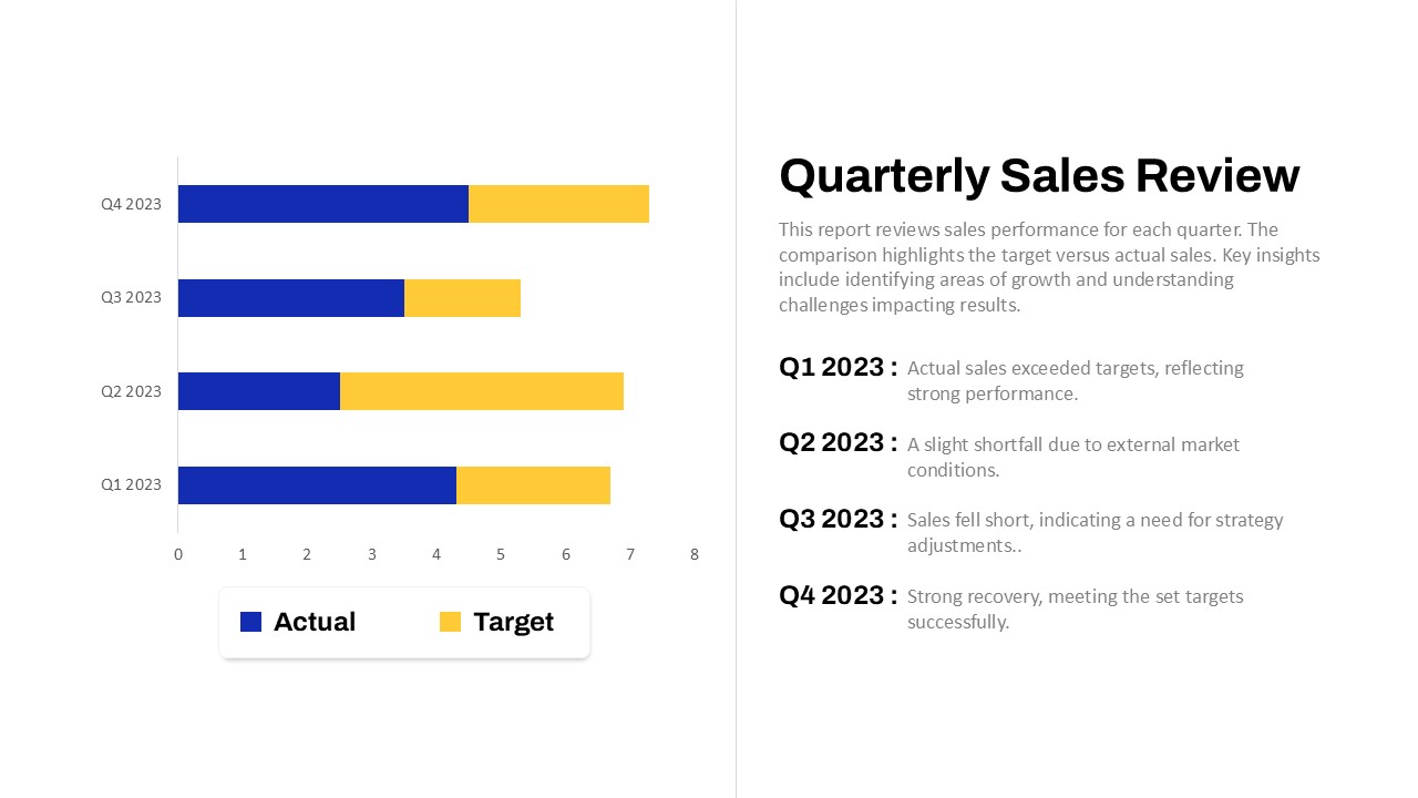
Quarterly Sales Review Bar Chart Template for PowerPoint & Google Slides
Bar/Column
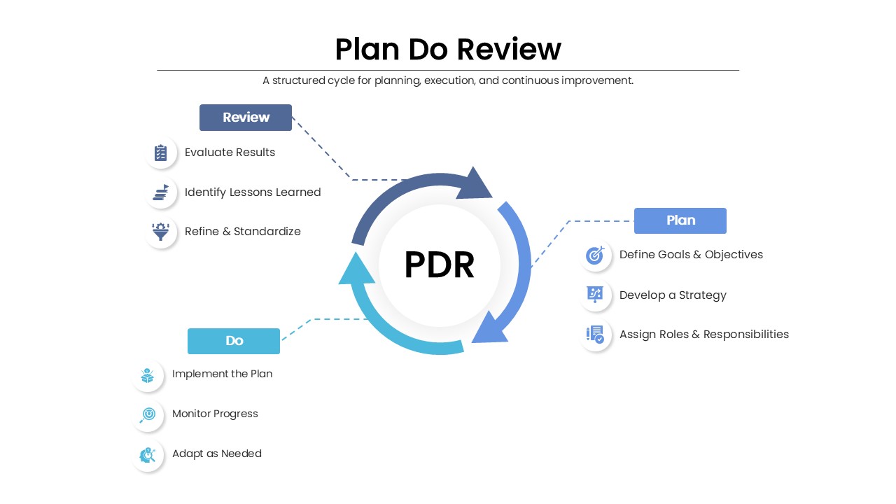
Plan Do Review (PDR) for PowerPoint & Google Slides
Process
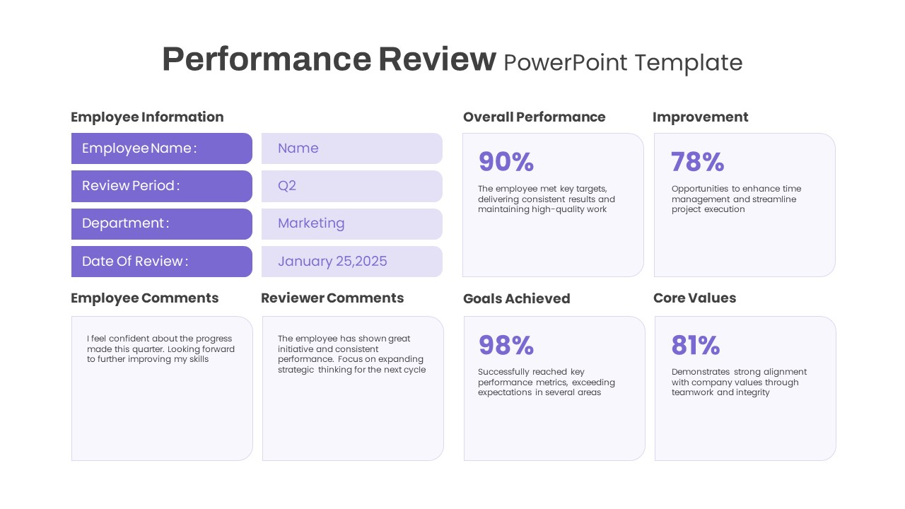
Performance Review template for PowerPoint & Google Slides
Employee Performance
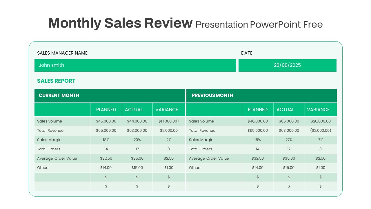
Free Monthly Sales Review template for PowerPoint & Google Slides
Business Report
Free
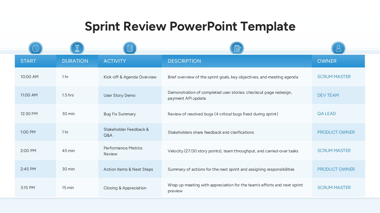
Sprint Review Meeting Agenda Table Template for PowerPoint & Google Slides
Agenda
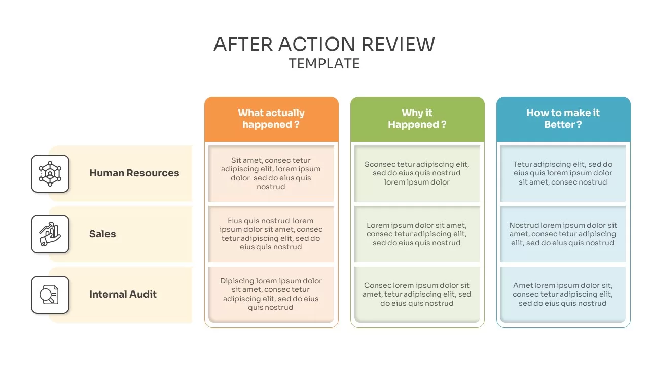
After Action Review Report Template PPT And Google Slides
Process
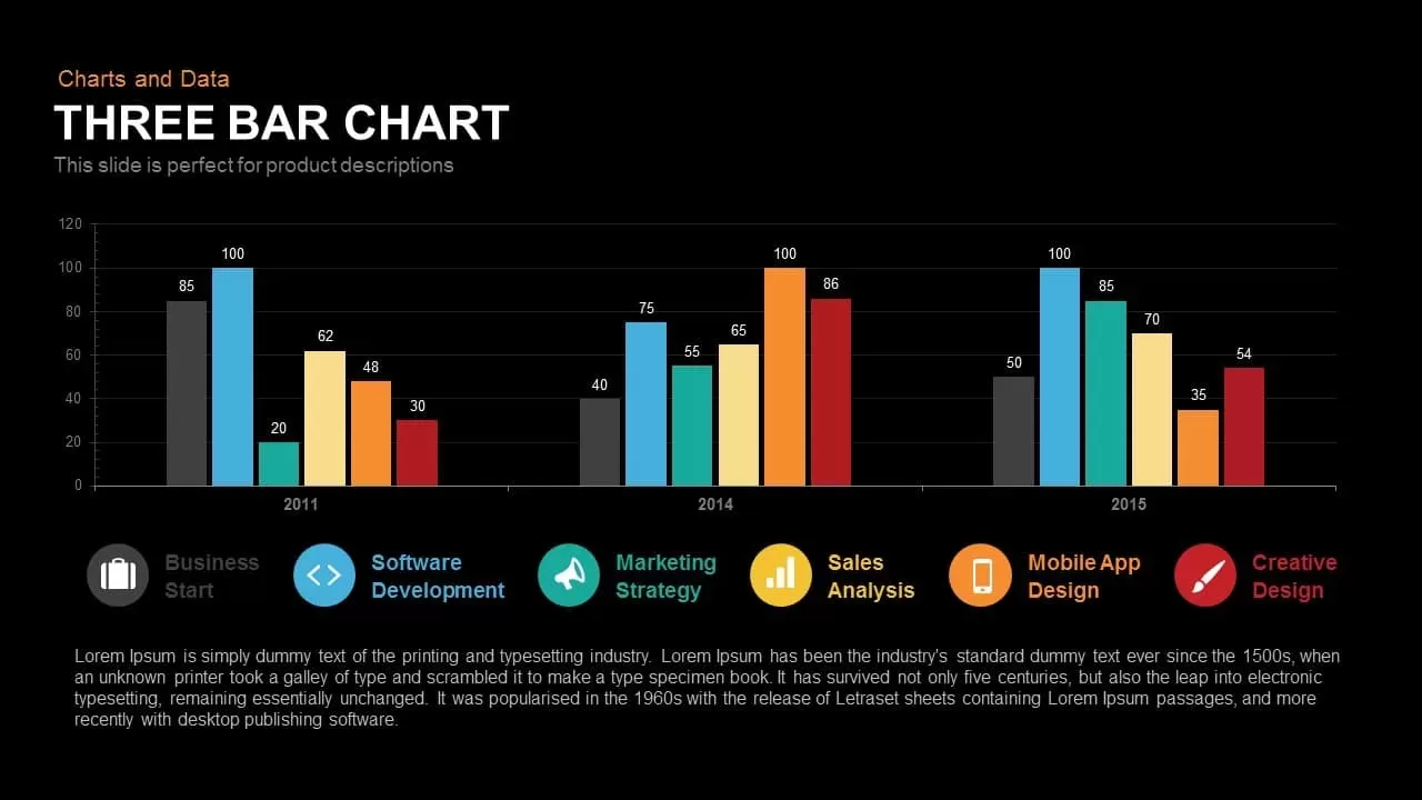
Three-Year Bar Chart template for PowerPoint & Google Slides
Charts
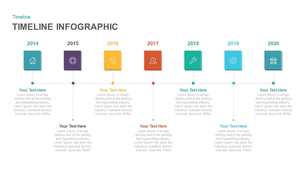
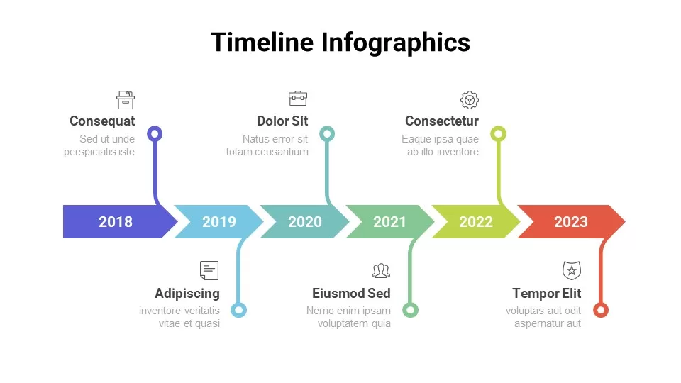
Multi-Year Timeline Infographic Template for PowerPoint & Google Slides
Timeline
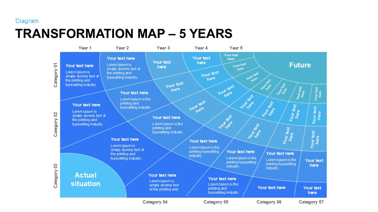
Five-Year Transformation Map Diagram Template for PowerPoint & Google Slides
Process
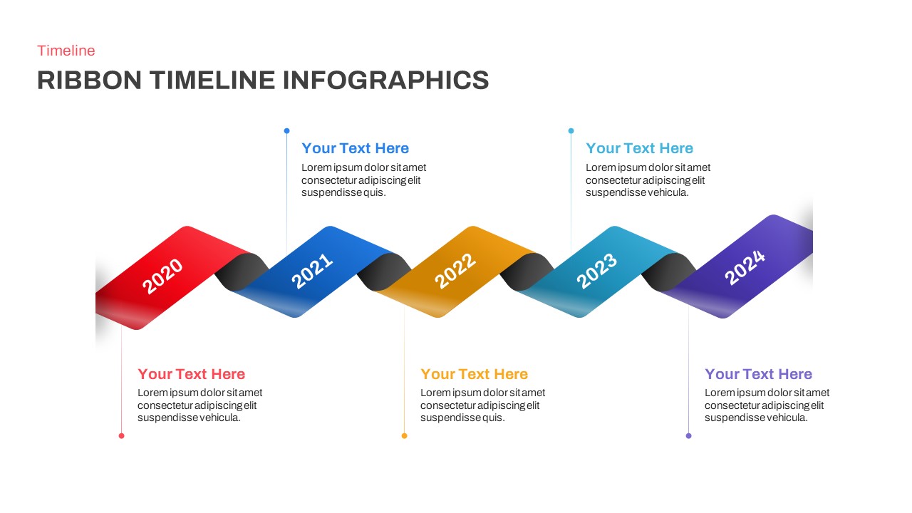
Five-Year Ribbon Timeline Diagram Template for PowerPoint & Google Slides
Timeline
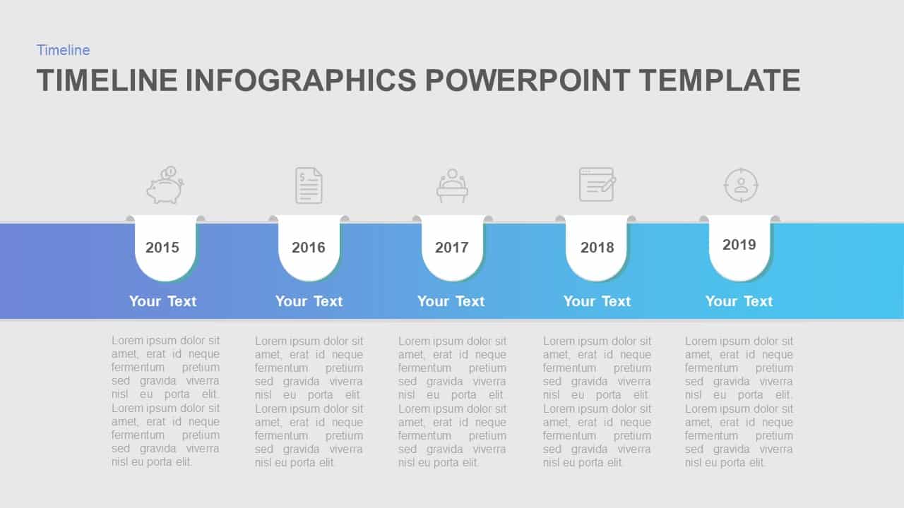
Five-Year Gradient Timeline Infographic Template for PowerPoint & Google Slides
Timeline
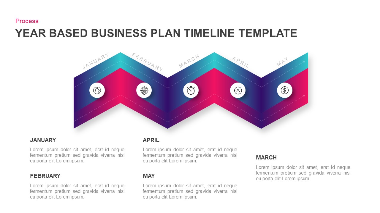
Year-Based Business Plan Zigzag Timeline Template for PowerPoint & Google Slides
Business Plan
Colorful Four-Year Timeline Layout Template for PowerPoint & Google Slides
Timeline
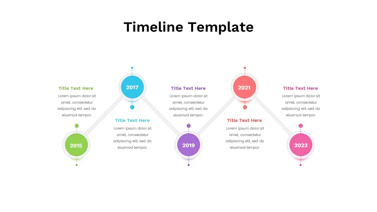
Colorful Five-Year Timeline Layout Template for PowerPoint & Google Slides
Timeline

Free Timeline Infographic Template
Timeline
Free
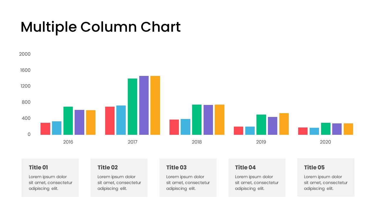
Minimal Multi-Year Column Chart Template for PowerPoint & Google Slides
Bar/Column
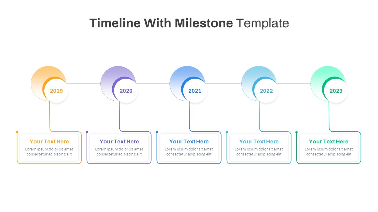
Milestone Timeline with Year Markers Template for PowerPoint & Google Slides
Timeline
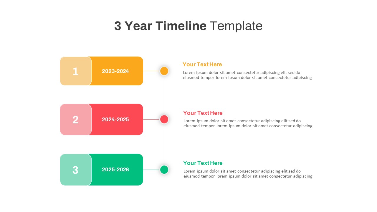
Three-Year Vertical Milestone Timeline Template for PowerPoint & Google Slides
Timeline
Three-Year Project Roadmap Timeline Template for PowerPoint & Google Slides
Timeline
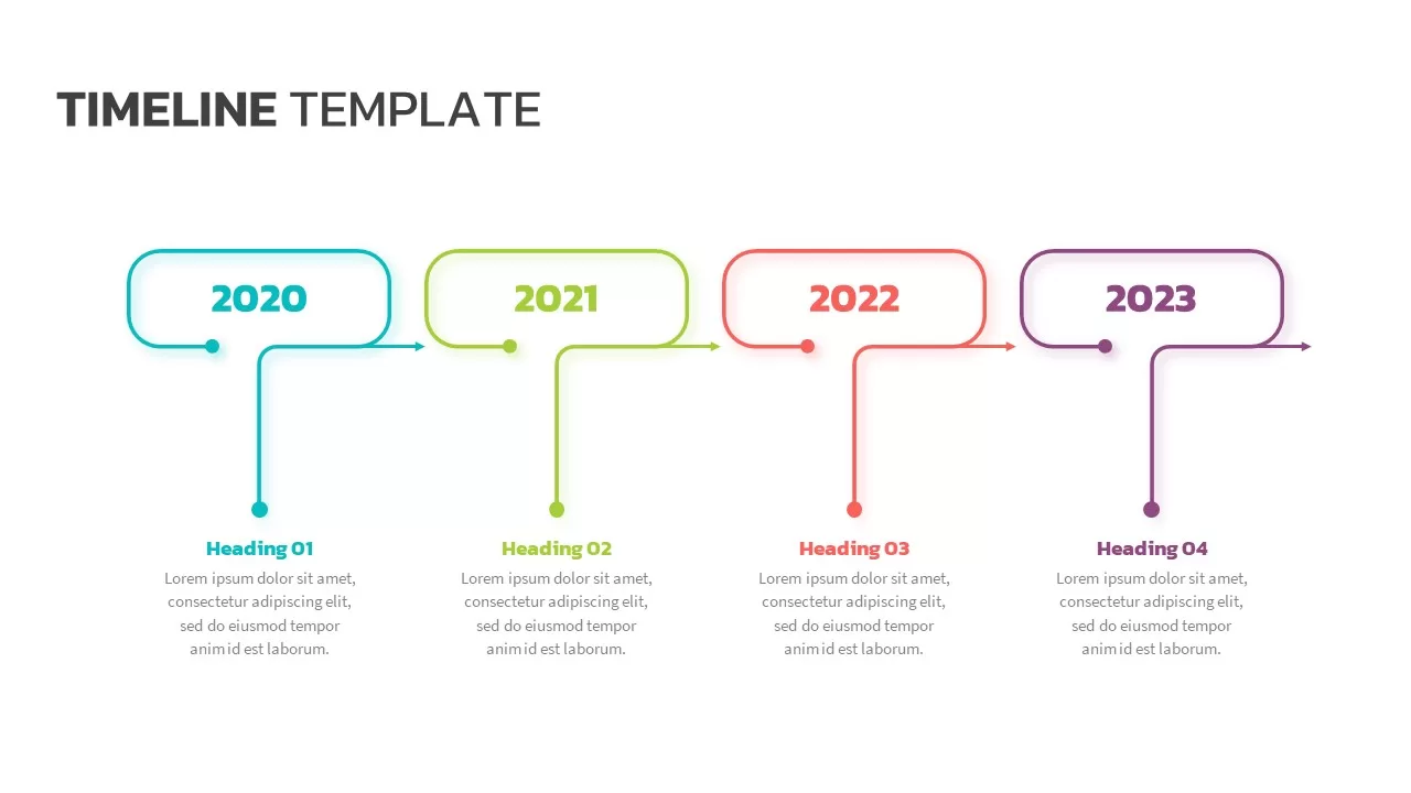
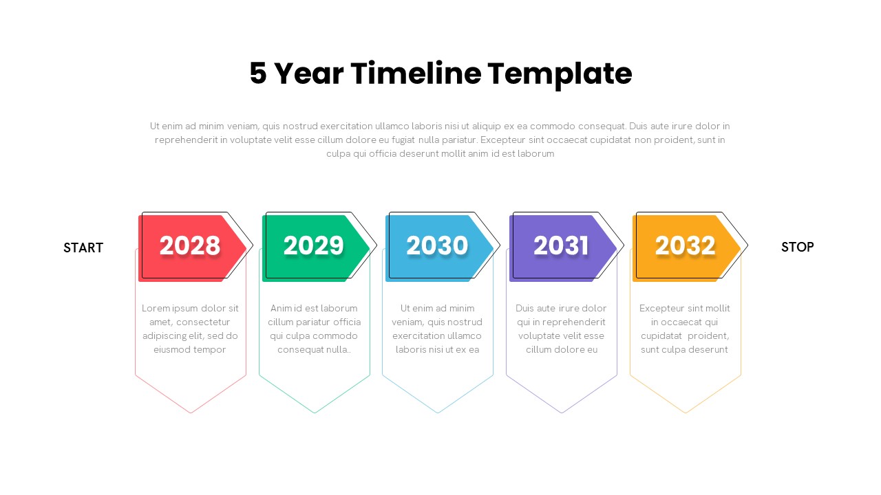
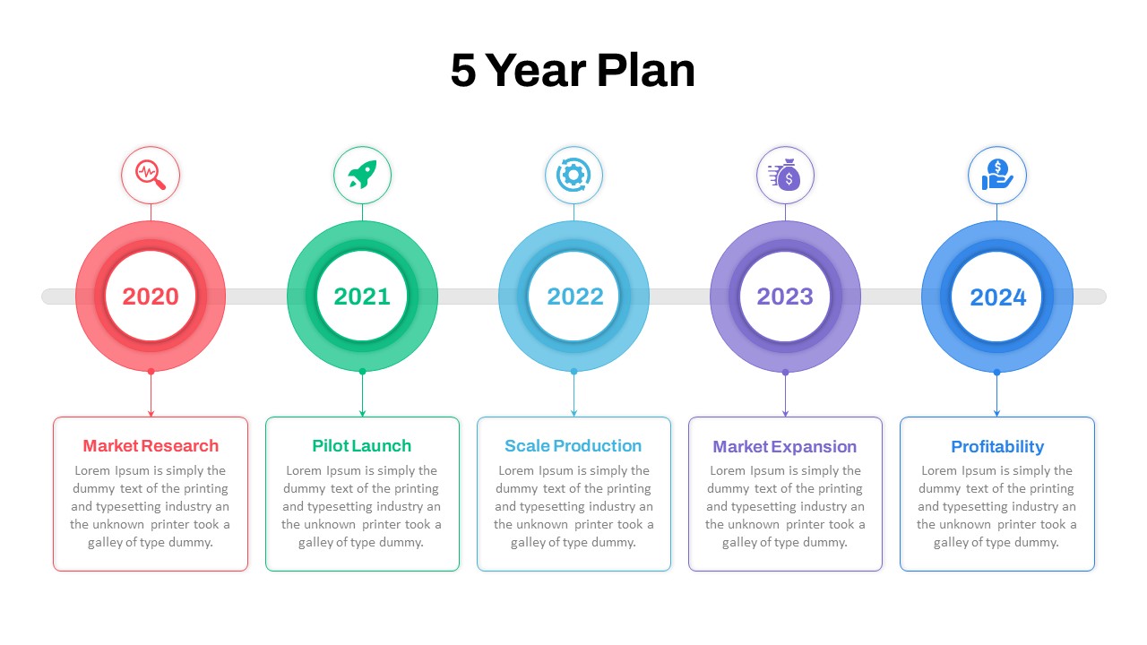
5 Year Timeline Template for PowerPoint & Google Slides
Timeline
Five-Year Plan Timeline Diagram Template for PowerPoint & Google Slides
Timeline
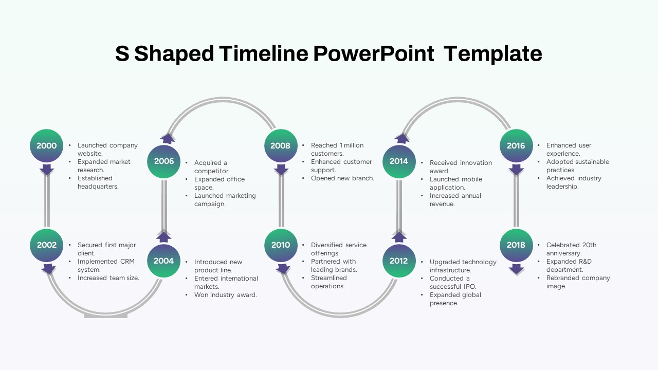
Multi-Year S-Shaped Roadmap Timeline Template for PowerPoint & Google Slides
Timeline
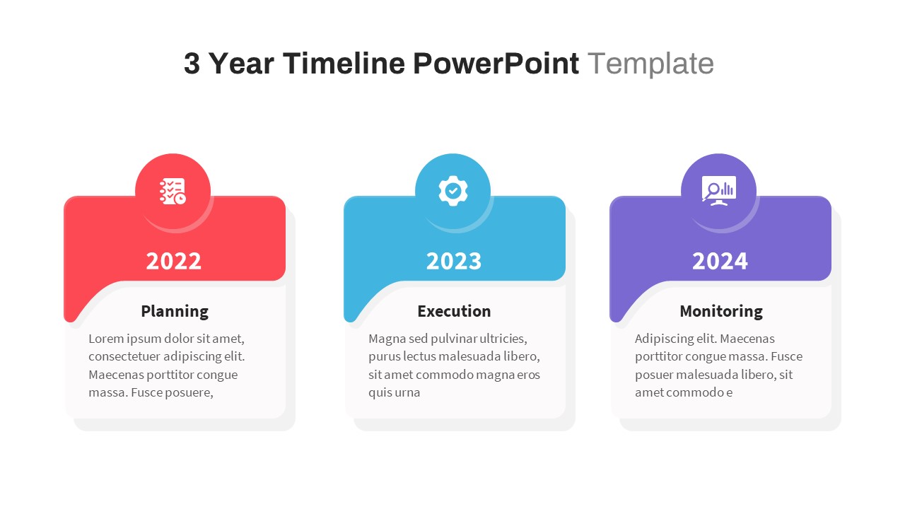
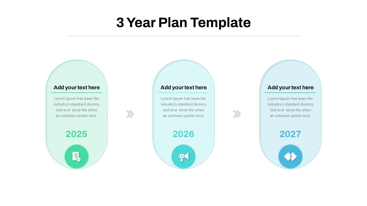
Three-Year Plan Timeline Diagram Template for PowerPoint & Google Slides
Timeline
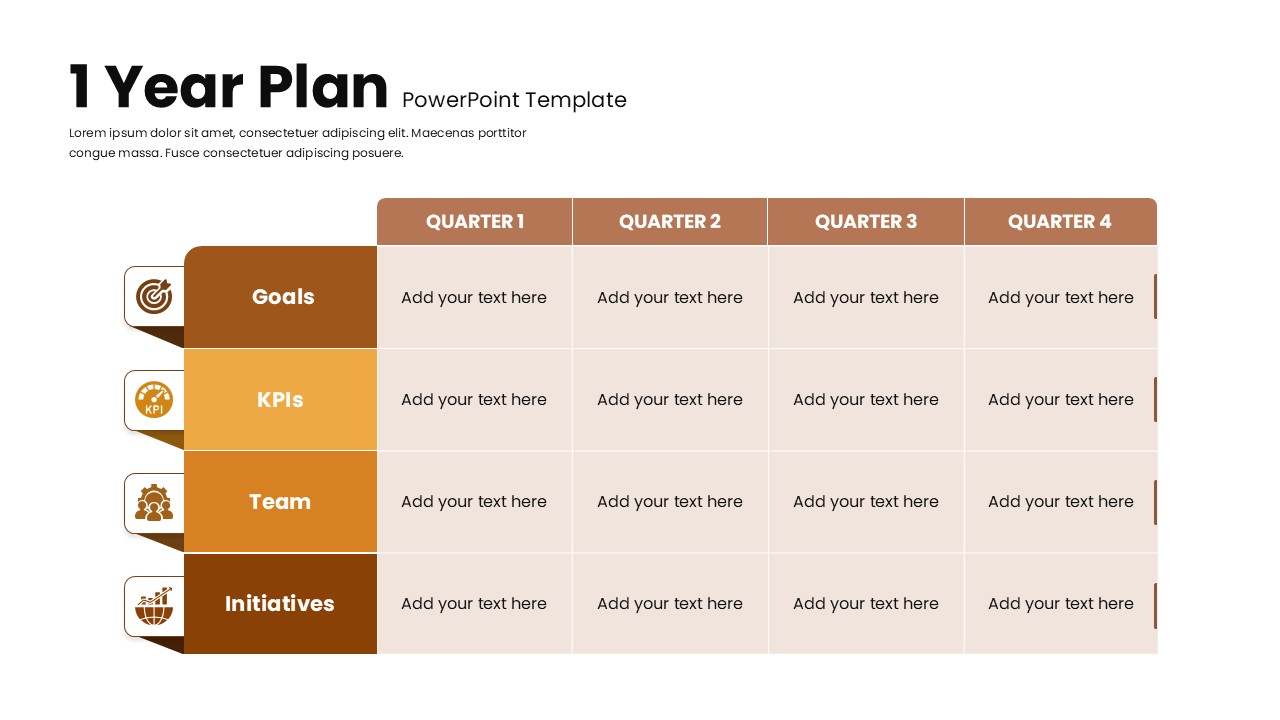
1 Year Plan Overview template for PowerPoint & Google Slides
Business Plan
Half Year Gantt Chart Templat for PowerPoint & Google Slides
Gantt Chart
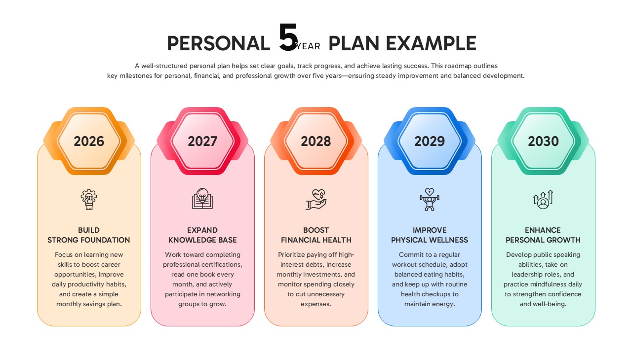
Personal 5-Year Roadmap Plan Example Template for PowerPoint & Google Slides
Timeline
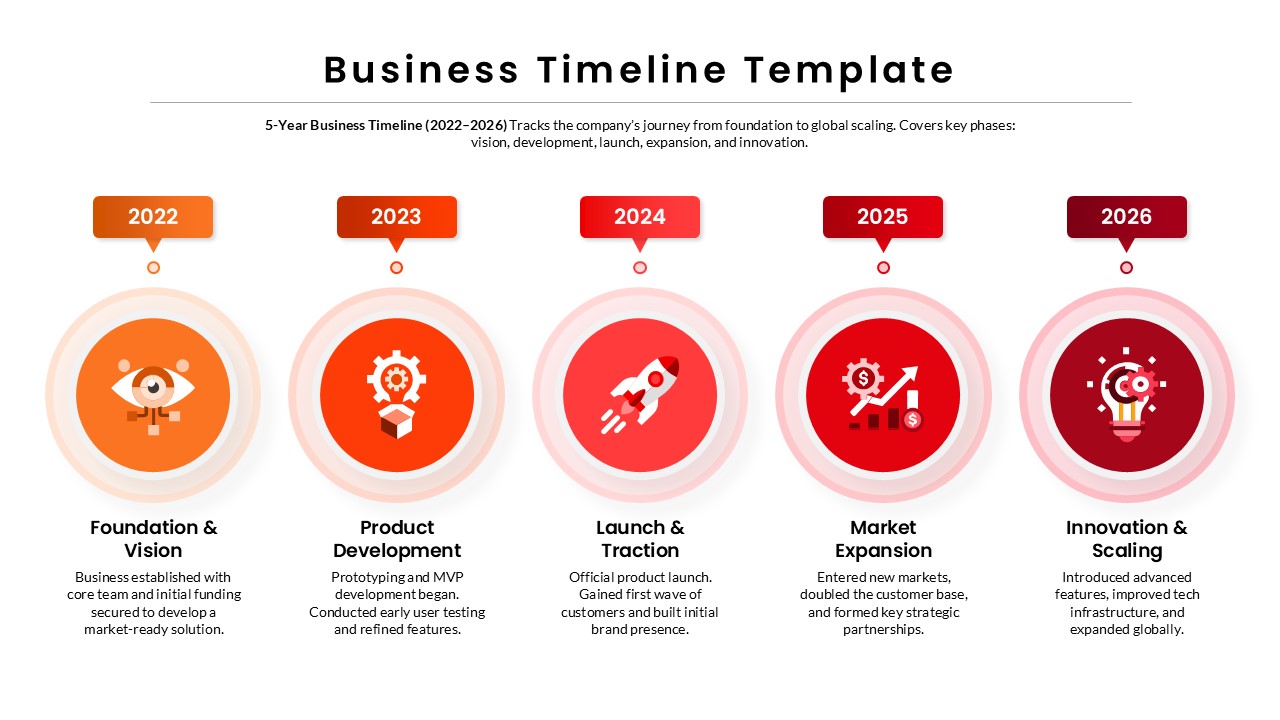
5-Year Business Timeline Template for PowerPoint & Google Slides
Timeline
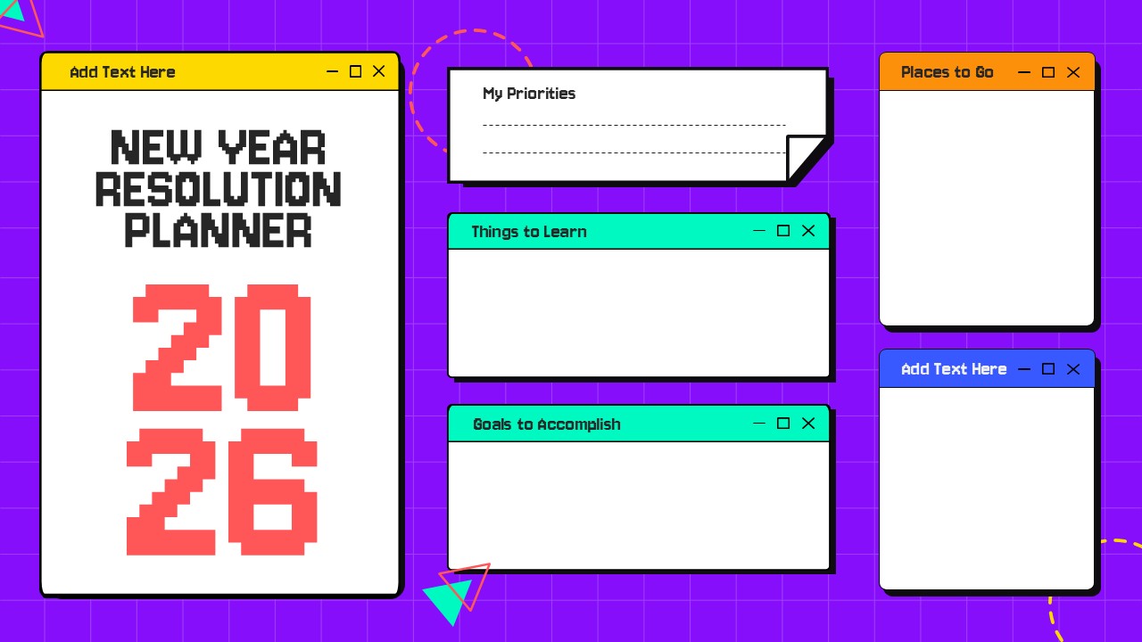
Creative New Year Resolution Planner for PowerPoint & Google Slides
Leadership
Free
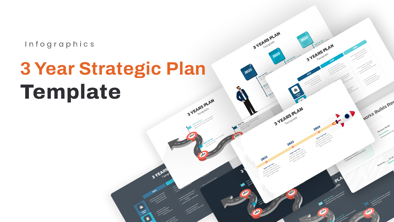
3 Year Strategic Plan PowerPoint template And Slides
Timeline
Monthly Business Review PowerPoint Template
Business Report
Sprint Review Template
Infographics
3 Year Strategic Plan Template for PowerPoint & Keynote
Timeline
2, 3, 4, 5 Year Transformation Map PowerPoint Template
Happy New Year 2025 PowerPoint Template
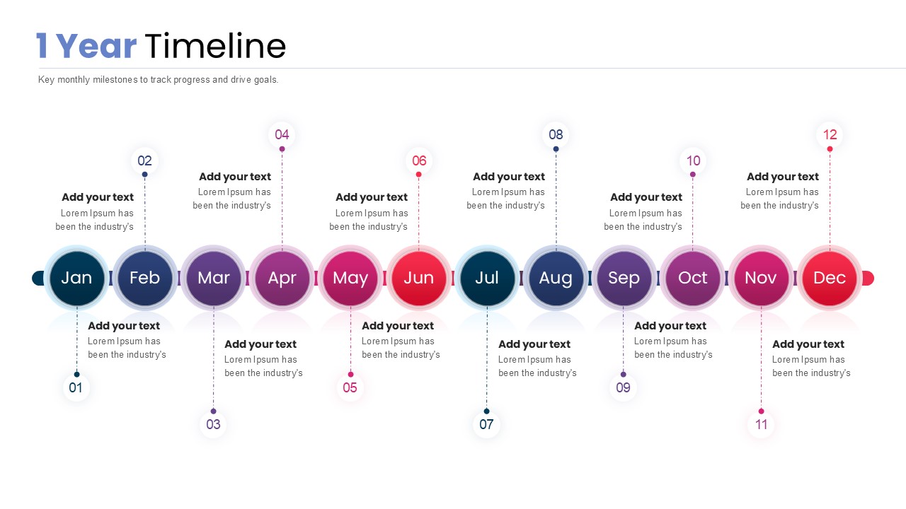
1 Year Timeline PowerPoint Template
Timeline