Gender Comparison People Infographic Template for PowerPoint & Google Slides
Gender Comparison People Infographic Template for PowerPoint & Google Slides
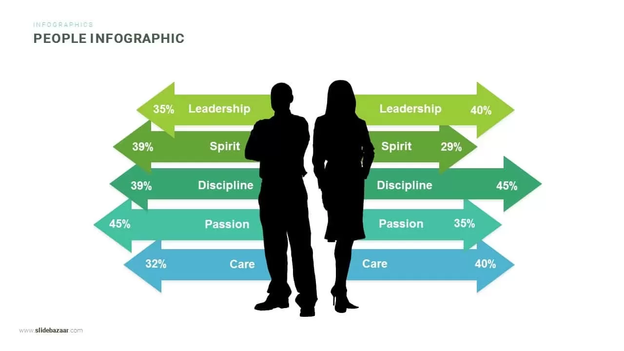
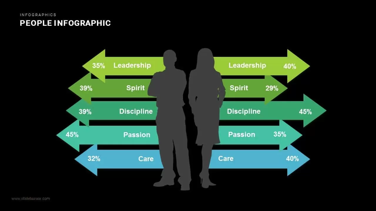
Demographic research, employee survey results, and workforce analytics often fail to make an impression when reported as plain tabular numbers. Built around central silhouette figures flanked by horizontal comparative arrow bars, this gender comparison people infographic template gives HR leaders, market researchers, and diversity officers a clear visual anchor to present comparative demographic data, behavioral metrics, and workforce survey findings.
The bilateral arrow layout makes evaluating differences between two sample groups intuitive and immediate. People operations leads, talent analysts, and social researchers can use this slide to illustrate diversity and inclusion metrics, consumer sentiment divides, leadership distribution, and cultural competency scores with visual clarity.
Where This Framework Adds Value
- Diversity, Equity & Inclusion (DEI) Reporting: Present gender representation, career progression metrics, and leadership equity findings to executive boards.
- Workforce Survey Analysis: Compare employee sentiment scores across key workplace traits like engagement, discipline, and managerial support.
- Consumer Market Demographics: Contrast purchasing behaviors, product affinity, and brand perception across demographic segments during market research briefings.
- Leadership Competency Assessments: Benchmark 360-degree feedback scores, cultural competencies, and soft-skills assessments across departmental cohorts.
Core Strategic Focus Areas
The visual structure balances human-centered silhouettes with mirrored quantitative metric arrows:
- Central Human Anchor: Professional male and female vector silhouettes standing back-to-back immediately ground the data in workforce demographics.
- Mirrored Trait Comparisons: Five horizontal tiers track essential evaluation categories, comparing Leadership, Spirit, Discipline, Passion, and Care side by side.
- Bidirectional Percentage Indicators: Outward-pointing arrow bars feature exact percentage markers at each tip, highlighting proportional variances between groups.
- Harmonized Color Spectrum: A balanced color progression from bright lime green down through rich emerald, teal, and sky blue establishes clear categorical distinction across rows.
Layout Highlights
- Clean upper header combines a subtle grey category label with a bold, modern title reading “PEOPLE INFOGRAPHIC”.
- Centered black silhouettes provide high contrast and focus against the clean white canvas.
- Five rows of dual-ended horizontal arrows create a balanced bilateral layout that guides the eye naturally outward.
- Distinct percentage callouts embedded directly within arrow tips ensure easy scanning during executive reviews.
- Fully editable vector elements in Microsoft PowerPoint and Google Slides enable rapid recoloring, category renaming, percentage adjustments, and silhouette customization.
Check out more comparison presentation slides here.
Login to download this file

Item ID
SB00628


Related Templates

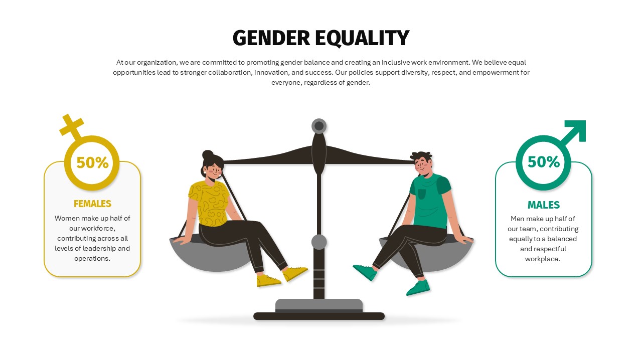
Balanced Gender Equality Scale Infographic Template for PowerPoint & Google Slides
Comparison
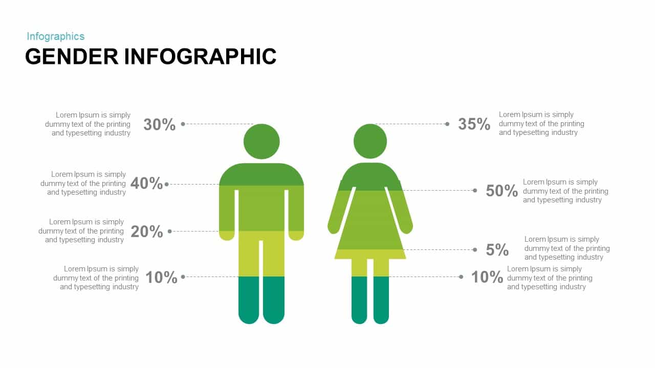
Gender Infographics PowerPoint Template
Infographics
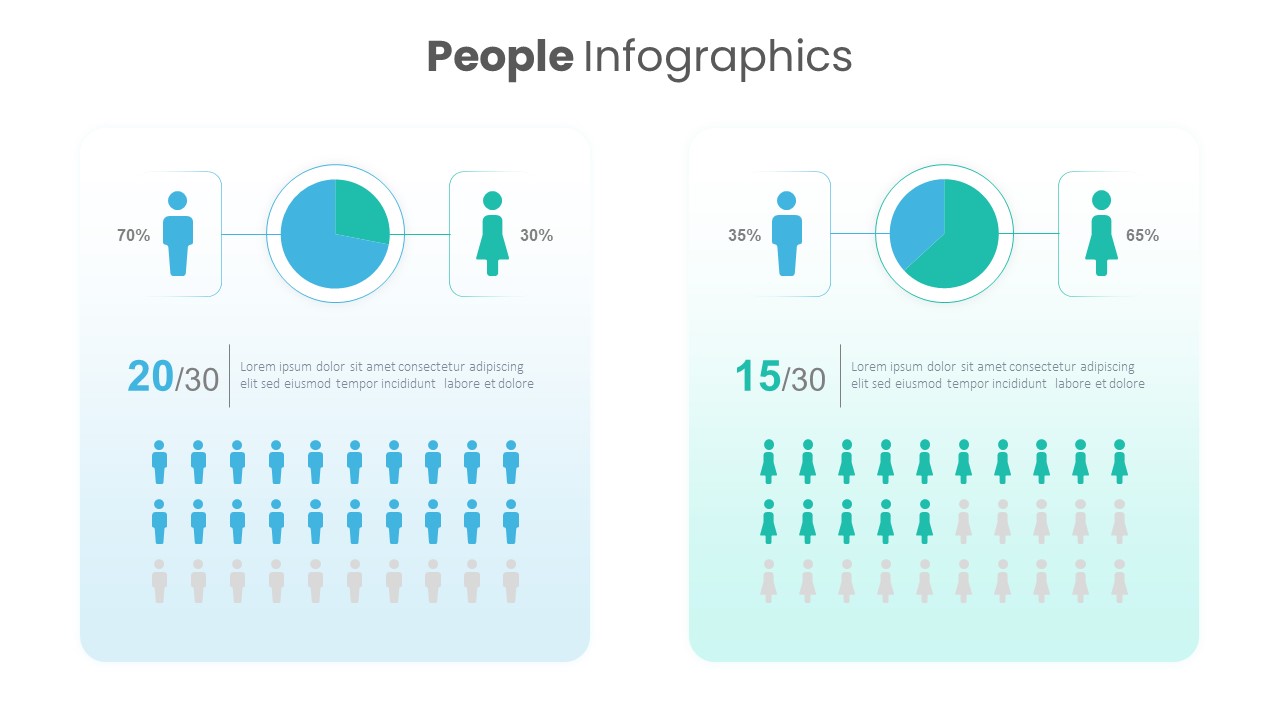
People Demographic Comparison Chart Template for PowerPoint & Google Slides
Comparison
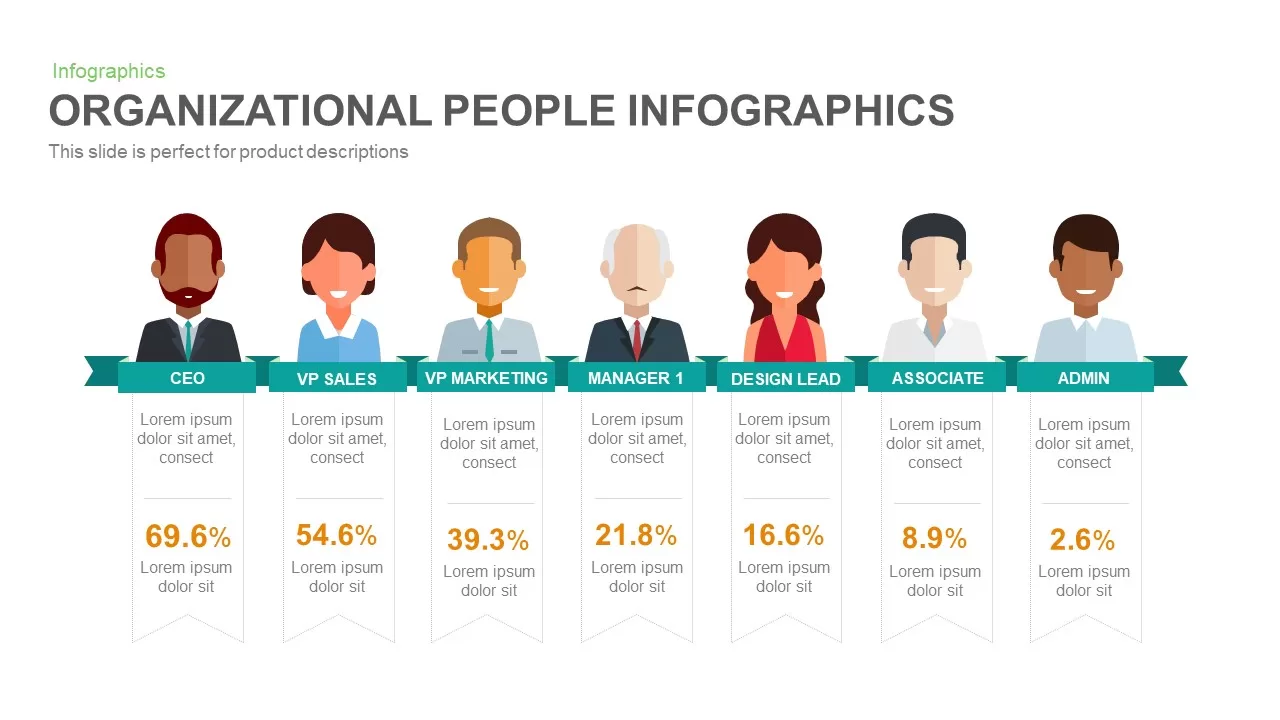
People Infographic Organizational PowerPoint Template
Org Chart
Conversation Between Two People template for PowerPoint & Google Slides
Graphics
Business People Characters Presentation Template for PowerPoint & Google Slides
Decks
4 People Racing to Finish Line Template for PowerPoint & Google Slides
Accomplishment
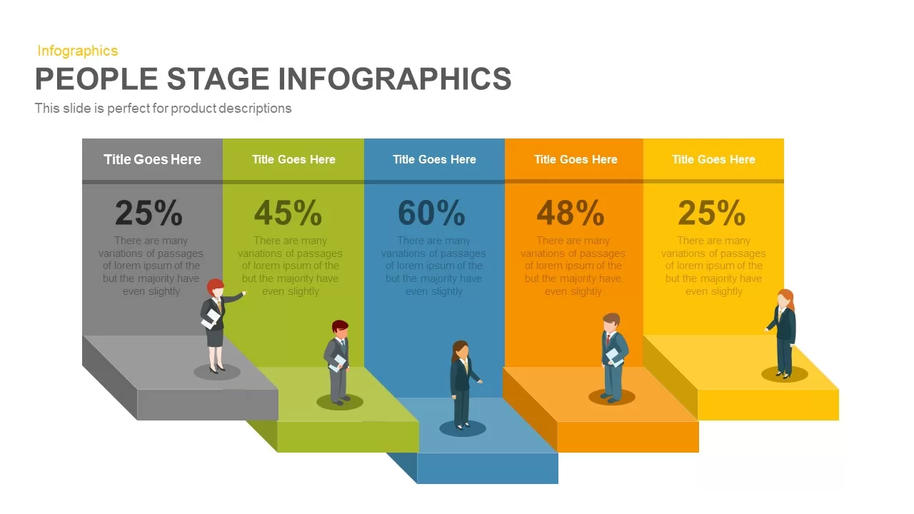
People Stage Infographics PowerPoint and Google Slide Template
Process

People Puzzle Pieces Diagram Template for PowerPoint
Org Chart
Isometric Business People Organization Chart Template for PowerPoint
Org Chart
PCI (People Centered Implementation) Diagram for PowerPoint
Process
The Global People Management Diagram for the PowerPoint Presentation
Business Models
Silhouette People with Bubbles Template
Comparison
6 Principles of People Management PPT Template
HR
Silhouettes Of People template
Company Profile
Blue Silhouettes of People Template
Our Team
People Strategy Business Competitive Corporate Diagram
Process
People Process Technology Slide
Process

A/B Testing Comparison Infographic template for PowerPoint & Google Slides
Comparison
Seller Portals Comparison Infographic Template for PowerPoint & Google Slides
Process