
- How to change the PowerPoint presentation background?
- How to Create the BEST PowerPoint background? Best practices and tips
- What is the best background color for a PowerPoint presentation?
- Presentation background colors for better accessibility
- PowerPoint background colors and emotions – the psychology of colors
- How to choose the best image for the presentation background?
- Adding shapes and overlays to the background
- How to use Artistic Effects in PowerPoint
- How to copy the PowerPoint background to another presentation?
- What is the best PowerPoint background size?
- Why do PowerPoint presentation backgrounds matter?
- Closing thoughts
How To Create the Best PowerPoint Presentation Background
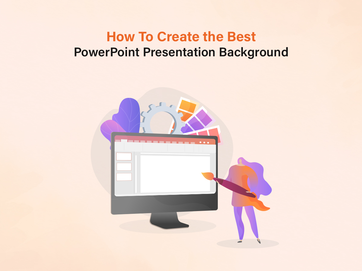

The background of your PowerPoint presentations is one of the most important factors behind an impactful presentation. A good background can transform a boring presentation into one that is more attractive, fun, impactful, and memorable. In this article, we shall look at how to create the best PowerPoint presentation background.
Most people tend to just leave the background of their presentation blank. They probably do not spend much time looking at the design side of the presentation, and this results in a very boring slideshow. When this happens, the audience has a good chance of getting bored, distracted, or worse, falling asleep.
How do you create the best PowerPoint presentation background? What images do you use in your slideshow background? What colors would be best for the background and the text? This article will answer all your questions and more.
What’s in this article?
To find what you need, check out this summary. Choose the topic that you need help with and navigate to that section. Or read the article in this order to fully learn how you can create the best PowerPoint presentation background.
- How to change the PowerPoint presentation background?
- Solid Colour Background for Presentations
- Gradient Colour Background for Presentations
- Pattern Backgrounds for Your Presentations
- Using images as PowerPoint background
- Using videos for PowerPoint presentation background
- How to make GIFs as a Background on PowerPoint
- How to Create the BEST PowerPoint background? Best practices and tips
- What is the best background color for a PowerPoint presentation?
- The best colors for PowerPoint backgrounds using color theory
- Presentation background colors for better accessibility
- PowerPoint background colors and emotions – the psychology of colors
- How to choose the best image for presentation background?
- Adding shapes and overlays to the background
- How to use Artistic Effects in PowerPoint
- How to copy the PowerPoint background to another presentation?
- What is the best PowerPoint background size?
- Why does PowerPoint presentation background matter?
- Closing thoughts
How to change the PowerPoint presentation background?
You can change the PowerPoint presentation background by accessing the Format Background option by right-clicking the slide or by clicking on the Design tab in the toolbar. You have the option of adding a solid color, gradient, pattern, images, and more as the background.
Here is a step-by-step tutorial for all types of backgrounds in PowerPoint:
Solid Colour Background for Presentations
This is the easiest way of adding a single-colored background to your PowerPoint presentation. Don’t just keep the plain white colored background as it is. Add some excitement to your slides with colors. Here’s how you can get started:
- Right-click on the slide and select Format Background
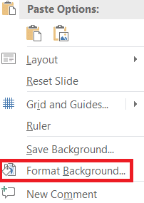
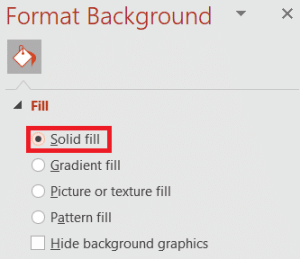
- Navigate to Fill and select Solid Fill.
- You can now choose the color you want and adjust the transparency.
Choosing the right color for your presentation background can make a massive difference. If you’re wondering which color to choose, we’ve covered that topic below. Keep reading to know more.
Solid color is great for your presentation backgrounds if you:
- Plan on keeping a simple and minimalistic look
- Have a lot of images in your slides
- Need to create slides with good contrast, even for audience with visual impairments
Gradient Colour Background for Presentations
If you consider yourself too quirky to limit your slides to a single color, you could always add gradient colors to your presentation’s background.
While choosing gradient colors for the background, there are a lot more options accessible that you can use to customize to get the background you need. Here’s how you get started:
- Same as above, right-click on the slide and select Format Background. Then navigate to Fill and select Gradient Fill.
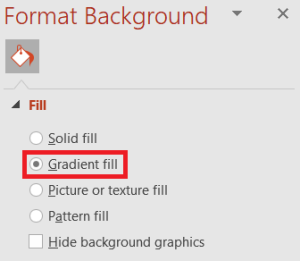
- You can now select the colors of the gradient and customize the direction, angle, and more. You can also add, delete or tweak the preset gradient stops.
Gradient backgrounds are perfect if you need to have a simple, yet visually striking design. Good gradient background is all about choosing the right colors. We have a section on color theory for presentations in this article, so keep reading to know more about that.
Pattern Backgrounds for Your Presentations
If you find gradients boring, you could always add a pattern to your presentation background. PowerPoint offers a wide selection of patterns you can choose from. These pattern backgrounds add texture to your slides. You also have the freedom of customizing the foreground and background colors of the patterns, among other things.
Here’s how to get started with pattern backgrounds on PowerPoint:
- After selecting Format Background from the previous steps, select Pattern fill.
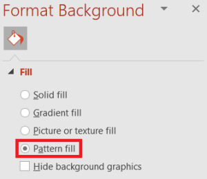
- Choose a pattern you’d like to add as the background. You can customize the foreground and background colors here as well.
And you’re done, your pattern background is ready!
Use pattern backgrounds in your slides if:
- You feel that solid color or gradient color backgrounds are too basic or boring
- If you need to add 2 or more colors to your background
- If you need texture or have branding requirements to fulfill. You can add your brand colors to the pattern.
Using images as PowerPoint background
Here’s how you can set an image as the background in your presentation:
- In the Format Background option discussed above, select Picture or texture fill
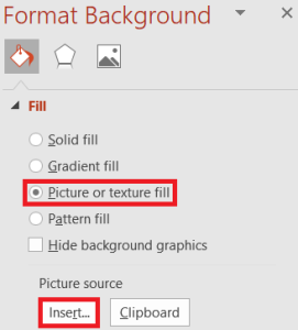
- Here you can upload an image of your choice by clicking on the File button, or even pull an image from the internet using the Online If you’ve copied the image, access it using the Clipboard button to select it.
You have the freedom to customize and edit the image in many different ways, including the transparency, position, alignment, and even make minute adjustments to the scale. You can also use the image to create a textured background by checking the Tile picture as texture feature. A lot of handy tools are available to create the perfect image background for your slides!
Using images as PowerPoint background is recommended if:
- Your slides mostly have text
- You plan on using certain images to evoke emotions
- You know exactly what devices these slides will appear on, eliminating any image scaling issues
Using videos for PowerPoint presentation background
Some people may like to add videos as backgrounds for their slides. Despite what most people might think, doing this is a piece of cake.
Having videos as your presentation’s background can look really nice. But you’ll have to get it right, or your slides might look amateurish and messy. Put short text pieces on top of these backgrounds and you’ve got yourself a memorable slide.
Here’s a useful video from our YouTube channel on adding video as background in PowerPoint:
Let’s have a look at how you can add videos to your presentation’s background.
- In PowerPoint, click on Insert and then Video. Here you can either upload a video file or choose an online video. Please note that if you choose the latter, you should have access to the video whenever you play your presentation. If you don’t the video will not appear and your background may appear blank.
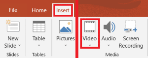
- Once the video has loaded, you can now resize it to fit inside the slide the way you want it to. You can also position the video in a way that only a particular section of the video is visible. To do this you’ll have to tweak the aspect ratio of the video. You can do this by clicking on the video and selecting Format Video.
- To send the video to the back (to keep it as the background) you need to click on the video. When the Video Tools tab appears, click on Format and then click on Send Backward.
There you go. It’s that simple to add videos as your presentation’s background. You can add text or shapes on the video by clicking on Insert and choosing the element you wish to add.
For royalty-free videos, check out some of these resources:
How to make GIFs as a Background on PowerPoint
You can put GIFs as the background for your PowerPoint presentations.
- Right-click on the slide
- Select Format Background
- Select Picture or texture fill
- Click on the Insert button and upload the GIF you want as the background.
You can get millions of GIFs from giphy.com
Now that we’ve got the basics covered, let’s go in-depth and talk about the best practices to follow while creating the PERFECT background for your presentations. This may sound like rocket science, but I’ve simplified it for complete beginners.
How to Create the BEST PowerPoint background? Best practices and tips
The best way to get your presentation slides to look impressive is to use a pre-built PowerPoint background. You can easily find thousands of such templates online. It’s easy as downloading and using the elements and colors that you like.
On the other hand, if you don’t have time to focus on the design aspects of your presentation, why not hire a presentation design agency? Drop us a message here to find out more.
Let’s explore how you can get the best possible backgrounds for your PowerPoint presentations:
What is the best background color for a PowerPoint presentation?
Let’s explore this question with the basics of color theory.
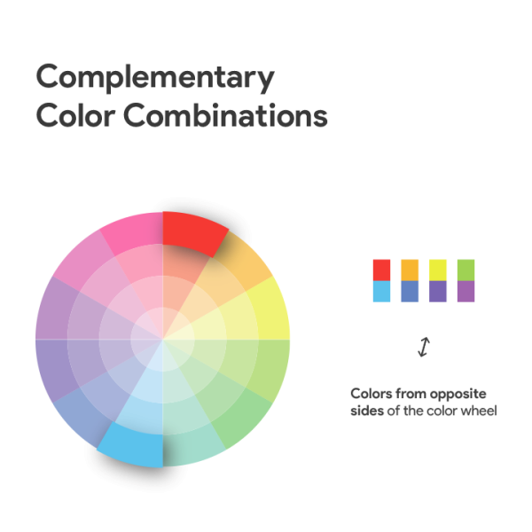
High Contrast
Ideally, it’s important to have high contrast colors in your slides. If you have a dark background, make sure all the text and elements on top of it are lighter in color. If your slides have a monochromatic color scheme, use complementary colors on the opposite side of the color wheel.
Choosing a high contrast color scheme for your slides not only makes the text more legible but also improves visual interest.
There’s a simple way to create your own high contrast color scheme:
- Select different tones, shades, and tints of a color (not the pure hue)
- Then select another pure color that is at least 3 spaces away on the color wheel. This color will be the accent color.
You can also use Adobe’s color wheel to create your own color scheme. This is a handy tool that can really help you nail the color scheme of your presentation slides.
Here’s an easy-to-use tool from Adobe that you can use to check the contrast of 2 colors.
Keep it simple. Limit your slides to have just 3-4 colors. Too much color can be distracting and can take away from what you are trying to convey.
Pro tip: How to find the RGB values of a color in PowerPoint?
Right-click on the slide to open the Format popup, or access it from the Home toolbar. Click on the dropdown next to the font color selector and select the Eyedropper. While the Eyedropper is selected, hover over any color and you will get the RGB values of that color. Use this information with the tools we’ve mentioned in this article to perfect your color palette for your background and foreground elements.
Stick by the 60-30-10 rule
If you’ve chosen 3 colors for your slides, you should give 60 percent of the spice to the primary color, 30 percent to the secondary, and finally 10 percent to the accent color.
Don’t forget to use different colors and experiment with color variations to make your slides interesting and all the more powerful.
The best colors for PowerPoint backgrounds using color theory
Colors are just as important as the content on your slides. If you use colors well on your slides, it can help enhance your message. Knowing the very basics of color theory can help you create better presentations.
Select Complementary Colours
To create complementary color combinations between your background and foreground, you can select colors that sit opposite each other on the color wheel. This could be a warm color or a cool color.
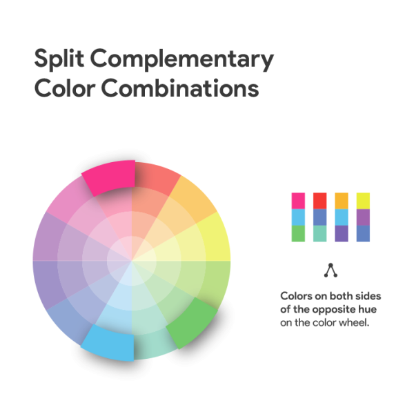
Split Complementary Colors
This is another color variation that you can experiment with. Split complementary colors are combinations of 2 adjacent colors and a complementary color. Experiment with these colors for your background and foreground to create stunning slides.
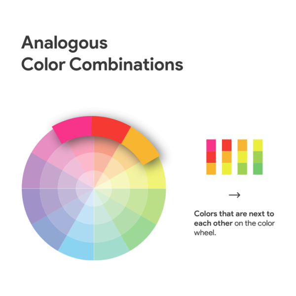
Analogous Colours
You may even choose the analogous color scheme for your slides. These colors are right next to each other on the color wheel:
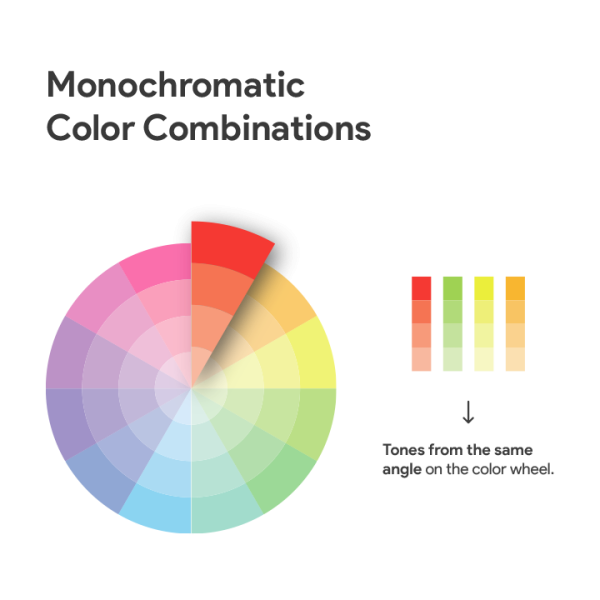
Monochromatic Colours
Even monochromatic color combinations make unique-looking slides. These are basically different shades, tones, and tints of the same hue.
Presentation background colors for better accessibility
When choosing colors for your presentation’s background and foreground, it is important to make your slides accessible to everyone, even people with visual impairments. PowerPoint has features that enable people with disabilities to read and author documents.
Here are a few pointers on choosing your background and foreground colors so that it is accessible to everyone.
- Have enough contrast between the background and the foreground. You can check the contrast between two colors using this tool from Adobe.
- Colour should not be the only way of conveying information. You can check if the colors of your slides are accessible to people with visual impairments by viewing them in black and white. In Windows you can do this by going to Start > Settings > Accessibility > Color Filters and selecting Grayscale.
- Stay away from backgrounds that have different colors in different areas (images, gradients, etc.). These can cause readability issues for the text, especially if there are color contrast issues.
PowerPoint background colors and emotions – the psychology of colors
Here are some popular color choices for presentation backgrounds and the use cases they are perfect for:
Blue – the most popular choice for business presentation slides
Blue is the most popular choice of color for presentation slides. The color has a calming feel to it and is conservative. Blue is a favorite among business presenters as well as trainers. You can add a dark blue background and light-colored text to your slides to make them appear professional and serious. Presentations with light blue backgrounds are great for environments that are more relaxed and preferably well-lit.
Green – encourages interactions
Green gives off a friendly appearance and warmth. Slides with green can potentially stimulate interaction. Green is loved by trainers, teachers, and others who create presentations that are intended to create interactions. Plus, it’s a no-brainer to use this color for all environmental-themed presentations.
Red – passionate, but carries negative implications
Red is an influential color, but it has often been associated with danger, failure, and similar negative ideas. While it may be a great color for conveying passion, red does not work for a lot of presentations. Never use red while presenting financial information, tables, or charts.
Purple – emotional and spiritual
Most of our clients that use purple are women. This is a good color for emotional or spiritual presentations. Purple is somewhat an exotic color since it doesn’t appear too often in nature.
Yellow – attention-grabbing
In my opinion, yellow doesn’t make a good background color. It can be used as a highlight color since Yellow is great for grabbing attention. A bright yellow background has the potential to be an eyesore. Instead, you can use an orangish shade. You can also add texture to the background as discussed in this article to get a better background.
Black – neutral but strong!
Black is a great choice for a background color for your presentations. Since it is a neutral color, it is also a great choice for presenting financial information. The simplest way to get your slides to look elegant and bold? Just slap a black background on them!
White – clean but boring
White is yet another neutral color, and all slides come default with it. The color white represents purity and innocence. It can create a sense of space and can be useful when you want the audience to focus on the message and not on anything else. However, it can also appear cheap. If all your slides have a white background, it can look like you didn’t put in any effort. Your presentation might appear a little boring as well.
How to choose the best image for the presentation background?
You can make your presentations a lot more memorable if you use pictures as your background. But using images as your background can be a hit or a miss, depending on the choice of picture. The right image can elevate your presentation and make it impactful. Wrong or irrelevant messages will just confuse the audience and come off as cheap and cringe. The right images in your presentations can enhance your presentations and make them much more effective at conveying your message. Here’s how you can choose the right images in your presentation’s background:
- Choose images that support your content. Don’t just use an image to fill up the white space on the screen. These images should be relevant to the topic of the presentation.
- Make sure you use high-quality images of the proper resolution. Having a pixelated background is an eyesore and can really ruin the experience for your audience.
- Use simple images. Images with too many things happening will distract from any text or elements on top of it. Remember that these images should be in the background and should not compete with the text on your slides.
- Pay attention to the colors. The colors of the background should not clash with the colors of the text or any other elements on top of it. I will clarify more on this later on, keep reading.
Adding shapes and overlays to the background
If you have an image as the background, you could add shapes and overlays to make the foreground appear sharper and help it stand out from the background. Here’s how you can do this:
- Click on the Insert tab
- Click on Shapes and select a shape. We recommend a rectangle. You can then cover the entire background with this shape.
- This should open a Format Shape If you can’t see this, right-click on the shape and select Format Shape
- Here you can adjust the Transparency for different colors. Your shape could have a solid color, gradient fill, or image. Adjust the transparency to your needs.
Note: If you already have text on the screen, right-click the shape and select Send to Back to send the shape behind the text.
This kind of overlay can help your audience focus more on the foreground than the background.
How to use Artistic Effects in PowerPoint
You can use Artistic Effects in PowerPoint to further customize your background to make it look better, and to make the foreground stand out. This feature is handy for adding filters and effects like blur, which can substantially improve how your slides look.
Here’s how you can access the Artistic Effects in PowerPoint
- Right-click on the background
- Select Format Background
- Click on the pentagon shape
- You can now check out all the Artistic Effects available
Experiment with different effects to get the result that you want. The simplest way you can improve foreground clarity is by blurring the background. You can do this by selecting Blur from the list of Artistic Effects. After selecting, you can immediately see the result. You can also use the slider to adjust the parameters of the effect. For example, by adjusting the Radius, you can control the intensity of the blur effect.
Here’s an example of background without the blur effect:

Here’s the same background with the blur effect:

As you can see, the text is easier to read when we add a little blur to the background.
How to copy the PowerPoint background to another presentation?
- Select the slide that you want to copy the background from in the Slides Pane.
- From the Toolbar (under Home) double click on Format Painter.
- Click on the slide with the background from the Slides Pane.
- Click on the slide you want to paste the background to. This could even be a different presentation.
What is the best PowerPoint background size?
Your PowerPoint presentation’s background size will depend on the slide size of your presentation. By default, it should be set to “Widescreen” (16:9), but it can also be set to “Standard” (4:3). Either way, the background you use will fit and be the same size as your slide. If your background image is 16:9 and your slide is 4:3, PowerPoint will resize your image to fit the slide.
You can check the slide size by going to Design and clicking on Slide Size.
Why do PowerPoint presentation backgrounds matter?
The best backgrounds help make your slide elements come alive
The best slides are a perfect combination of ample amount of white space, good color combination, and the perfect background. A good background can elevate the presentation and help you communicate better to your audience. Nobody wants to look at poorly designed slides, after all, they’re just pieces of text on a poorly designed canvas. A good background is all it takes sometimes to get your slide to look professionally designed.
Backgrounds add texture to the presentations
Why have a boring backdrop on your slides when you’re trying to convey something important? A lot of people don’t even bother changing the default background. A good background can really help your slides look a lot better.
Backgrounds can be used to add texture to your presentations. It’s sort of like creating a physical illusion for your audience. I remember once sitting through a presentation about the water cycle. The slides with backgrounds showing rain in a way made me feel the rain, creating a memorable experience.
Similarly, you can use different kinds of backgrounds in your slides to give an illusion of the desired texture. Creating a presentation on Egyptian tombs? Why not have hieroglyphs as the background?
Creates visual interest
Let’s face it, most presentations are boring. I mean, imagine sitting through a 30-minute presentation where all the slides have the same background. You’d get distracted easily or worse, you’d start nodding off soon! When there’s no variety, your brain just wants to shut off and the whole experience is just awful for everyone.
Having good backgrounds in your slides can sometimes be the first (and sometimes the biggest) step to making your slides look interesting.
Having good images as your background can improve the visual interest of your slides. If you’ve paid attention to the colors you use in your background and foreground as well, you’re going to have really pretty-looking slides.
You don’t need to be some designer wizard to get started with backgrounds as well, it’s not rocket science! Just follow the color suggestions we’ve mentioned in this article. Make sure to blur your background if it has a chance of clashing with the foreground text. This also works if the background has many colors and is super packed with details. Choose the right type of background your slides need and trust me; your presentation will be a success.
Closing thoughts
Let’s quickly sum up key points from this article. If you need to add a background to your PowerPoint slide, you have these options:
- Solid color background
- Gradient background
- Image background
- GIF background
- Pattern background
- Video background
All of these are accessible in the Format Background option which you can access by right-clicking the slide.
You have plenty of options to customize your background to improve the legibility of the foreground and to make the slides look much better. This article also talks about using the right colors, images, and more to create impactful slides.
So, there you go, here’s all you need to know about PowerPoint backgrounds. I hope you’ve learned something new here. Good luck with your presentation!
Related Articles
-
 August 16th, 2024
How To Make Your PowerPoint Interactive: A Complete Guide
Blog Post -
 September 1st, 2024
How to Create Interactive Polls and Surveys in PowerPoint Using Microsoft Forms
Blog Post -
 May 15th, 2024
How to Loop Your PowerPoint Presentations
Blog Post