
Best PowerPoint Color Palettes and Color Themes for Presentations in 2026
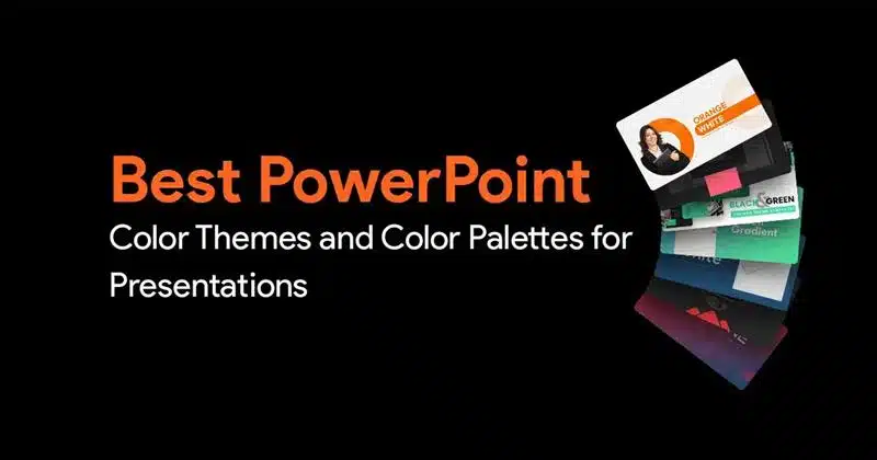

This article is about PowerPoint color palettes and color themes. It is well known that a good color palette can completely change how your presentation looks. But if you’re someone who doesn’t have the time to pick out color palettes, and experiment, then don’t worry. This article will help you out. Here are some of our top picks of the best PowerPoint color themes that can transform your presentations from average to all the rage!
Psst… if you want the TLDR version of this article check out our Insta post (and follow us for more such posts):
Also, check out PowerPoint background, animated PowerPoint background, and confetti animation PowerPoint for a visually impressive touch.
Table of contents
Dark Background and Light Text – Red and Black
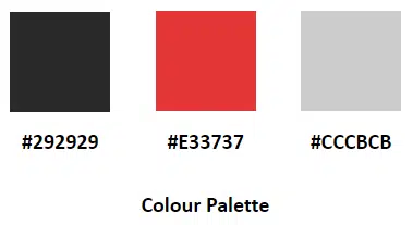
Here are the color codes for you to copy and paste: #292929, #E33737 and #CCCBCB and here’s what a template made with that color scheme looks like:
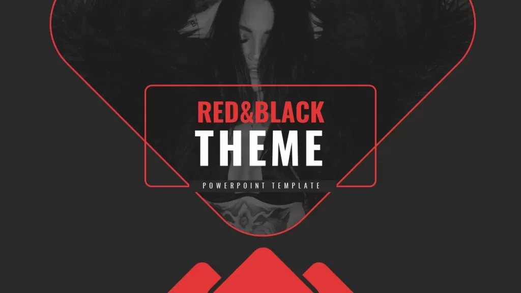


This PowerPoint color theme gives your presentation a very sleek and stylish look. If you design your slide well, you’ll have a beautiful presentation that is legible, engaging and impactful. Red and black go really well together, and combining them with grey or white, gives your slides a professional touch. Feel free to copy the color codes try them out on your slides. You can also speed up the process by simply downloading the above template and then customizing it to your needs, which barely takes a few minutes.
Why and when to use this color scheme?
- Black and white is a sophisticated color combination but when combined with a contrasting and striking accent color, the overall deck will look sleek, stylish, and engaging.
- The color red is chosen as the accent color here due to its effect of getting the audience excited about an idea. Moreover this color prompts the user to take quick actions, hence this color can be used to highlight areas which need to be quickly acted upon.
- Use this accent color to call attention to specific phrases or points which require more focus.

Blue, Yellow and White Color Theme
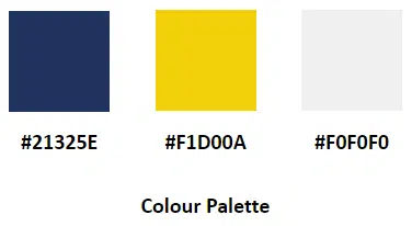
Here are the color codes: #21325E, #F1D00A, and #F0F0F0. This is what a PowerPoint presentation with that color scheme would look like:
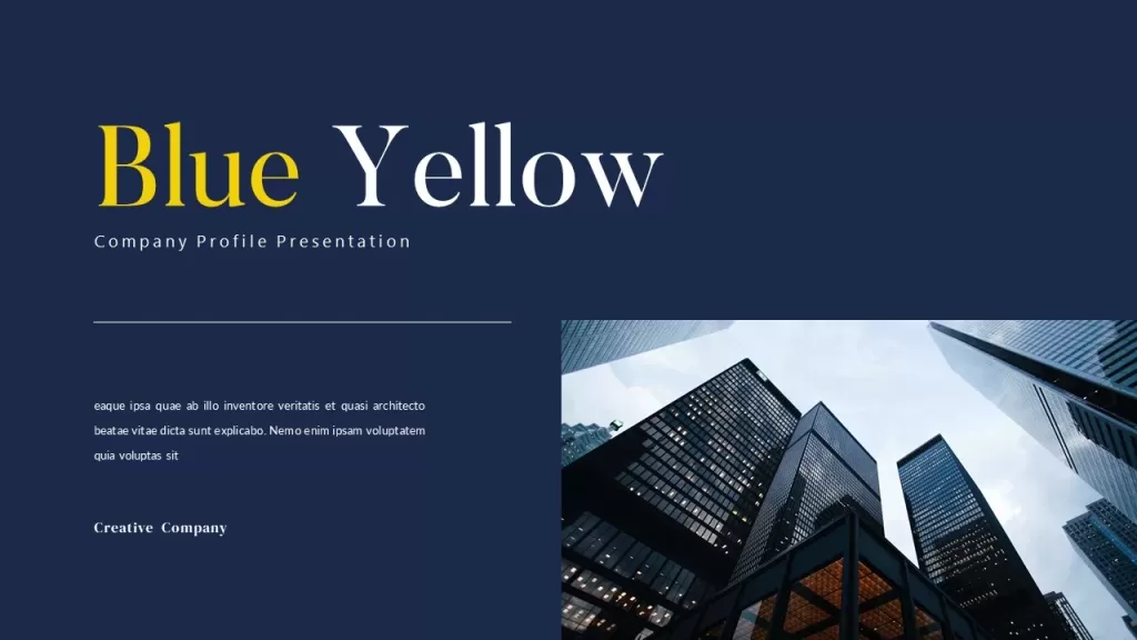

This color scheme for PowerPoint gives your presentations a very refined, professional look. The combination of the three colors, navy blue, yellow, and white looks really good. This type of PowerPoint color palette is perfect for corporate presentations. Try it out today by using the color codes, or by using the PowerPoint template above.
Why and when to use this particular color scheme?
- For a lively presentation that also serves the purpose of being executive, a combination of navy blue, yellow and white colors work well.
- The color yellow is an attention grabber and should be used in small doses to highlight important facts, dates, statistics, etc.
- These decks will be useful in presenting business reports of start-up brands or other budding companies.
Blue and White Color Palette
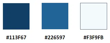
The color codes are #113F67, #226597, and #F3F9FB. Here’s what those colors would look like in a PowerPoint presentation.

This is yet another PowerPoint color palette that’s perfect for professional presentations. Blue and white is a very common color pattern, often used in business presentations. It’s fairly simple to use, and can really beautify your presentation. Download the template above to get started.
Why and when to use this particular color scheme?
- One of the most commonly used color schemes in PowerPoint, especially by various business corporations for their presentations, this colour scheme is a no-nonsense choice and can be powerful when used effectively.
- According to color psychology, this blue exudes traits like loyalty and trust, hence this theme can be used while presenting company profiles or business plans.
- Tech businesses and start-up brands also go with templates with this chromatic pattern for their presentations.
Dark Duotone Gradient and Light Color Combination
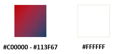
The color codes are: #C00000 – #113F67 and #FFFFFF. Here’s what your presentation will look like with this color scheme:
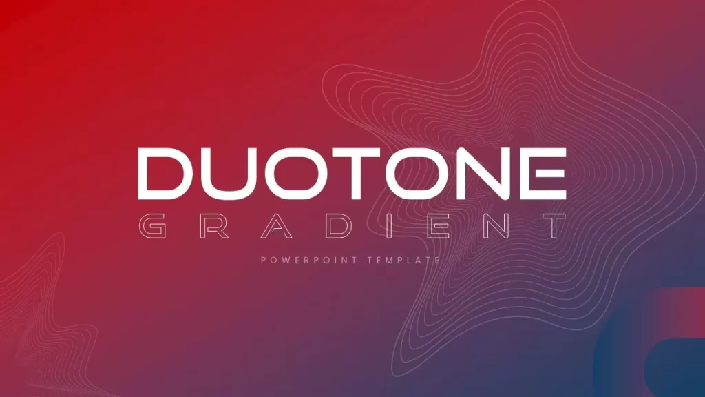


This particular PowerPoint color palette gives your presentations a modern, even futuristic vibe, depending on how you use it. Personally I am not a fan of gradient colors, but if executed well like in this template above, it can look absolutely gorgeous. So if you’re interested in this color palette for your next presentation, download this template and customize it to your needs.
Why and when to use this particular color scheme?
- Duotones gradient themes are in trend right now due to the modern vibe it gives off.
- Using gradients in PowerPoint backgrounds are more beneficial in accommodating contrasting hues without going over the top.
- These colors create a strong impression yet makes the overall presentation look legible and comprehensive. Balance the colors well while creating the deck without making the gradient overpowering for the eyes.
Orange and White Color Theme
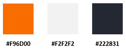
The color codes are #F96D00, #F2F2F2, and #222831 and here’s what a PowerPoint slide would look like with that color theme:
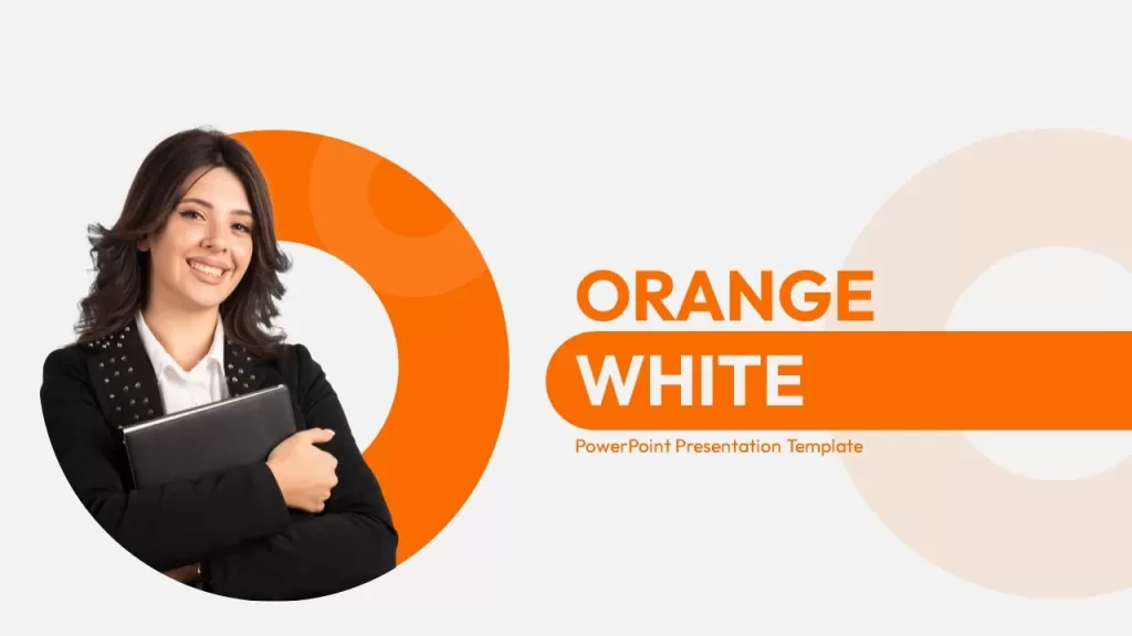


This beautiful PowerPoint color palette consists of a combination of orange, white and black. You can make some amazing slide designs with these colors, I mean just look at the slides above! Orange is a great color to use since it’s not a very common color you see in presentations. Your presentation will definitely stand out, and be engaging with this color scheme.
Why and when to use this particular color scheme?
- Orange is deemed to be a color which stimulates our creative juices. To mellow down the bright hue, it is paired with white and black.
- If the end goal is to try something new or engage in creative activities, orange color focused template should be used for your presentation.
- Usually used in informal scenarios, this is apt for educational purposes mostly, or for group activities.
Black and Green Color Palette
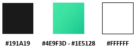
The color codes are #191A19, #4E9F3D – #1E5128, and #FFFFFF. Here’s a PowerPoint template with the color scheme:


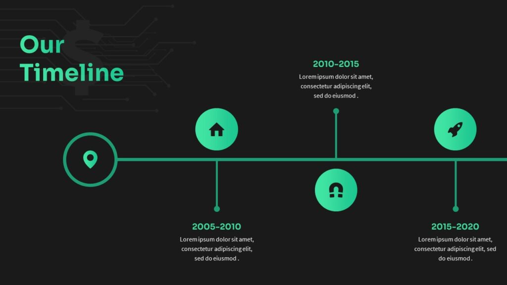
This PowerPoint color palette is great for technology related presentations. It is already giving me low-key matrix vibes. You can also use this color scheme for finance related presentations.
Why and when to use this particular color scheme?
- This color combination is mainly seen while presenting topics related to gaming, technology, and other futuristic elements. Alternatively, they are also useful in presenting finance reports when used in balance with white.
- Green encourages participation of audience when used with the right color pair. For interactive queries or sessions, use this color theme.
Blue – Green Gradient Color Scheme
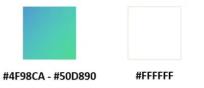
The color codes are #4F98CA – #50D890, and #FFFFFF. Here’s what a PowerPoint presentation would look like with this color scheme:


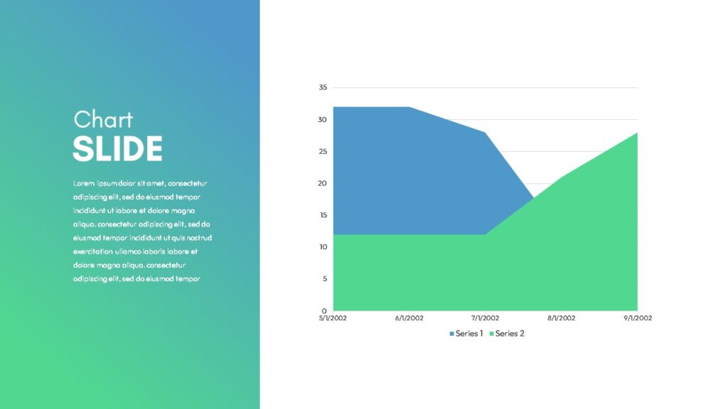
Another color scheme for PowerPoint which is great for corporate and business related presentations. The colors are mild, and are pleasing to the eyes. It’s a great theme if you want a simple design for your presentation.
Why and when to use this particular color scheme?
- Blue-Green gradient is another favorite theme among corporates and tech related brands while creating presentations.
- This color scheme is pleasant to the eyes, and is efficient in delivering calculated messages when combined with black color text.
- While being presented on a screen, these colors ensure that the audience doesn’t get lethargic, and makes it easier to process.
Conclusion
There you go, some of our top picks for the best PowerPoint color palette for your presentations! We hope this article was helpful, and you’re able to create stunning presentations with it. We’ll be updating this article with more color schemes, and templates, so make sure you bookmark this page and come back later! Until next time, cheers!

Related Articles
-
 March 22nd, 2024
How to Add Audio to PowerPoint
Blog Post -
 April 2nd, 2024
How to Use Hyperlinks and Action Buttons in PowerPoint
Blog Post -
 February 17th, 2023
Best Six Sigma PowerPoint Templates (DMAIC, SIPOC, MUDA 7, DMADV)
Blog Post