
Pitch Deck Teardown: Redesigning Famous Failed Decks Slide-by-Slide


About the author:
“I’m Tanya Slyvkin, the Founder and CEO of Whitepage. I hold a degree in Marketing from Suffolk University’s Sawyer Business School and am a certified Project Management Professional I have more than 12 years of experience as a pitch deck strategist and a background in C-level operations. I’ve built my career around helping startups, tech companies, and global organizations translate dense, high-stakes complexity into institutional-grade narratives that get people to act. I work closely with founders and executives to ask the hard questions upfront, helping them figure out what to say.”
The common advice, “find a successful pitch deck and use it,” is wrong. Everybody is trying to copy the successful pitches, especially the Airbnb and Uber pitches, to try to figure out the secret sauce of creating a good pitch.
While this sounds right intuitively, it’s a dangerous practice because it creates a false sense of security. Winning pitches work primarily because the macro environment was favorable, or the presenter had access to a super-elite network, or traction was so massive that even a poor pitch wouldn’t have killed the opportunity.
Learn from mistakes.
If you want to be able to communicate effectively under pressure, learn from bad examples. Bad presentations aren’t bad because of the choice of font or design style. They are bad because the process of communication was flawed. In most cases, the main problem is that you give your audience too many things to digest at once and overload their brain.
Here are four classic slides from well-known, high-profile company flops that you need to avoid. I’ll show you how to rebuild them correctly.
Slide 1: The Problem Slide with Lots of Vocabulary
The Flop
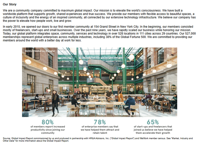
Take any failed company presentation, such as WeWork’s famous pre-IPO presentation. Its problem slide didn’t describe a clearly defined commercial pain point. Instead, the founders talked about elevating the planet’s consciousness and addressing the crisis of chronic loneliness through WeWork’s real estate arbitrage.
The Critique
This is a recipe for disaster as it creates excessive cognitive overload. When a potential investor sees such a massive amount of corporate text on the slide, two reactions happen almost automatically. First, they stop listening to the presentation as they are mentally incapable of reading the text while processing the spoken words.
Secondly, the skeptic inside comes to life as they immediately notice all those buzzwords and fancy vocabulary and realize that the founders don’t know the problem they are solving well.
Using jargon and difficult terms to talk about a business problem is a way of masking an insufficient understanding of what needs to be done. If you cannot describe your problem in simple terms, it means you need to research it more. Investors invest in pain, not philosophy.
And if you are solving a problem that is not painful enough for your target customers to spend actual money solving it, then you don’t have a viable business idea.
The Redesign
Ditch all the buzzwords and complicated corporate vocabulary. Any real problem can be translated into a cost metric, an hour deficit or a regulatory burden.
For example: “Companies lose $4,200 every time a remote engineer leaves their team due to loneliness.”
The Design Fix: Just put that one sentence on a slide. Make the numerical metric bold and large compared to the rest of the text. Use a dark background and make the words white with high visual contrast. Remove all icons and generic images of lonely people deep in their thoughts. You want the cold, hard facts to create the atmosphere of tension.
Slide 2: The Solution Slide
The Flop
Let us examine early failed decks from industries such as medical devices or enterprise software. In this case, Theranos’ fundraising decks, slides 6 and 7. We tend to see the same mistake made over and over again. The solution slides featured incredibly complicated explanations with multi-level diagrams, flow charts, and 15 textboxes describing everything about the system.
The Critique
If you talk about five things simultaneously, investors will remember nothing. It is a terrible mistake of the founders to believe that complexity equals competence. In fact, the opposite is true. An extremely elaborate explanation of the product is a sign that the founders do not really know what they are doing.
Such a solution slide shows three things:
- The product will take twice as long to develop
- Is impossible to launch cleanly
- It will lengthen the sales cycle
The Redesign
Follow the “One-Feature Rule.” Don’t describe how many components and features the system has. Show investors that a particular action delivers a particular outcome for the user.
The complicated diagram should be in the appendix, which the investors can access in case they need additional information. Your focus should be on explaining how your product works in a few words.
• The Layout: Divide the slide into two equal parts.
• Left Part: Describe the input (What the user physically does).
• Right Part: Describe the output (How the user gets a value in return).
Example: “Step 1: Load an unprocessed Excel file. Step 2: Automatically receive a compliance report within 12 seconds.”
Slide 3: The Market Slide with Multi-Trillion Market Estimates
The Flop
Any failed consumer-facing apps or B2B solutions from the mid-2010s would have used a similar market slide. They would feature three concentric rings indicating that the size of the market (TAM) was measured in trillions. A good example is slide 2 of Trucking Tech’s presentation.
Most companies would always come with a story that went like this: “The global logistics market is worth $3 trillion. If we capture 1% of this market, we are a billion-dollar company.”
The Critique
This is a sure-fire way of making the investors lose interest. Investors perceive this as a sign of a novice entrepreneur because an experienced investor knows that you don’t measure markets with concentric circles.
It tells them that you do not know where your product fits, and where you can find your target audience. A market size of $1 trillion means that you are fighting against the whole world and shows an inability to comprehend GTM dynamics.
The Redesign
Instead of using a top-down estimation of market size, use a bottom-up approach. Explain to the investors exactly who your target market is. Who are the users who need your product right now and can be addressed with the funds you currently have?
Also, forget the concentric circles. They use a huge amount of space but provide absolutely no operational data. Use a horizontal timeline or bar chart to divide your market into three phases:
1. Phase 1 (The Beachhead/SOM): Users you can reach easily right now with little to no marketing efforts (for example, “Mid-sized logistic firms in Ohio with legacy systems”)
2. Phase 2 (The Adjacent Market/SAM): The logical next step once your first phase is covered (for example, “All Mid-Market logistic firms in the Midwest region”).
3. Phase 3 (The Long-Term Vision/TAM): The large market you can access once you are already established.
Add the calculation details to your slides (in small print). If you say that your beachhead market size is $50 million, show the exact formula for calculating it in a footnote (for example: Number of companies x Annual contract value = Beachhead market size).
Slide 4: The Financials, Always the Most Messy One
The Flop
The standard financials slide uses an overwhelming line graph with a hockey stick growth curve that starts skyrocketing from the third year onward. It includes multiple data layers – five product types represented with colorful bars, vague EBITDA numbers, and a lot of other data that can hardly be seen from far away.
Takes us back to WeWork, page 16. They used a dense and complex table to introduce a non-standard accounting metric, Community Adjusted EBITDA.
The Critique
Messy visualizations are a warning signal for investors as they indicate an attempt to hide poor margins and metrics. Furthermore, the complex graphics make it difficult for your investors to analyze the core aspect of your financials – your unit economics.
The Redesign
Use a minimalist design. The best visualizations are those that are easy to scan quickly. Try to limit yourself to two or three colors. Soften your past history by using neutral grey tones and highlight future goals in the bright accent colors from your branding guidelines.
If possible, remove the line graph and use a table instead. They are easier to perceive and make it possible to include the actual numbers.
| Metric | Current (Y1) | Target (Y2) | Scale (Y3) |
| Annual Recurring Revenue (ARR) | $250K | $1.2M | $4.5M |
| LTV:CAC Ratio | 2.1:1 | 3.5:1 | 4.2:1 |
| Gross Margin | 68% | 74% | 78% |
That’s how simple it is.
Take Away
There is one foundational rule you must remember. If an investor cannot grasp the single core takeaway of a slide within three seconds of looking at it, your slide has failed.
Slides are not there to prove how smart you are or act as your teleprompter. They exist exclusively to provide visual validation for the words coming out of your mouth.
Focus on one idea per slide. Speak conversationally. Let your environment do the heavy lifting, and stop hiding behind your deck.
Related Articles
-
 July 26th, 2024
How to Activate or Re-enable a Disabled PowerPoint Add-in
Blog Post -
 June 9th, 2021
Kotter’s 8 Step Change Model
Blog Post -
 November 19th, 2025
How to Foster a Culture of Continuous Learning and Innovation in Presentation Design Teams
Blog Post