
How to Use White Space in PowerPoint Presentations

Never underestimate the importance of white space in PowerPoint presentations. Most presentations often fall victim to information overload. Densely packed slides with walls of text leave audiences overwhelmed and disengaged. You should learn how to use white space in your presentations to avoid this.
Think of white space (not necessarily white in color) as the breathing room of your slides. It’s the emptiness that allows your content to shine, creating a sense of hierarchy, focus and visual appeal. By using white space, you can transform your presentations from chaotic clutter to compelling canvases for your message. Let’s dive deeper into why white space matters in your presentations.
We’ve got a video on this topic on our YouTube channel, so if that is what you prefer, here you go:
If you found the video helpful, subscribe to the channel, since we’ve got plenty of other useful videos like this. Alright then, let’s move on to the rest of the article.
Why White Space Matters:
Enhanced readability.
Imagine navigating a jungle of text compared to scrolling through a park with clear pathways. White space around and between text blocks improves readability, making your content easier to digest and remember.
Visual hierarchy.
White space helps prioritize information. By surrounding key points with emptiness, you draw attention to what matters most, guiding your audience’s eyes and emphasizing the flow of your narrative.
Professional touch.
A slide with ample white space exudes sophistication and professionalism. A slide with no white space and too much crammed into it, will just feel amateurish.
How to use white space in your presentations:
Use margins! Don’t fill your slides to the brim. Leave a little breathing room around the edges of your slides, creating a visual frame for your content.
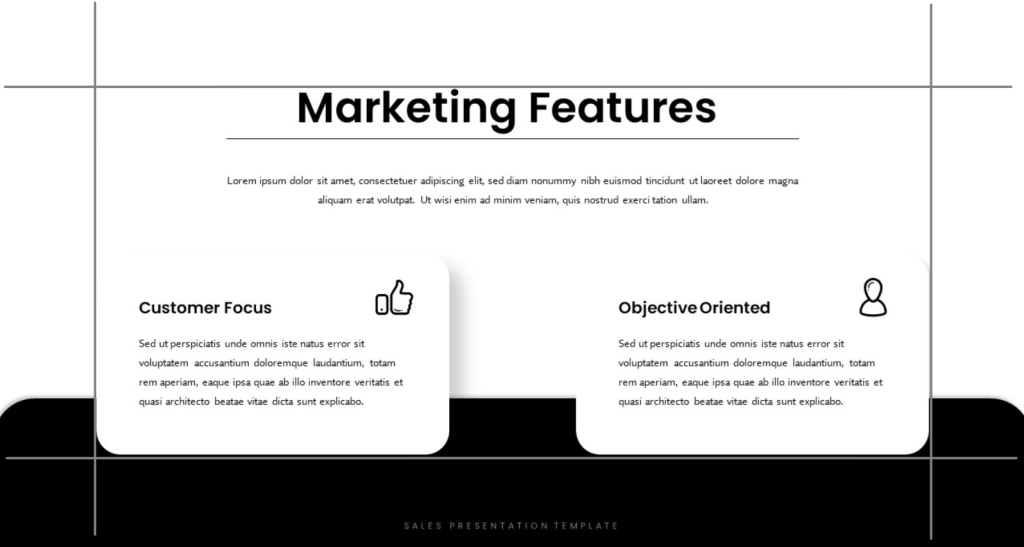
You can also try simplifying text. Ditch lengthy paragraphs and bullet points. Use concise phrases, headlines, and visuals to convey your message.

Use more visuals to convey your message. High-quality images, infographics and data visualizations can replace walls of text.

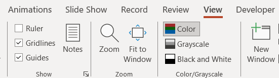
Use grids and guides in PowerPoint. This in-built feature can help you arrange your content strategically and ensure balanced use of white space. You can enable them by going to View and selecting Gridlines and Guides.
Keep in mind that white space isn’t the enemy, it is your ally. By embracing its power, you can create presentations that are clear, impactful, and visually engaging. Your job is not to create slides crammed with info. Your slides are just visual aids for your presentation.
With these tips and a bit of practice, you’ll be well on your way to mastering the art of white space and delivering presentations that truly resonate with your audience. I hope you’ll put these tips to good use!
Related Articles
-
 August 26th, 2025
How to Centralize Slide Storage and Enforce Version Control for Your Presentation Team
Blog Post -
 April 10th, 2024
40+ Organizational Chart Examples for Company Hierarchy Presentation
Blog Post -
 February 10th, 2024
How to Be More Confident During a Presentation
Blog Post