
- Step 1: Start with a Clear Brief, Not a Vague Prompt
- Step 2: Fix the Structure Before You Touch the Design
- Step 3: Rewrite the Text for Clarity and Impact
- Remove Filler Language
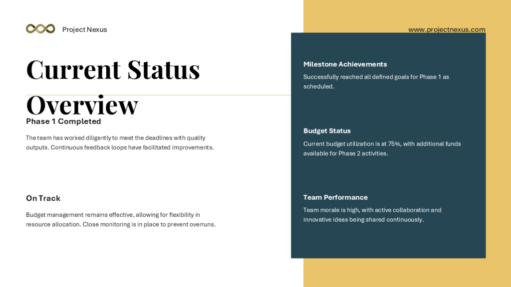
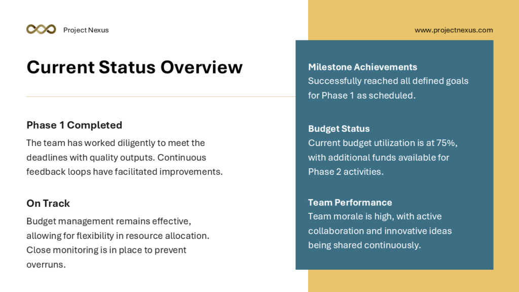
- Step 4: Fix The AI Template (or Apply One)
- Step 5: Create a Consistent Visual System
- Step 6: Replace Generic AI Images
- Step 7: Improve Your Data Slides
- Step 8: Check Consistency Across Every Slide
- Step 9: Rehearse and Refine the Narrative
- Step 10: Final Review
How to Make AI Presentations Look Professional


AI presentation tools have really changed the way people create slides.
With a single prompt, you can generate a full deck in seconds. That speed is genuinely useful. But speed alone does not make a presentation professional. You need to put in some more work to make these slides look professional.
Most AI-generated decks share the same problems: generic layouts, inconsistent fonts, cluttered slides, and placeholder-style content that feels unfinished. When slides look rough, it undermines the message, no matter how strong the content is, and the audience notices these things.
This guide walks you through every step required to turn an AI-generated draft into a presentation that looks polished, well-structured, and ready to impress. You do not need a design background. You just need to know what to fix, and in what order.
Step 1: Start with a Clear Brief, Not a Vague Prompt
The quality of your AI presentation starts before you see a single slide.
The prompt you give the AI determines the structure, tone, and direction of everything that follows. Vague prompts produce vague results.
What Makes a Strong Prompt
A strong prompt includes the following elements:
- The specific topic and angle, not just a broad subject area
- Your audience (investors, students, clients, internal team)
- The goal of the presentation (inform, persuade, train, pitch)
- The desired length or number of slides
- The tone, whether formal, conversational, or technical
For example, instead of writing “Make a presentation about marketing” write: “Create a 10-slide presentation for a client pitch about a social media marketing strategy for a retail brand. The audience is a small business owner with no marketing background. The tone should be clear and confident, not technical.“
When you give the AI clear direction, the output requires far fewer manual corrections. This saves time and results in a more coherent structure from the start.
Step 2: Fix the Structure Before You Touch the Design
Once you have your AI draft, resist the urge to immediately start changing colors and fonts.
Structure comes first.
A beautifully designed slide deck with weak structure still fails to communicate.
– Evaluate the Slide-by-Slide Flow
Read through the deck from start to finish and ask yourself:
- Does each slide have one clear point?
- Does the order make logical sense?
- Is there a clear opening, middle, and close?
- Are there any slides that repeat the same idea?
- Is anything important missing?
– The Rule of One Idea Per Slide
AI tools often combine too many ideas on a single slide. Professional presentations follow a simple rule: one idea per slide. If a slide tries to make three points, split it into three slides. This makes your content easier to follow and gives each idea the visual space it deserves.
– The Opening and Closing Slides
Check that your opening slide sets context clearly and your closing slide ends with a purposeful message. AI tools often generate bland openers like “Introduction” and closers like “Thank You.” Replace these with something specific. A strong opener might state the central problem you are addressing. A strong closer might restate your key takeaway or include a clear next step.
Step 3: Rewrite the Text for Clarity and Impact
AI-generated text tends to be wordy, generic, and safe.
It fills space without saying anything memorable. To make your presentation look and sound professional, every line of text needs to earn its place.
Fix Your Headlines – They Should Do Real Work
The headline is the most important text on any slide. Weak headlines describe a topic. Strong headlines make a point.
- Weak: “Market Research”
- Strong: “68% of Customers Are Ready to Switch Brands for Better Service”
When a headline communicates the takeaway directly, the audience absorbs the message even if they are only skimming the slides.
Cut the Bullet Points Down
AI tools sometimes love bullet points. They also tend to produce too many of them. Aim for a maximum of three to four bullets per slide. Each bullet should be one line, not a full sentence. If a bullet needs to be explained in detail, that explanation belongs in your spoken words, not on the slide.
Remove Filler Language
Search your deck for phrases like “in today’s fast-paced world,” “leveraging synergies,” “a wide range of solutions,” and “cutting-edge technology.” These phrases add no information. Replace them with specific facts, numbers, or concrete descriptions. Specificity is what makes content feel credible.
Now the next few steps mentioned, works better if you export the AI generated presentation and use a familiar tool like PowerPoint or Google Slides to customize them.
Step 4: Fix The AI Template (or Apply One)
The visual design of your presentation sends a signal before the audience reads a single word. A well-chosen template communicates professionalism, consistency, and attention to detail.
Why AI Default Templates Often Fall Short
Most AI tools generate slides using their own built-in themes, which are functional but rarely distinctive. These default themes are used by millions of people, so your deck can end up looking identical to presentations from competing businesses or organizations.
Using a professionally designed template, such as those available from SlideBazaar, immediately elevates the visual quality. Good templates are designed with consistent spacing, thoughtful typography, and layouts that work for real content, not just placeholder text. You can simply download a template, and move the AI generated content onto the template slides.
If you are working in PowerPoint or Google Slides, you can paste your AI-generated content into a new template by copying the text from each slide and placing it into the corresponding layout in your chosen theme. This takes around 15 to 30 minutes for a 10-slide deck, and the result is a substantial visual improvement.
Step 5: Create a Consistent Visual System
Consistency is one of the clearest markers of professionalism. When fonts, colors, spacing, and alignment are consistent across every slide, the deck looks intentional and controlled. When they are inconsistent, even great content looks disorganized.
Typography Rules to Follow
- Use no more than two fonts: one for headings and one for body text
- Keep body text at 18pt minimum: anything smaller becomes hard to read in a room
- Use font weight for emphasis: bold for key terms, regular for supporting text
- Avoid italic text in body copy: it reduces readability on screen
Color System Rules
- Define a primary color: used for headings, key data, and accent elements
- Define a secondary color: used for subheadings, dividers, and supporting elements
- Use neutral backgrounds: white, light gray, or very dark navy work best for readability
- Avoid red and green together: it creates problems for color-blind viewers
Alignment and Spacing
Check that text boxes start at the same horizontal position across all slides. Use your software’s alignment tools to ensure consistent margins. Inconsistent alignment is one of the most common signs of a quickly assembled or AI-generated deck.
Step 6: Replace Generic AI Images
AI tools often insert stock images or AI generated images that are technically related to the topic but add no real value. And let’s be honest, who really likes AI slop?
A photo of people shaking hands on a slide about partnerships communicates nothing new. Visuals should do one of three things: clarify a concept, support a data point, or create emotional connection.
Types of Visuals That Work
- Data charts and graphs: Use these when a number or trend is central to your point. Keep them clean with labeled axes and minimal grid lines. Here’s a guide on using charts in PowerPoint.
- Diagrams and process flows: Use these to show how something works, how steps connect, or how a system is organized.
- Icons: Simple, consistent icons help break up text and signal category. Use icons from one set to maintain visual consistency.
- Product or real-world photography: Where relevant, real images of your product, team, or project add authenticity that stock images cannot match.
When to Remove Visuals Entirely
If a visual does not add meaning to the slide, remove it. A clean slide with strong text is more professional than a cluttered slide with a decorative image. Whitespace is not wasted space. It gives the audience’s eye somewhere to rest and makes your content feel more considered.
Step 7: Improve Your Data Slides
Data slides are where many AI-generated presentations fall down. The AI may insert a chart, but it rarely formats it in a way that makes the insight immediately clear.
Principles for Clear Data Presentation
- Lead with the insight, not the data. Your slide headline should state what the chart means, not just what it shows. “Revenue grew 40% in Q3” is more useful than “Quarterly Revenue Chart.”
- Use the right chart type. Bar charts compare categories. Line charts show trends over time. Pie charts show proportions (use sparingly). Scatter plots show correlation. Choosing the wrong chart type confuses the audience.
- Remove chart clutter. Delete the chart border, reduce grid lines to light gray, remove the legend if the chart can be labeled directly, and use one accent color to highlight the most important data point.
- Label your axes clearly. Every chart axis should have a short, descriptive label. Avoid abbreviations that the audience may not recognize.
- Cite your source. Add a small source line at the bottom of any data slide. This builds credibility and allows the audience to verify the data.
Step 8: Check Consistency Across Every Slide
Before finalizing, go through the entire deck in thumbnail view and look for anything that breaks the visual pattern you have established. Small inconsistencies are easy to miss when editing one slide at a time but immediately noticeable when viewing the deck as a whole.
Consistency Checklist
Go through each of the following:
- Are all slide titles in the same font, size, and color?
- Are all body text blocks in the same font and size?
- Do all images sit within the same margins?
- Are slide numbers appearing in the same position throughout?
- Are colors drawn from the same palette on every slide?
- Is spacing above and below titles uniform?
- Are brand logos or other fixed elements in the same position on every slide?
Catching and fixing inconsistencies at this stage takes very little time but has a significant impact on how polished the final deck appears.
Step 9: Rehearse and Refine the Narrative
A professional presentation is not just about how the slides look. It is about how they work when someone is presenting from them. AI tools generate content but they cannot anticipate how you will speak around it.
Present Out Loud During Editing
The most effective way to spot problems with your deck is to talk through it out loud as if you are presenting. You will quickly notice when a transition feels jarring, when a slide has too little content for what you want to say, or when a slide has so much text that your spoken words become redundant.
Add Speaker Notes for Detail
If there is information you want to cover that would clutter the slide, put it in the speaker notes. Speaker notes are where context, examples, and supporting details live. The slide itself should contain only what the audience needs to see. The rest belongs in what you say.
Use Transitions Sparingly
Animations and transitions can enhance a presentation when used well, but AI tools sometimes apply them inconsistently. As a rule, use a single simple transition throughout the entire deck. Avoid complex or dramatic transitions. They distract attention from the content and can slow down the pacing of your presentation.
Step 10: Final Review
Before you share or present the deck, run a final quality check. This review is about catching the last remaining issues before your audience sees the work.
Final Review Checklist
- Proofread every slide for spelling and grammar errors. AI tools make mistakes.
- Check that all names, dates, statistics, and figures are accurate. AI can confidently state incorrect information.
- Confirm all links or references are working if you plan to share the file digitally.
- View the deck in full-screen presentation mode to see it as the audience will.
- If presenting in person, verify how it looks on the projector or screen you will be using.
Choosing the Right Export Format
If you haven’t exported the slide already, here’s a guide on choosing the right export format for your AI presentations.
- For live presenting: keep it as a .pptx or Google Slides file so you can make last-minute adjustments
- For sharing via email or PDF review: export as PDF so formatting is preserved across all devices
- For embedding online: use the format supported by the platform, whether that is PDF, or a shareable link
How SlideBazaar Fits Into Your Workflow
SlideBazaar offers a library of professionally designed presentation templates built for PowerPoint and Google Slides. These templates are created with real-world use cases in mind, covering business pitches, educational content, marketing strategy, data reports, and more.
The best way to use SlideBazaar alongside AI tools is straightforward. Generate your content structure and draft text using an AI presentation tool. Then migrate that content into a SlideBazaar template. This gives you the speed advantage of AI-generated content combined with the visual credibility of a professionally designed layout.
The result is a presentation that looks like it was designed by someone who cares about the work.
Conclusion
AI presentation tools are genuinely useful. They reduce the time it takes to build a first draft from hours to minutes. But they do not replace judgment, and they do not guarantee quality.
Making an AI presentation look professional requires the same skills that making any presentation look professional requires: a clear structure, purposeful language, visual consistency, accurate data, and content that has been tailored to a specific audience. AI just gives you a faster starting point.
Follow the steps in this guide, use templates designed for the purpose, and take the time to edit before you present. The difference between an AI draft and a professional presentation is not luck or expensive software. It is deliberate effort applied in the right places.
Related Articles
-
 January 6th, 2023
Stop Creating Text Heavy and Bullet Filled Slides Now!
Blog Post -
 September 18th, 2020
Conflict Resolution Explained
Blog Post -
 April 16th, 2024
Working with Multiple Images in PowerPoint
Blog Post