
- Changing Data in Charts and Diagrams in PowerPoint
- How to change the order of the data series in PowerPoint
- How to remove or add a data series in PowerPoint
- How to change the fill color of the data series in PowerPoint
- How to add data labels to a chart in PowerPoint
- How to add a data table to a chart in PowerPoint
How to Change the Data in Charts and Diagrams in PowerPoint for Windows

Working with charts and diagrams in PowerPoint can get tricky, whether you’re a first-timer or someone who’s been using it for years. This quick guide walks you through how to change the data in charts and diagrams in PowerPoint for Windows, so your slides always show exactly what you need.
When you insert a new chart in PowerPoint, a small embedded Excel sheet automatically pops up alongside it. This sheet holds the sample data that your chart is built on, and any changes you make to it will instantly reflect on the chart in your slide. Think of it as a live data source that’s baked right into your presentation.
One thing worth noting: this Excel sheet doesn’t exist as a separate file on your computer. It’s stored entirely within the PowerPoint file itself, so there’s no standalone spreadsheet to hunt down or manage separately.
Also, check out this video from our YouTube channel to learn more about working with charts in PowerPoint:
Changing Data in Charts and Diagrams in PowerPoint
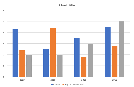
- Select the chart on your slide that needs to be modified. For the explanation purpose, we have used (and selected) a Column chart as shown in the figure below.
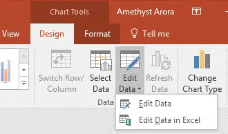
- Right click the chart and select Edit Data or Edit Data in Excel. Alternatively, after selecting the chart, select the Chart Tools and then the Design tab from the Ribbon and then click the bottom half of the Edit Data
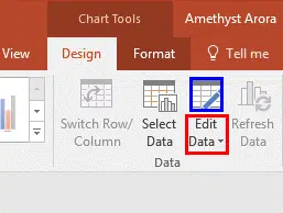
- When you do as said the Edit Data drop-down menu containing two options would be opened, as shown below in Figure C.
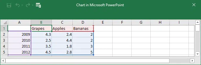
Edit Data: Selecting the Edit Data option will open a small part of Excel sheet which contains the chart data within the PowerPoint as shown in the below Figure D.
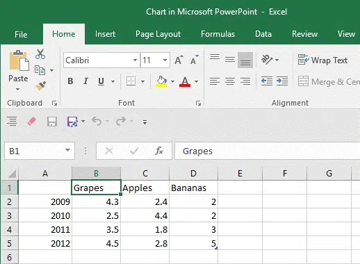
Edit Data in Excel: when you select this option, a new sheet of Excel 2016 containing the same chart data will be launched as shown in Figure E.
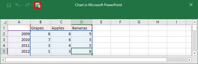
- You can either select the Edit Data directly or the Edit Data in Excel options. And you can change the Category and/or Series names and also their given values within the resultant Excel sheet itself. In order to do that, you have to first select the specific cell in the Excel sheet, and then enter the new value (or name). Figure F shows all values except the names, of the sample chart changed. Compare Figures D and F.
Tip: To launch the complete Excel interface, as shown in Figure E, you just have to click the small icon representing Excel (highlighted in red within Figure F, top portion) within the smaller Excel window.
- When you are finished with editing values and names within the Excel sheet, you can close the small Excel sheet (or Excel itself). The changes you made will automatically reflect in the chart on the PowerPoint slide.
- Now, Save your PowerPoint presentation.
How to change the order of the data series in PowerPoint
To change the order of a data series, you need to work with a chart that has more than one data series.
From the chart, select a data series you want, and then go to Chart Design and click on Select Data. This should open up the following dialog box:
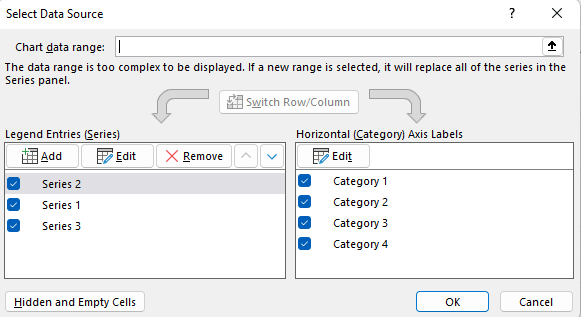
Click on the data series you want to change the order of (on the left) and click the arrows to move it up and down. This is how you change the order of the data series in PowerPoint.
How to remove or add a data series in PowerPoint
To add or remove a data series from a chart in PowerPoint first:
- Click on the chart
- Go to Chart Design and click on Select Data. You will see a pop up box like the one shown above.
- In the Select Data Source pop up box follow the following instructions:
| To | Do This |
| Add a series
| Under Legend Entries (Series), click the Add, and then add the data. |
| Remove a series | Under Legend Entries (Series), select a data series and click on Remove. |
How to change the fill color of the data series in PowerPoint
- From the chart, select a data series which you want to edit, and then click Format
For example, in a row chart, click a column, and all the rows of that data series become selected.
- From the Shape Styles, click the arrow beside Shape Fill button, and then click the color of your choice.
How to add data labels to a chart in PowerPoint
Labels are added to show the data point values from the Excel sheet in the chart.
- Select the data series for which you want data labels
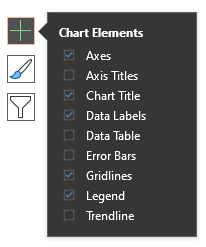
- Click on the plus icon next to the chart
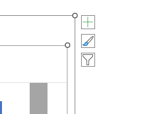
- Select Data Label. Expand this section using the arrow button to change the position of the data label.
How to add a data table to a chart in PowerPoint
- Repeat the above step, but instead choose Data Table from the list of Chart Elements.
And that’s all there is to it! Changing the data in charts and diagrams in PowerPoint for Windows is pretty straightforward once you know where to look. We hope this guide helped clear things up. If you get stuck at any point, don’t hesitate to reach out to us and we’ll be happy to help.
And if you need to build more advanced charts and diagrams than what PowerPoint offers out of the box, the easiest way to level up your slides is to browse our templates for PowerPoint charts.
Related Articles
-
 May 21st, 2024
How to Print Your PowerPoint Slides – Things to Keep in Mind
Blog Post -
 November 7th, 2022
How to Change the Color Scheme of a PowerPoint Presentation
PowerPoint How To -
 January 2nd, 2025
How To Easily Create a Word Cloud in PowerPoint
Blog Post