How to Create the Perfect Executive Summary Slide [Examples and Templates]

Most business communication necessitates a quick overview – a precis of the information that follows. While it is called an executive summary, even personnel in non-executive positions benefit from this summary. They are commonly used in business settings but are also used in scientific discussions, education, projects, and so on.
Getting the design of the executive summary template for PowerPoint and ensuring its clarity can be pretty challenging. After all, it is the abridged version of the business document that follows, and yet, it has to impress the viewer and convey the message properly. We can guide you if you’re worried about creating a good executive summary slide.
Check out our collection of PowerPoint templates for executive summary slides here.
What is an Executive Summary?
It is simply a summary of business documents like whitepapers, business plans, or annual reports, which provides the important points of discussion in a concise preview of the main document. This helps the audience understand the contents to follow before they dive headlong into the details.
A more detailed definition is provided by The University of Arizona, which says that an executive summary should:
- Reiterate the aim of the following document.
- Emphasize the important points of discussion and crucial facts.
- Mention prominent outcomes, suggestions, or conclusions.
Much effort goes into creating the ideal executive summary as you have to squeeze in a great deal of information in a short space.
Executive Summary Examples
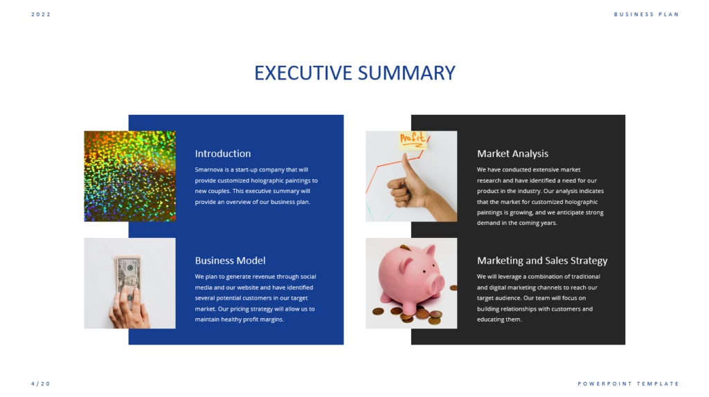
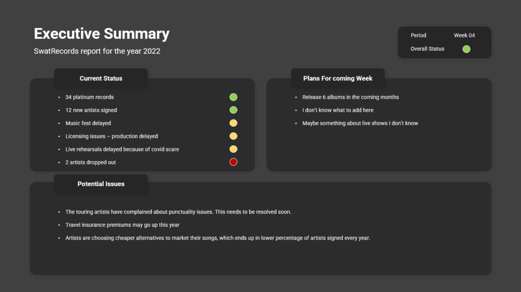
Almost all documents have executive summaries, and some are structured and presented in a better manner than others. Here are some of the most effective executive summary slide examples we collected:
Executive Summary Format
There isn’t any single format that can be touted as ideal for an executive summary slide. It all depends on the type of document to be presented, the purpose behind it, and what it contains. However, there are certain norms it needs to follow, like conveying important information at a single glance, offering a preview of the main document, highlighting outcomes and suggestions, and so on. Most readers or viewers expect to see these on the first page as it is.
An executive summary should ideally have these sections:
- A generic introduction and explanation of the important points to be discussed
- A statement of the main issue
- Handpicked outcomes, recommendations, etc.
- The importance of the points discussed.
You are likely to present this summary to other stakeholders. It may be a good idea to keep this structure as a bulleted list. You can then move the important ideas to your executive summary in PowerPoint slides.
You also need expertise in PowerPoint to ensure that your executive summary looks appealing – eye-catching, neat, and clear. It is important to make good use of white space. You can use icons and other minor visual elements to reduce text blocks; use crisp headings and subheadings to make the slide look leaner. If you’re unsure how to do this, check out the templates listed in this article.
Length of your Executive Summary
Ideally, an executive summary should be one page, or about 500 words maximum, depending on the font, of course. If the document to be presented is voluminous, you could have a two-page summary, but it is always better to be brief. Think of an executive summary as a trailer for a movie: you reveal just enough to pique the reader’s interest.
The need for Executive Summary Slides
Your audience can easily lose interest in a PowerPoint slide deck, or lose interest in it. After all, you need to remember the information presented in the previous slide and follow the argument presented, and then link everything into a narrative that makes sense to you.
This is where executive summary slides help:
- They provide the reader with context and explain the importance of the topic of the PowerPoint slide deck.
- They convey the high-level argument prior to the reader getting into the details, which allows the reader to understand your slide deck and its details.
- These slides function like a map for the viewer to refer to in case they lose the trail of the argument or report in the slide deck.
Executive Summary Slide Templates
There is no ‘perfect’ look for an executive summary slide; presenters use custom slides to align with the content they want to project. However, there are some universal examples like these below:
How to Write an Executive Summary for a Presentation
Here are some ideas we collected from various sources that can help you create a solid draft executive summary for a presentation:
1. State the Problem
Your first paragraph is akin to the first slide of a presentation, which means you need to create an impact and convey the agenda – set the scene, so to speak. This can be achieved by stressing the urgency of the matter, showcasing the importance of the issue to be discussed, or explaining the background behind the research. You can then go on to convey the chief goals of the report or other document.
2. Talk About the Main Discussion Points
Expand the points or the report scope to fulfill the audience’s expectations. For example, utilize the subheads in the report as the main points of discussion; you can even create more descriptive and appealing statements. Here are some tips:
- Break down big blocks of text into bullet points.
- Use figures for the most important findings.
- Be sure to clarify the scope of the report and what it does not include.
- Talk about the resources and methods of research used.
- If space permits, include a summary of the findings as a conclusion, or keep it as a featured quote to catch the viewer’s attention to critical information.
3. List the Next Steps
Towards the bottom of the page, dedicate a small paragraph to stress the outcomes and deductions and what follow-up action you expect your viewer to take. Finally, summarize what you found during your research and if there’s any solution or action you have recommended.
When this is done, get feedback from team members who have not seen the report to be presented, and ask if they can say what is included in the report after reading the summary. For example, does it pique their interest, and can they understand it without getting additional context? Use their feedback to make necessary improvements.
Tips to Make the Summary Engaging
1. Use a Consistent Tone
Ensure you continue with the same voice tone and choice of words in the summary slide as you have in the main document. Significant differences in the tone and terms between the presentation and the summary can cause your audience to get confused and lose interest.
2. Tell a Story
Your audience will get time to read the report in its entirety; when you present it before them, you need to focus on getting them to pay attention to the most critical issues, highlight the value contained within the report, and get them interested enough to go through the entire document later. The summary must thoroughly outline the whole communication with a proper starting, middle, and ending. Most people tend to focus their summaries on the data or observations without a proper introduction or conclusion – and you can lose the audience this way. Formulating a clear narrative in your mind at the outset is important.
3. Use Bullet Points
We’ve already touched on this point briefly. People today prefer snippets of information; with attention spans dwindling, short sentences and phrases are preferred. Trim your text and resist the urge to overload your audience with information. Bulleted lists present information crisply and quickly.
4. Cut Down on Data
While figures and data visualizations are great, going overboard with data slides does not create a bigger impact – in fact, the opposite happens. You should convey what the data means, rather than the data itself. By showcasing a lot of numbers, you won’t be able to convince your audience as they cannot process all those figures. Stick to a couple of important data points in the executive summary slide – and maybe you can elaborate on why these are depicted here.
5. Give an attention-grabbing slide title
The title or heading is where anyone’s attention naturally gravitates to at first; use this to your advantage. The title must clearly state the important takeaway and set the stage for the rest of the slide.
6. Ensure it can be scanned
Even summary slides can have tons of information, making them difficult to go through; you can make it easy for your audience to consume such a slide by cutting it up into sections that can be easily noticed. For example, you could put graphs and related text in the same group. You can also use text headings for every section so that any person who is skimming through for a few seconds will get the important points. You can also do the same for visuals – like bar charts, for example.
To Conclude
As your executive summary is the very first page or slides your audience will see, it is critical to perfect it. Now, with these tips and tricks, we’re sure it’s no longer a problem! Do you have any more tips for creating a compelling executive summary slide? Let us know.
