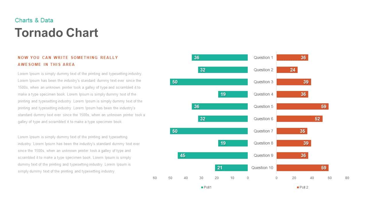
Tornado Chart PowerPoint template

Login to download this file
Popular Search Terms
Timeline Infographic
Business Deck
Roadmap Template
Pitch Deck
Sales Deck
Pyramid
Essentials
Must-have decks for quick wins
By Industry
Professionally tailored slides for every sector
By Style
Minimal, modern and creative designs
By Topic
Explore slides curated by purpose and theme
 Timeline
 Roadmap
 Strategy
 Goals
Goals Table
Table Comparison
 SWOT
SWOT Agenda
 Arrow
Arrow World Map
 Maps
Maps Process
 Funnel
 Team
Team Org Chart
 Pyramid
 Circular
 Business Plan
 Business Strategy
 Business Proposal
 Business Models
 Digital Marketing
 Marketing Funnel
 Customer Experience
 Project Status
 Gantt Chart
 Recruitment
 Employee Performance
 Leadership
 AI
AI Machine Learning
AI Presentation Maker
Install the Windows plugin for quick access to templates and design tools.
AI Infographics Maker
Use our Office 365 add - in to access templates directly from the cloud.
Exe Version
Install the Windows plugin for quick access to templates and design tools.
Office 365
Use our Office 365 add - in to access templates directly from the cloud.
Mac Version
Get the Mac plugin to easily browse, insert, and customize templates and visuals within PowerPoint.
Home » Tornado Chart Data Comparison Slide Template for PowerPoint & Google Slides » Tornado Chart PowerPoint template

Tornado Chart PowerPoint template
Login to download this file
No. of Slides
2Item ID
SB00918Rating
0.0
(0 reviews)