Service Quality Heatmap Template for PowerPoint & Google Slides

Description
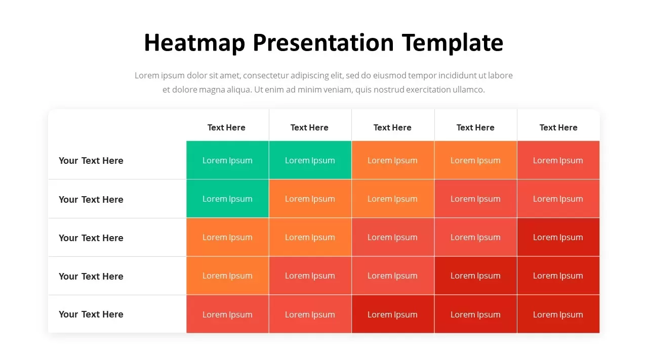
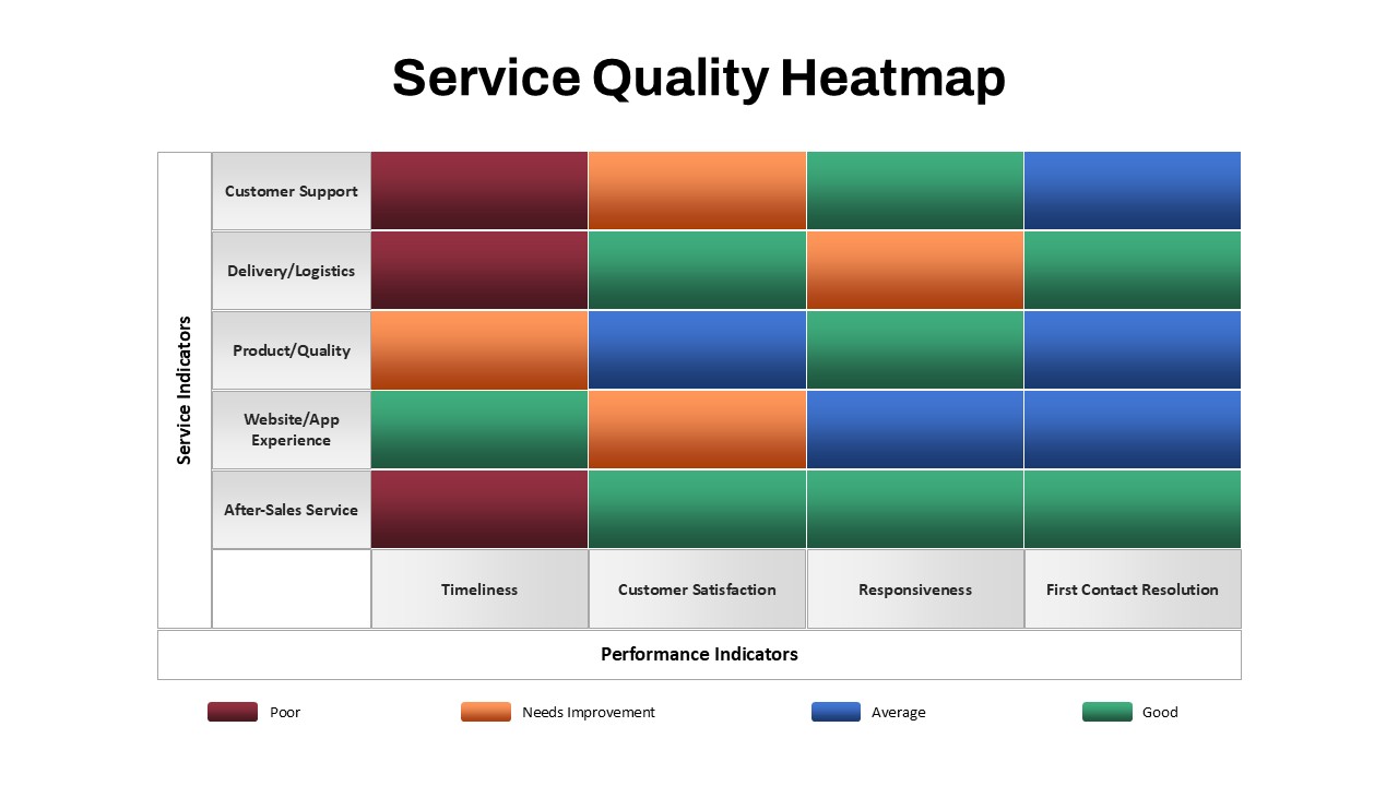
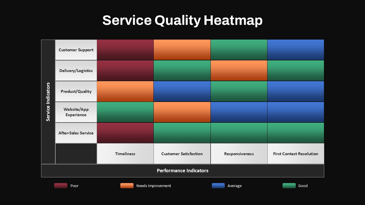
Evaluate your service quality with this visual heatmap template. The chart is divided into two key axes: Service Indicators on the left (Customer Support, Delivery/Logistics, Product/Quality, Website/App Experience, and After-Sales Service) and Performance Indicators at the top (Timeliness, Customer Satisfaction, Responsiveness, and First Contact Resolution). Each cell is color-coded to represent performance levels, from Poor (red) to Good (green), with intermediate colors to show areas that need improvement or are performing at an average level.
This template is ideal for showcasing the strengths and weaknesses in various service areas, helping teams identify gaps and focus on improvements. The layout is fully editable—change the text, adjust the colors, and replace the categories to match your specific needs. Whether you’re assessing customer service performance, product delivery, or website usability, this heatmap ensures that insights are clear, quick to understand, and easy to present.
Who is it for
Perfect for service managers, customer experience teams, product managers, and data analysts who need to present service performance data in a clear and actionable way for stakeholders and leadership.
Other Uses
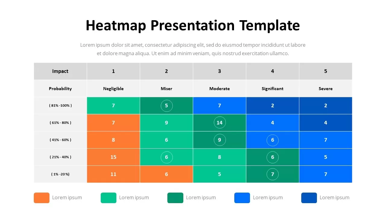
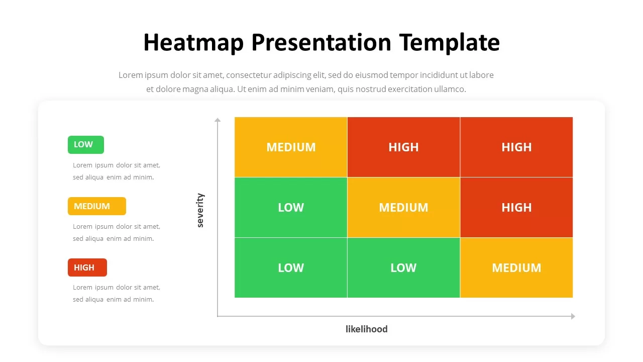
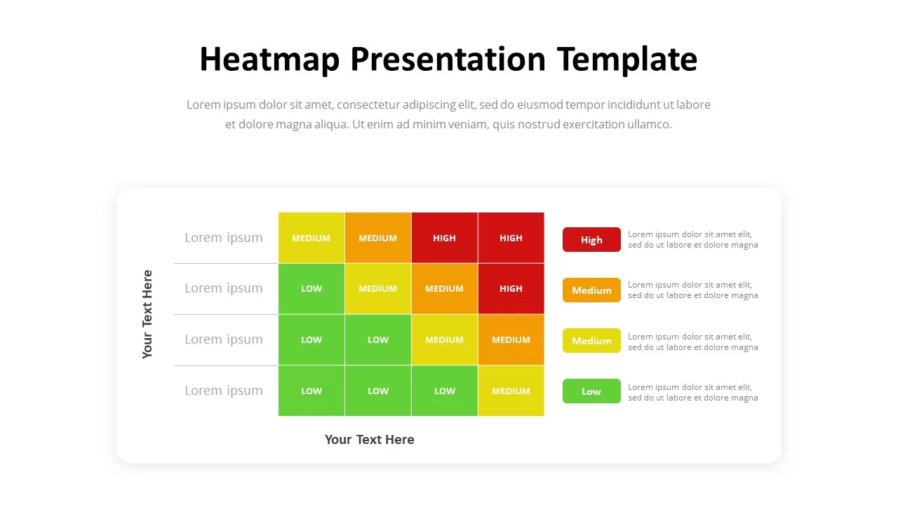
Repurpose the heatmap to track performance across other business metrics like sales, marketing, employee satisfaction, or project performance. The grid can also be adapted for risk assessments, product audits, or operational reviews.
Login to download this file

Item ID
SB05429Designed By
Filda
Related Templates

Professional Heatmap Data Visualization Template for PowerPoint & Google Slides
Infographics
Risk Assessment Heatmap Matrix Slide Template for PowerPoint & Google Slides
Comparison Chart
Heatmap Matrix Template for PowerPoint & Google Slides
Maps
Risk Heatmap Comparison Template for PowerPoint & Google Slides
Maps
Heatmap Comparison Template for PowerPoint & Google Slides
Maps
Risk Scoring & Ranking Heatmap Matrix Template for PowerPoint & Google Slides
Risk Management
Heatmap Matrix with Numbers Template for PowerPoint & Google Slides
Project
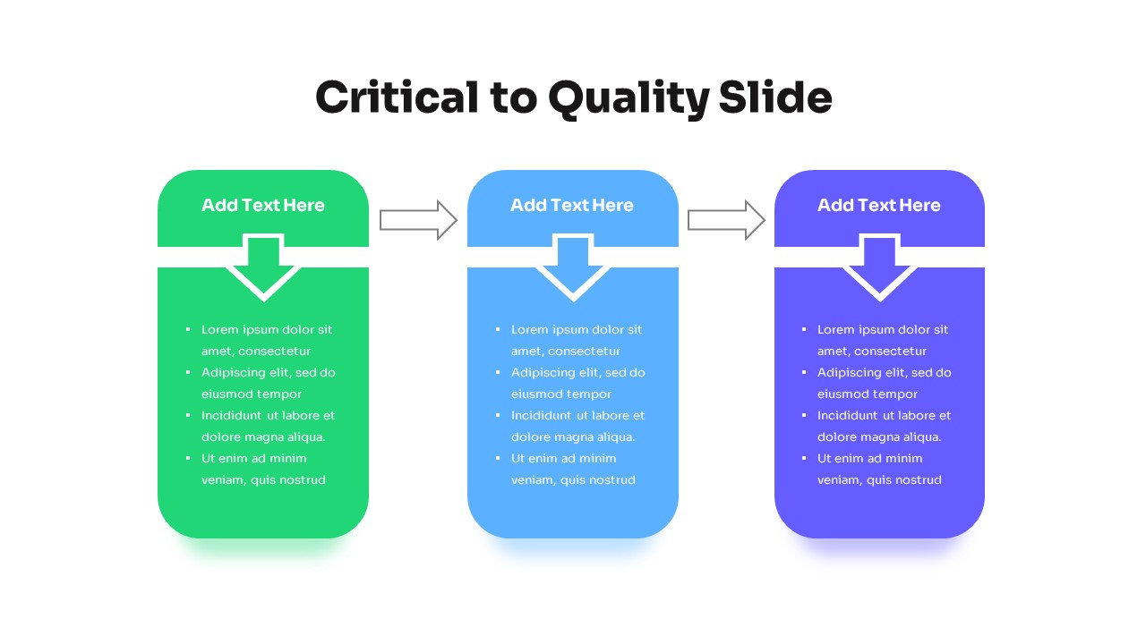
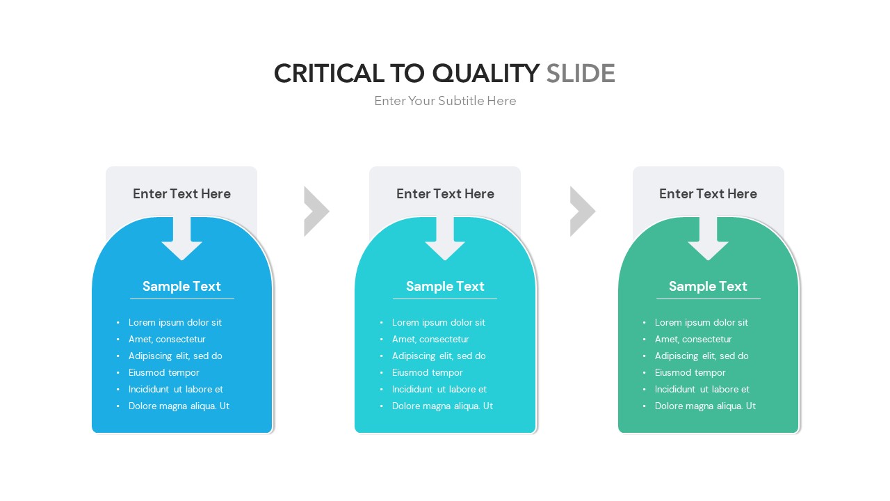
Three-Step Critical to Quality Slides Template for PowerPoint & Google Slides
Process

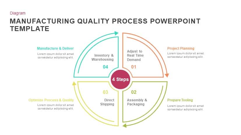
Manufacturing Quality Process template for PowerPoint & Google Slides
Process
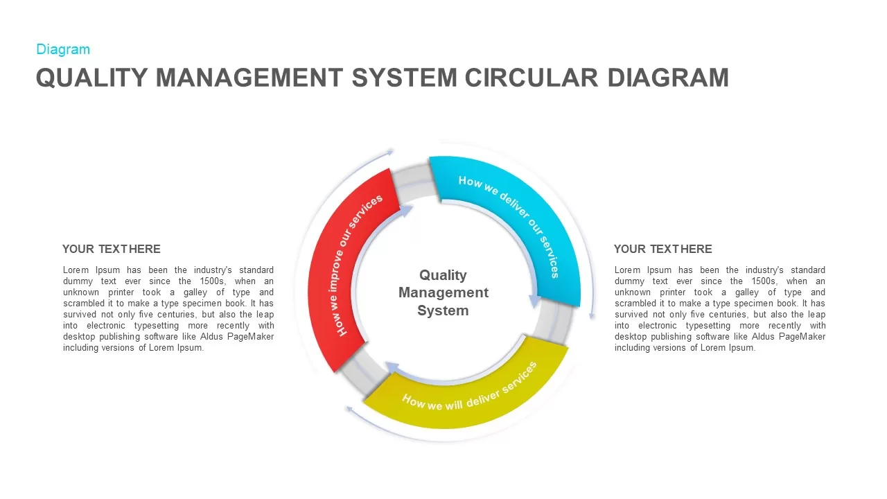
Quality Management System Circular Diagram template for PowerPoint & Google Slides
Process
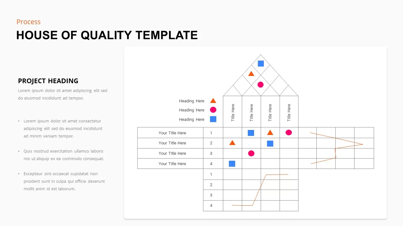
House of Quality template for PowerPoint & Google Slides
Marketing
Critical to Quality Diagram Slide template for PowerPoint & Google Slides
Process
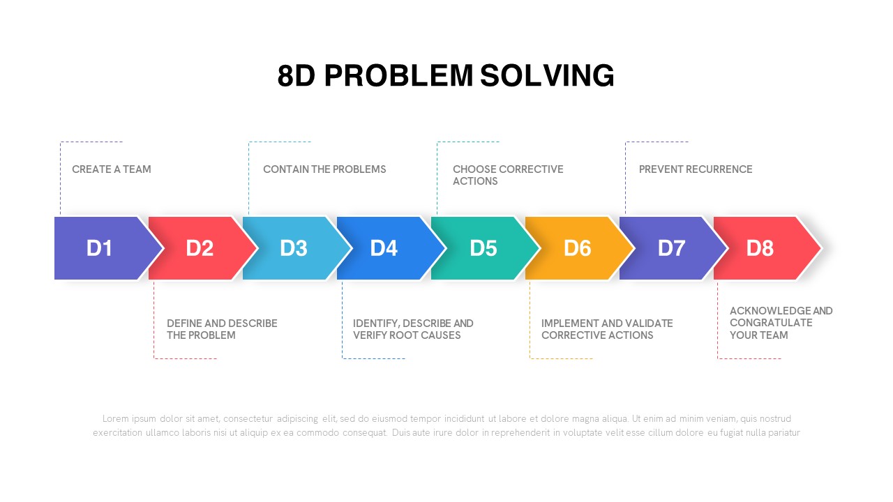
Quality Control 8D Problem Solving Template for PowerPoint & Google Slides
Business Strategy
Quality Control Process Presentation Template for PowerPoint & Google Slides
Process
Seven Quality Control Tools Diagram Template for PowerPoint & Google Slides
Decks

Comprehensive Quality Assurance Workflow Template for PowerPoint & Google Slides
Company Profile
Critical to Quality Slide for PowerPoint & Google Slides
Business Strategy
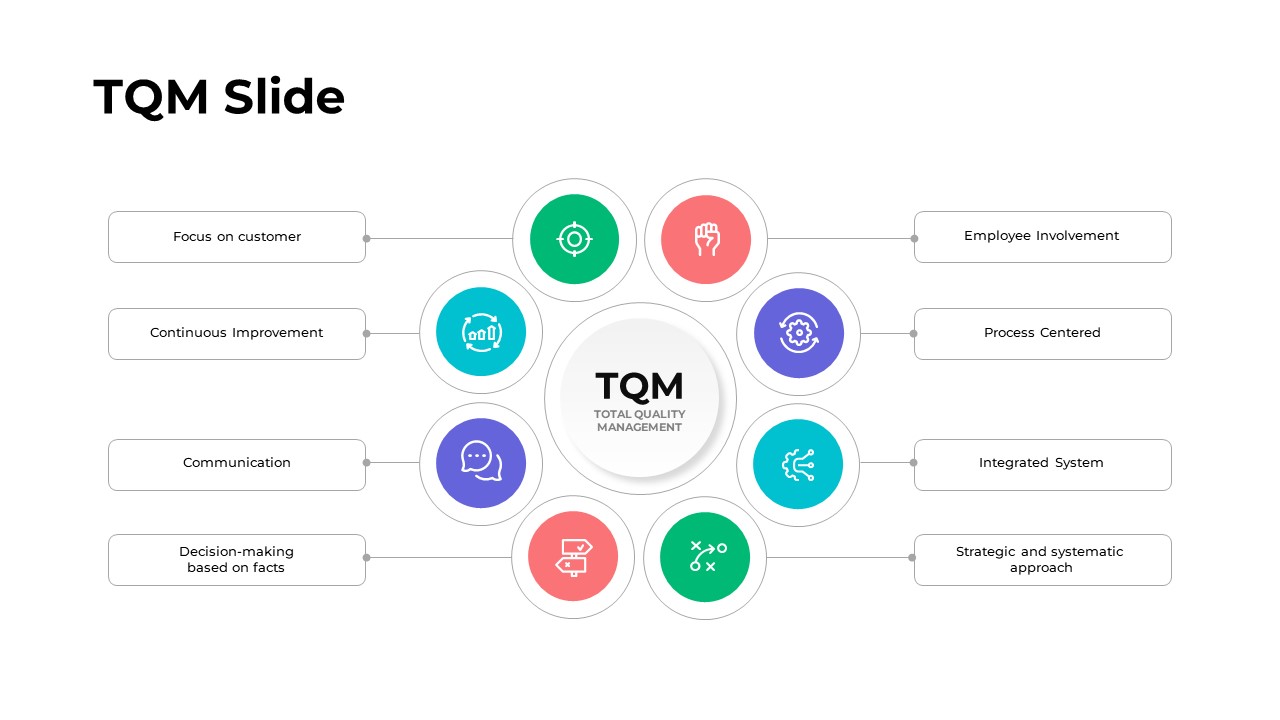
Total Quality Management (TQM) Slide for PowerPoint & Google Slides
Business Strategy
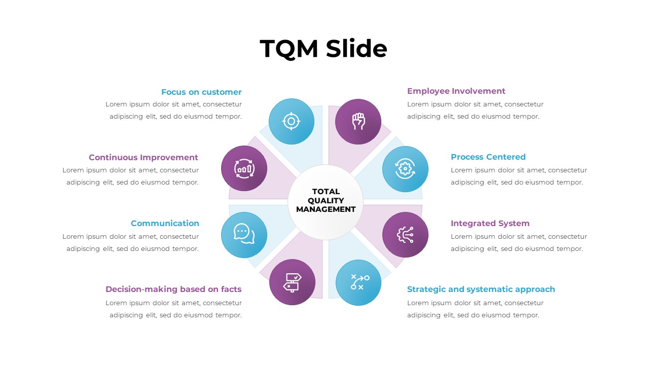
Total Quality Management (TQM) Slide for PowerPoint & Google Slides
Business Proposal
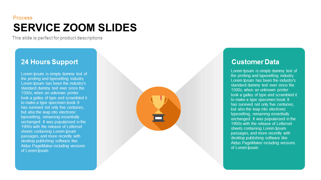
Service Zoom Feature Slides Comparison template for PowerPoint & Google Slides
Process
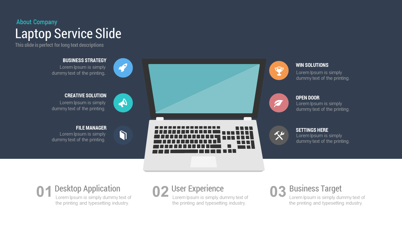
Free Laptop Service Slide template for PowerPoint & Google Slides
Business
Free
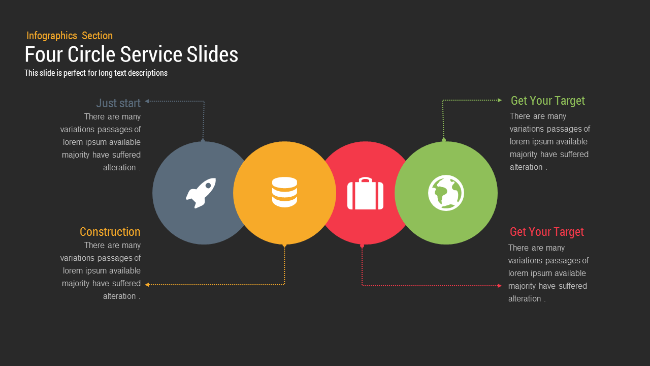
Four Circle Service template for PowerPoint & Google Slides
Process

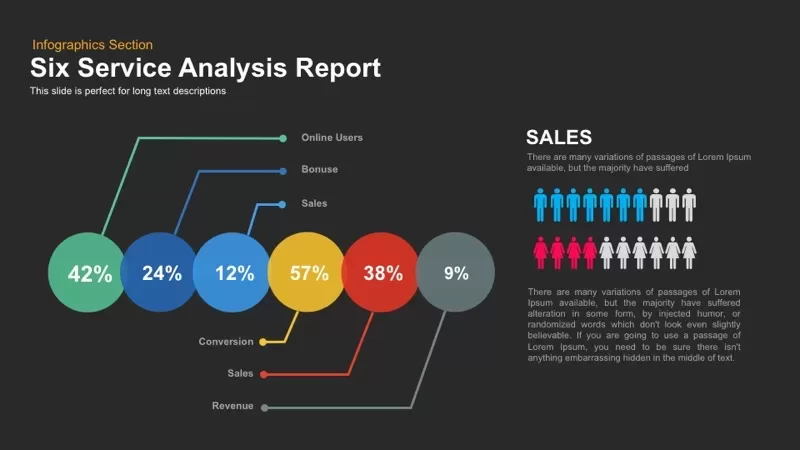
Six Service Analysis Report template for PowerPoint & Google Slides
Infographics
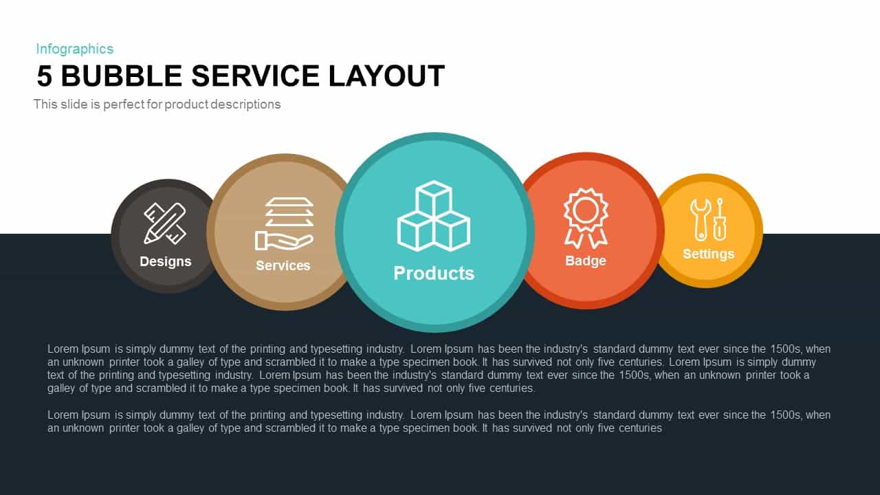
5 Bubble Service Layout Diagram Template for PowerPoint & Google Slides
Process
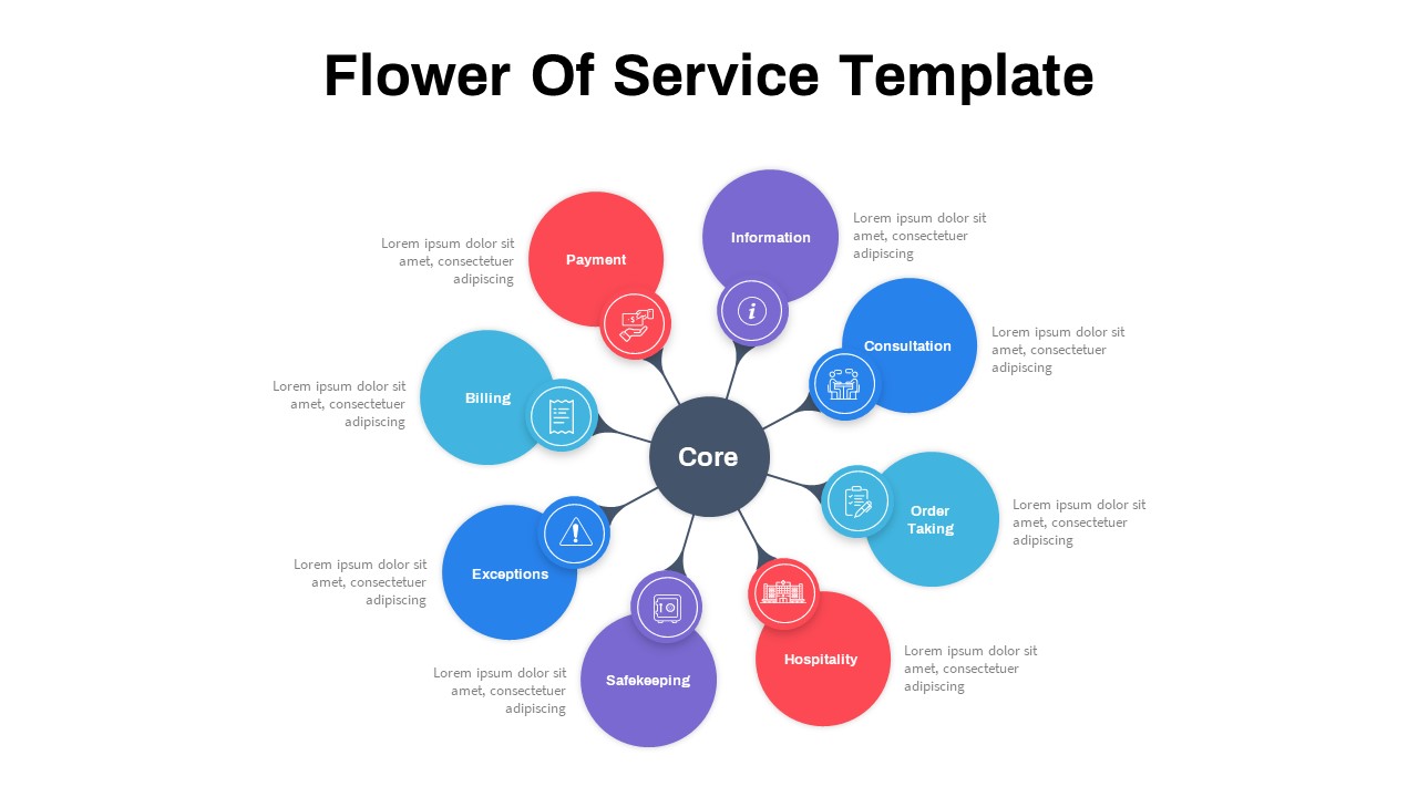
Flower of Service template for PowerPoint & Google Slides
Process

Creative Zigzag Circle Service Steps Template for PowerPoint & Google Slides
Process
Clean Mobile Service Comparison Slide Template for PowerPoint & Google Slides
Comparison
Mobile Service Features Infographic Template for PowerPoint & Google Slides
Process
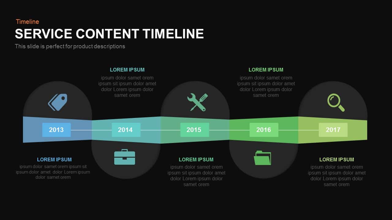
Service Content Timeline Diagram Template for PowerPoint & Google Slides
Timeline
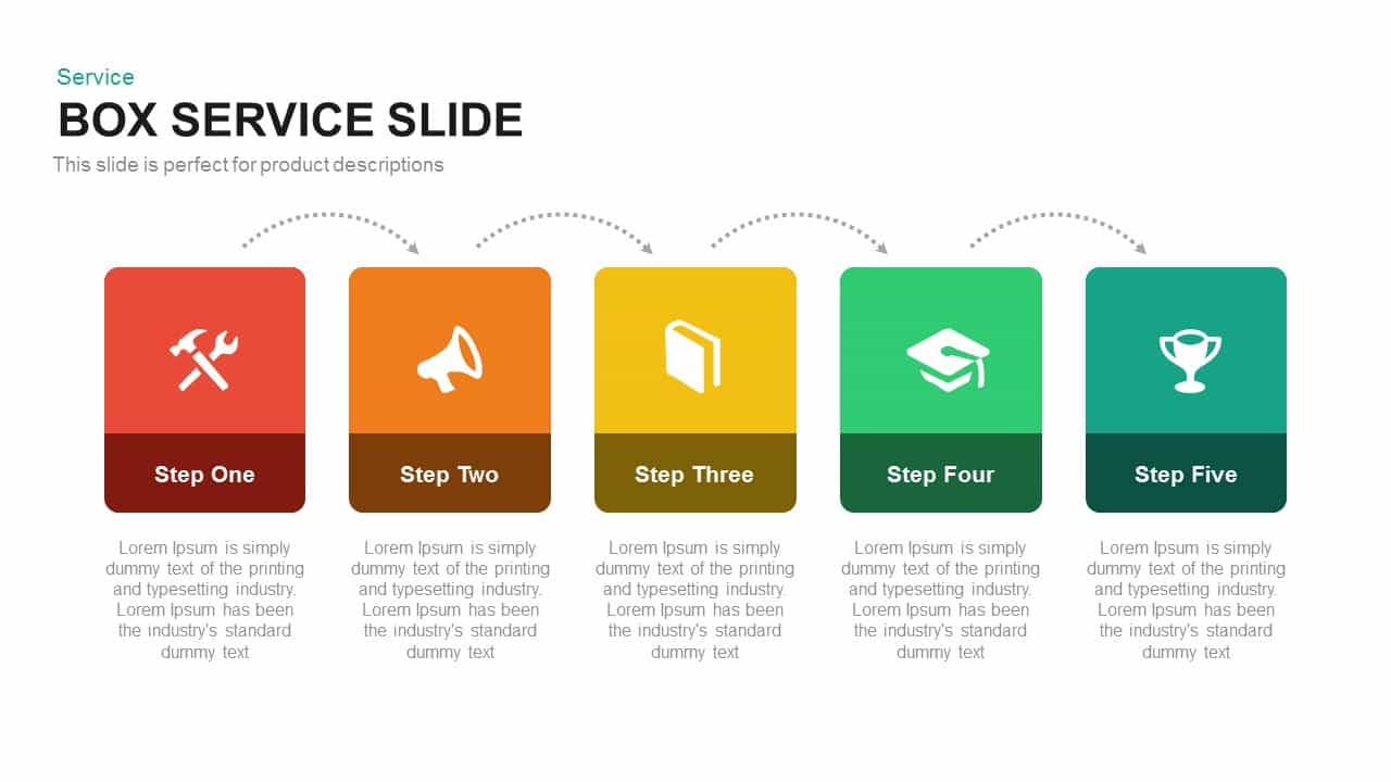
Professional Box Service Diagram Template for PowerPoint & Google Slides
Comparison

Service Features Presentation template for PowerPoint & Google Slides
Business Proposal
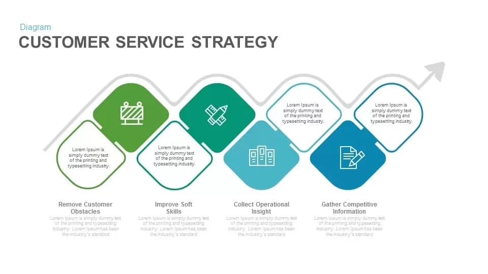
Customer Service Strategy template for PowerPoint & Google Slides
Business Strategy
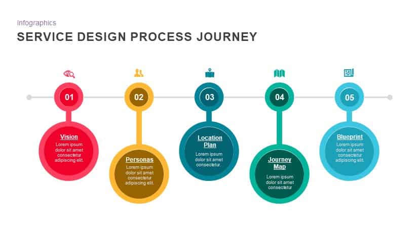
Service Design Process Journey template for PowerPoint & Google Slides
Process
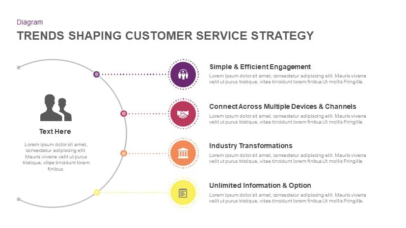
Trends Shaping Customer Service Strategy template for PowerPoint & Google Slides
Marketing
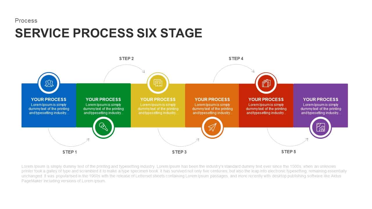
Six-Stage Service Process Workflow Template for PowerPoint & Google Slides
Process
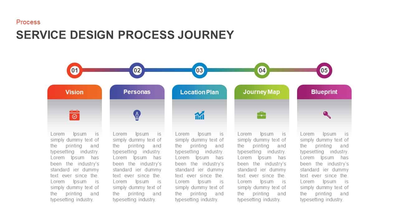
Service Design Process Journey Template for PowerPoint & Google Slides
Process
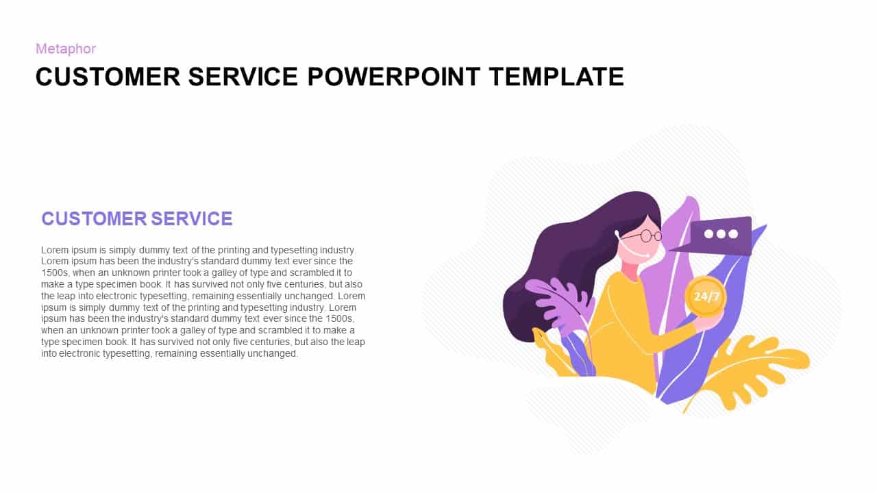
Customer Service Metaphor Infographic Template for PowerPoint & Google Slides
Customer Experience
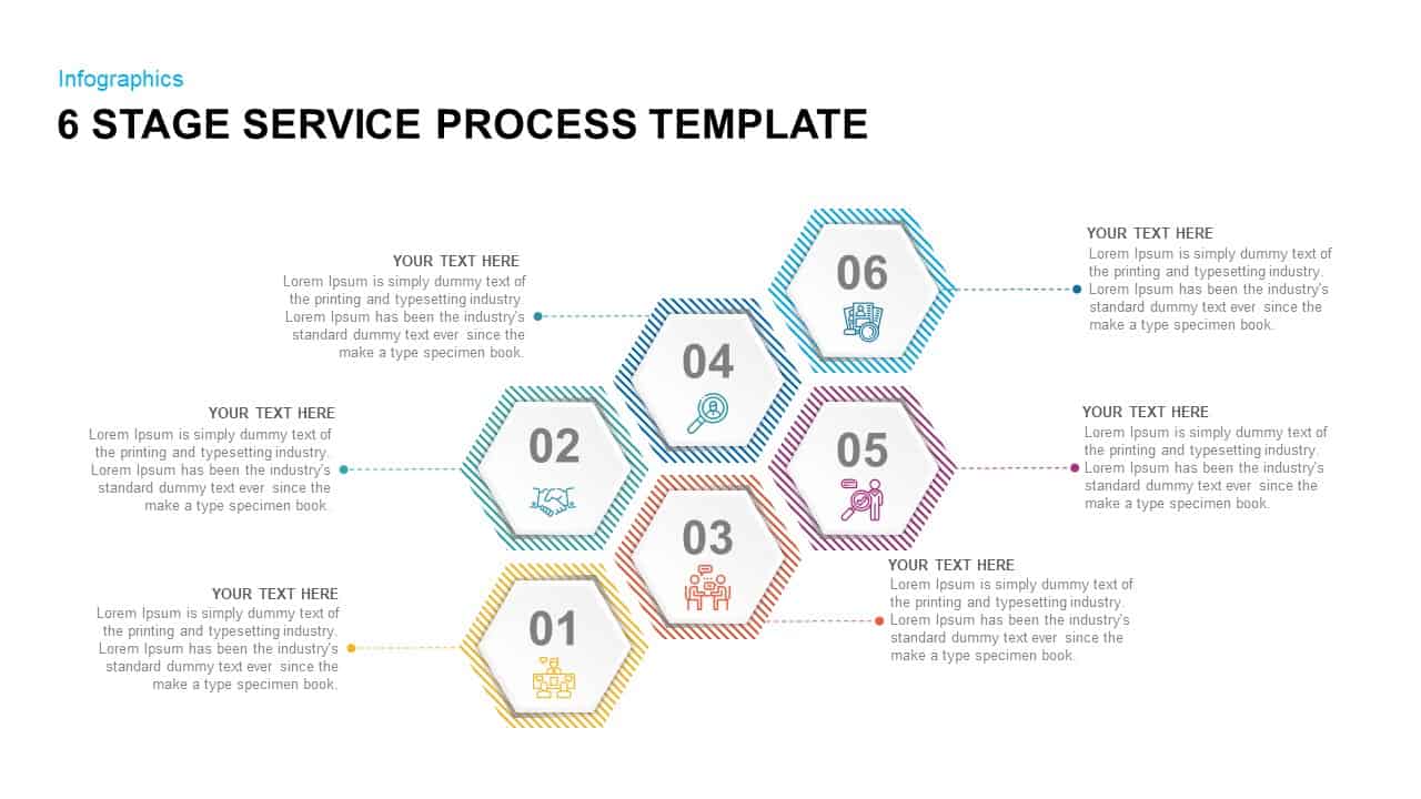
6 Stage Service Process Infographic Template for PowerPoint & Google Slides
Process
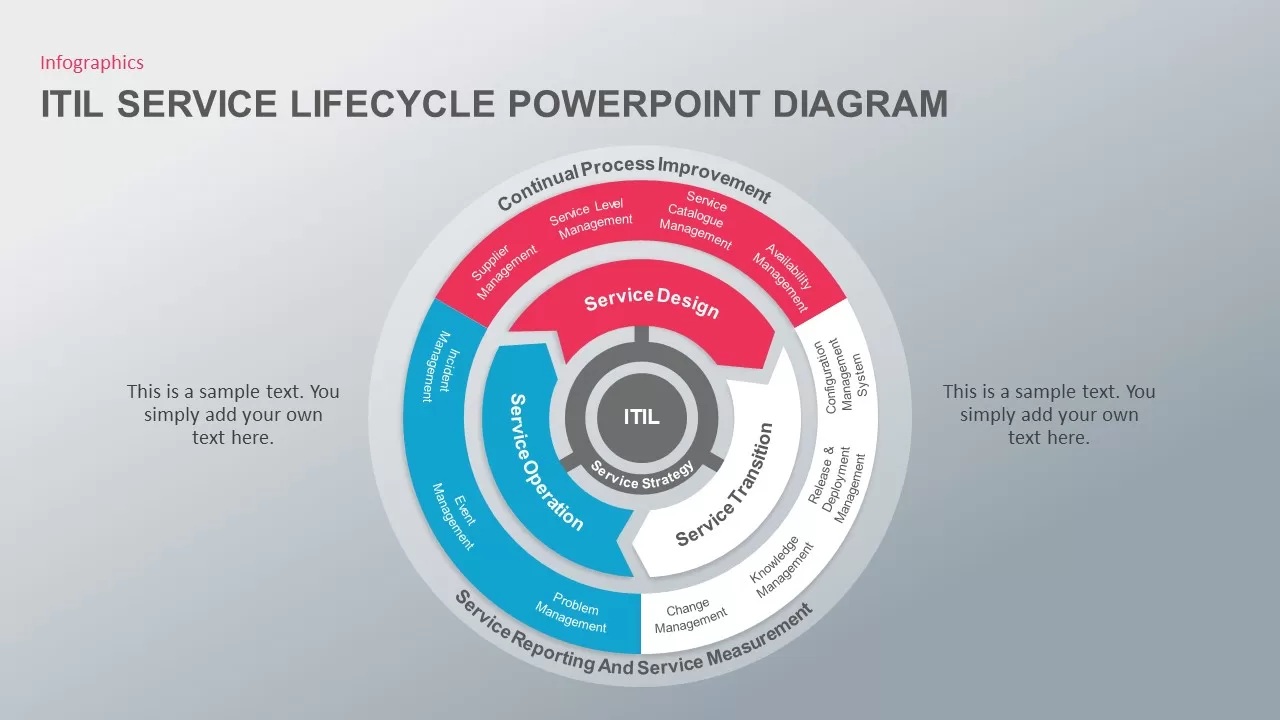
ITIL Service Lifecycle Circular Diagram Template for PowerPoint & Google Slides
Circular
Streaming Service Overview template for PowerPoint & Google Slides
Business Proposal
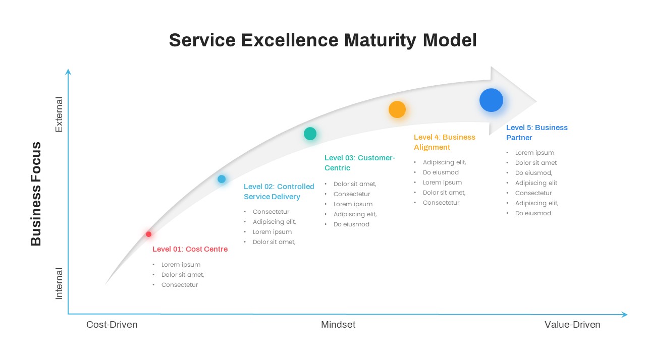
Service Excellence Maturity 5-Stage Template for PowerPoint & Google Slides
Process
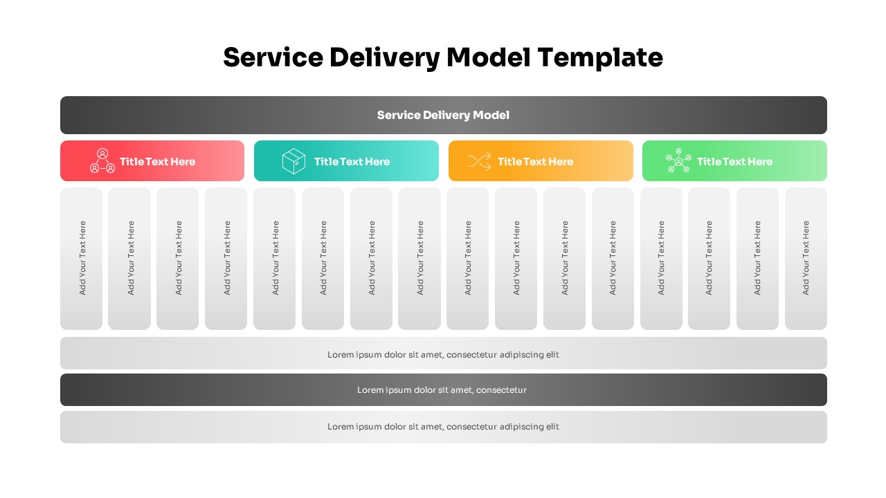
Comprehensive Service Delivery Model Template for PowerPoint & Google Slides
Project
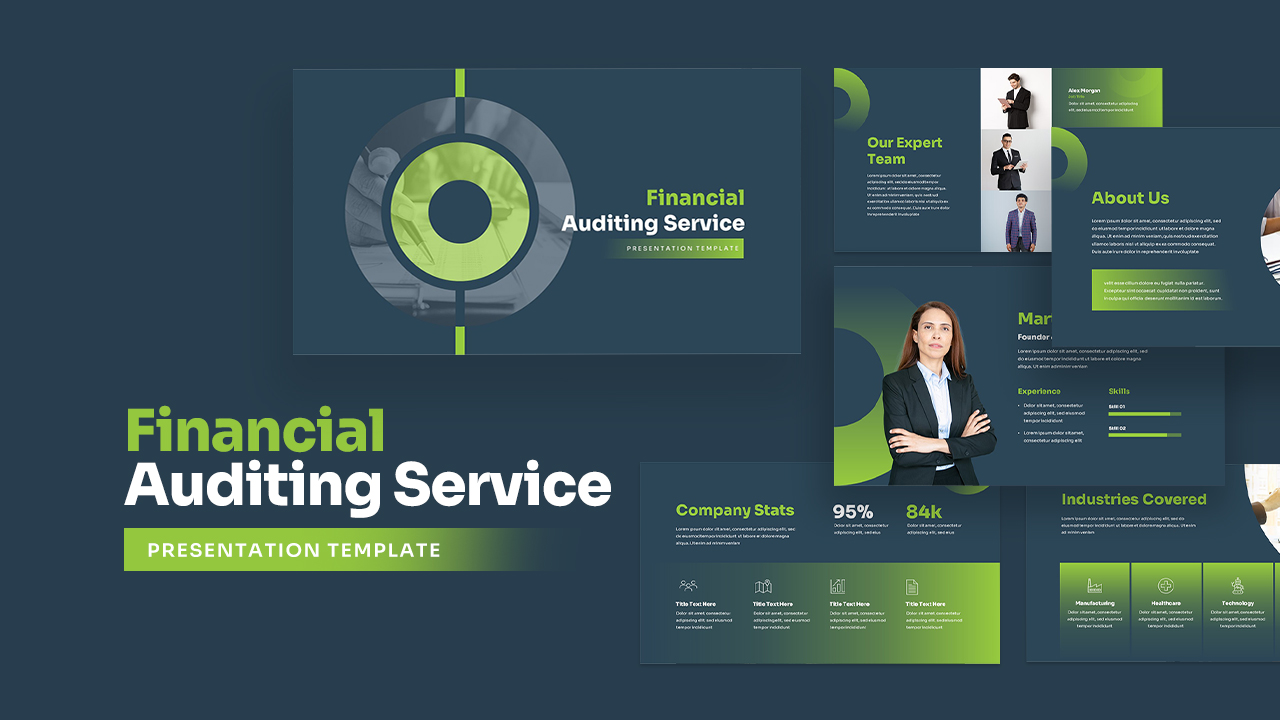
Corporate Financial Auditing Service Template for PowerPoint & Google Slides
Finance

Financial Advisory Service Pitch Deck Template for PowerPoint & Google Slides
Finance
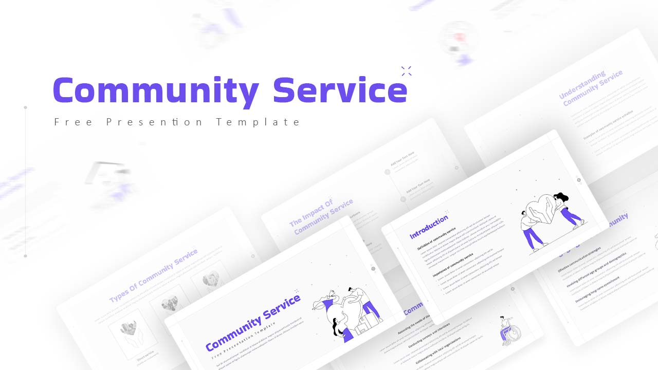
Free Community Service Presentation Deck Template for PowerPoint & Google Slides
Company Profile
Free
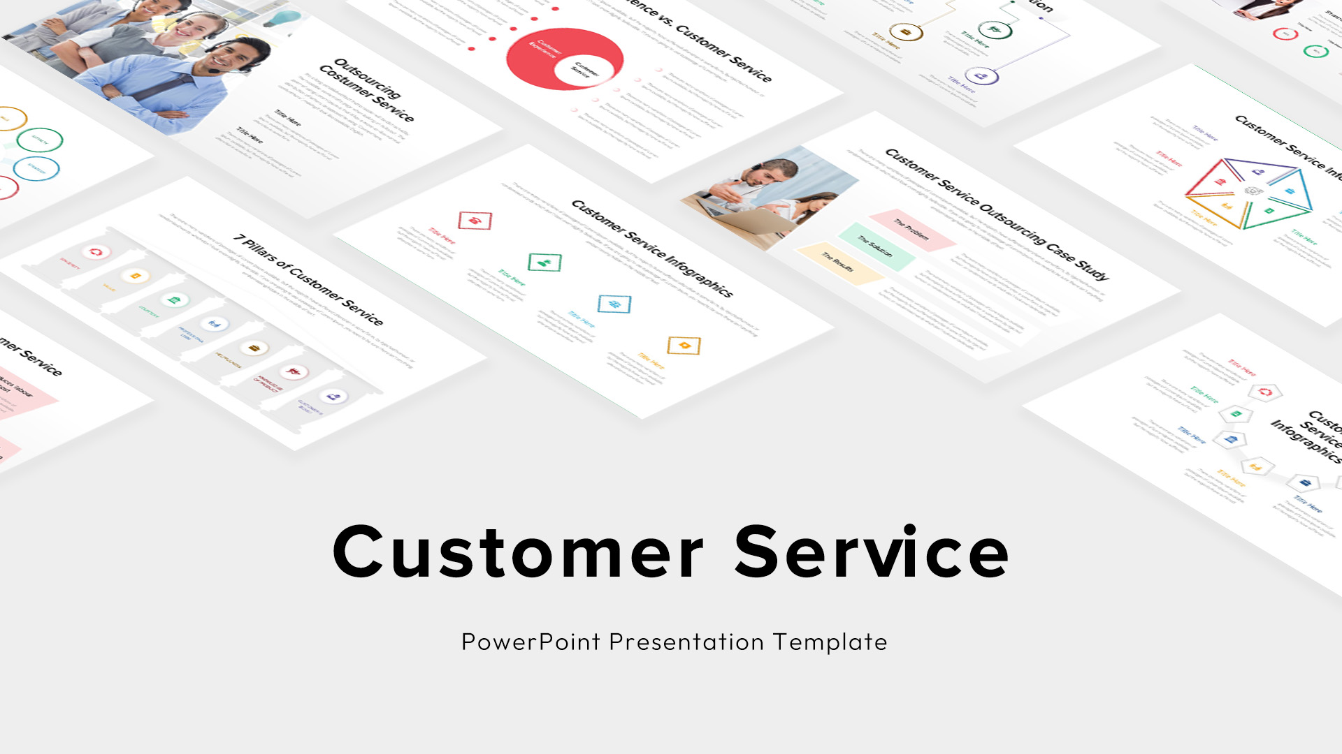
Custom Customer Service Infographics Template for PowerPoint & Google Slides
Process
Cleaning Service Blue Theme Slide Deck Template for PowerPoint & Google Slides
Pitch Deck
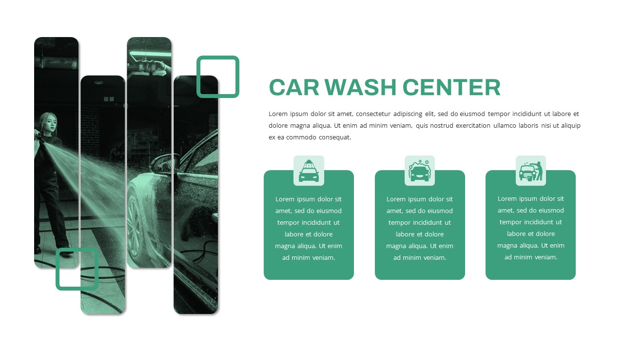
Free Car Wash Center Service Features Slide Template for PowerPoint & Google Slides
Business Proposal
Free
Modern Professional Medical Service Template for PowerPoint & Google Slides
Health
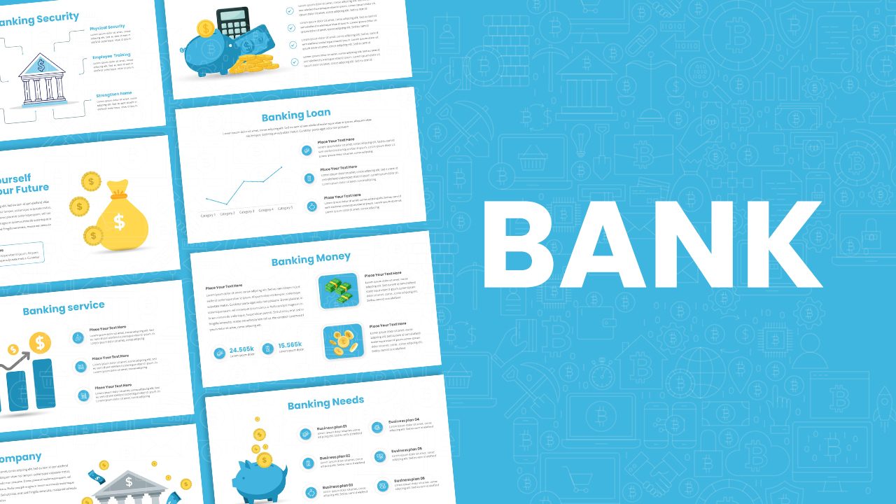
Banking Service & Finance Infographics Template for PowerPoint & Google Slides
Finance
Free
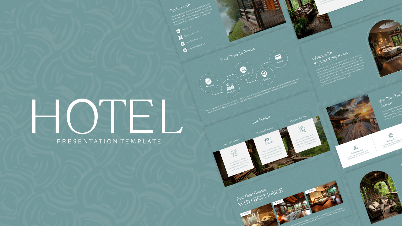
Free Nature-Inspired Hotel Service Showcase Template for PowerPoint & Google Slides
Company Profile
Free
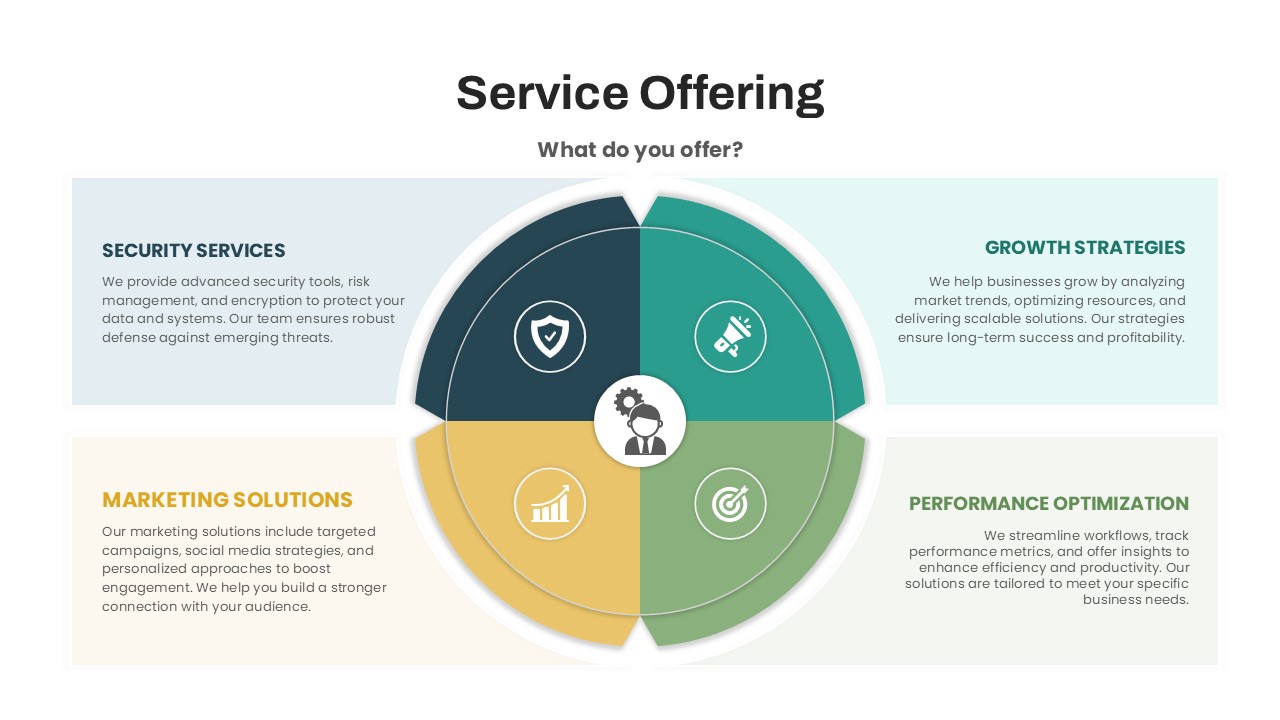
Circular Service Offering Diagram Template for PowerPoint & Google Slides
Circular
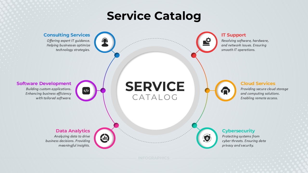
Service Catalog Circular Infographic Template for PowerPoint & Google Slides
Circular
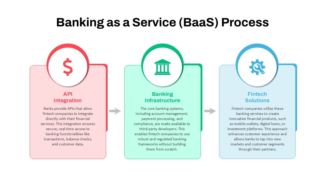
Banking as a Service (BaaS) Process Flow Template for PowerPoint & Google Slides
Process
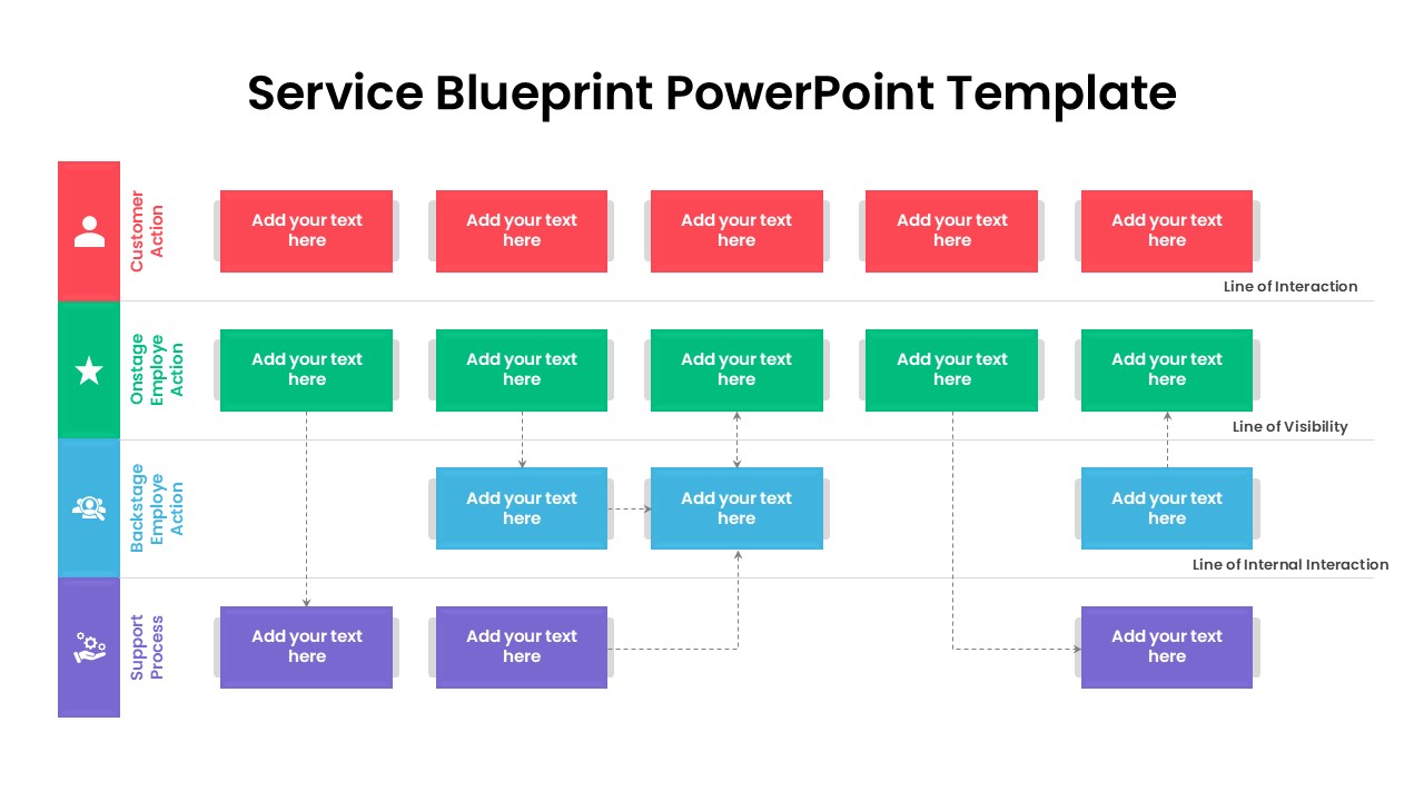
Service Blueprint Process Flow Template for PowerPoint & Google Slides
Process
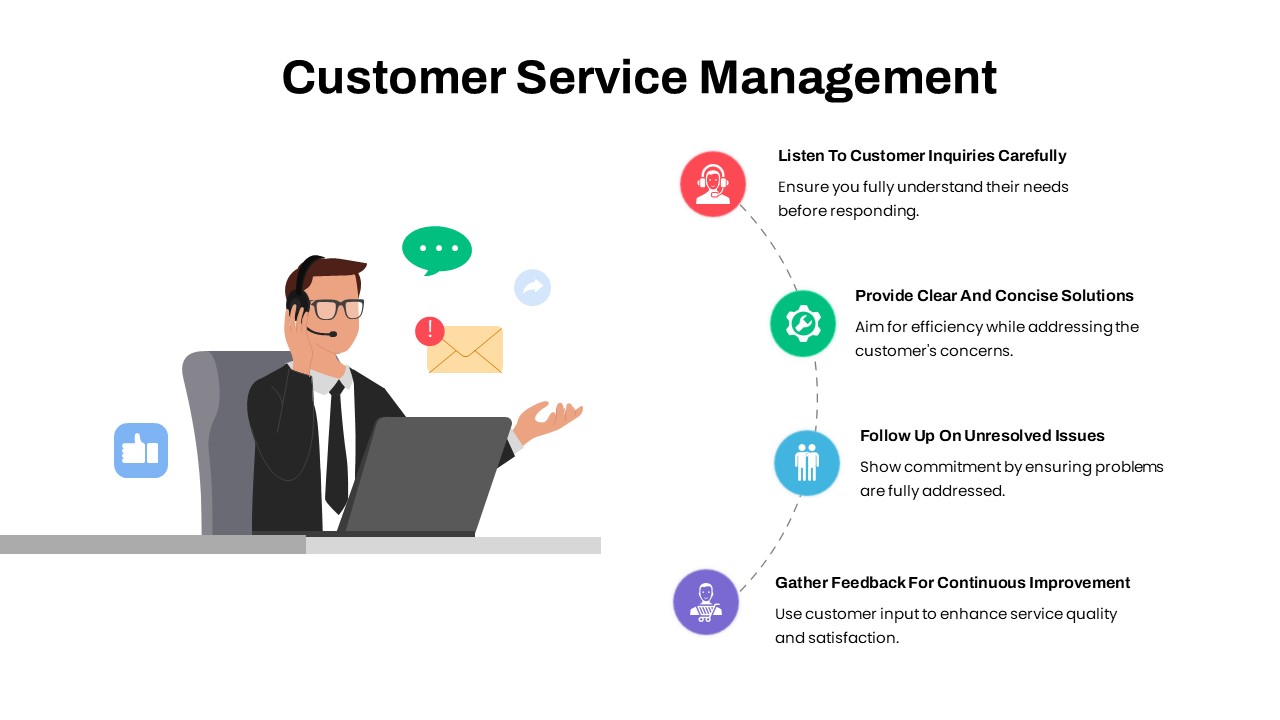
Customer Service Management Process Template for PowerPoint & Google Slides
Process
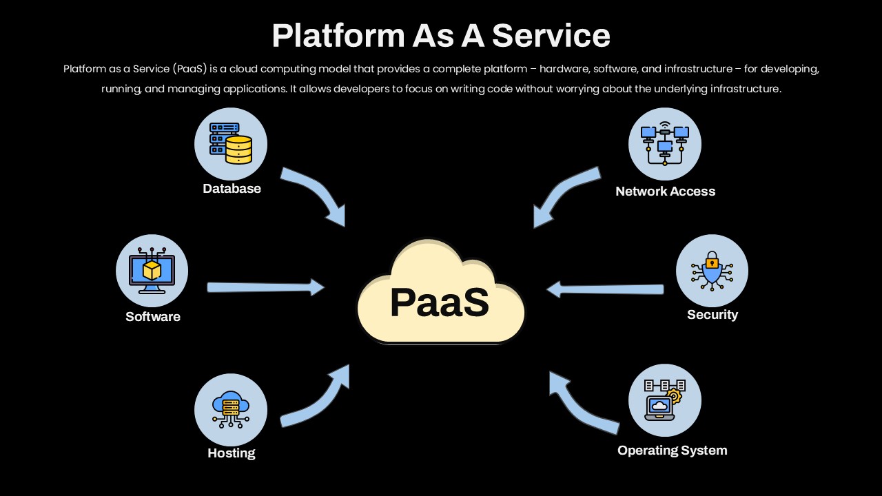
Platform as a Service Cloud Diagram Template for PowerPoint & Google Slides
Cloud Computing
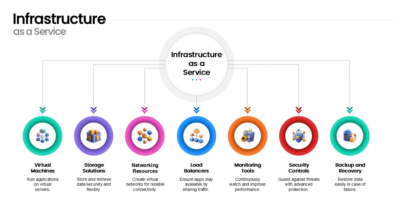
Infrastructure as a Service Diagram Template for PowerPoint & Google Slides
Cloud Computing
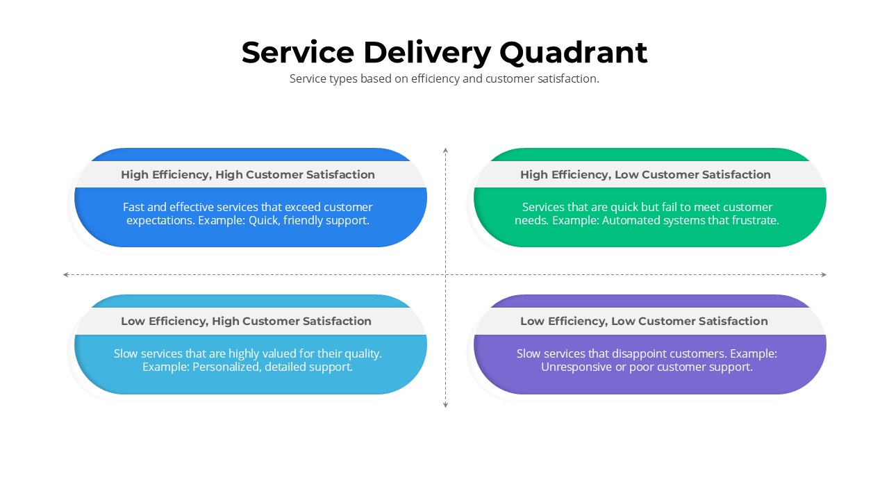
Service Delivery Quadrant Slide Template for PowerPoint & Google Slides
Comparison
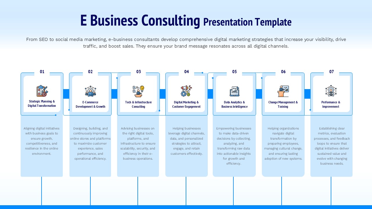
E Business Consulting Service Framework Template for PowerPoint & Google Slides
Business Strategy
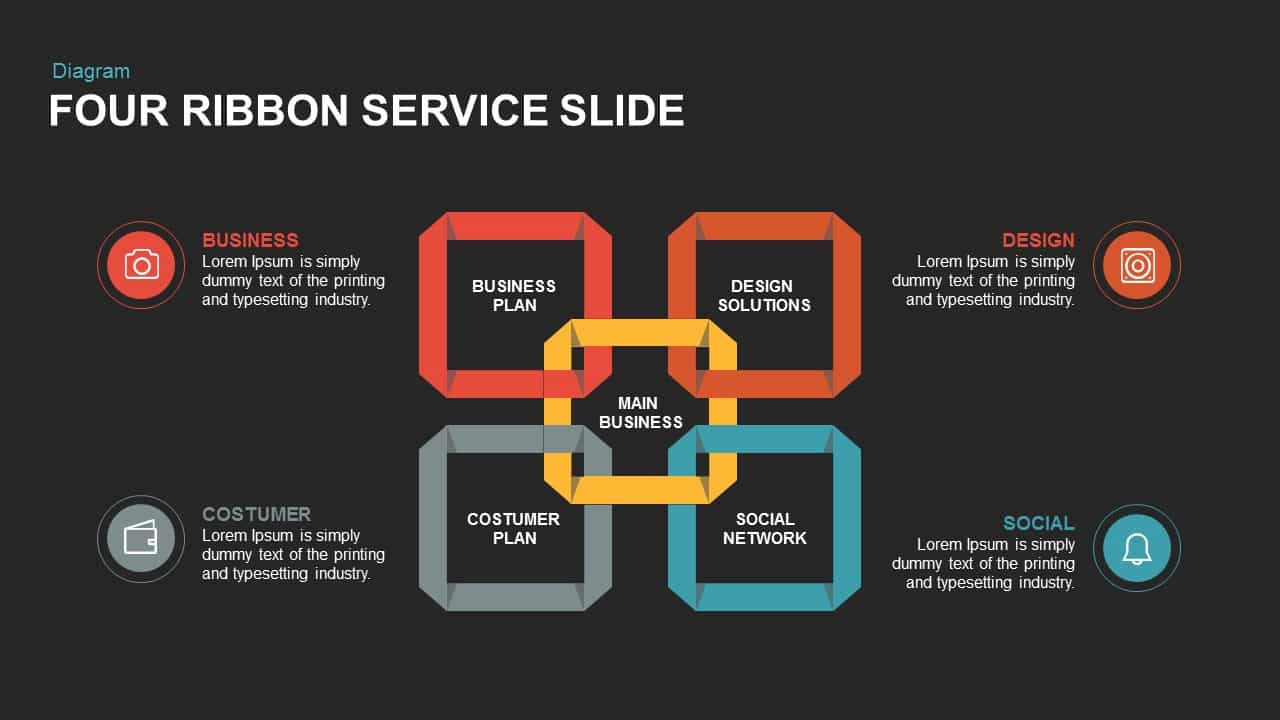
Four Ribbon Service Slide for PowerPoint & Google Slides
Infographics
Cab Service Presentation Deck for PowerPoint & Google Slides
Decks
Free Customer Service Breakdown Slide for PowerPoint & Google Slides
Infographics
Free