

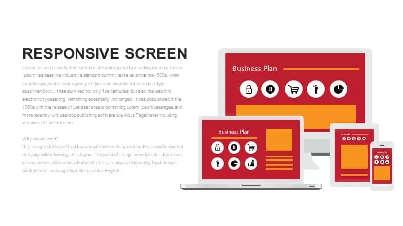
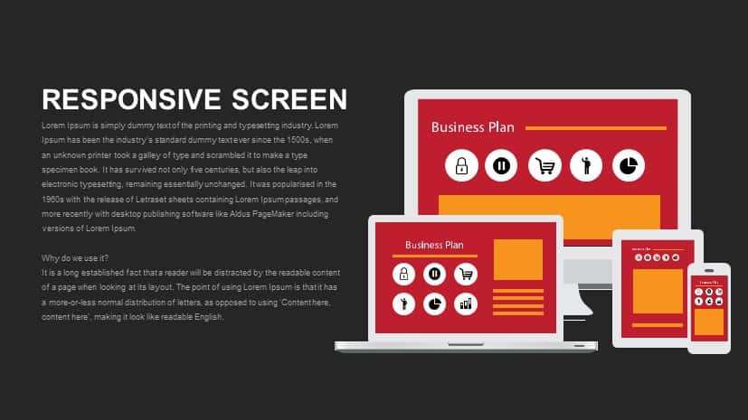
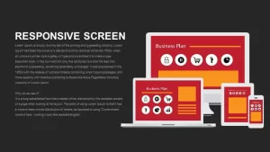
Responsive Screen Design for PowerPoint & Google Slides

Description
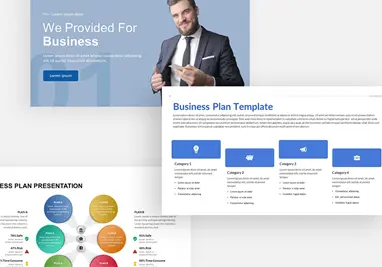
This responsive screen design template showcases how a business plan or content can adapt across different devices, including desktop, tablet, and mobile. The design illustrates a clear and responsive layout with vibrant colors and intuitive icons, making it ideal for demonstrating how digital content adjusts based on the screen size. The color scheme features warm reds and oranges, paired with simple yet impactful icons representing key features like security, shopping carts, charts, and more.
Each device screen is presented with a business plan template, highlighting sections where text and images can be customized. This diagram is excellent for presentations focused on website design, mobile application development, or responsive web design strategies. With its clean, professional design, it provides a clear representation of how content can shift to fit multiple platforms.
Fully editable in both PowerPoint and Google Slides, this template allows you to replace the text and icons with your own content, ensuring a personalized experience. Whether you are presenting to clients or discussing a digital project with a team, this slide will help convey the importance of responsive design in today’s multi-platform world.
Who is it for
This slide is ideal for web designers, digital marketers, developers, and business owners who need to showcase their digital strategies or responsive web design. It’s also great for product managers or project teams working on mobile apps or websites that need to demonstrate cross-platform compatibility.
Other Uses
Beyond showcasing responsive design, this diagram can be repurposed for demonstrating app interfaces, product feature highlights, or explaining how content adapts across devices. It’s also useful for tech demos, client briefings, or marketing presentations on digital user experience.
Login to download this file

Item ID
SB00798
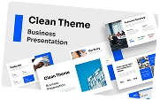
Related Templates

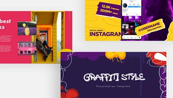
Screen Mockup PowerPoint Template for PowerPoint & Google Slides
Graphics
Modern Business Speech Slide Design Template for PowerPoint & Google Slides
Business

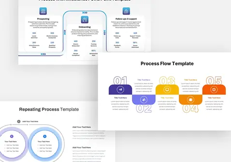
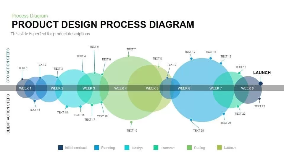
Product Development Design Process template for PowerPoint & Google Slides
Process
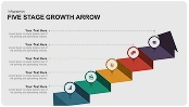
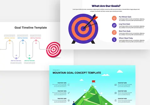
Process Timeline Infographics Design template for PowerPoint & Google Slides
Timeline
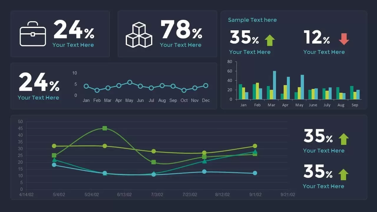
Data Analytics Dashboard Design template for PowerPoint & Google Slides
Bar/Column

Product Design Process Diagram Template for PowerPoint & Google Slides
Timeline
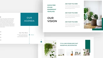
Modern Orange Business Plan Design Theme Template for PowerPoint & Google Slides
Company Profile
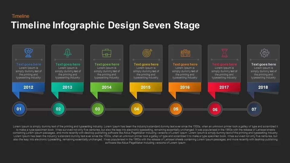
Timeline Infographic Design Seven Stage template for PowerPoint & Google Slides
Timeline
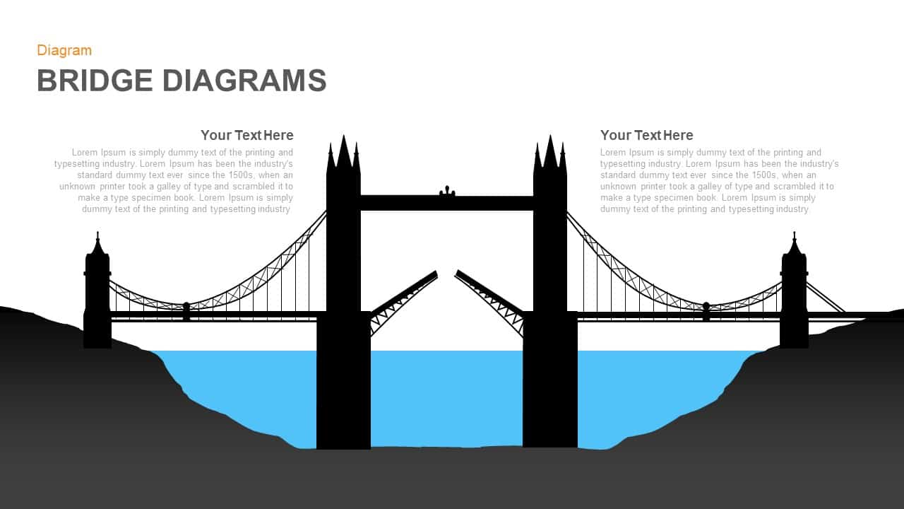
Modern Bridge Diagram Slide Design Template for PowerPoint & Google Slides
Process

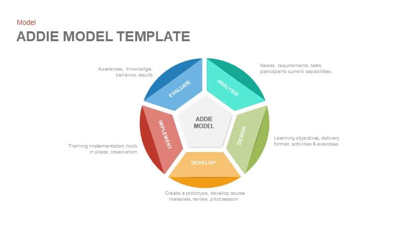
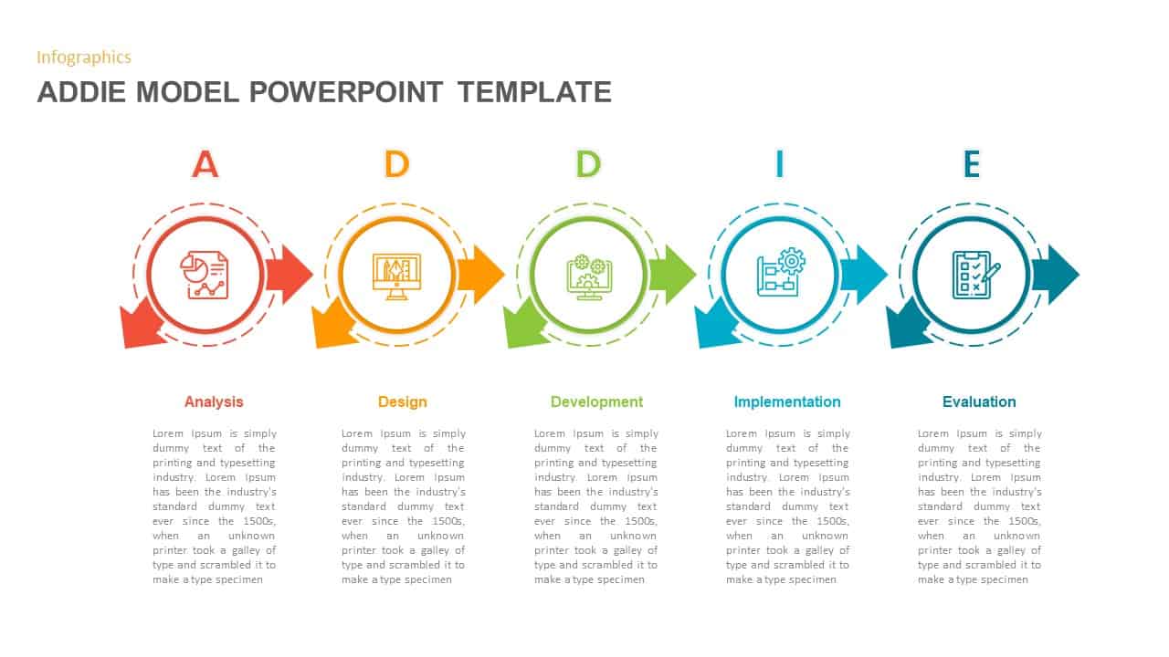
ADDIE Model Instructional Design Template for PowerPoint & Google Slides
Circular
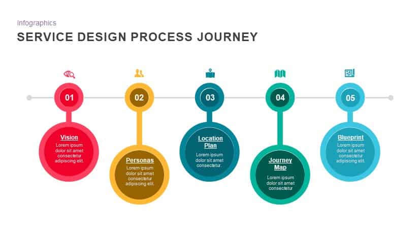
Service Design Process Journey template for PowerPoint & Google Slides
Process
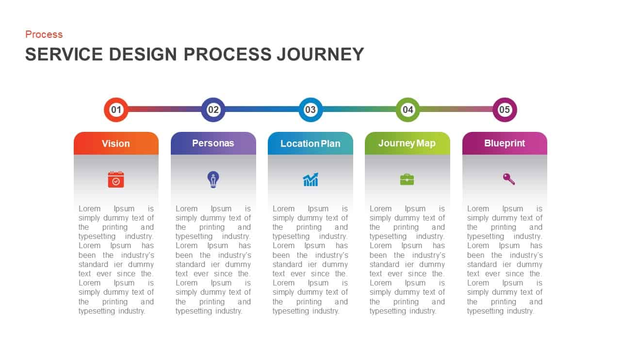
Service Design Process Journey Template for PowerPoint & Google Slides
Process

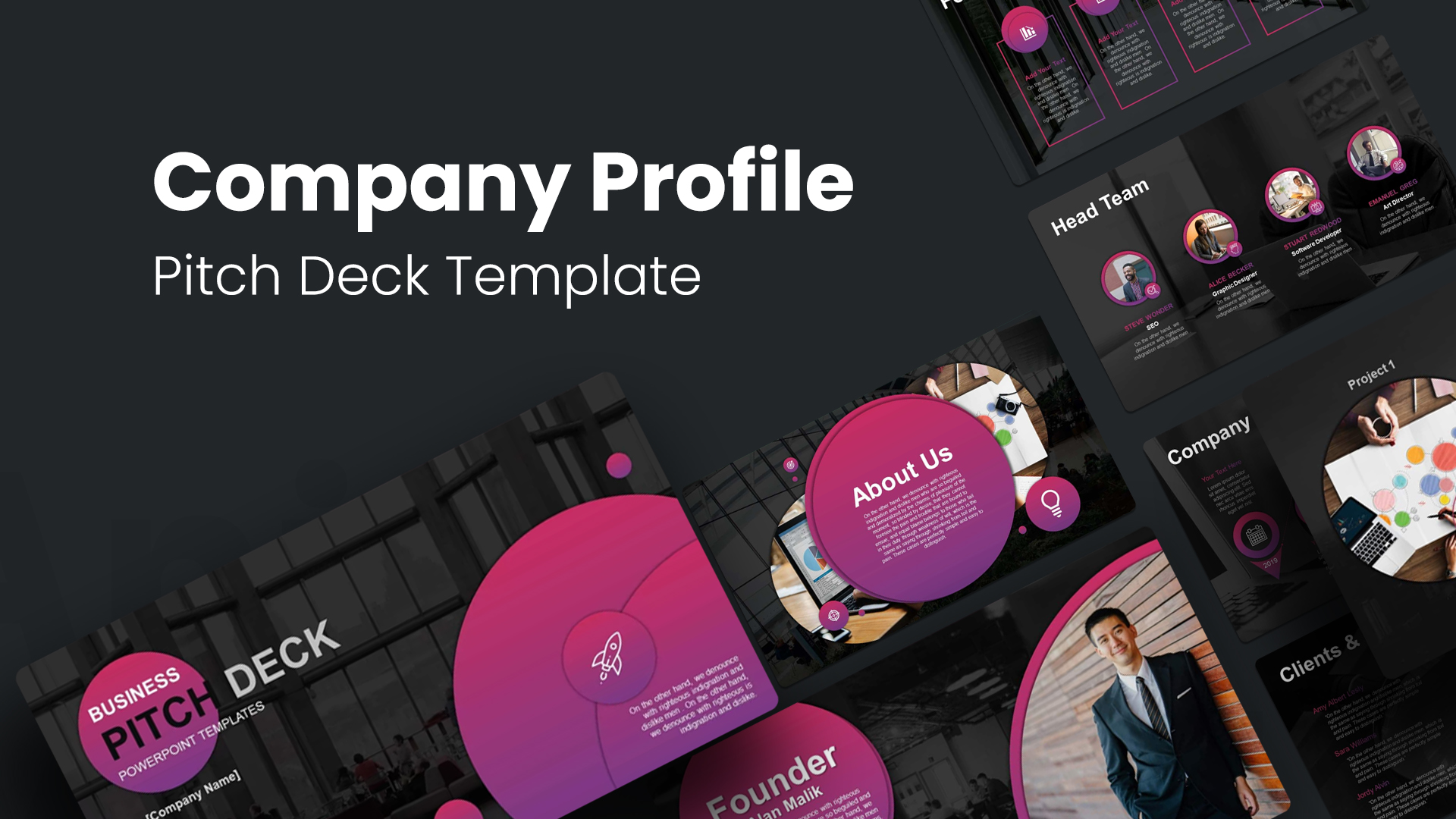
Company Profile Pitch Deck Design Template for PowerPoint & Google Slides
Company Profile
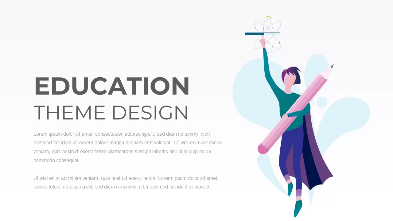
Free Education Theme Design Presentation Template for PowerPoint & Google Slides
Pitch Deck
Free
Free Corporate Design Deck Template for PowerPoint & Google Slides
Company Profile
Free
ADDIE Instructional Design Model Template for PowerPoint & Google Slides
Process

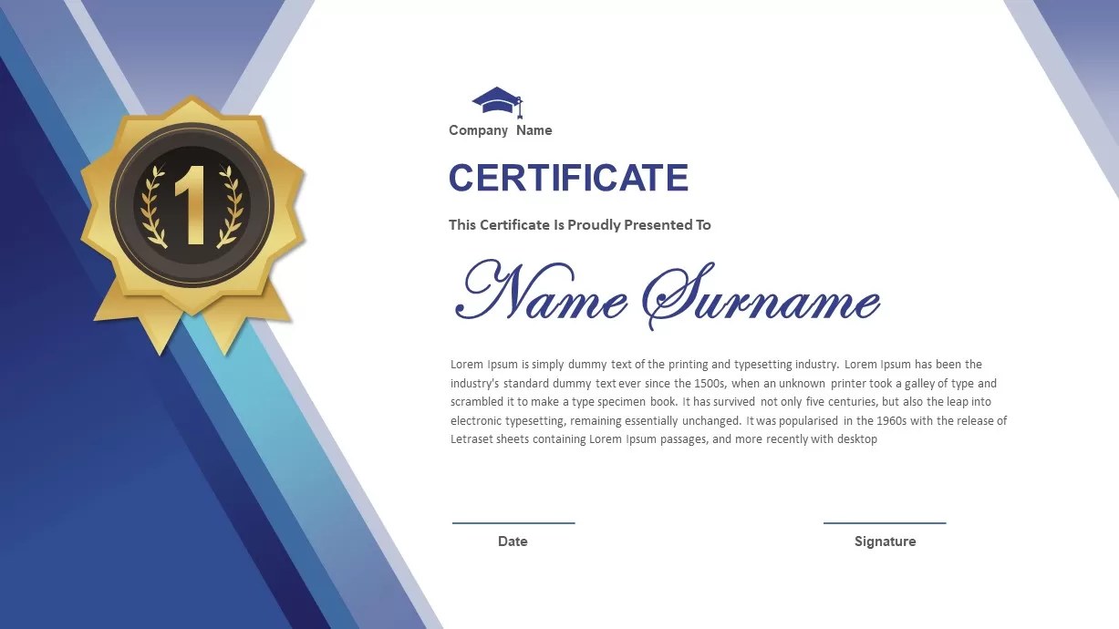
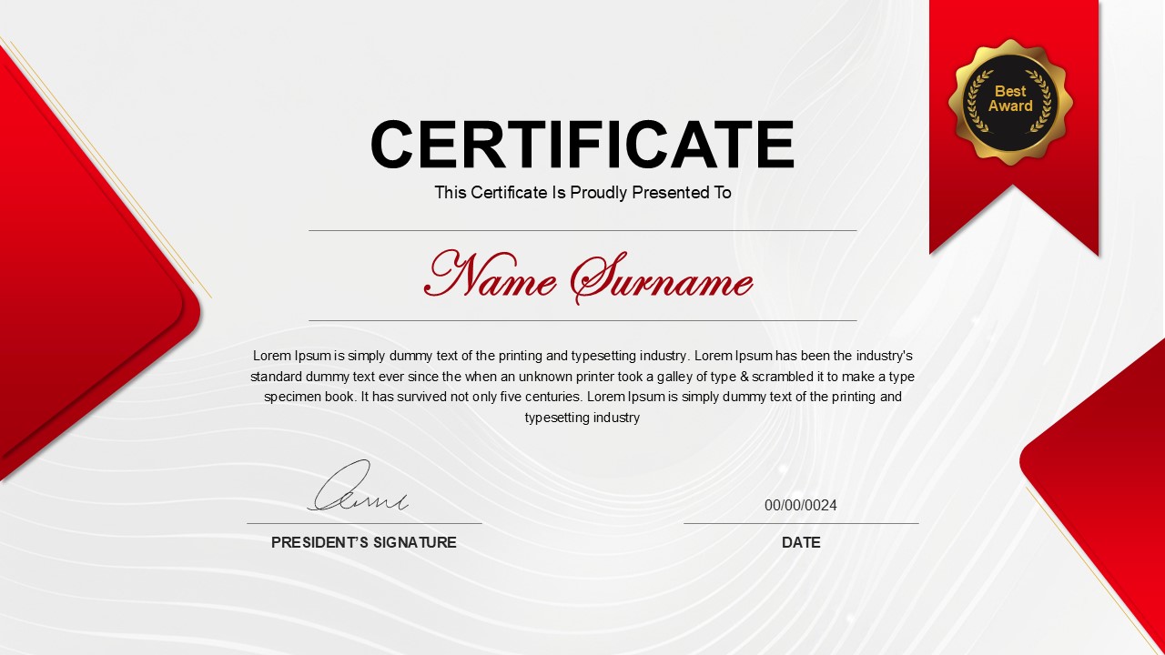
Corporate Award Certificate Design Template for PowerPoint & Google Slides
Accomplishment
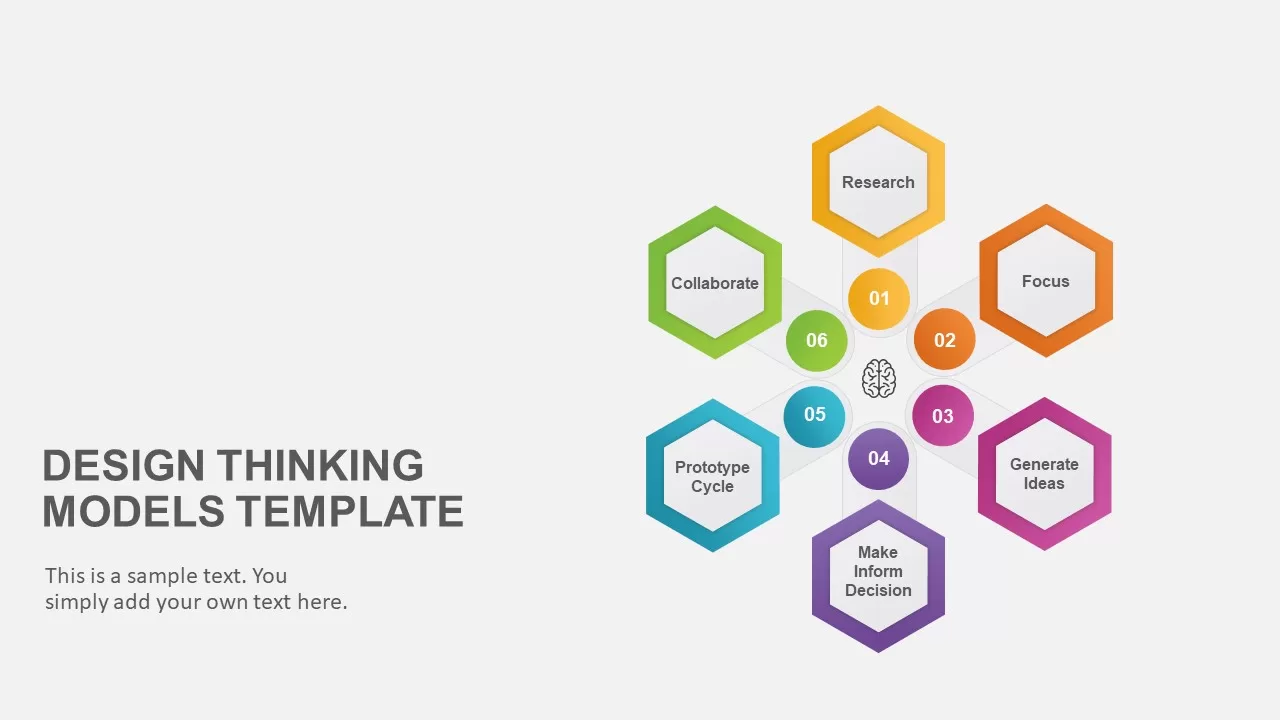
Six-Step Hexagon Design Thinking Models Template for PowerPoint & Google Slides
Circular
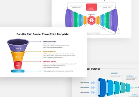
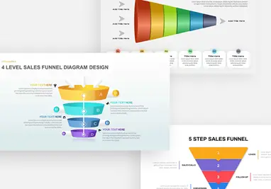
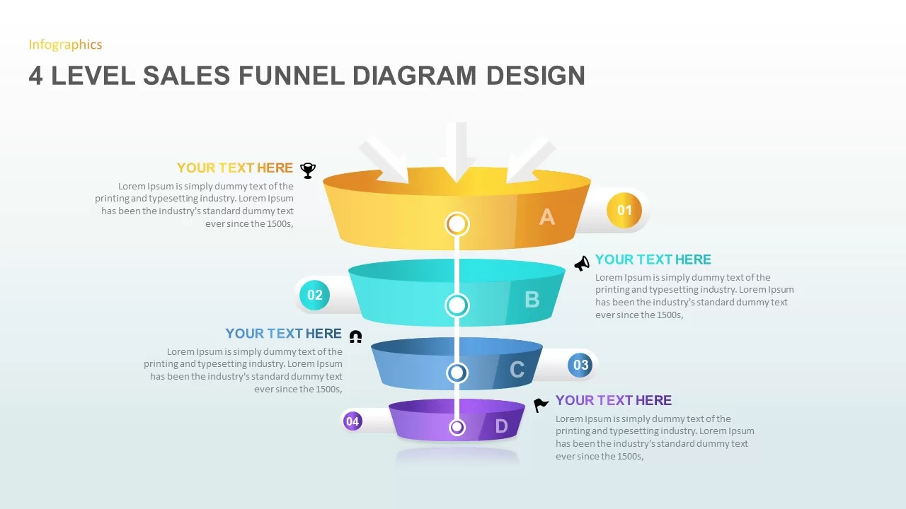
4 Level Sales Funnel Diagram Design for PowerPoint & Google Slides
Marketing Funnel
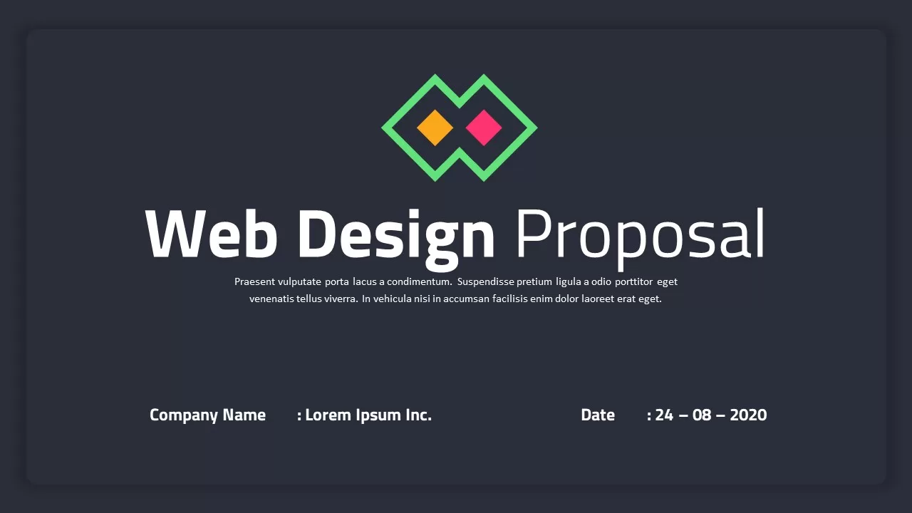
Web Design Proposal Template for PowerPoint & Google Slides
Information Technology
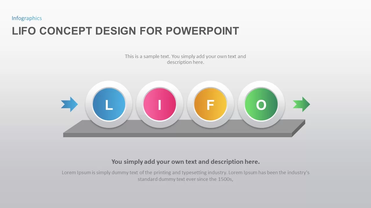
LIFO Concept Design for PowerPoint & Google Slides
Process
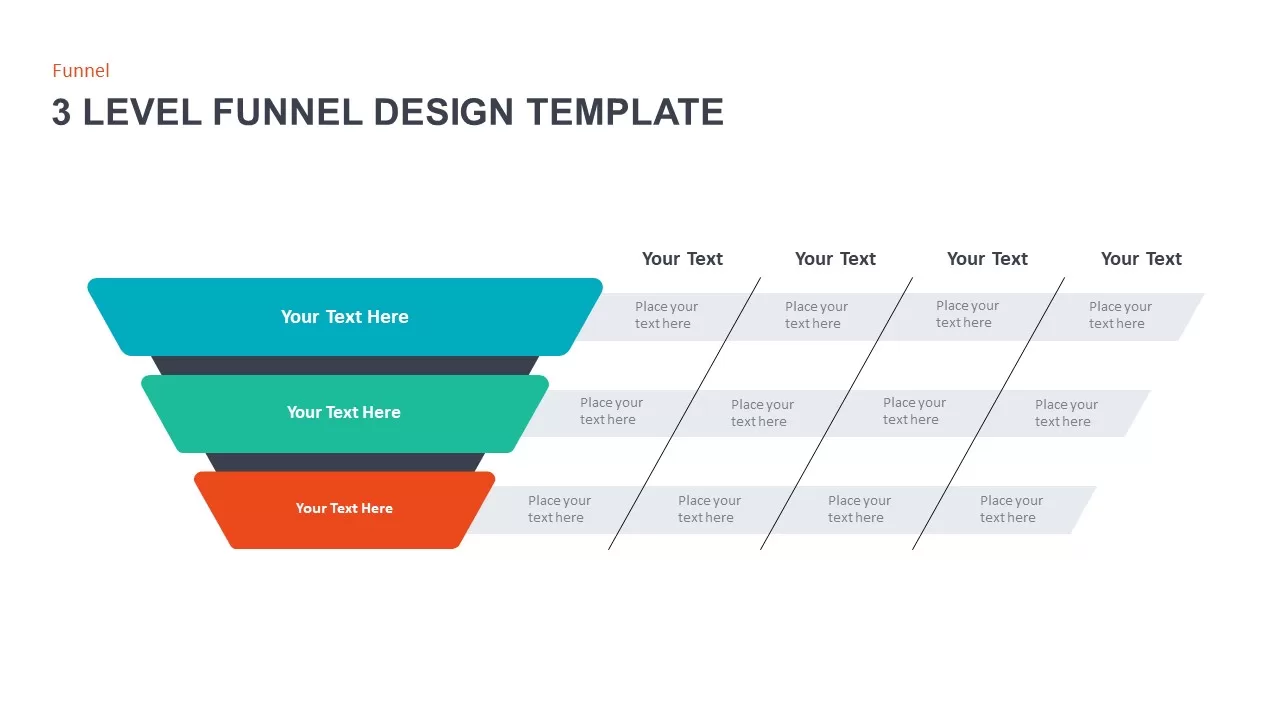
3 Level Funnel Design Visualization Template for PowerPoint & Google Slides
Funnel
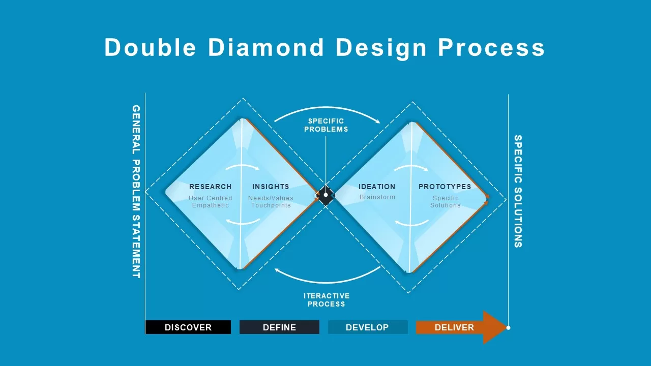
Double Diamond Design Process Overview Template for PowerPoint & Google Slides
Process
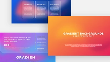
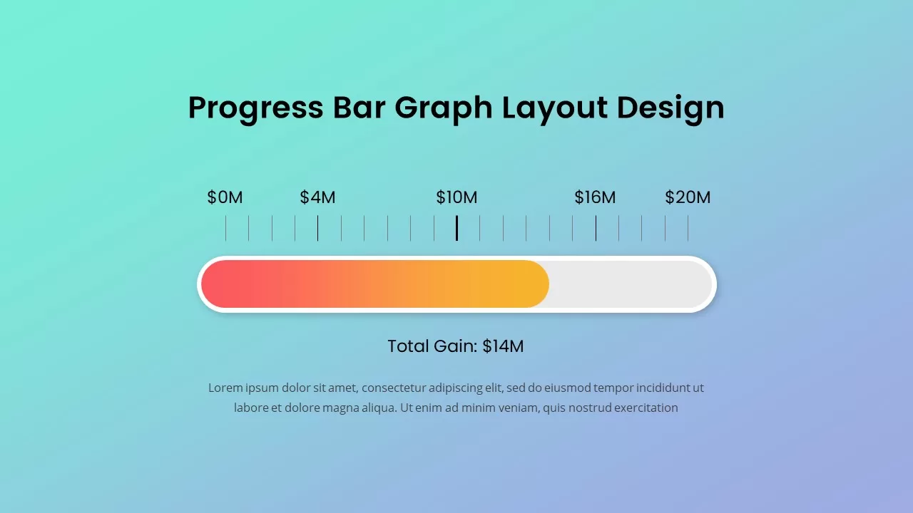
Progress Bar Graph Layout Design for PowerPoint & Google Slides
Charts
Animated Announcement Banner Design for PowerPoint & Google Slides
Business
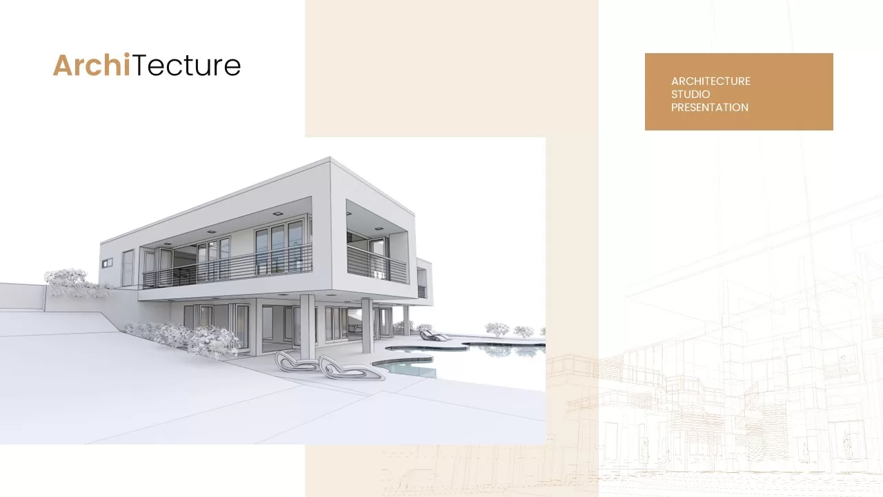
Architecture Design Studio Template for PowerPoint & Google Slides
Company Profile
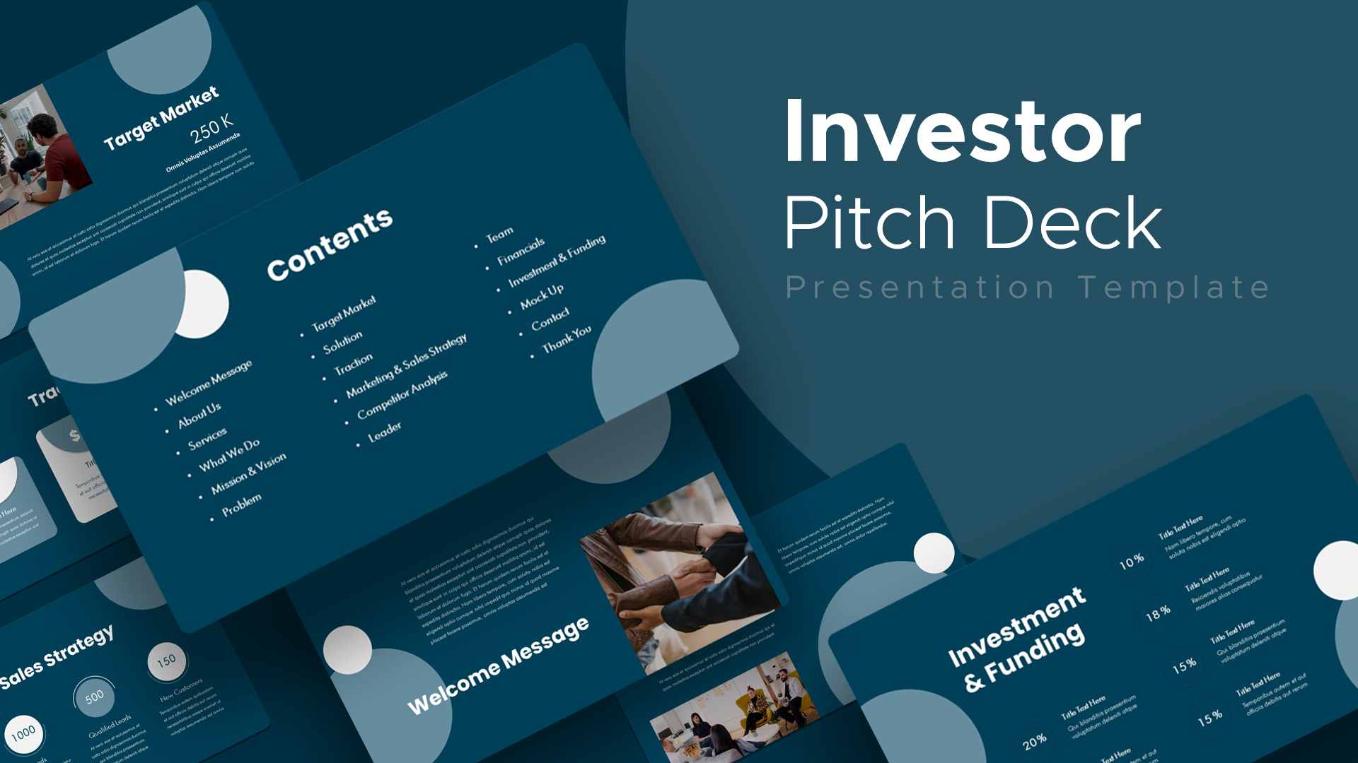
Modern Investor Pitch Deck Design Template for PowerPoint & Google Slides
Pitch Deck
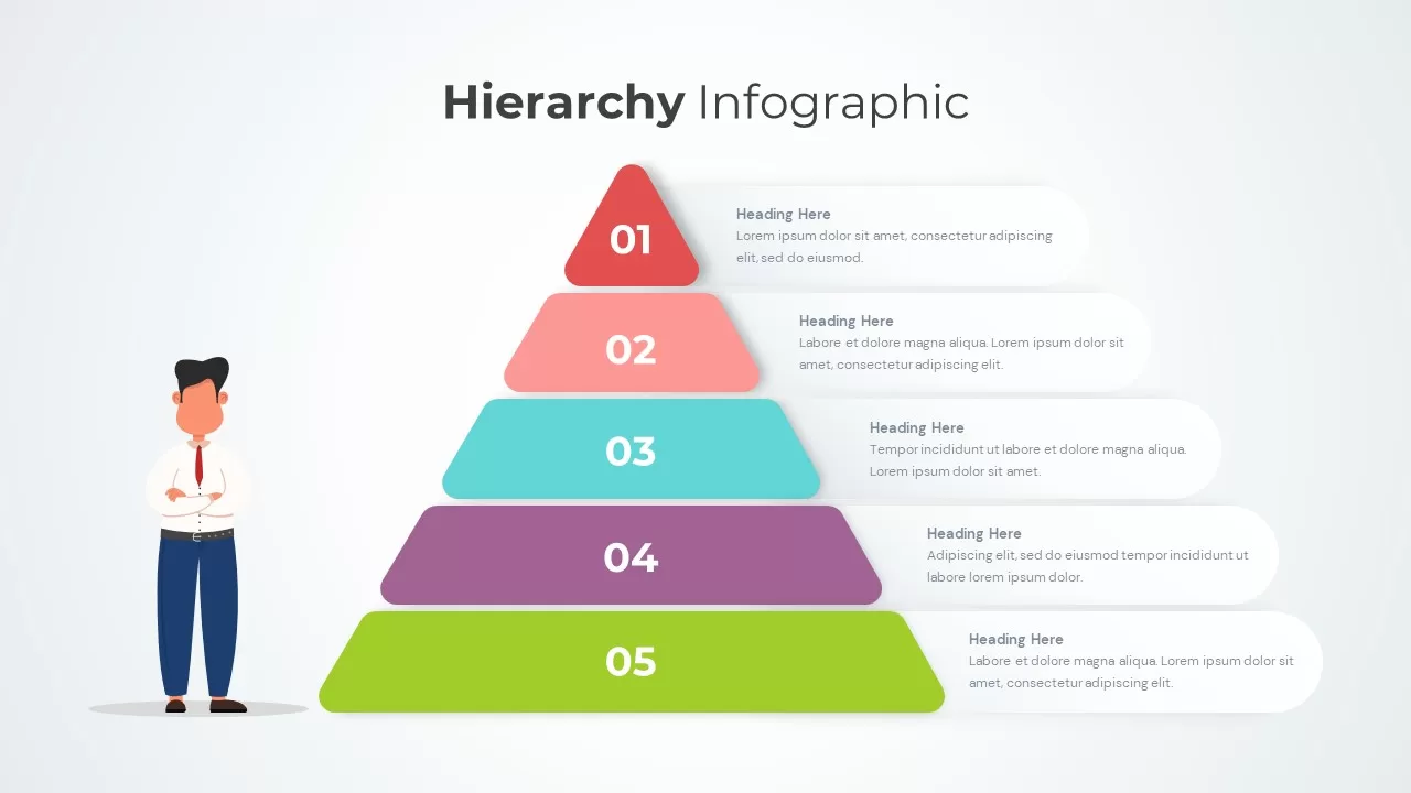
Hierarchy Infographic Design for PowerPoint & Google Slides
Business
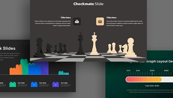
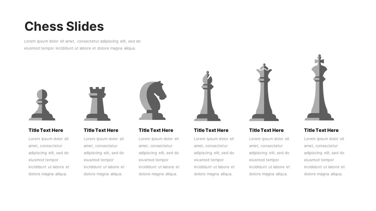
Chess Piece Infographic Design Template for PowerPoint & Google Slides
Process
Minimal Blue Cover Slide Design for PowerPoint & Google Slides
Company Profile
Corporate Business Cover Slide Design for PowerPoint & Google Slides
Pitch Deck
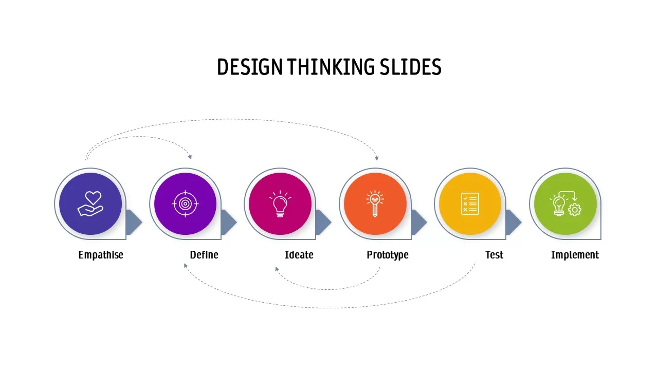
Design Thinking Process Cycle Slide Template for PowerPoint & Google Slides
Process
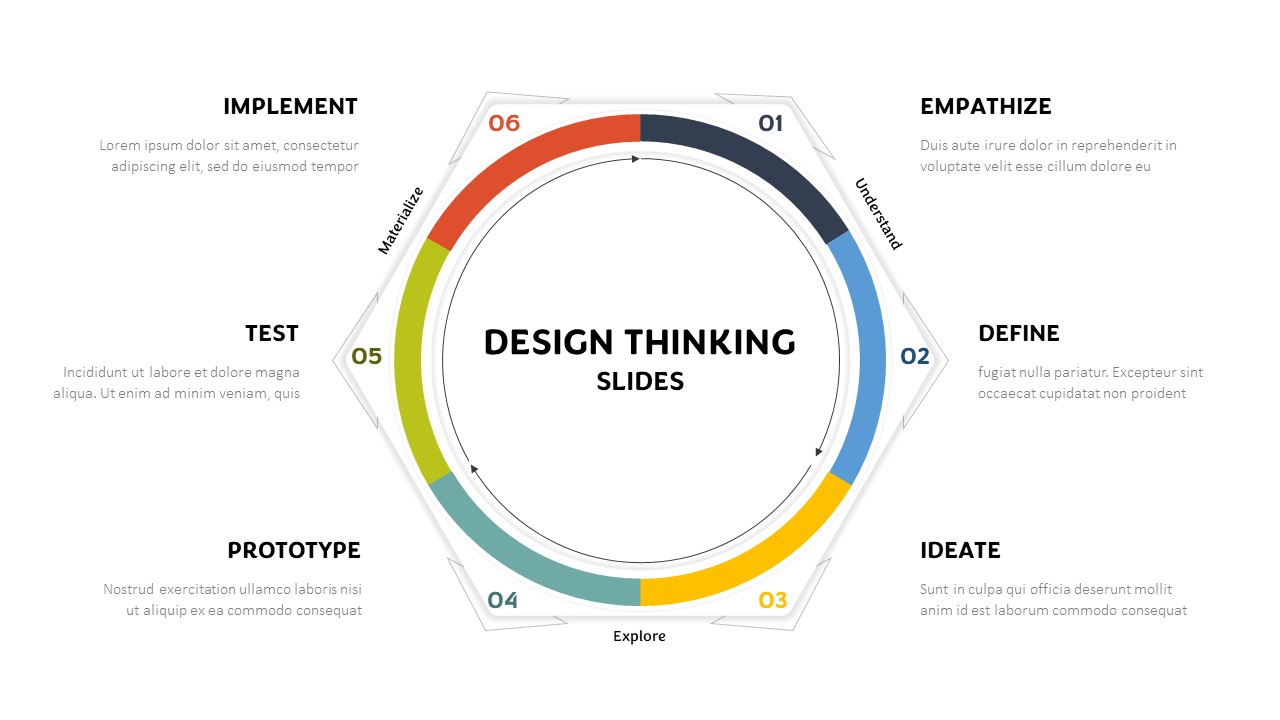
Hexagonal Design Thinking Cycle Template for PowerPoint & Google Slides
Process
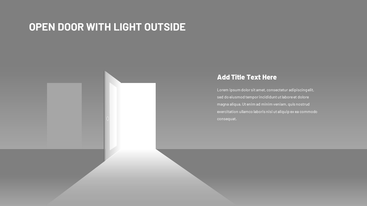
Open Door Transition Slide Design Template for PowerPoint & Google Slides
Opportunities Challenges
3D Product Spotlight Stage Design Template for PowerPoint & Google Slides
Graphics
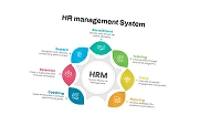
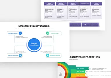
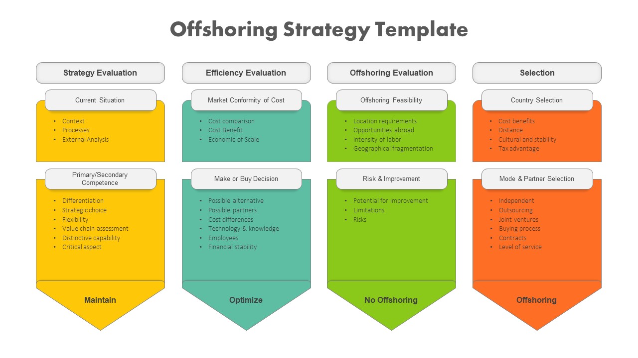
Offshoring Strategy Framework Design Template for PowerPoint & Google Slides
Business Strategy
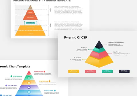
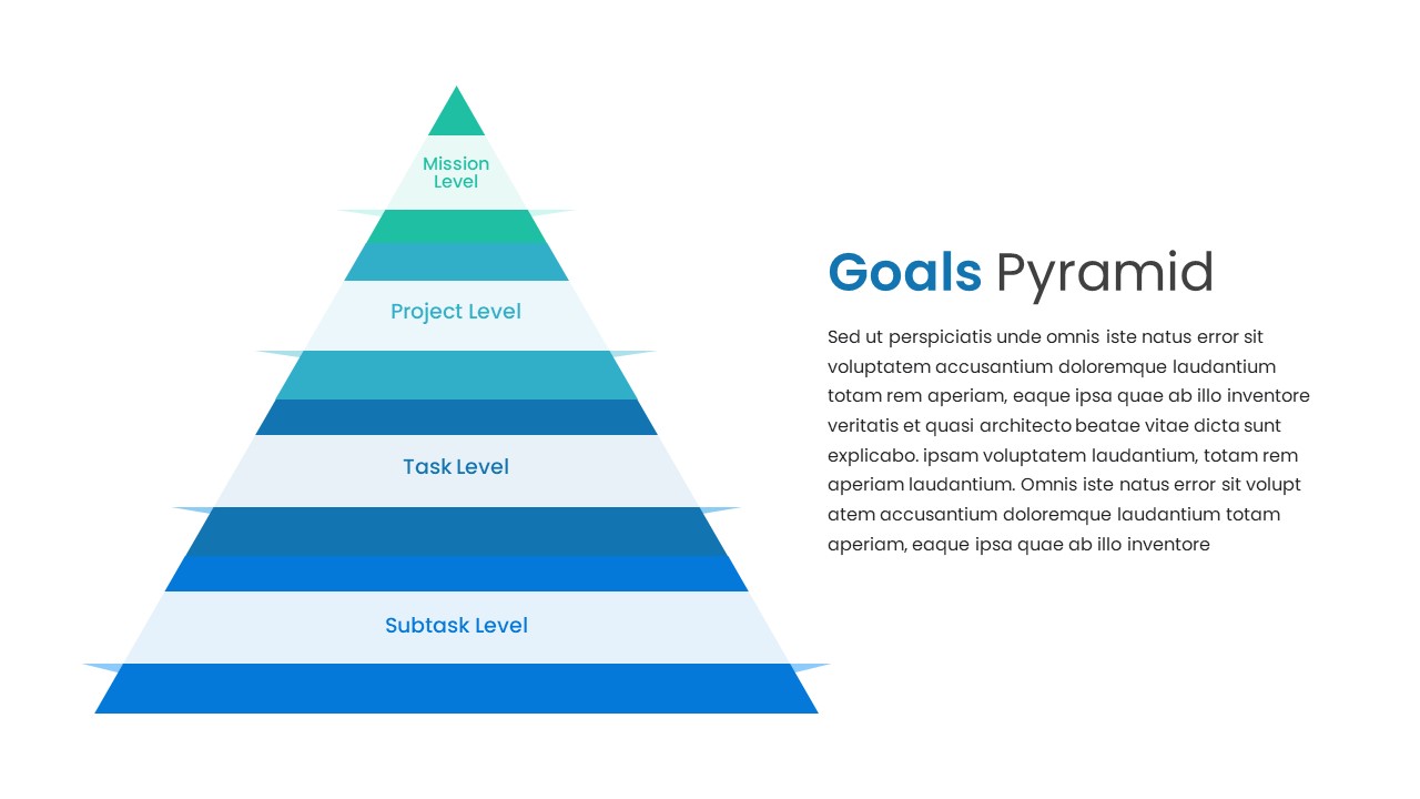
Goals Pyramid Hierarchy Slide Design Template for PowerPoint & Google Slides
Pyramid
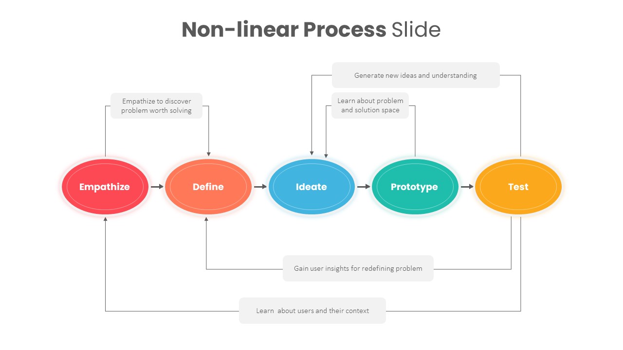
Non-linear Design Thinking Process Template for PowerPoint & Google Slides
Process
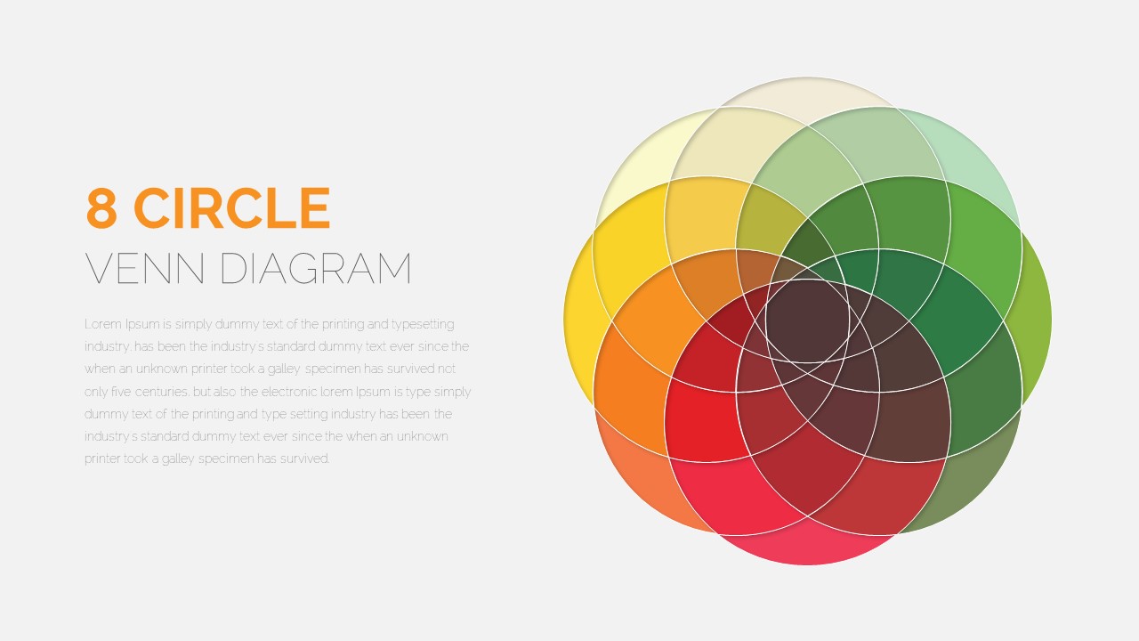
8 Circle Venn Diagram Infographic Design Template for PowerPoint & Google Slides
Circular
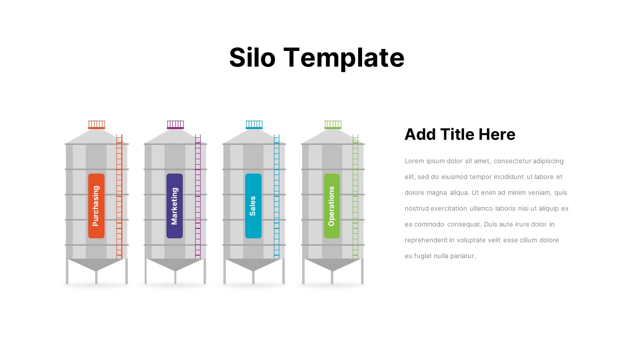
Business Silo Diagram Infographic Design Template for PowerPoint & Google Slides
Business
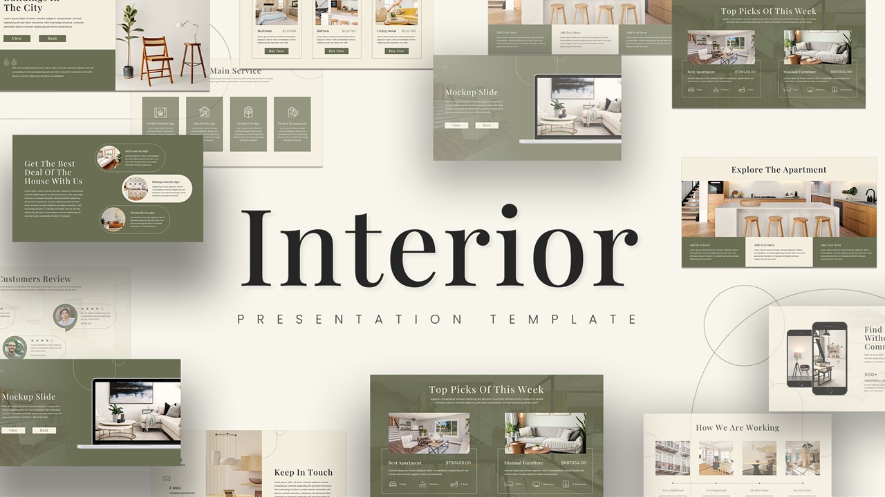
Interior Design Showcase Presentation Template for PowerPoint & Google Slides
Company Profile
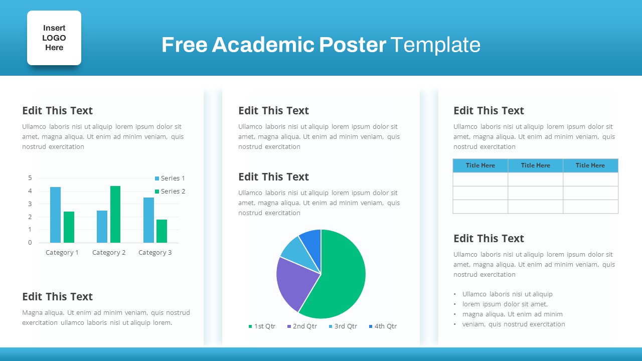
Free Academic Research Poster Design Template for PowerPoint & Google Slides
Bar/Column
Free
Minimal Portfolio Pictures Design Template for PowerPoint & Google Slides
Company Profile
Free Space Minimal Deck Design Template for PowerPoint & Google Slides
Company Profile
Free
Consulting Pitch Deck Design for PowerPoint & Google Slides
Pitch Deck

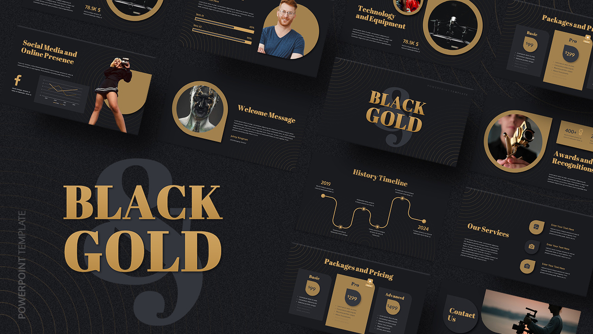
Free Black and Gold Pitch Deck Design for PowerPoint & Google Slides
Pitch Deck
Free
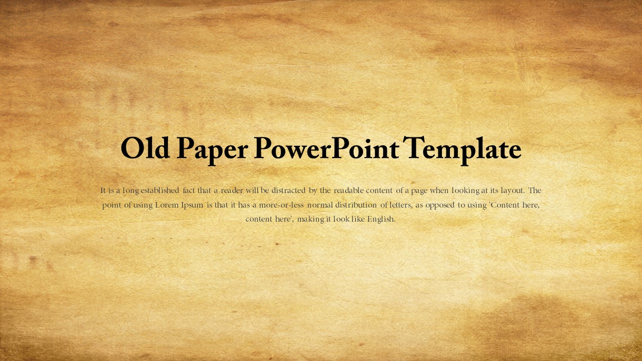
Vintage Old Paper Background Design Template for PowerPoint & Google Slides
Free
Free
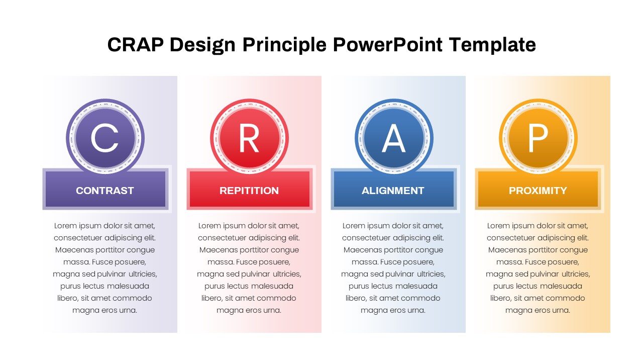
CRAP Design Principles Explained Template for PowerPoint & Google Slides
Business Strategy
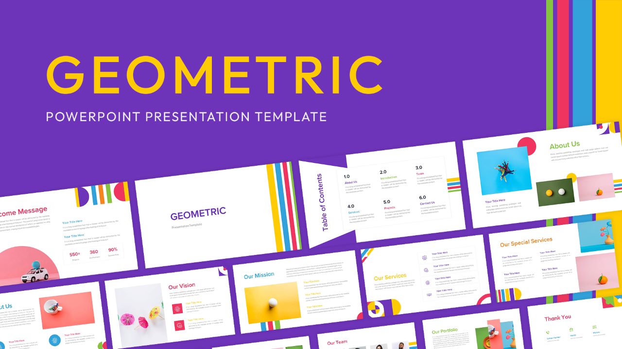
Geometric Company Profile Design Template for PowerPoint & Google Slides
Company Profile
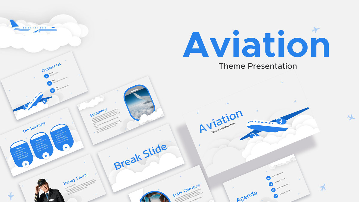
Aviation Theme Presentation Design Template for PowerPoint & Google Slides
Pitch Deck
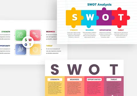
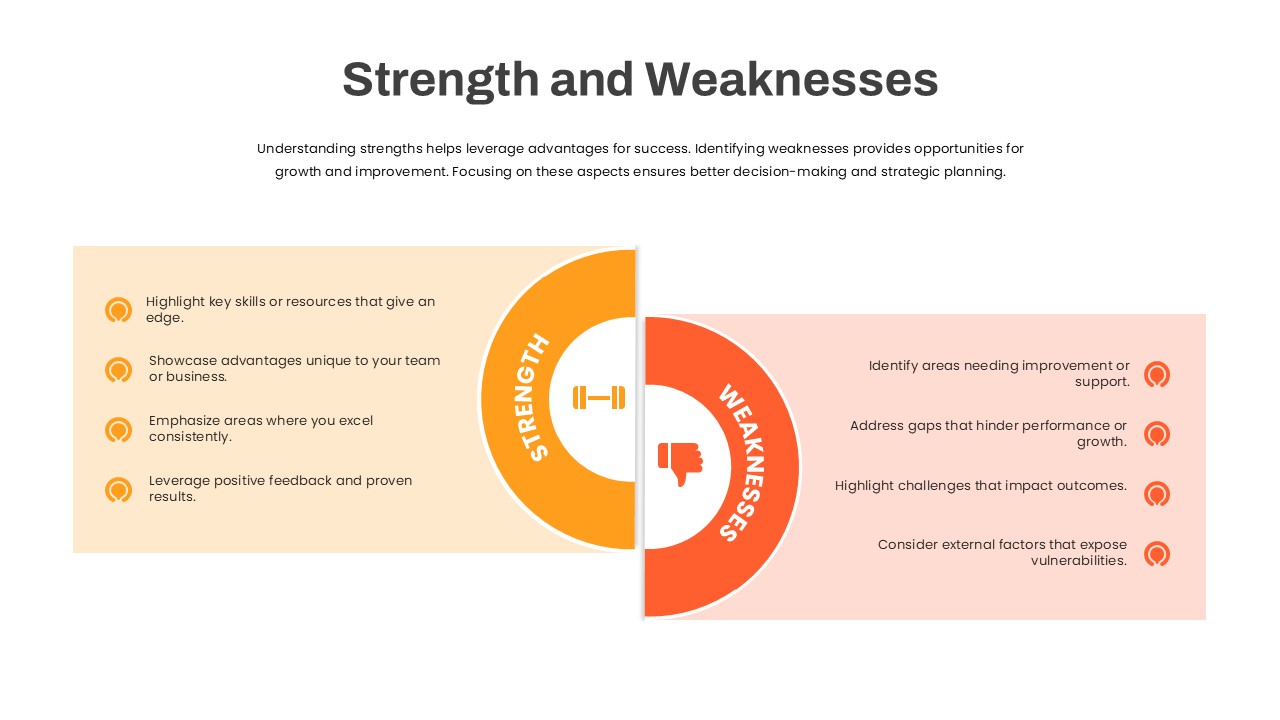
Strength and Weaknesses Slide Design Template for PowerPoint & Google Slides
SWOT
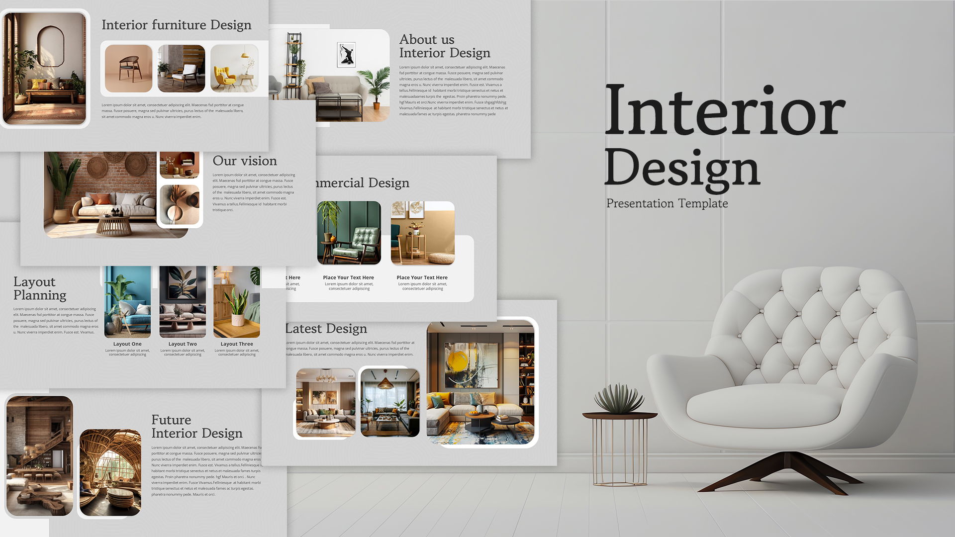
Interior Design Company Profile Deck Template for PowerPoint & Google Slides
Company Profile
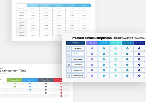
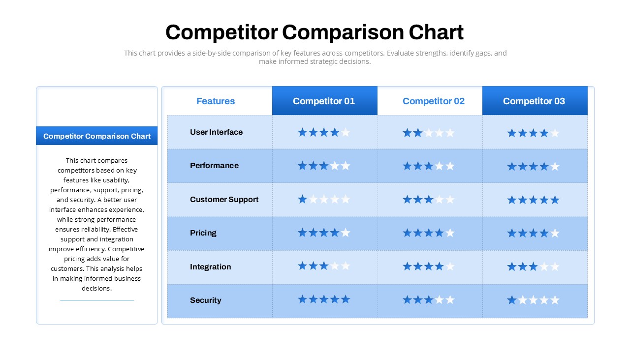
Competitor Comparison Chart Design Template for PowerPoint & Google Slides
Comparison
Free Award Certificate Design Template for PowerPoint & Google Slides
Accomplishment
Free
Blood Cancer Awareness Slide Design Template for PowerPoint & Google Slides
Health
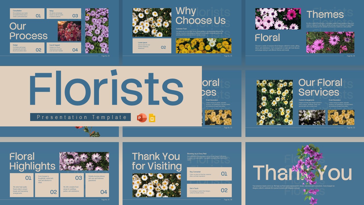
Free Florists Business Presentation Design Template for PowerPoint & Google Slides
Company Profile


