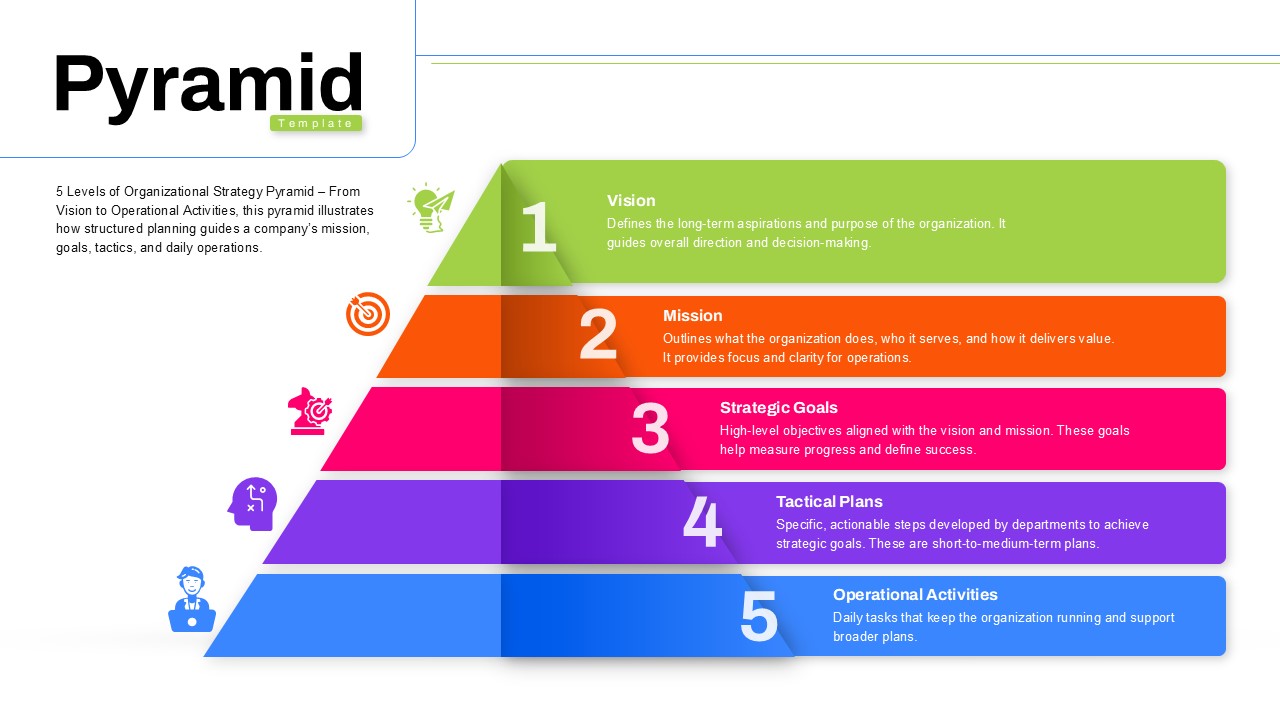
Free Pyramid Diagram Infographics PowerPoint Template
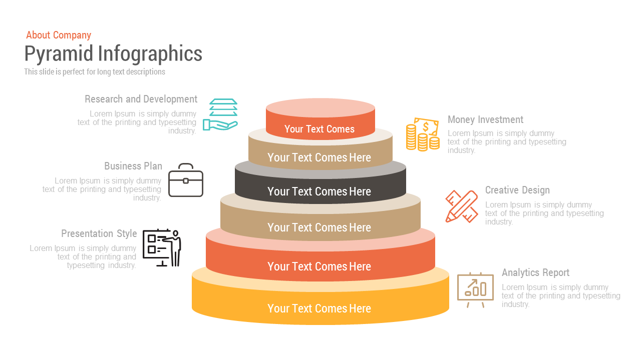
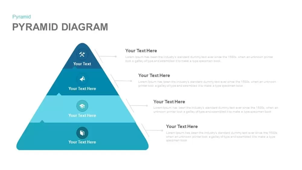
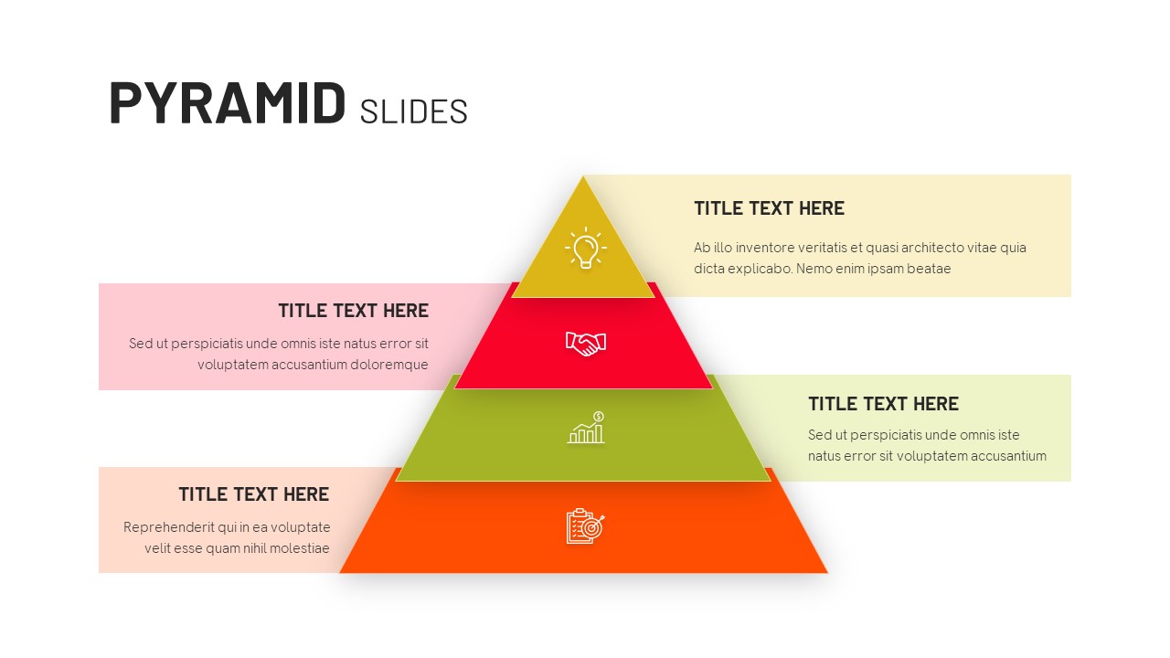
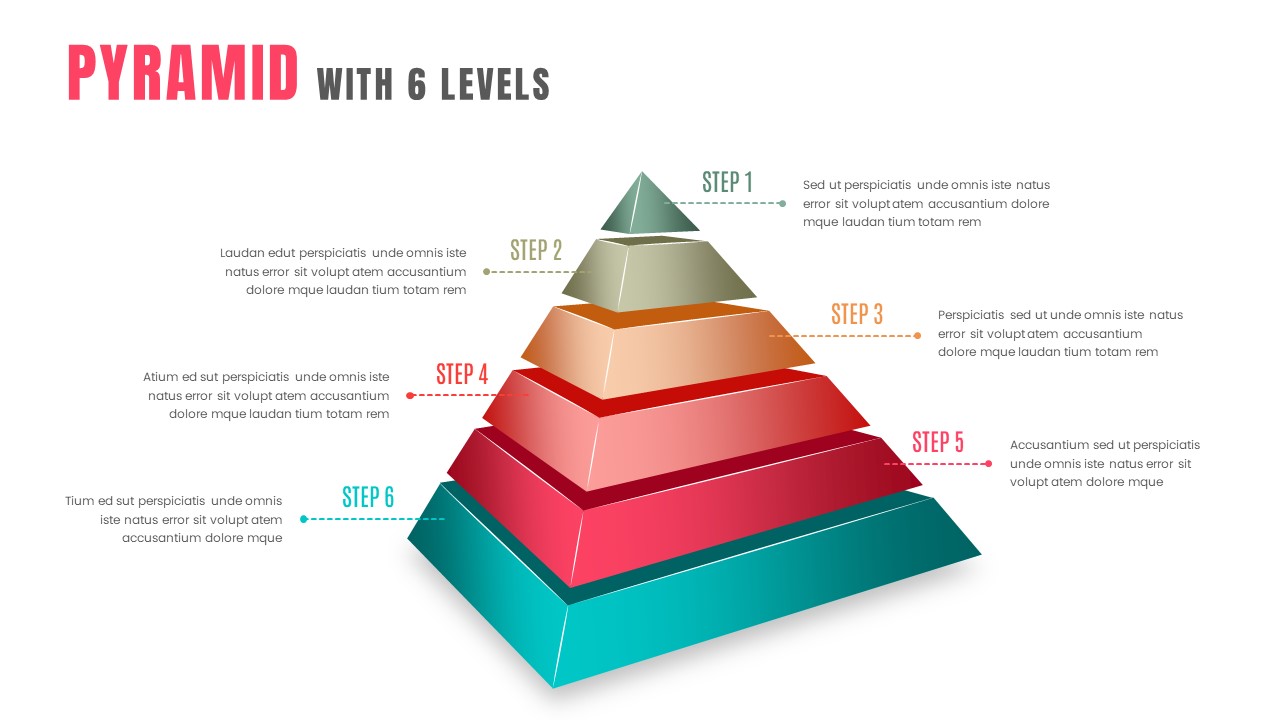
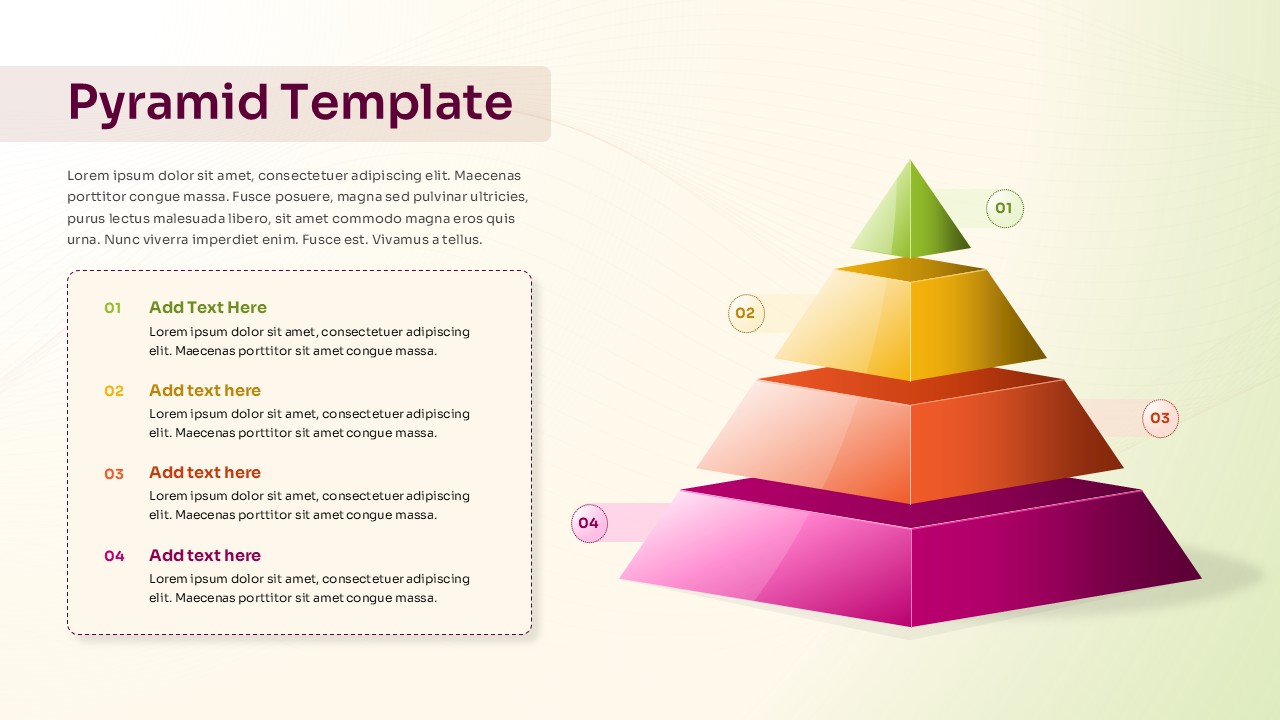
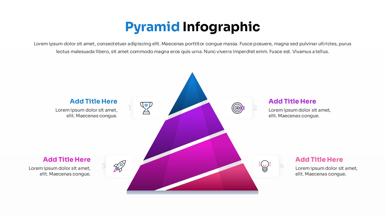
When you need to show stakeholders how your organization allocates resources, ranks strategic initiatives, or structures a decision-making framework, a flat bullet list simply does not do the job. This six-layer free pyramid infographic diagram gives you a visual architecture that communicates priority and hierarchy at a glance. Fully editable in PowerPoint and Google Slides, it fits seamlessly into your existing presentation workflow without requiring design expertise. Whether you are working from free ppt templates or building a branded deck from scratch, this slide adapts to your content in minutes.
The pyramid structure is especially effective in business contexts where sequence and weight matter. Think of a strategy review where leadership needs to understand which initiatives sit at the foundation versus which are the narrow priorities at the top. The layered format makes those relationships self-evident, reducing the time you spend explaining and increasing the time your audience spends understanding. Each tier accommodates a label and supporting text, so you can attach real data, KPIs, or short descriptions directly to the visual without cluttering the slide.
Why This Template Format Works in Practice
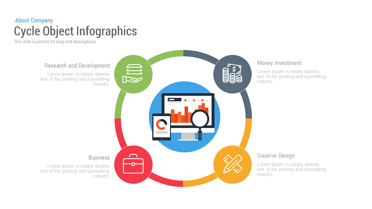
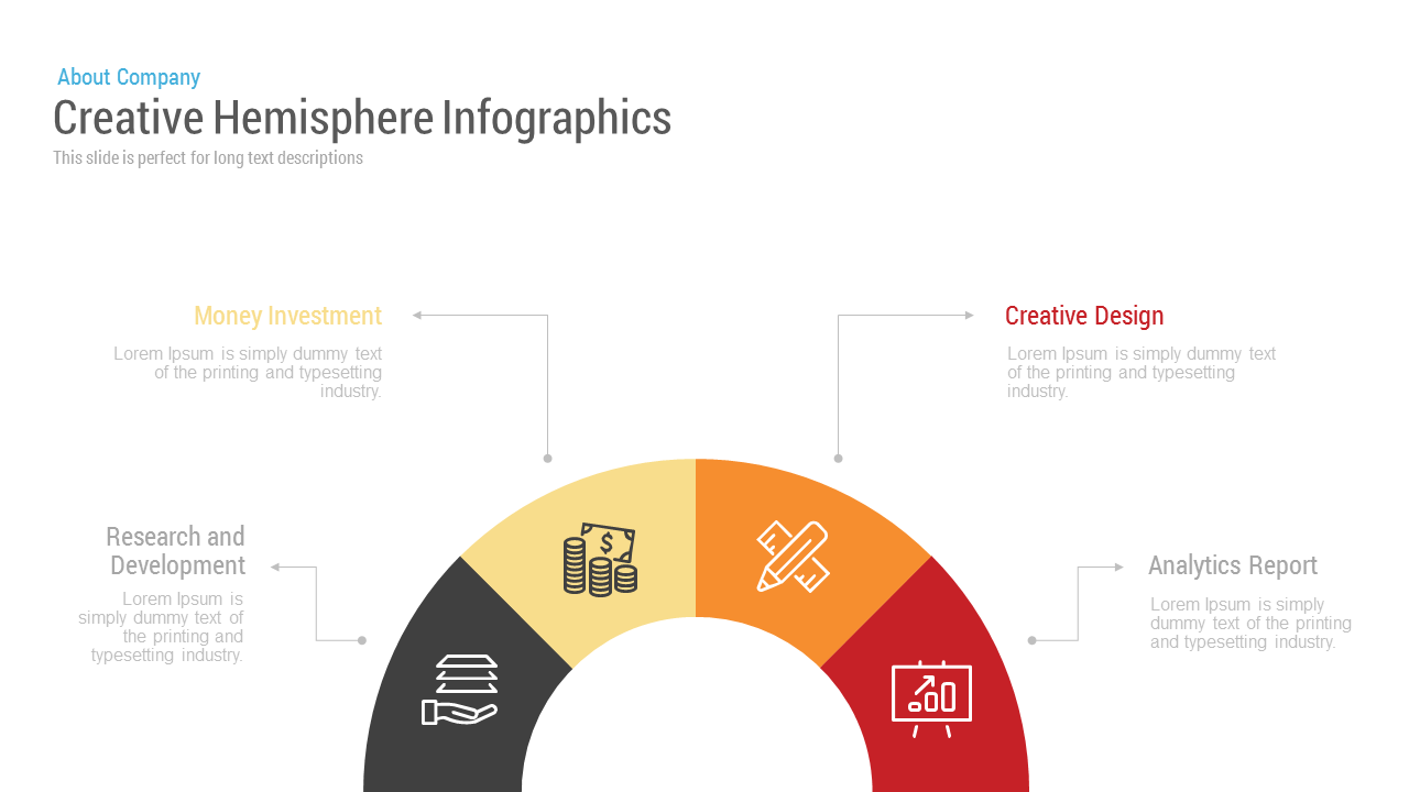
Teams use Pyramid Slides most effectively during quarterly business reviews, organizational planning sessions, product roadmaps, and investor presentations. If you are presenting a go-to-market model, a risk prioritization framework, or a needs hierarchy for customer segments, this slide carries that message with structure and authority. The surrounding icon-and-text callout zones on both sides of the pyramid let you connect each layer to a named concept, such as Money Investment, Creative Design, or Analytics Report, making the slide useful for both internal alignment and client-facing delivery.
This free template is part of a broader library of Google Slide themes designed for business professionals who need polished visuals without starting from scratch. The color scheme is warm and neutral, appropriate for conservative industries like finance and consulting, while remaining flexible enough for product and tech teams. When clarity of communication is the goal, a well-structured pyramid beats a dense table or a crowded chart every time.
Login to download this file

Item ID
SBF00006
Related Templates

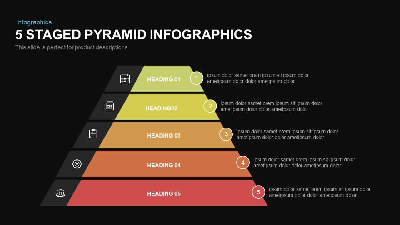
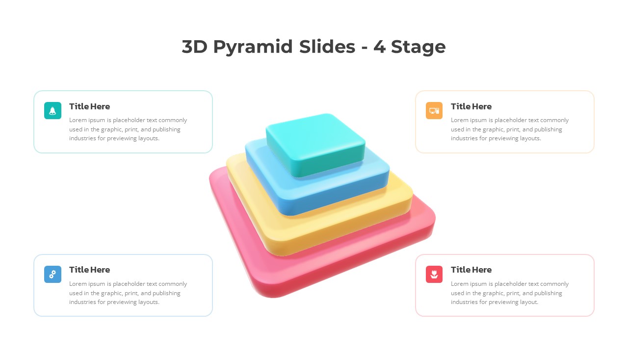
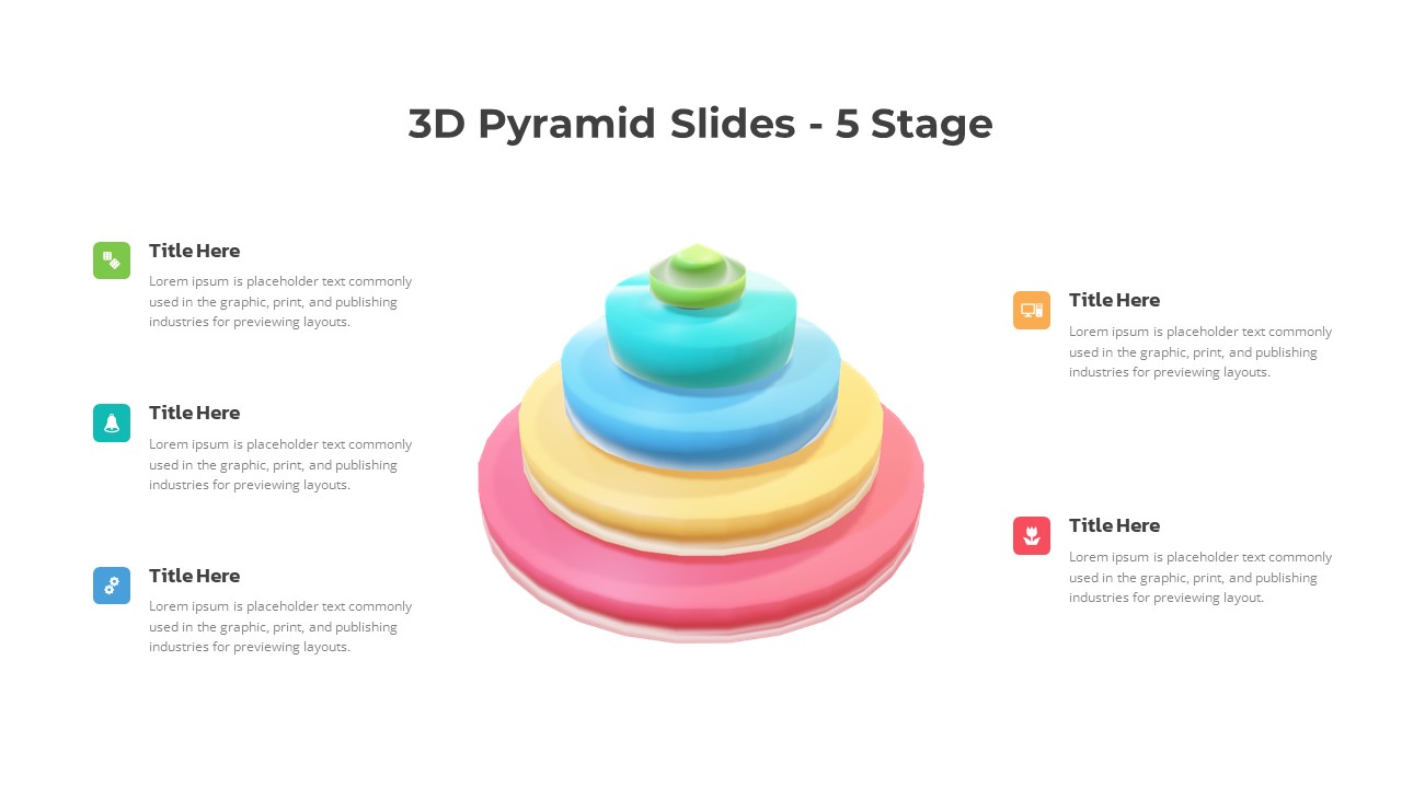
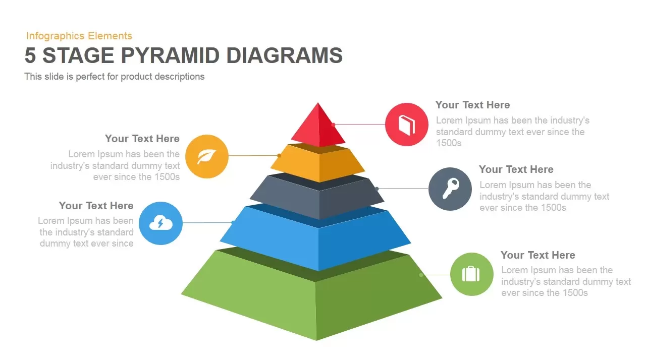
Five-Stage Pyramid Infographics Diagram Template for PowerPoint & Google Slides
Pyramid
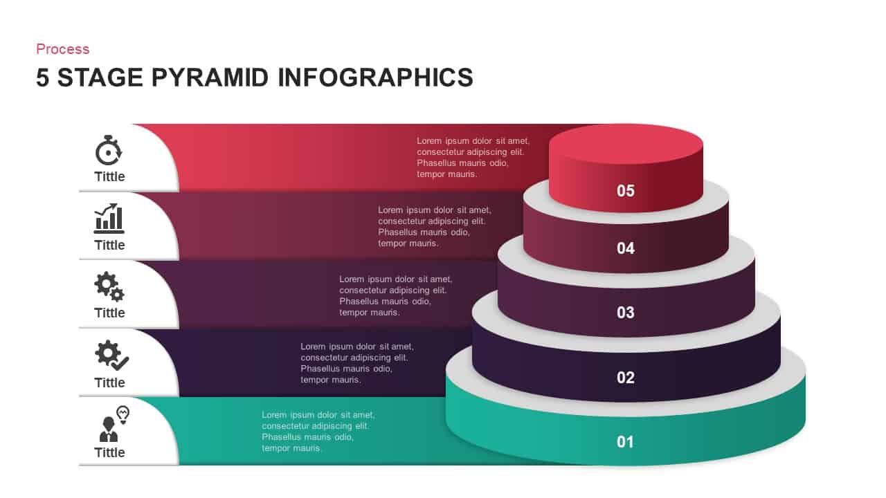
Five-Stage Pyramid Infographics Process Template for PowerPoint & Google Slides
Pyramid
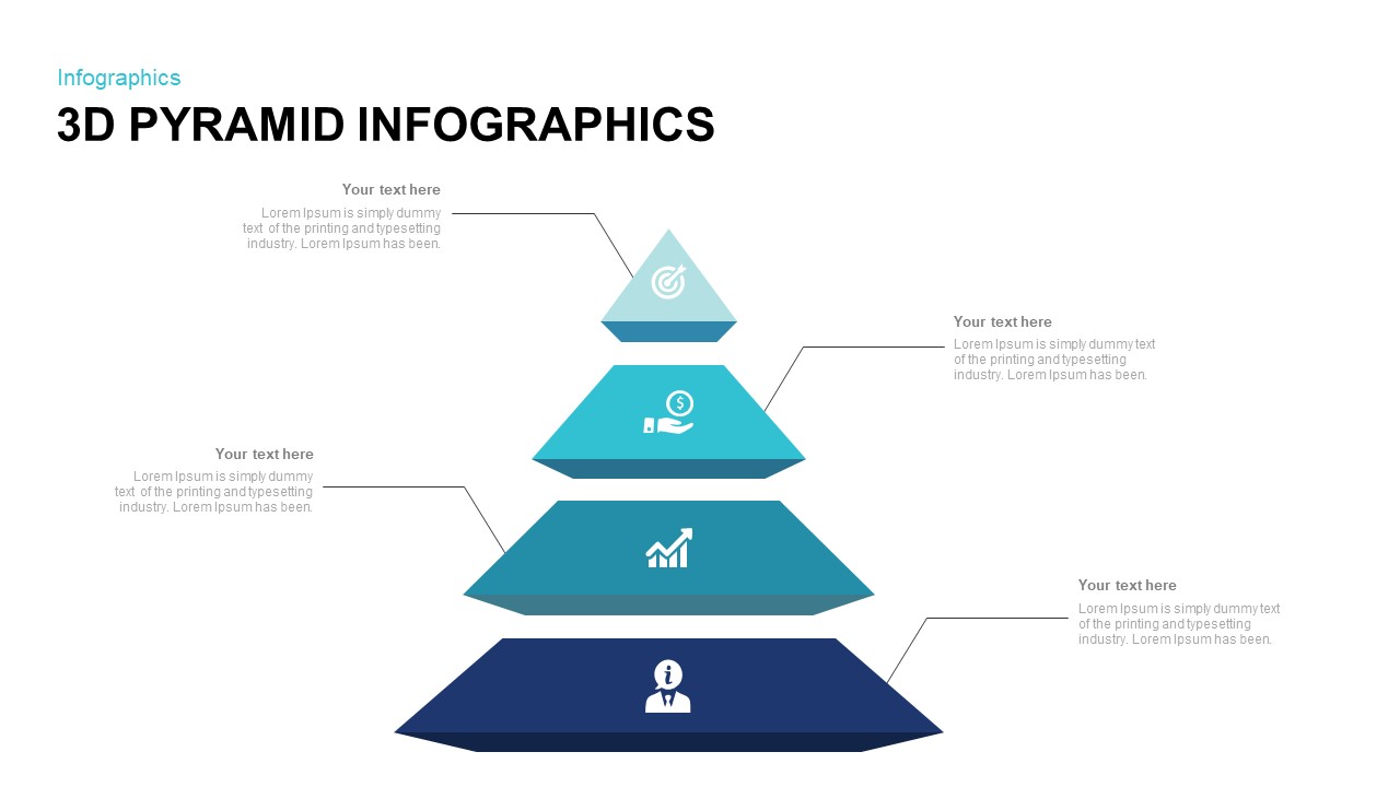
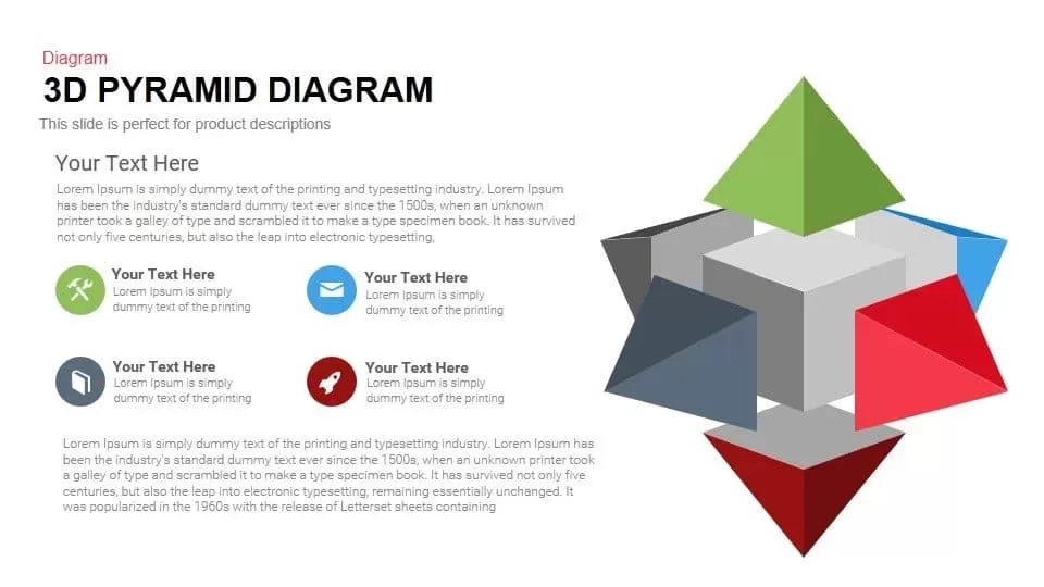
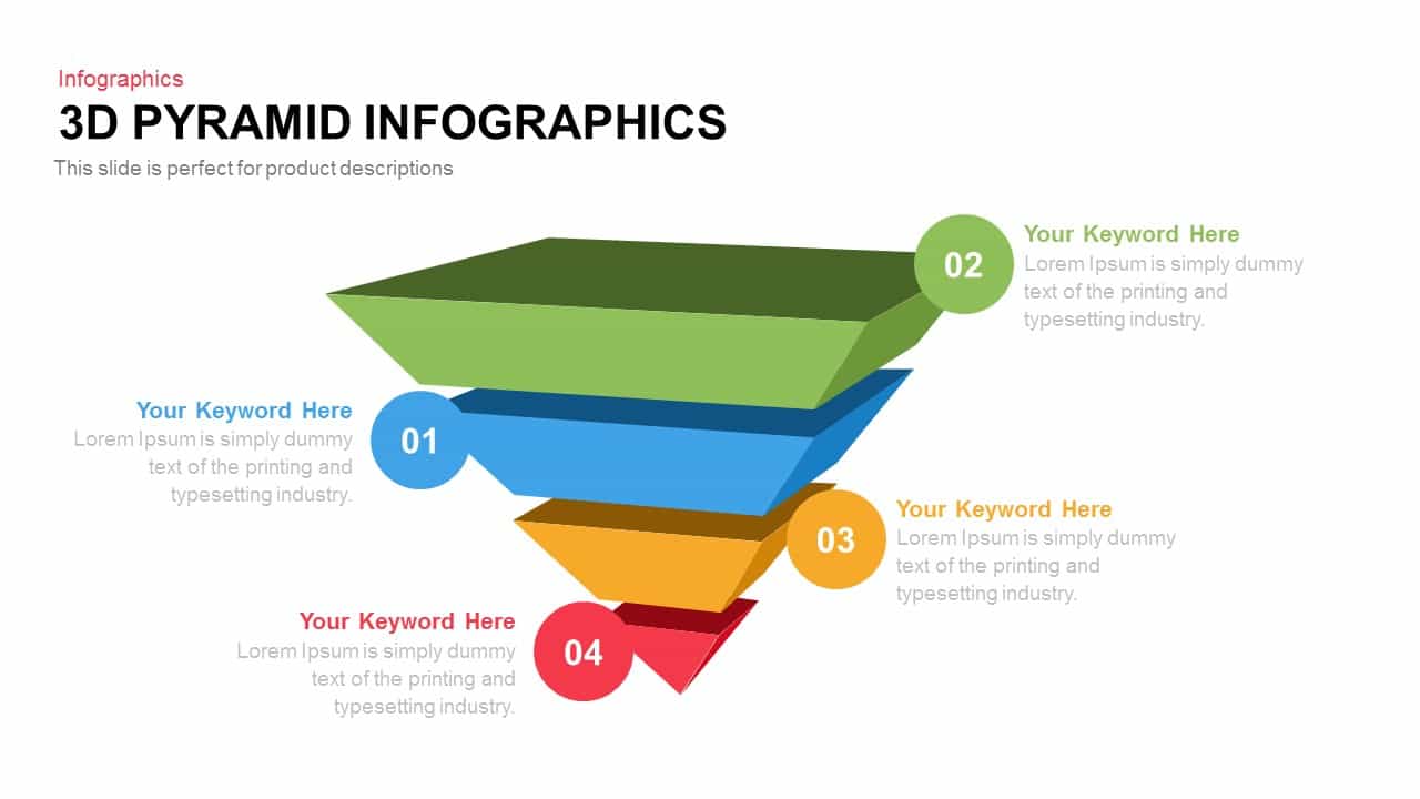
3D Pyramid Infographics Slide Template for PowerPoint & Google Slides
Pyramid
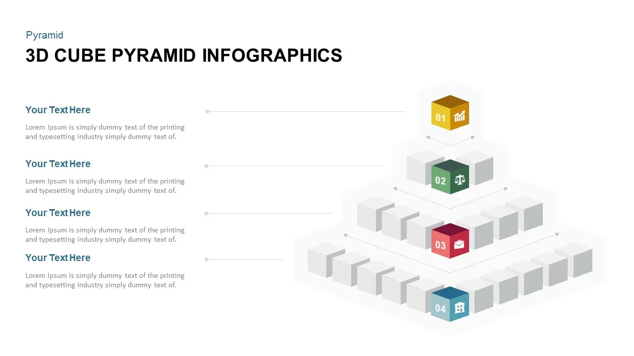
3D Cube Pyramid Infographics Slide Template for PowerPoint & Google Slides
Pyramid
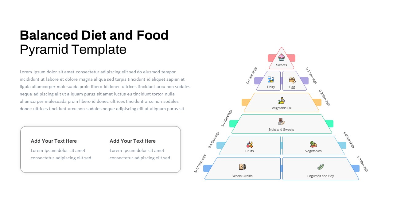
Free Balanced Diet and Food Pyramid Template for PowerPoint & Google Slides
Pyramid
Free
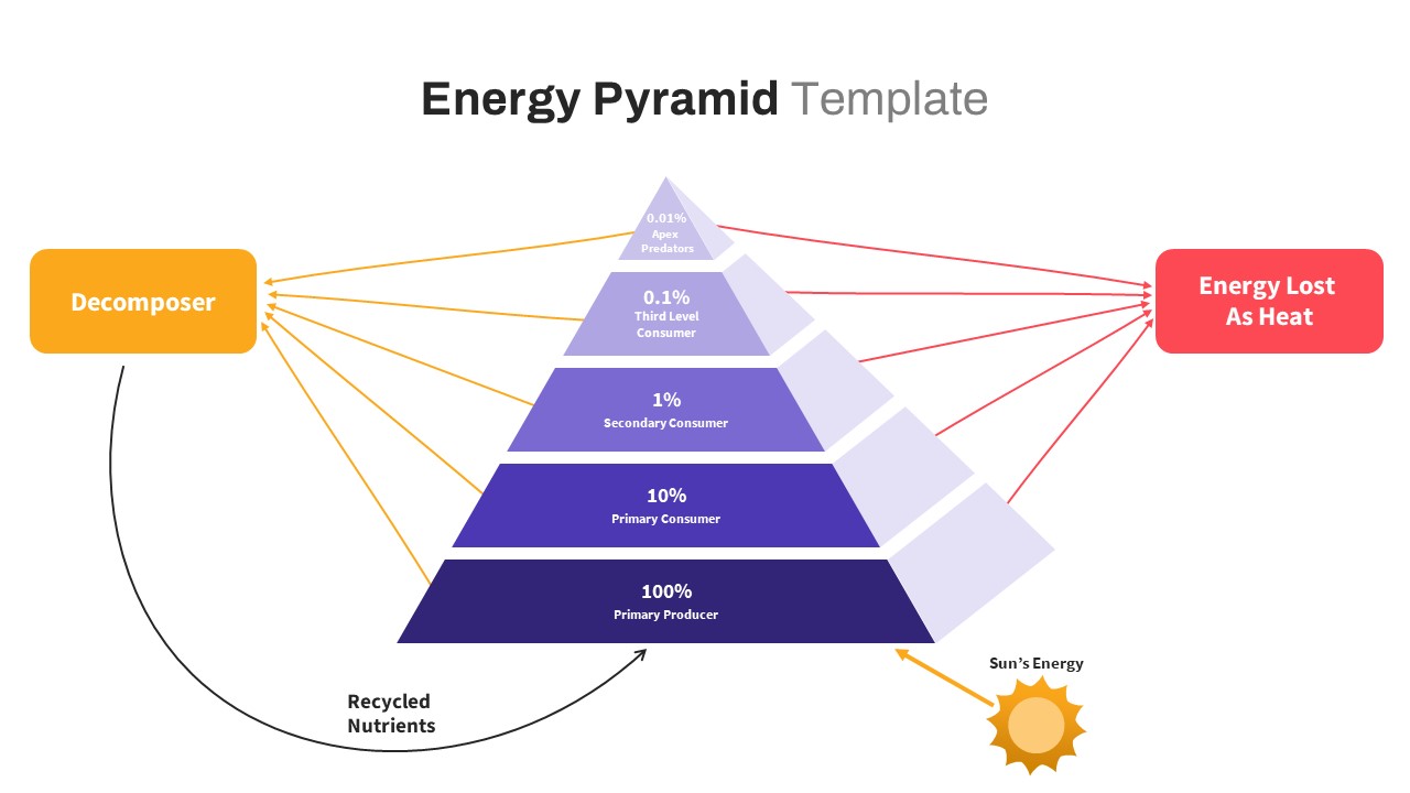
Free Ecological Energy Flow Pyramid Template for PowerPoint & Google Slides
Pyramid
Free
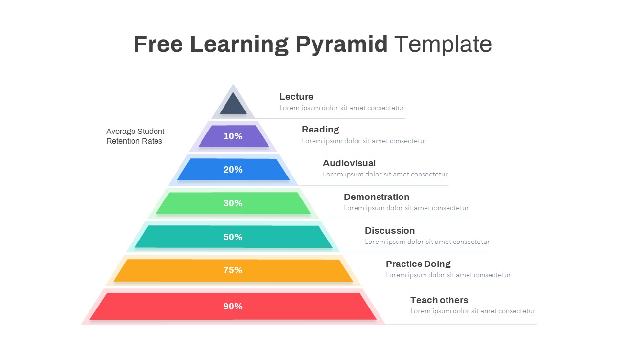
Free Learning Retention Pyramid Chart Template for PowerPoint & Google Slides
Pyramid
Free
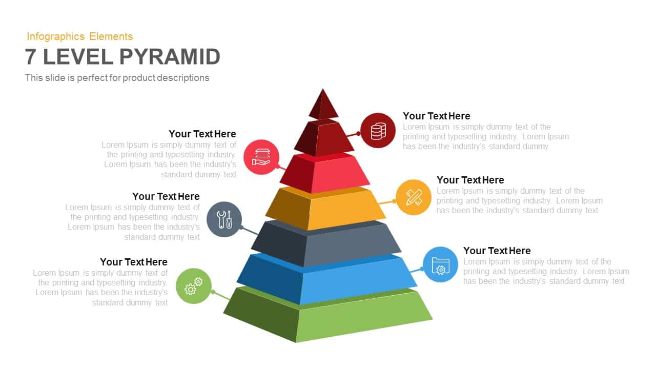
7-Level 3D Pyramid Infographic Diagram Template for PowerPoint & Google Slides
Pyramid
4-Step 3D Pyramid Diagram with Callouts template for PowerPoint & Google Slides
Pyramid
Professional 5-Stage Pyramid Diagram Template for PowerPoint & Google Slides
Pyramid
Professional 4-Piece 3D Pyramid Diagram Template for PowerPoint & Google Slides
Pyramid
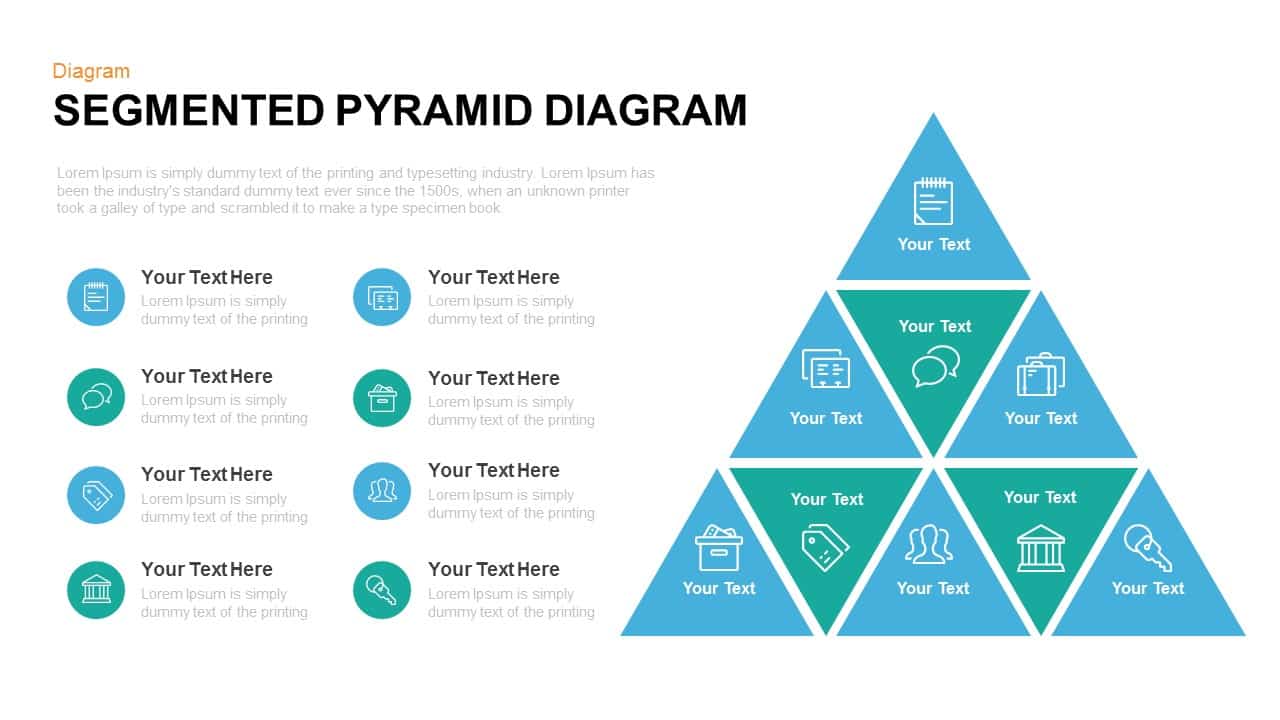
Segmented Pyramid Diagram Infographic Template for PowerPoint & Google Slides
Pyramid
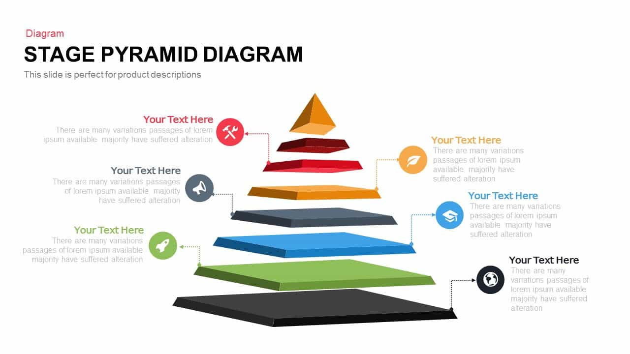
Editable Six-Level 3D Pyramid Diagram Template for PowerPoint & Google Slides
Pyramid

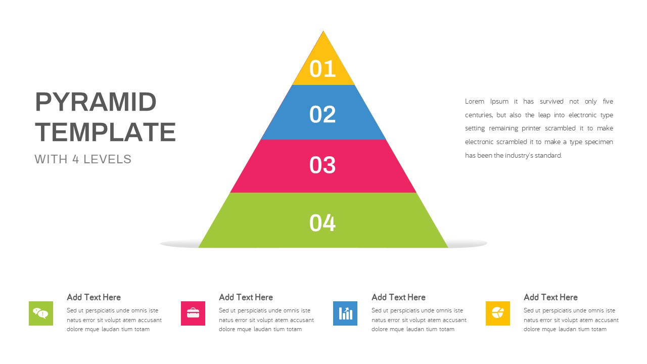
Four-Level Business Pyramid Diagram Template for PowerPoint & Google Slides
Pyramid
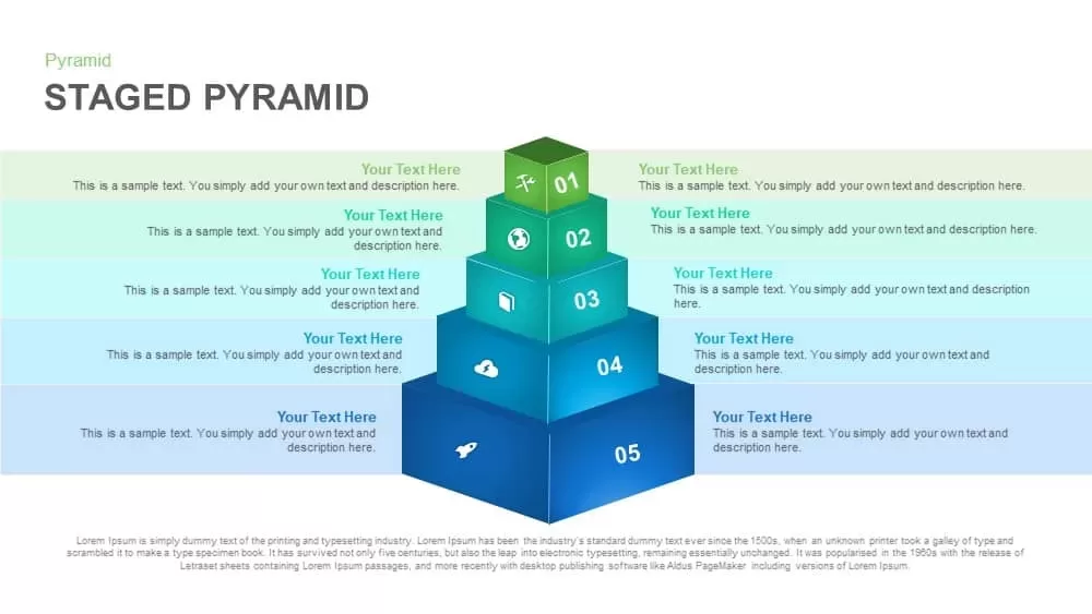
Five-Level Staged Pyramid Diagram Template for PowerPoint & Google Slides
Pyramid
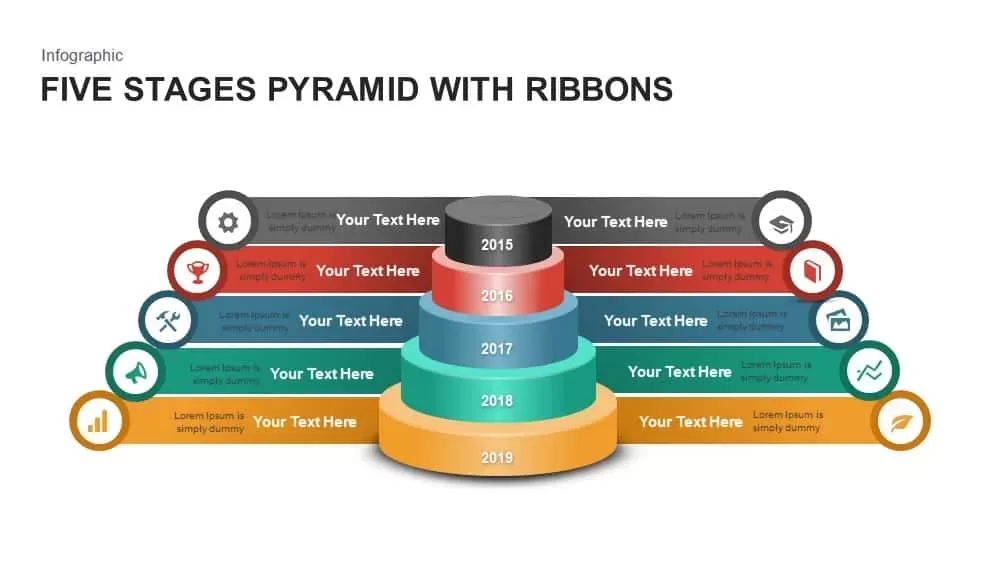
Five Stages Pyramid with Ribbons Diagram Template for PowerPoint & Google Slides
Pyramid
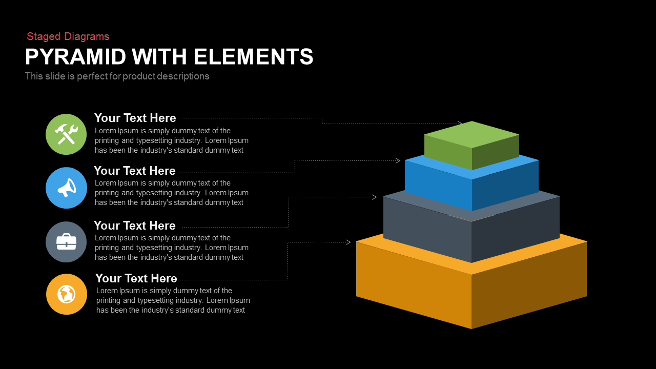
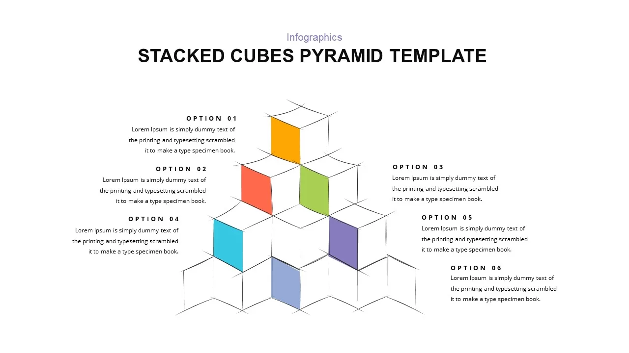
Stacked Cubes Pyramid Six-Option Diagram Template for PowerPoint & Google Slides
Pyramid
3D Four-Stage Pyramid Diagram Template for PowerPoint & Google Slides
Pyramid
Four-Level Colorful Pyramid Diagram Template for PowerPoint & Google Slides
Pyramid
3D Six-Level Pyramid Diagram Infographic Template for PowerPoint & Google Slides
Pyramid
3D Five-Stage Pyramid Diagram Slide Template for PowerPoint & Google Slides
Pyramid
Modern Four-Level Pyramid Diagram Template for PowerPoint & Google Slides
Pyramid
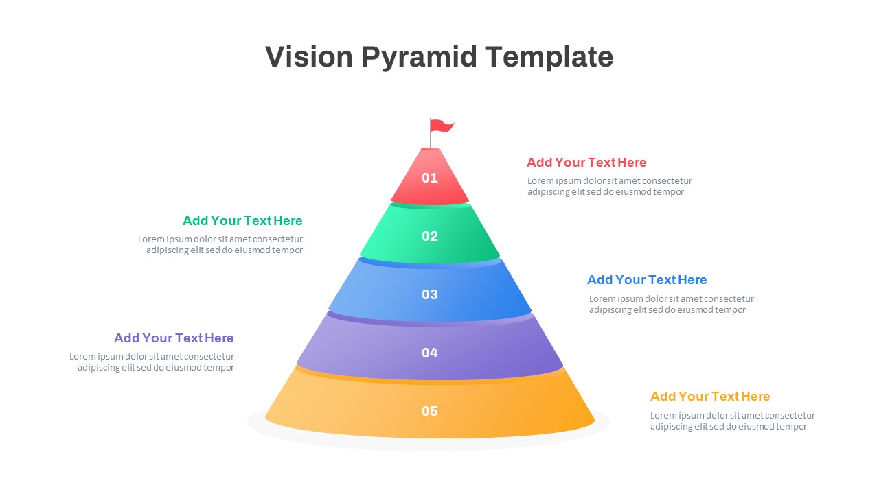
Five-Level Vision Pyramid Diagram Template for PowerPoint & Google Slides
Pyramid
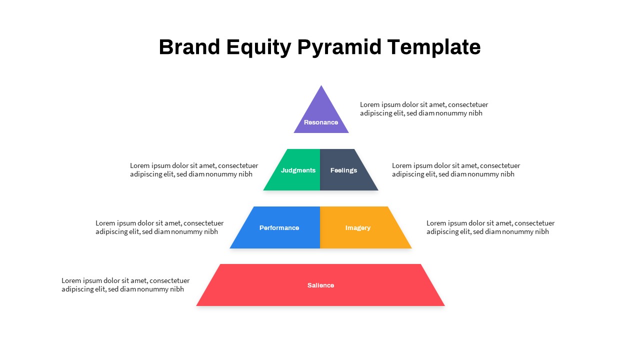
Strategic Brand Equity Pyramid Diagram Template for PowerPoint & Google Slides
Pyramid
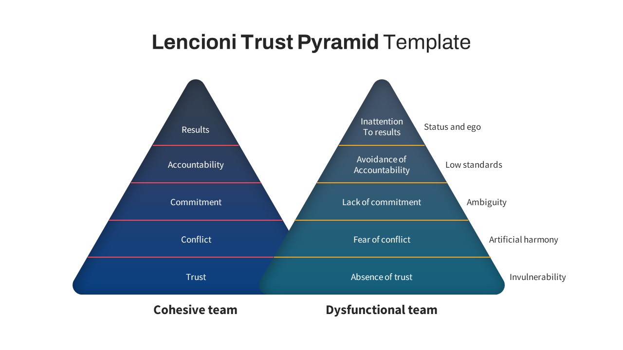
Lencioni Trust Pyramid Diagram Template for PowerPoint & Google Slides
Pyramid
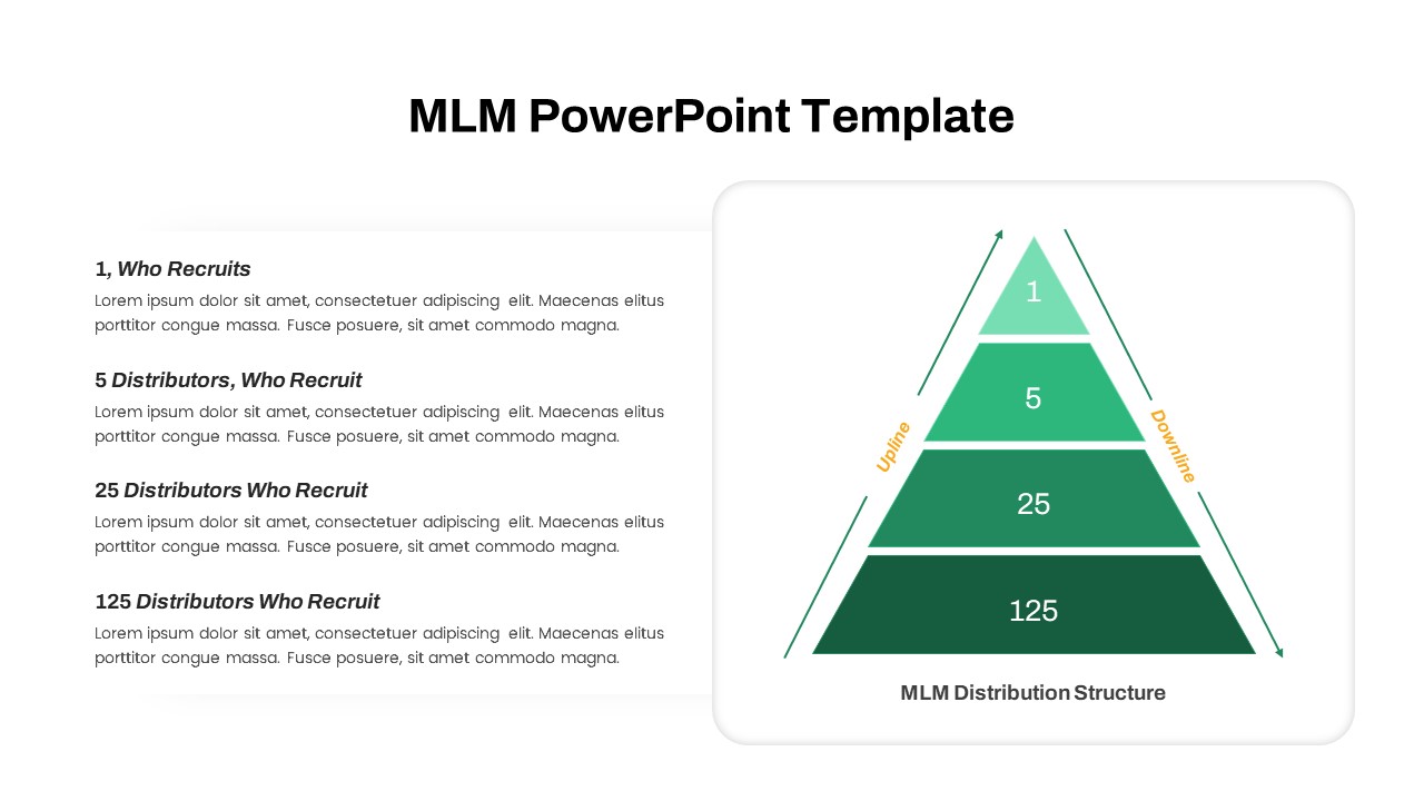
MLM Distribution Pyramid Diagram Template for PowerPoint & Google Slides
Business Models
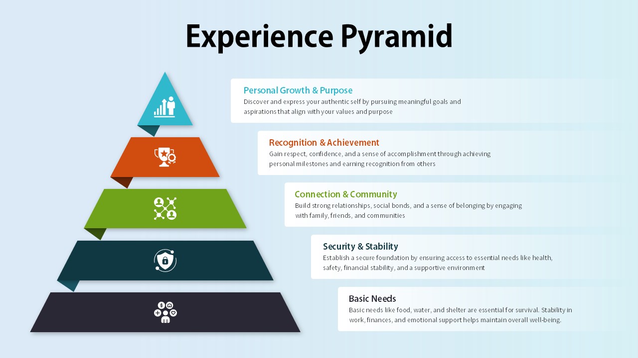
Experience Pyramid Hierarchy Diagram Template for PowerPoint & Google Slides
Pyramid
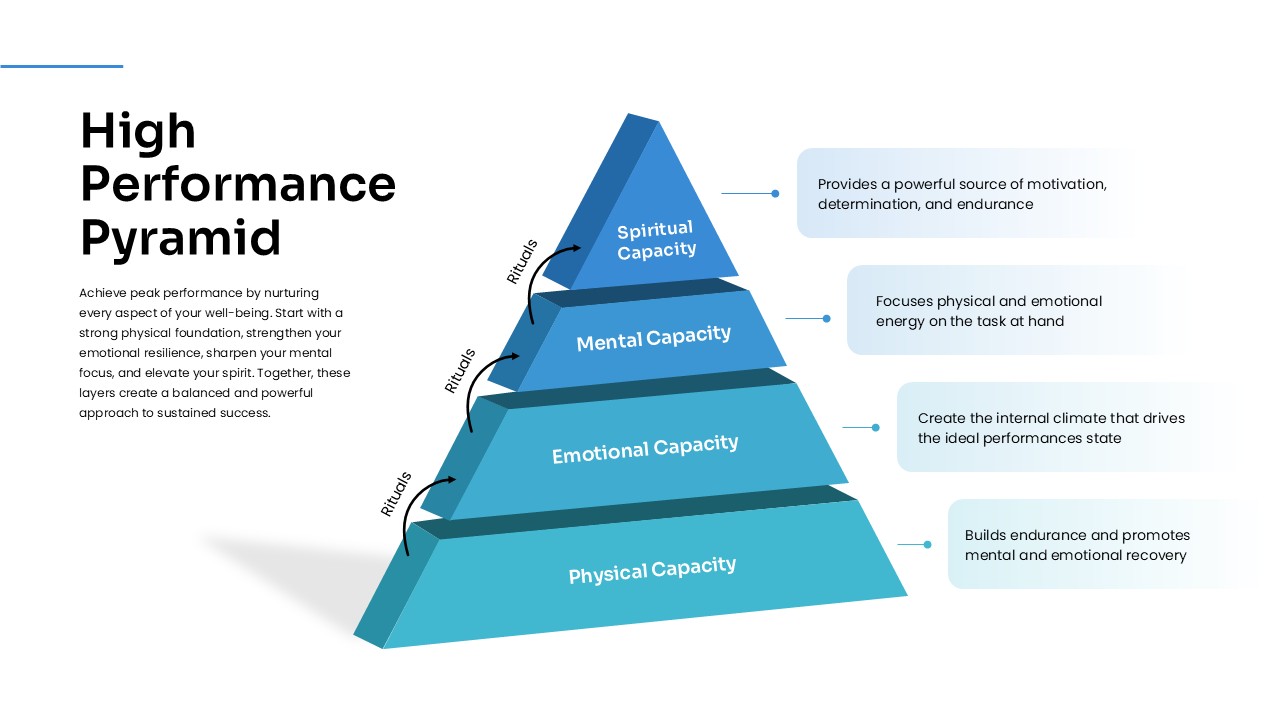
High Performance Pyramid Diagram Template for PowerPoint & Google Slides
Pyramid
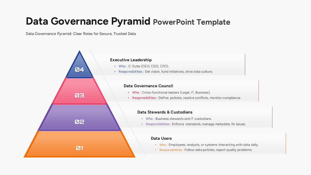
Data Governance Roles Pyramid Diagram Template for PowerPoint & Google Slides
Pyramid
Four-Level Colorful Pyramid Diagram Template for PowerPoint & Google Slides
Pyramid

3D Pyramid Diagram for PowerPoint & Google Slides
Pyramid
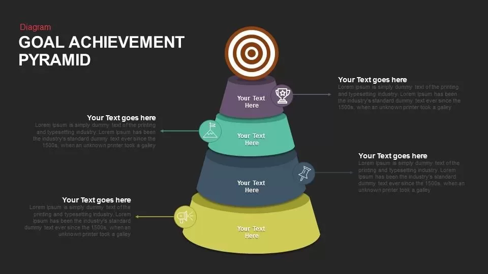
Goal Achievement Pyramid Diagram for PowerPoint & Google Slides
Pyramid
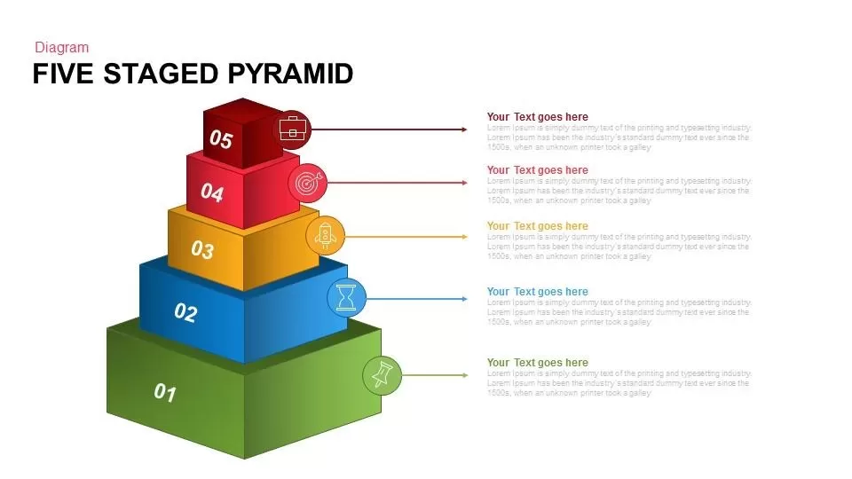
Five Staged Pyramid Diagram for PowerPoint & Google Slides
Pyramid
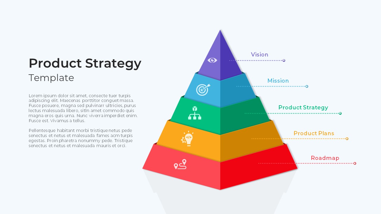
Product Strategy Pyramid Diagram for PowerPoint & Google Slides
Business Strategy
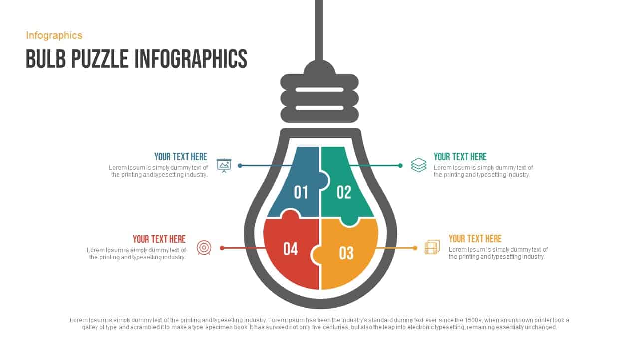
Free Bulb Puzzle Infographics Diagram Template for PowerPoint & Google Slides
Process
Free
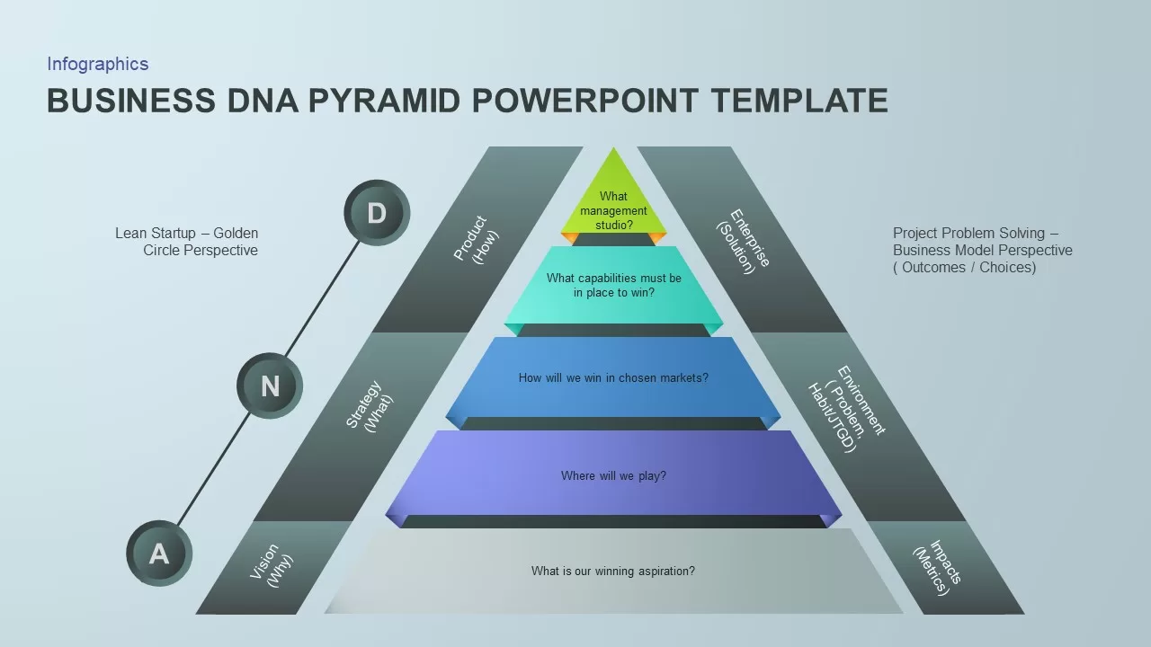
Business DNA Pyramid PowerPoint Template for PowerPoint & Google Slides
Pyramid
Pyramid infographic template for PowerPoint & Google Slides
Pyramid
5 Stage Pyramid template for PowerPoint & Google Slides
Pyramid
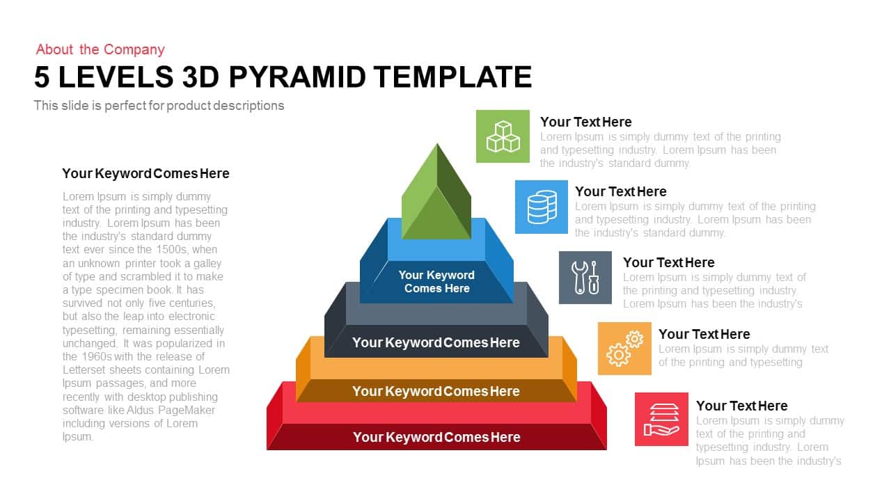
Five-Level 3D Pyramid Hierarchy Template for PowerPoint & Google Slides
Pyramid
Four-Level 3D Pyramid Infographic Template for PowerPoint & Google Slides
Pyramid

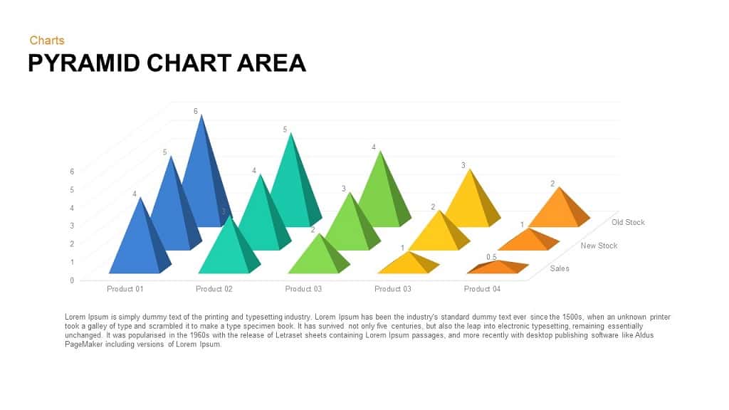
Pyramid Chart Area template for PowerPoint & Google Slides
Pyramid
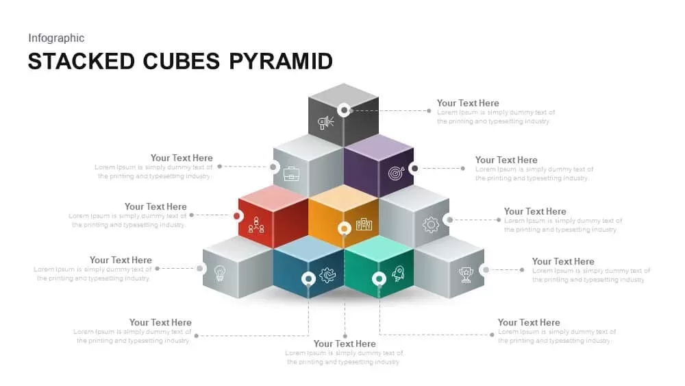
Stacked Cubes Pyramid Infographic Template for PowerPoint & Google Slides
Pyramid
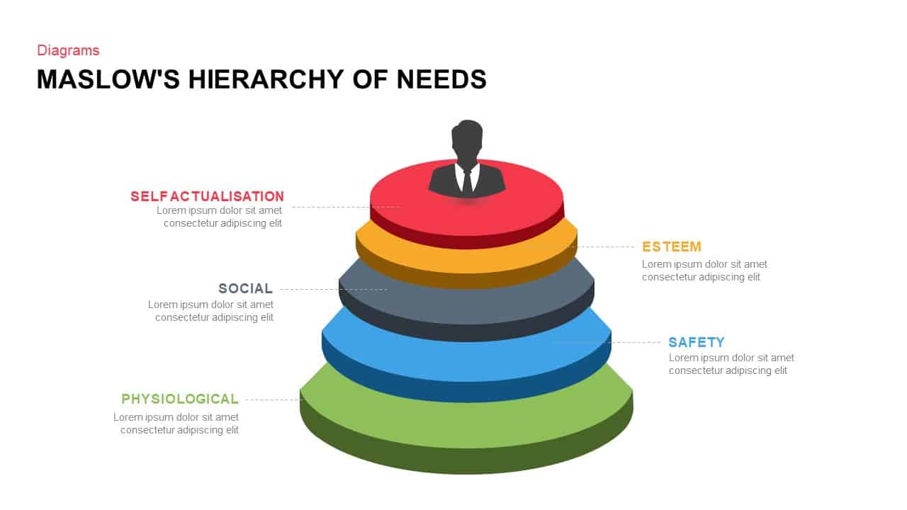
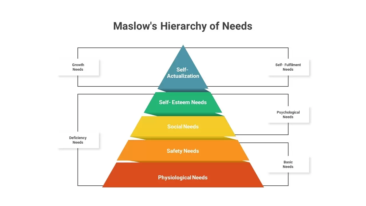
Maslow’s Hierarchy of Needs Pyramid Template for PowerPoint & Google Slides
Pyramid
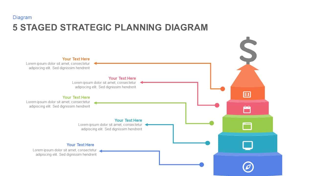
5-Stage Strategic Planning Pyramid Template for PowerPoint & Google Slides
Business Strategy
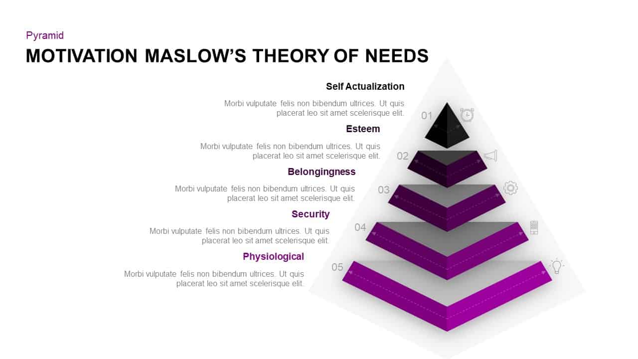
Maslow’s Hierarchy of Needs Theory of Motivat
Pyramid
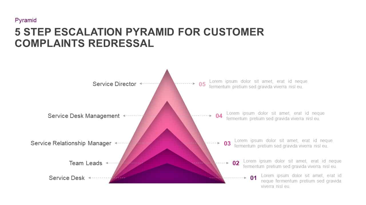
Customer Complaints Escalation Pyramid Template for PowerPoint & Google Slides
Infographics
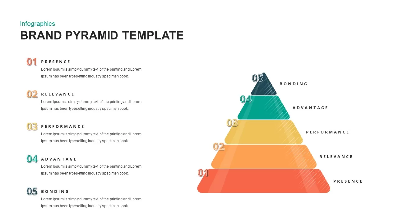
Brand Pyramid Framework template for PowerPoint & Google Slides
Pyramid
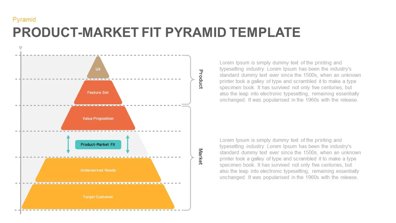
Product-Market Fit Pyramid template for PowerPoint & Google Slides
Pyramid
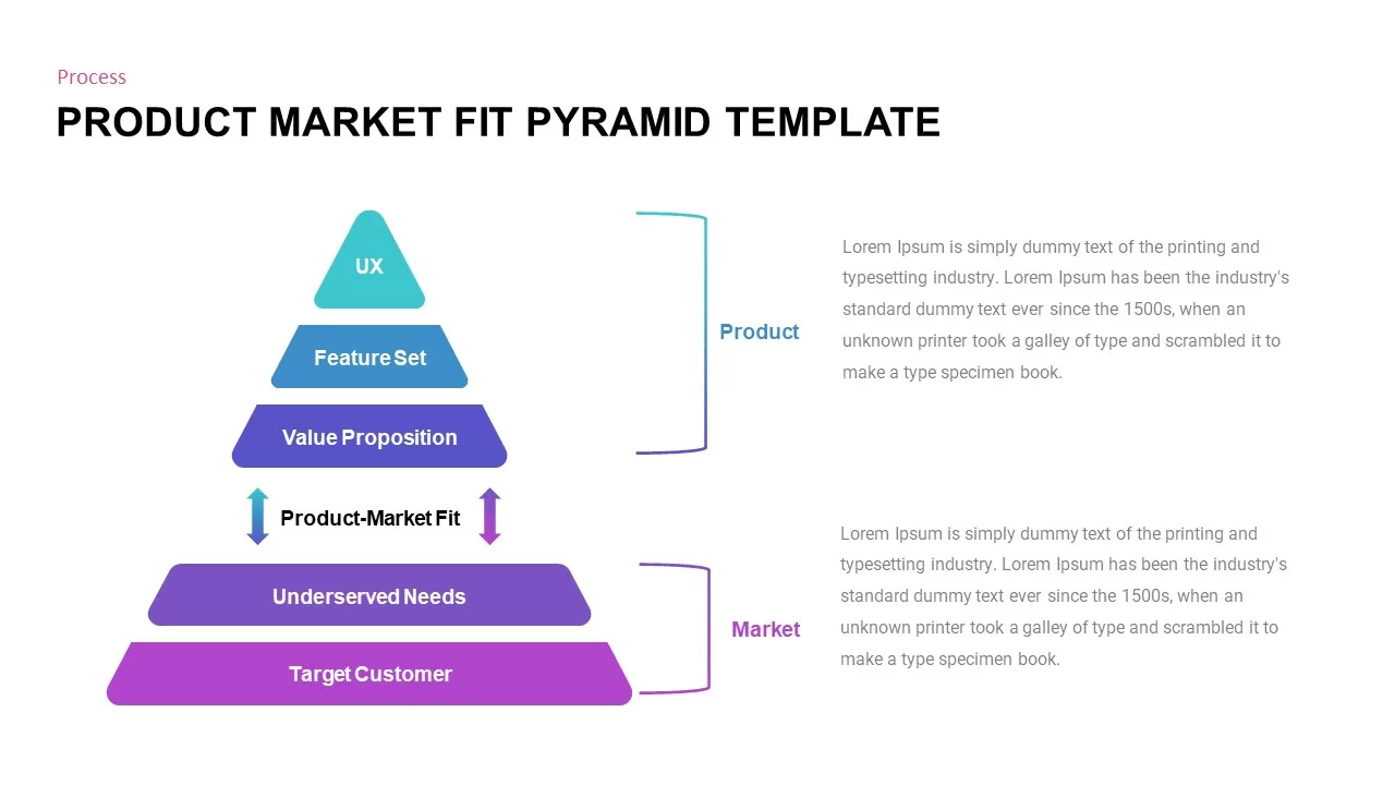
Professional Product Market Fit Pyramid Template for PowerPoint & Google Slides
Pyramid
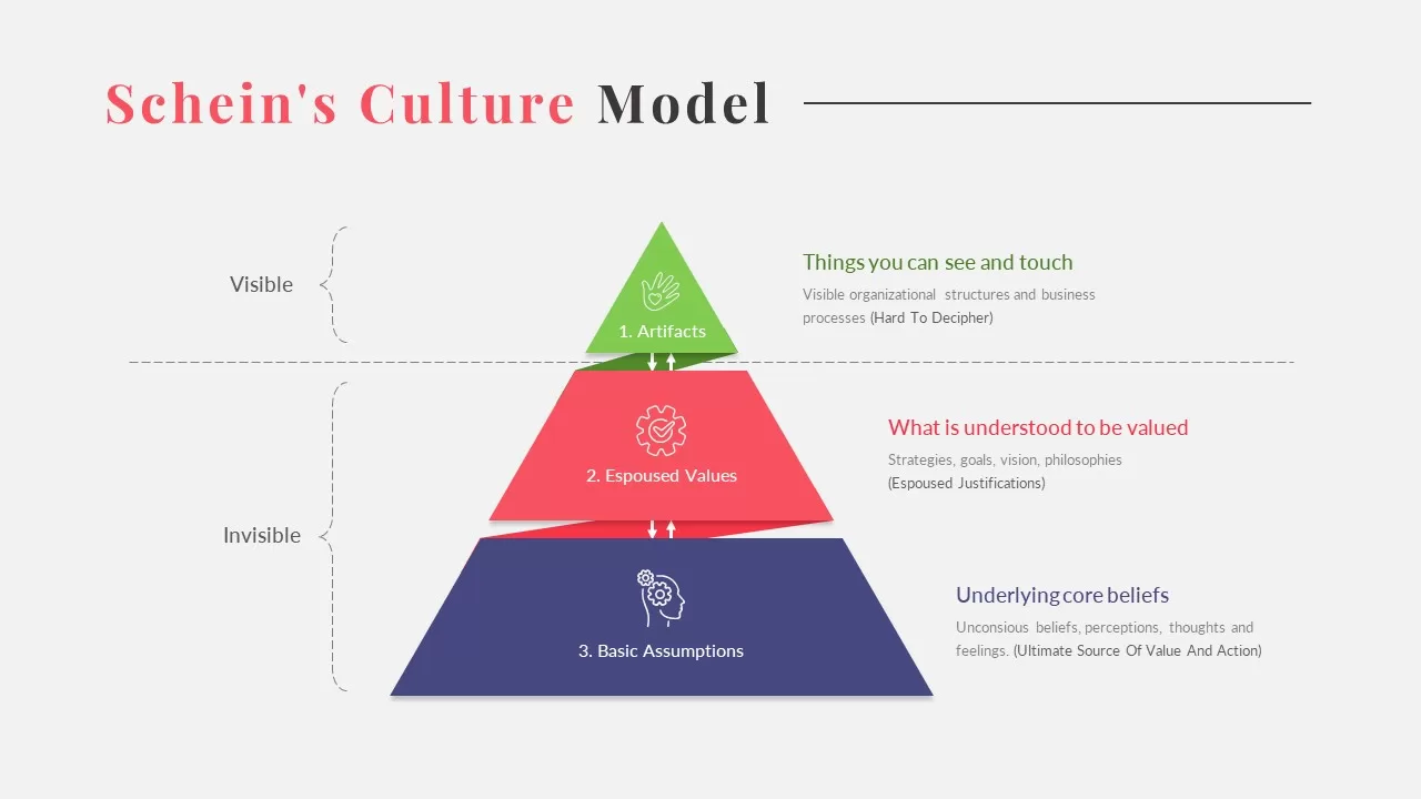
Schein’s Culture Model Template
Pyramid
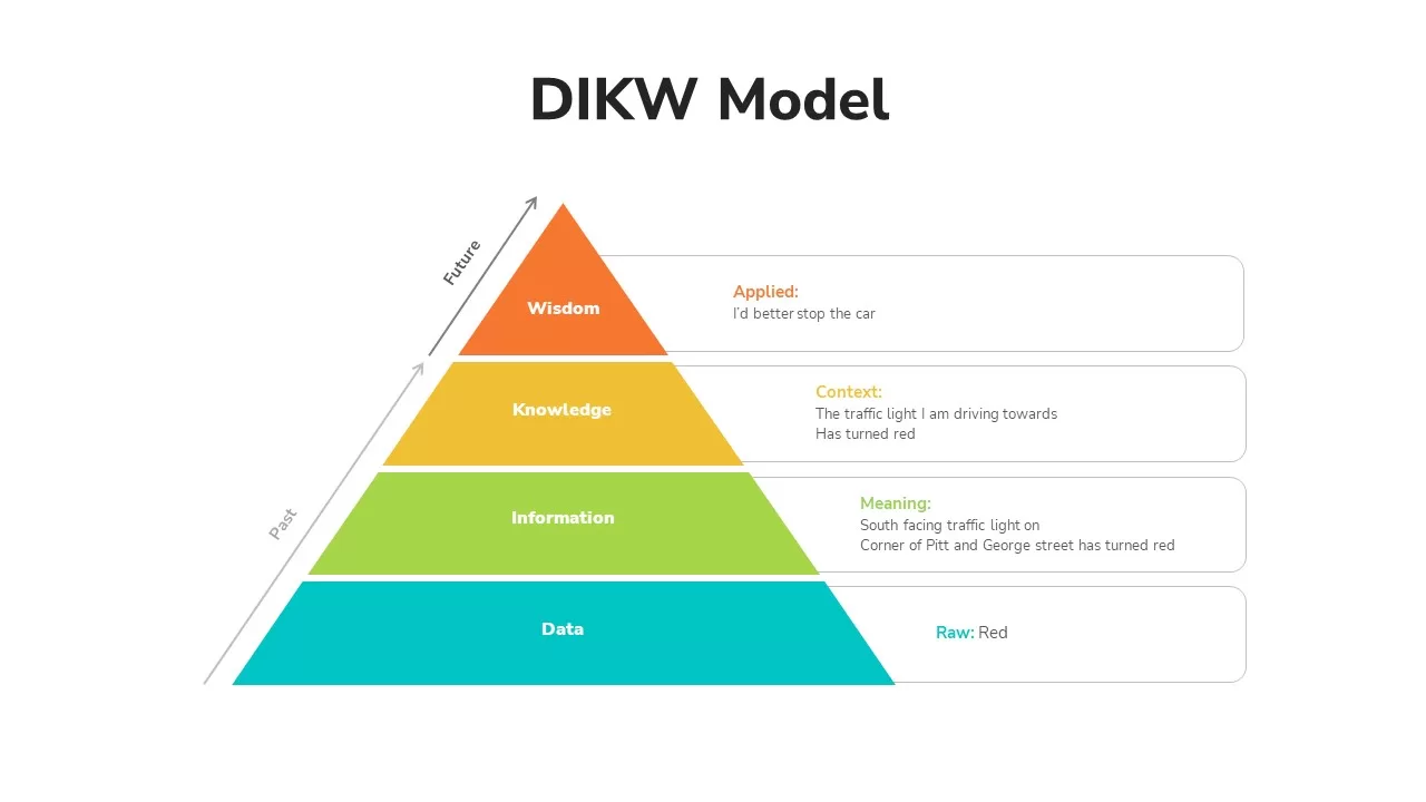
DIKW Data to Wisdom Pyramid Model Template for PowerPoint & Google Slides
Pyramid
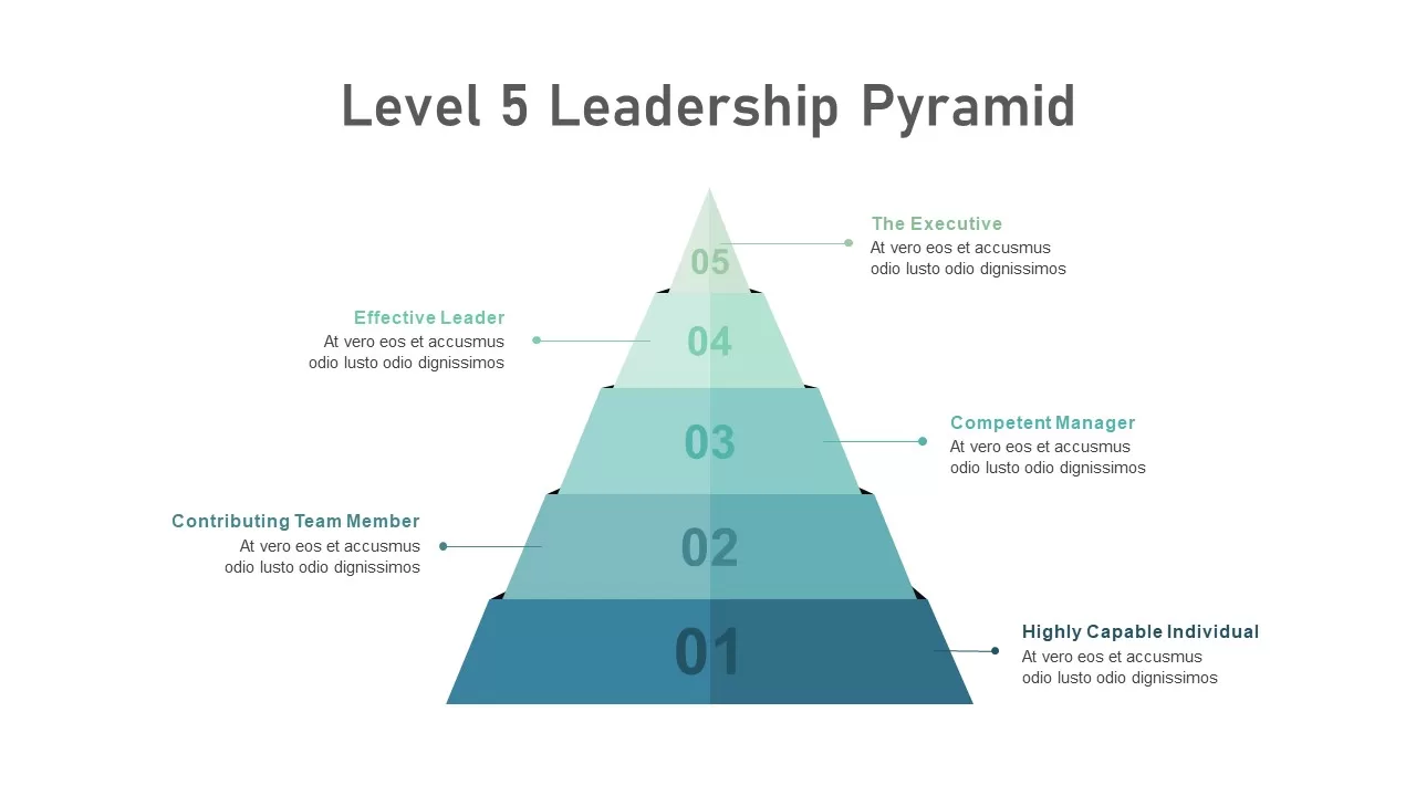
Level 5 Leadership Pyramid Infographic Template for PowerPoint & Google Slides
Pyramid
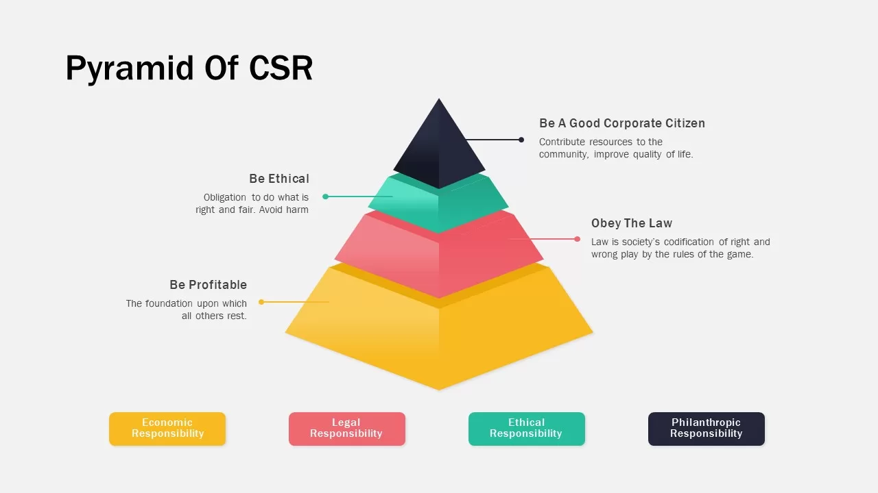
Corporate Social Responsibility Pyramid Template for PowerPoint & Google Slides
Pyramid
Maslow’s Colorful Pyramid of Needs Template for PowerPoint & Google Slides
Pyramid
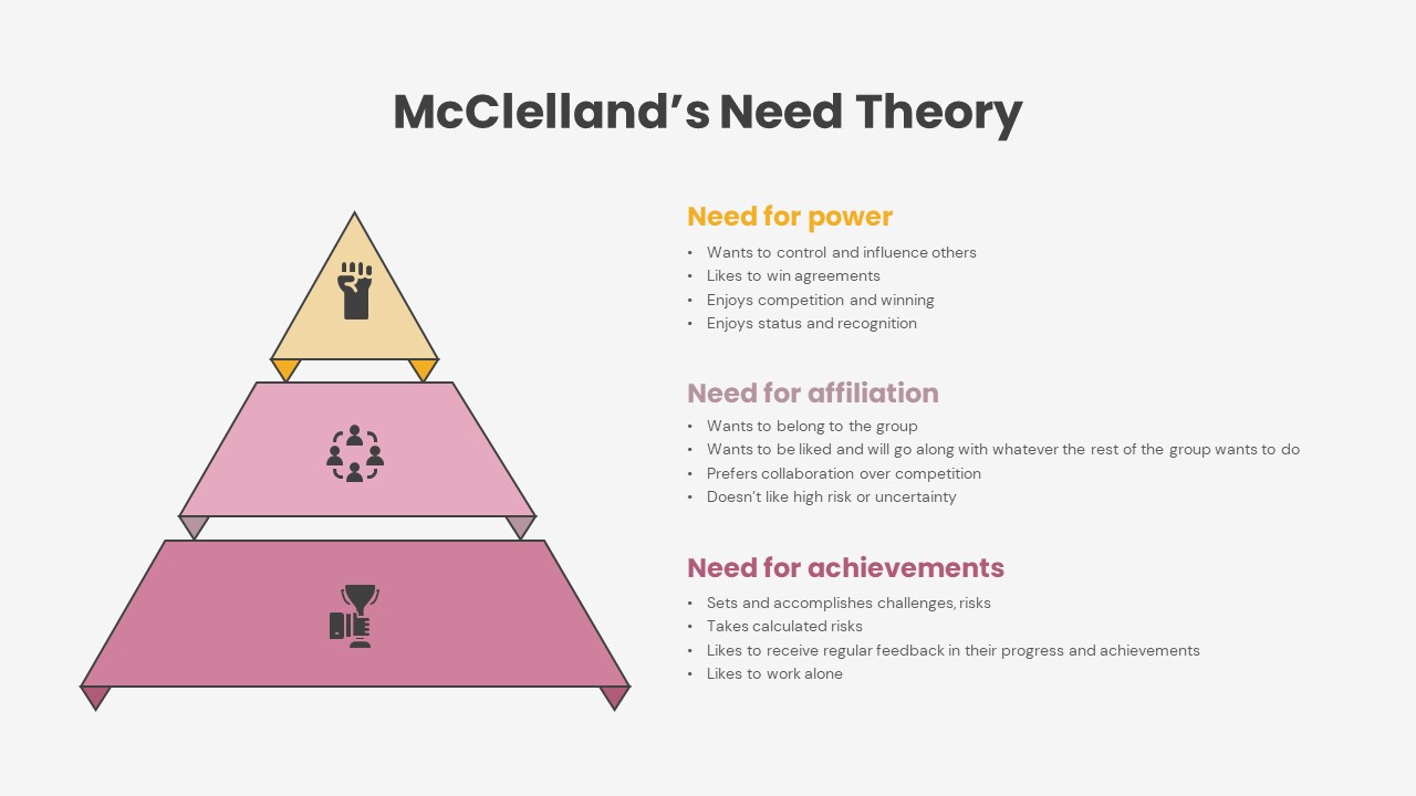
McClelland Theory of Motivation PPT
Pyramid
Five-Stage Pyramid Process Slide Template for PowerPoint & Google Slides
Pyramid
Six-Stage Pyramid Process Slide Template for PowerPoint & Google Slides
Pyramid
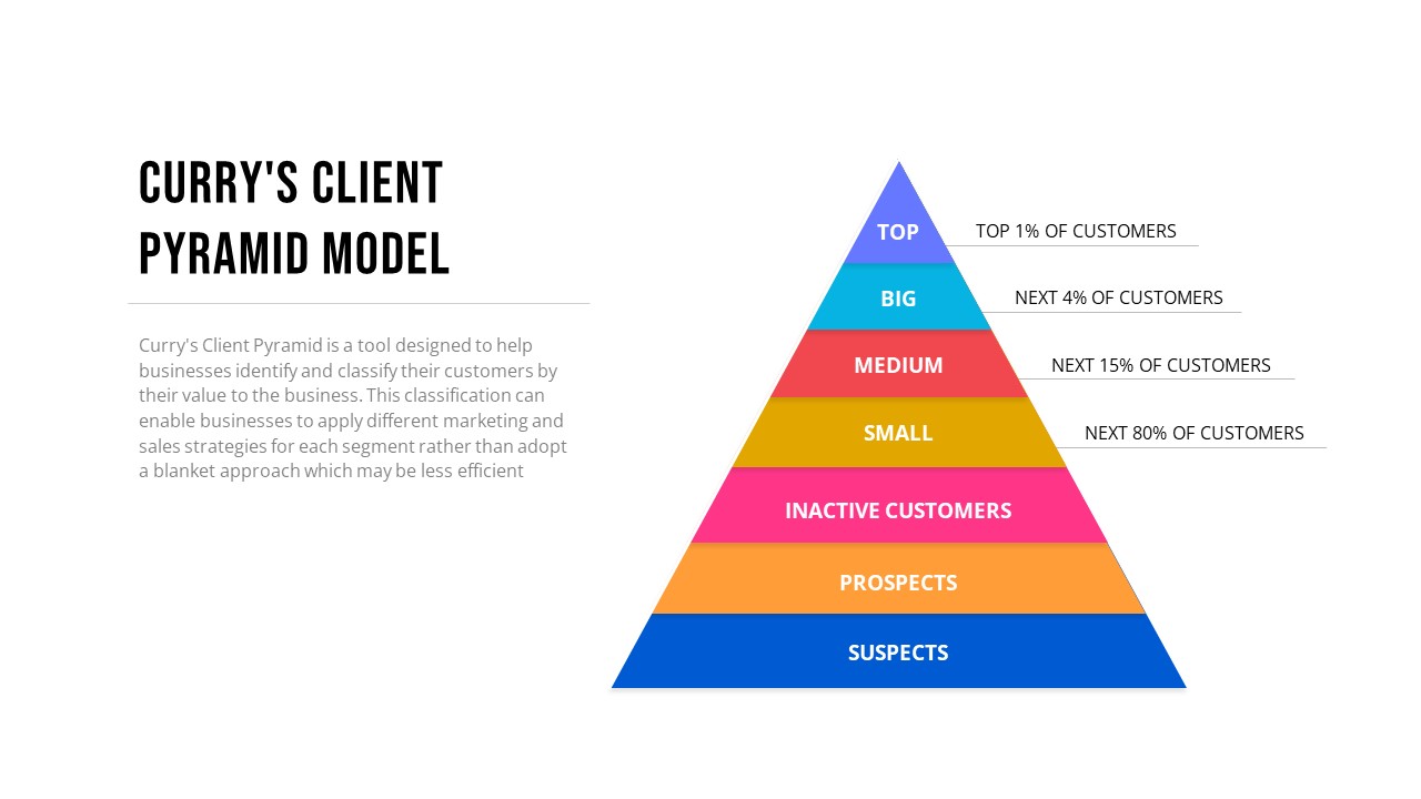
Curry’s Client Segmentation Pyramid Model Template for PowerPoint & Google Slides
Pyramid
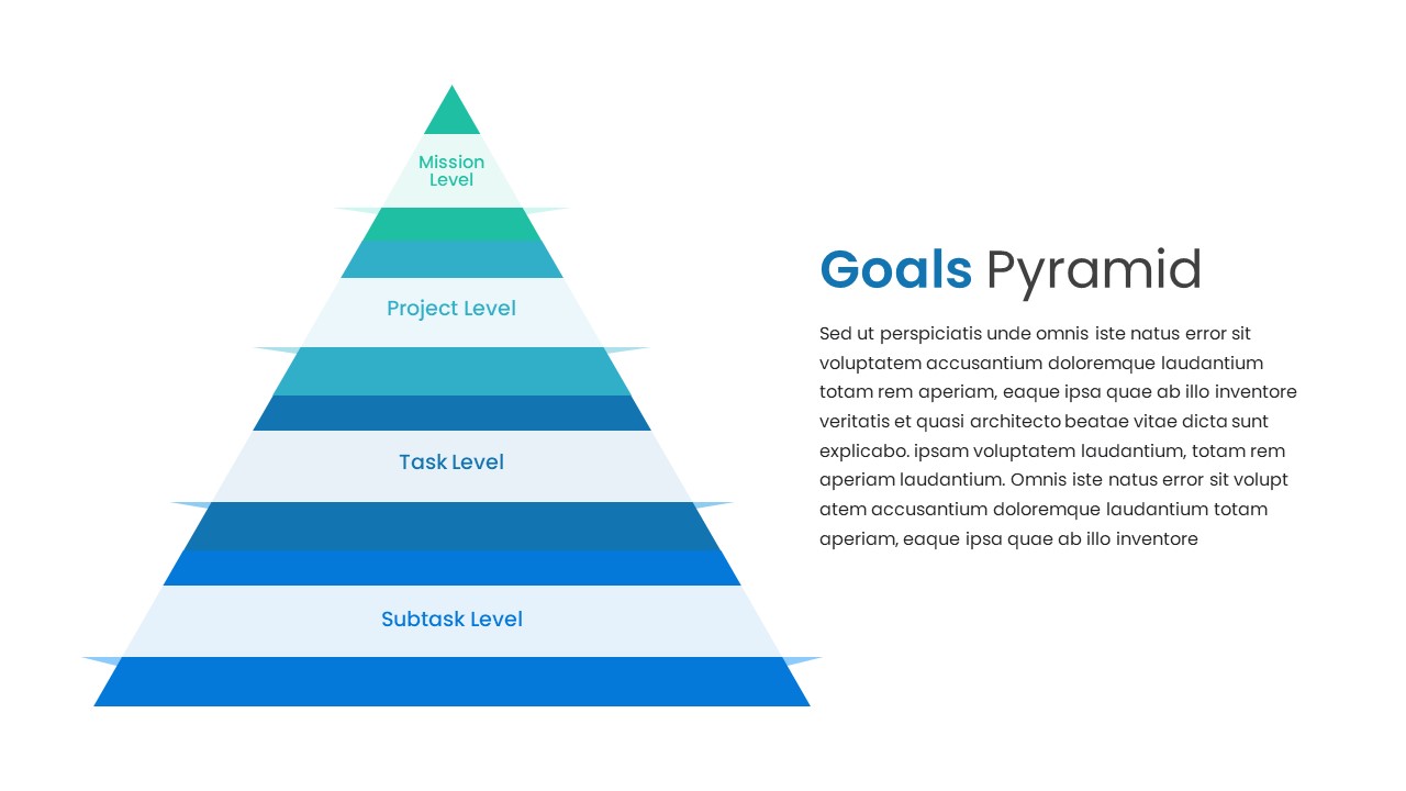
Goals Pyramid Hierarchy Slide Design Template for PowerPoint & Google Slides
Pyramid
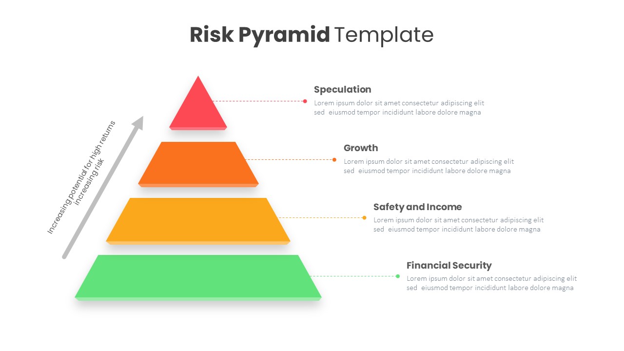
Risk Pyramid Hierarchy Analysis Template for PowerPoint & Google Slides
Pyramid
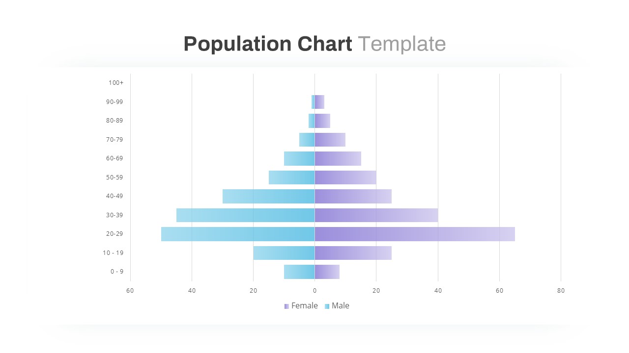
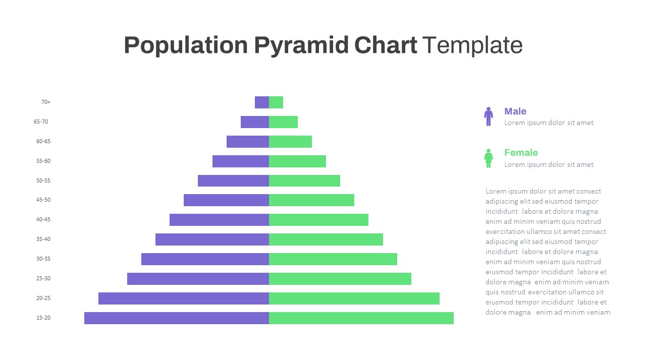
Population Pyramid Chart Analysis Template for PowerPoint & Google Slides
Bar/Column
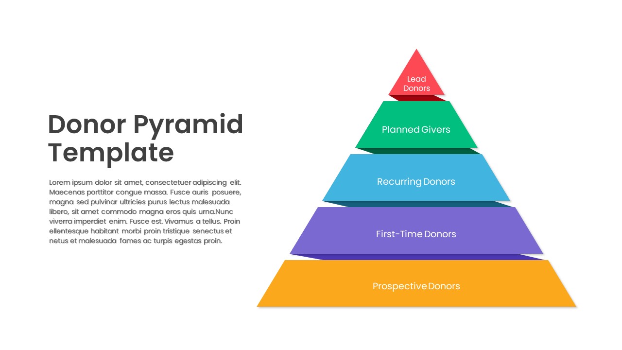
Donor Pyramid PowerPoint Template
Pyramid
Population Age Distribution Pyramid Chart Template for PowerPoint & Google Slides
Pyramid
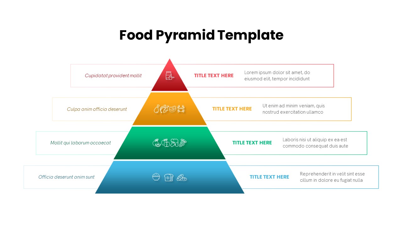
Four-Level Food Pyramid Infographic Template for PowerPoint & Google Slides
Pyramid
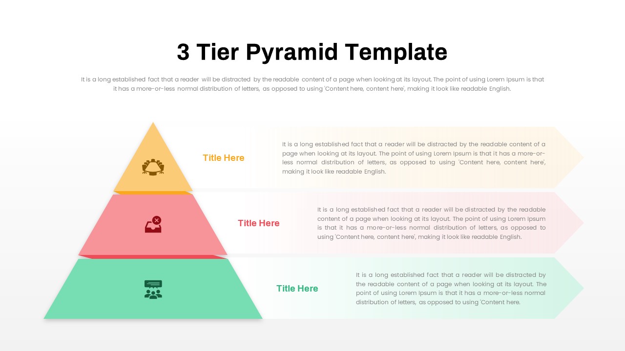
3 Tier Pyramid Template for PowerPoint & Google Slides
Pyramid
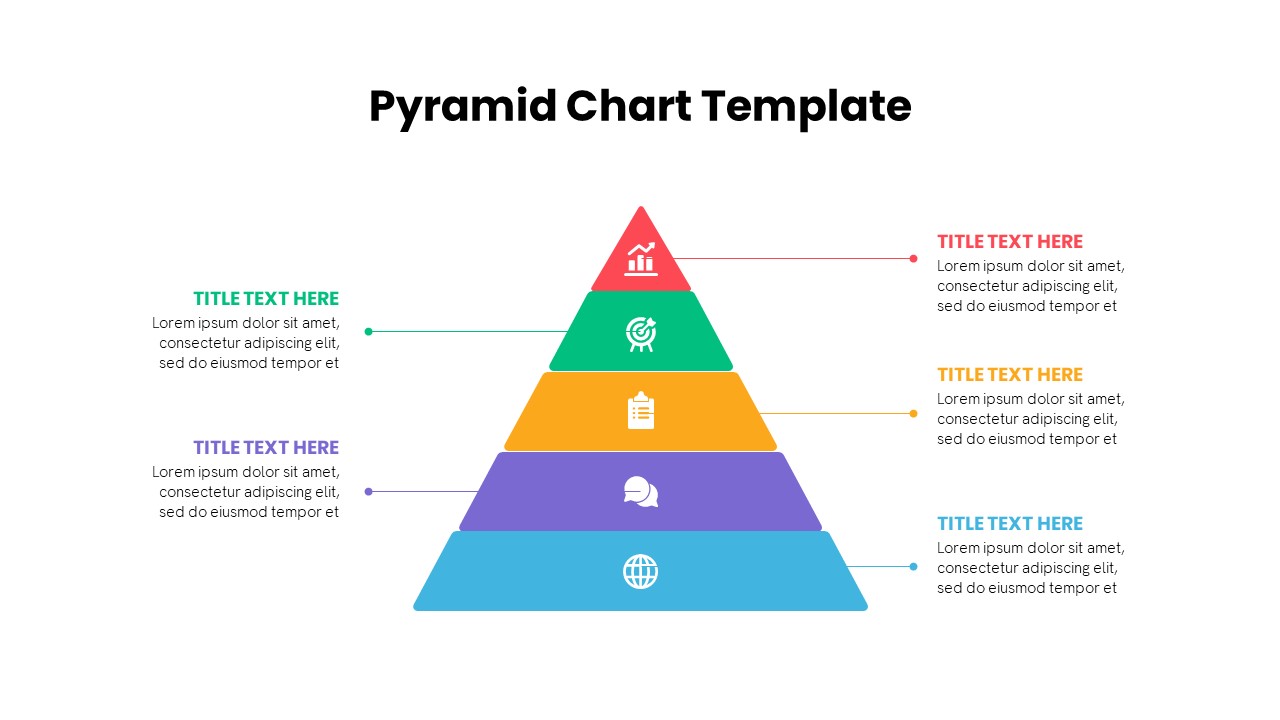
Multi-Level Colorful Pyramid Chart Template for PowerPoint & Google Slides
Pyramid
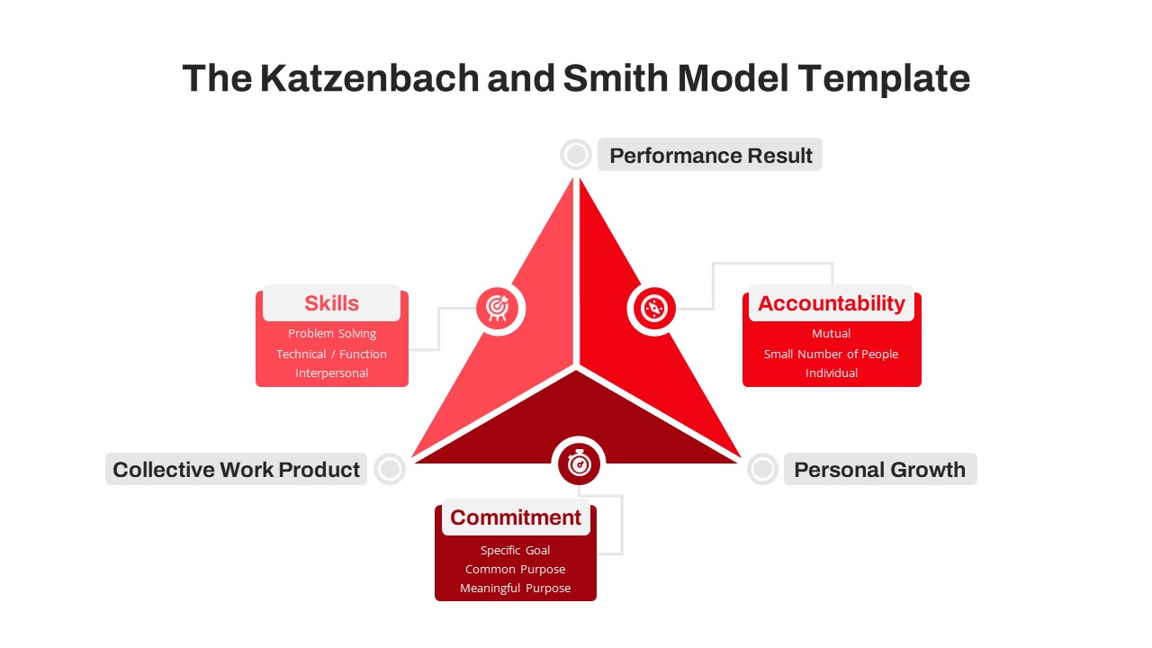
Katzenbach & Smith Model Pyramid Template for PowerPoint & Google Slides
Pyramid
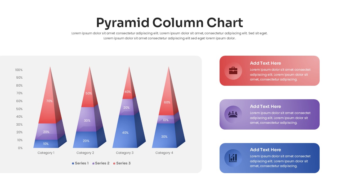
3D Pyramid Column Chart Infographic Template for PowerPoint & Google Slides
Bar/Column
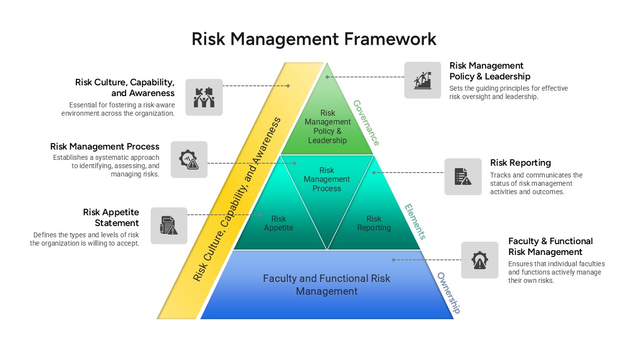
Risk Management Framework Pyramid Template for PowerPoint & Google Slides
Risk Management
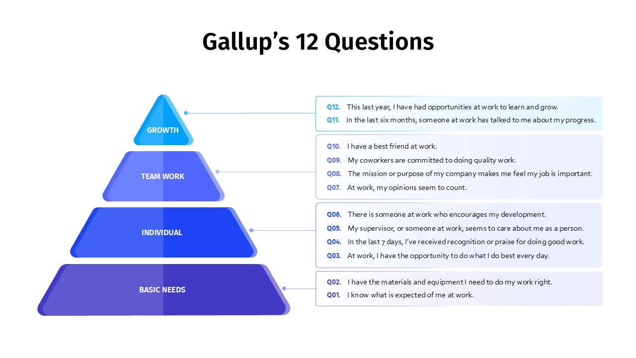
Gallup’s 12 Questions Engagement Pyramid Template for PowerPoint & Google Slides
Pyramid
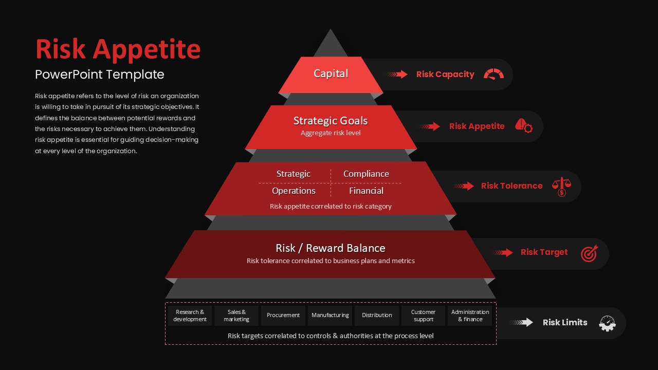
Risk Appetite Pyramid Framework Template for PowerPoint & Google Slides
Pyramid
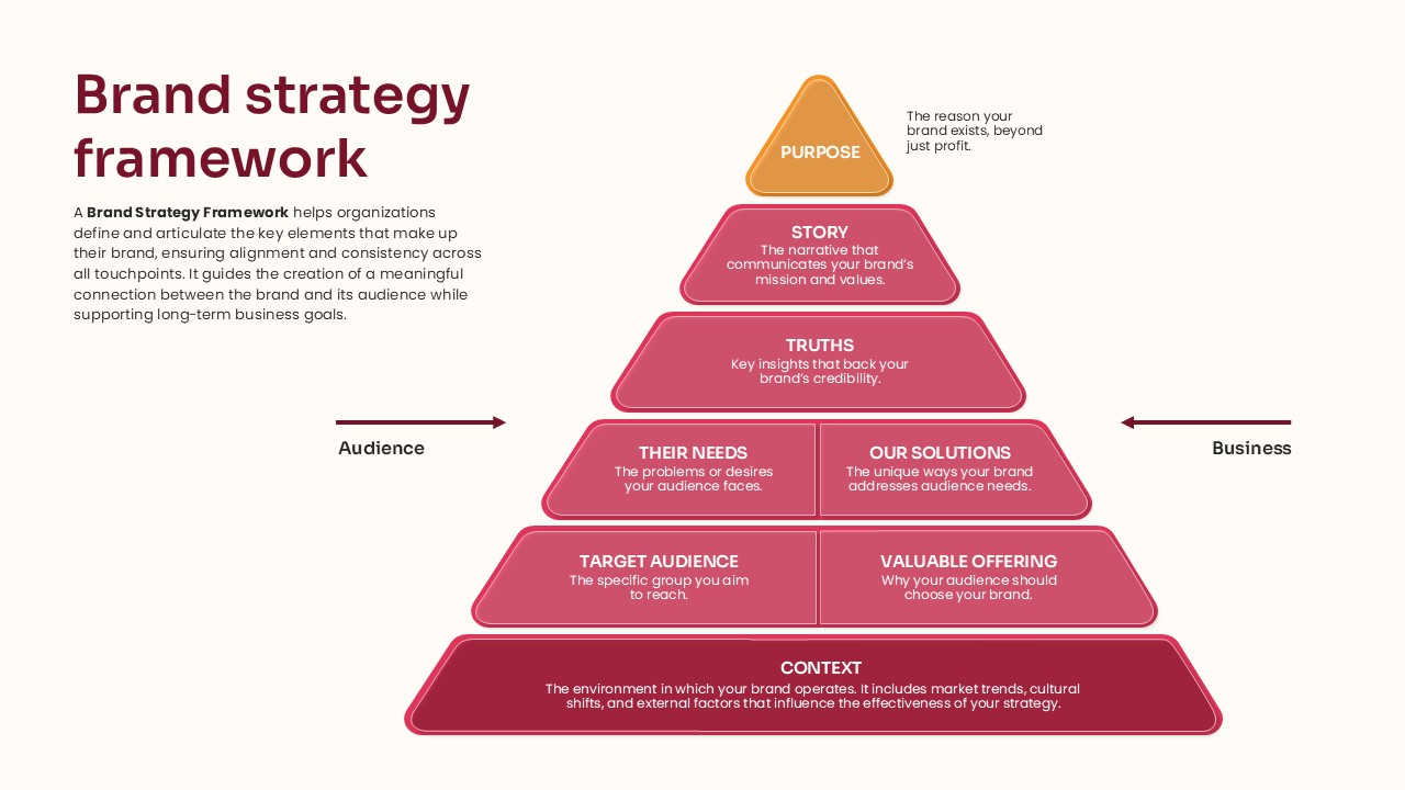
Pyramid Brand Strategy Framework Template for PowerPoint & Google Slides
Business Strategy
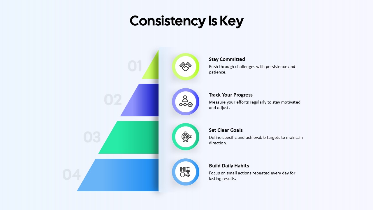
Consistency Is Key Four-Step Pyramid Template for PowerPoint & Google Slides
Process
Five-Stage Pyramid Template for PowerPoint & Google Slides
Pyramid
Four Level Pyramid Infographic Template for PowerPoint & Google Slides
Pyramid
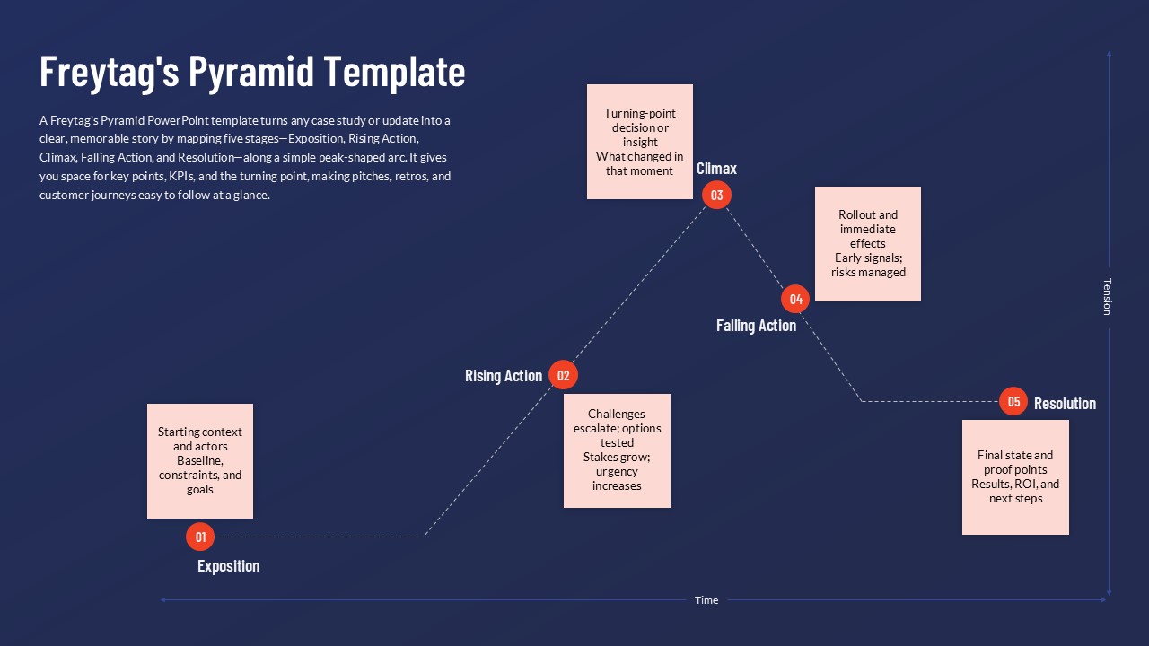
Freytag’s Pyramid Template for PowerPoint & Google Slides
Process
5 Level Hierarchy Pyramid Template for PowerPoint & Google Slides
Pyramid
3 Stage Pyramid Slides for PowerPoint & Google Slides
Pyramid
5 Stage Pyramid Slide for PowerPoint & Google Slides
Pyramid
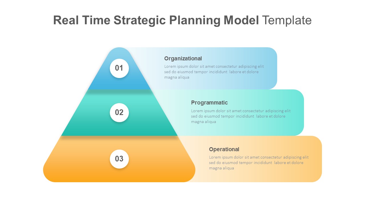
Real-Time Strategic Planning Pyramid Slide for PowerPoint & Google Slides
Business Strategy
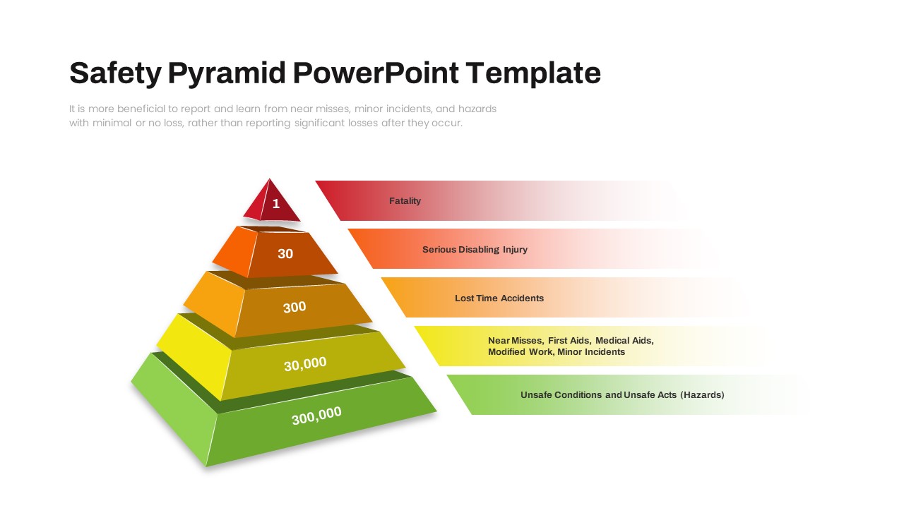
Safety Pyramid PowerPoint Template
Risk Management
True vs. Incomplete MVP Pyramid Slide for PowerPoint & Google Slides
Pyramid
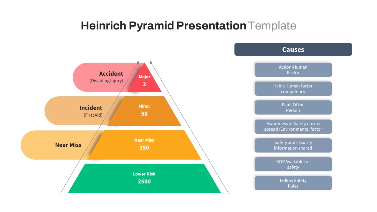
Heinrich Safety Pyramid Theory PPT & Google Slides
Pyramid
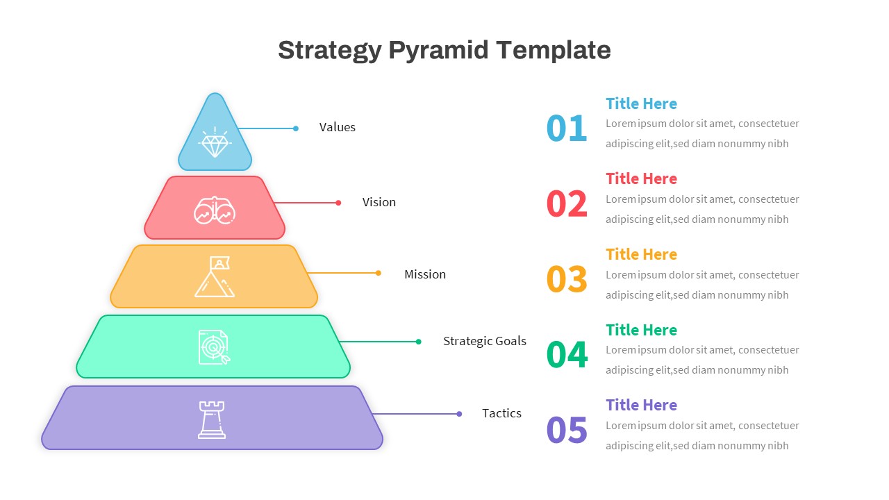
Business Strategy Pyramid with Goals and Tactics for PowerPoint & Google Slides
Pyramid
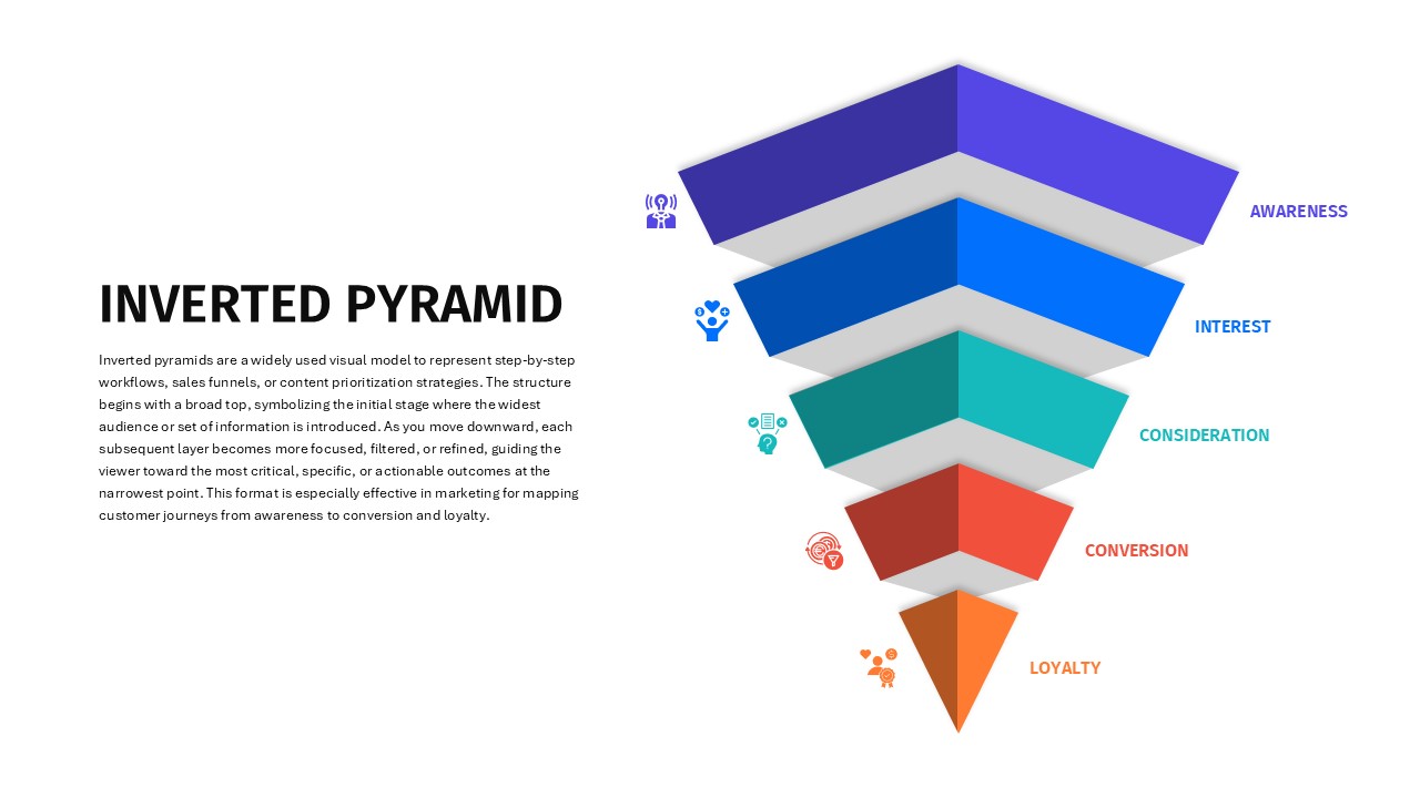
Inverted Pyramid for PowerPoint & Google Slides
Funnel
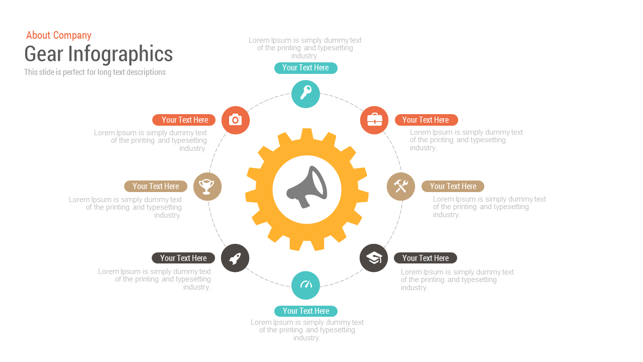
Free Gear Infographics Template Editable In PowerPoint & Google Slides
Process
Free
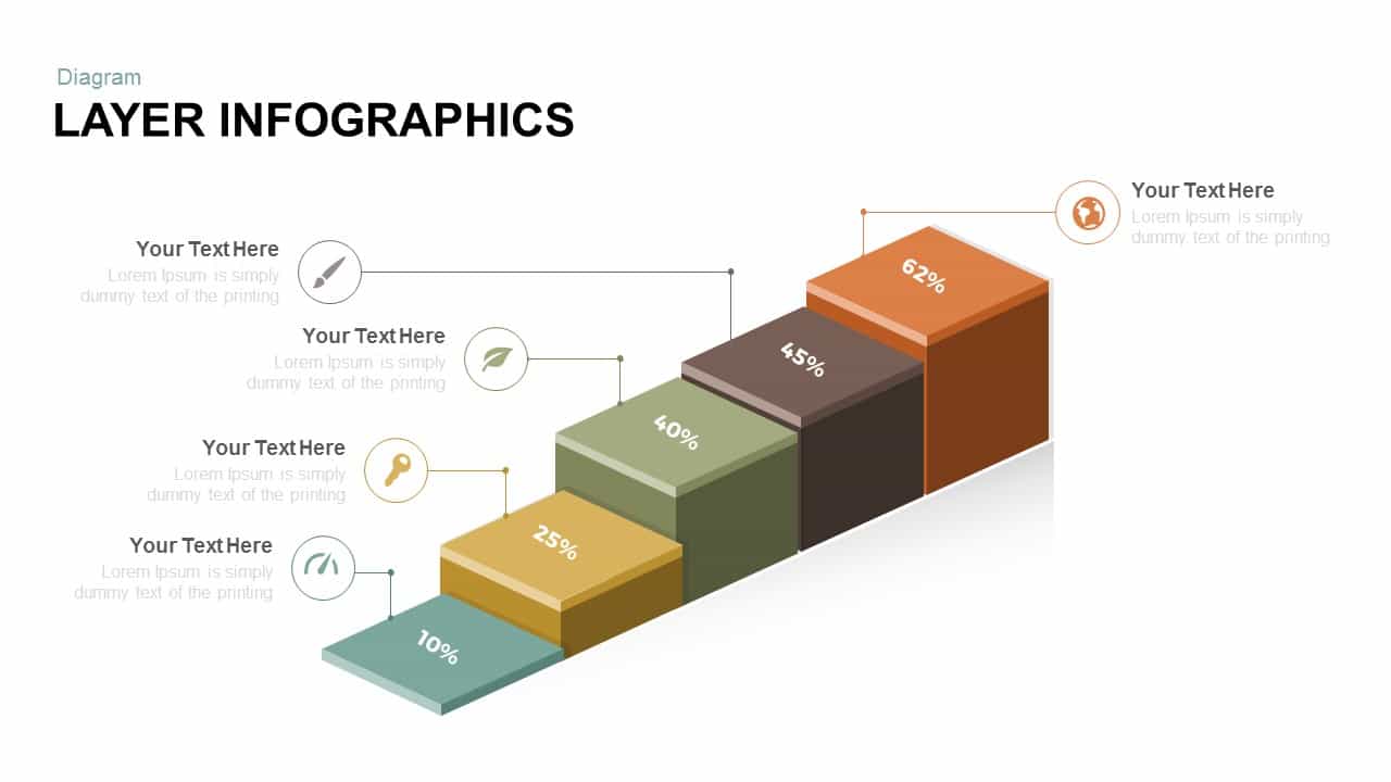
Free Layer Infographics template for PowerPoint & Google Slides
Process
Free
Free Professional Cloud Infographics Template for PowerPoint & Google Slides
Process
Free
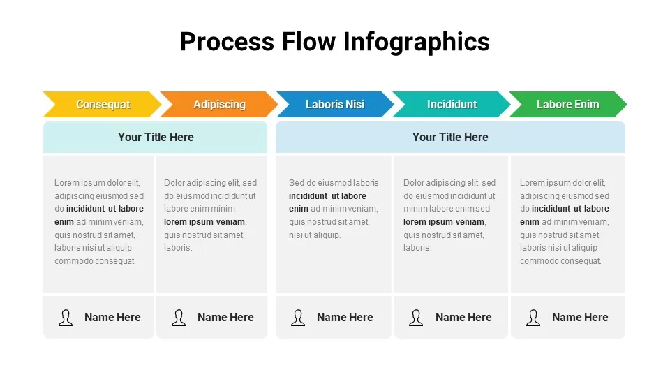
Free Colorful Process Flow Infographics Template for PowerPoint & Google Slides
Process
Free
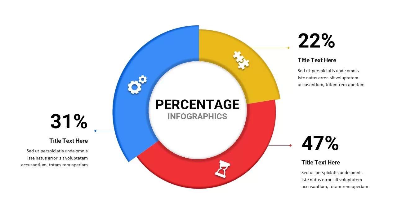
Free Percentage Infographics template for PowerPoint & Google Slides
Comparison
Free
Free Mental Health Presentation Template
Health
Free
Free Roadmap Infographics Pack Template for PowerPoint & Google Slides
Pitch Deck
Free

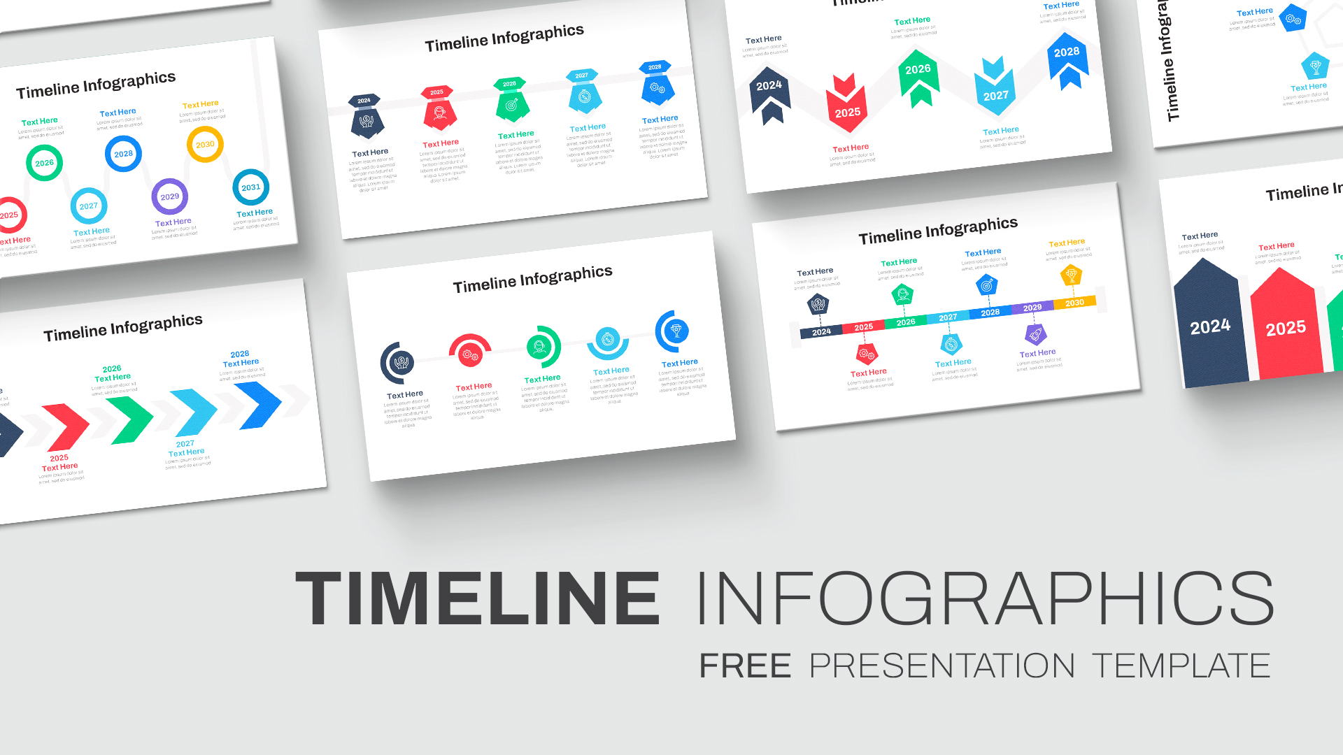
Free Colorful Timeline Infographics Template for PowerPoint & Google Slides
Timeline
Free
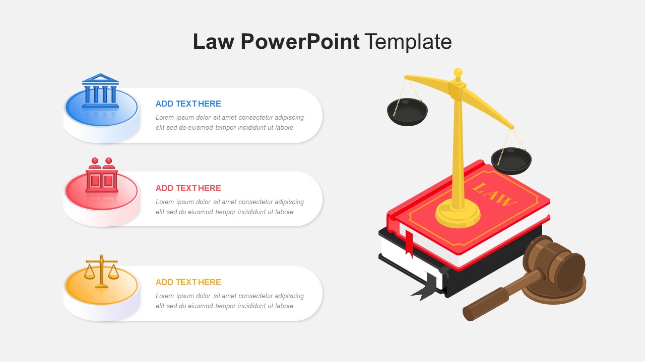
Free Law PowerPoint Google Slides Template
Infographics
Free
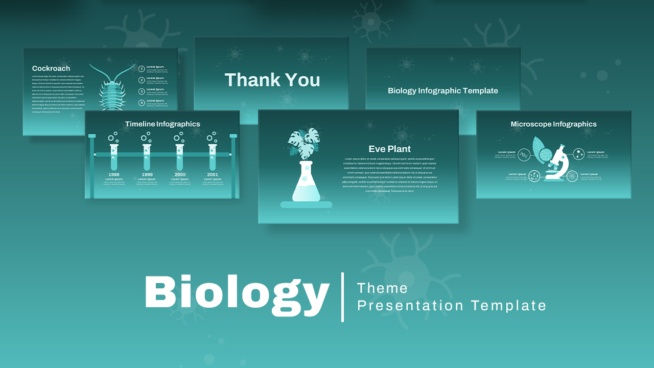
Free Biology Theme Infographics Deck Template for PowerPoint & Google Slides
Health
Free
Free Cycle Object Infographics Presentation Template
Process
Free
Free Creative Hemisphere Infographics Template
Infographics
Free
3D Four Arrow Infographics Diagram Template for PowerPoint & Google Slides
Arrow
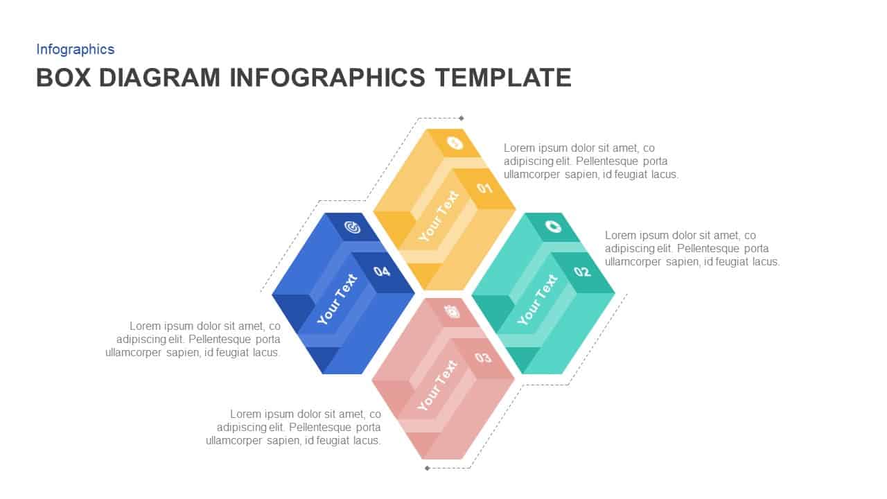
Box Diagram Infographics template for PowerPoint & Google Slides
Business
Versatile Creative Diagram Infographics Template for PowerPoint & Google Slides
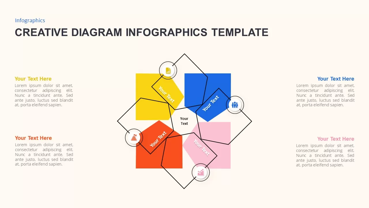
Process