Linear Regression Vs Logistic Regression Comparison Diagram
Visual Comparison of Regression Models for Machine Learning
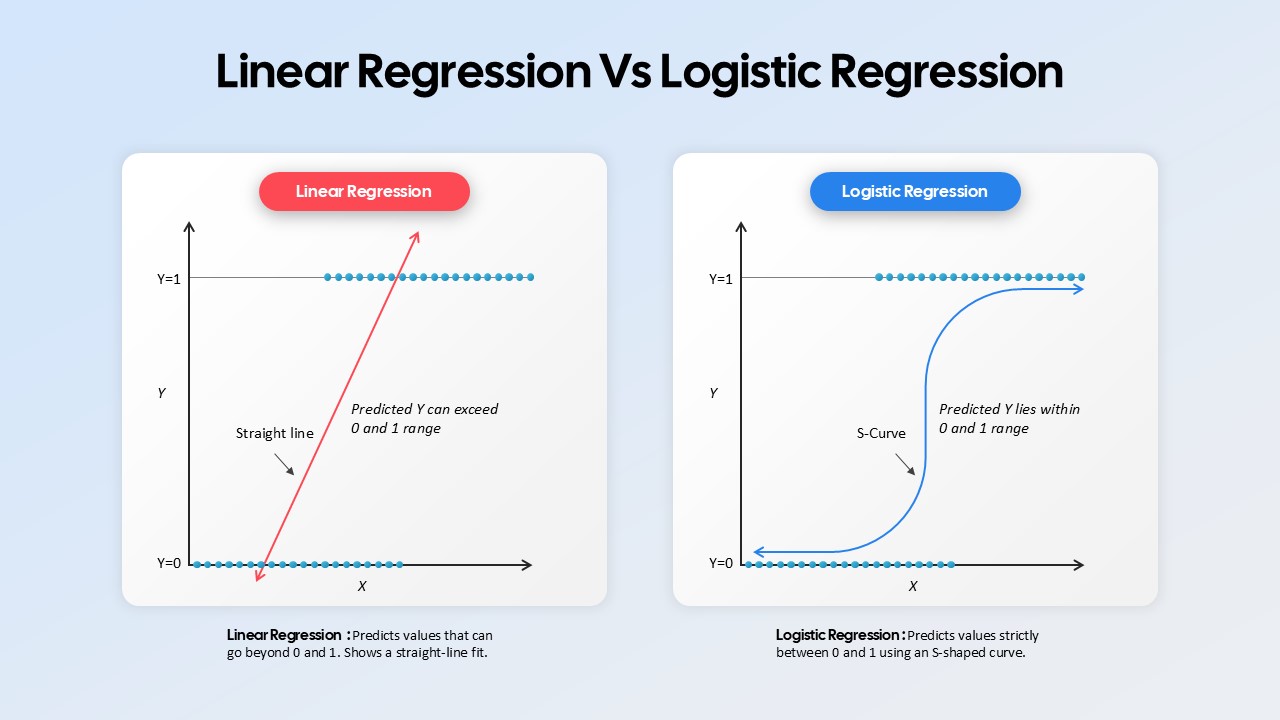
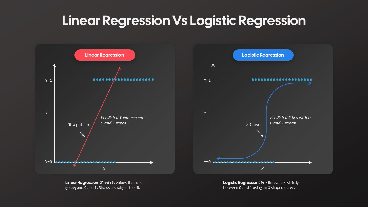
The Linear Regression Vs Logistic Regression Comparison Diagram is a professionally designed comparison slide that visually highlights the key differences between two fundamental predictive modeling techniques. Featuring side-by-side graphical representations, this template helps presenters explain how each model generates predictions and where they are commonly applied. Its intuitive layout, clear annotations, and dual-theme design make complex statistical concepts easier to understand for both technical and non-technical audiences.
Understanding Linear Regression and Logistic Regression
Linear Regression is a statistical method used to predict continuous numerical values by modeling the relationship between variables through a straight-line equation. The predicted output can extend beyond the range of 0 and 1, making it suitable for forecasting and trend analysis. Logistic Regression, on the other hand, is primarily used for classification tasks. It applies a sigmoid (S-shaped) curve to generate probability-based predictions that remain within the 0–1 range, making it ideal for determining categorical outcomes such as yes/no or true/false decisions.
How This Comparison Diagram Helps
- Simplifies Complex Concepts – Visually demonstrates the fundamental differences between regression and classification models.
- Enhances Learning and Training – Supports lectures, workshops, and machine learning training sessions with easy-to-follow visuals.
- Improves Model Selection Discussions – Helps explain when to use linear regression versus logistic regression in real-world scenarios.
- Provides Clear Visual Differentiation – Uses distinct graph styles and color coding to separate both regression techniques.
- Supports Technical Presentations – Makes data science, analytics, and statistical modeling presentations more engaging and understandable.
- Flexible for Multiple Audiences – Useful for students, educators, data scientists, analysts, and business professionals.
This comparison diagram serves as an effective visual aid for explaining predictive analytics, machine learning fundamentals, and statistical modeling concepts. Whether used in academic instruction, corporate training, or professional presentations, it enables presenters to communicate regression techniques with greater clarity, confidence, and visual impact.
Login to download this file

Item ID
SB05179


Related Templates

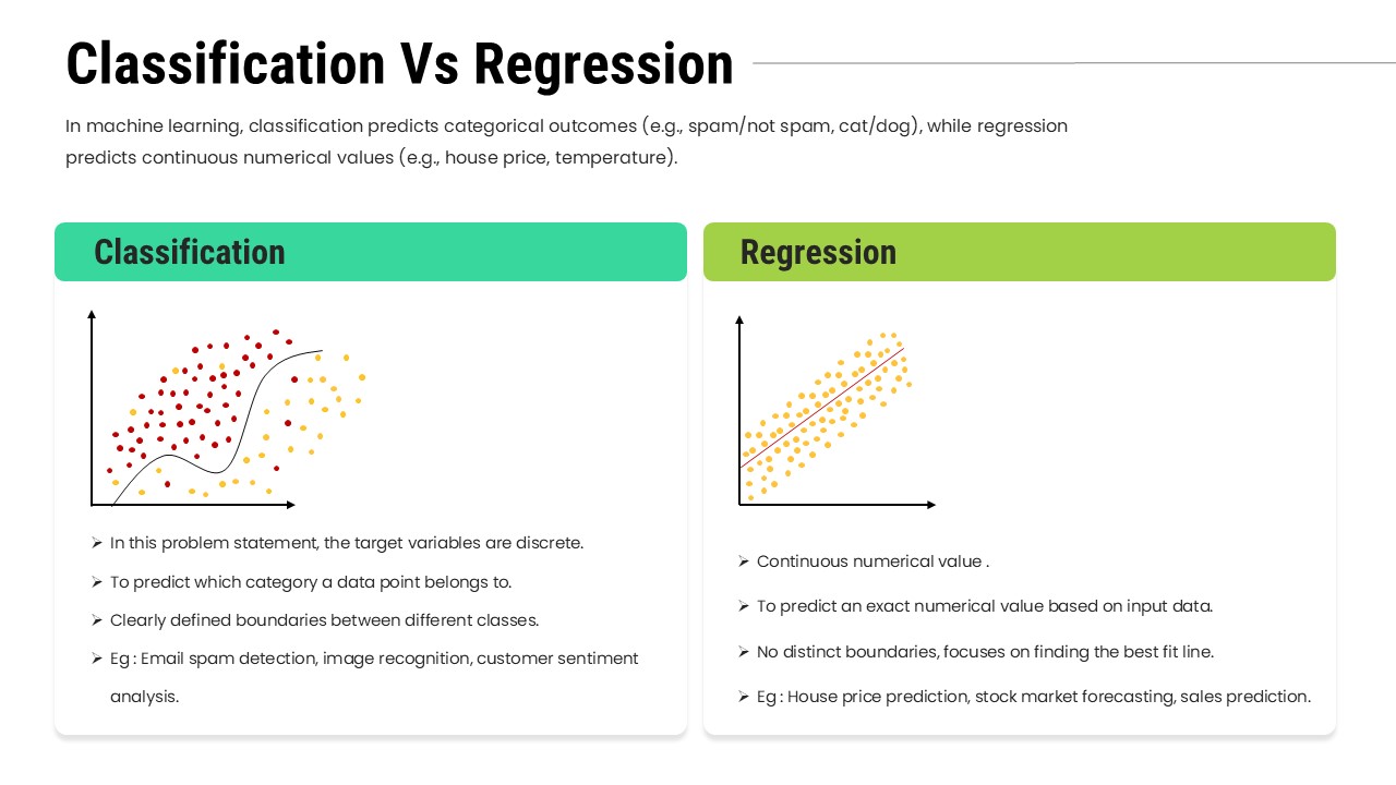
Classification Vs Regression Comparison Diagram
Machine Learning
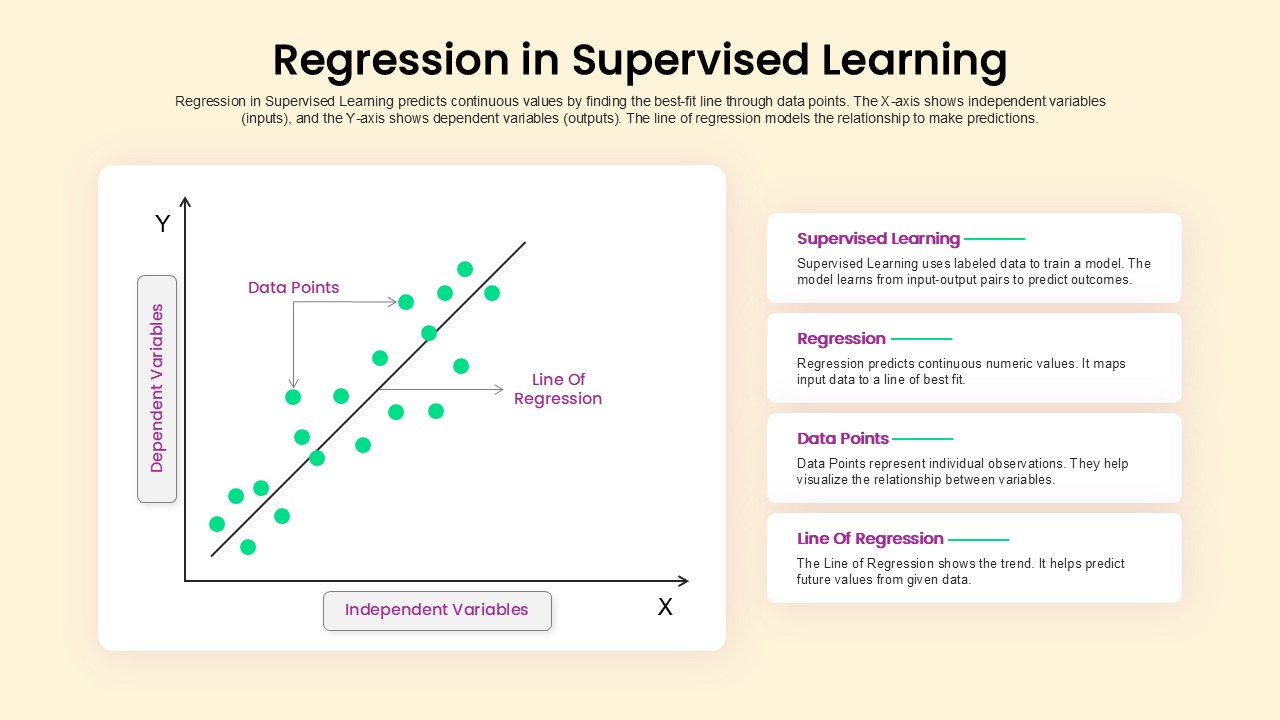
Regression in Supervised Learning Overview template
Process
5 and 6 Steps Linear Line Diagram Template
Infographics
7 Piece Linear Puzzles Diagram for PowerPoint & Google Slides
Process
4 Stage Linear Process Flow Diagram PowerPoint Template
Process
6 Staged Linear Process Diagram Template
Process
5 Stage Linear Process Flow Diagram Template for PowerPoint
Process
5 Stage Linear Process Diagram for PowerPoint and Google Slides
Process
5 Stage Linear Process Flow Diagram for Business Presentation
Arrow
5 Steps Linear Process Flow Diagram Template
Process
7 Stages Linear 3D Process Flow Diagram for PowerPoint
Process
5 Stage Linear Process Flow Diagram Presentation Template
Process
5 Stage Linear Process Flow Diagram Template
Process
4 Stage Linear Process Flow Diagram for PowerPoint
Process
7 Stage Linear Process Flow Diagram Template
Process
4 Stage Linear Process Flow Diagram for PowerPoint
Process
5 Staged Linear Timeline Diagram for Financial Growth
Timeline
4 Steps Linear Process Flow Diagram Template
Process
5 Steps Linear Process Flow Diagram template
Process
8 Step Linear Process Flow Diagram for PowerPoint & Google Slides
Process