search

Essentials

Must-have decks for quick wins

By Industry

Professionally tailored slides for every sector

By Style

Minimal, modern and creative designs

By Topic

Explore slides curated by purpose and theme

TimelineTimelineRoadmapRoadmapStrategyStrategyGoalsGoalsTableTableComparisonComparisonSWOTSWOTAgendaAgendaArrowArrowWorld MapWorld MapMapsMapsProcessProcessFunnelFunnelTeamTeamOrg ChartOrg ChartPyramidPyramidCircularCircular

Business PlanBusiness PlanBusiness StrategyBusiness StrategyBusiness ProposalBusiness ProposalBusiness ModelsBusiness ModelsDigital MarketingDigital MarketingMarketing FunnelMarketing FunnelCustomer ExperienceCustomer ExperienceProject StatusProject StatusGantt ChartGantt ChartRecruitmentRecruitmentEmployee PerformanceEmployee PerformanceLeadershipLeadershipAIAIMachine LearningMachine Learning

AI Presentation Maker

Install the Windows plugin for quick access to templates and design tools.

AI Infographics Maker

Use our Office 365 add - in to access templates directly from the cloud.

Exe Version

Install the Windows plugin for quick access to templates and design tools.

Office 365

Use our Office 365 add - in to access templates directly from the cloud.

Mac Version

Get the Mac plugin to easily browse, insert, and customize templates and visuals within PowerPoint.
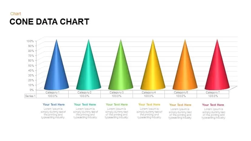
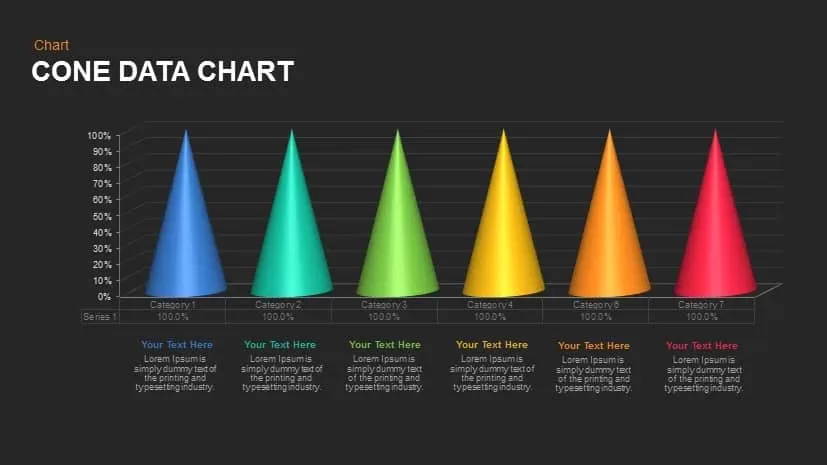
Cone Data Chart Powerpoint template

Cone Data Chart Powerpoint template
This template is part of a deck featuring multiple slides. To check out all slides, click on See All. See All round right arrow
Cone chart data PowerPoint template

Description

This vibrant cone data chart is an engaging way to visualize categorical data in a 3D format. The cones represent different categories, each with a percentage value at the top, giving a clear and visually appealing comparison between categories. The colors—ranging from blue and green to yellow, orange, and red—are easily distinguishable, making it ideal for highlighting differences in data points.

Each cone is paired with a text placeholder at the base where additional information or context can be added. This feature makes the diagram useful for explaining the significance of the data or adding details such as trends, insights, or comments. The 3D nature of the chart adds depth, making it visually striking while still being easy to interpret.

Fully customizable in both PowerPoint and Google Slides, you can adjust the colors, icons, and text to fit your needs, whether you’re presenting sales data, market research, or performance metrics. It’s an excellent tool for business presentations, marketing campaigns, and data-driven discussions.

Who is it for

This diagram is ideal for business analysts, marketers, sales teams, and project managers who need to present data comparisons clearly and effectively. It's also perfect for educators or anyone looking to illustrate categorical data in a more engaging way.

Other Uses

Besides comparing categories, this chart can be used for visualizing budgets, resource allocations, product performance, or any other set of data that can be grouped into distinct categories. It’s also useful for illustrating survey results, customer preferences, or key performance indicators (KPIs).

Login to download this file