Text-Heavy Deck Template for Corporate Presentation


21 slides. White background, blue accents, slide numbers on the left edge. Built specifically for presentations where you need to put a lot of text on each slide and still have it look organized.
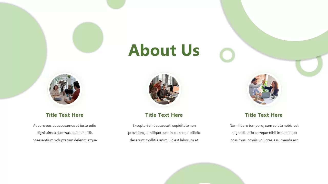
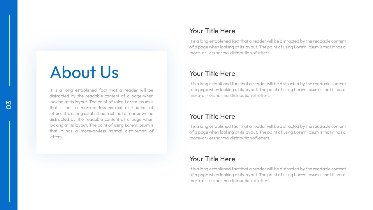
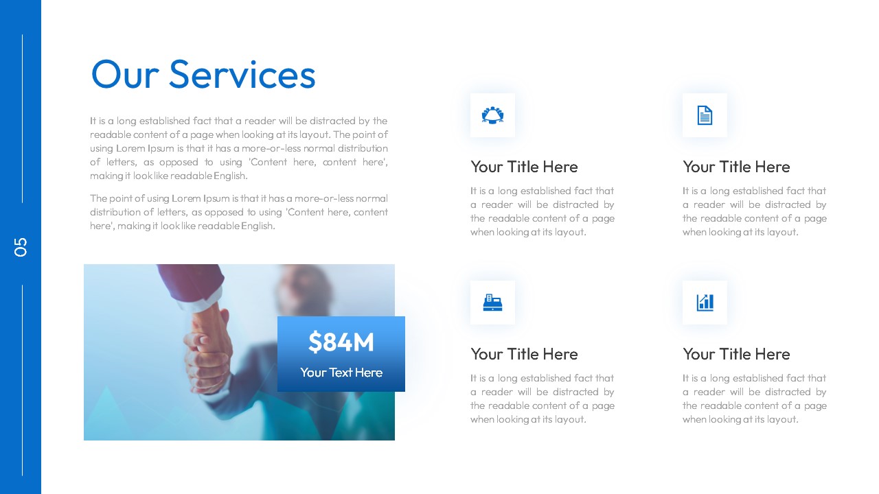
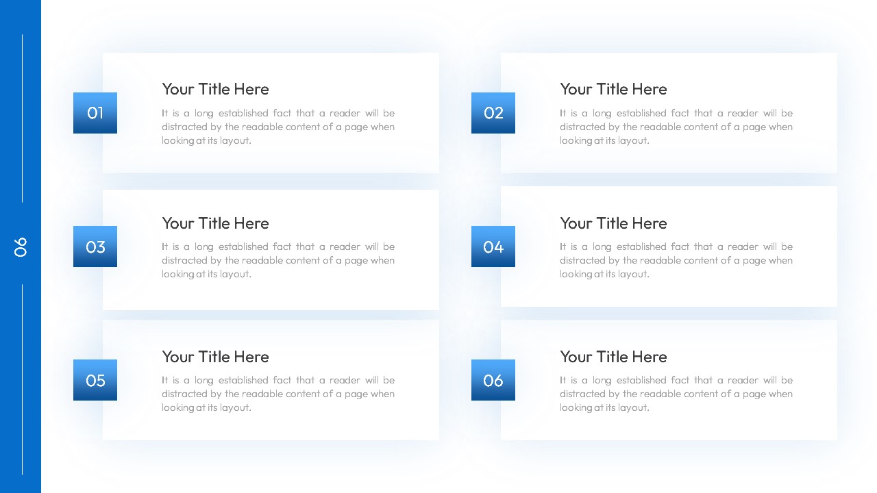
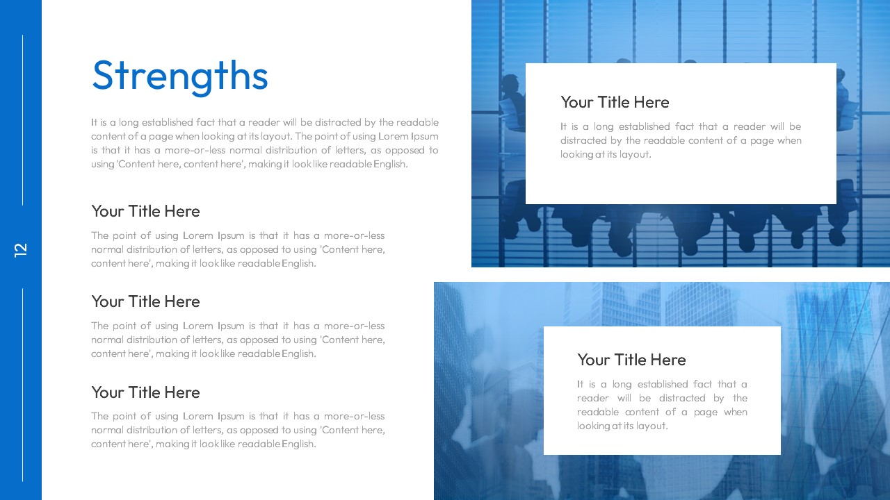
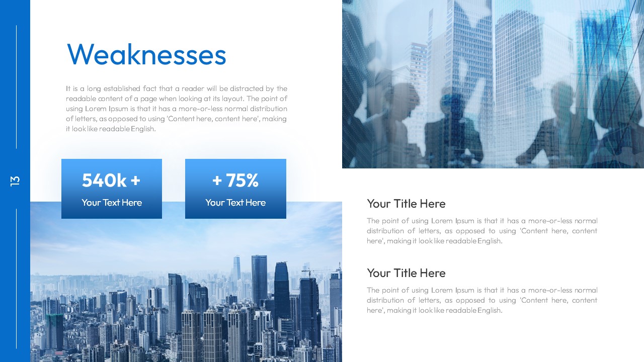
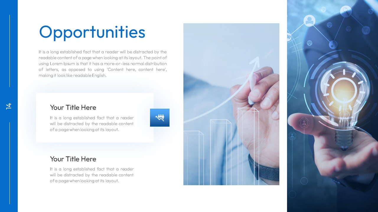
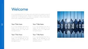
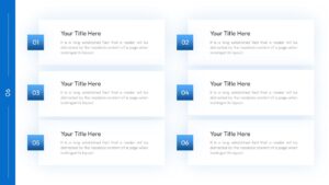
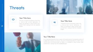
Every slide has more text space than a typical template. The About Us slide has a large paragraph block on the left and four titled text sections stacked on the right. The six-point content slide uses a 3×2 grid with numbered blue squares and a paragraph under each one. The Strengths slide has three sub-sections with full paragraphs on the left and two image-text cards on the right with blue business photography behind them. The same layout structure repeats for Weaknesses, Opportunities, and Threats, so SWOT analysis is built in across four slides.
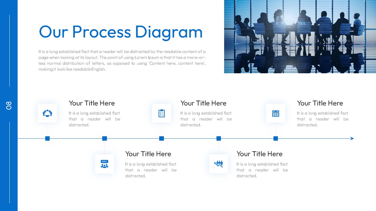
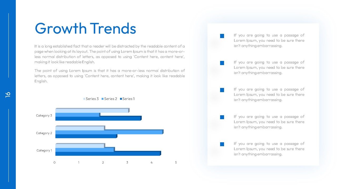
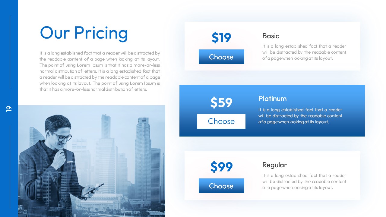
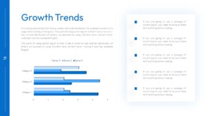
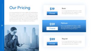
The Process Diagram slide has five icon-led process steps arranged in a staggered layout with a boardroom silhouette photo in the top right. The Growth Trends slide pairs a horizontal stacked bar chart (three series across three categories) with five bullet-point commentary blocks on the right side. The Pricing slide shows three tiers (Basic $19, Platinum $59, Regular $99) stacked vertically with a businessman photo on the left.
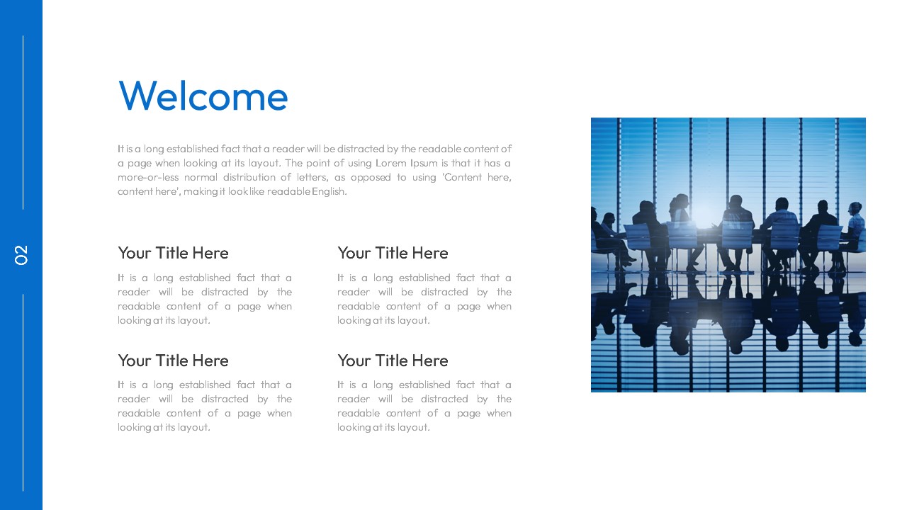
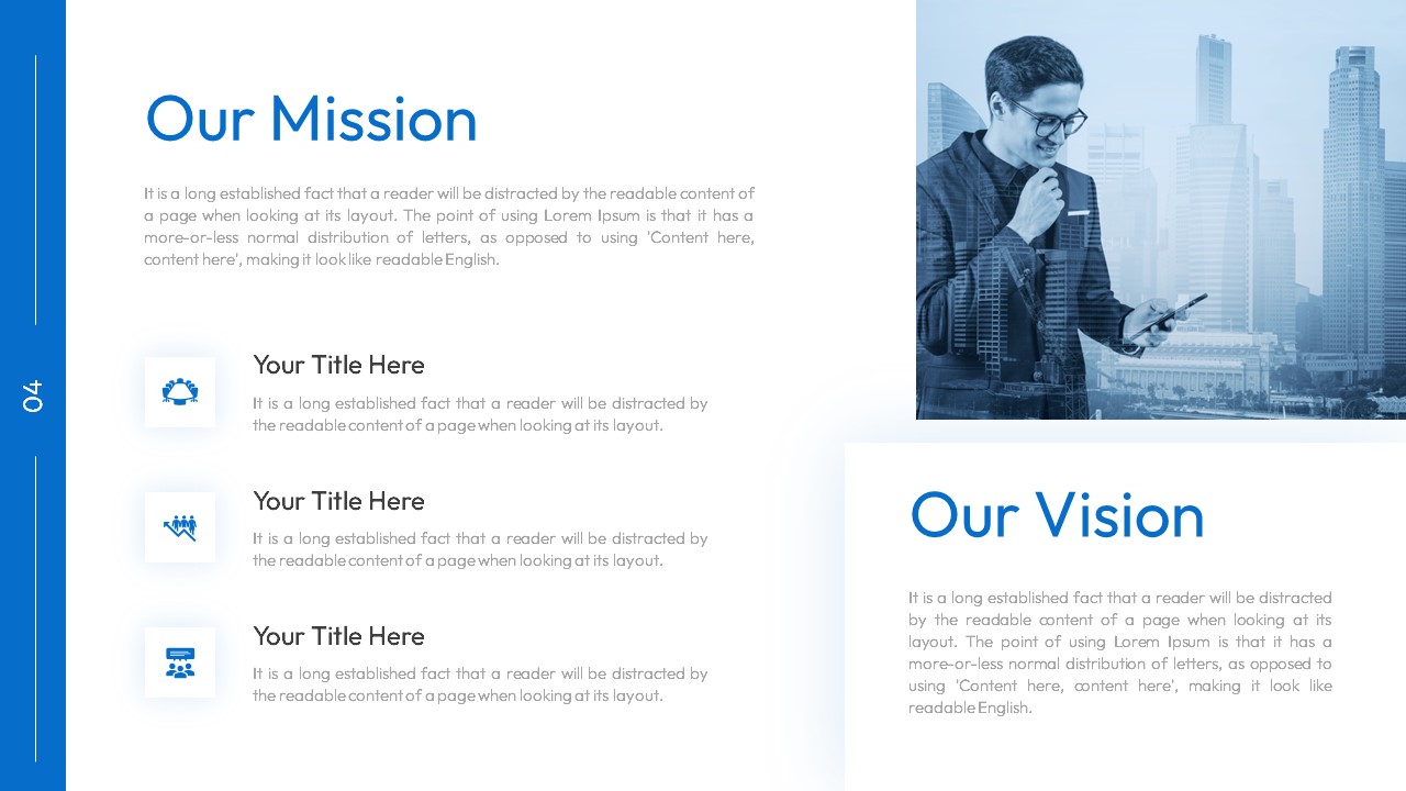
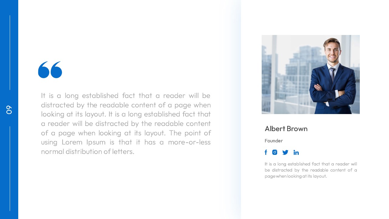
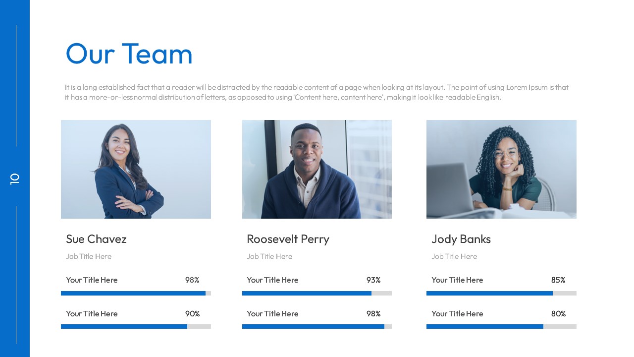
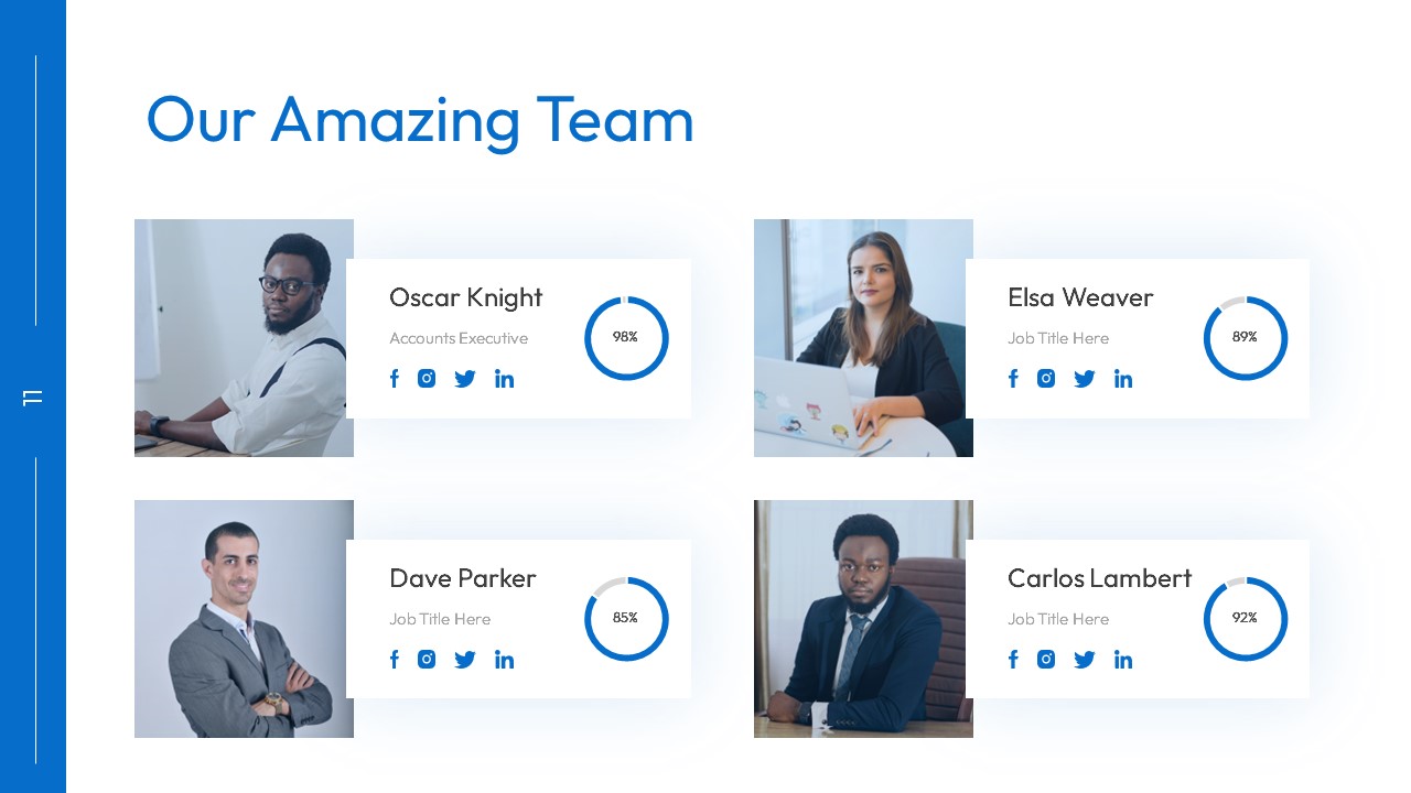
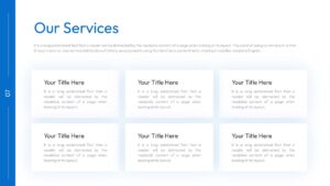
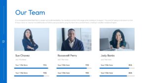
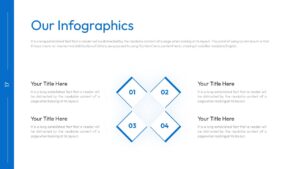
Also includes: Welcome, Mission, Vision, Services, Team, Quotes, Infographics, Mockup, Contact, and Thank You slides.
Text-Heavy PowerPoint And Google Slides Templates for Detailed Business Presentations
Most presentation advice says “less text on slides.” That’s fine for keynotes and sales pitches. But some presentations need detail on the slide itself. Board reports that get emailed as PDFs and read without a presenter. Compliance documentation that needs full explanations on each page. Strategy documents where the slide IS the deliverable, not just a visual aid for someone talking.
This deck is designed for that. The text placeholders are sized for actual paragraphs, not three-word bullet points. The layouts organize multiple blocks of text into sections with clear visual separation so the reader doesn’t lose their place. The blue accent bars and numbered blocks create enough structure that a text-heavy slide doesn’t turn into a wall of words.
Consulting firms produce decks like this constantly. The slide is the document. McKinsey-style strategy decks, Bain client reports, Deloitte audit summaries. Each slide has a title, a governing thought, and supporting detail. This template’s layout is built for that kind of content density.
The SWOT slides (Strengths, Weaknesses, Opportunities, Threats spread across four separate slides) give each section room for three full sub-topics with paragraphs instead of cramming all four into one overcrowded quadrant. The Growth Trends slide has space for both the chart AND written commentary explaining what the data means, which is how most management consultancies present data.
Login to download this file

Item ID
SB03764
Related Templates

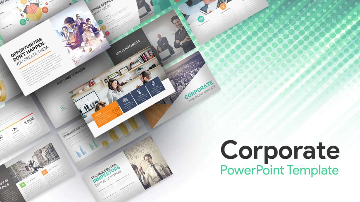
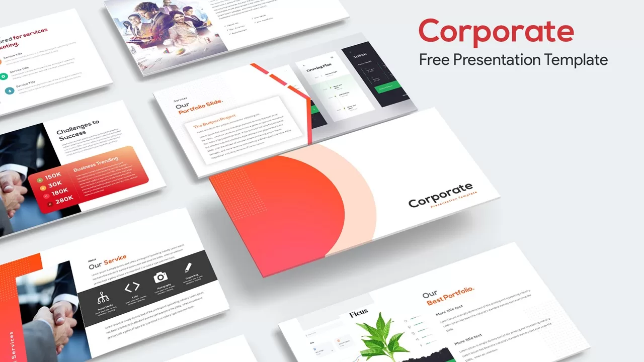
Corporate Business Presentation Deck Template for PowerPoint & Google Slides
Company Profile

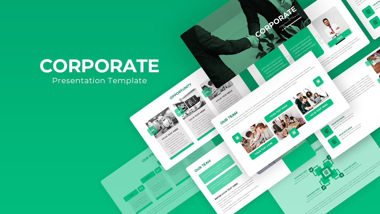
Free Modern Corporate Green Presentation Slide Deck for PowerPoint & Google Slides
Company Profile
Free
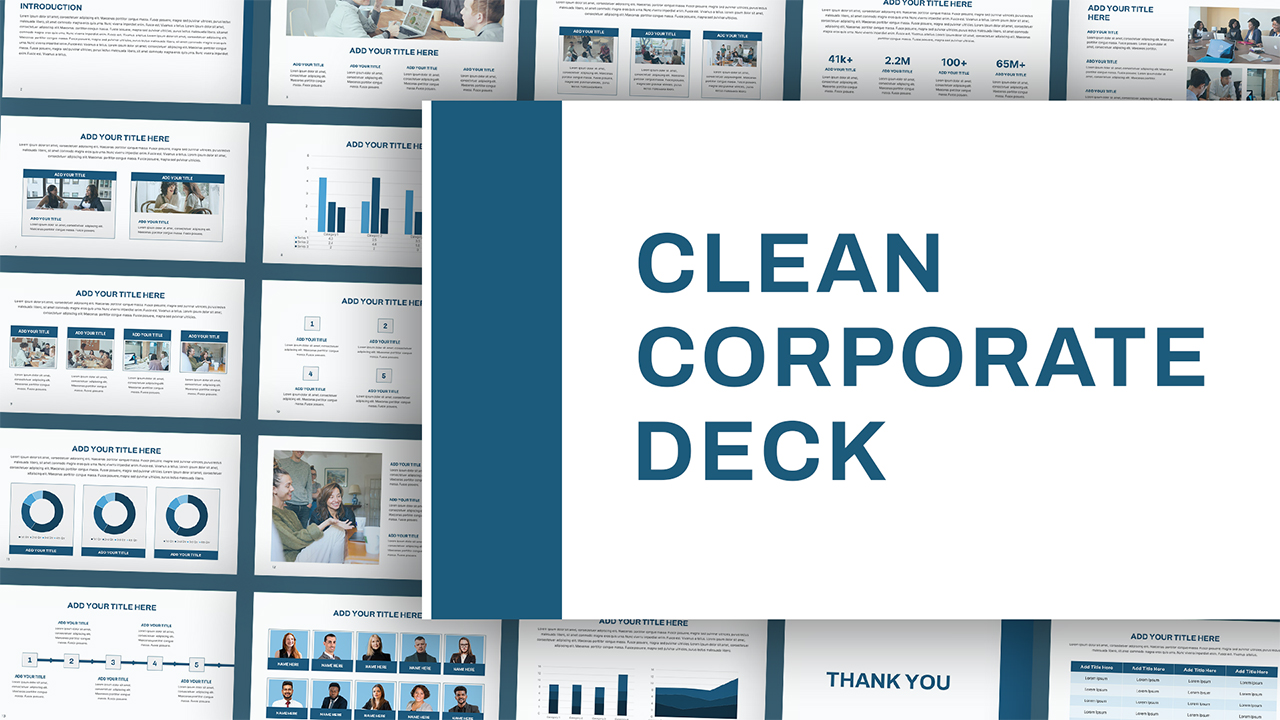
Clean Corporate Presentation Deck for PowerPoint & Google Slides
Company Profile
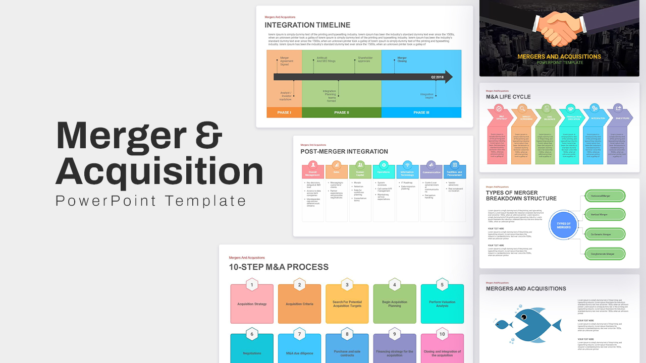
Mergers & Acquisitions Corporate Deck Template for PowerPoint & Google Slides
Pitch Deck
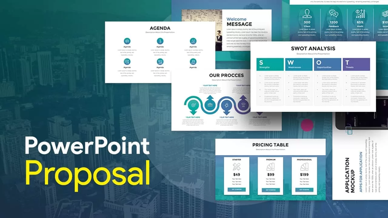
Corporate PowerPoint Proposal Deck Template for PowerPoint & Google Slides
Company Profile
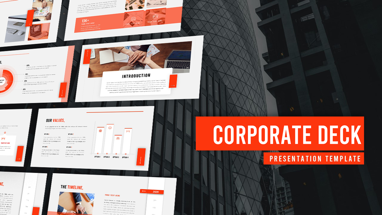
Corporate Deck Overview template for PowerPoint & Google Slides
Pitch Deck
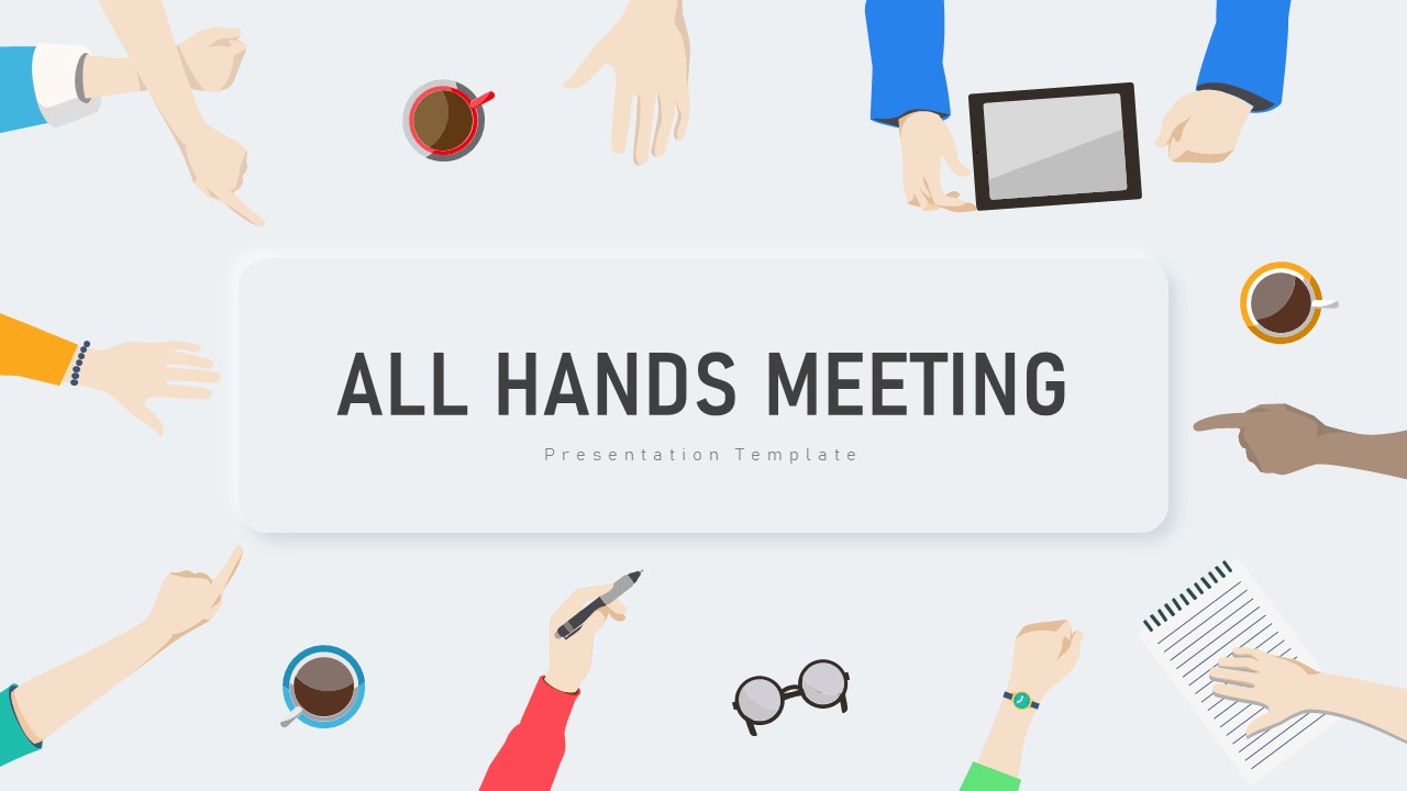
All Hands Meeting Corporate Slide Deck Template for PowerPoint & Google Slides
Decks

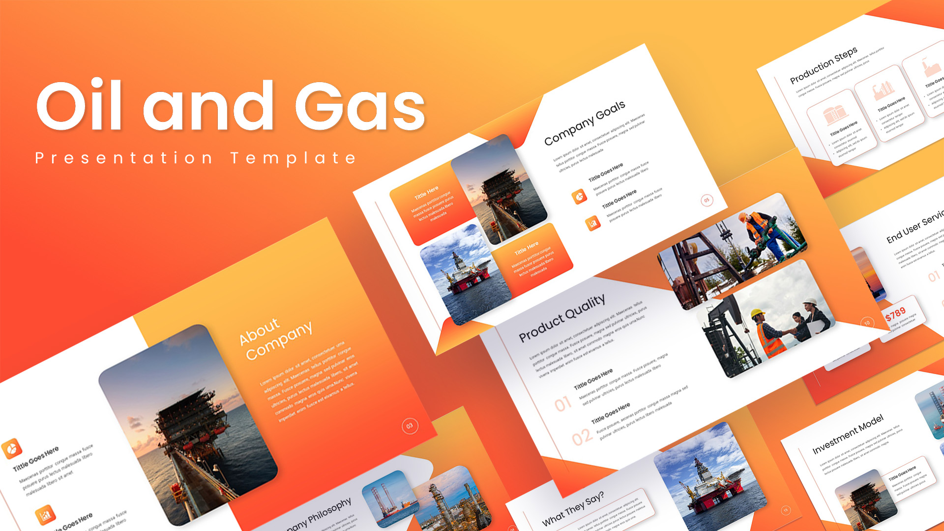
Oil and Gas Corporate Deck Template for PowerPoint & Google Slides
Pitch Deck
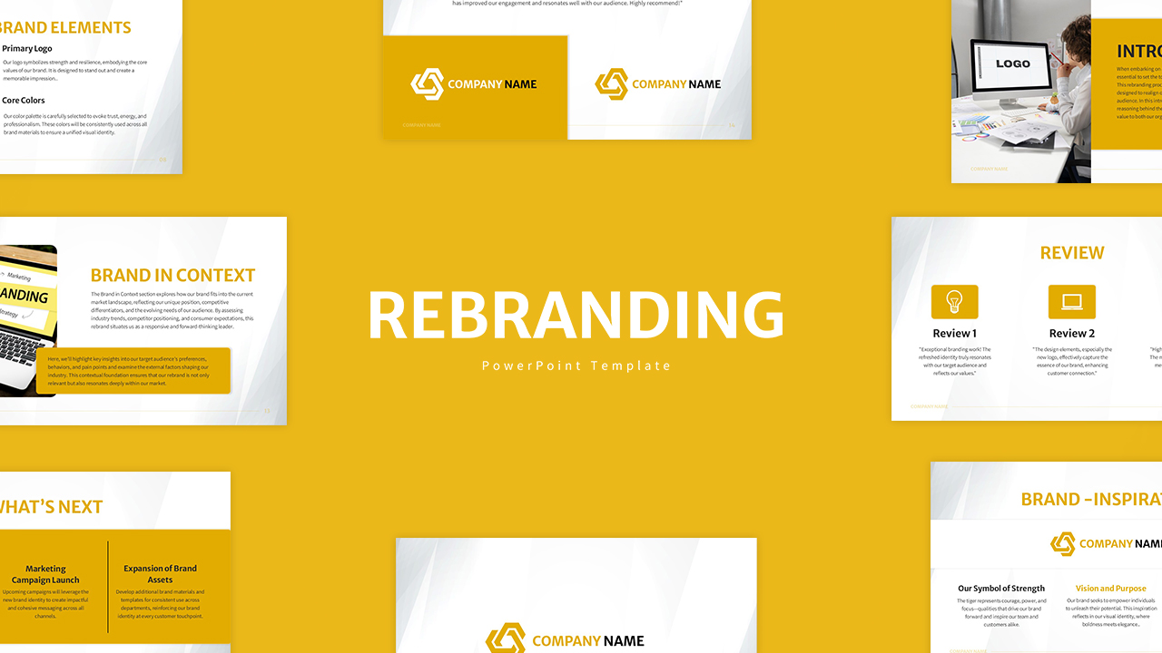
Corporate Rebranding Strategy Pitch Deck Template for PowerPoint & Google Slides
Pitch Deck
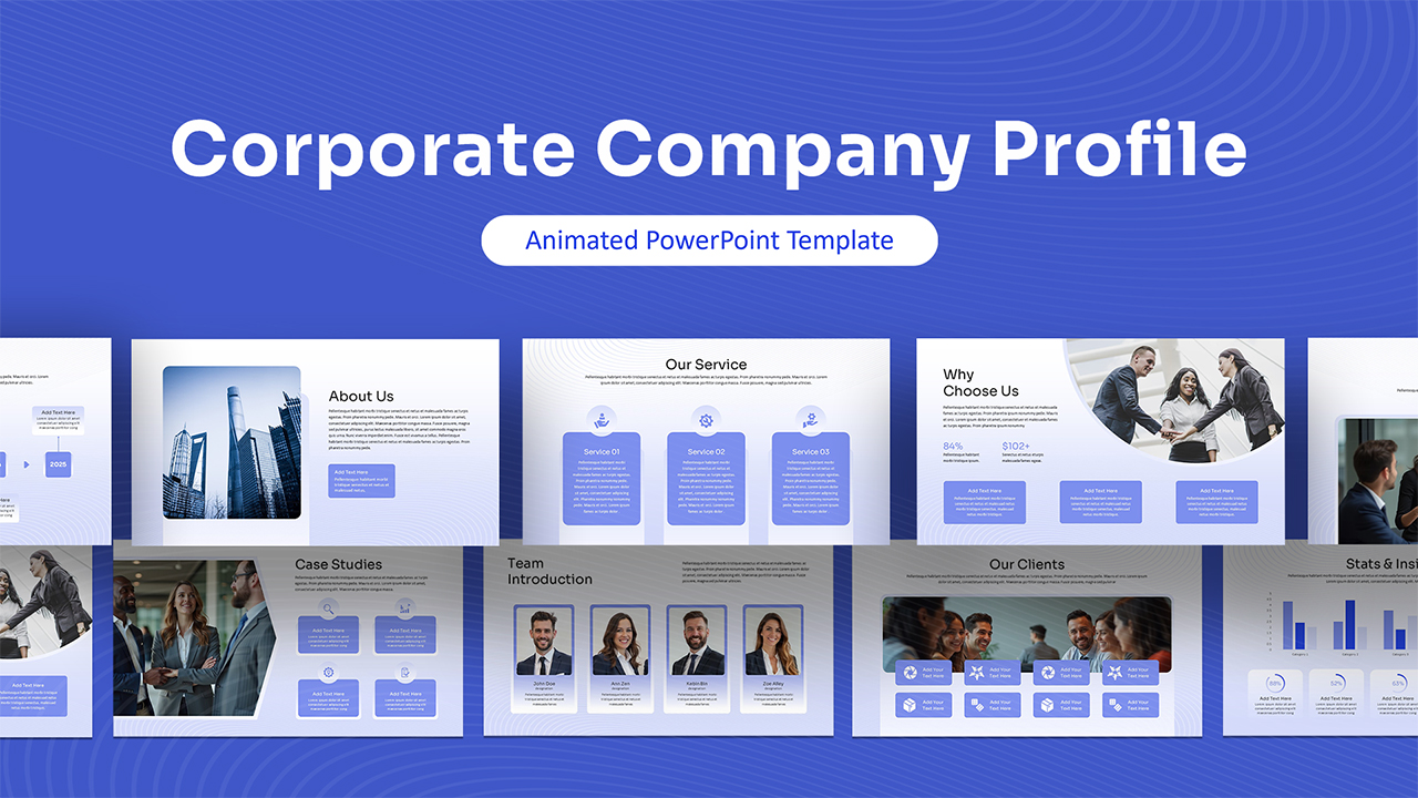
Animated Corporate Company Profile Deck Template for PowerPoint & Google Slides
Company Profile
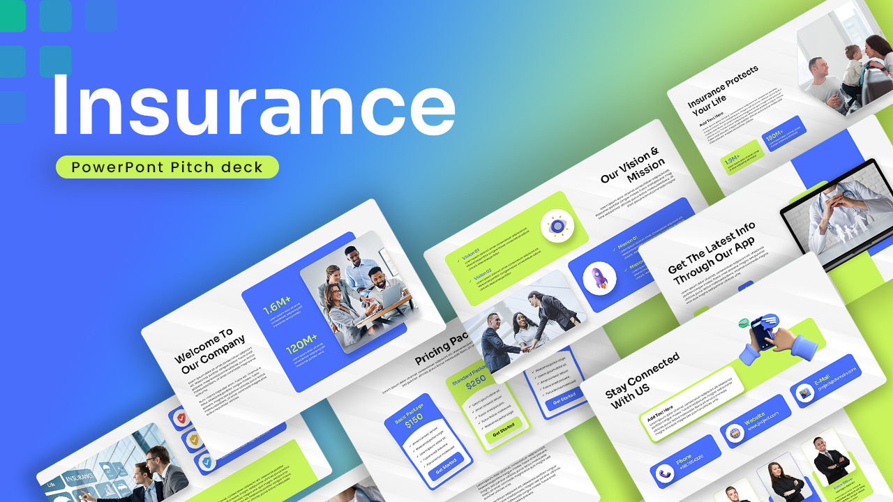
Insurance Corporate Pitch Deck Template for PowerPoint & Google Slides
Pitch Deck
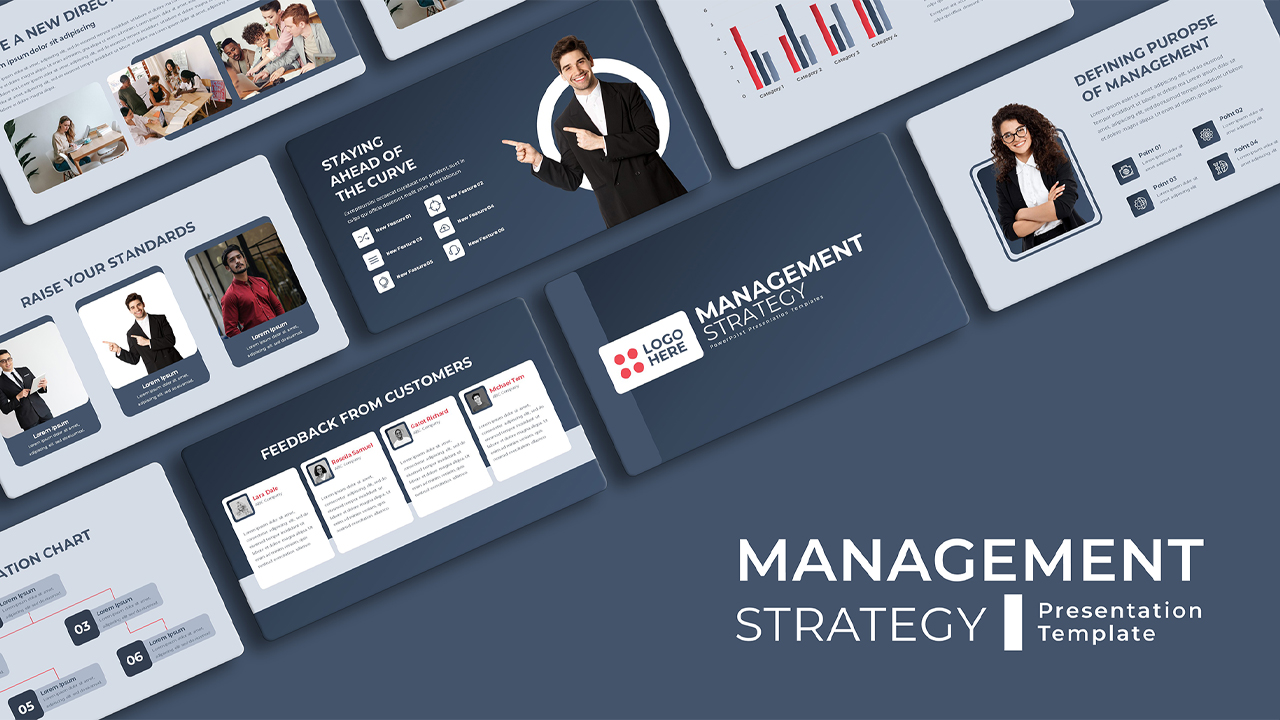
Corporate Management Strategy Deck for PowerPoint & Google Slides
Business Strategy
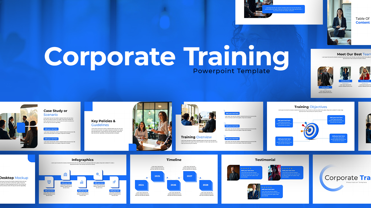
Corporate Training Deck for PowerPoint & Google Slides
HR
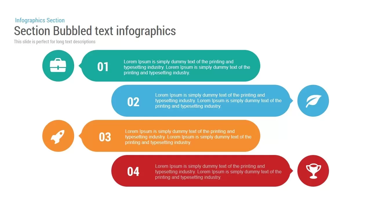
Section Bubbled Text template for PowerPoint & Google Slides
Infographics
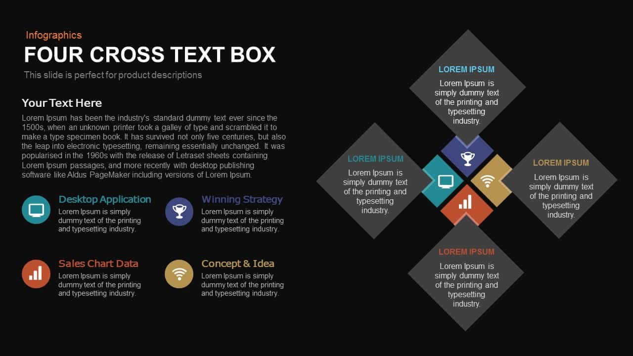
Four-Cross Text Box Diagram Template for PowerPoint & Google Slides
Comparison
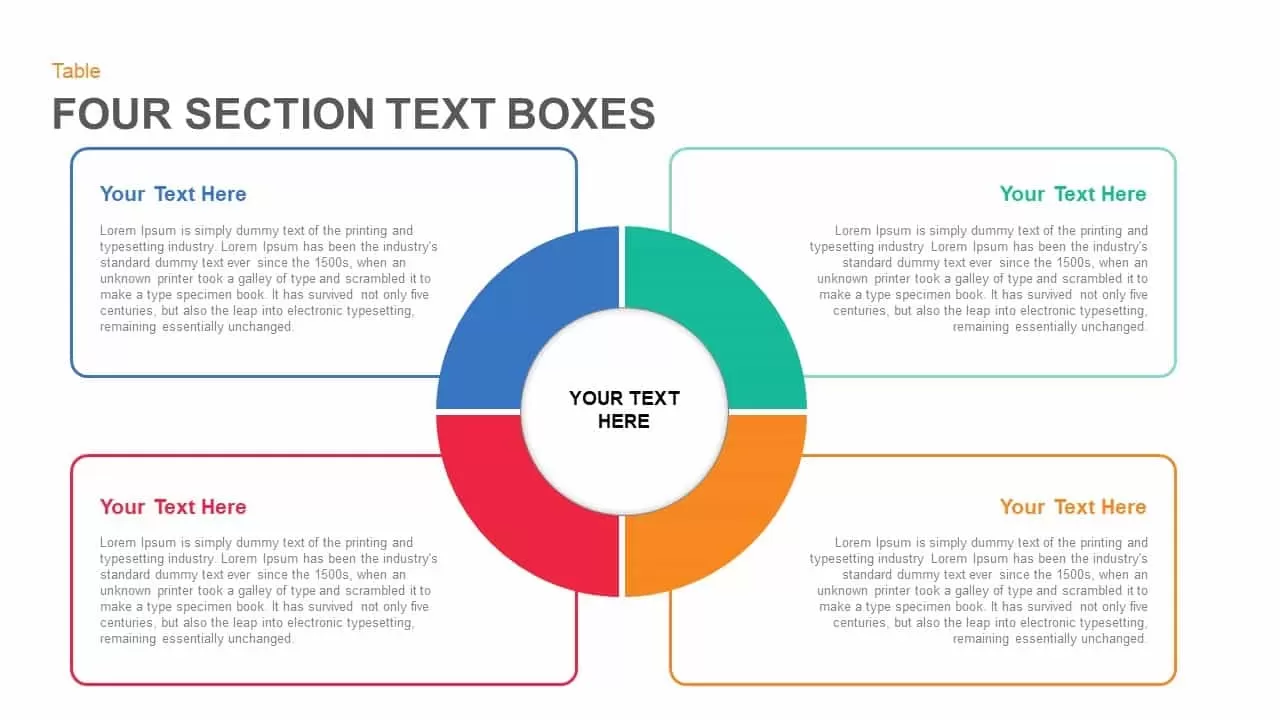
Four Section Circular Text Boxes Diagram Template for PowerPoint & Google Slides
Circular
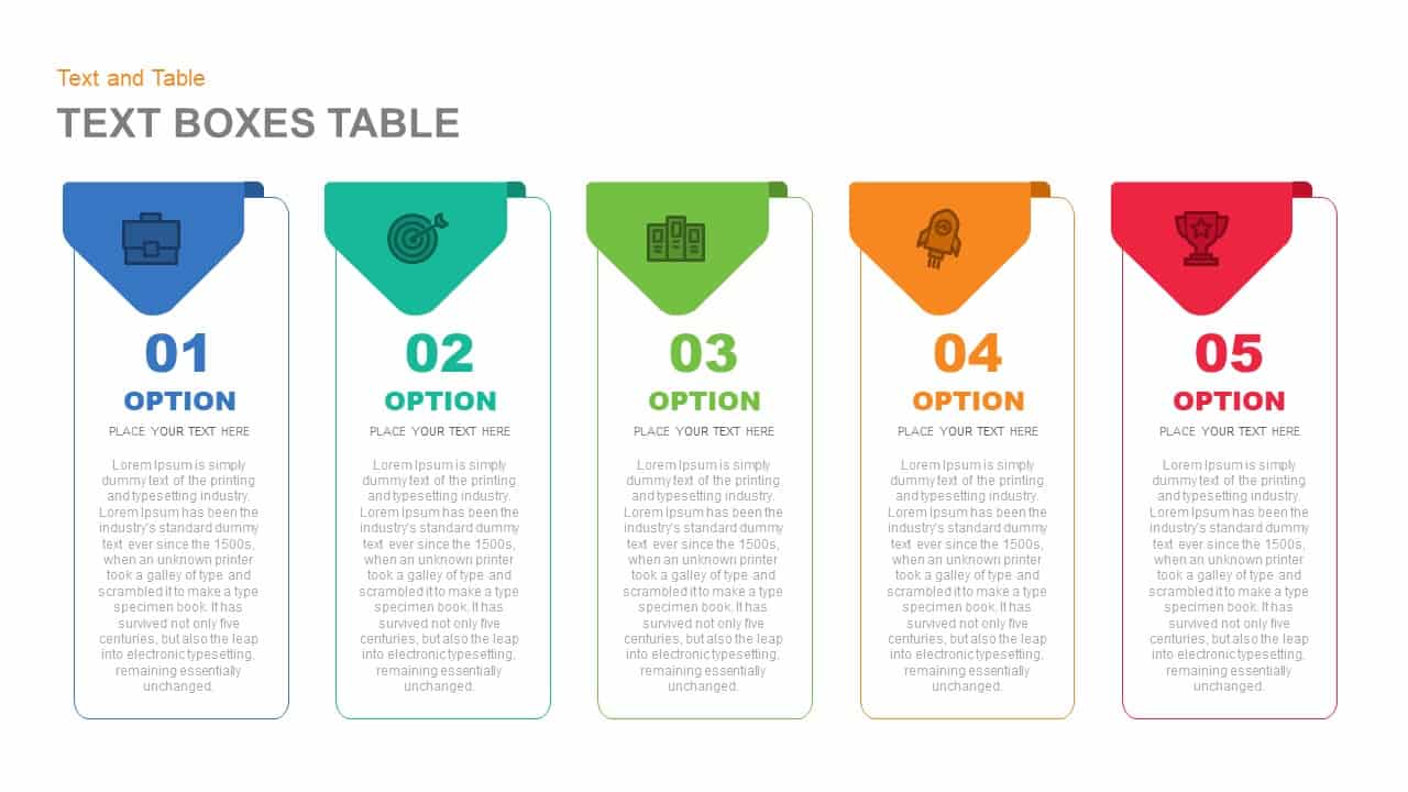
Five-Option Text Boxes Table Comparison Template for PowerPoint & Google Slides
Business Report
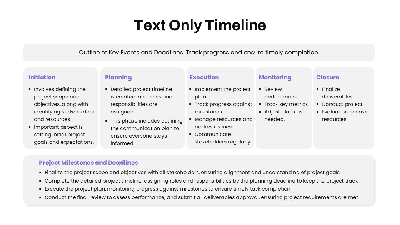
Text-Only Five-Phase Timeline Template for PowerPoint & Google Slides
Timeline
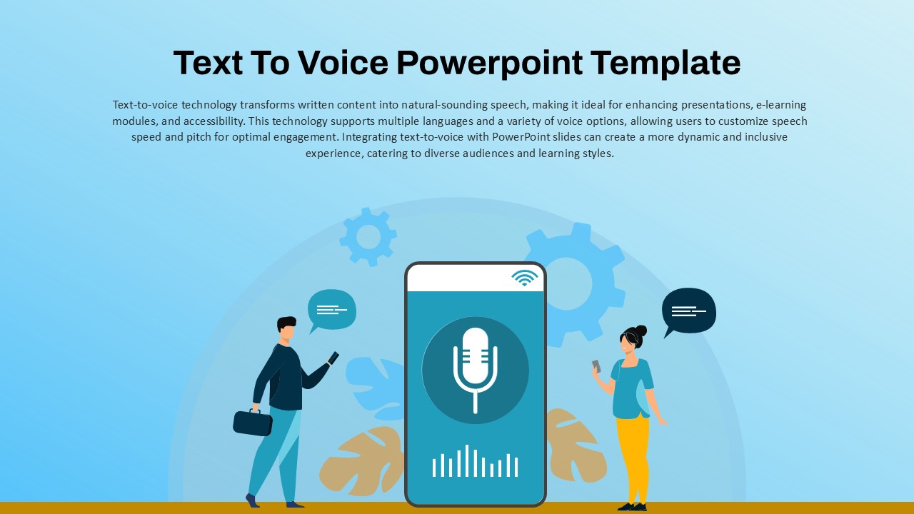
Text to Voice Technology overview template for PowerPoint & Google Slides
Technology
Top 10 Step-by-Step Image & Text Layouts Template for PowerPoint & Google Slides
Graphics
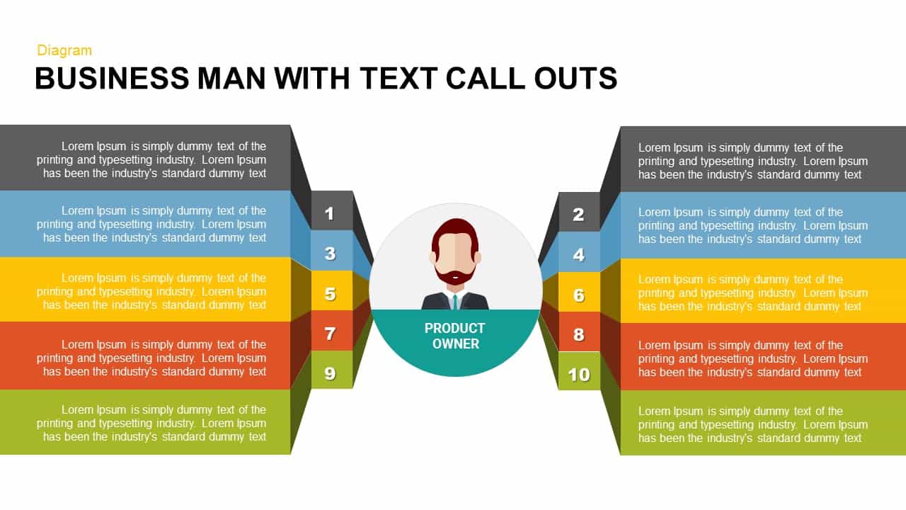
Business and Team with Text Call Outs Diagram for PowerPoint & Google Slides
Infographics

Free Coffee Break Slide with Circular Text for PowerPoint & Google Slides
Graphics
Free
Business Corporate Presentation Template
Business Requirements
Corporate Presentation Template – Free Download
Pitch Deck
Free
Minimal Corporate Presentation template for PowerPoint & Google Slides
Pitch Deck
Corporate Business Profile Presentation Template for PowerPoint & Google Slides
Company Profile
Yellow Corporate Pitch Presentation Template for PowerPoint & Google Slides
Company Profile

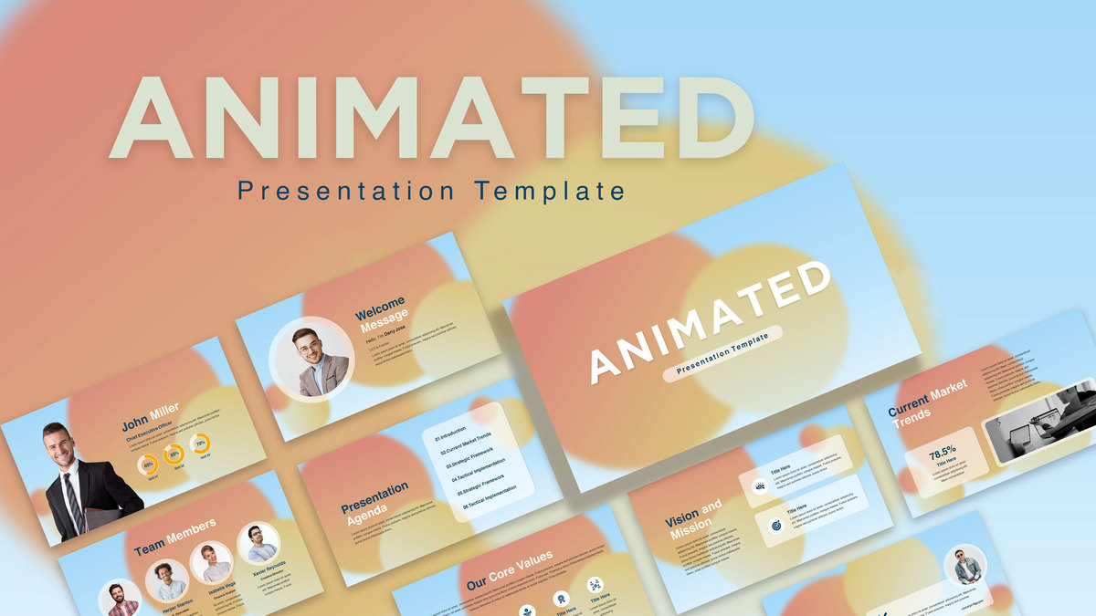
Free Animated Gradient Corporate Presentation Template for PowerPoint & Google Slides
Company Profile
Free
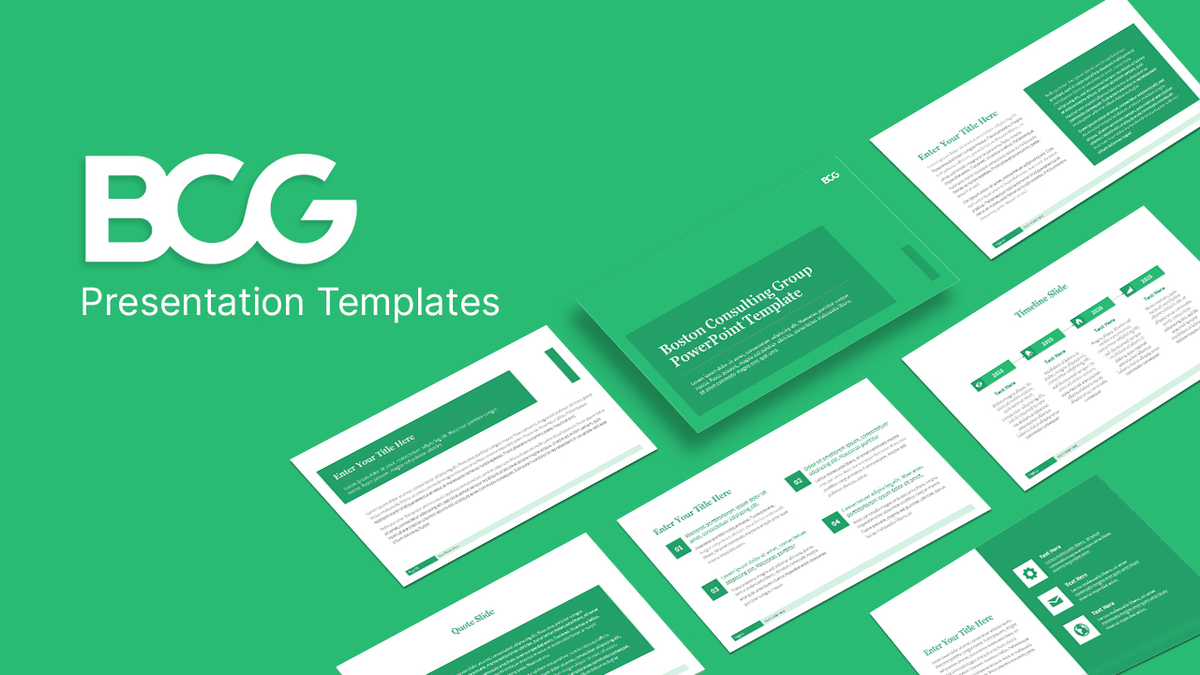
BCG Corporate Consulting Presentation Template for PowerPoint & Google Slides
Pitch Deck
Medical Theme Corporate Presentation Template for PowerPoint & Google Slides
Health
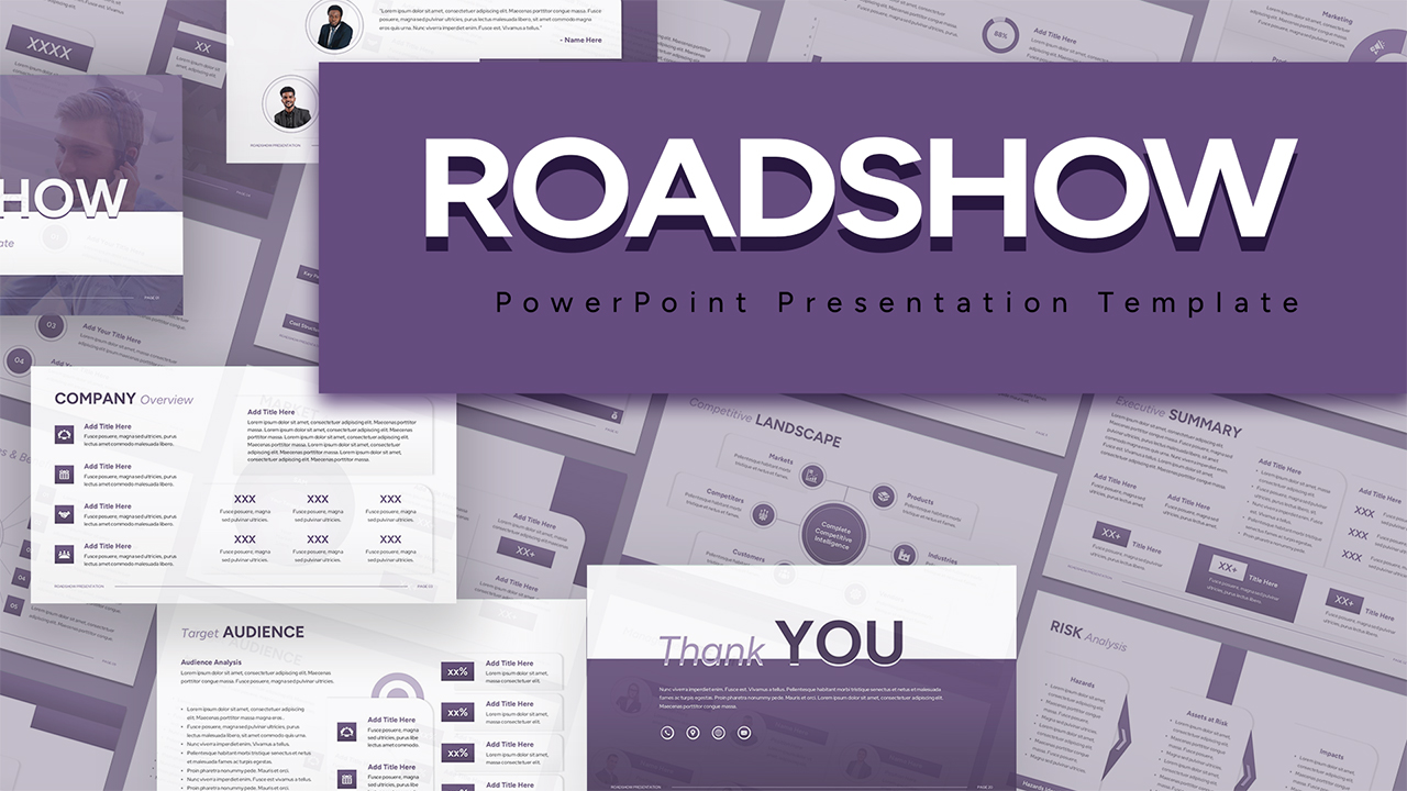
Corporate Roadshow Presentation Template for PowerPoint & Google Slides
Pitch Deck

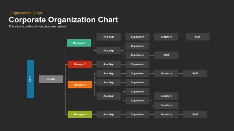
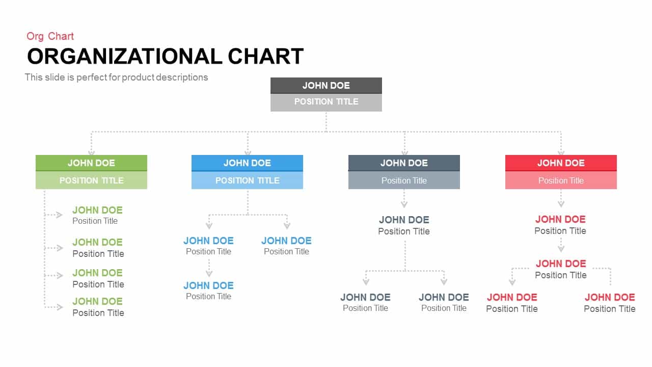
Corporate Organization Chart template for PowerPoint & Google Slides
Org Chart
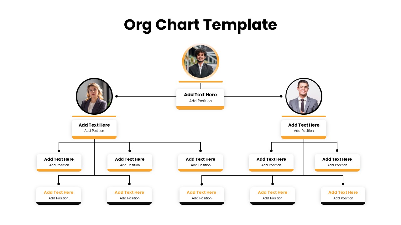
Corporate Org Chart template for PowerPoint & Google Slides
Org Chart

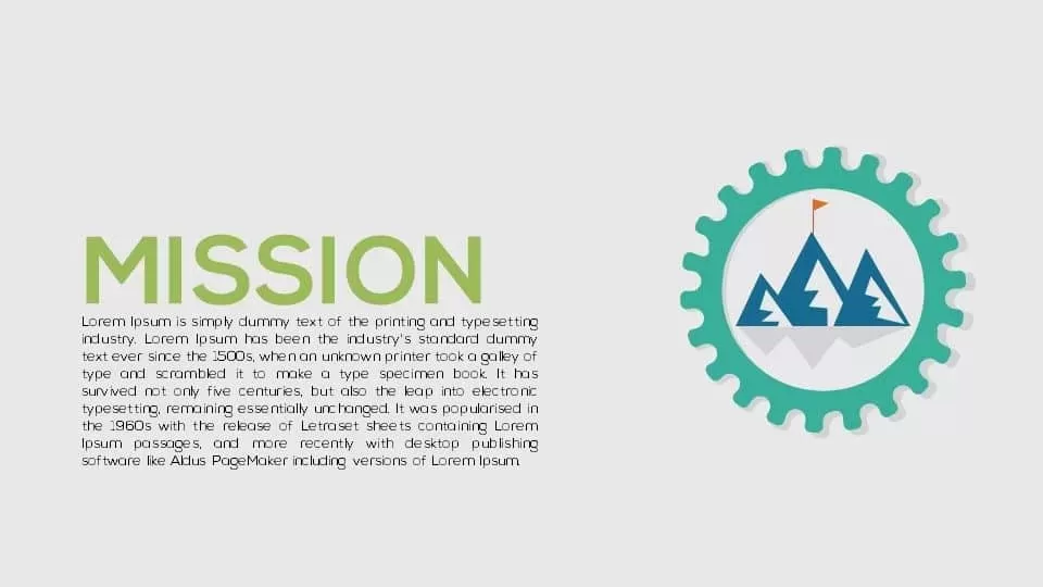
Corporate Mission Statement Gear Slide Template for PowerPoint & Google Slides
Vision and Mission
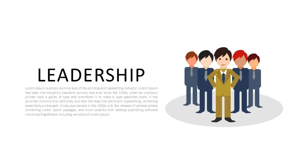
Corporate Leadership Team Illustration Template for PowerPoint & Google Slides
Leadership
Corporate PowerPoint Keynote Background Template
Background
Formal Corporate Business Cover Slide Template for PowerPoint & Google Slides
Pitch Deck

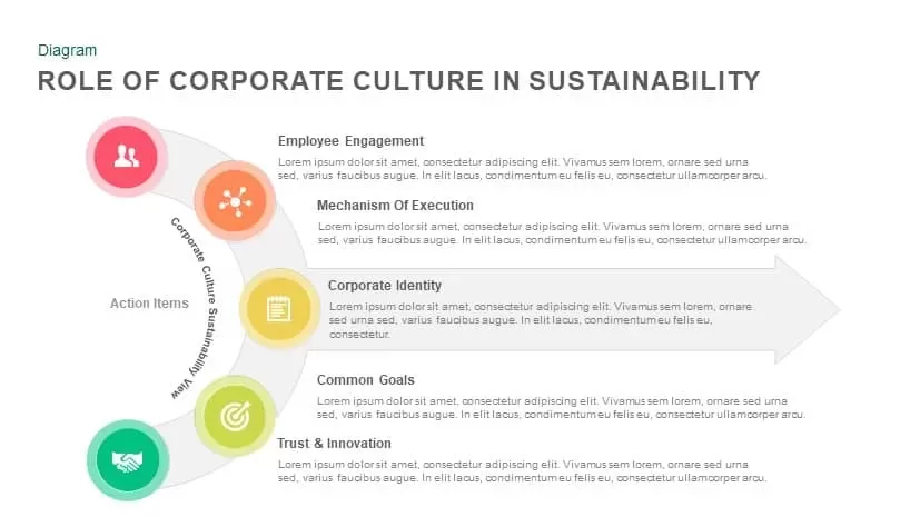
Corporate Culture in Sustainability Template for PowerPoint & Google Slides
Process
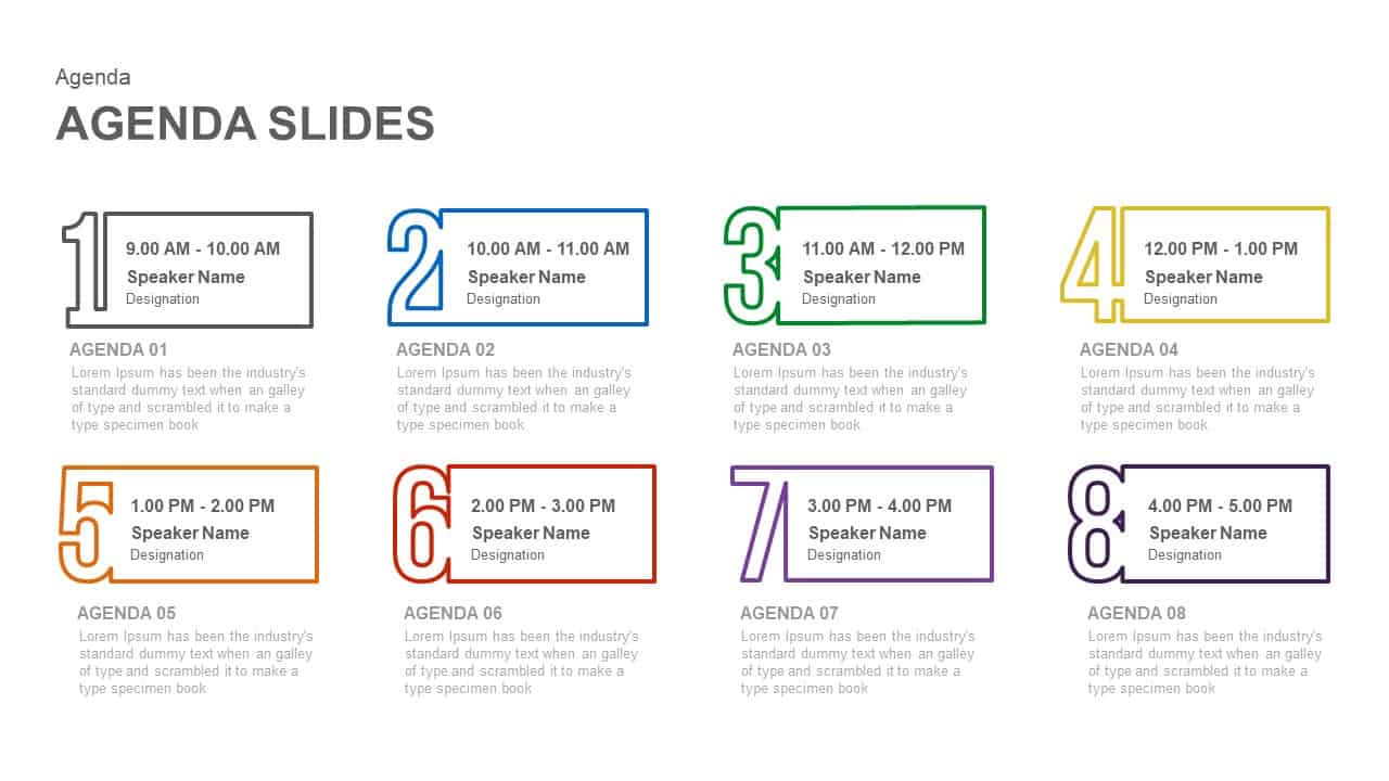
Corporate Meeting Agenda Eight-Step Template for PowerPoint & Google Slides
Agenda
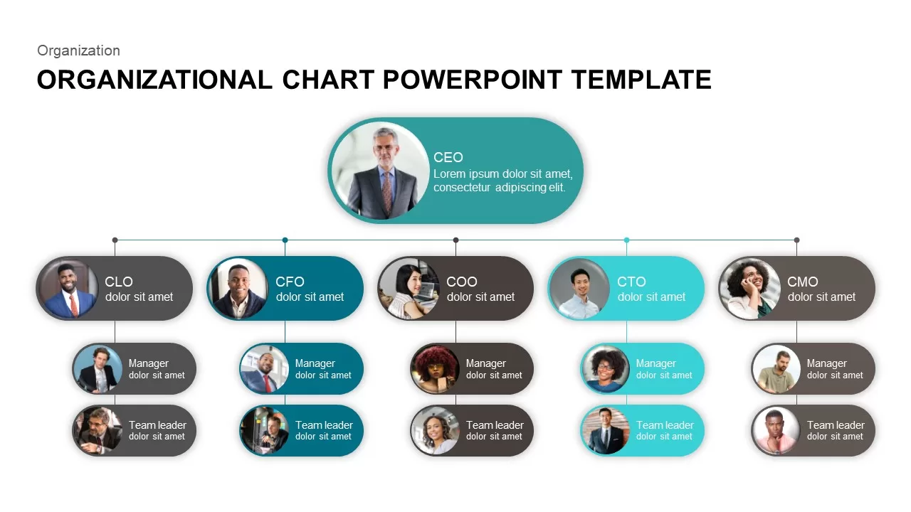
Corporate Organizational Chart PowerPoint Template
Org Chart
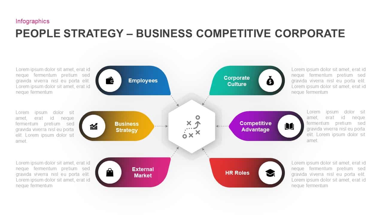
Corporate People Strategy Infographic Template for PowerPoint & Google Slides
Process
Free Corporate PowerPoint Template Design
Company Profile
Free
Corporate Solutions & Company Profile Template for PowerPoint & Google Slides
Company Profile
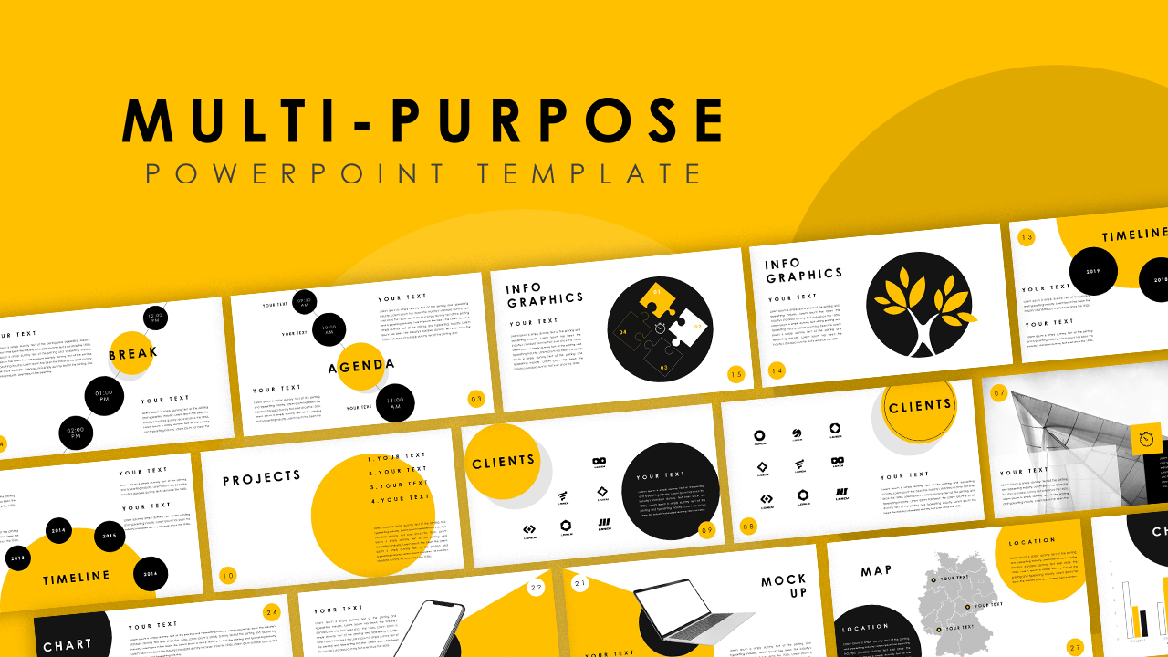
Multi-Purpose Corporate Infographic Template for PowerPoint & Google Slides
Company Profile
Free
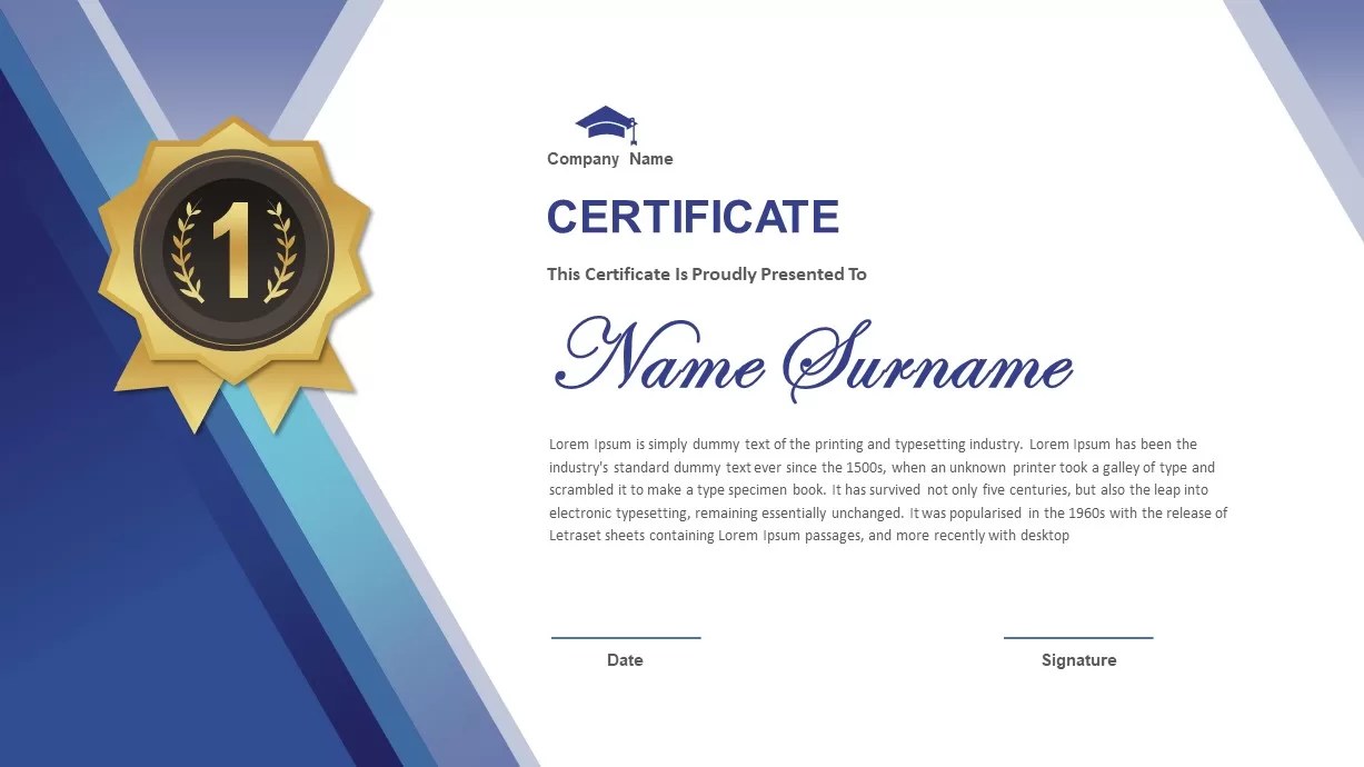
Corporate Award Certificate Design Template for PowerPoint & Google Slides
Accomplishment
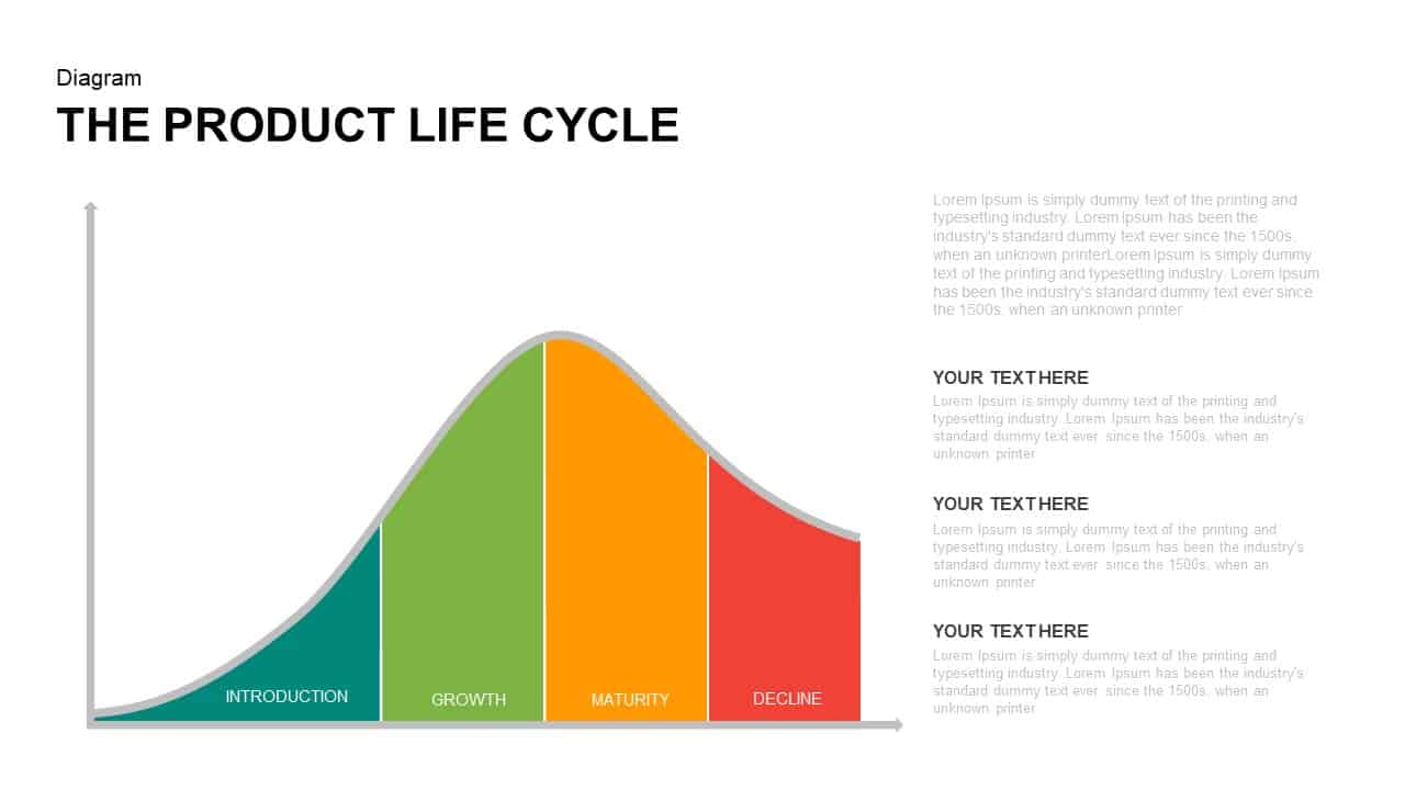
Corporate Product Life Cycle Diagram Template for PowerPoint & Google Slides
Process
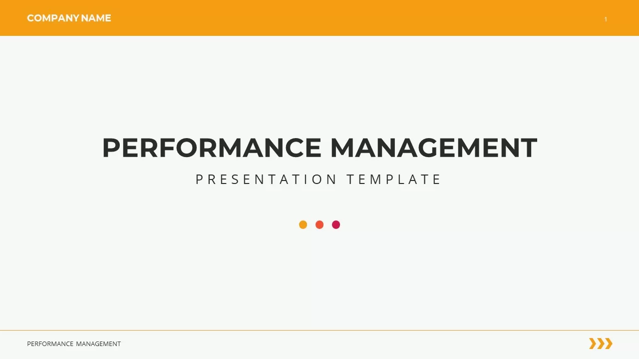
Corporate Performance Management Template for PowerPoint & Google Slides
Pitch Deck
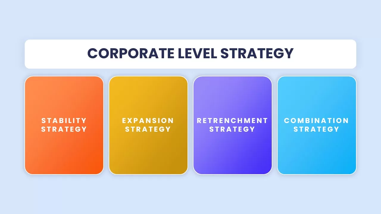
Corporate Level Strategy Overview template for PowerPoint & Google Slides
Business Strategy
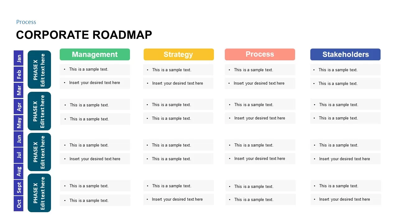
Corporate Roadmap Process Template for PowerPoint & Google Slides
Roadmap
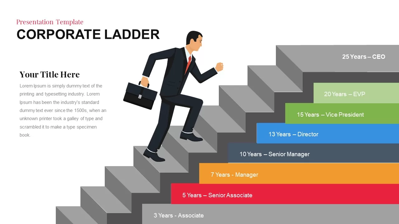
Corporate Ladder Template – Career Development Stages Infographics
Timeline
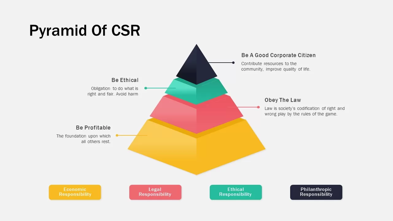
Corporate Social Responsibility Pyramid Template for PowerPoint & Google Slides
Pyramid
Professional Corporate Company About Us Template for PowerPoint & Google Slides
Graphics
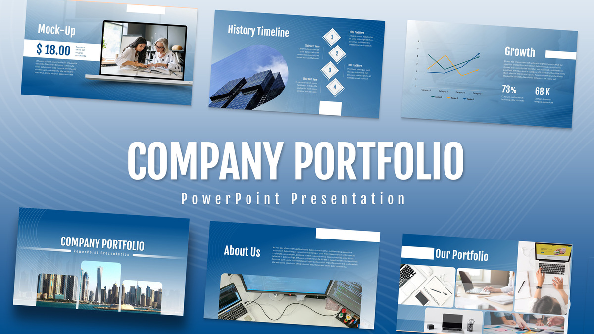
Corporate Portfolio Showcase Template for PowerPoint & Google Slides
Company Profile
Professional Corporate Cover Slide Template for PowerPoint & Google Slides
Company Profile
Geometric Corporate Cover Slide Template for PowerPoint & Google Slides
Company Profile
Red Corporate Cover Slide Template for PowerPoint & Google Slides
Company Profile
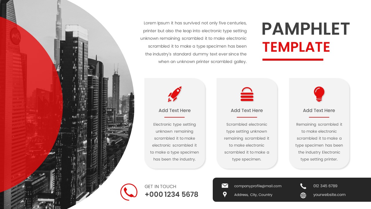
Corporate Pamphlet with Icon Features Template for PowerPoint & Google Slides
Graphics
Corporate Event Poster Announcement Template for PowerPoint & Google Slides
Advertising
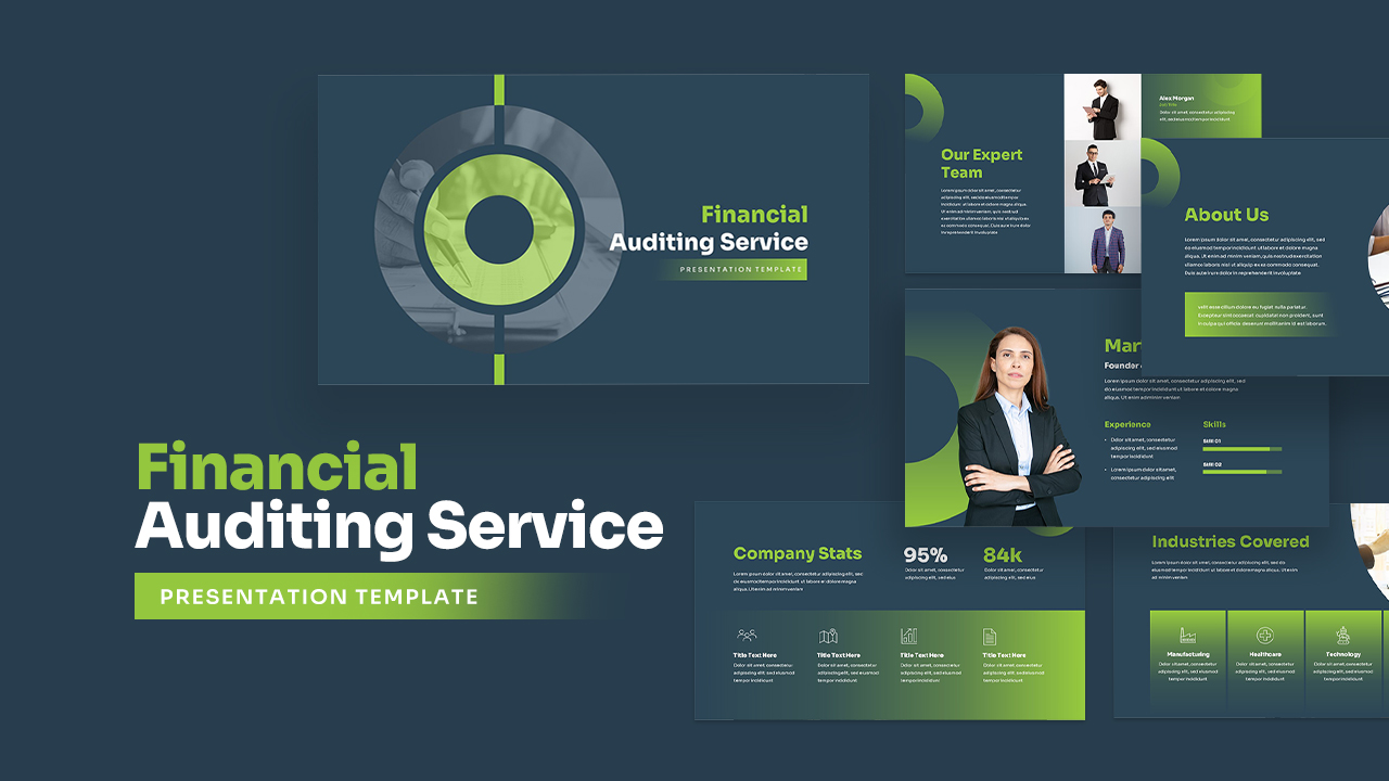
Corporate Financial Auditing Service Template for PowerPoint & Google Slides
Finance
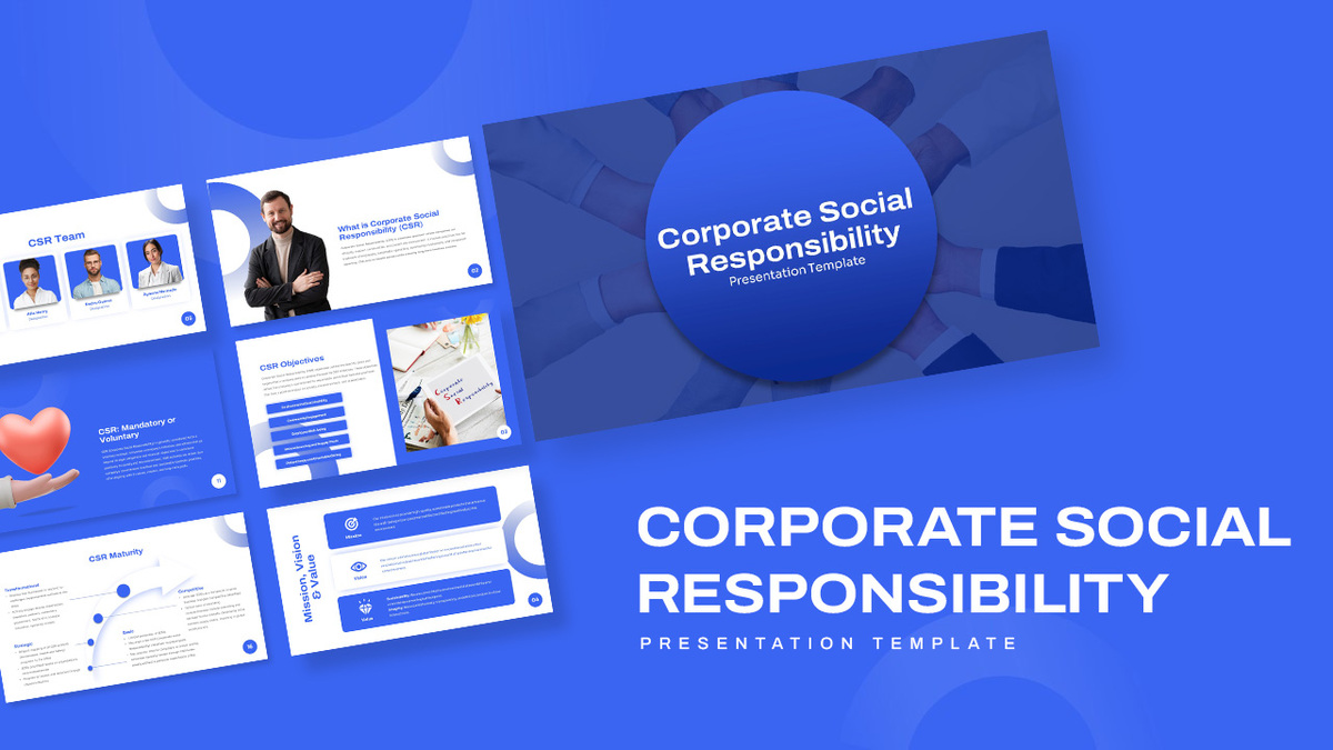
Corporate Social Responsibility Strategy Template for PowerPoint & Google Slides
Company Profile
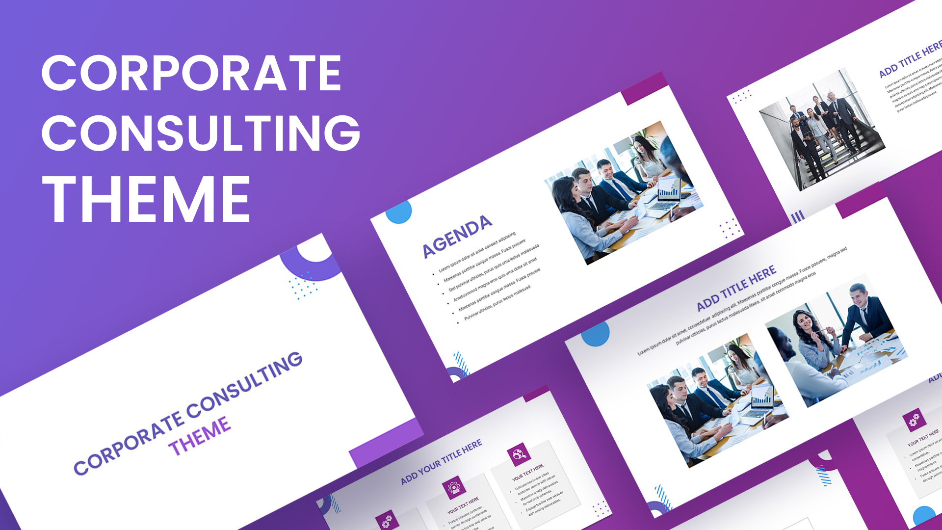
Modern Corporate Consulting Theme Template for PowerPoint & Google Slides
Company Profile
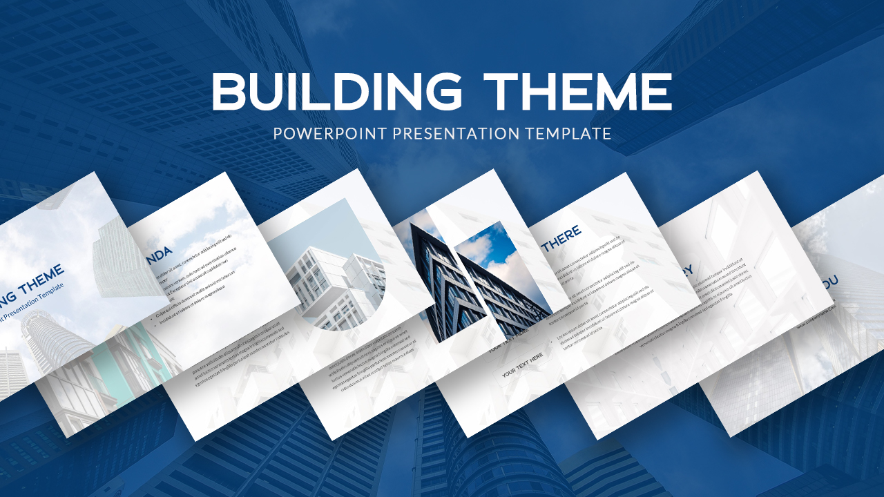
Corporate Architecture Building Theme Template for PowerPoint & Google Slides
Decks
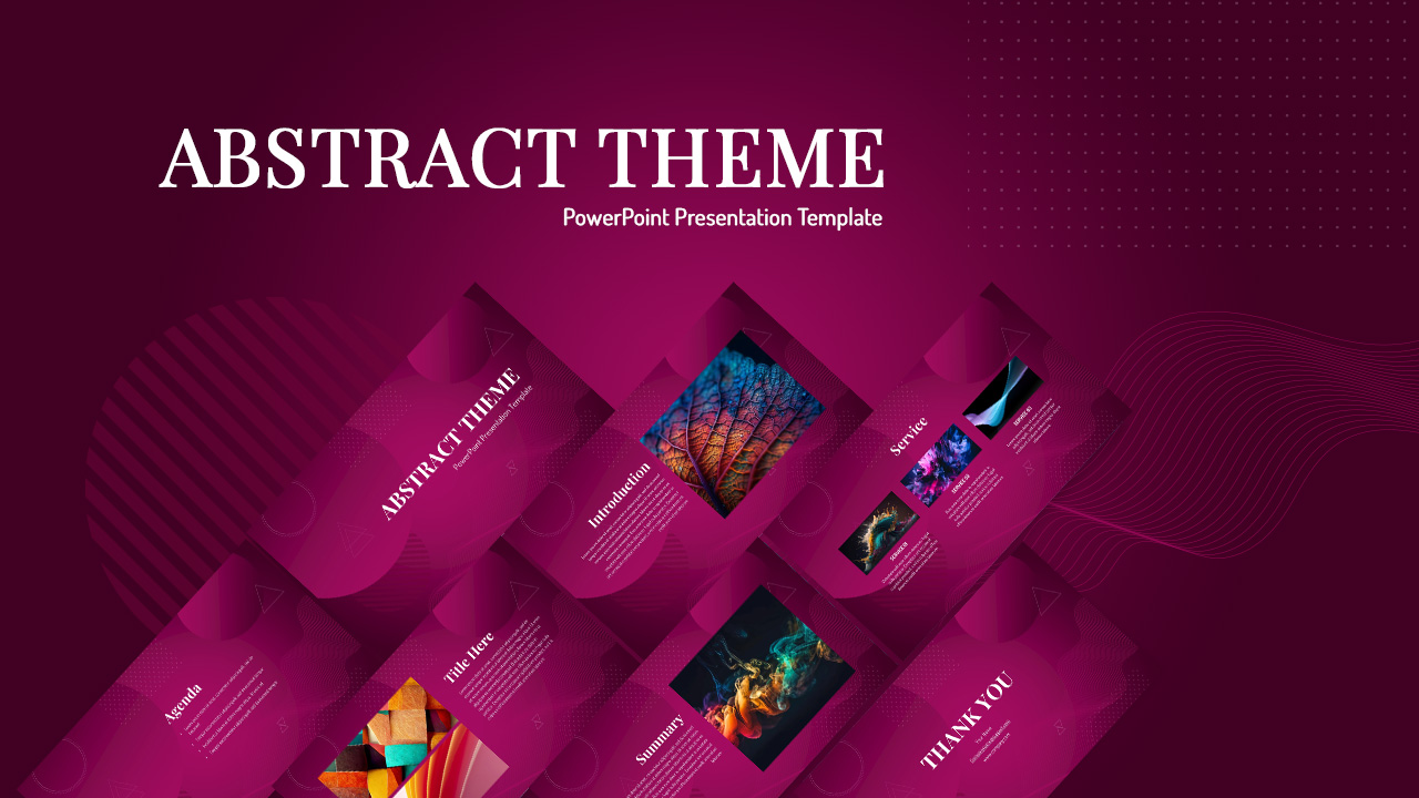
Dynamic Abstract Corporate Theme Template for PowerPoint & Google Slides
Decks
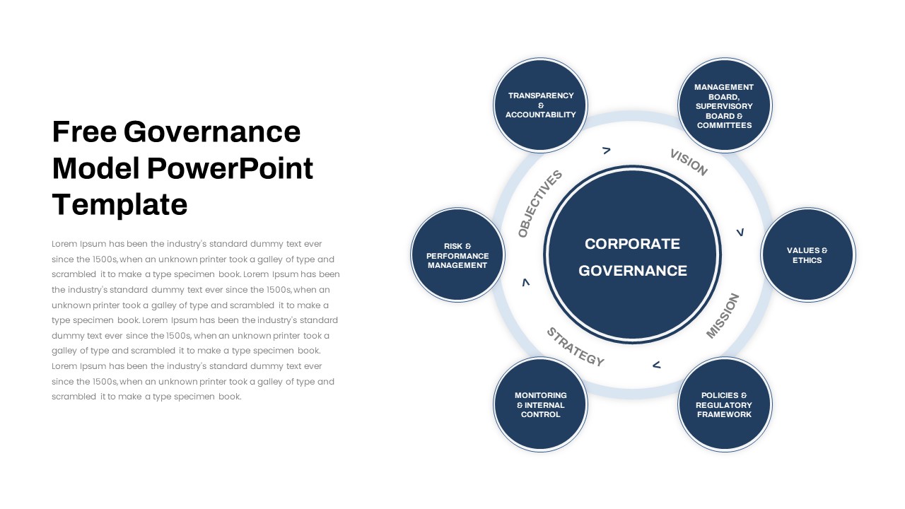
Free Corporate Governance Circular Model Template for PowerPoint & Google Slides
Circular
Free
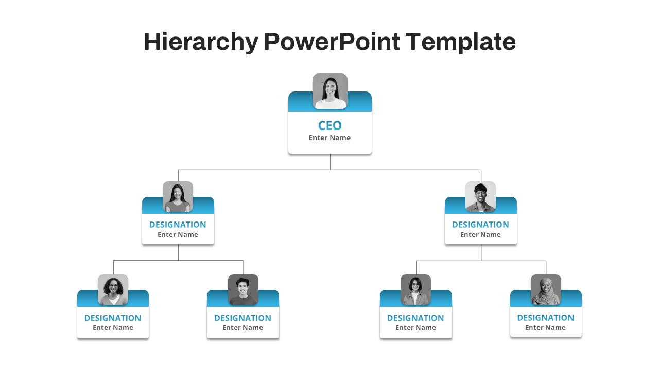
Free Corporate Hierarchy Organizational Chart Template for PowerPoint & Google Slides
Org Chart
Free
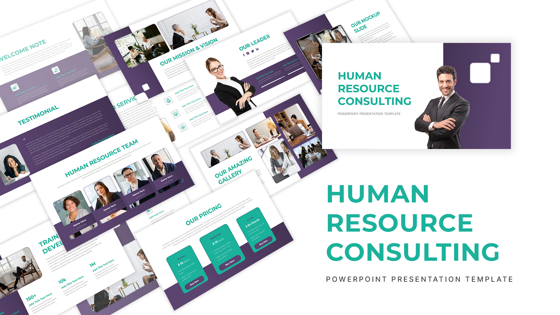
Corporate Human Resource Consulting Template for PowerPoint & Google Slides
HR
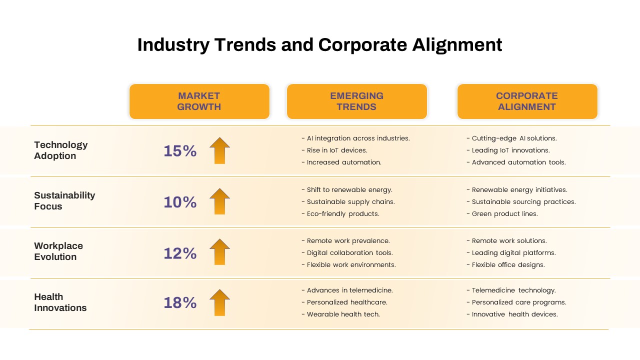
Industry Trends & Corporate Alignment Template for PowerPoint & Google Slides
Business Strategy
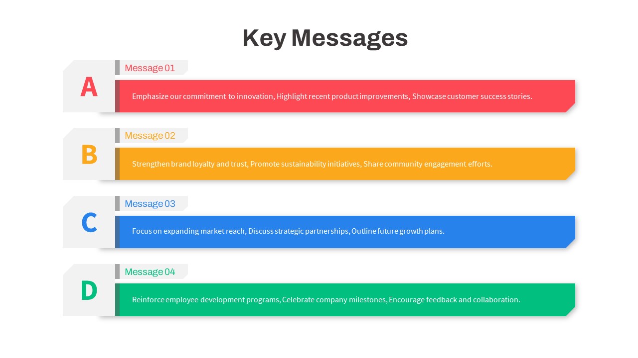
Color-Coded Corporate Key Messages Template for PowerPoint & Google Slides
Process
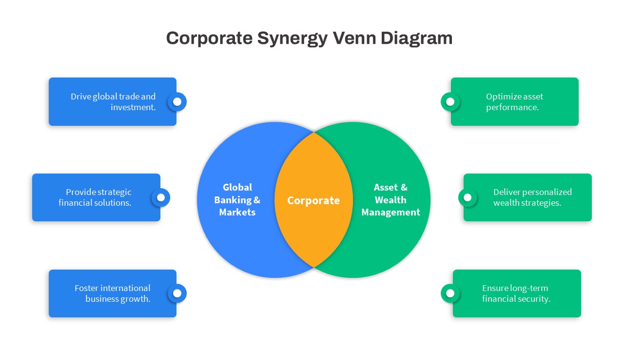
Corporate Synergy Venn Diagram Template for PowerPoint & Google Slides
Comparison
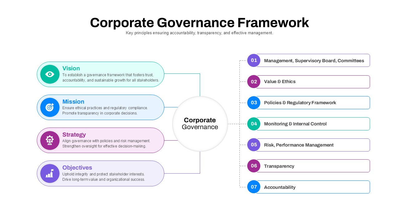
Corporate Governance Framework Diagram Template for PowerPoint & Google Slides
Process
Animated Corporate Company Profile Template for PowerPoint & Google Slides
Company Profile
Corporate Hierarchy Org Chart Template for PowerPoint & Google Slides
Org Chart
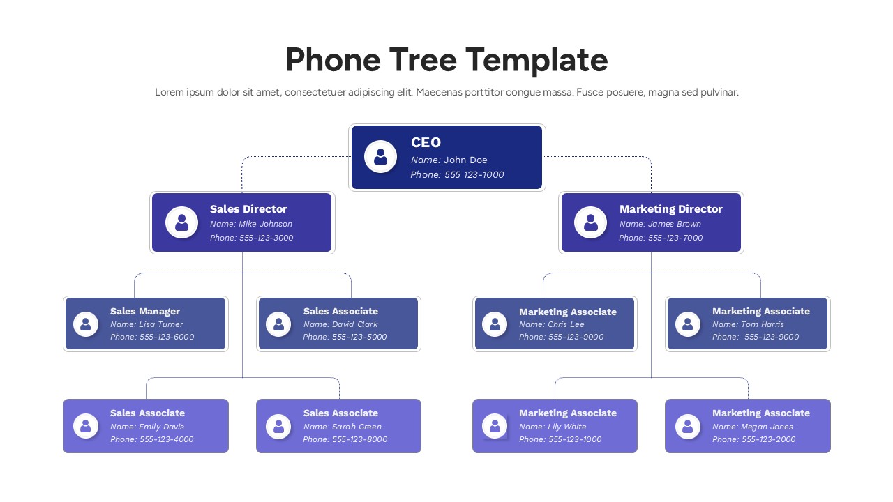
Corporate Phone Tree Hierarchy Template for PowerPoint & Google Slides
Org Chart
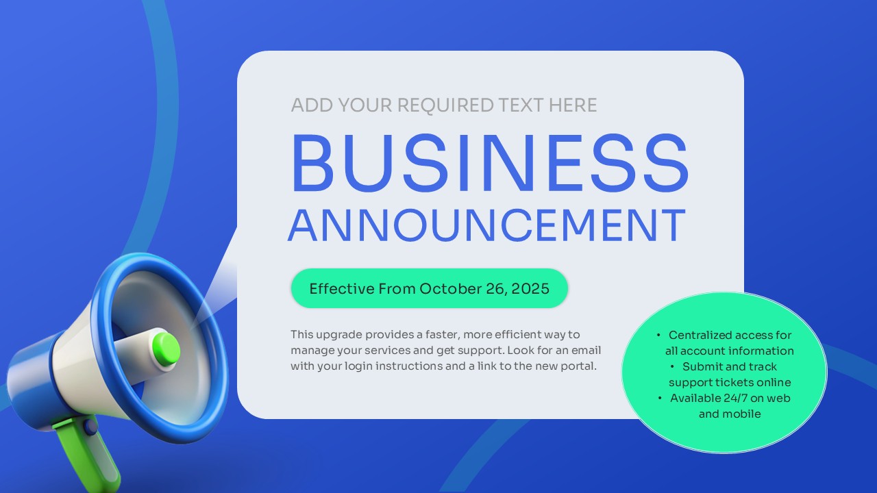
Business Announcement Corporate Update Slide Template for PowerPoint & Google Slides
Graphics
Corporate Business Cover Slide Design for PowerPoint & Google Slides
Pitch Deck
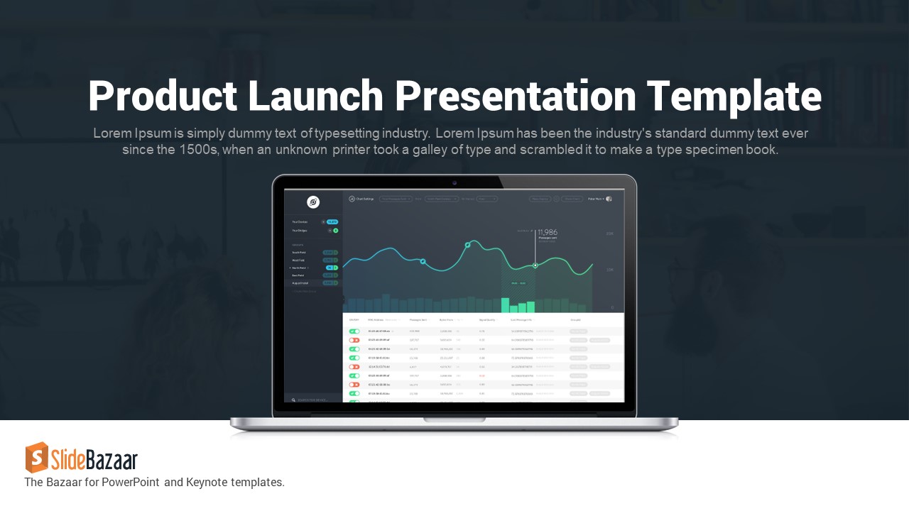
Sleek Product Launch Presentation Deck Template for PowerPoint & Google Slides
Pitch Deck
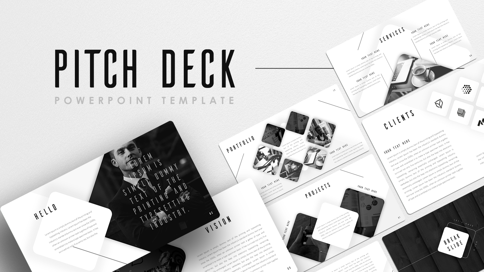
Black White Pitch Deck Presentation Template for PowerPoint & Google Slides
Pitch Deck
E-Learning Education Presentation Deck Template for PowerPoint & Google Slides
Decks
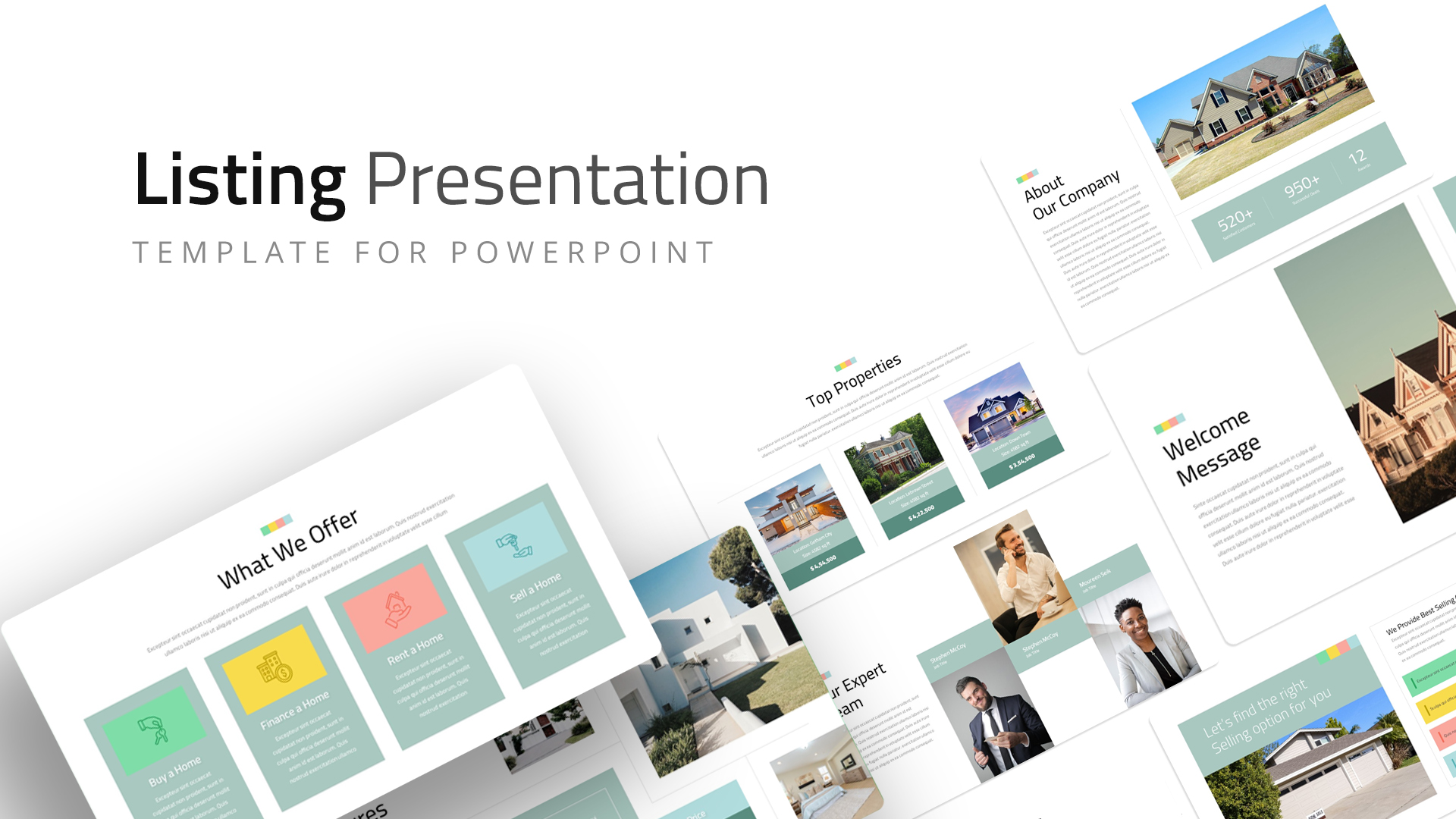
Real Estate Listing Presentation Deck Template for PowerPoint & Google Slides
Company Profile
Airline Industry Presentation Deck Template for PowerPoint & Google Slides
Company Profile
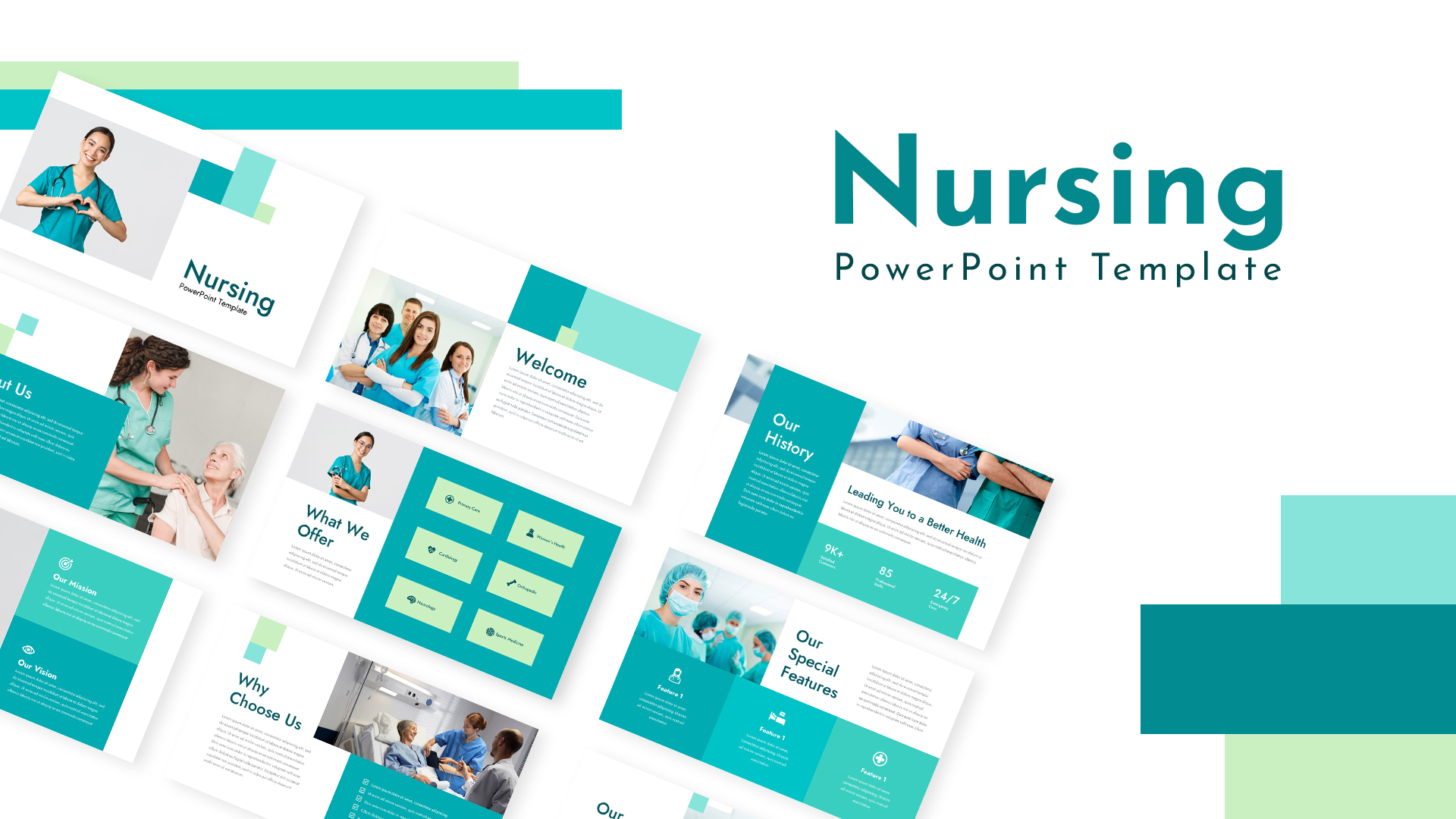
Medical Nursing Presentation Deck Template for PowerPoint & Google Slides
Nursing
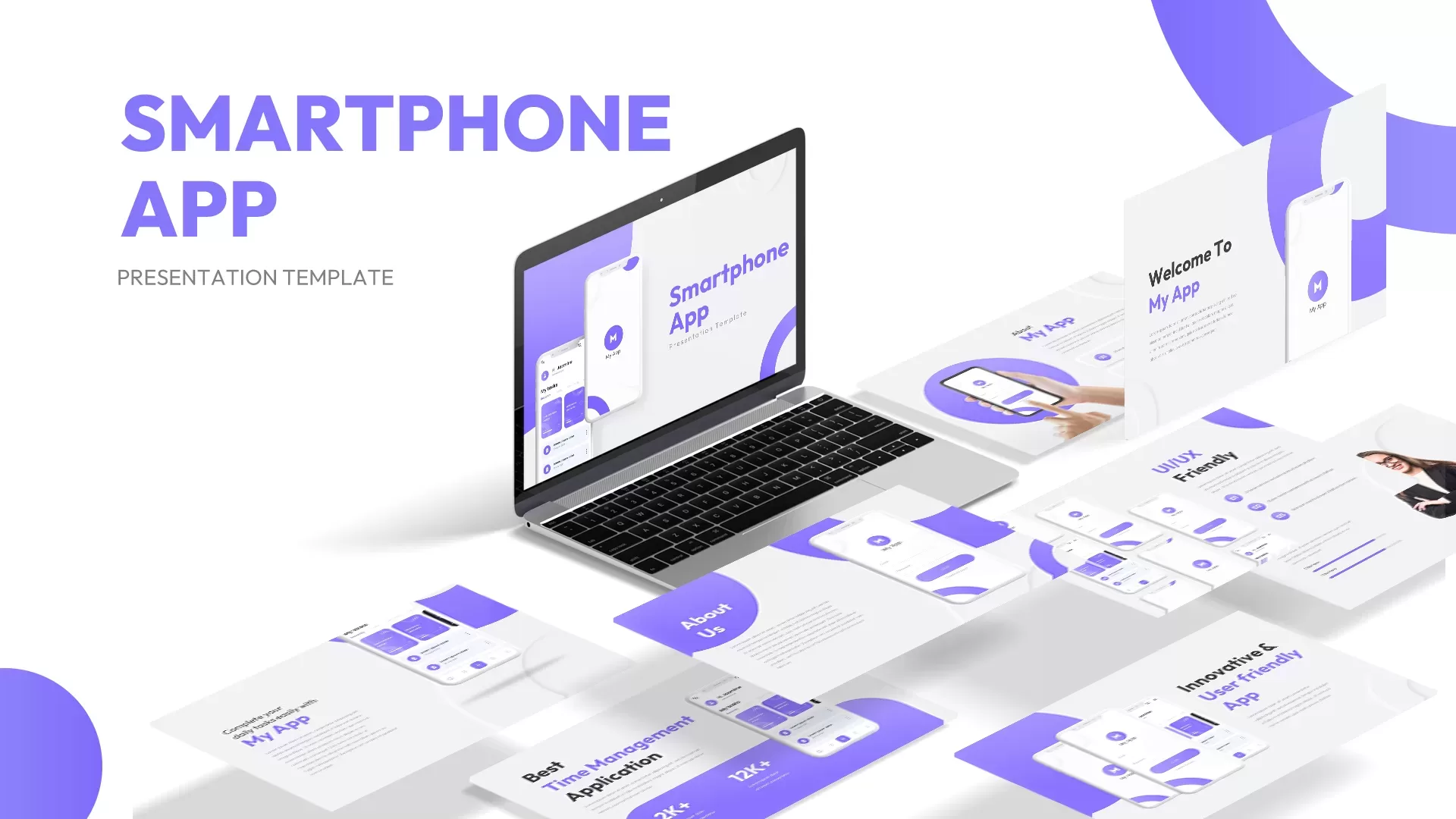
Smartphone App Pitch Deck Presentation Template for PowerPoint & Google Slides
Pitch Deck
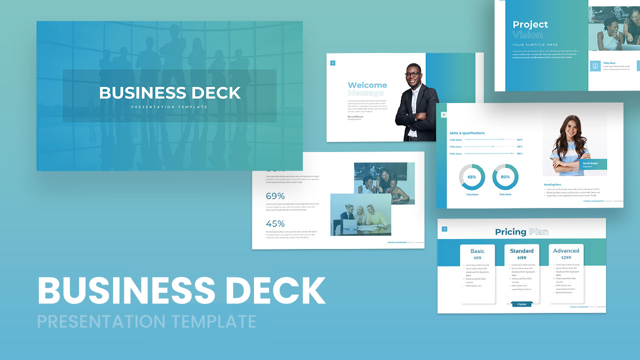
Professional Business Deck Presentation Template for PowerPoint & Google Slides
Company Profile
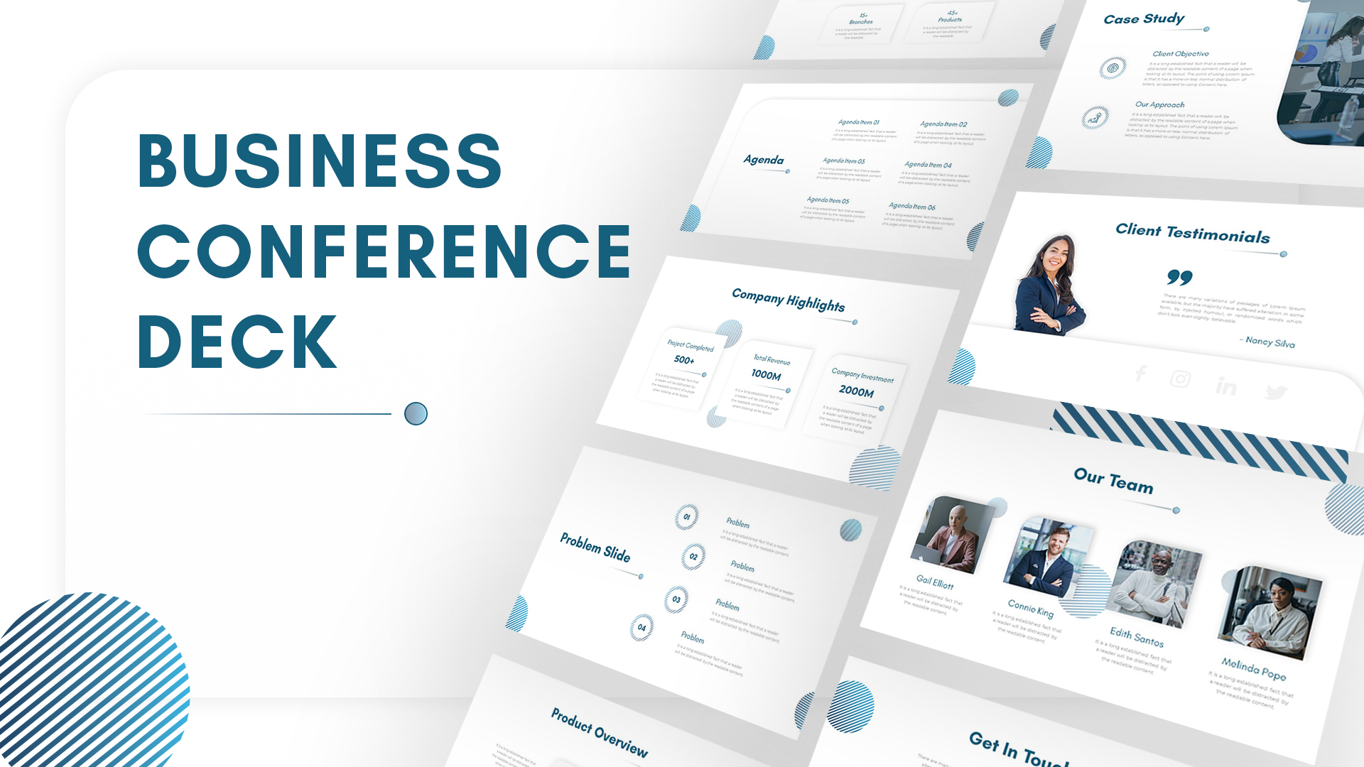
Business Conference Deck Presentation Template for PowerPoint & Google Slides
Pitch Deck
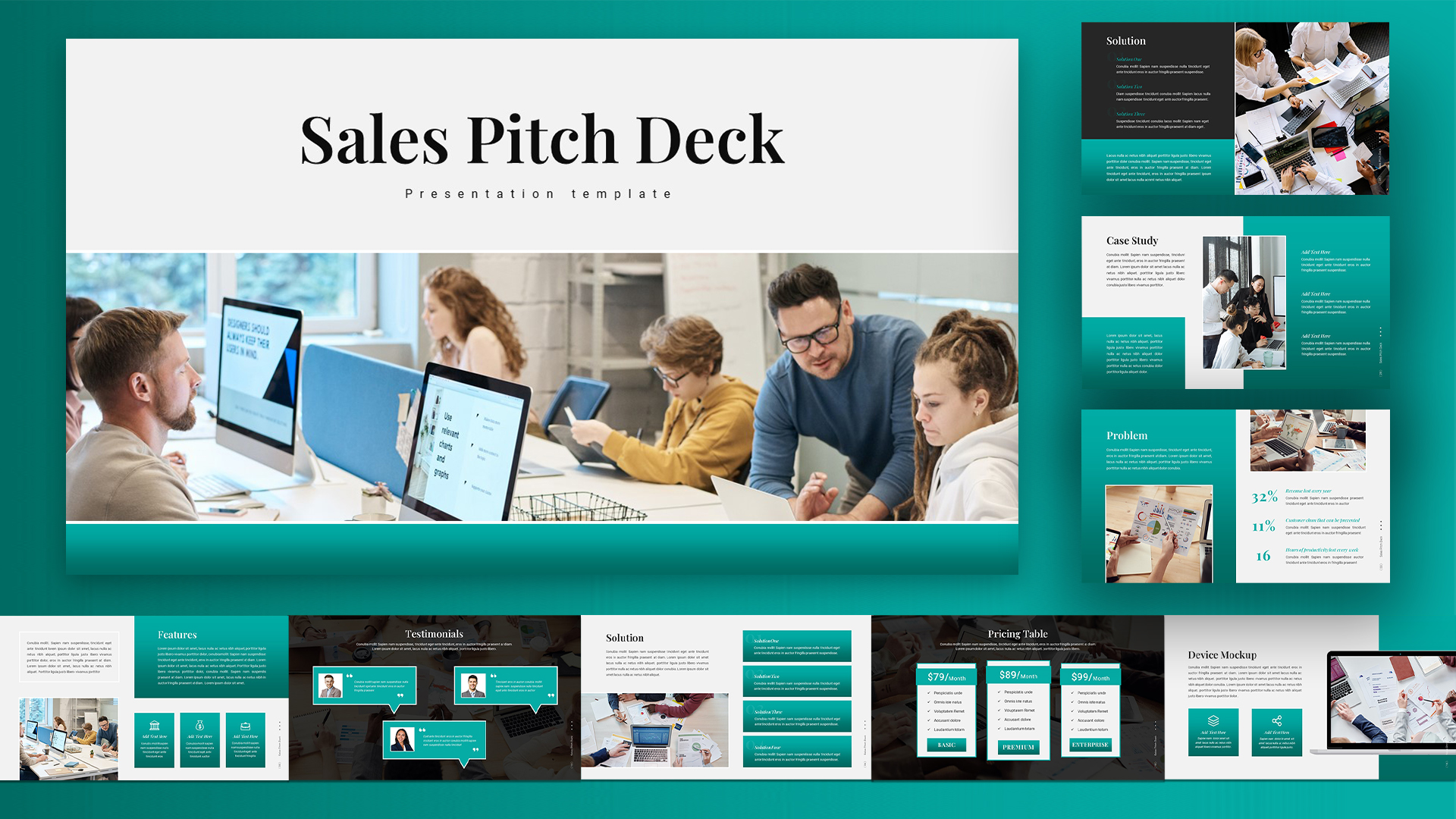
Editable Sales Pitch Deck Presentation Template for PowerPoint & Google Slides
Pitch Deck
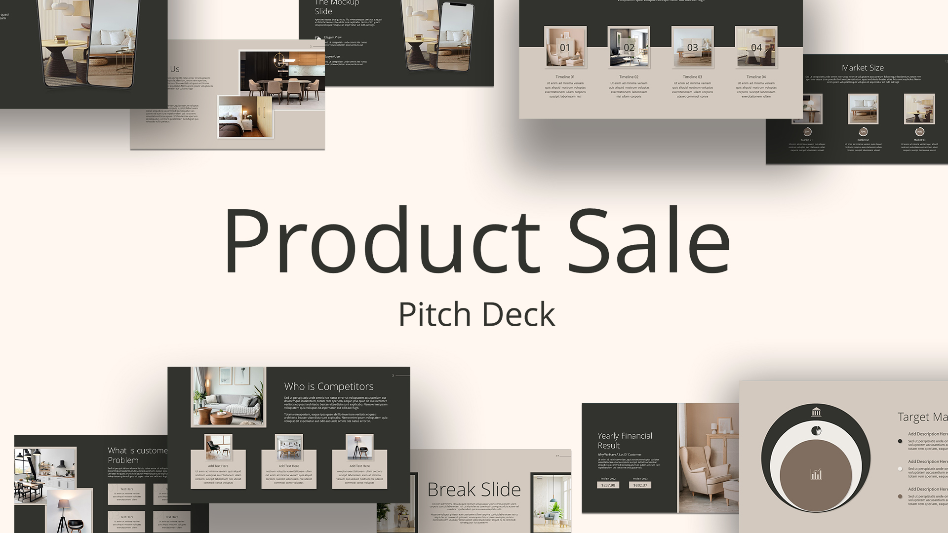
Product Sale Pitch Deck Presentation Template for PowerPoint & Google Slides
Pitch Deck
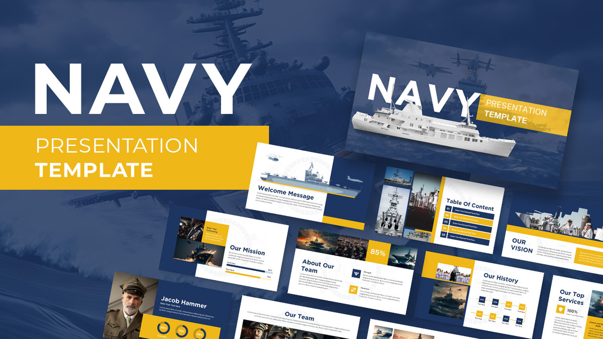
Navy PowerPoint Deck Template
Company Profile
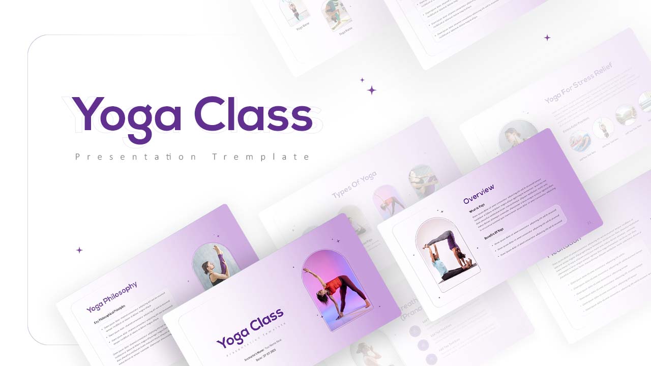
Serene Yoga Class Presentation Deck Template for PowerPoint & Google Slides
Company Profile
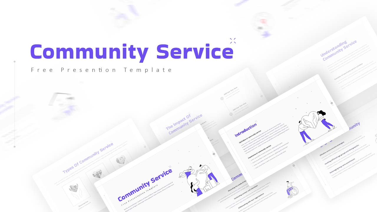
Free Community Service PowerPoint Template
Company Profile
Free
Free Modern Dark Pitch Deck Presentation Template for PowerPoint & Google Slides
Pitch Deck
Free
Free Charts & Graphs Presentation Deck Template for PowerPoint & Google Slides
Pitch Deck
Free
Consulting Proposal Presentation Deck Template for PowerPoint & Google Slides
Pitch Deck
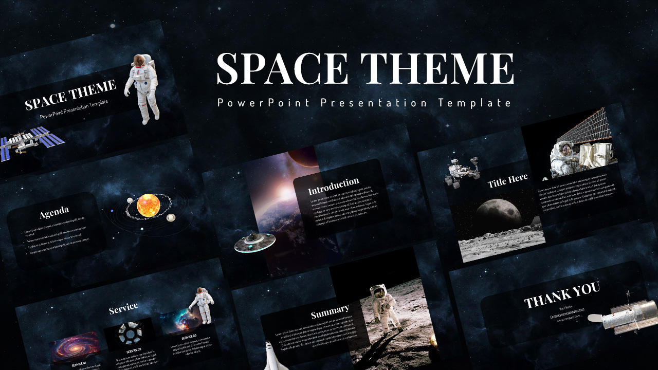
Space-Themed Presentation Deck Template for PowerPoint & Google Slides
Pitch Deck
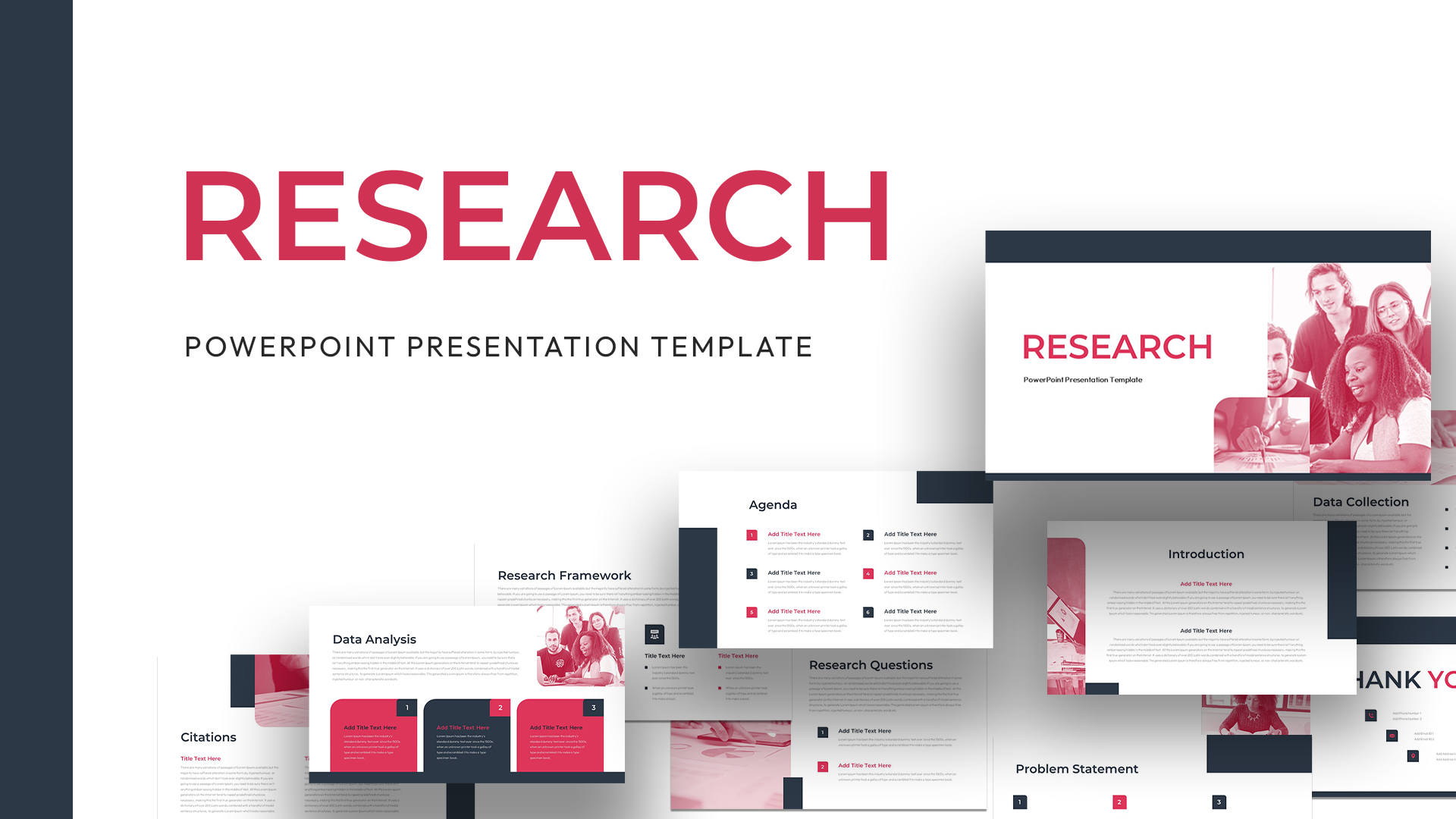
Research Presentation Template Free Download
Decks
Free
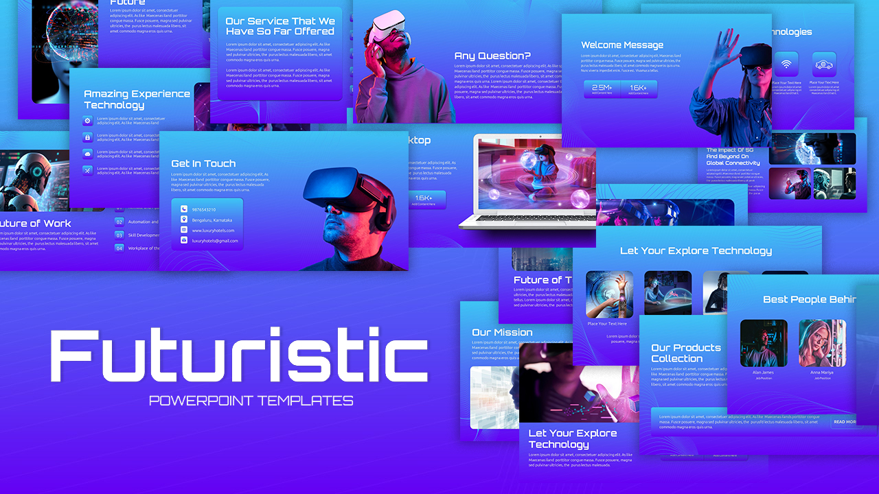
Futuristic Technology Presentation Deck Template for PowerPoint & Google Slides
Company Profile
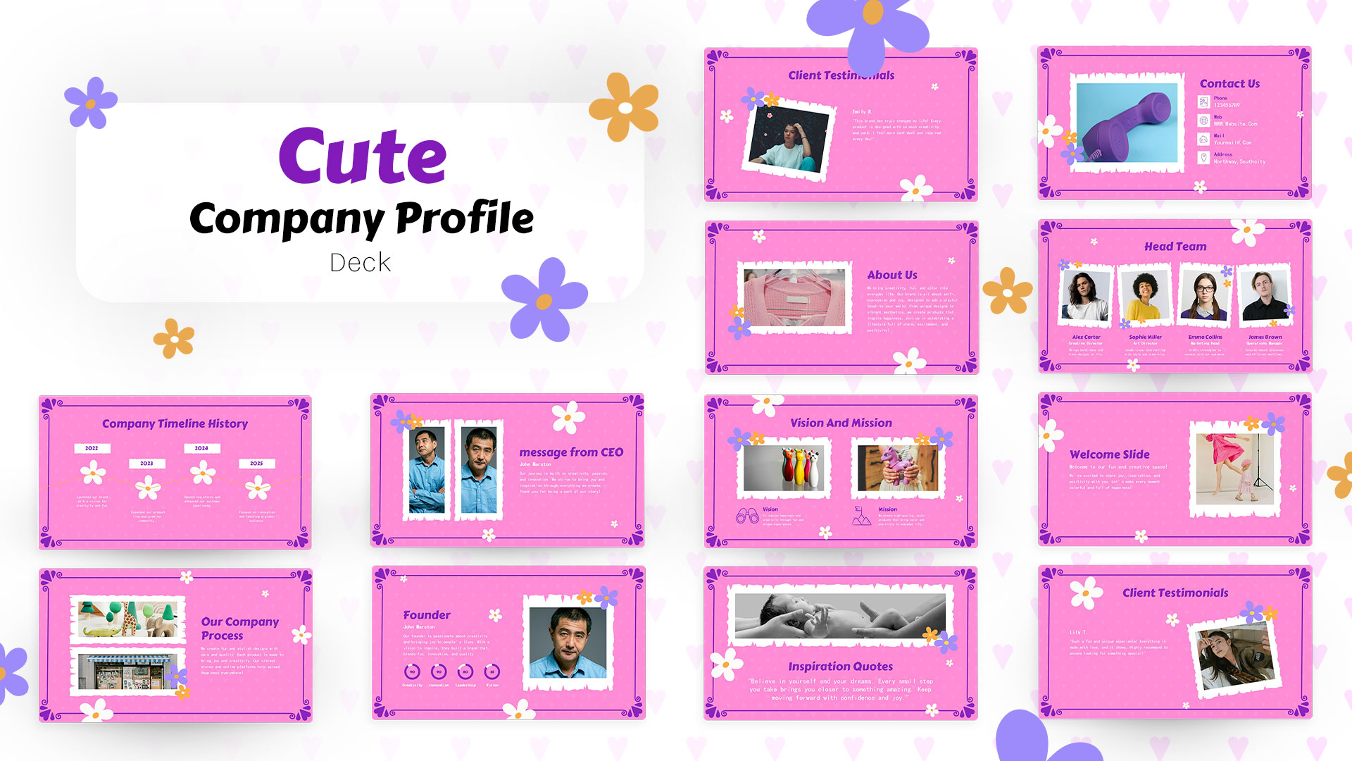
Cute Company Profile Presentation Deck Template for PowerPoint & Google Slides
Company Profile
Self Introduction Presentation Deck Template for PowerPoint & Google Slides
Recruitment
Hybrid Work Presentation Deck Template for PowerPoint & Google Slides
Company Profile
Client Meeting Presentation Deck Template for PowerPoint & Google Slides
Company Profile
Neuromarketing Presentation Deck Template for PowerPoint & Google Slides
Pitch Deck