How to Create Color Palette for Your Next Presentation

It goes without saying that color is a powerful tool in presentations. A good color palette can grab attention, and elevate your presentation to the next level. But with so many colors to choose from, how do you create a palette for your presentation that is both visually appealing and effective for your message? In this guide, we’ll go through some basics that will help you create a color palette that takes your presentations to the next level.
What purpose does color serve in presentation?
Colors don’t just exist for aesthetics, they also evoke emotions and influence perception. Here’s what you need to know about colors in presentations:
Color Psychology:
Different colors, evoke different emotions. Red exudes energy, blue conveys trust, and more. Consider which emotions you want to elicit in your presentations and choose your colors accordingly.
Here are some examples:
Red: Energetic, passion, strength. Red represents power.


Blue: Most commonly used color in healthcare and finance industries. Confidence, responsibility, calmness and a sense of security.


Yellow: This color conveys energy, and used a lot in the food industry.


Green: Symbolizes nature, life, and peace. Evokes a sense of growth, balance. Used by companies in the tech and energy sectors.


White: Simple, minimalistic, evoking optimism, it is the color of purity.


Black: Used by luxury brands to convey elegance and courage.


Brand Alignment
Does your presentation represent a specific company or brand? Integrate their established color palette to maintain consistency.
Accessibility
Don’t forget to ensure sufficient contrast between text and background colors for optimal readability, especially for visually impaired viewers. You can read more about making your presentations more accessible here.
How to choose a color palette for your presentations?
There are various strategies that you can use to create a color palette for your PowerPoint presentations. Let’s look at a few of them:
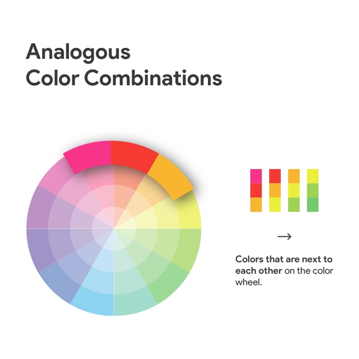
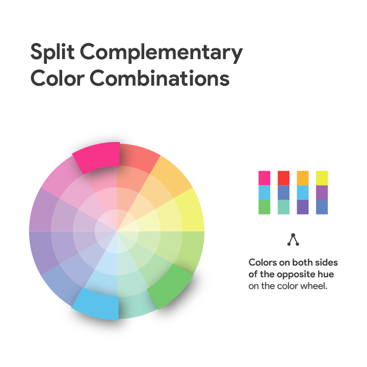
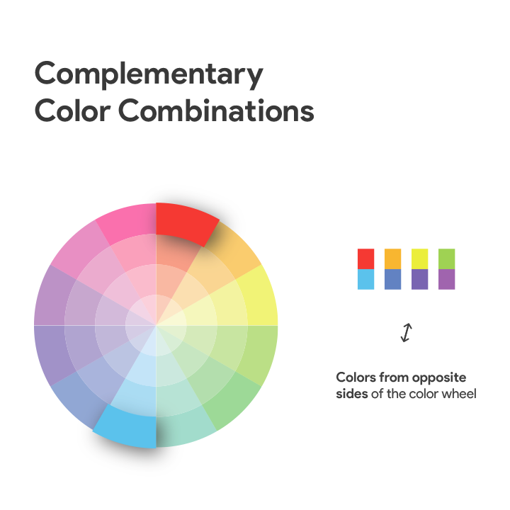
Use the color wheel:
The color wheel is a circular guide that visually represents the relationships between colors. Colors that are opposite to each other, known as complementary colors, create a high-contrast but balanced color scheme. Colors that are neighbours on the color wheel, called analogous colors, offer a subtle and cohesive feel. Three evenly placed colors, known as triadic colors provide another option of vibrant and dynamic colors that you can use in your presentations.


Rule of three:
Do not go overboard with choosing colors. Limit you palette to three, or at most, four main colors. Or you might end up overwhelming your audience. Use a primary color for emphasis, a secondary color for supporting elements, and an accent color for highlights.
Once you have chosen a color palette, here is what you can do next:
Establish a base color. This color will be the dominant color that sets the overall tone of your presentation. You can use this for backgrounds or text.
Choose accent colors. These colors add vibrancy and can be used highlight key information. Use them sparingly for titles, charts, or CTA elements.
Now it’s all about applying your color palette to your presentation:
To start off, apply the base color, or use a lighter shade as your main background. Use contrasting colors, for text and headlines to ensure readability. You can also use accent colors in data sets and charts to make them pop. Additionally, if the images in your slides also follow the same color palette, you’ll end up having a cohesive looking presentation that’s sure to impress.
Conclusion:
A well-defined color palette is an essential component of all impactful presentations. By employing strategic color selection methods, and applying these techniques effectively, you can transform your slides from ordinary to extraordinary. That’s all for now, check out SlideBazaar for well-designed, colorful PowerPoint slides that you can use in your presentations.


