
- Why Comparison Infographics Work
- Starting With a Clear Foundation
- Method 1: Using PowerPoint’s Built-In Comparison Layout to create a Comparison Infographic
- Method 2: Building a Comparison Infographic using a Table
- Method 3: Visual Comparison with Charts
- Method 4: Custom Visual Design (For Maximum Impact)
- Using Templates to Save Time
- Design Principles That Make Comparisons Clear
- Common Pitfalls to Avoid
- Bringing It Home
How to Create a Compelling Comparison Infographic Slide in PowerPoint


When you need to help your audience make a decision, few tools are more powerful than a well-designed comparison infographic. Whether you’re contrasting two products, weighing pros and cons, or analyzing competing strategies, a visual side-by-side comparison cuts through complexity and drives clarity.
The challenge? Creating one that’s genuinely helpful rather than just visually busy. A great comparison infographic guides decision-making by highlighting what truly matters. In this guide, I’ll show you how to build comparison slides in PowerPoint that are both beautiful and functional.
Why Comparison Infographics Work
Our brains love patterns and contrasts. When you place two options side by side with consistent visual treatment, you’re doing the cognitive heavy lifting for your audience. They can scan, compare, and reach conclusions faster than if they had to hold multiple pieces of information in their heads.
The key is making the comparison effortless. Your audience shouldn’t have to work to understand which feature belongs to which product, or what your color coding means. Everything should be immediately intuitive.
Starting With a Clear Foundation
Define Your Comparison
Before you open PowerPoint, get crystal clear on what you’re comparing and why it matters.
Are you contrasting two products? Three pricing tiers? The before-and-after of a process?
Your comparison structure will shape every design decision that follows.
Write down your comparison title in simple, human language: “iPhone vs. Android,” “2024 vs. 2025 Performance,” “Plan A vs. Plan B.” This becomes your slide headline and keeps you focused.
Choose Your Criteria Wisely
Here’s where many comparison slides fall apart: trying to compare too much at once.
Select 3-7 key criteria that actually drive the decision. More than that and your slide becomes a spreadsheet. Fewer than that and you might not provide enough information.
Ask yourself: “If someone could only know three things about this comparison, what would change their decision?” Those are your criteria.
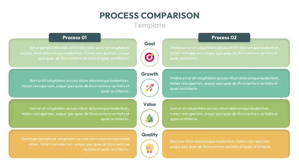
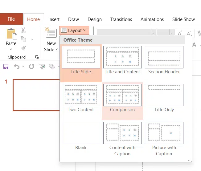
Method 1: Using PowerPoint’s Built-In Comparison Layout to create a Comparison Infographic
PowerPoint anticipates your needs with pre-designed layouts, and the Comparison layout is perfect for getting started quickly.
Setting Up the Structure
Create a new slide and click the Layout dropdown in the Home tab. Select Comparison. You’ll see a slide divided into two columns, each with a heading area and content section.
Click into the heading boxes and type your comparison subjects. These should be short and punchy. “Option A” and “Option B” work, but “Premium Plan” and “Basic Plan” are more concrete and meaningful.
In the content areas below, add your comparison points as bullet lists. Keep these scannable. Think single phrases rather than complete sentences. “24/7 customer support” beats “We offer customer support that is available twenty-four hours a day.”
Making It Visual
The default layout gives you structure, but it’s fairly plain. This is where you transform text into an infographic.
Replace those bullet points with icons. Go to Insert → Icons, search for relevant symbols (checkmarks, stars, tools—whatever represents your criteria), and place them next to your text. Icons create visual anchors that help people scan faster.

Add subtle background colors to distinguish each column. Select the shapes behind each section, then go to Shape Format → Shape Fill and choose colors that align with your brand or naturally represent each option (blue for one, orange for another, for instance).
Method 2: Building a Comparison Infographic using a Table
For more data-driven comparisons where you’re evaluating multiple criteria across multiple options, a table structure often works better than the layout approach.
Creating Your Table
Go to Insert → Table and create a grid that matches your needs. Typically, you’ll want one column for criteria labels, plus one column for each item you’re comparing. So for a two-way comparison across five criteria, you’d create a 6-row by 3-column table (including a header row).
In the top row, add your headers: “Features,” “Product A,” “Product B.” In the left column, list your comparison criteria row by row.
Filling With Meaningful Data
Now comes the magic: instead of just typing “Yes” or “No” in each cell, use visual indicators.
- Checkmarks and X-marks: Insert icons (Insert → Icons) for clear yes/no comparisons
- Star ratings: Add star icons in quantities that represent quality levels (★★★★★ vs. ★★★☆☆)
- Color coding: Fill cells with green for advantages, red for disadvantages, yellow for neutral
- Numbers and metrics: When comparing quantifiable features, use large, bold numbers
To insert icons into table cells, click inside the cell, then Insert → Icons. Resize them to fit comfortably within the cell without crowding the text.
Styling Your Table
Default PowerPoint tables look institutional. Let’s fix that.
Select your table and go to Table Design in the ribbon. Choose a style, but don’t just accept the default—customize it. I recommend:
- Removing most gridlines for a cleaner look (keep just the header row border)
- Using alternating row colors very subtly (just 5-10% fill, not bold stripes)
- Making header text bold and slightly larger
- Aligning text consistently (centered headers, left-aligned criteria, centered comparison data)
Right-click your table, select Format Shape, and in the pane that appears, you can fine-tune cell padding, borders, and spacing. A little extra padding (0.1″ on all sides) makes everything more readable.
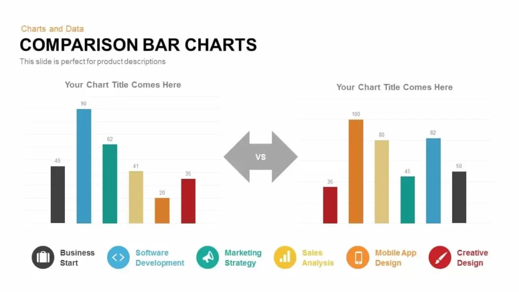
Method 3: Visual Comparison with Charts
Sometimes your comparison is fundamentally about numbers—sales figures, ratings, performance metrics. In these cases, a chart embedded in your comparison infographic tells the story more powerfully than tables.
Choosing the Right Chart Type
Go to Insert → Chart and consider which type serves your comparison:
- Clustered columns: Perfect for side-by-side comparisons across multiple categories
- Bar charts: Great when you have longer category names that need more space
- Radar charts: Excellent for comparing multiple attributes in a circular pattern (think skill assessments)
For a simple two-way comparison, clustered columns are your safest bet.
Inputting Your Data
When you insert a chart, PowerPoint opens a mini Excel window. Replace the sample data with your comparison data. Each row represents a criterion, and each column represents one of the items you’re comparing.
Close the Excel window and your chart updates automatically.
Integrating Charts Into Your Design
Charts alone can look isolated on a slide. Integrate them into your comparison infographic by:
- Adding your comparison subjects as clear labels above or beside the chart
- Using your brand colors for the data series (select the bars, right-click, Format Data Series, Fill)
- Removing unnecessary gridlines and chart clutter (click Chart Elements button next to your chart and uncheck items)
- Adding data labels directly on the bars so viewers see exact numbers without squinting at the axis
Place supporting icons or images next to the chart—product logos, representative icons, or even small product photos—to reinforce what’s being compared.
Method 4: Custom Visual Design (For Maximum Impact)
When you need something truly distinctive, build your comparison from scratch using shapes, icons, and images.
Creating Split-Screen Layouts
Insert a rectangle shape that fills half your slide vertically. Duplicate it and align the second rectangle to fill the other half. Give each a different background color that represents what you’re comparing.
Now you have a clean split-screen foundation. Add your comparison subject names at the top of each section using text boxes with large, bold fonts.
This video can provide some design inspiration:
Building Visual Hierarchies
Within each section, use a consistent layout pattern:
- Icon or image at the top: A visual identifier (product logo, concept icon)
- Key metric in large text: The most important number or statement
- Supporting details below: 3-5 brief points with small icons
This pattern creates scannable columns that viewers can absorb in seconds.
Use Insert → Shapes to add dividing lines, callout boxes for highlighting advantages, or subtle background shapes that group related information.
Adding Professional Polish
Alignment is everything in custom designs. Select all elements in one section, then use Format → Align → Align Center and Distribute Vertically to create perfect spacing.
Add subtle shadows or glows to key elements (right-click → Format Shape → Shadow) to create depth, but keep these effects minimal—a little goes a long way.
Using Templates to Save Time
If you’re creating comparison slides regularly, starting with a template can save hours while maintaining professional quality.
Search for “comparison infographic PowerPoint template” on sites like SlideBazaar.
When you find one you like, download it and customize by:
- Replacing placeholder text with your actual comparison points
- Swapping generic icons for ones specific to your content
- Adjusting colors to match your brand
- Removing any elements that don’t serve your specific comparison
The structure and spacing are already perfected, you’re just personalizing the content.
Design Principles That Make Comparisons Clear
Use Color Strategically
Assign one consistent color to each item being compared and use it everywhere—backgrounds, icons, text highlights. This creates instant visual association. If you’re comparing three options, you need three distinct colors.
Avoid using red and green together unless you’re specifically indicating good/bad, as these combinations can be challenging for colorblind viewers. Blue and orange, purple and yellow, or navy and teal work well.
Embrace White Space
Cramming too much into your comparison defeats the purpose. If you have more criteria than fit comfortably, create a second comparison slide rather than shrinking everything down. Your audience should be able to read your slide from the back of the room.
Leave margins around your content, space between elements, and breathing room in table cells.
Make Winners Obvious
If your comparison is designed to recommend one option, make that clear. Use visual emphasis:
- Slightly larger dimensions for the recommended choice
- A subtle glow or border
- A “Recommended” badge or ribbon
- Bolder, brighter colors
Don’t make your audience guess which option you’re advocating for if you have a position.
Keep Text Minimal
Every word on your comparison slide should earn its place. Replace phrases with single words when possible:
- “Available on request” → “Available”
- “Not included in this package” → “Not included” or just an ✗
- “Superior performance in testing” → “Superior” or a star rating
You can always elaborate verbally during your presentation. The slide is for scanning, not reading.
Testing Your Comparison
Before you present, preview your slide in Slide Show mode and ask yourself:
- Can I understand the comparison in under 10 seconds? If not, it’s too complex.
- Is anything misleading? Make sure visual sizes, colors, and positions accurately represent the data.
- Does the comparison drive the decision I want? If you’re recommending something, does your design make that choice obvious?
- Would this work in black and white? If your comparison relies solely on color, it may not work if printed or viewed by colorblind audience members.
Show it to a colleague who knows nothing about the comparison and ask them to summarize what they see. Their immediate takeaway tells you if your design is working.
Common Pitfalls to Avoid
Too Many Criteria: More than seven comparison points and you’ve created a reference document, not a presentation slide. Prioritize ruthlessly.
Inconsistent Layouts: If Product A’s information is organized one way and Product B’s is arranged differently, your audience wastes energy just figuring out where to look. Mirror your layouts exactly.
Unclear Symbols: Don’t assume everyone interprets your icons the same way. Add a small legend or use universally recognized symbols (✓ for yes, ✗ for no).
Competing Visual Weights: When every element is bold, large, or brightly colored, nothing stands out. Create hierarchy—some elements should be prominent, others should recede.
Bringing It Home
A well-crafted comparison infographic transforms decision-making from exhausting to effortless. Whether you’re using PowerPoint’s built-in layouts, creating custom designs with shapes and charts, or adapting templates, the principles remain the same: clarity, consistency, and visual hierarchy.
Start with your most important comparison criteria, choose a structure that serves your content, and design with empathy for your audience’s scanning patterns. Keep testing and refining until the right choice becomes immediately obvious.
Now open PowerPoint and start comparing. Your audience will thank you for making complex decisions feel simple.
Related Articles
-
 July 26th, 2024
How to Activate or Re-enable a Disabled PowerPoint Add-in
Blog Post -
 July 20th, 2021
Why did second-level thinking make Howard Marks a buyer in a turbulent market
Blog Post -
 February 9th, 2024
How to Add a Countdown Timer in PowerPoint
Blog Post