
How to Choose a Perfect Color Combination for PowerPoint Designs?

“What’s in a name? That which we call a rose by any other name would smell as sweet”. This phrase from the evergreen William Shakespeare gives an idea of futility behind nomenclature. It is a thought-provoking philosophy with a logical touch. In the modern techie world, what you think about it! Is it a logical framework? Do you think the name has no role in determining once existence? The philosophy behind the naming is now correlated with sales and marketing. So, naming has immense importance in the modern business world.
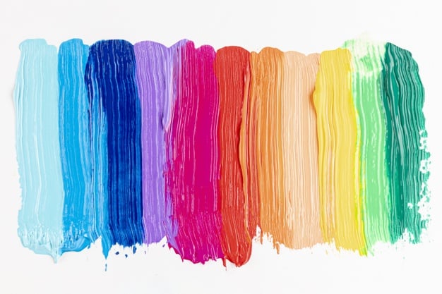
In this article, I would like to share the selection of colour combinations in PowerPoint designs instead of the naming. We all know, there is something in a name, without a name you can’t identify a person. And you can’t even search a website without a proper domain name. I do just change the famous quote, “what’s in a colour? That which we call a red by any other name would see as the same”. Do you agree with this statement? If not, why do you are disagreeing? You know the impact of colours on our emotions, and how we react when seeing dark and light colour. Colours have a vital role to play in our life, so it is the same in PowerPoint designs. It is the colour combination that determines whether a PowerPoint template is eye-catching or boring.
Colours are an element that is capable to make or break a design, so, a professional designer creates a colour sense for better PowerPoint slides. Picking colours that work well together is a bit of science, taste, common sense and culture and of course, the psychological impacts of colour. You can make the best business PowerPoint templates if you understand basic colour theory, and your audience won’t make you that you are colourblind because of your different colour choices. By observing surrounding and with practical exercises, you can create stunning templates with different colour palettes without fear.
Colours are a strong tool for nonverbal communication
Colour is a form of nonverbal communication and people are influenced by it subconsciously. However, choosing the right colour is subjective. What invokes one reaction in one person may invoke a very diverse reaction in someone else, and this may have various factors such as personal preferences or cultural background. Colour changes the meaning of the theme unless it is added proper manner. Choosing the perfect PowerPoint colour scheme is very important.
PowerPoint designers should study the geographical locations, and mix colours according to the cultural background of the audiences because different geographical regions have different colour senses. Besides, there is one additional thing to consider; where your presentation will be given.
A PowerPoint presentation can look quite different on a computer or smartphone versus on a projected screen. Marketing professionals always choose the ‘proper’ colours for their campaigns just to influence your purchasing decisions all the time. According to your presentation subject, choosing the perfect colours will get your viewers to see what you want them to see and feel what you want them to feel. There is no other technique than this in visual communication because you are tapping into your viewer’s emotional cues.
Colour theory

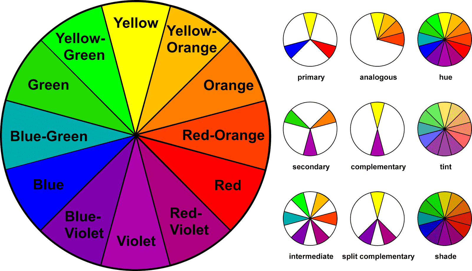
Colour theory is both the science and skill of using colour. It describes how humans perceive colour; and the visual effects of how colours mix, match or contrast with each other. The colour theory also includes the meanings colours communicate, and the techniques used to replicate colour. In colour theory, colours are organized on a colour wheel and grouped into three categories; primary colours, secondary colours and tertiary colours.
The primary colours are red, yellow and blue. You can’t create these colours while mixing with other combinations. It is the source of other colour shades, and all the other colours come from these three shades.
Secondary colours are green, orange, and purple, and these are the colours produced by mixing two primary colours together.
Tertiary colours are red-orange, yellow-orange, red-purple, blue-green, blue-purple and yellow-green. These are the colours produced by mixing a primary and secondary colour. That’s why the shades have a two-word name, such as red-violet, yellow-orange and blue-green.
Note: If you want to create fantastic PowerPoint designs, study in details with, contrasting colours, colour temperature, unconventional colour matches, colour tints/shades, colour context, colour perception and the like. Colour harmony delivers visual interest and a sense of order.
Impacts of colour on one’s emotions
Red: passion, love, anger
Orange: energy, happiness, spirituality
Yellow: happiness, hope, deceit
Green: growth, nature
Blue: calm, responsible, sadness
Purple: royalty, creativity, wealth
Black: elegance, mystery, evil
White: purity, peace, virtue
Brown: nature, dependability
Pink: feminine
Audience perception of your colour choices can make or break your design. So, carefully insert colour schemes in your PowerPoint slides, which may bring attention and enthusiasm to the viewers.
Know your colour contrast
Using too many colours in a single presentation deck is a common mistake, it creates confusion. It is usually best to use one prominent colour in design and balance it with a neutral colour like black, white or grey. Using too many colours will display too many messages and signals, making it difficult to understand what users are looking at? If you blend with extreme colours, no one will engage with your design, and it won’t hold their attention or it will bore them. Avoid too many colours, and make your presentation amazing. Remember, the chaotic combination will make it hard to focus.
Better knowledge in the science of colour contrast makes your design eye-catching and awesome. A designer should know the velocity of colours to penetrate the mind. Besides, they know what message a colour conveys to the viewer. For instance, if you are creating a growth diagram for showing the business success and growth, use green or blue colour because these colours will provide a positive atmosphere in the presentation hall.
Light Letters in a dark background gives more visual impacts and clarity than dark letters on a dark background. It is easier to understand if you keep in mind white is the lightest value and black is the darkest value. Don’t add light colours in the light background and dark letters in the dark background. Right colour mixing makes your interaction more possible and you can convey your messages with the support of colours.
The purpose of the PowerPoint presentation is to facilitate a seamless interactive relationship with the audience. As such, colour choice and juxtaposition should not be solely based on your personal preferences. Of course, it should be grounded in your presentation subject, but also in the science of accessibility.
Follow; 60 30 10 colour rule
60-30-10 is an eternal beautifying rule that can help you put a colour scheme together easily. The 60% + 30% + 10% ratio is intended to give balance to the colours used in any space. This concept is incredibly simple to use. This interior design rule can be incorporated with PowerPoint designs for better accessibility. This theory empathizes that the right colour proportion of space (here, it is the PowerPoint canvas) should comply with the 60, 30, 10 per cent distribution, in order to be considered balanced.
The main colour should be in 60% distribution, the secondary colour distribution pattern covers 30% distribution, and finally, the 10% is allocated as the accent colour, used in outlines and text. When you select a perfect colour scheme for a presentation, it comes out to be the most effective. While other mixings make your presentations hard to watch and understand.
Errors to avoid while combining colours in PowerPoint
Colour groups

We can classify colours into two broad groups: warm and cool colours. Yellow, red, and orange are referred to as warm colours. They have the capacity to grab attention- especially a bright red. Blue, green, and purple are cool colours, they tend to recede into the background and draw less attention, especially darker shades. White and very light colours also catch the eye, whereas dark colours and very black generally are less noticeable. Error in choosing the right colours from the colour groups creates three common mistakes in PowerPoint designs.
Faded text areas
Improper colour selection may harm your texts and the PowerPoint itself. It becomes difficult to see slides due to colour choice. The simplest colour choices make presentations readable and the audience can see your texts with ease.
Vague graphics
While designing graphs or charts, use colours to distinguish relationships or data points between items. Use a single colour to represent similar data groups to distinguish from others. This is the best way to make things clear and understandable to viewers. On the other hand, too many colour schemes confuse viewers and make it hard to understand the things shown in the templates.
Using gradient colours in the background

Modern PowerPoint designs often use a gradient colour combination to attract the viewer’s attention. However, this may bring difficulties in PowerPoint designs, when you use it for your background shades. Because the gradient colours show different colour blends creates adverse effects on texts readability.
Craft your presentation with the right colour combination. PowerPoint presentations don’t tend to stick to the dull black and white, Arial font and bullet point routine. Professional presenters use colours because they can meaningfully help get a crafted message across.
Related Articles
-
 November 30th, 2019
How to Create Investor Presentation Deck for Startups
Presentation Skills -
 December 1st, 2018
Advantages of Using templates
Presentation Skills -
 September 27th, 2024
Essential Tips: What You Need to Know About Animations In PowerPoint
Blog Post