
What ‘Draw to Win’ by Dan Roam teaches you about creating engaging presentations.
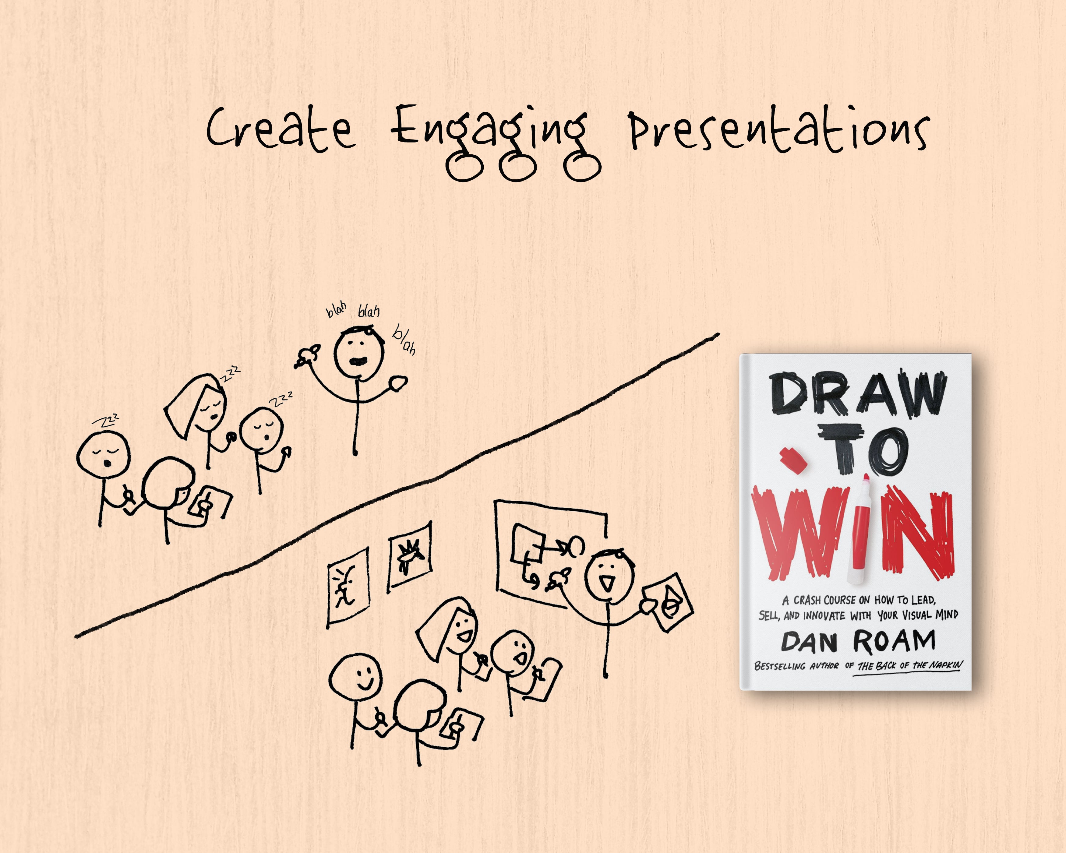

Article Summary: Effective presentations are all about communicating with 100% clarity and having your audience connect with what you have to say. Dan Roam’s ‘Draw to Win’ has some great insights on how you can achieve it by understanding visual communication.
‘Draw to Win’ is an excellent primer on improving visual communication. It explains everything from why you should draw to how to go about drawing. Most importantly, it tells you what to draw to win in life, whether it is leading, selling, or just thinking itself. A must-apply book (must-read is a given, but don’t just read. Apply it.), it really opened my eyes to how you can use drawing to improve almost every area of one’s life.
Moreover, I realized this book is a gold mine for everyone who has to present in front of an audience. You can apply the techniques described in the book to design effective presentations and have your audience hold on to every single word of what you have to say.
The secret to engaging an audience
The secret to engaging an audience is to get their eyes engaged. When their eyes are engaged, their entire attention is upon you. Here’s how you keep their eyes engaged:
- Always keep your presentations dynamic. The instant they see bullet points, they will lose focus and no longer care.
- Keep the visualizations simple. Make sure what you’re showing aligns with what you’re saying. If your images are too complex, they will concentrate on the image first, tuning out what you’re saying. When they come back, if they do, they wouldn’t be able to catch up with what you’re saying and will lose focus.
- If your picture is complex, don’t show it in one go. Show it step by step while explaining each step. This way, there won’t be a disconnect between what you’re saying and what the audience is concentrating on.
The Biggest Takeaway.
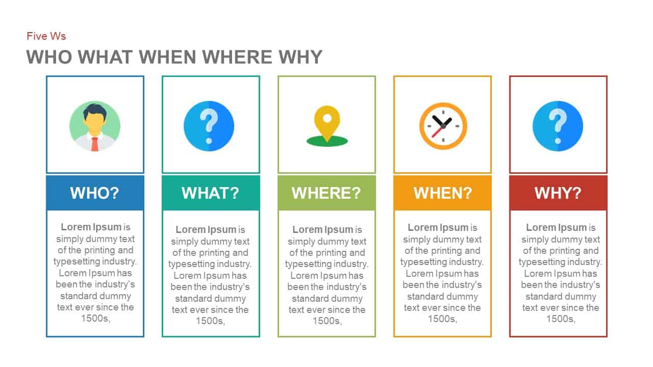
Here are some slides you should always include in your presentation and you should show them in this exact same order:
- Portrait of the item you are presenting. (More on this below)
- Chart showing numbers relevant to the item.
- Map showing where the item is situated.
- Timeline showing the transformation of the item over time.
- Flow-chart showing factors involved in this transformation.
- Equation summarizing the relationship between different items in play.
Why?
It has to do with the neuromechanical process which your vision applies to make sense of what it sees. When the photons enter your eyes, the first few milliseconds are used to make sense of Who/What the object is, How much of it is present and Where the object is situated. The eyes then detect the changes in position over time (the When). The brain makes sense of these changes to understand How things work; if this information can be codified into a cause-and-effect model (the Why), the brain stores this information for later retrieval.
You can use this process to create the most engaging presentations. To engage the visual cortex, start your presentation by showing a portrait (the Who) of the thing you are talking about. Then bring attention to the quantity, size, or gravity of the issue using charts (the How much). Third, show a map of Where the thing lies so your audience can share your perspective. You can use a timeline diagram to describe how things are changing over time (the When), and a flow chart codifies the How into the visual mind of your audience. The final slide should conclude with an equation that summarizes the entire process (Why). By showing these slides in the same order, you can tune in to what your audience’s visual system is looking for.
Why Does This Sound So Familiar?
This is the popular 5W (also referred to as Five Ws and How, 5W1H, or Six Ws) approach made popular in journalism, research and police investigations. When you provide factual answers to these questions, in this specific order (Who, How much, Where, When, How and Why) you are able to tap into the unconscious process of visual data analysis and interpretation running in your audience.
That’s all cool, but how do I make portraits of [insert presentation topic here]?
By showing the people involved, you instantly engage with the audience’s mind and, more importantly, their heart. And the best way to show who? Faces. Faces, whether actual or anthropomorphized, help your audience understand who’s at stake. If you’re pitching your new business, start with yourself and your team so the audience can feel a connection with you. If you’re selling something, start a portrait of something the audience can identify as themselves. By adding human elements to the topic, idea, or item you want to talk about, you will instantly click with the audience.
Ending Note
Visual communication wins every single time. If your presentations are loaded with insightful visualizations, you can move your audience to act the way you want them. Start by manually sketching out your presentation using a pen and paper if you’re finding it difficult to start. It helps to get the creative juices flowing. Make a circle, give it a name and let your pen do the thinking.
Happy presenting!
Related Articles
-
 May 21st, 2019
Tips For Creating Professional PowerPoint Template
Leadership -
 September 19th, 2019
7 Types of Presentation Styles
Presentation Skills -
 August 16th, 2024
How To Make Your PowerPoint Interactive: A Complete Guide
Blog Post