How could you get rid of time constraints by adding a burndown chart

Do you ever feel the allocated time for project completion is not enough? Oh! What an absurd question is this! We are confronting time lagging most of the time. Yes, project team members often feel there’s never enough hours in a day to get everything done. But all of them would like to do work at the earliest. Therefore, intelligent managers know that time is a constraint which they’re always working to control.
The better data they have related to time and work, the better they can stick to the schedule and get the project completed on time and within budget.
What is a burndown chart?
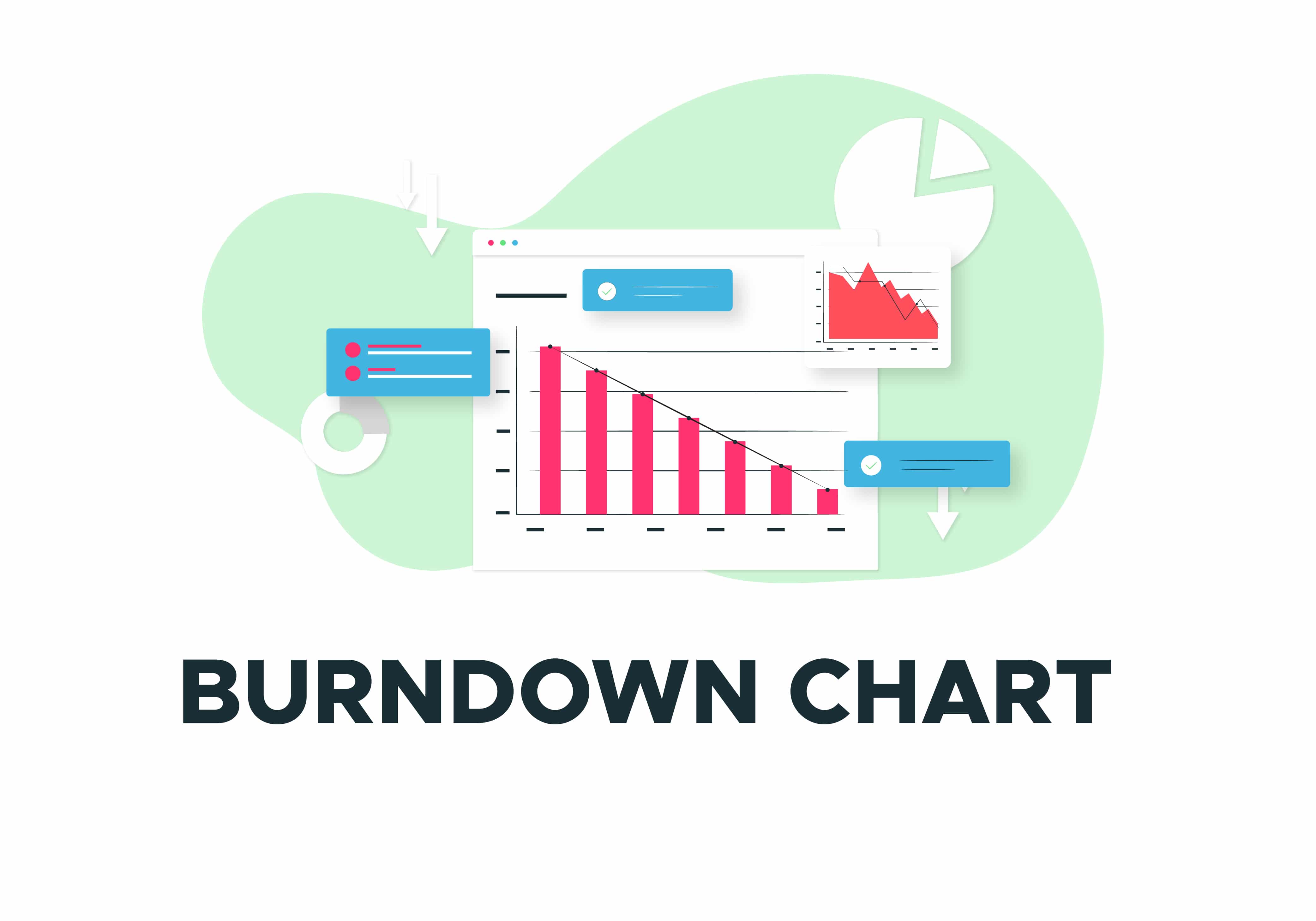
Burndown chart is an agile tool used to capture a description of a feature from an end-user viewpoint. This is a graph consists of an X-axis and Y-axis. The quantity of time remaining is showing on the X-axis, whereas the amount of pending work is showing on the Y-axis. Every day, team members work on their given tasks. Then, the amount of work can be plotted, and the graph will show a downward trend.
A burndown chart starts with the complete amount of work and slowly ‘burns down’ until nothing is left, and the goal has been completed. The burndown chart is showed so everyone on the team can see it and is updated regularly to keep it accurate.
There are two variants in a burndown chart. One is the sprint variant, and the other is called product burndown. Sprint burndown is for work remaining in the iteration, whereas product burndown shows the total remaining works in a project.
How to Read a Burndown Chart
The burndown chart has several points. The X-axis is the project or iteration timeline. The Y-axis is the work assigned to get done in the project. The story point estimates for the work that remains is signified by this axis. The starting point of the project has been depicted in the farthest point to the left of the chart and occurs on day zero of the project or iteration.
The project endpoint is extreme to the right and marks the final day of the project or iteration. It is easy to understand and has an inspiring effect, so many project managers show interest in the burndown chart. These types of graphical representations are best for summarizing project meeting with the help of a burndown chart; it will show the overall scenario of the present situation.
Ideal Work Remaining Line
There is an ideal work remaining line, which is a straight line linking the start point to the endpoint. It displays the sum of the estimates for all the jobs that need to be finished. At the endpoint, the ideal line crosses the x-axis and displays there is no work left to be done. This line is based on estimates and therefore not always precise.
Actual Work Remaining Line
Then there is the actual work remaining line that displays the actual work that remains in the project or iteration. At the start, the actual work remaining and the ideal work remaining are the same, but as the project or iteration headways, the actual work line will vary above and below the ideal work line. Each day a new point is added to this line until the project or iteration is done to make sure it’s as perfect as possible.
If the actual work line is above the ideal work line, it means there is more work left than originally thought. In other words, the project is lagging, and far behind the estimated schedule. However, if the actual work line is below the ideal work line, there is less work left than had been projected and the project is ahead of schedule.

Pros and cons of Burndown Charts
The Burndown chart has its own strength and weakness.
Pros of a Burndown Chart
- Burndown Charts are simple, and easy to use and read
- Burndown Charts clearly picture the performance of the team
- Burndown Charts also clearly picture what has yet to be realized
- Burndown Charts have an inspiring influence on the team
- The use of burndown charts aids the project manager and team to keep a full overview
Cons of a Burndown Chart
- User-friendly software for crafting burndown charts is costly, and the options in Microsoft Excel are limited
- The inspiring feature of burndown charts can also be a drawback. For instance, they could lead to overstated expectations
- Only the development of an individual sprint or task is shown. The complete picture is missing
- Burndown charts do not display which tasks are under development
Ending note
A burndown chart is one such tool for gathering that project data. Using a burndown chart is a means of seeing how much work is left and how much time there is to do it. It’s a graphical representation, showcasing the balance of work and time in a single frame. The graph is often used in project management – for example, in combination with the Scrum Agile Methodology – and aids teams to display the progress of a project. It is significant for the project manager to have a project run according to plan and to forecast whether the team can meet their goals within the set time.


