Death By PowerPoint: Tips To Avoid In Your Presentation

The phrase “Death by PowerPoint” first appeared as a criticism of badly planned and executed presentations that were unable to engage or educate the audience. These presentations lack visual appeal because of the excessive text and complicated slides. Presenting information is essential, whether you are creating slides for a team meeting, delivering a class, or a business proposal. A well-created presentation always makes the message clear and engaging and leaves a lasting impression on your audience.
What is Death by PowerPoint?
“Death By PowerPoint” refers to presentations that are so monotonous and tedious that fail to get the audience’s attention and interest, leading to disengagement and lack of audience retention.
Real-Life Examples and Consequences
Think about the meetings where people have completely lost interest or the sales presentations that were so overwhelming that the audience was unable to convince them. These examples show how bad presentation techniques can lead to missed opportunities, weakened credibility, and time wastage in real life.
Understanding Your Audience
Audience Needs and Preferences
To create an effective presentation, first understand your audience. Ask yourself:
- What expectations and interests do they have?
- How much experience do they have with the subject?
- What are their primary concerns or areas of discomfort?
Engage Your Audience
Make the content specifically targeted at your audience’s needs and preferences. Maintain their interest throughout the entire presentation by using language and examples that they can relate to.
Design Principles for Effective Slides
The Role of Visual Design in Presentations
Using effective visual design in your presentation makes it more engaging and memorable. A poorly created slide could be confusing and tedious to your audience, on the other hand, a well-designed slide will clearly communicate the actual information quickly and clearly.
Key Design Elements: Fonts, Colors, and Layouts
- Fonts: Make sure the presentation is consistent throughout by using a limited number of fonts. Choose fonts that could improve visibility.
- Colors: Try a color palette that is visually appealing and creates contrast. Use colors to highlight key points.
- Layouts: Maintain your slides layouts clean and structured. Use whitespace effectively to avoid overwhelming your audience.
- Avoiding Clutter and Overload: Be focused on the key points to make your slides simple and easy to understand to the audience. Avoiding information overload in a single slide is the primary factor to consider. Also, using bullet points will help to make the slide clear and easy to understand.
Tips to Avoid Death by PowerPoint
- Keep Slides Simple and Focused
Your presentation should convey the exact information. Make it structured and break down complex data and information by keeping them concise.
- Use High-Quality Visuals and Graphics
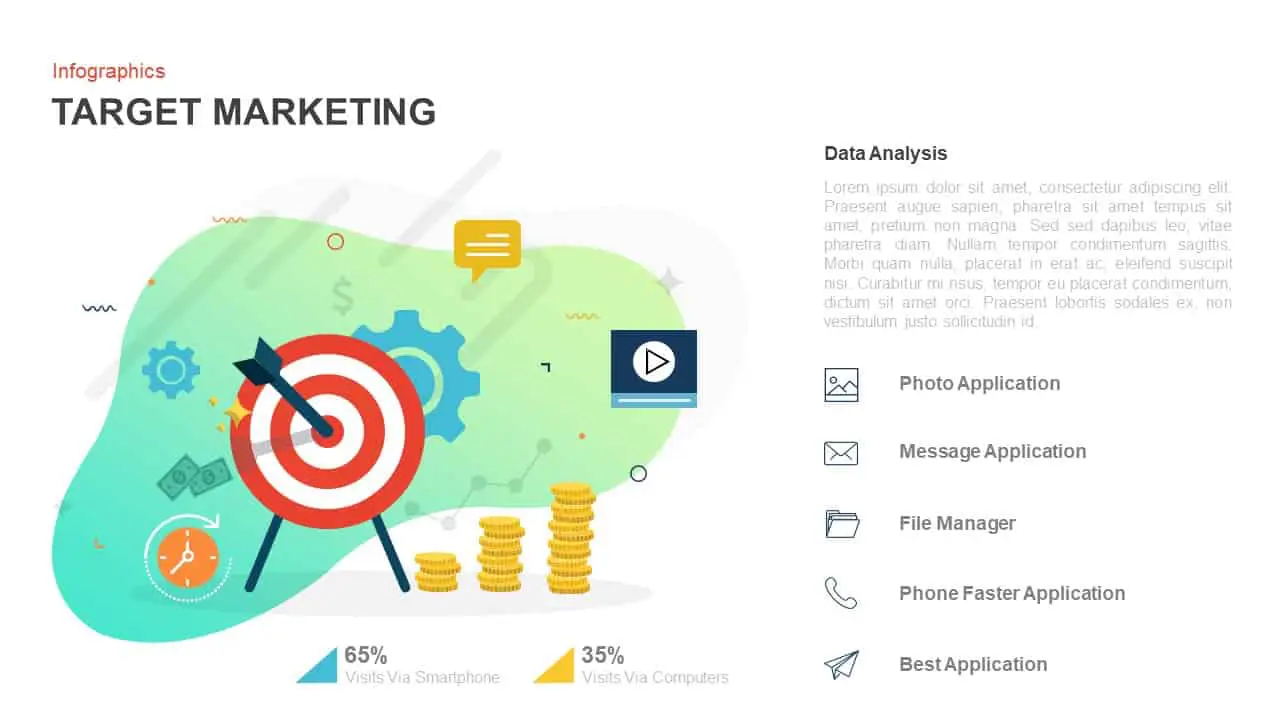
Always use high-quality visuals and graphics throughout your presentation and make it more engaging to your audience. But make sure that they help you share the exact message of the presentation.
- Limit Text and Bullet Points
Don’t make slides with a lot of text. Try to use key phrases and bullet points to highlight important points. Explain and interact with the audience instead of just reading the exact sentences in the slide.
- Incorporate Storytelling Techniques
The storytelling method could engage your audience. You can also include case studies and other examples to strengthen your points and presentation.
- Practice Good Slide Transitions and Animations
Don’t make the presentation filled up with animations and transitions, that could distract the audience. Instead, use it wisely to guide your audience.
- Engage Using Interactive Elements
Another technique to engage your audience is including Q&A sessions and games in between the presentations.
Delivery Techniques
- Strategies for Confident and Clear Speaking
Practice makes perfect. Practicing also helps you deliver presentations confidently and clearly. Always try to use a conversational tone while delivering.
- Questions and Interactions
The audience will have questions so be prepared for that. Encourage the audience participation thoughtfully.
- Utilize Technology to Improve Delivery
As we have advanced technologies like remote clickers and laser pointers available
Utilize Technology to Improve Delivery
- As we have advanced technologies like remote clickers and laser pointers available
Tools and Resources for Better Presentations
- Recommended Software and Online Sources
Make use of software and online sources like SlideBazaar, SlideKit, Prezi, and Canva to design a better presentation.
- Forums and Communities
Many online communities and forums like SlideShare and TED Talks are available over the internet in which you can discuss, share, and get feedback for your presentation.
Conclusion
To avoid Death by PowerPoint, the presentation should have a good visual design, interesting content, and a better delivery. Create informative and engaging presentations by following the tips and focusing on your audience.
Practice as much as possible and try to get feedback from the audience to improve your delivery skills. Your presentation will be better the more you refine your skills.


