
Advantages of Infographics for Education


Infographics have the ability to break complex information into easy-to-understand components and to make even intricate data engaging. Whether you want to communicate with your audience about the education industry or you need to use visual content as a teaching tool, infographics are the ideal answer.
Apart from the education industry, infographics have spread to other horizons such as business and financial data presentation. It’s been used for all purposes having an academic mode of displaying. Find out why visual content is so effective in an educational context and learn how to design and use infographics for education.
Why is visual content so effective in an educational context?
No matter what type of message you want to convey, there’s a good chance that verbal or non-verbal instruction alone won’t get your information across. After all, the average person is more likely to forget verbal or non-verbal communication than visual information. In fact, most people recall just 10% of what they heard and 20% of what they read, while they can retain 80% of what they see.
Further, most people can make sense of visual content much quicker than they can absorb what they hear or read. The average person can process images 60,000 times faster than other types of content. Adding image-based components to your teaching materials will be a smart choice.
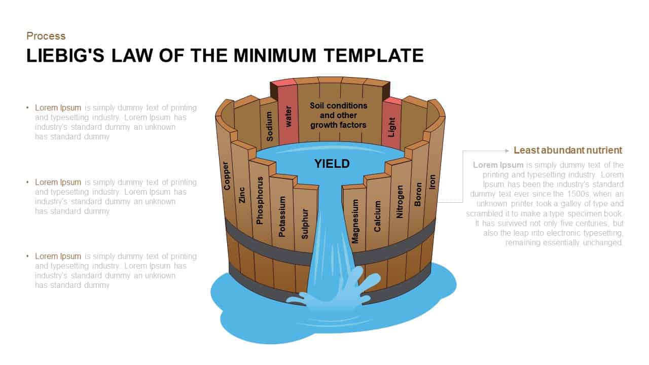
If you want to uncover the different facets of a theory, it is better to use an image to display its various components. Here you can understand how the popular Liebig’s theory is portrayed using visual arts.
Download PowerPoint templates and infographics have the ability to capture the brain in educational context because they use imagery to explain, highlight, or enhance text-based information. They have the unique ability to convey information, capture attention, and encourage data retention despite their complex nature. That indicates infographics can be perfect for teaching the fundamentals of complicated processes or breaking down high-level data for all types of audiences.
How to use infographics for educational purposes
Regardless of the topic that you want to present, you can use infographics to teach your audience. If you want to expose education-specific themes or stress on virtually any other sector, you can use infographics to achieve these goals:
Display a historical timeline
Infographics are perfect for highlighting important events throughout a historical period; serving students comprehending how events link to and influence each other, or even reconsidering the most significant events of a particular period. To make this infographic style as influential as possible, narrow down the time period or the topic significantly. Doing so will save the content focused and stops it from being overly detailed or difficult to follow.
Illustrate important statistics
Statistics can speak a lot about a topic, but figures alone don’t always make for the most persuasive reading material. Instead, adding graphics and short text descriptions can make a sequence of numbers much easier to understand and remember.
A data-dense infographic can also offer your audience insight into a high-level topic and help you place yourself as an authority on the subject. It is better to picture the most complicated data rather than doing mere textual themes.
Increase awareness of a matter
Directing to change isn’t always easy, but an attractive infographic can teach your audience about an important issue while schooling them how and why to take action. This type of infographic is most operative when it concludes with a strong call to action (CTA) that tells your audience accurately what to do next.
Provide useful tips
This is the era of tips, no matter what the subject, tips are going on. Visual graphics can be a great deck for educating your audience about processes or for helping viewers work through multiple problems. This kind of visual graphics tends to work best when it brings key issues to your audience’s attention and then provides tips for overcoming the associated effects.
Provide step-by-step instructions
Information with a sequence can offer a better understanding of the topic. Infographics can also teach your viewers how to complete a complex procedure. If you deliver your speech with the help of a connected graphic, which will help your audience identify the goal of each stage and understand how to handle it efficiently. So, stage by stage illustration of a process will guide your audience into the right destination.
Create Interest for an Event
If you are planning a one-time speech on annual basis, infographics can help your viewers learn about events. Suppose, you are a PowerPoint presenter, you can sort events in a timely manner and put it into your slide collection. Use the blend of visual and text features to showcase key statistics about attendees or performers, share details about stimulating highlights, or advise your audience on how to get the most out of the event.
How to use infographics in the classroom
Our classrooms have become smart rooms. Overhead projections in teaching have become common. Primary education is also looking for dynamic changes with the incorporation of infographics. Visual aids can be outstanding teaching tools, whether you want to use them to teach your class or you want students to develop their own for a graded project. From learning activities to creative projects, find out how to put infographics to work in your classroom.
Integrate infographics into learning activities.
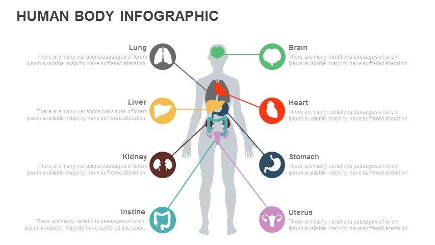
Human Body PowerPoint Template
Irrespective of the subject, you can use infographics to teach your students. Visual aids are a smart way to produce your topics before your students. It does not only increase students’ interest and engagement but also helps them learn about subjects ranging from history and literature to math and science. Depending on the level of your students and the subject you teach, you could use infographics in a number of learning activities.
- By using an eye-catching visual graphics, you can introduce new modules in the classroom, and thereby generate the interest of the students.
- Motivate students to read facts, interpret data, and draw conclusions from an infographic.
- Rather than having students read a textbook passage or a news editorial, use an infographic to start a discussion or lead a classroom discussion.
- Use an infographic for your storytelling presentation that will surely catch student attention with inspiring images.
Use infographics in creative projects
Finding pre-designed infographics to enhance learning activities isn’t the only way to use this visual content in the classroom. You can also inspire students to create their own infographics. To make the most of this resourceful project, try one of these schemes:
- Inspire the students to chart the key events of a historic period
- Motivate students to analyze how a topic of their choosing has evolved over time.
- Ask students to develop a visual slide to accompany a written research assignment.
- Encourage students to share their understanding of a process with a step-by-step guide.
- Inspire the students to make innovative combinations of modern graphics with their projects.
How to create infographics for education
Whether you are a beginner or have advanced design skills, you can use great infographics templates for education. The following are guidelines for creating infographics for educational purposes. Either you can do it by yourself, or with the help of a professional infographic designer.
Select a topic
First, you’ll need to pick a topic for your infographic. Select a focus area that will echo with your audience, whether that’s your eighth-grade classroom, the students taking your online course, or your company’s client base. To select an apt topic, consider fresh news in your industry, important findings you’ve collected, or an important issue in your place.
For extra knowledge, try browsing roundups of PowerPoint galleries or Google slide themes. Take care not to recap a topic that another educator or brand has already covered. Obviously, your content won’t have as great of influence if it isn’t unique.
Explore relevant data
If you want to create eye-catching infographics, do the necessary research. An interesting and innovative data set will make your presentation unique, and the audience can analyze your knowledge about the subject. Unless you do research on your subject, you can’t make mind-blowing presentations. In this case, your research may be as straightforward as analyzing numbers and interpreting statistics in interesting ways. Explore your necessary data from some of these publicly available resources:
- Google Public Data Explorer: This resource comprises datasets from over 100 providers, including the World Development Indicators, Human Development Indicators, Demographic statistics, the World Bank, the International Monetary Fund, and many more.
- Data.gov: This resource deals with all open data from the United States government, including numerous education-related datasets.
- HealthData.gov: This U.S. Department of Health & Human Resources website provides health-related datasets at the national, state, and community levels.
- World Factbook: This Central Intelligence Agency resource provides data on the people, government, and culture of nations and regions around the globe.
Your presentation content, as well as its credibility, is also important as your presentation style.
Outline the story
Once you’ve done the exploration and collected the data, you can begin to visualize how your infographic will look. Even if your design skills are comparatively limited, start to outline the story and develop a narrative. Try changing your data into visual modules to get a better sense of patterns and key points.
Find the most significant sections of information, and then use the research you’ve gathered to write short explanations for each point you want to cover. Soon, you’ll have a draft of your infographic, which you can use to select the suitable layout and design platform to complete the job.
Pick a design platform
Select a design platform and create an infographic after doing all of the preliminary work. You can choose different apps, a few stand out as the most user-friendly, even if you have fewer design skills. You can select your design platform from the following list:
- Canva: it is one of the popular online design apps; helps you make creative infographics on education or other subject matter. Get underway by selecting from the large template library, and then add your text and edit the layout as needed. This app lets you customize almost every element, so you can change alignment, expand text, fine-tune colors, and more.
- BeFunky: If you’re considering a relatively basic option that you can use to manage pictures, make simple charts, and design colorful infographics, try BeFunky. Start with a pre-design template, add your text, and select a few icons. You can change the colors and some arrangement elements to make your design modern.
- Piktochart: This is creative design app permits you to pick from ready-made templates or create your own infographic from scratch. To entrée all of the options and features, you might want to consider upgrading to the paid version, which also allows you to upload the features of your own graphics.
- Venngage: This free app offers you to get started by choosing a chronological, informational, or statistical infographic template. You can easily add diagrams, charts, and maps to incorporate data and enrich your story. With so many auxiliary elements to choose from, Venngage is the best option for showcasing statistics and data.
- Easel.ly: This basic design app offers simple, modernized infographics. Layout options are somewhat limited and may not let for difficult storylines, but Easel.ly works well for direct visual stories that feature a few key points.
- Snappa: One of the coolest design tools to use, Snappa is a basic graphic design app that allows you to make easy-to-use infographics for education. The design options and icon libraries may be relatively limited, but in this case, fewer varieties mean a more streamlined design process. This app can help you produce an infographic within a matter of minutes.
- Infogram: This app needs more design skills than many other online apps, but Infogram can be an excellent choice for data-heavy infographics. Surf the library to see the many diagrams, graphs, charts, and map options available for telling your visual story.
If you want to create infographics that are matching with your own thought and visual idea, it is better to study graphical design courses. However, your designs might be an ordinary one, when we compare with the design of a professional infographic designer. So, leave the design process to a professional team and make your presentation thrilling and inspiring.
Related Articles
-
 June 20th, 2019
A guide to presenting financial data: graphs, charts and other visuals
Presentation Tips -
 November 30th, 2019
How to Create Investor Presentation Deck for Startups
Presentation Skills -
 October 18th, 2019
Why Business PPT Presentations Requires Unique Design Slides
Presentation Tips