


Application Revenue Line Chart PowerPoint and Keynote template
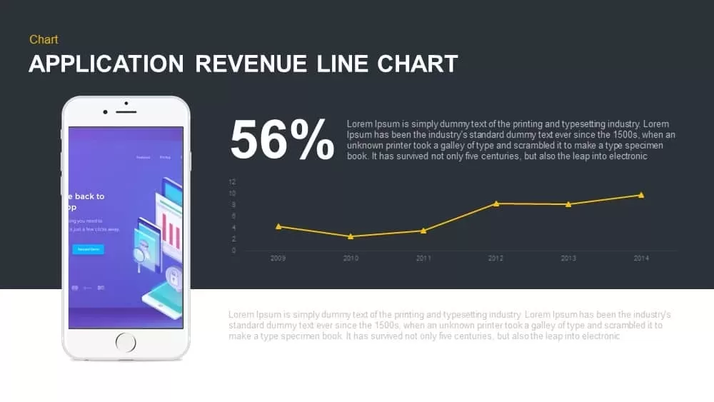
Leverage this striking application revenue line chart slide to communicate financial performance with clarity and visual impact. A dark background provides a high-contrast canvas for a crisp white smartphone mockup that showcases app interface visuals, while a bold 56% KPI figure anchors audience attention. A vivid yellow line plots revenue values from 2009 through 2014, with light gray axis labels and subtle gridlines guiding the viewer’s eye. Dashed connector lines link the KPI callout and description text to specific data points, enabling you to contextualize performance insights alongside your narrative. The flat design aesthetic, accented by gentle drop shadows and generous white space, ensures a polished, professional look that adapts seamlessly to corporate or startup branding. Fully created in vector format, this slide maintains sharp clarity across devices and resolutions.
Every element is fully editable: adjust chart colors, swap percentage values, update year markers, or replace the smartphone image with your own mockups in seconds. Master slide integration guarantees consistent styling throughout your deck, while intuitive placeholders streamline content updates without disrupting layout. Compatible with PowerPoint and Google Slides, this template preserves formatting integrity across platforms and supports entrance animations to reveal KPI metrics and chart segments sequentially. Ideal for app performance reviews, financial reports, and investor presentations, this line chart empowers stakeholders to identify revenue trends, seasonal fluctuations, and growth opportunities. Beyond revenue visualization, repurpose this slide to showcase user acquisition metrics, engagement rates, retention benchmarks, or A/B testing outcomes. Duplicate or remove data series, relabel axes, or recolor chart lines to align with brand guidelines—all without design expertise. Whether you are preparing boardroom briefings, pitch decks, or strategy workshops, this slide delivers a versatile, high-impact foundation for data-driven storytelling.
Who is it for
Product managers, financial analysts, marketing directors, app developers, executives, and investor relations teams seeking to present revenue trends and KPI insights.
Other Uses
Use this slide to illustrate user acquisition metrics, engagement or retention rates, A/B test results, forecast projections, sales funnel performance, or market penetration dashboards by adjusting line series and percentage callouts.
Login to download this file

Item ID
SB00884