


3D Column Chart
Description
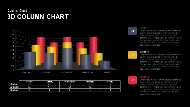
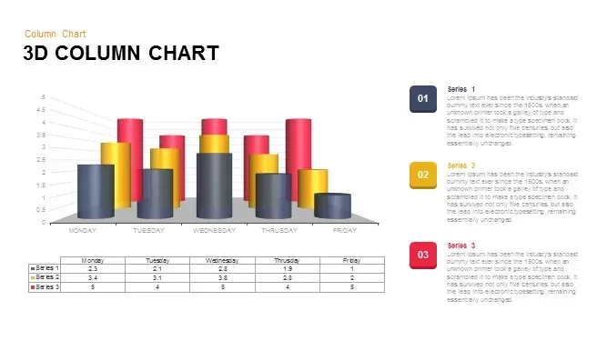
This dynamic 3D column chart is designed to visually present your data with clarity and impact. Featuring three distinct data series represented by colorful 3D bars, this chart allows you to compare different variables over the course of a week (Monday to Friday). The accompanying data table below provides precise numerical values for each series, offering further context and ensuring the information is easy to digest. The vivid use of colors—red, yellow, and gray—creates a professional and attractive presentation that draws attention to key trends and insights.
Ideal for business presentations, sales reports, or performance reviews, this chart is fully editable, so you can update the labels, colors, and values to match your own dataset. Whether you're showcasing weekly performance metrics, sales data, or project progress, this slide will help you present your information in an engaging and accessible way.
Who is it for
This slide is perfect for data analysts, business managers, project leaders, or marketing professionals who need to present detailed data in an impactful way. It’s also ideal for educators or trainers who need to explain statistical information in a clear and engaging format.
Other Uses
Beyond sales and performance reporting, this 3D column chart can be repurposed for various purposes, such as market research comparisons, customer satisfaction surveys, project progress tracking, and financial reporting. It can also be used for visualizing survey data, growth trends, or production analysis.
Login to download this file
Add to favorites
Add to collection

Item ID
SB00781