


baseline-vs-actual-gantt-chart-template-powerpoint-google-slides
Description
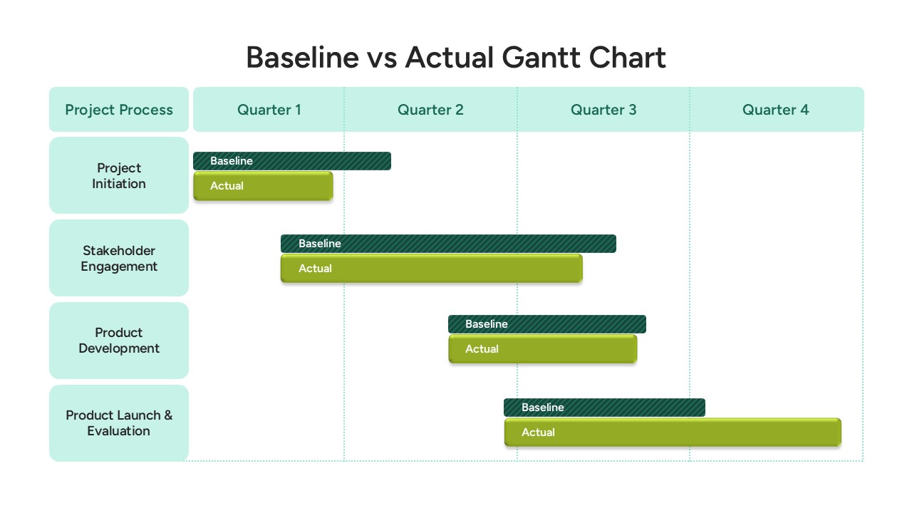
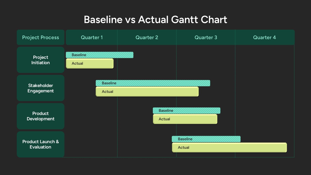
Use this Baseline vs Actual Gantt Chart slide to compare planned and actual timelines across four key project phases: Project Initiation, Stakeholder Engagement, Product Development, and Product Launch & Evaluation. The layout features a light mint-green header row delineating quarters Q1–Q4 and a matching left panel identifying processes. Within each row, two horizontal bars represent the baseline schedule (hatched dark teal) and the actual progress (solid lime green), with subtle drop shadows and rounded ends for visual clarity. Vertical dotted gridlines mark quarter boundaries, enabling precise timeline comparisons at a glance.
Master slide support and intuitive placeholders let you easily adjust durations, swap colors, and update process names without manual alignment or formatting headaches. Editable bar styles—striped and solid—ensure your audience immediately distinguishes between planned milestones and real-world performance. The clean font and spacious grid deliver a professional, high-fidelity visual that maintains full resolution on both PowerPoint and Google Slides.
Engineered for project reviews, stakeholder updates, and schedule variance analysis, this template streamlines presentation preparation and drives data-driven discussions. Simply drag bar endpoints to reflect new dates, customize text boxes to add progress notes, or duplicate rows to include additional tasks. With this slide in your toolkit, you can highlight delays, celebrate on-time achievements, and forecast resource needs with maximum impact and minimal effort.
Beyond timeline tracking, you can repurpose the hatched/solid bars for comparative workload allocations, budget vs actual spend visuals, or multi-department capacity planning. Section headers and quarter labels are fully customizable. The minimalist color palette ensures seamless integration with corporate themes, while the structured grid keeps content aligned. Export into high-resolution PDF for printing or embed in interactive slide decks. Use the slide as a standalone snapshot or as part of a larger project status deck.
Who is it for
Project managers, program directors, and PMO teams will find this slide invaluable for schedule variance analysis, stakeholder briefings, and quarterly performance reviews. Team leads and portfolio managers can leverage it to illustrate timeline deviations, report progress, and coordinate resource planning.
Other Uses
Use this Gantt chart layout for budget vs actual spend comparisons, resource allocation dashboards, or marketing campaign timelines. Duplicate rows to track parallel workstreams, milestones, or regulatory compliance tasks. Customize headers and colors to map sprint backlogs, release schedules, and cross-functional dependency plans.
Login to download this file

Item ID
SB05364