


Sun-Burst-Chart-PowerPoint-Template
Description
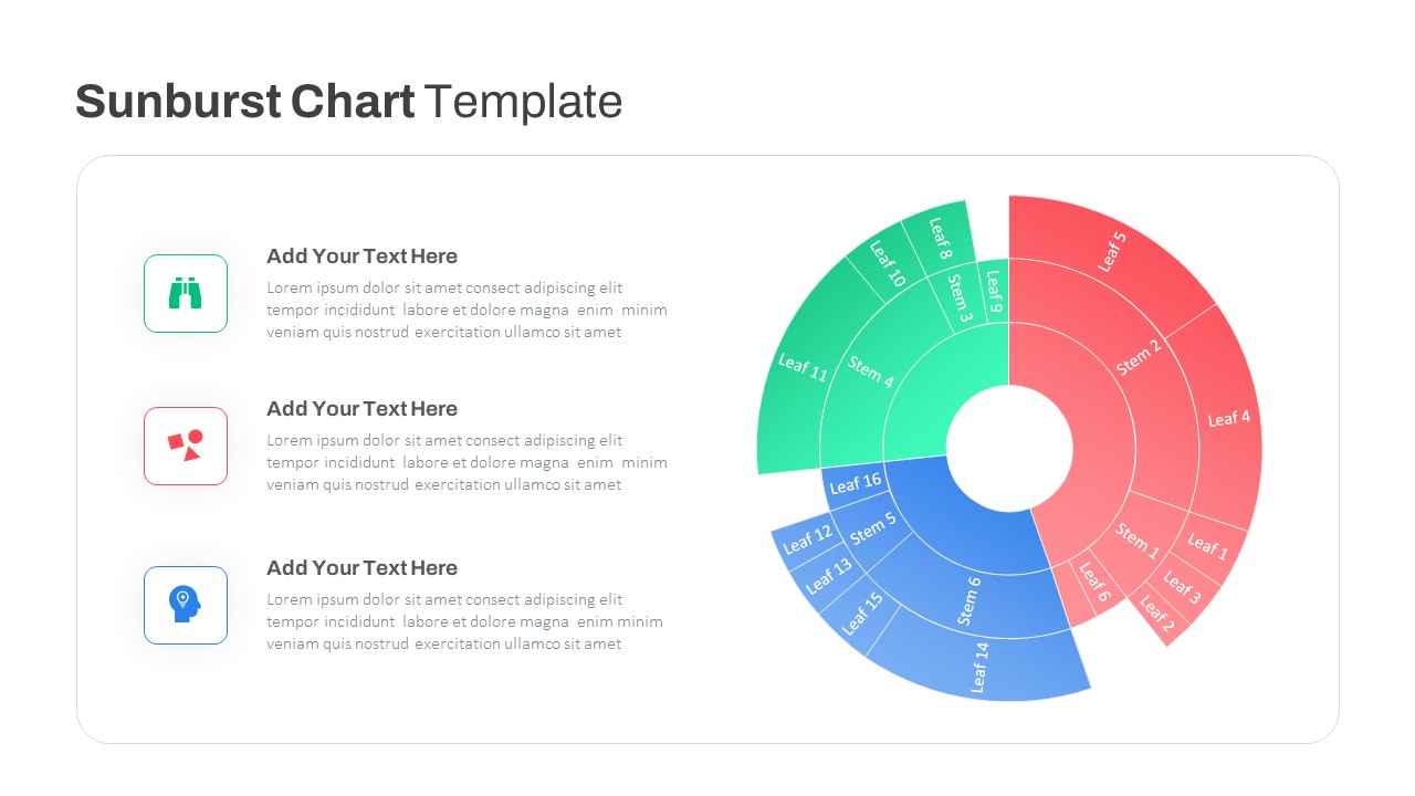
Leverage this dynamic sunburst chart slide to present hierarchical data with clarity and visual impact. This fully editable template features three concentric segments representing stems and leaves, allowing you to illustrate multi-level breakdowns at a glance. Each segment is color-coded in red, green, and blue gradients to differentiate categories and maintain a cohesive aesthetic. Clear labels on both inner rings (stems) and outer rings (leaves) enable you to highlight key data points, while the central donut space focuses attention and can accommodate a headline or icon.
The left pane pairs each chart segment with a modern line-style icon and descriptive text placeholder, facilitating narrative context and emphasizing insights. Whether detailing organizational structures, project phases, or market share distributions, this sunburst layout streamlines complex information into a structured radial diagram. The minimal iconography, subtle drop shadows, and generous white space ensure readability and seamless integration with any brand palette.
Engineered for seamless customization, this slide includes master layouts, editable shapes, and intuitive placeholders. Resize rings, adjust gradient stops, or update text labels without compromising slide integrity. Optimized for both PowerPoint and Google Slides, it maintains full resolution across devices, reducing formatting issues and version-control errors.
Leverage the built-in themes and predefined color schemes to align with corporate branding in seconds. Swap icons from the extensive library or integrate custom SVGs. Smart guides and snap-to-grid functionality guarantee precise alignment. Suitable for financial reporting, customer segmentation, risk analysis, or product portfolio evaluation, this versatile sunburst template elevates data storytelling and cuts preparation time.
Use this sunburst chart to drive data-driven discussions in executive briefings, stakeholder workshops, or academic presentations. With its radial architecture and gradient design, you can effectively communicate nested relationships and proportionate metrics in a single, compelling view.
Who is it for
Business analysts, data scientists, project managers, marketing strategists, product managers, and academic researchers who need to visualize complex hierarchies and multi-level data.
Other Uses
Map organizational structures, illustrate customer segmentation, present product portfolios, compare market share distributions, conduct risk assessments, or build executive dashboards. Adapt it for financial reporting, portfolio breakdowns, or academic data presentations.
Login to download this file
Add to favorites
Add to collection

Item ID
SB03843