


Data Over Time Line Chart PowerPoint slide
Description
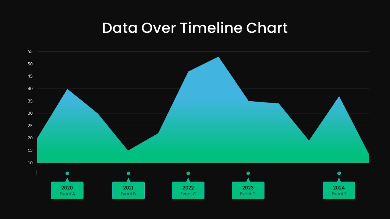
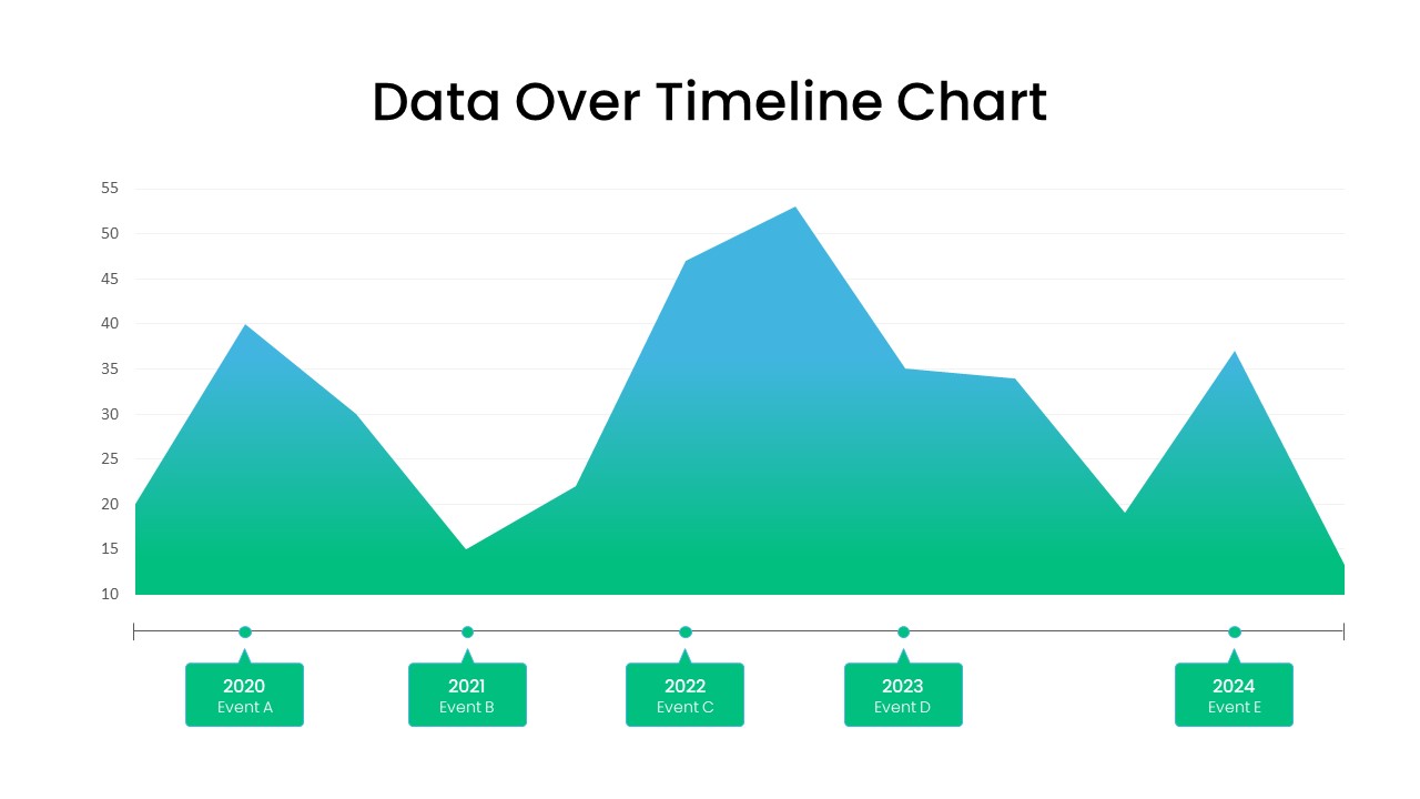
Empower your presentations with the Dynamic Data Over Time line Chart, a versatile slide designed to showcase metric evolution across distinct annual milestones with professional polish. This fully editable area chart utilizes a smooth gradient fill—from vibrant green at the baseline to bold blue at peak values—to draw attention to significant fluctuations between 2020 and 2024. Each of the five key data points is marked with a clearly styled circular marker and labeled callout, enabling audiences to immediately identify Event A through Event E along a horizontal line. Fine-tuned gridlines and precise y-axis labels spanning from 10 to 55 provide contextual clarity, making trends, spikes, and dips easy to interpret at a glance. The minimalist layout features generous white space, crisp typography, and intuitive placeholders, ensuring that your narrative remains the focal point without unnecessary visual clutter.
Engineered for rapid customization, this template supports master slide integration, editable gradient stops, and seamless color modification. Swap in your corporate palette, adjust data values, or rename event tags in seconds, and the design automatically adapts to maintain alignment and proportional scaling. Whether you are preparing an executive briefing, quarterly performance review, academic lecture, or investor pitch, the slide’s balanced composition and high-resolution graphics guarantee consistency across PowerPoint and Google Slides platforms. Its adaptive structure also streamlines collaborative editing, reducing version control headaches and saving valuable preparation time.
Beyond traditional timeline analyses, this slide excels at financial reporting, project milestone tracking, marketing campaign performance, and risk management presentations. Use it to compare historical sales volumes, visualize user acquisition growth, illustrate budget allocations over time, or forecast future KPIs. With this versatile timeline module in your toolkit, you can elevate data-driven storytelling and deliver compelling visual narratives that resonate with stakeholders and drive informed decision-making.
Who is it for
Product managers, financial analysts, marketing teams, project managers, executives, and educators will benefit from this timeline chart slide when presenting trend analyses, performance reviews, and strategic forecasts.
Other Uses
Apart from annual trend reporting, repurpose this slide for budget tracking, user growth visualization, project milestone mapping, sales velocity comparisons, resource allocation over time, and academic data presentations.
Login to download this file

Item ID
SB03629