


Polynomial Combination Chart Powerpoint Keynote template
Description
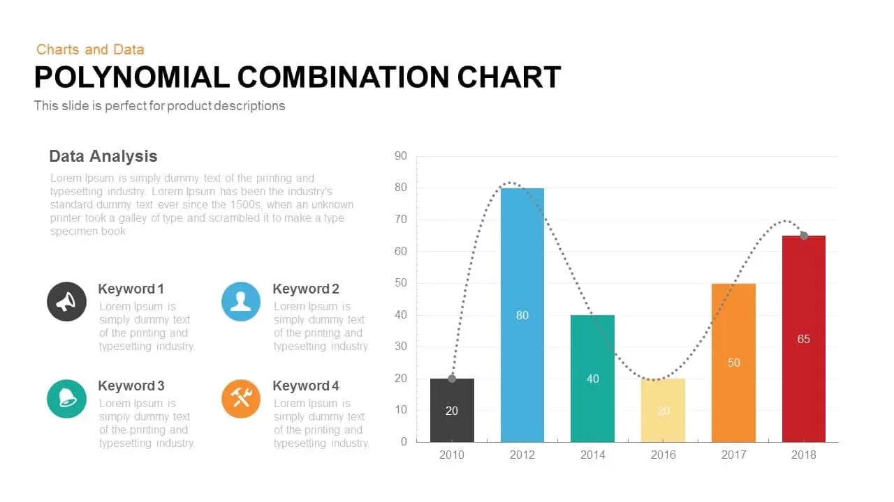
This clean, modern combination chart slide merges a colorful bar column graph with a polynomial trend line to present complex data analyses in a single view. Designed for product performance or time-series reporting, each bar represents distinct year-on-year metrics (2010 through 2018) in vibrant black, blue, green, yellow, orange, and red palettes, while a dotted line elegantly tracks overall growth patterns. The slide features preformatted placeholders for a descriptive headline, subtext, and four keyword-driven highlights—ideal for emphasizing critical insights, marketing touchpoints, or operational KPIs. Its intuitive master layout supports 16:9 and 4:3 ratios, ensuring flawless rendering on HD screens. Fully editable shapes, fonts, and colors enable quick brand customization, and intuitive icons accompany each keyword for added clarity. Optional navigation arrows embedded in the layout enable guided walkthroughs of multiple data scenarios across sequential slides.
Who is it for
Business analysts, marketing managers, financial planners, and product strategists will find this slide essential for illustrating performance trends. Project leaders, data scientists, and consultants can leverage it to report quarterly results or forecast future growth. Educational professionals and trainers may also adopt the template to teach data visualization best practices or statistical modeling techniques.
Other Uses
Beyond year-over-year analyses, the combination chart template adapts seamlessly to presentations on project timelines, budget forecasts, sales pipelines, or KPI dashboards. Replace the bars with different metrics—such as customer acquisition costs, website traffic, or resource allocation—and adjust the polynomial curve to reflect rolling averages, cumulative gains, or regression outputs. Its modular design also doubles as a visual roadmap or process audit tool, making it a versatile asset across industries.
Login to download this file
Add to favorites
Add to collection

Item ID
SB00207