


Donut Chart Template For PowerPoint
Description
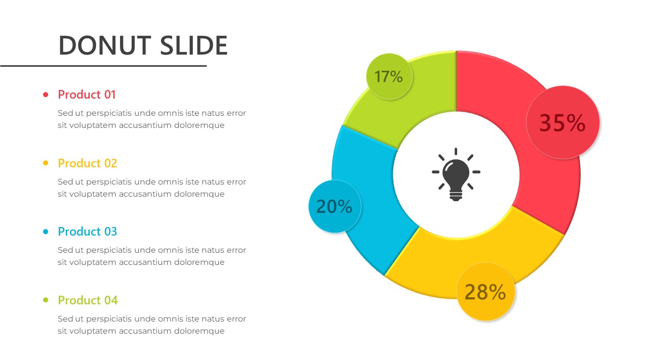
This "Donut Chart" slide offers a visually appealing way to display and compare data across multiple categories or products. The chart is divided into four colorful sections—red, yellow, green, and blue—each representing a different product or data point with corresponding percentages (17%, 20%, 28%, and 35%). The center of the chart features an icon of a lightbulb, symbolizing insight or an important takeaway.
Ideal for use in marketing, sales, product comparison, or performance reporting, this donut chart design helps convey numerical data in a straightforward and digestible format. Each section is clearly labeled, and the bright colors make it easy for the audience to differentiate between categories at a glance. The layout also includes space beneath the chart for additional descriptions or notes, allowing you to expand on the data points.
Fully customizable, this slide allows you to change the percentages, labels, and color scheme to suit your specific needs. Compatible with both PowerPoint and Google Slides, this donut chart is perfect for professionals, business analysts, and marketers who need a quick and effective way to communicate data visually.
Who is it for
This slide is ideal for business analysts, product managers, marketers, and project managers who need to present comparative data in a visually clear and engaging format. It’s perfect for reporting on sales performance, product breakdowns, market analysis, and more.
Other Uses
Beyond product comparisons, this slide can be used to present market share, budget allocations, customer satisfaction ratings, or survey results. It's also suitable for use in project management to show task distribution or progress across multiple areas.
Login to download this file
Add to favorites
Add to collection

Item ID
SB03234